9 CSS Toggle Switches — dán 1 dòng là chạy
CSS toggle switch là control chỉ dùng một input checkbox để bật tắt thật, còn track và núm là lớp vỏ CSS phủ lên trên.
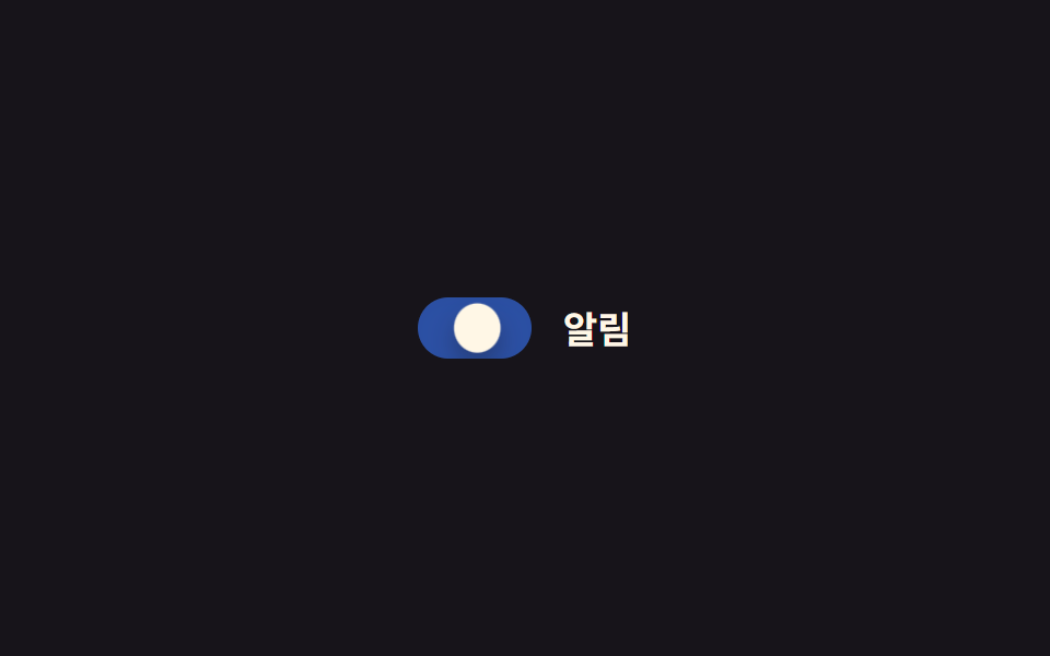 01 toggle-switch-basic-slide
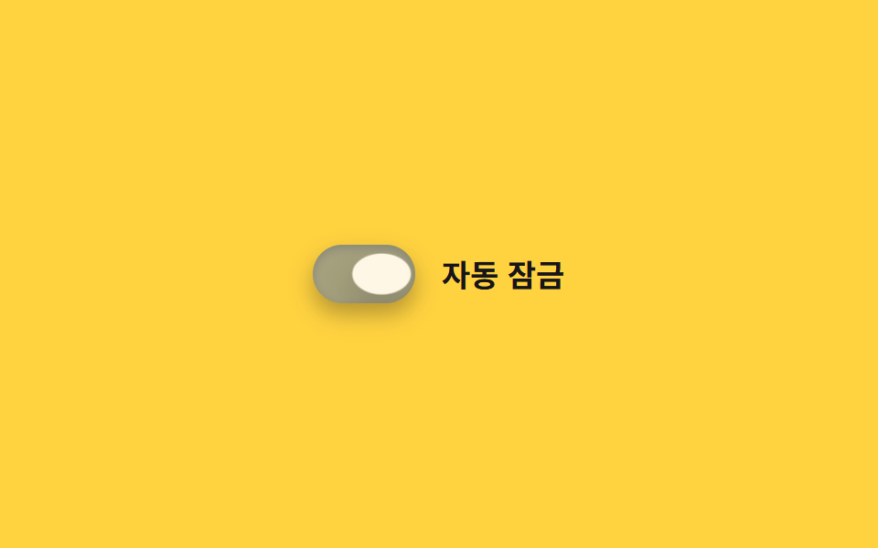 02 toggle-switch-ios-style
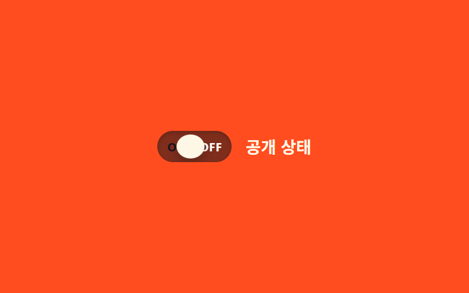 03 toggle-switch-label-inside-onoff
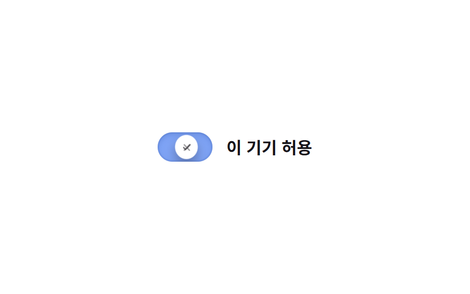 04 toggle-switch-icon-swap
 05 toggle-switch-squish-press
 06 toggle-switch-color-fill-bg
 07 toggle-switch-day-night-icon
 08 toggle-switch-size-variants
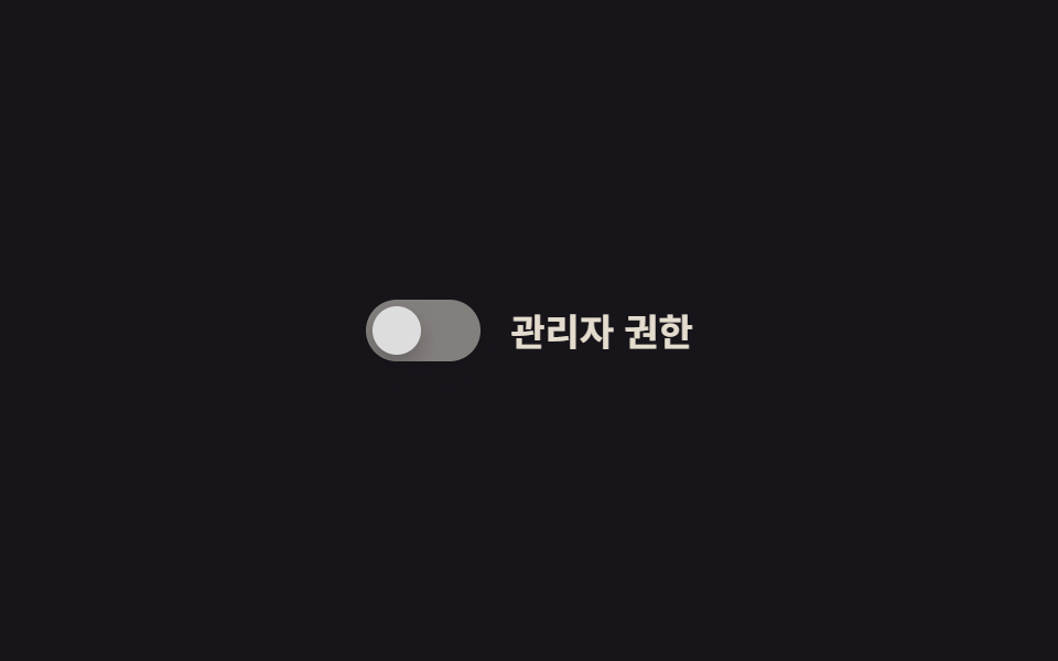 09 toggle-switch-disabled-state
Tự chạy · bấm ô để tới mục đó · cả 9 trong một zip
- 01 Trượt cơ bản
- 02 Kiểu iOS
- 03 Nhãn ON/OFF gắn sẵn
- 04 Đổi icon
- 05 Hiệu ứng bóp khi nhấn
- 06 Chuyển màu nền lan tỏa
- 07 Toggle icon mặt trời/mặt trăng
- 08 Mixin biến thể kích cỡ
- 09 Kiểu trạng thái disabled
Chín kiểu này không xếp theo độ hoành tráng mà theo việc track thật sự đổi cái gì. Mở đầu là hai kiểu chỉ dời vị trí núm (01, 02), tiếp đến hai kiểu đổi nội dung bên trong track (03, 04), rồi ba kiểu thêm một lớp diễn xuất như bị bóp hay bị lan màu (05 đến 07), và khép lại bằng hai kiểu — một dựng từ nhiều biến thể, một hoàn toàn không đụng được vào (08, 09). Khối code chỉ giữ đúng bộ chọn cốt lõi của mỗi switch, bản đầy đủ dán vào là chạy nằm trong file zip.
01Trượt cơ bản
Bạn thấy gì
Khi checkbox nhận checked, núm tròn trượt sang bên phải track bằng translateX, còn track lật giữa hai lớp nền chồng nhau chỉ qua opacity để đổi màu chứ không animate background-color trực tiếp. Ngay trước khi đến chỗ, núm vọt quá mốc một nhịp rồi hất lại kèm hiệu ứng squash dẹt xuống trong tích tắc, và bóng của track đậm lên rồi nhạt dần đúng lúc núm đáp xuống.
<main class="stage">
  <label class="switch is-demo">
    <input type="checkbox" class="switch__input" role="switch">
    <span class="switch__track">
      <span class="switch__bg switch__bg--off"></span>
      <span class="switch__bg switch__bg--on"></span>
      <span class="switch__knob"></span>
    </span>
    <span class="switch__label">Thông báo</span>
  </label>
</main>
@use "../../../../site/static/demo-tokens" as *;
// ── 변수 3개 ──────────────────────────────
$duration: $dur-base;
$easing: $ease-out;
$color: $subject-blue;
// ── 데모 무대 ───────────────────────────────
@include stage($stage-ink);
.switch {
position: relative;
display: inline-flex; align-items: center; gap: clamp(10px, 3vw, 14px);
cursor: pointer;
-webkit-tap-highlight-color: transparent;
}
.switch__input {
position: absolute; inset: 0; width: 100%; height: 100%;
margin: 0; opacity: 0; cursor: pointer;
}
.switch__track {
position: relative; overflow: hidden;
width: clamp(44px, 12vw, 52px); height: clamp(24px, 6.5vw, 28px);
border-radius: $r-pill;
}
.switch__bg { position: absolute; inset: 0; }
.switch__bg--off { background: rgba(255, 255, 255, .18); opacity: 1; }
.switch__bg--on { background: $color; opacity: 0; }
.switch__knob {
position: absolute; top: 3px; left: 3px; z-index: 1;
width: clamp(18px, 5vw, 22px); height: clamp(18px, 5vw, 22px);
border-radius: 50%;
background: $subject-cream;
box-shadow: $shadow-press;
transform: translateX(0);
transition: transform $duration cubic-bezier(0.34, 1.56, 0.64, 1);
}
.switch__label { color: $subject-cream; font-weight: 600; font-size: clamp(14px, 4vw, 17px); line-height: 1; font-family: inherit; }
// ── 실제 동작: :checked 로 진짜 토글된다 ──────────────────
.switch__input:checked ~ .switch__track .switch__bg--off { opacity: 0; transition: opacity $duration $easing; }
.switch__input:checked ~ .switch__track .switch__bg--on { opacity: 1; transition: opacity $duration $easing; }
.switch__input:checked ~ .switch__track .switch__knob { transform: translateX(clamp(20px, 6vw, 24px)); }
.switch__input:focus-visible ~ .switch__track {
outline: 2px solid $subject-cream; outline-offset: 3px;
}
// ── 데모 루프: 클릭 전까지 스스로 켜졌다 꺼진다 ──────────────
// 한 겹: 노브는 도착 지점을 지나쳤다 되돌아오며 찌그러지고(스프링 오버슛+squash),
// 트랙은 상태가 바뀌는 순간 내부 그림자가 깊어졌다 얕아진다(바닥에 앉는 깊이).
.switch.is-demo .switch__bg--off { animation: bg-off-loop $dur-loop $easing infinite; }
.switch.is-demo .switch__bg--on { animation: bg-on-loop $dur-loop $easing infinite; }
.switch.is-demo .switch__knob { animation: knob-spring-loop $dur-loop $easing infinite; }
.switch.is-demo .switch__track { animation: shadow-depth-loop $dur-loop $easing infinite; }
@keyframes bg-off-loop { 0%, 15% { opacity: 1; } 40%, 60% { opacity: 0; } 85%, 100% { opacity: 1; } }
@keyframes bg-on-loop { 0%, 15% { opacity: 0; } 40%, 60% { opacity: 1; } 85%, 100% { opacity: 0; } }
@keyframes knob-loop {
0%, 15% { transform: translateX(0); }
40%, 60% { transform: translateX(24px); }
85%, 100% { transform: translateX(0); }
}
@keyframes knob-spring-loop {
0%, 15% { transform: translateX(0) scaleX(1) scaleY(1); }
38% { transform: translateX(27px) scaleX(1.25) scaleY(.85); } // 오버슈트 + 도착 순간 squash
42% { transform: translateX(23.5px) scaleX(1.08) scaleY(.94); } // 되튕기며 회복
46%, 60% { transform: translateX(24px) scaleX(1) scaleY(1); } // 안착
84% { transform: translateX(-2px) scaleX(.92) scaleY(1.06); } // 출발 반동
85%, 100% { transform: translateX(0) scaleX(1) scaleY(1); }
}
@keyframes shadow-depth-loop {
0%, 15% { box-shadow: inset 0 1px 3px rgba(0, 0, 0, .15); }
38% { box-shadow: inset 0 3px 8px rgba(0, 0, 0, .28); } // 노브가 내려앉는 순간 깊어짐
40%, 60% { box-shadow: inset 0 3px 8px rgba(0, 0, 0, .28); }
85%, 100% { box-shadow: inset 0 1px 3px rgba(0, 0, 0, .15); }
}
// ── 접근성: 움직임 줄이기 설정이면 전환만 남기고 데모 루프는 끈다 ──────
@media (prefers-reduced-motion: reduce) {
.switch.is-demo .switch__bg--off,
.switch.is-demo .switch__bg--on,
.switch.is-demo .switch__knob,
.switch.is-demo .switch__track { animation: none !important; }
.switch__knob, .switch__bg--off, .switch__bg--on { transition: none; }
}html, body {
margin: 0;
overflow: hidden;
}
.stage {
box-sizing: border-box;
min-height: 100vh;
display: grid;
place-items: center;
margin: 0;
background: #17141a;
font-family: -apple-system, "Segoe UI", "Noto Sans KR", sans-serif;
padding: clamp(8px, 4vw, 24px);
}
.switch {
position: relative;
display: inline-flex;
align-items: center;
gap: clamp(10px, 3vw, 14px);
cursor: pointer;
-webkit-tap-highlight-color: transparent;
}
.switch__input {
position: absolute;
inset: 0;
width: 100%;
height: 100%;
margin: 0;
opacity: 0;
cursor: pointer;
}
.switch__track {
position: relative;
overflow: hidden;
width: clamp(44px, 12vw, 52px);
height: clamp(24px, 6.5vw, 28px);
border-radius: 999px;
}
.switch__bg {
position: absolute;
inset: 0;
}
.switch__bg--off {
background: rgba(255, 255, 255, 0.18);
opacity: 1;
}
.switch__bg--on {
background: #2f6df6;
opacity: 0;
}
.switch__knob {
position: absolute;
top: 3px;
left: 3px;
z-index: 1;
width: clamp(18px, 5vw, 22px);
height: clamp(18px, 5vw, 22px);
border-radius: 50%;
background: #fff7e6;
box-shadow: 0 6px 12px rgba(23, 20, 26, 0.32);
transform: translateX(0);
transition: transform 300ms cubic-bezier(0.34, 1.56, 0.64, 1);
}
.switch__label {
color: #fff7e6;
font-weight: 600;
font-size: clamp(14px, 4vw, 17px);
line-height: 1;
font-family: inherit;
}
.switch__input:checked ~ .switch__track .switch__bg--off {
opacity: 0;
transition: opacity 300ms ease-out;
}
.switch__input:checked ~ .switch__track .switch__bg--on {
opacity: 1;
transition: opacity 300ms ease-out;
}
.switch__input:checked ~ .switch__track .switch__knob {
transform: translateX(clamp(20px, 6vw, 24px));
}
.switch__input:focus-visible ~ .switch__track {
outline: 2px solid #fff7e6;
outline-offset: 3px;
}
.switch.is-demo .switch__bg--off {
animation: bg-off-loop 2s ease-out infinite;
}
.switch.is-demo .switch__bg--on {
animation: bg-on-loop 2s ease-out infinite;
}
.switch.is-demo .switch__knob {
animation: knob-spring-loop 2s ease-out infinite;
}
.switch.is-demo .switch__track {
animation: shadow-depth-loop 2s ease-out infinite;
}
@keyframes bg-off-loop {
0%, 15% {
opacity: 1;
}
40%, 60% {
opacity: 0;
}
85%, 100% {
opacity: 1;
}
}
@keyframes bg-on-loop {
0%, 15% {
opacity: 0;
}
40%, 60% {
opacity: 1;
}
85%, 100% {
opacity: 0;
}
}
@keyframes knob-loop {
0%, 15% {
transform: translateX(0);
}
40%, 60% {
transform: translateX(24px);
}
85%, 100% {
transform: translateX(0);
}
}
@keyframes knob-spring-loop {
0%, 15% {
transform: translateX(0) scaleX(1) scaleY(1);
}
38% {
transform: translateX(27px) scaleX(1.25) scaleY(0.85);
}
42% {
transform: translateX(23.5px) scaleX(1.08) scaleY(0.94);
}
46%, 60% {
transform: translateX(24px) scaleX(1) scaleY(1);
}
84% {
transform: translateX(-2px) scaleX(0.92) scaleY(1.06);
}
85%, 100% {
transform: translateX(0) scaleX(1) scaleY(1);
}
}
@keyframes shadow-depth-loop {
0%, 15% {
box-shadow: inset 0 1px 3px rgba(0, 0, 0, 0.15);
}
38% {
box-shadow: inset 0 3px 8px rgba(0, 0, 0, 0.28);
}
40%, 60% {
box-shadow: inset 0 3px 8px rgba(0, 0, 0, 0.28);
}
85%, 100% {
box-shadow: inset 0 1px 3px rgba(0, 0, 0, 0.15);
}
}
@media (prefers-reduced-motion: reduce) {
.switch.is-demo .switch__bg--off,
.switch.is-demo .switch__bg--on,
.switch.is-demo .switch__knob,
.switch.is-demo .switch__track {
animation: none !important;
}
.switch__knob, .switch__bg--off, .switch__bg--on {
transition: none;
}
}// 실제 클릭이 오면 데모 루프(.is-demo)를 떼고 :checked 로만 움직이게 한다.
// aria-checked 는 role="switch" 를 쓴 네이티브 체크박스라 브라우저가 checked 에서 자동으로 읽지만,
// 오래된 스크린리더까지 챙기려면 change 때마다 명시적으로 맞춰 둔다.
document.querySelectorAll(".switch").forEach(function (s) {
var input = s.querySelector(".switch__input");
var sync = function () { input.setAttribute("aria-checked", String(input.checked)); };
input.addEventListener("pointerdown", function () { s.classList.remove("is-demo"); });
input.addEventListener("change", sync);
sync();
});import { useState } from "react";
import type { ChangeEvent, CSSProperties } from "react";
import styles from "./ToggleSwitch.module.scss";
export type ToggleSwitchProps = {
label?: string;
/** 전환 시간 (기본 300ms) */
duration?: number;
/** CSS easing (기본 스프링 오버슛) */
easing?: string;
/** on 상태 트랙 색 */
color?: string;
defaultChecked?: boolean;
onChange?: (checked: boolean) => void;
};
type Vars = CSSProperties & { "--duration"?: string; "--easing"?: string; "--color"?: string };
export default function ToggleSwitch({
label = "알림",
duration = 300,
easing = "cubic-bezier(0.34, 1.56, 0.64, 1)",
color = "#2f6df6",
defaultChecked = false,
onChange,
}: ToggleSwitchProps) {
const [checked, setChecked] = useState(defaultChecked);
const vars: Vars = { "--duration": `${duration}ms`, "--easing": easing, "--color": color };
return (
<label className={styles.switch} style={vars}>
<input
type="checkbox"
role="switch"
aria-checked={checked}
className={styles.switch__input}
checked={checked}
onChange={(e: ChangeEvent<HTMLInputElement>) => {
setChecked(e.target.checked);
onChange?.(e.target.checked);
}}
/>
<span className={styles.switch__track}>
<span className={styles["switch__bg--off"]} />
<span className={styles["switch__bg--on"]} />
<span className={styles.switch__knob} />
</span>
<span className={styles.switch__label}>{label}</span>
</label>
);
}01 · Trượt cơ bản — Diện tích đo được 0.917% · khung hình chuyển động 15/23Nguyên tác GODRICH · SCSS và React nằm trong tệp zip · Xem mật khẩu
Dùng ở đâu
Đây là dạng cơ bản nhất để thay checkbox trong màn hình cài đặt.
.switch__bg--off { background: rgba(255, 255, 255, .18); opacity: 1; }
.switch__bg--on  { background: $color; opacity: 0; }
.switch__knob { transform: translateX(0); transition: transform $duration $easing; }

.switch__input:checked ~ .switch__track .switch__bg--off { opacity: 0; }
.switch__input:checked ~ .switch__track .switch__bg--on  { opacity: 1; }
.switch__input:checked ~ .switch__track .switch__knob    { transform: translateX(24px); }
02Kiểu iOS
Chuyện gì diễn ra trên màn hình
Track bo tròn xanh phối núm trắng đúng kiểu app Cài đặt của iOS, còn núm nảy vượt qua mốc translateX(24px) một nhịp rồi mới lùi lại đúng chỗ nhờ các mốc keyframes lệch nhau. Đỉnh điểm của cú nảy, núm bị ép dẹt theo chiều dọc bởi squash, còn bóng inset của track đậm lên khi núm đè xuống và nhạt ra khi nó rời đi.
<main class="stage">
  <label class="switch is-demo">
    <input type="checkbox" class="switch__input" role="switch">
    <span class="switch__track">
      <span class="switch__bg switch__bg--off"></span>
      <span class="switch__bg switch__bg--on"></span>
      <span class="switch__knob"></span>
    </span>
    <span class="switch__label">Tự động khóa</span>
  </label>
</main>
@use "../../../../site/static/demo-tokens" as *;
// ── 변수 3개 ──────────────────────────────
$duration: $dur-enter;
$easing: $ease-spring;
$color: $subject-blue;
// ── 데모 무대 ───────────────────────────────
@include stage($stage-yellow);
.switch {
position: relative;
display: inline-flex; align-items: center; gap: clamp(10px, 3vw, 14px);
cursor: pointer;
-webkit-tap-highlight-color: transparent;
}
.switch__input {
position: absolute; inset: 0; width: 100%; height: 100%;
margin: 0; opacity: 0; cursor: pointer;
}
.switch__track {
position: relative; overflow: hidden;
width: clamp(48px, 13vw, 56px); height: clamp(28px, 7.5vw, 32px);
border-radius: $r-pill;
box-shadow: $shadow-press;
}
.switch__bg { position: absolute; inset: 0; }
.switch__bg--off { background: rgba(23, 20, 26, .16); opacity: 1; }
.switch__bg--on { background: $color; opacity: 0; }
.switch__knob {
position: absolute; top: 3px; left: 3px; z-index: 1;
width: clamp(22px, 6vw, 26px); height: clamp(22px, 6vw, 26px);
border-radius: 50%;
background: $subject-cream;
box-shadow: $shadow-raised;
transform: translateX(0);
transition: transform $duration cubic-bezier(0.34, 1.56, 0.64, 1);
}
.switch__label { color: $subject-ink; font-weight: 600; font-size: clamp(14px, 4vw, 17px); line-height: 1; font-family: inherit; }
// ── 실제 동작 ─────────────────────────────
.switch__input:checked ~ .switch__track .switch__bg--off { opacity: 0; transition: opacity $duration $easing; }
.switch__input:checked ~ .switch__track .switch__bg--on { opacity: 1; transition: opacity $duration $easing; }
.switch__input:checked ~ .switch__track .switch__knob { transform: translateX(clamp(20px, 6vw, 24px)); }
.switch__input:focus-visible ~ .switch__track {
outline: 2px solid $subject-ink; outline-offset: 3px;
}
// ── 데모 루프: 도착 지점에서 스프링 이징이 살짝 튕긴다 ─────────
// 한 겹: 오버슈트 순간 노브가 찌그러지고(squash), 트랙은 상태 전환 때
// 내부 그림자가 깊어졌다 얕아진다(바닥에 앉는 깊이).
.switch.is-demo .switch__bg--off { animation: bg-off-loop $dur-loop $ease-out infinite; }
.switch.is-demo .switch__bg--on { animation: bg-on-loop $dur-loop $ease-out infinite; }
.switch.is-demo .switch__knob { animation: knob-spring-loop $dur-loop $easing infinite; }
.switch.is-demo .switch__track { animation: shadow-depth-loop $dur-loop $ease-out infinite; }
@keyframes bg-off-loop { 0%, 15% { opacity: 1; } 40%, 60% { opacity: 0; } 85%, 100% { opacity: 1; } }
@keyframes bg-on-loop { 0%, 15% { opacity: 0; } 40%, 60% { opacity: 1; } 85%, 100% { opacity: 0; } }
@keyframes knob-loop {
0%, 15% { transform: translateX(0); }
38% { transform: translateX(28px); } // 스프링 오버슈트
40%, 60% { transform: translateX(24px); }
85%, 100% { transform: translateX(0); }
}
@keyframes knob-spring-loop {
0%, 15% { transform: translateX(0) scaleX(1) scaleY(1); }
38% { transform: translateX(28px) scaleX(1.3) scaleY(.82); } // 오버슈트 + 찌그러짐
43% { transform: translateX(23px) scaleX(1.1) scaleY(.92); } // 되튕기며 회복
47%, 60% { transform: translateX(24px) scaleX(1) scaleY(1); } // 안착
84% { transform: translateX(-2px) scaleX(.92) scaleY(1.06); } // 출발 반동
85%, 100% { transform: translateX(0) scaleX(1) scaleY(1); }
}
@keyframes shadow-depth-loop {
0%, 15% { box-shadow: $shadow-press, inset 0 1px 3px rgba(0, 0, 0, .15); }
38% { box-shadow: $shadow-press, inset 0 3px 8px rgba(0, 0, 0, .28); }
40%, 60% { box-shadow: $shadow-press, inset 0 3px 8px rgba(0, 0, 0, .28); }
85%, 100% { box-shadow: $shadow-press, inset 0 1px 3px rgba(0, 0, 0, .15); }
}
@media (prefers-reduced-motion: reduce) {
.switch.is-demo .switch__bg--off,
.switch.is-demo .switch__bg--on,
.switch.is-demo .switch__knob,
.switch.is-demo .switch__track { animation: none !important; }
.switch__knob, .switch__bg--off, .switch__bg--on { transition: none; }
}html, body {
margin: 0;
overflow: hidden;
}
.stage {
box-sizing: border-box;
min-height: 100vh;
display: grid;
place-items: center;
margin: 0;
background: #ffd23f;
font-family: -apple-system, "Segoe UI", "Noto Sans KR", sans-serif;
padding: clamp(8px, 4vw, 24px);
}
.switch {
position: relative;
display: inline-flex;
align-items: center;
gap: clamp(10px, 3vw, 14px);
cursor: pointer;
-webkit-tap-highlight-color: transparent;
}
.switch__input {
position: absolute;
inset: 0;
width: 100%;
height: 100%;
margin: 0;
opacity: 0;
cursor: pointer;
}
.switch__track {
position: relative;
overflow: hidden;
width: clamp(48px, 13vw, 56px);
height: clamp(28px, 7.5vw, 32px);
border-radius: 999px;
box-shadow: 0 6px 12px rgba(23, 20, 26, 0.32);
}
.switch__bg {
position: absolute;
inset: 0;
}
.switch__bg--off {
background: rgba(23, 20, 26, 0.16);
opacity: 1;
}
.switch__bg--on {
background: #2f6df6;
opacity: 0;
}
.switch__knob {
position: absolute;
top: 3px;
left: 3px;
z-index: 1;
width: clamp(22px, 6vw, 26px);
height: clamp(22px, 6vw, 26px);
border-radius: 50%;
background: #fff7e6;
box-shadow: 0 14px 24px rgba(23, 20, 26, 0.32);
transform: translateX(0);
transition: transform 600ms cubic-bezier(0.34, 1.56, 0.64, 1);
}
.switch__label {
color: #17141a;
font-weight: 600;
font-size: clamp(14px, 4vw, 17px);
line-height: 1;
font-family: inherit;
}
.switch__input:checked ~ .switch__track .switch__bg--off {
opacity: 0;
transition: opacity 600ms cubic-bezier(0.2, 0.8, 0.2, 1);
}
.switch__input:checked ~ .switch__track .switch__bg--on {
opacity: 1;
transition: opacity 600ms cubic-bezier(0.2, 0.8, 0.2, 1);
}
.switch__input:checked ~ .switch__track .switch__knob {
transform: translateX(clamp(20px, 6vw, 24px));
}
.switch__input:focus-visible ~ .switch__track {
outline: 2px solid #17141a;
outline-offset: 3px;
}
.switch.is-demo .switch__bg--off {
animation: bg-off-loop 2s ease-out infinite;
}
.switch.is-demo .switch__bg--on {
animation: bg-on-loop 2s ease-out infinite;
}
.switch.is-demo .switch__knob {
animation: knob-spring-loop 2s cubic-bezier(0.2, 0.8, 0.2, 1) infinite;
}
.switch.is-demo .switch__track {
animation: shadow-depth-loop 2s ease-out infinite;
}
@keyframes bg-off-loop {
0%, 15% {
opacity: 1;
}
40%, 60% {
opacity: 0;
}
85%, 100% {
opacity: 1;
}
}
@keyframes bg-on-loop {
0%, 15% {
opacity: 0;
}
40%, 60% {
opacity: 1;
}
85%, 100% {
opacity: 0;
}
}
@keyframes knob-loop {
0%, 15% {
transform: translateX(0);
}
38% {
transform: translateX(28px);
}
40%, 60% {
transform: translateX(24px);
}
85%, 100% {
transform: translateX(0);
}
}
@keyframes knob-spring-loop {
0%, 15% {
transform: translateX(0) scaleX(1) scaleY(1);
}
38% {
transform: translateX(28px) scaleX(1.3) scaleY(0.82);
}
43% {
transform: translateX(23px) scaleX(1.1) scaleY(0.92);
}
47%, 60% {
transform: translateX(24px) scaleX(1) scaleY(1);
}
84% {
transform: translateX(-2px) scaleX(0.92) scaleY(1.06);
}
85%, 100% {
transform: translateX(0) scaleX(1) scaleY(1);
}
}
@keyframes shadow-depth-loop {
0%, 15% {
box-shadow: 0 6px 12px rgba(23, 20, 26, 0.32), inset 0 1px 3px rgba(0, 0, 0, 0.15);
}
38% {
box-shadow: 0 6px 12px rgba(23, 20, 26, 0.32), inset 0 3px 8px rgba(0, 0, 0, 0.28);
}
40%, 60% {
box-shadow: 0 6px 12px rgba(23, 20, 26, 0.32), inset 0 3px 8px rgba(0, 0, 0, 0.28);
}
85%, 100% {
box-shadow: 0 6px 12px rgba(23, 20, 26, 0.32), inset 0 1px 3px rgba(0, 0, 0, 0.15);
}
}
@media (prefers-reduced-motion: reduce) {
.switch.is-demo .switch__bg--off,
.switch.is-demo .switch__bg--on,
.switch.is-demo .switch__knob,
.switch.is-demo .switch__track {
animation: none !important;
}
.switch__knob, .switch__bg--off, .switch__bg--on {
transition: none;
}
}document.querySelectorAll(".switch").forEach(function (s) {
var input = s.querySelector(".switch__input");
var sync = function () { input.setAttribute("aria-checked", String(input.checked)); };
input.addEventListener("pointerdown", function () { s.classList.remove("is-demo"); });
input.addEventListener("change", sync);
sync();
});import { useState } from "react";
import type { ChangeEvent, CSSProperties } from "react";
import styles from "./IOSToggle.module.scss";
export type IOSToggleProps = {
label?: string;
/** 도착 지점 트랜지션 시간 (기본 600ms) */
duration?: number;
/** 스프링 이징 */
easing?: string;
color?: string;
defaultChecked?: boolean;
onChange?: (checked: boolean) => void;
};
type Vars = CSSProperties & { "--duration"?: string; "--easing"?: string; "--color"?: string };
export default function IOSToggle({
label = "자동 잠금",
duration = 600,
easing = "cubic-bezier(0.34, 1.56, 0.64, 1)",
color = "#2f6df6",
defaultChecked = false,
onChange,
}: IOSToggleProps) {
const [checked, setChecked] = useState(defaultChecked);
const vars: Vars = { "--duration": `${duration}ms`, "--easing": easing, "--color": color };
return (
<label className={styles.switch} style={vars}>
<input
type="checkbox"
role="switch"
aria-checked={checked}
className={styles.switch__input}
checked={checked}
onChange={(e: ChangeEvent<HTMLInputElement>) => { setChecked(e.target.checked); onChange?.(e.target.checked); }}
/>
<span className={styles.switch__track}>
<span className={styles["switch__bg--off"]} />
<span className={styles["switch__bg--on"]} />
<span className={styles.switch__knob} />
</span>
<span className={styles.switch__label}>{label}</span>
</label>
);
}02 · Kiểu iOS — Diện tích đo được 1.118% · khung hình chuyển động 15/23Nguyên tác GODRICH · SCSS và React nằm trong tệp zip · Xem mật khẩu
Chỗ dùng
Hợp với màn hình cài đặt web di động, nơi cảm giác phản hồi dưới ngón tay quan trọng.
@keyframes knob-loop {
  0%, 15%   { transform: translateX(0); }
  38%       { transform: translateX(28px); }   // nảy quá đà kiểu lò xo
  40%, 60%  { transform: translateX(24px); }
  85%, 100% { transform: translateX(0); }
}
03Nhãn ON/OFF gắn sẵn
Chuyển động thế nào
Track cố định sẵn chữ ON và OFF ở hai đầu, còn núm mang z-index cao hơn nên khi trượt qua sẽ che mất chữ ở phía nó vừa tới. Cuốt hành trình, núm nảy lên rồi bị ép dẹt bởi cú squash spring trước khi đứng hẳn, và bóng track đậm thêm đúng khoảnh khắc nó đè lên chữ.
<main class="stage">
  <label class="switch is-demo">
    <input type="checkbox" class="switch__input" role="switch">
    <span class="switch__track">
      <span class="switch__text switch__text--on">ON</span>
      <span class="switch__text switch__text--off">OFF</span>
      <span class="switch__knob"></span>
    </span>
    <span class="switch__label">Trạng thái công khai</span>
  </label>
</main>
@use "../../../../site/static/demo-tokens" as *;
// ── 변수 3개 ──────────────────────────────
$duration: $dur-base;
$easing: $ease-out;
$color: $subject-cream;
// ── 데모 무대 ───────────────────────────────
@include stage($stage-orange);
.switch {
position: relative;
display: inline-flex; align-items: center; gap: clamp(10px, 3vw, 14px);
cursor: pointer;
-webkit-tap-highlight-color: transparent;
}
.switch__input {
position: absolute; inset: 0; width: 100%; height: 100%;
margin: 0; opacity: 0; cursor: pointer;
}
.switch__track {
position: relative; overflow: hidden;
width: clamp(64px, 17vw, 76px); height: clamp(28px, 7.5vw, 32px);
border-radius: $r-pill;
background: rgba(23, 20, 26, .55);
}
.switch__text {
position: absolute; top: 50%; transform: translateY(-50%);
font-weight: 700; font-size: clamp(10px, 2.8vw, 12px); line-height: 1; font-family: inherit; letter-spacing: .04em;
color: $subject-ink;
}
.switch__text--on { left: clamp(8px, 2.5vw, 10px); }
.switch__text--off { right: clamp(8px, 2.5vw, 10px); color: $stage-paper; }
.switch__knob {
position: absolute; top: 3px; left: 3px; z-index: 1;
width: clamp(22px, 6vw, 26px); height: clamp(22px, 6vw, 26px);
border-radius: 50%;
background: $color;
box-shadow: $shadow-press;
transform: translateX(0);
transition: transform $duration cubic-bezier(0.34, 1.56, 0.64, 1);
}
.switch__label { color: $subject-cream; font-weight: 600; font-size: clamp(14px, 4vw, 17px); line-height: 1; font-family: inherit; }
// ── 실제 동작: 노브가 이동하며 반대쪽 글자를 덮는다 ──────
.switch__input:checked ~ .switch__track .switch__knob {
transform: translateX(clamp(36px, 10vw, 44px));
}
.switch__input:focus-visible ~ .switch__track {
outline: 2px solid $subject-cream; outline-offset: 3px;
}
// ── 데모 루프 ─────────────────────────────
// 한 겹: 노브가 도착 지점을 지나쳤다(47px) 되돌아오며 찌그러지고,
// 트랙 내부 그림자가 상태 전환 때 깊어졌다 얕아진다.
.switch.is-demo .switch__knob { animation: knob-spring-loop $dur-loop $easing infinite; }
.switch.is-demo .switch__track { animation: shadow-depth-loop $dur-loop $easing infinite; }
@keyframes knob-loop {
0%, 15% { transform: translateX(0); }
40%, 60% { transform: translateX(44px); }
85%, 100% { transform: translateX(0); }
}
@keyframes knob-spring-loop {
0%, 15% { transform: translateX(0) scaleX(1) scaleY(1); }
38% { transform: translateX(47px) scaleX(1.25) scaleY(.85); } // 오버슈트 + 도착 순간 squash
43% { transform: translateX(43px) scaleX(1.08) scaleY(.94); } // 되튕기며 회복
47%, 60% { transform: translateX(44px) scaleX(1) scaleY(1); } // 안착
84% { transform: translateX(-2px) scaleX(.92) scaleY(1.06); } // 출발 반동
85%, 100% { transform: translateX(0) scaleX(1) scaleY(1); }
}
@keyframes shadow-depth-loop {
0%, 15% { box-shadow: inset 0 1px 3px rgba(0, 0, 0, .15); }
38% { box-shadow: inset 0 3px 8px rgba(0, 0, 0, .28); }
40%, 60% { box-shadow: inset 0 3px 8px rgba(0, 0, 0, .28); }
85%, 100% { box-shadow: inset 0 1px 3px rgba(0, 0, 0, .15); }
}
@media (prefers-reduced-motion: reduce) {
.switch.is-demo .switch__knob,
.switch.is-demo .switch__track { animation: none !important; }
.switch__knob { transition: none; }
}html, body {
margin: 0;
overflow: hidden;
}
.stage {
box-sizing: border-box;
min-height: 100vh;
display: grid;
place-items: center;
margin: 0;
background: #ff4d1f;
font-family: -apple-system, "Segoe UI", "Noto Sans KR", sans-serif;
padding: clamp(8px, 4vw, 24px);
}
.switch {
position: relative;
display: inline-flex;
align-items: center;
gap: clamp(10px, 3vw, 14px);
cursor: pointer;
-webkit-tap-highlight-color: transparent;
}
.switch__input {
position: absolute;
inset: 0;
width: 100%;
height: 100%;
margin: 0;
opacity: 0;
cursor: pointer;
}
.switch__track {
position: relative;
overflow: hidden;
width: clamp(64px, 17vw, 76px);
height: clamp(28px, 7.5vw, 32px);
border-radius: 999px;
background: rgba(23, 20, 26, 0.55);
}
.switch__text {
position: absolute;
top: 50%;
transform: translateY(-50%);
font-weight: 700;
font-size: clamp(10px, 2.8vw, 12px);
line-height: 1;
font-family: inherit;
letter-spacing: 0.04em;
color: #17141a;
}
.switch__text--on {
left: clamp(8px, 2.5vw, 10px);
}
.switch__text--off {
right: clamp(8px, 2.5vw, 10px);
color: #ffffff;
}
.switch__knob {
position: absolute;
top: 3px;
left: 3px;
z-index: 1;
width: clamp(22px, 6vw, 26px);
height: clamp(22px, 6vw, 26px);
border-radius: 50%;
background: #fff7e6;
box-shadow: 0 6px 12px rgba(23, 20, 26, 0.32);
transform: translateX(0);
transition: transform 300ms cubic-bezier(0.34, 1.56, 0.64, 1);
}
.switch__label {
color: #fff7e6;
font-weight: 600;
font-size: clamp(14px, 4vw, 17px);
line-height: 1;
font-family: inherit;
}
.switch__input:checked ~ .switch__track .switch__knob {
transform: translateX(clamp(36px, 10vw, 44px));
}
.switch__input:focus-visible ~ .switch__track {
outline: 2px solid #fff7e6;
outline-offset: 3px;
}
.switch.is-demo .switch__knob {
animation: knob-spring-loop 2s ease-out infinite;
}
.switch.is-demo .switch__track {
animation: shadow-depth-loop 2s ease-out infinite;
}
@keyframes knob-loop {
0%, 15% {
transform: translateX(0);
}
40%, 60% {
transform: translateX(44px);
}
85%, 100% {
transform: translateX(0);
}
}
@keyframes knob-spring-loop {
0%, 15% {
transform: translateX(0) scaleX(1) scaleY(1);
}
38% {
transform: translateX(47px) scaleX(1.25) scaleY(0.85);
}
43% {
transform: translateX(43px) scaleX(1.08) scaleY(0.94);
}
47%, 60% {
transform: translateX(44px) scaleX(1) scaleY(1);
}
84% {
transform: translateX(-2px) scaleX(0.92) scaleY(1.06);
}
85%, 100% {
transform: translateX(0) scaleX(1) scaleY(1);
}
}
@keyframes shadow-depth-loop {
0%, 15% {
box-shadow: inset 0 1px 3px rgba(0, 0, 0, 0.15);
}
38% {
box-shadow: inset 0 3px 8px rgba(0, 0, 0, 0.28);
}
40%, 60% {
box-shadow: inset 0 3px 8px rgba(0, 0, 0, 0.28);
}
85%, 100% {
box-shadow: inset 0 1px 3px rgba(0, 0, 0, 0.15);
}
}
@media (prefers-reduced-motion: reduce) {
.switch.is-demo .switch__knob,
.switch.is-demo .switch__track {
animation: none !important;
}
.switch__knob {
transition: none;
}
}document.querySelectorAll(".switch").forEach(function (s) {
var input = s.querySelector(".switch__input");
var sync = function () { input.setAttribute("aria-checked", String(input.checked)); };
input.addEventListener("pointerdown", function () { s.classList.remove("is-demo"); });
input.addEventListener("change", sync);
sync();
});import { useState } from "react";
import type { ChangeEvent, CSSProperties } from "react";
import styles from "./OnOffToggle.module.scss";
export type OnOffToggleProps = {
label?: string;
duration?: number;
easing?: string;
color?: string;
defaultChecked?: boolean;
onChange?: (checked: boolean) => void;
};
type Vars = CSSProperties & { "--duration"?: string; "--easing"?: string; "--color"?: string };
export default function OnOffToggle({
label = "공개 상태",
duration = 300,
easing = "cubic-bezier(0.34, 1.56, 0.64, 1)",
color = "#fff7e6",
defaultChecked = false,
onChange,
}: OnOffToggleProps) {
const [checked, setChecked] = useState(defaultChecked);
const vars: Vars = { "--duration": `${duration}ms`, "--easing": easing, "--color": color };
return (
<label className={styles.switch} style={vars}>
<input
type="checkbox"
role="switch"
aria-checked={checked}
className={styles.switch__input}
checked={checked}
onChange={(e: ChangeEvent<HTMLInputElement>) => { setChecked(e.target.checked); onChange?.(e.target.checked); }}
/>
<span className={styles.switch__track}>
<span className={styles["switch__text--on"]}>ON</span>
<span className={styles["switch__text--off"]}>OFF</span>
<span className={styles.switch__knob} />
</span>
<span className={styles.switch__label}>{label}</span>
</label>
);
}03 · Nhãn ON/OFF gắn sẵn — Diện tích đo được 1.507% · khung hình chuyển động 16/23Nguyên tác GODRICH · SCSS và React nằm trong tệp zip · Xem mật khẩu
Dùng khi nào
Hợp với switch trạng thái trên dashboard quản trị, nơi giá trị hiện tại cần đọc được bằng chữ chứ không chỉ bằng màu.
.switch__text--on  { left: 10px; }
.switch__text--off { right: 10px; }
.switch__knob {
  position: absolute; top: 3px; left: 3px; z-index: 1;
  transition: transform $duration $easing;
}
.switch__input:checked ~ .switch__track .switch__knob {
  transform: translateX(44px);
}
04Đổi icon
Bạn thấy gì
Núm trượt sang bên phải đúng lúc icon bên trong đổi từ dấu X sang dấu tick, cả hai icon nằm chồng lên nhau ở cùng một vị trí và chỉ hoán đổi opacity cho nhau. Quãng trượt vọt quá đích một nhịp rồi hất về nhờ spring, kèm một nhịp squash ngắn, và bóng track đậm lên đúng lúc hai icon đổi chỗ cho nhau.
<main class="stage">
  <label class="switch is-demo">
    <input type="checkbox" class="switch__input" role="switch">
    <span class="switch__track">
      <span class="switch__bg switch__bg--off"></span>
      <span class="switch__bg switch__bg--on"></span>
      <span class="switch__knob">
        <svg class="switch__icon switch__icon--x" viewBox="0 0 16 16" width="11" height="11" aria-hidden="true">
          <path d="M4 4l8 8M12 4l-8 8" fill="none" stroke="currentColor" stroke-width="2" stroke-linecap="round"/>
        </svg>
        <svg class="switch__icon switch__icon--check" viewBox="0 0 16 16" width="11" height="11" aria-hidden="true">
          <path d="M3 8l3 3 7-7" fill="none" stroke="currentColor" stroke-width="2" stroke-linecap="round" stroke-linejoin="round"/>
        </svg>
      </span>
    </span>
    <span class="switch__label">Cho phép thiết bị này</span>
  </label>
</main>
@use "../../../../site/static/demo-tokens" as *;
// ── 변수 3개 ──────────────────────────────
$duration: $dur-quick;
$easing: $ease-out;
$color: $subject-blue;
// ── 데모 무대 ───────────────────────────────
@include stage($stage-paper);
.switch {
position: relative;
display: inline-flex; align-items: center; gap: clamp(10px, 3vw, 14px);
cursor: pointer;
-webkit-tap-highlight-color: transparent;
}
.switch__input {
position: absolute; inset: 0; width: 100%; height: 100%;
margin: 0; opacity: 0; cursor: pointer;
}
.switch__track {
position: relative; overflow: hidden;
width: clamp(48px, 13vw, 56px); height: clamp(26px, 7vw, 30px);
border-radius: $r-pill;
box-shadow: inset 0 0 0 1px rgba(23, 20, 26, .1);
}
.switch__bg { position: absolute; inset: 0; }
.switch__bg--off { background: rgba(23, 20, 26, .12); opacity: 1; }
.switch__bg--on { background: $color; opacity: 0; }
.switch__knob {
position: absolute; top: 3px; left: 3px; z-index: 1;
display: grid; place-items: center;
width: clamp(20px, 5.5vw, 24px); height: clamp(20px, 5.5vw, 24px);
border-radius: 50%;
background: $stage-paper;
box-shadow: $shadow-press;
color: $subject-ink;
transform: translateX(0);
transition: transform $duration cubic-bezier(0.34, 1.56, 0.64, 1);
}
.switch__icon { grid-area: 1 / 1; transition: opacity $duration $easing; }
.switch__icon--x { opacity: 1; }
.switch__icon--check { opacity: 0; }
.switch__label { color: $subject-ink; font-weight: 600; font-size: clamp(14px, 4vw, 17px); line-height: 1; font-family: inherit; }
// ── 실제 동작 ─────────────────────────────
.switch__input:checked ~ .switch__track .switch__bg--off { opacity: 0; transition: opacity $duration $easing; }
.switch__input:checked ~ .switch__track .switch__bg--on { opacity: 1; transition: opacity $duration $easing; }
.switch__input:checked ~ .switch__track .switch__knob { transform: translateX(clamp(22px, 6vw, 26px)); color: $color; }
.switch__input:checked ~ .switch__track .switch__icon--x { opacity: 0; }
.switch__input:checked ~ .switch__track .switch__icon--check { opacity: 1; }
.switch__input:focus-visible ~ .switch__track {
outline: 2px solid $subject-ink; outline-offset: 3px;
}
// ── 데모 루프 ─────────────────────────────
// 한 겹: 노브는 도착 지점을 지나쳤다 찌그러지며 안착하고(스프링+squash),
// 트랙의 inset 링 두께·블러가 상태 전환 때 깊어졌다 얕아진다.
.switch.is-demo .switch__bg--off { animation: bg-off-loop $dur-loop $easing infinite; }
.switch.is-demo .switch__bg--on { animation: bg-on-loop $dur-loop $easing infinite; }
.switch.is-demo .switch__knob { animation: knob-spring-loop $dur-loop $easing infinite; }
.switch.is-demo .switch__track { animation: shadow-depth-loop $dur-loop $easing infinite; }
.switch.is-demo .switch__icon--x { animation: icon-x-loop $dur-loop $easing infinite; }
.switch.is-demo .switch__icon--check { animation: icon-check-loop $dur-loop $easing infinite; }
@keyframes bg-off-loop { 0%, 15% { opacity: 1; } 40%, 60% { opacity: 0; } 85%, 100% { opacity: 1; } }
@keyframes bg-on-loop { 0%, 15% { opacity: 0; } 40%, 60% { opacity: 1; } 85%, 100% { opacity: 0; } }
@keyframes knob-loop {
0%, 15% { transform: translateX(0); }
40%, 60% { transform: translateX(26px); }
85%, 100% { transform: translateX(0); }
}
@keyframes knob-spring-loop {
0%, 15% { transform: translateX(0) scaleX(1) scaleY(1); }
38% { transform: translateX(29px) scaleX(1.25) scaleY(.85); } // 오버슈트 + 도착 순간 squash
43% { transform: translateX(25px) scaleX(1.08) scaleY(.94); } // 되튕기며 회복
47%, 60% { transform: translateX(26px) scaleX(1) scaleY(1); } // 안착
84% { transform: translateX(-2px) scaleX(.92) scaleY(1.06); } // 출발 반동
85%, 100% { transform: translateX(0) scaleX(1) scaleY(1); }
}
@keyframes shadow-depth-loop {
0%, 15% { box-shadow: inset 0 0 0 1px rgba(23, 20, 26, .1), inset 0 1px 3px rgba(0, 0, 0, .15); }
38% { box-shadow: inset 0 0 0 2px rgba(23, 20, 26, .1), inset 0 3px 8px rgba(0, 0, 0, .28); }
40%, 60% { box-shadow: inset 0 0 0 2px rgba(23, 20, 26, .1), inset 0 3px 8px rgba(0, 0, 0, .28); }
85%, 100% { box-shadow: inset 0 0 0 1px rgba(23, 20, 26, .1), inset 0 1px 3px rgba(0, 0, 0, .15); }
}
@keyframes icon-x-loop { 0%, 15% { opacity: 1; } 40%, 60% { opacity: 0; } 85%, 100% { opacity: 1; } }
@keyframes icon-check-loop { 0%, 15% { opacity: 0; } 40%, 60% { opacity: 1; } 85%, 100% { opacity: 0; } }
@media (prefers-reduced-motion: reduce) {
.switch.is-demo .switch__bg--off, .switch.is-demo .switch__bg--on,
.switch.is-demo .switch__knob, .switch.is-demo .switch__icon--x, .switch.is-demo .switch__icon--check,
.switch.is-demo .switch__track {
animation: none !important;
}
.switch__knob, .switch__bg--off, .switch__bg--on, .switch__icon { transition: none; }
}html, body {
margin: 0;
overflow: hidden;
}
.stage {
box-sizing: border-box;
min-height: 100vh;
display: grid;
place-items: center;
margin: 0;
background: #ffffff;
font-family: -apple-system, "Segoe UI", "Noto Sans KR", sans-serif;
padding: clamp(8px, 4vw, 24px);
}
.switch {
position: relative;
display: inline-flex;
align-items: center;
gap: clamp(10px, 3vw, 14px);
cursor: pointer;
-webkit-tap-highlight-color: transparent;
}
.switch__input {
position: absolute;
inset: 0;
width: 100%;
height: 100%;
margin: 0;
opacity: 0;
cursor: pointer;
}
.switch__track {
position: relative;
overflow: hidden;
width: clamp(48px, 13vw, 56px);
height: clamp(26px, 7vw, 30px);
border-radius: 999px;
box-shadow: inset 0 0 0 1px rgba(23, 20, 26, 0.1);
}
.switch__bg {
position: absolute;
inset: 0;
}
.switch__bg--off {
background: rgba(23, 20, 26, 0.12);
opacity: 1;
}
.switch__bg--on {
background: #2f6df6;
opacity: 0;
}
.switch__knob {
position: absolute;
top: 3px;
left: 3px;
z-index: 1;
display: grid;
place-items: center;
width: clamp(20px, 5.5vw, 24px);
height: clamp(20px, 5.5vw, 24px);
border-radius: 50%;
background: #ffffff;
box-shadow: 0 6px 12px rgba(23, 20, 26, 0.32);
color: #17141a;
transform: translateX(0);
transition: transform 220ms cubic-bezier(0.34, 1.56, 0.64, 1);
}
.switch__icon {
grid-area: 1/1;
transition: opacity 220ms ease-out;
}
.switch__icon--x {
opacity: 1;
}
.switch__icon--check {
opacity: 0;
}
.switch__label {
color: #17141a;
font-weight: 600;
font-size: clamp(14px, 4vw, 17px);
line-height: 1;
font-family: inherit;
}
.switch__input:checked ~ .switch__track .switch__bg--off {
opacity: 0;
transition: opacity 220ms ease-out;
}
.switch__input:checked ~ .switch__track .switch__bg--on {
opacity: 1;
transition: opacity 220ms ease-out;
}
.switch__input:checked ~ .switch__track .switch__knob {
transform: translateX(clamp(22px, 6vw, 26px));
color: #2f6df6;
}
.switch__input:checked ~ .switch__track .switch__icon--x {
opacity: 0;
}
.switch__input:checked ~ .switch__track .switch__icon--check {
opacity: 1;
}
.switch__input:focus-visible ~ .switch__track {
outline: 2px solid #17141a;
outline-offset: 3px;
}
.switch.is-demo .switch__bg--off {
animation: bg-off-loop 2s ease-out infinite;
}
.switch.is-demo .switch__bg--on {
animation: bg-on-loop 2s ease-out infinite;
}
.switch.is-demo .switch__knob {
animation: knob-spring-loop 2s ease-out infinite;
}
.switch.is-demo .switch__track {
animation: shadow-depth-loop 2s ease-out infinite;
}
.switch.is-demo .switch__icon--x {
animation: icon-x-loop 2s ease-out infinite;
}
.switch.is-demo .switch__icon--check {
animation: icon-check-loop 2s ease-out infinite;
}
@keyframes bg-off-loop {
0%, 15% {
opacity: 1;
}
40%, 60% {
opacity: 0;
}
85%, 100% {
opacity: 1;
}
}
@keyframes bg-on-loop {
0%, 15% {
opacity: 0;
}
40%, 60% {
opacity: 1;
}
85%, 100% {
opacity: 0;
}
}
@keyframes knob-loop {
0%, 15% {
transform: translateX(0);
}
40%, 60% {
transform: translateX(26px);
}
85%, 100% {
transform: translateX(0);
}
}
@keyframes knob-spring-loop {
0%, 15% {
transform: translateX(0) scaleX(1) scaleY(1);
}
38% {
transform: translateX(29px) scaleX(1.25) scaleY(0.85);
}
43% {
transform: translateX(25px) scaleX(1.08) scaleY(0.94);
}
47%, 60% {
transform: translateX(26px) scaleX(1) scaleY(1);
}
84% {
transform: translateX(-2px) scaleX(0.92) scaleY(1.06);
}
85%, 100% {
transform: translateX(0) scaleX(1) scaleY(1);
}
}
@keyframes shadow-depth-loop {
0%, 15% {
box-shadow: inset 0 0 0 1px rgba(23, 20, 26, 0.1), inset 0 1px 3px rgba(0, 0, 0, 0.15);
}
38% {
box-shadow: inset 0 0 0 2px rgba(23, 20, 26, 0.1), inset 0 3px 8px rgba(0, 0, 0, 0.28);
}
40%, 60% {
box-shadow: inset 0 0 0 2px rgba(23, 20, 26, 0.1), inset 0 3px 8px rgba(0, 0, 0, 0.28);
}
85%, 100% {
box-shadow: inset 0 0 0 1px rgba(23, 20, 26, 0.1), inset 0 1px 3px rgba(0, 0, 0, 0.15);
}
}
@keyframes icon-x-loop {
0%, 15% {
opacity: 1;
}
40%, 60% {
opacity: 0;
}
85%, 100% {
opacity: 1;
}
}
@keyframes icon-check-loop {
0%, 15% {
opacity: 0;
}
40%, 60% {
opacity: 1;
}
85%, 100% {
opacity: 0;
}
}
@media (prefers-reduced-motion: reduce) {
.switch.is-demo .switch__bg--off, .switch.is-demo .switch__bg--on,
.switch.is-demo .switch__knob, .switch.is-demo .switch__icon--x, .switch.is-demo .switch__icon--check,
.switch.is-demo .switch__track {
animation: none !important;
}
.switch__knob, .switch__bg--off, .switch__bg--on, .switch__icon {
transition: none;
}
}document.querySelectorAll(".switch").forEach(function (s) {
var input = s.querySelector(".switch__input");
var sync = function () { input.setAttribute("aria-checked", String(input.checked)); };
input.addEventListener("pointerdown", function () { s.classList.remove("is-demo"); });
input.addEventListener("change", sync);
sync();
});import { useState } from "react";
import type { ChangeEvent, CSSProperties } from "react";
import styles from "./IconSwapToggle.module.scss";
export type IconSwapToggleProps = {
label?: string;
duration?: number;
easing?: string;
color?: string;
defaultChecked?: boolean;
onChange?: (checked: boolean) => void;
};
type Vars = CSSProperties & { "--duration"?: string; "--easing"?: string; "--color"?: string };
export default function IconSwapToggle({
label = "이 기기 허용",
duration = 220,
easing = "cubic-bezier(0.34, 1.56, 0.64, 1)",
color = "#2f6df6",
defaultChecked = false,
onChange,
}: IconSwapToggleProps) {
const [checked, setChecked] = useState(defaultChecked);
const vars: Vars = { "--duration": `${duration}ms`, "--easing": easing, "--color": color };
return (
<label className={styles.switch} style={vars}>
<input
type="checkbox"
role="switch"
aria-checked={checked}
className={styles.switch__input}
checked={checked}
onChange={(e: ChangeEvent<HTMLInputElement>) => { setChecked(e.target.checked); onChange?.(e.target.checked); }}
/>
<span className={styles.switch__track}>
<span className={styles["switch__bg--off"]} />
<span className={styles["switch__bg--on"]} />
<span className={styles.switch__knob}>
<svg className={styles["switch__icon--x"]} viewBox="0 0 16 16" width="11" height="11" aria-hidden="true">
<path d="M4 4l8 8M12 4l-8 8" fill="none" stroke="currentColor" strokeWidth={2} strokeLinecap="round" />
</svg>
<svg className={styles["switch__icon--check"]} viewBox="0 0 16 16" width="11" height="11" aria-hidden="true">
<path d="M3 8l3 3 7-7" fill="none" stroke="currentColor" strokeWidth={2} strokeLinecap="round" strokeLinejoin="round" />
</svg>
</span>
</span>
<span className={styles.switch__label}>{label}</span>
</label>
);
}04 · Đổi icon — Diện tích đo được 1.05% · khung hình chuyển động 16/23Nguyên tác GODRICH · SCSS và React nằm trong tệp zip · Xem mật khẩu
Dùng ở đâu
Hợp với switch cho phép hoặc từ chối quyền, nơi kết quả cần được nói rõ bằng một icon duy nhất.
.switch__knob { transform: translateX(0); transition: transform $duration $easing; }
.switch__icon--x     { opacity: 1; }
.switch__icon--check { opacity: 0; }

.switch__input:checked ~ .switch__track .switch__knob        { transform: translateX(26px); }
.switch__input:checked ~ .switch__track .switch__icon--x     { opacity: 0; }
.switch__input:checked ~ .switch__track .switch__icon--check { opacity: 1; }
05Hiệu ứng bóp khi nhấn
Chuyện gì diễn ra trên màn hình
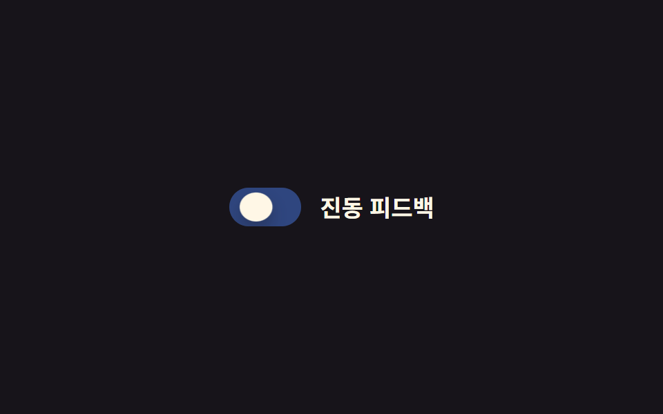
Trong lúc con trỏ còn nhấn xuống, biến --sx kéo núm giãn ngang qua scaleX, còn --sy ép nó dẹt lại theo chiều cao; buông tay thì cả hai biến trở về 1 nên núm bật lại thành hình tròn. Cú bật vọt quá kích thước nghỉ một nhịp rồi mới thu vào, và bóng track đậm lúc bị nhấn sẽ nhạt dần theo ngay sau đó.
<main class="stage">
  <label class="switch is-demo">
    <input type="checkbox" class="switch__input" role="switch">
    <span class="switch__track">
      <span class="switch__bg switch__bg--off"></span>
      <span class="switch__bg switch__bg--on"></span>
      <span class="switch__knob"></span>
    </span>
    <span class="switch__label">Phản hồi rung</span>
  </label>
</main>
@use "../../../../site/static/demo-tokens" as *;
// ── 변수 3개 ──────────────────────────────
$duration: $dur-instant;
$easing: $ease-pop;
$color: $subject-blue;
// ── 데모 무대 ───────────────────────────────
@include stage($stage-ink);
.switch {
position: relative;
display: inline-flex; align-items: center; gap: clamp(10px, 3vw, 14px);
cursor: pointer;
-webkit-tap-highlight-color: transparent;
}
.switch__input {
position: absolute; inset: 0; width: 100%; height: 100%;
margin: 0; opacity: 0; cursor: pointer;
}
.switch__track {
position: relative; overflow: hidden;
width: clamp(44px, 12vw, 52px); height: clamp(24px, 6.5vw, 28px);
border-radius: $r-pill;
transition: box-shadow $duration $easing;
}
.switch__bg { position: absolute; inset: 0; }
.switch__bg--off { background: rgba(255, 255, 255, .18); opacity: 1; }
.switch__bg--on { background: $color; opacity: 0; }
.switch__knob {
--x: 0px; --sx: 1; --sy: 1;
position: absolute; top: 3px; left: 3px; z-index: 1;
width: clamp(18px, 5vw, 22px); height: clamp(18px, 5vw, 22px);
border-radius: 50%;
background: $subject-cream;
box-shadow: $shadow-press;
transform: translateX(var(--x)) scaleX(var(--sx)) scaleY(var(--sy));
transition: transform $duration $easing;
}
.switch__label { color: $subject-cream; font-weight: 600; font-size: clamp(14px, 4vw, 17px); line-height: 1; font-family: inherit; }
// ── 실제 동작: :checked 는 위치, :active 는 눌림만 (서로 안 덮는다) ──
.switch__input:checked ~ .switch__track .switch__bg--off { opacity: 0; transition: opacity $duration $easing; }
.switch__input:checked ~ .switch__track .switch__bg--on { opacity: 1; transition: opacity $duration $easing; }
.switch__input:checked ~ .switch__track .switch__knob { --x: 24px; }
.switch:active .switch__knob { --sx: 1.35; --sy: .8; }
.switch__input:focus-visible ~ .switch__track {
outline: 2px solid $subject-cream; outline-offset: 3px;
}
// ── 데모 루프: 눌림 → 이동 → 눌림 → 되돌아감 ────────────
// 한 겹: 이동 도착 지점(28%) 앞에 오버슈트+squash 스트로크를 보강하고,
// 트랙은 상태 전환 때 내부 그림자가 깊어졌다 얕아진다.
.switch.is-demo .switch__bg--off { animation: bg-off-loop $dur-loop $ease-out infinite; }
.switch.is-demo .switch__bg--on { animation: bg-on-loop $dur-loop $ease-out infinite; }
.switch.is-demo .switch__knob { animation: squish-loop $dur-loop $easing infinite; }
.switch.is-demo .switch__track { animation: shadow-depth-loop $dur-loop $easing infinite; }
@keyframes bg-off-loop { 0%, 20% { opacity: 1; } 28%, 60% { opacity: 0; } 85%, 100% { opacity: 1; } }
@keyframes bg-on-loop { 0%, 20% { opacity: 0; } 28%, 60% { opacity: 1; } 85%, 100% { opacity: 0; } }
@keyframes squish-loop {
0%, 8% { transform: translateX(0) scaleX(1) scaleY(1); }
16% { transform: translateX(0) scaleX(1.35) scaleY(.8); }
24% { transform: translateX(26px) scaleX(1.2) scaleY(.88); } // 이동 오버슈트 + squash
28%, 60% { transform: translateX(24px) scaleX(1) scaleY(1); }
68% { transform: translateX(24px) scaleX(1.35) scaleY(.8); }
85%, 100% { transform: translateX(0) scaleX(1) scaleY(1); }
}
@keyframes shadow-depth-loop {
0%, 20% { box-shadow: inset 0 1px 3px rgba(0, 0, 0, .15); }
24% { box-shadow: inset 0 3px 8px rgba(0, 0, 0, .28); }
28%, 60% { box-shadow: inset 0 3px 8px rgba(0, 0, 0, .28); }
85%, 100% { box-shadow: inset 0 1px 3px rgba(0, 0, 0, .15); }
}
@media (prefers-reduced-motion: reduce) {
.switch.is-demo .switch__bg--off, .switch.is-demo .switch__bg--on, .switch.is-demo .switch__knob,
.switch.is-demo .switch__track {
animation: none !important;
}
.switch__knob, .switch__bg--off, .switch__bg--on { transition: none; }
.switch__track { transition: none; }
}html, body {
margin: 0;
overflow: hidden;
}
.stage {
box-sizing: border-box;
min-height: 100vh;
display: grid;
place-items: center;
margin: 0;
background: #17141a;
font-family: -apple-system, "Segoe UI", "Noto Sans KR", sans-serif;
padding: clamp(8px, 4vw, 24px);
}
.switch {
position: relative;
display: inline-flex;
align-items: center;
gap: clamp(10px, 3vw, 14px);
cursor: pointer;
-webkit-tap-highlight-color: transparent;
}
.switch__input {
position: absolute;
inset: 0;
width: 100%;
height: 100%;
margin: 0;
opacity: 0;
cursor: pointer;
}
.switch__track {
position: relative;
overflow: hidden;
width: clamp(44px, 12vw, 52px);
height: clamp(24px, 6.5vw, 28px);
border-radius: 999px;
transition: box-shadow 140ms cubic-bezier(0.2, 1.4, 0.4, 1);
}
.switch__bg {
position: absolute;
inset: 0;
}
.switch__bg--off {
background: rgba(255, 255, 255, 0.18);
opacity: 1;
}
.switch__bg--on {
background: #2f6df6;
opacity: 0;
}
.switch__knob {
--x: 0px;
--sx: 1;
--sy: 1;
position: absolute;
top: 3px;
left: 3px;
z-index: 1;
width: clamp(18px, 5vw, 22px);
height: clamp(18px, 5vw, 22px);
border-radius: 50%;
background: #fff7e6;
box-shadow: 0 6px 12px rgba(23, 20, 26, 0.32);
transform: translateX(var(--x)) scaleX(var(--sx)) scaleY(var(--sy));
transition: transform 140ms cubic-bezier(0.2, 1.4, 0.4, 1);
}
.switch__label {
color: #fff7e6;
font-weight: 600;
font-size: clamp(14px, 4vw, 17px);
line-height: 1;
font-family: inherit;
}
.switch__input:checked ~ .switch__track .switch__bg--off {
opacity: 0;
transition: opacity 140ms cubic-bezier(0.2, 1.4, 0.4, 1);
}
.switch__input:checked ~ .switch__track .switch__bg--on {
opacity: 1;
transition: opacity 140ms cubic-bezier(0.2, 1.4, 0.4, 1);
}
.switch__input:checked ~ .switch__track .switch__knob {
--x: 24px;
}
.switch:active .switch__knob {
--sx: 1.35;
--sy: .8;
}
.switch__input:focus-visible ~ .switch__track {
outline: 2px solid #fff7e6;
outline-offset: 3px;
}
.switch.is-demo .switch__bg--off {
animation: bg-off-loop 2s ease-out infinite;
}
.switch.is-demo .switch__bg--on {
animation: bg-on-loop 2s ease-out infinite;
}
.switch.is-demo .switch__knob {
animation: squish-loop 2s cubic-bezier(0.2, 1.4, 0.4, 1) infinite;
}
.switch.is-demo .switch__track {
animation: shadow-depth-loop 2s cubic-bezier(0.2, 1.4, 0.4, 1) infinite;
}
@keyframes bg-off-loop {
0%, 20% {
opacity: 1;
}
28%, 60% {
opacity: 0;
}
85%, 100% {
opacity: 1;
}
}
@keyframes bg-on-loop {
0%, 20% {
opacity: 0;
}
28%, 60% {
opacity: 1;
}
85%, 100% {
opacity: 0;
}
}
@keyframes squish-loop {
0%, 8% {
transform: translateX(0) scaleX(1) scaleY(1);
}
16% {
transform: translateX(0) scaleX(1.35) scaleY(0.8);
}
24% {
transform: translateX(26px) scaleX(1.2) scaleY(0.88);
}
28%, 60% {
transform: translateX(24px) scaleX(1) scaleY(1);
}
68% {
transform: translateX(24px) scaleX(1.35) scaleY(0.8);
}
85%, 100% {
transform: translateX(0) scaleX(1) scaleY(1);
}
}
@keyframes shadow-depth-loop {
0%, 20% {
box-shadow: inset 0 1px 3px rgba(0, 0, 0, 0.15);
}
24% {
box-shadow: inset 0 3px 8px rgba(0, 0, 0, 0.28);
}
28%, 60% {
box-shadow: inset 0 3px 8px rgba(0, 0, 0, 0.28);
}
85%, 100% {
box-shadow: inset 0 1px 3px rgba(0, 0, 0, 0.15);
}
}
@media (prefers-reduced-motion: reduce) {
.switch.is-demo .switch__bg--off, .switch.is-demo .switch__bg--on, .switch.is-demo .switch__knob,
.switch.is-demo .switch__track {
animation: none !important;
}
.switch__knob, .switch__bg--off, .switch__bg--on {
transition: none;
}
.switch__track {
transition: none;
}
}document.querySelectorAll(".switch").forEach(function (s) {
var input = s.querySelector(".switch__input");
var sync = function () { input.setAttribute("aria-checked", String(input.checked)); };
input.addEventListener("pointerdown", function () { s.classList.remove("is-demo"); });
input.addEventListener("change", sync);
sync();
});import { useState } from "react";
import type { ChangeEvent, CSSProperties } from "react";
import styles from "./SquishToggle.module.scss";
export type SquishToggleProps = {
label?: string;
/** 눌림 트랜지션 시간 (기본 140ms) */
duration?: number;
/** 팝 이징 */
easing?: string;
color?: string;
defaultChecked?: boolean;
onChange?: (checked: boolean) => void;
};
type Vars = CSSProperties & { "--duration"?: string; "--easing"?: string; "--color"?: string };
export default function SquishToggle({
label = "진동 피드백",
duration = 140,
easing = "cubic-bezier(.2,1.4,.4,1)",
color = "#2f6df6",
defaultChecked = false,
onChange,
}: SquishToggleProps) {
const [checked, setChecked] = useState(defaultChecked);
const vars: Vars = { "--duration": `${duration}ms`, "--easing": easing, "--color": color };
return (
<label className={styles.switch} style={vars}>
<input
type="checkbox"
role="switch"
aria-checked={checked}
className={styles.switch__input}
checked={checked}
onChange={(e: ChangeEvent<HTMLInputElement>) => { setChecked(e.target.checked); onChange?.(e.target.checked); }}
/>
<span className={styles.switch__track}>
<span className={styles["switch__bg--off"]} />
<span className={styles["switch__bg--on"]} />
<span className={styles.switch__knob} />
</span>
<span className={styles.switch__label}>{label}</span>
</label>
);
}05 · Hiệu ứng bóp khi nhấn — Diện tích đo được 0.917% · khung hình chuyển động 13/23Nguyên tác GODRICH · SCSS và React nằm trong tệp zip · Xem mật khẩu
Chỗ dùng
Hợp với form di động ưu tiên chạm, nơi cần một tín hiệu tức thì báo rằng ngón tay đã chạm đúng chỗ.
.switch__knob {
  --x: 0px; --sx: 1; --sy: 1;
  transform: translateX(var(--x)) scaleX(var(--sx)) scaleY(var(--sy));
  transition: transform $duration $easing;
}
.switch__input:checked ~ .switch__track .switch__knob { --x: 24px; }
.switch:active .switch__knob { --sx: 1.35; --sy: .8; }
06Chuyển màu nền lan tỏa
Chuyển động thế nào
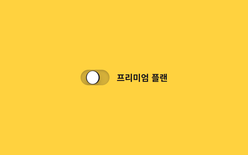
Nền track không đổi màu ngay lập tức mà một vòng tròn clip-path mở rộng dần từ đúng vị trí núm đứng, lan ra tới khi phủ gần hết track. Đúng lúc phủ xong, núm nảy nhẹ kèm squash báo hiệu đã chuyển xong, còn bóng track chuyển từ nông sang sâu đánh dấu hai trạng thái.
<main class="stage">
  <label class="switch is-demo">
    <input type="checkbox" class="switch__input" role="switch">
    <span class="switch__track">
      <span class="switch__fill"></span>
      <span class="switch__knob"></span>
    </span>
    <span class="switch__label">Gói premium</span>
  </label>
</main>
@use "../../../../site/static/demo-tokens" as *;
// ── 변수 3개 ──────────────────────────────
$duration: $dur-base;
$easing: $ease-out;
$color: $subject-ink;
// ── 데모 무대 ───────────────────────────────
@include stage($stage-yellow);
.switch {
position: relative;
display: inline-flex; align-items: center; gap: clamp(10px, 3vw, 14px);
cursor: pointer;
-webkit-tap-highlight-color: transparent;
}
.switch__input {
position: absolute; inset: 0; width: 100%; height: 100%;
margin: 0; opacity: 0; cursor: pointer;
}
.switch__track {
position: relative; overflow: hidden;
width: clamp(48px, 13vw, 56px); height: clamp(26px, 7vw, 30px);
border-radius: $r-pill;
background: rgba(23, 20, 26, .18);
box-shadow: inset 0 1px 3px rgba(0, 0, 0, .15);
transition: box-shadow $duration $easing;
}
.switch__fill {
position: absolute; inset: 0;
background: $color;
clip-path: circle(0% at 18% 50%);
transition: clip-path $duration $easing;
}
.switch__knob {
position: absolute; top: 3px; left: 3px; z-index: 1;
width: clamp(20px, 5.5vw, 24px); height: clamp(20px, 5.5vw, 24px);
border-radius: 50%;
background: $stage-paper;
box-shadow: $shadow-press;
transform: translateX(0);
transition: transform $duration cubic-bezier(0.34, 1.56, 0.64, 1);
}
.switch__label { color: $subject-ink; font-weight: 600; font-size: clamp(14px, 4vw, 17px); line-height: 1; font-family: inherit; }
// ── 실제 동작: 노브가 지나간 자리부터 clip-path 원이 번진다 ──────
.switch__input:checked ~ .switch__track .switch__fill { clip-path: circle(75% at 82% 50%); }
.switch__input:checked ~ .switch__track .switch__knob { transform: translateX(clamp(22px, 6vw, 26px)); }
.switch__input:checked ~ .switch__track { box-shadow: inset 0 3px 8px rgba(0, 0, 0, .28); }
.switch__input:focus-visible ~ .switch__track {
outline: 2px solid $subject-ink; outline-offset: 3px;
}
// ── 데모 루프 ─────────────────────────────
// 한 겹: 노브는 도착 지점을 지나쳤다 찌그러지며 안착하고(스프링+squash),
// 트랙 내부 그림자가 채워지는 순간 깊어졌다 얕아진다(바닥에 앉는 깊이).
.switch.is-demo .switch__fill { animation: fill-loop $dur-loop $easing infinite; }
.switch.is-demo .switch__knob { animation: knob-spring-loop $dur-loop $easing infinite; }
.switch.is-demo .switch__track { animation: shadow-depth-loop $dur-loop $easing infinite; }
@keyframes fill-loop {
0%, 15% { clip-path: circle(0% at 18% 50%); }
40%, 60% { clip-path: circle(75% at 82% 50%); }
85%, 100% { clip-path: circle(0% at 18% 50%); }
}
@keyframes knob-loop {
0%, 15% { transform: translateX(0); }
40%, 60% { transform: translateX(26px); }
85%, 100% { transform: translateX(0); }
}
@keyframes knob-spring-loop {
0%, 15% { transform: translateX(0) scaleX(1) scaleY(1); }
38% { transform: translateX(29px) scaleX(1.25) scaleY(.85); } // 오버슈트 + 도착 순간 squash
43% { transform: translateX(25px) scaleX(1.08) scaleY(.94); } // 되튕기며 회복
47%, 60% { transform: translateX(26px) scaleX(1) scaleY(1); } // 안착
84% { transform: translateX(-2px) scaleX(.92) scaleY(1.06); } // 출발 반동
85%, 100% { transform: translateX(0) scaleX(1) scaleY(1); }
}
@keyframes shadow-depth-loop {
0%, 15% { box-shadow: inset 0 1px 3px rgba(0, 0, 0, .15); }
38% { box-shadow: inset 0 3px 8px rgba(0, 0, 0, .28); }
40%, 60% { box-shadow: inset 0 3px 8px rgba(0, 0, 0, .28); }
85%, 100% { box-shadow: inset 0 1px 3px rgba(0, 0, 0, .15); }
}
@media (prefers-reduced-motion: reduce) {
.switch.is-demo .switch__fill, .switch.is-demo .switch__knob,
.switch.is-demo .switch__track { animation: none !important; }
.switch__fill, .switch__knob { transition: none; }
}html, body {
margin: 0;
overflow: hidden;
}
.stage {
box-sizing: border-box;
min-height: 100vh;
display: grid;
place-items: center;
margin: 0;
background: #ffd23f;
font-family: -apple-system, "Segoe UI", "Noto Sans KR", sans-serif;
padding: clamp(8px, 4vw, 24px);
}
.switch {
position: relative;
display: inline-flex;
align-items: center;
gap: clamp(10px, 3vw, 14px);
cursor: pointer;
-webkit-tap-highlight-color: transparent;
}
.switch__input {
position: absolute;
inset: 0;
width: 100%;
height: 100%;
margin: 0;
opacity: 0;
cursor: pointer;
}
.switch__track {
position: relative;
overflow: hidden;
width: clamp(48px, 13vw, 56px);
height: clamp(26px, 7vw, 30px);
border-radius: 999px;
background: rgba(23, 20, 26, 0.18);
box-shadow: inset 0 1px 3px rgba(0, 0, 0, 0.15);
transition: box-shadow 300ms ease-out;
}
.switch__fill {
position: absolute;
inset: 0;
background: #17141a;
clip-path: circle(0% at 18% 50%);
transition: clip-path 300ms ease-out;
}
.switch__knob {
position: absolute;
top: 3px;
left: 3px;
z-index: 1;
width: clamp(20px, 5.5vw, 24px);
height: clamp(20px, 5.5vw, 24px);
border-radius: 50%;
background: #ffffff;
box-shadow: 0 6px 12px rgba(23, 20, 26, 0.32);
transform: translateX(0);
transition: transform 300ms cubic-bezier(0.34, 1.56, 0.64, 1);
}
.switch__label {
color: #17141a;
font-weight: 600;
font-size: clamp(14px, 4vw, 17px);
line-height: 1;
font-family: inherit;
}
.switch__input:checked ~ .switch__track .switch__fill {
clip-path: circle(75% at 82% 50%);
}
.switch__input:checked ~ .switch__track .switch__knob {
transform: translateX(clamp(22px, 6vw, 26px));
}
.switch__input:checked ~ .switch__track {
box-shadow: inset 0 3px 8px rgba(0, 0, 0, 0.28);
}
.switch__input:focus-visible ~ .switch__track {
outline: 2px solid #17141a;
outline-offset: 3px;
}
.switch.is-demo .switch__fill {
animation: fill-loop 2s ease-out infinite;
}
.switch.is-demo .switch__knob {
animation: knob-spring-loop 2s ease-out infinite;
}
.switch.is-demo .switch__track {
animation: shadow-depth-loop 2s ease-out infinite;
}
@keyframes fill-loop {
0%, 15% {
clip-path: circle(0% at 18% 50%);
}
40%, 60% {
clip-path: circle(75% at 82% 50%);
}
85%, 100% {
clip-path: circle(0% at 18% 50%);
}
}
@keyframes knob-loop {
0%, 15% {
transform: translateX(0);
}
40%, 60% {
transform: translateX(26px);
}
85%, 100% {
transform: translateX(0);
}
}
@keyframes knob-spring-loop {
0%, 15% {
transform: translateX(0) scaleX(1) scaleY(1);
}
38% {
transform: translateX(29px) scaleX(1.25) scaleY(0.85);
}
43% {
transform: translateX(25px) scaleX(1.08) scaleY(0.94);
}
47%, 60% {
transform: translateX(26px) scaleX(1) scaleY(1);
}
84% {
transform: translateX(-2px) scaleX(0.92) scaleY(1.06);
}
85%, 100% {
transform: translateX(0) scaleX(1) scaleY(1);
}
}
@keyframes shadow-depth-loop {
0%, 15% {
box-shadow: inset 0 1px 3px rgba(0, 0, 0, 0.15);
}
38% {
box-shadow: inset 0 3px 8px rgba(0, 0, 0, 0.28);
}
40%, 60% {
box-shadow: inset 0 3px 8px rgba(0, 0, 0, 0.28);
}
85%, 100% {
box-shadow: inset 0 1px 3px rgba(0, 0, 0, 0.15);
}
}
@media (prefers-reduced-motion: reduce) {
.switch.is-demo .switch__fill, .switch.is-demo .switch__knob,
.switch.is-demo .switch__track {
animation: none !important;
}
.switch__fill, .switch__knob {
transition: none;
}
}document.querySelectorAll(".switch").forEach(function (s) {
var input = s.querySelector(".switch__input");
var sync = function () { input.setAttribute("aria-checked", String(input.checked)); };
input.addEventListener("pointerdown", function () { s.classList.remove("is-demo"); });
input.addEventListener("change", sync);
sync();
});import { useState } from "react";
import type { ChangeEvent, CSSProperties } from "react";
import styles from "./ColorFillToggle.module.scss";
export type ColorFillToggleProps = {
label?: string;
duration?: number;
easing?: string;
color?: string;
defaultChecked?: boolean;
onChange?: (checked: boolean) => void;
};
type Vars = CSSProperties & { "--duration"?: string; "--easing"?: string; "--color"?: string };
export default function ColorFillToggle({
label = "프리미엄 플랜",
duration = 300,
easing = "ease-out",
color = "#17141a",
defaultChecked = false,
onChange,
}: ColorFillToggleProps) {
const [checked, setChecked] = useState(defaultChecked);
const vars: Vars = { "--duration": `${duration}ms`, "--easing": easing, "--color": color };
return (
<label className={styles.switch} style={vars}>
<input
type="checkbox"
role="switch"
aria-checked={checked}
className={styles.switch__input}
checked={checked}
onChange={(e: ChangeEvent<HTMLInputElement>) => { setChecked(e.target.checked); onChange?.(e.target.checked); }}
/>
<span className={styles.switch__track}>
<span className={styles.switch__fill} />
<span className={styles.switch__knob} />
</span>
<span className={styles.switch__label}>{label}</span>
</label>
);
}06 · Chuyển màu nền lan tỏa — Diện tích đo được 1.033% · khung hình chuyển động 16/23Nguyên tác GODRICH · SCSS và React nằm trong tệp zip · Xem mật khẩu
Dùng khi nào
Hợp với card cài đặt mang cảm giác cao cấp hoặc switch demo trên trang landing, nơi bản thân khoảnh khắc chuyển đổi cũng đáng để xem.
.switch__fill {
  background: $color;
  clip-path: circle(0% at 18% 50%);
  transition: clip-path $duration $easing;
}
.switch__input:checked ~ .switch__track .switch__fill {
  clip-path: circle(75% at 82% 50%);
}
07Toggle icon mặt trời/mặt trăng
Bạn thấy gì
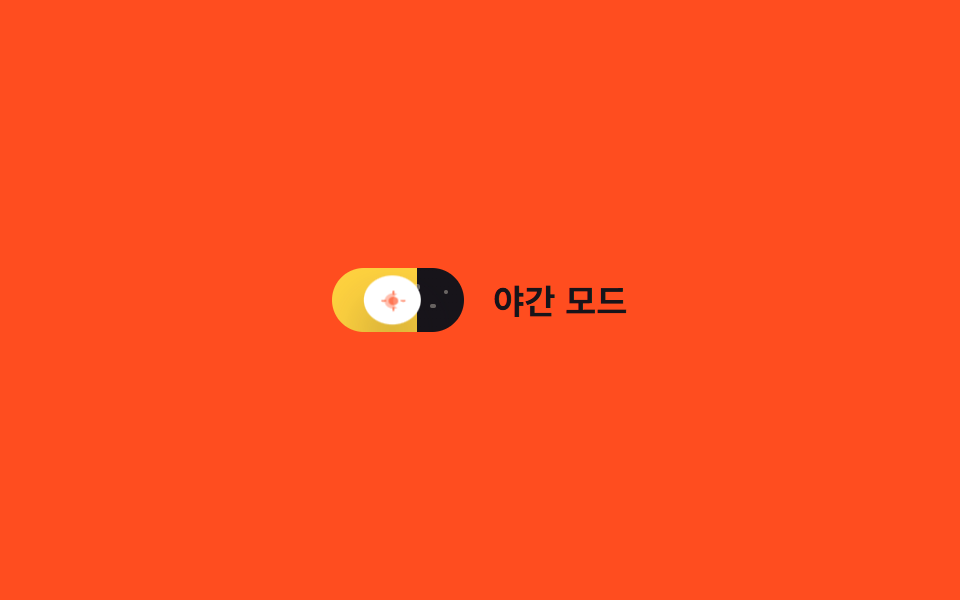
Chính track nơi núm di chuyển trở thành bầu trời: nền gradient dịch background-position từ nửa vàng sang nửa màu tối, còn vài chấm sao hiện dần lên qua opacity. Núm vọt quá chỗ rồi squash dẹt thành mặt trăng trước khi ổn định, còn bóng của track vốn đậm dưới ánh ngày sẽ mỏng dần khi màn đêm tràn tới.
<main class="stage">
  <label class="switch is-demo">
    <input type="checkbox" class="switch__input" role="switch">
    <span class="switch__track">
      <span class="switch__star switch__star--1"></span>
      <span class="switch__star switch__star--2"></span>
      <span class="switch__star switch__star--3"></span>
      <span class="switch__knob">
        <svg class="switch__icon switch__icon--sun" viewBox="0 0 16 16" width="11" height="11" aria-hidden="true">
          <circle cx="8" cy="8" r="3.2" fill="currentColor"/>
          <g stroke="currentColor" stroke-width="1.4" stroke-linecap="round">
            <line x1="8" y1="0.5" x2="8" y2="2.4"/>
            <line x1="8" y1="13.6" x2="8" y2="15.5"/>
            <line x1="0.5" y1="8" x2="2.4" y2="8"/>
            <line x1="13.6" y1="8" x2="15.5" y2="8"/>
          </g>
        </svg>
        <svg class="switch__icon switch__icon--moon" viewBox="0 0 16 16" width="11" height="11" aria-hidden="true">
          <path d="M10.5 2.5a6 6 0 100 11 7 7 0 010-11z" fill="currentColor"/>
        </svg>
      </span>
    </span>
    <span class="switch__label">Chế độ ban đêm</span>
  </label>
</main>@use "../../../../site/static/demo-tokens" as *;
// ── 변수 3개 ──────────────────────────────
$duration: $dur-enter;
$easing: $ease-out;
$color: $stage-ink;
// ── 데모 무대 ───────────────────────────────
@include stage($stage-orange);
.switch {
position: relative;
display: inline-flex; align-items: center; gap: clamp(10px, 3vw, 14px);
cursor: pointer;
-webkit-tap-highlight-color: transparent;
}
.switch__input {
position: absolute; inset: 0; width: 100%; height: 100%;
margin: 0; opacity: 0; cursor: pointer;
}
.switch__track {
position: relative; overflow: hidden;
width: clamp(56px, 15vw, 66px); height: clamp(28px, 7.5vw, 32px);
border-radius: $r-pill;
background-image: linear-gradient(90deg, $stage-yellow 0%, $stage-yellow 50%, $color 50%, $color 100%);
background-size: 200% 100%;
background-position: 0% 0%;
transition: background-position $duration $easing;
}
.switch__star {
position: absolute; top: 30%; width: 2.5px; height: 2.5px; border-radius: 50%;
background: $subject-cream; opacity: 0;
transition: opacity $duration $easing;
}
.switch__star--1 { left: 62%; top: 26%; }
.switch__star--2 { left: 74%; top: 55%; }
.switch__star--3 { left: 84%; top: 34%; }
.switch__knob {
position: absolute; top: 3px; left: 3px; z-index: 1;
display: grid; place-items: center;
width: clamp(22px, 6vw, 26px); height: clamp(22px, 6vw, 26px);
border-radius: 50%;
background: $stage-paper;
box-shadow: $shadow-raised;
color: $stage-orange;
transform: translateX(0);
transition: transform $duration cubic-bezier(0.34, 1.56, 0.64, 1), color $duration $easing, box-shadow $duration $easing;
}
.switch__icon { grid-area: 1 / 1; transition: opacity $duration $easing; }
.switch__icon--sun { opacity: 1; }
.switch__icon--moon { opacity: 0; }
.switch__label { color: $subject-ink; font-weight: 600; font-size: clamp(14px, 4vw, 17px); line-height: 1; font-family: inherit; }
// ── 실제 동작: 트랙 자체가 하늘, 노브 안 아이콘이 크로스페이드 ──────
.switch__input:checked ~ .switch__track { background-position: 100% 0%; }
.switch__input:checked ~ .switch__track .switch__star { opacity: 1; }
.switch__input:checked ~ .switch__track .switch__knob {
transform: translateX(clamp(28px, 8vw, 34px));
color: $subject-ink;
box-shadow: 0 20px 32px rgba(23, 20, 26, .4);
}
.switch__input:checked ~ .switch__track .switch__icon--sun { opacity: 0; }
.switch__input:checked ~ .switch__track .switch__icon--moon { opacity: 1; }
.switch__input:focus-visible ~ .switch__track {
outline: 2px solid $subject-ink; outline-offset: 3px;
}
// ── 데모 루프 ─────────────────────────────
// 한 겹: 노브는 도착 지점을 지나쳤다 찌그러지며 안착하고(스프링+squash),
// 밤으로 갈 때 노브 그림자가 깊어진다(blur 증가·offset 하강 — 더 붙는 느낌).
.switch.is-demo .switch__track { animation: sky-loop $dur-loop $easing infinite; }
.switch.is-demo .switch__star--1,
.switch.is-demo .switch__star--2,
.switch.is-demo .switch__star--3 { animation: star-loop $dur-loop $easing infinite; }
.switch.is-demo .switch__knob { animation: knob-spring-loop $dur-loop $easing infinite, knob-shadow-loop $dur-loop $easing infinite; }
.switch.is-demo .switch__icon--sun { animation: sun-loop $dur-loop $easing infinite; }
.switch.is-demo .switch__icon--moon { animation: moon-loop $dur-loop $easing infinite; }
@keyframes sky-loop { 0%, 15% { background-position: 0% 0%; } 40%, 60% { background-position: 100% 0%; } 85%, 100% { background-position: 0% 0%; } }
@keyframes star-loop { 0%, 15% { opacity: 0; } 40%, 60% { opacity: 1; } 85%, 100% { opacity: 0; } }
@keyframes knob-loop {
0%, 15% { transform: translateX(0); }
40%, 60% { transform: translateX(34px); }
85%, 100% { transform: translateX(0); }
}
@keyframes knob-spring-loop {
0%, 15% { transform: translateX(0) scaleX(1) scaleY(1); }
38% { transform: translateX(37px) scaleX(1.25) scaleY(.85); } // 오버슈트 + 도착 순간 squash
43% { transform: translateX(33px) scaleX(1.08) scaleY(.94); } // 되튕기며 회복
47%, 60% { transform: translateX(34px) scaleX(1) scaleY(1); } // 안착
84% { transform: translateX(-2px) scaleX(.92) scaleY(1.06); } // 출발 반동
85%, 100% { transform: translateX(0) scaleX(1) scaleY(1); }
}
@keyframes knob-shadow-loop {
0%, 15% { box-shadow: $shadow-raised; }
40%, 60% { box-shadow: 0 20px 32px rgba(23, 20, 26, .4); }
85%, 100% { box-shadow: $shadow-raised; }
}
@keyframes sun-loop { 0%, 15% { opacity: 1; } 40%, 60% { opacity: 0; } 85%, 100% { opacity: 1; } }
@keyframes moon-loop { 0%, 15% { opacity: 0; } 40%, 60% { opacity: 1; } 85%, 100% { opacity: 0; } }
@media (prefers-reduced-motion: reduce) {
.switch.is-demo .switch__track, .switch.is-demo .switch__star--1, .switch.is-demo .switch__star--2,
.switch.is-demo .switch__star--3, .switch.is-demo .switch__knob, .switch.is-demo .switch__icon--sun,
.switch.is-demo .switch__icon--moon { animation: none !important; }
.switch__track, .switch__star, .switch__knob, .switch__icon { transition: none; }
}html, body {
margin: 0;
overflow: hidden;
}
.stage {
box-sizing: border-box;
min-height: 100vh;
display: grid;
place-items: center;
margin: 0;
background: #ff4d1f;
font-family: -apple-system, "Segoe UI", "Noto Sans KR", sans-serif;
padding: clamp(8px, 4vw, 24px);
}
.switch {
position: relative;
display: inline-flex;
align-items: center;
gap: clamp(10px, 3vw, 14px);
cursor: pointer;
-webkit-tap-highlight-color: transparent;
}
.switch__input {
position: absolute;
inset: 0;
width: 100%;
height: 100%;
margin: 0;
opacity: 0;
cursor: pointer;
}
.switch__track {
position: relative;
overflow: hidden;
width: clamp(56px, 15vw, 66px);
height: clamp(28px, 7.5vw, 32px);
border-radius: 999px;
background-image: linear-gradient(90deg, #ffd23f 0%, #ffd23f 50%, #17141a 50%, #17141a 100%);
background-size: 200% 100%;
background-position: 0% 0%;
transition: background-position 600ms ease-out;
}
.switch__star {
position: absolute;
top: 30%;
width: 2.5px;
height: 2.5px;
border-radius: 50%;
background: #fff7e6;
opacity: 0;
transition: opacity 600ms ease-out;
}
.switch__star--1 {
left: 62%;
top: 26%;
}
.switch__star--2 {
left: 74%;
top: 55%;
}
.switch__star--3 {
left: 84%;
top: 34%;
}
.switch__knob {
position: absolute;
top: 3px;
left: 3px;
z-index: 1;
display: grid;
place-items: center;
width: clamp(22px, 6vw, 26px);
height: clamp(22px, 6vw, 26px);
border-radius: 50%;
background: #ffffff;
box-shadow: 0 14px 24px rgba(23, 20, 26, 0.32);
color: #ff4d1f;
transform: translateX(0);
transition: transform 600ms cubic-bezier(0.34, 1.56, 0.64, 1), color 600ms ease-out, box-shadow 600ms ease-out;
}
.switch__icon {
grid-area: 1/1;
transition: opacity 600ms ease-out;
}
.switch__icon--sun {
opacity: 1;
}
.switch__icon--moon {
opacity: 0;
}
.switch__label {
color: #17141a;
font-weight: 600;
font-size: clamp(14px, 4vw, 17px);
line-height: 1;
font-family: inherit;
}
.switch__input:checked ~ .switch__track {
background-position: 100% 0%;
}
.switch__input:checked ~ .switch__track .switch__star {
opacity: 1;
}
.switch__input:checked ~ .switch__track .switch__knob {
transform: translateX(clamp(28px, 8vw, 34px));
color: #17141a;
box-shadow: 0 20px 32px rgba(23, 20, 26, 0.4);
}
.switch__input:checked ~ .switch__track .switch__icon--sun {
opacity: 0;
}
.switch__input:checked ~ .switch__track .switch__icon--moon {
opacity: 1;
}
.switch__input:focus-visible ~ .switch__track {
outline: 2px solid #17141a;
outline-offset: 3px;
}
.switch.is-demo .switch__track {
animation: sky-loop 2s ease-out infinite;
}
.switch.is-demo .switch__star--1,
.switch.is-demo .switch__star--2,
.switch.is-demo .switch__star--3 {
animation: star-loop 2s ease-out infinite;
}
.switch.is-demo .switch__knob {
animation: knob-spring-loop 2s ease-out infinite, knob-shadow-loop 2s ease-out infinite;
}
.switch.is-demo .switch__icon--sun {
animation: sun-loop 2s ease-out infinite;
}
.switch.is-demo .switch__icon--moon {
animation: moon-loop 2s ease-out infinite;
}
@keyframes sky-loop {
0%, 15% {
background-position: 0% 0%;
}
40%, 60% {
background-position: 100% 0%;
}
85%, 100% {
background-position: 0% 0%;
}
}
@keyframes star-loop {
0%, 15% {
opacity: 0;
}
40%, 60% {
opacity: 1;
}
85%, 100% {
opacity: 0;
}
}
@keyframes knob-loop {
0%, 15% {
transform: translateX(0);
}
40%, 60% {
transform: translateX(34px);
}
85%, 100% {
transform: translateX(0);
}
}
@keyframes knob-spring-loop {
0%, 15% {
transform: translateX(0) scaleX(1) scaleY(1);
}
38% {
transform: translateX(37px) scaleX(1.25) scaleY(0.85);
}
43% {
transform: translateX(33px) scaleX(1.08) scaleY(0.94);
}
47%, 60% {
transform: translateX(34px) scaleX(1) scaleY(1);
}
84% {
transform: translateX(-2px) scaleX(0.92) scaleY(1.06);
}
85%, 100% {
transform: translateX(0) scaleX(1) scaleY(1);
}
}
@keyframes knob-shadow-loop {
0%, 15% {
box-shadow: 0 14px 24px rgba(23, 20, 26, 0.32);
}
40%, 60% {
box-shadow: 0 20px 32px rgba(23, 20, 26, 0.4);
}
85%, 100% {
box-shadow: 0 14px 24px rgba(23, 20, 26, 0.32);
}
}
@keyframes sun-loop {
0%, 15% {
opacity: 1;
}
40%, 60% {
opacity: 0;
}
85%, 100% {
opacity: 1;
}
}
@keyframes moon-loop {
0%, 15% {
opacity: 0;
}
40%, 60% {
opacity: 1;
}
85%, 100% {
opacity: 0;
}
}
@media (prefers-reduced-motion: reduce) {
.switch.is-demo .switch__track, .switch.is-demo .switch__star--1, .switch.is-demo .switch__star--2,
.switch.is-demo .switch__star--3, .switch.is-demo .switch__knob, .switch.is-demo .switch__icon--sun,
.switch.is-demo .switch__icon--moon {
animation: none !important;
}
.switch__track, .switch__star, .switch__knob, .switch__icon {
transition: none;
}
}document.querySelectorAll(".switch").forEach(function (s) {
var input = s.querySelector(".switch__input");
var sync = function () { input.setAttribute("aria-checked", String(input.checked)); };
input.addEventListener("pointerdown", function () { s.classList.remove("is-demo"); });
input.addEventListener("change", sync);
sync();
});import { useState } from "react";
import type { ChangeEvent, CSSProperties } from "react";
import styles from "./DayNightToggle.module.scss";
export type DayNightToggleProps = {
label?: string;
duration?: number;
easing?: string;
/** 밤 트랙 색 */
color?: string;
defaultChecked?: boolean;
onChange?: (checked: boolean) => void;
};
type Vars = CSSProperties & { "--duration"?: string; "--easing"?: string; "--color"?: string };
export default function DayNightToggle({
label = "야간 모드",
duration = 600,
easing = "ease-out",
color = "#17141a",
defaultChecked = false,
onChange,
}: DayNightToggleProps) {
const [checked, setChecked] = useState(defaultChecked);
const vars: Vars = { "--duration": `${duration}ms`, "--easing": easing, "--color": color };
return (
<label className={styles.switch} style={vars}>
<input
type="checkbox"
role="switch"
aria-checked={checked}
className={styles.switch__input}
checked={checked}
onChange={(e: ChangeEvent<HTMLInputElement>) => { setChecked(e.target.checked); onChange?.(e.target.checked); }}
/>
<span className={styles.switch__track}>
<span className={`${styles.switch__star} ${styles["switch__star--1"]}`} />
<span className={`${styles.switch__star} ${styles["switch__star--2"]}`} />
<span className={`${styles.switch__star} ${styles["switch__star--3"]}`} />
<span className={styles.switch__knob}>
<svg className={styles["switch__icon--sun"]} viewBox="0 0 16 16" width="11" height="11" aria-hidden="true">
<circle cx="8" cy="8" r="3.2" fill="currentColor" />
<g stroke="currentColor" strokeWidth={1.4} strokeLinecap="round">
<line x1="8" y1="0.5" x2="8" y2="2.4" />
<line x1="8" y1="13.6" x2="8" y2="15.5" />
<line x1="0.5" y1="8" x2="2.4" y2="8" />
<line x1="13.6" y1="8" x2="15.5" y2="8" />
</g>
</svg>
<svg className={styles["switch__icon--moon"]} viewBox="0 0 16 16" width="11" height="11" aria-hidden="true">
<path d="M10.5 2.5a6 6 0 100 11 7 7 0 010-11z" fill="currentColor" />
</svg>
</span>
</span>
<span className={styles.switch__label}>{label}</span>
</label>
);
}07 · Toggle icon mặt trời/mặt trăng — Diện tích đo được 1.343% · khung hình chuyển động 17/23Nguyên tác GODRICH · SCSS và React nằm trong tệp zip · Xem mật khẩu
Dùng ở đâu
Hợp với switch đổi theme hoặc cài đặt kiểu app thời tiết, nơi bản thân track đã kể hết câu chuyện ngày và đêm.
.switch__track {
  background-image: linear-gradient(90deg, $stage-yellow 0%, $stage-yellow 50%, $color 50%, $color 100%);
  background-size: 200% 100%;
  background-position: 0% 0%;
  transition: background-position $duration $easing;
}
.switch__input:checked ~ .switch__track { background-position: 100% 0%; }
.switch__input:checked ~ .switch__track .switch__star { opacity: 1; }
08Mixin biến thể kích cỡ
Chuyện gì diễn ra trên màn hình
Một mixin SCSS nhận vào chiều rộng, chiều cao và kích cỡ núm rồi tự tính quãng đường --travel cần trượt, nên ba switch nhỏ/vừa/lớn ra đời từ đúng ba lời gọi @include, cả ba lại dùng chung một animation translateX nên đổi tốc độ ở một chỗ là cả ba cùng đổi theo. Độ vọt spring, tỉ lệ squash và biên độ đổi chiều sâu bóng cũng scale theo --travel, nên ba kích cỡ nào bấm vào cũng thấy đúng một cảm giác.
<main class="stage">
  <p class="group__title">Đồng bộ tự động</p>
  <div class="group">
    <label class="switch switch--sm is-demo">
      <input type="checkbox" class="switch__input" role="switch" aria-label="Nhỏ">
      <span class="switch__track">
        <span class="switch__bg switch__bg--off"></span>
        <span class="switch__bg switch__bg--on"></span>
        <span class="switch__knob"></span>
      </span>
    </label>
    <label class="switch switch--md is-demo">
      <input type="checkbox" class="switch__input" role="switch" aria-label="Vừa">
      <span class="switch__track">
        <span class="switch__bg switch__bg--off"></span>
        <span class="switch__bg switch__bg--on"></span>
        <span class="switch__knob"></span>
      </span>
    </label>
    <label class="switch switch--lg is-demo">
      <input type="checkbox" class="switch__input" role="switch" aria-label="Lớn">
      <span class="switch__track">
        <span class="switch__bg switch__bg--off"></span>
        <span class="switch__bg switch__bg--on"></span>
        <span class="switch__knob"></span>
      </span>
    </label>
  </div>
</main>@use "../../../../site/static/demo-tokens" as *;
// ── 변수 3개 ──────────────────────────────
$duration: $dur-base;
$easing: $ease-out;
$color: $subject-blue;
// ── 데모 무대 ───────────────────────────────
@include stage($stage-paper);
.group__title {
margin: 0 0 clamp(10px, 3vw, 14px);
color: $subject-ink;
font-weight: 600; font-size: clamp(13px, 3.6vw, 15px); line-height: 1; font-family: inherit;
text-align: center;
}
.group {
display: flex; align-items: center; justify-content: center;
gap: clamp(14px, 4vw, 20px);
}
.switch {
position: relative;
display: inline-flex; align-items: center;
cursor: pointer;
-webkit-tap-highlight-color: transparent;
}
.switch__input {
position: absolute; inset: 0; width: 100%; height: 100%;
margin: 0; opacity: 0; cursor: pointer;
}
.switch__track {
position: relative; overflow: hidden;
border-radius: $r-pill;
box-shadow: inset 0 1px 3px rgba(0, 0, 0, .15);
transition: box-shadow $duration $easing;
}
.switch__bg { position: absolute; inset: 0; }
.switch__bg--off { background: rgba(23, 20, 26, .12); opacity: 1; }
.switch__bg--on { background: $color; opacity: 0; }
.switch__knob {
position: absolute; top: 3px; left: 3px; z-index: 1;
border-radius: 50%;
background: $stage-paper;
box-shadow: $shadow-press;
transform: translateX(0);
transition: transform $duration cubic-bezier(0.34, 1.56, 0.64, 1);
}
// ── 하나의 믹스인이 폭·높이·이동 거리를 계산한다 ──────────
@mixin switch-size($track-w, $track-h, $knob) {
  --travel: #{$track-w - $knob - 6px};
  .switch__track { width: $track-w; height: $track-h; }
  .switch__knob  { width: $knob; height: $knob; }
}
.switch--sm { @include switch-size(36px, 20px, 14px); }
.switch--md { @include switch-size(48px, 26px, 20px); }
.switch--lg { @include switch-size(60px, 32px, 26px); }
// ── 실제 동작 ─────────────────────────────
.switch__input:checked ~ .switch__track .switch__bg--off { opacity: 0; transition: opacity $duration $easing; }
.switch__input:checked ~ .switch__track .switch__bg--on { opacity: 1; transition: opacity $duration $easing; }
.switch__input:checked ~ .switch__track .switch__knob { transform: translateX(var(--travel)); }
.switch__input:checked ~ .switch__track { box-shadow: inset 0 3px 8px rgba(0, 0, 0, .28); }
.switch__input:focus-visible ~ .switch__track {
outline: 2px solid $subject-ink; outline-offset: 3px;
}
// ── 데모 루프: 세 크기가 같은 keyframes 를 공유한다 ──────
// 한 겹: 노브는 var(--travel) 를 지나쳤다 찌그러지며 안착하고(스프링+squash, 세 크기 공유),
// 트랙 내부 그림자가 상태 전환 때 깊어졌다 얕아진다(세 크기 공유).
.switch.is-demo .switch__bg--off { animation: bg-off-loop $dur-loop $easing infinite; }
.switch.is-demo .switch__bg--on { animation: bg-on-loop $dur-loop $easing infinite; }
.switch.is-demo .switch__knob { animation: knob-spring-loop $dur-loop $easing infinite; }
.switch.is-demo .switch__track { animation: shadow-depth-loop $dur-loop $easing infinite; }
@keyframes bg-off-loop { 0%, 15% { opacity: 1; } 40%, 60% { opacity: 0; } 85%, 100% { opacity: 1; } }
@keyframes bg-on-loop { 0%, 15% { opacity: 0; } 40%, 60% { opacity: 1; } 85%, 100% { opacity: 0; } }
@keyframes knob-loop {
0%, 15% { transform: translateX(0); }
40%, 60% { transform: translateX(var(--travel)); }
85%, 100% { transform: translateX(0); }
}
@keyframes knob-spring-loop {
0%, 15% { transform: translateX(0) scaleX(1) scaleY(1); }
38% { transform: translateX(calc(var(--travel) + 3px)) scaleX(1.25) scaleY(.85); } // 오버슈트 + 도착 순간 squash
43% { transform: translateX(calc(var(--travel) - 1px)) scaleX(1.08) scaleY(.94); } // 되튕기며 회복
47%, 60% { transform: translateX(var(--travel)) scaleX(1) scaleY(1); } // 안착
84% { transform: translateX(-2px) scaleX(.92) scaleY(1.06); } // 출발 반동
85%, 100% { transform: translateX(0) scaleX(1) scaleY(1); }
}
@keyframes shadow-depth-loop {
0%, 15% { box-shadow: inset 0 1px 3px rgba(0, 0, 0, .15); }
38% { box-shadow: inset 0 3px 8px rgba(0, 0, 0, .28); }
40%, 60% { box-shadow: inset 0 3px 8px rgba(0, 0, 0, .28); }
85%, 100% { box-shadow: inset 0 1px 3px rgba(0, 0, 0, .15); }
}
@media (prefers-reduced-motion: reduce) {
.switch.is-demo .switch__bg--off, .switch.is-demo .switch__bg--on, .switch.is-demo .switch__knob,
.switch.is-demo .switch__track {
animation: none !important;
}
.switch__bg--off, .switch__bg--on, .switch__knob { transition: none; }
}html, body {
margin: 0;
overflow: hidden;
}
.stage {
box-sizing: border-box;
min-height: 100vh;
display: grid;
place-items: center;
margin: 0;
background: #ffffff;
font-family: -apple-system, "Segoe UI", "Noto Sans KR", sans-serif;
padding: clamp(8px, 4vw, 24px);
}
.group__title {
margin: 0 0 clamp(10px, 3vw, 14px);
color: #17141a;
font-weight: 600;
font-size: clamp(13px, 3.6vw, 15px);
line-height: 1;
font-family: inherit;
text-align: center;
}
.group {
display: flex;
align-items: center;
justify-content: center;
gap: clamp(14px, 4vw, 20px);
}
.switch {
position: relative;
display: inline-flex;
align-items: center;
cursor: pointer;
-webkit-tap-highlight-color: transparent;
}
.switch__input {
position: absolute;
inset: 0;
width: 100%;
height: 100%;
margin: 0;
opacity: 0;
cursor: pointer;
}
.switch__track {
position: relative;
overflow: hidden;
border-radius: 999px;
box-shadow: inset 0 1px 3px rgba(0, 0, 0, 0.15);
transition: box-shadow 300ms ease-out;
}
.switch__bg {
position: absolute;
inset: 0;
}
.switch__bg--off {
background: rgba(23, 20, 26, 0.12);
opacity: 1;
}
.switch__bg--on {
background: #2f6df6;
opacity: 0;
}
.switch__knob {
position: absolute;
top: 3px;
left: 3px;
z-index: 1;
border-radius: 50%;
background: #ffffff;
box-shadow: 0 6px 12px rgba(23, 20, 26, 0.32);
transform: translateX(0);
transition: transform 300ms cubic-bezier(0.34, 1.56, 0.64, 1);
}
.switch--sm {
--travel: 16px;
}
.switch--sm .switch__track {
width: 36px;
height: 20px;
}
.switch--sm .switch__knob {
width: 14px;
height: 14px;
}
.switch--md {
--travel: 22px;
}
.switch--md .switch__track {
width: 48px;
height: 26px;
}
.switch--md .switch__knob {
width: 20px;
height: 20px;
}
.switch--lg {
--travel: 28px;
}
.switch--lg .switch__track {
width: 60px;
height: 32px;
}
.switch--lg .switch__knob {
width: 26px;
height: 26px;
}
.switch__input:checked ~ .switch__track .switch__bg--off {
opacity: 0;
transition: opacity 300ms ease-out;
}
.switch__input:checked ~ .switch__track .switch__bg--on {
opacity: 1;
transition: opacity 300ms ease-out;
}
.switch__input:checked ~ .switch__track .switch__knob {
transform: translateX(var(--travel));
}
.switch__input:checked ~ .switch__track {
box-shadow: inset 0 3px 8px rgba(0, 0, 0, 0.28);
}
.switch__input:focus-visible ~ .switch__track {
outline: 2px solid #17141a;
outline-offset: 3px;
}
.switch.is-demo .switch__bg--off {
animation: bg-off-loop 2s ease-out infinite;
}
.switch.is-demo .switch__bg--on {
animation: bg-on-loop 2s ease-out infinite;
}
.switch.is-demo .switch__knob {
animation: knob-spring-loop 2s ease-out infinite;
}
.switch.is-demo .switch__track {
animation: shadow-depth-loop 2s ease-out infinite;
}
@keyframes bg-off-loop {
0%, 15% {
opacity: 1;
}
40%, 60% {
opacity: 0;
}
85%, 100% {
opacity: 1;
}
}
@keyframes bg-on-loop {
0%, 15% {
opacity: 0;
}
40%, 60% {
opacity: 1;
}
85%, 100% {
opacity: 0;
}
}
@keyframes knob-loop {
0%, 15% {
transform: translateX(0);
}
40%, 60% {
transform: translateX(var(--travel));
}
85%, 100% {
transform: translateX(0);
}
}
@keyframes knob-spring-loop {
0%, 15% {
transform: translateX(0) scaleX(1) scaleY(1);
}
38% {
transform: translateX(calc(var(--travel) + 3px)) scaleX(1.25) scaleY(0.85);
}
43% {
transform: translateX(calc(var(--travel) - 1px)) scaleX(1.08) scaleY(0.94);
}
47%, 60% {
transform: translateX(var(--travel)) scaleX(1) scaleY(1);
}
84% {
transform: translateX(-2px) scaleX(0.92) scaleY(1.06);
}
85%, 100% {
transform: translateX(0) scaleX(1) scaleY(1);
}
}
@keyframes shadow-depth-loop {
0%, 15% {
box-shadow: inset 0 1px 3px rgba(0, 0, 0, 0.15);
}
38% {
box-shadow: inset 0 3px 8px rgba(0, 0, 0, 0.28);
}
40%, 60% {
box-shadow: inset 0 3px 8px rgba(0, 0, 0, 0.28);
}
85%, 100% {
box-shadow: inset 0 1px 3px rgba(0, 0, 0, 0.15);
}
}
@media (prefers-reduced-motion: reduce) {
.switch.is-demo .switch__bg--off, .switch.is-demo .switch__bg--on, .switch.is-demo .switch__knob,
.switch.is-demo .switch__track {
animation: none !important;
}
.switch__bg--off, .switch__bg--on, .switch__knob {
transition: none;
}
}document.querySelectorAll(".switch").forEach(function (s) {
var input = s.querySelector(".switch__input");
var sync = function () { input.setAttribute("aria-checked", String(input.checked)); };
input.addEventListener("pointerdown", function () { s.classList.remove("is-demo"); });
input.addEventListener("change", sync);
sync();
});import { useState } from "react";
import type { ChangeEvent, CSSProperties } from "react";
import styles from "./SizeVariantToggle.module.scss";
export type SizeVariantToggleProps = {
label?: string;
size?: "sm" | "md" | "lg";
duration?: number;
easing?: string;
color?: string;
defaultChecked?: boolean;
onChange?: (checked: boolean) => void;
};
const SIZES = {
sm: { track: "36px", height: "20px", knob: "14px", travel: "16px" },
md: { track: "48px", height: "26px", knob: "20px", travel: "22px" },
lg: { track: "60px", height: "32px", knob: "26px", travel: "28px" },
} as const;
type Vars = CSSProperties & {
"--duration"?: string; "--easing"?: string; "--color"?: string;
"--track-w"?: string; "--track-h"?: string; "--knob"?: string; "--travel"?: string;
};
export default function SizeVariantToggle({
label,
size = "md",
duration = 300,
easing = "ease-out",
color = "#2f6df6",
defaultChecked = false,
onChange,
}: SizeVariantToggleProps) {
const [checked, setChecked] = useState(defaultChecked);
const s = SIZES[size];
const vars: Vars = {
"--duration": `${duration}ms`, "--easing": easing, "--color": color,
"--track-w": s.track, "--track-h": s.height, "--knob": s.knob, "--travel": s.travel,
};
return (
<label className={styles.switch} style={vars}>
<input
type="checkbox"
role="switch"
aria-label={label ?? size}
aria-checked={checked}
className={styles.switch__input}
checked={checked}
onChange={(e: ChangeEvent<HTMLInputElement>) => { setChecked(e.target.checked); onChange?.(e.target.checked); }}
/>
<span className={styles.switch__track}>
<span className={styles["switch__bg--off"]} />
<span className={styles["switch__bg--on"]} />
<span className={styles.switch__knob} />
</span>
</label>
);
}08 · Mixin biến thể kích cỡ — Diện tích đo được 2.444% · khung hình chuyển động 16/23Nguyên tác GODRICH · SCSS và React nằm trong tệp zip · Xem mật khẩu
Chỗ dùng
Hợp với component trong design system, nơi không ai muốn đo lại quãng trượt mỗi lần thêm một kích cỡ mới.
@mixin switch-size($track-w, $track-h, $knob) {
--travel: #{$track-w - $knob - 6px};
.switch__track { width: $track-w; height: $track-h; }
.switch__knob { width: $knob; height: $knob; }
}
.switch--sm { @include switch-size(36px, 20px, 14px); }
.switch--md { @include switch-size(48px, 26px, 20px); }
.switch--lg { @include switch-size(60px, 32px, 26px); }
09Kiểu trạng thái disabled
Chuyển động thế nào
Switch mang thuộc tính disabled mờ dần qua filter: grayscale và opacity rồi đứng yên hẳn ở đó, con trỏ đổi thành not-allowed để xác nhận không còn bấm được nữa. Ngay cả nhịp mờ đi ấy vẫn còn một cú overshoot spring nhỏ và bóng mỏng dần theo, giữ nguyên chất liệu chung với tám switch kia cho tới khi đóng băng.
<main class="stage">
  <!-- 이 항목은 실제로 disabled 다. 데모의 흐려짐 루프는 그 상태로 들어가는 전환을 반복 재생해서 보여줄 뿐, 다시 켜지지 않는다. -->
  <label class="switch is-demo">
    <input type="checkbox" class="switch__input" role="switch" aria-checked="false" disabled aria-label="Quyền quản trị">
    <span class="switch__track">
      <span class="switch__bg switch__bg--off"></span>
      <span class="switch__knob"></span>
    </span>
    <span class="switch__label">Quyền quản trị</span>
  </label>
</main>
@use "../../../../site/static/demo-tokens" as *;
// ── 변수 3개 ──────────────────────────────
$duration: $dur-enter;
$easing: $ease-out;
$color: $subject-cream;
// ── 데모 무대 ───────────────────────────────
@include stage($stage-ink);
.switch {
position: relative;
display: inline-flex; align-items: center; gap: clamp(10px, 3vw, 14px);
cursor: not-allowed;
}
.switch__input {
position: absolute; inset: 0; width: 100%; height: 100%;
margin: 0; opacity: 0; cursor: not-allowed;
}
.switch__track {
position: relative; overflow: hidden;
width: clamp(44px, 12vw, 52px); height: clamp(24px, 6.5vw, 28px);
border-radius: $r-pill;
filter: none; opacity: 1;
box-shadow: $shadow-press;
}
.switch__bg { position: absolute; inset: 0; background: $color; opacity: .55; }
.switch__knob {
position: absolute; top: 3px; left: 3px;
width: clamp(18px, 5vw, 22px); height: clamp(18px, 5vw, 22px);
border-radius: 50%;
background: $stage-paper;
box-shadow: $shadow-press;
}
.switch__label { color: $subject-cream; font-weight: 600; font-size: clamp(14px, 4vw, 17px); line-height: 1; font-family: inherit; }
// ── 실제 동작: 진짜 disabled 다. filter·opacity 로만 흐려진다 ──────
.switch__input:disabled ~ .switch__track { filter: grayscale(1); opacity: .45; }
.switch__input:disabled ~ .switch__label { opacity: .55; }
// ── 데모 루프: 흐려지는 전환만 반복 재생한다 (실제로 다시 켜지지 않는다) ──
// 한 겹: 노브 이동은 없다(비활성 데모) — 흐려지는 순간 노브·트랙 그림자가 얕아진다
// (blur·opacity 감소 — "비활성은 바닥에서 뜬다").
.switch.is-demo .switch__track { animation: fade-loop $dur-loop $easing infinite, shadow-fade-loop $dur-loop $easing infinite; }
.switch.is-demo .switch__knob { animation: shadow-fade-loop $dur-loop $easing infinite; }
.switch.is-demo .switch__label { animation: label-fade-loop $dur-loop $easing infinite; }
@keyframes fade-loop {
0%, 20% { filter: grayscale(0); opacity: 1; }
50%, 70% { filter: grayscale(1); opacity: .45; }
100% { filter: grayscale(0); opacity: 1; }
}
@keyframes shadow-fade-loop {
0%, 20% { box-shadow: 0 6px 12px rgba(23, 20, 26, .32); }
50%, 70% { box-shadow: 0 2px 4px rgba(23, 20, 26, .12); }
100% { box-shadow: 0 6px 12px rgba(23, 20, 26, .32); }
}
@keyframes label-fade-loop {
0%, 20% { opacity: 1; }
50%, 70% { opacity: .55; }
100% { opacity: 1; }
}
@media (prefers-reduced-motion: reduce) {
.switch.is-demo .switch__track, .switch.is-demo .switch__knob, .switch.is-demo .switch__label { animation: none !important; }
}html, body {
margin: 0;
overflow: hidden;
}
.stage {
box-sizing: border-box;
min-height: 100vh;
display: grid;
place-items: center;
margin: 0;
background: #17141a;
font-family: -apple-system, "Segoe UI", "Noto Sans KR", sans-serif;
padding: clamp(8px, 4vw, 24px);
}
.switch {
position: relative;
display: inline-flex;
align-items: center;
gap: clamp(10px, 3vw, 14px);
cursor: not-allowed;
}
.switch__input {
position: absolute;
inset: 0;
width: 100%;
height: 100%;
margin: 0;
opacity: 0;
cursor: not-allowed;
}
.switch__track {
position: relative;
overflow: hidden;
width: clamp(44px, 12vw, 52px);
height: clamp(24px, 6.5vw, 28px);
border-radius: 999px;
filter: none;
opacity: 1;
box-shadow: 0 6px 12px rgba(23, 20, 26, 0.32);
}
.switch__bg {
position: absolute;
inset: 0;
background: #fff7e6;
opacity: 0.55;
}
.switch__knob {
position: absolute;
top: 3px;
left: 3px;
width: clamp(18px, 5vw, 22px);
height: clamp(18px, 5vw, 22px);
border-radius: 50%;
background: #ffffff;
box-shadow: 0 6px 12px rgba(23, 20, 26, 0.32);
}
.switch__label {
color: #fff7e6;
font-weight: 600;
font-size: clamp(14px, 4vw, 17px);
line-height: 1;
font-family: inherit;
}
.switch__input:disabled ~ .switch__track {
filter: grayscale(1);
opacity: 0.45;
}
.switch__input:disabled ~ .switch__label {
opacity: 0.55;
}
.switch.is-demo .switch__track {
animation: fade-loop 2s ease-out infinite, shadow-fade-loop 2s ease-out infinite;
}
.switch.is-demo .switch__knob {
animation: shadow-fade-loop 2s ease-out infinite;
}
.switch.is-demo .switch__label {
animation: label-fade-loop 2s ease-out infinite;
}
@keyframes fade-loop {
0%, 20% {
filter: grayscale(0);
opacity: 1;
}
50%, 70% {
filter: grayscale(1);
opacity: 0.45;
}
100% {
filter: grayscale(0);
opacity: 1;
}
}
@keyframes shadow-fade-loop {
0%, 20% {
box-shadow: 0 6px 12px rgba(23, 20, 26, 0.32);
}
50%, 70% {
box-shadow: 0 2px 4px rgba(23, 20, 26, 0.12);
}
100% {
box-shadow: 0 6px 12px rgba(23, 20, 26, 0.32);
}
}
@keyframes label-fade-loop {
0%, 20% {
opacity: 1;
}
50%, 70% {
opacity: 0.55;
}
100% {
opacity: 1;
}
}
@media (prefers-reduced-motion: reduce) {
.switch.is-demo .switch__track, .switch.is-demo .switch__knob, .switch.is-demo .switch__label {
animation: none !important;
}
}import type { CSSProperties } from "react";
import styles from "./DisabledToggle.module.scss";
export type DisabledToggleProps = {
label?: string;
duration?: number;
easing?: string;
color?: string;
};
type Vars = CSSProperties & { "--duration"?: string; "--easing"?: string; "--color"?: string };
/** 항상 disabled. 권한이 없을 때 그대로 두는 용도라 checked/onChange 를 받지 않는다. */
export default function DisabledToggle({
label = "관리자 권한",
duration = 600,
easing = "ease-out",
color = "#fff7e6",
}: DisabledToggleProps) {
const vars: Vars = { "--duration": `${duration}ms`, "--easing": easing, "--color": color };
return (
<label className={styles.switch} style={vars}>
<input type="checkbox" role="switch" aria-label={label} aria-checked={false} className={styles.switch__input} disabled />
<span className={styles.switch__track}>
<span className={styles.switch__bg} />
<span className={styles.switch__knob} />
</span>
<span className={styles.switch__label}>{label}</span>
</label>
);
}09 · Kiểu trạng thái disabled — Diện tích đo được 1.517% · khung hình chuyển động 10/23Nguyên tác GODRICH · SCSS và React nằm trong tệp zip · Xem mật khẩu
Dùng khi nào
Hợp với mục cài đặt mà người dùng không có quyền, nơi trạng thái mờ đi tự nó đã là câu trả lời.
.switch__input:disabled ~ .switch__track { filter: grayscale(1); opacity: .45; }
.switch__input:disabled ~ .switch__label { opacity: .55; }

@keyframes fade-loop {
  0%, 20%  { filter: grayscale(0); opacity: 1; }
  50%, 70% { filter: grayscale(1); opacity: .45; }
  100%     { filter: grayscale(0); opacity: 1; }
}
Chỗ dễ hỏng ở đâu? — cái bẫy
Hai lớp chồng thay vì animate màu nền
Hơn nửa trong chín switch này không animate thẳng background-color mà xếp hai lớp chồng lên nhau rồi chỉ đổi opacity giữa chúng, như mục 01 và 04 đang làm. Nếu animate màu nền trực tiếp, giá trị giữa chừng phải nội suy qua không gian màu và mỗi trình duyệt trả về một sắc xám đục khác nhau, còn đổi độ trong suốt của hai lớp sẵn màu thì mỗi lớp vẫn giữ đúng màu gốc suốt quá trình. Tài liệu hiệu năng animation của MDN khuyên ưu tiên đúng hai thuộc tính transform và opacity vì lý do này. clip-path ở mục 06 và background-position ở mục 07 là hai ngoại lệ được giữ lại, vì cả hai chỉ buộc trình duyệt vẽ lại chứ không tính lại layout — caniuse.com xác nhận clip-path đã được các trình duyệt chính hỗ trợ từ rất lâu.
Bề rộng track và chữ ON OFF
Một điểm không hẳn là lỗi nhưng đáng nhớ: chữ ON và OFF ở mục 03 cần track rộng hơn hẳn đường kính núm, nếu không phần chữ sẽ bị che nửa vời ngay giữa cú trượt và trông rất vụng. Bản nén giữ nguyên các con số chiều rộng track và quãng trượt ghi ở trên chỉ mở ra khi gõ đúng mật khẩu a2ejkfw2, nút tải nằm ngay bên dưới.
Khả năng tiếp cận
Vai trò switch và focus bàn phím
Cả chín switch đều là <input type="checkbox"> gắn role="switch", nên Tab đưa focus tới và phím Space đổi giá trị như một checkbox thật (riêng 09 bị disabled nên bị loại khỏi thứ tự focus ngay từ đầu). :focus-visible được vẽ thêm một viền ngoài như bên dưới, và từ 01 đến 08, mỗi lần sự kiện change nổ ra thì aria-checked được JS set lại để trình đọc màn hình cũ không bỏ lỡ trạng thái, còn 09 vốn không bao giờ bật lại nên aria-checked="false" được gắn cố định ngay trong markup.
<label class="switch">
  <input type="checkbox" class="switch__input" role="switch" aria-checked="false">
  <span class="switch__track"><span class="switch__knob"></span></span>
</label>
.switch__input:focus-visible ~ .switch__track {
  outline: 2px solid currentColor;
  outline-offset: 3px;
}
Giảm chuyển động và trạng thái bật tắt
Khi prefers-reduced-motion: reduce được bật, cả chín switch chỉ tắt phần chuyển động còn trạng thái bật/tắt vẫn hiện đúng ngay lập tức. Riêng mục 09 vốn đã đứng yên vì bị khoá disabled, nên thiết lập này không đổi gì thêm ở đó. Tài liệu prefers-reduced-motion của MDN ghi chi tiết mức hỗ trợ trình duyệt cho media query này.
Muốn xem thêm control dạng checkbox khác thì ghé danh sách hiệu ứng CSS, còn muốn biết godrichstory thật ra bán gì thì đọc trang giới thiệu.
FAQ
Toggle switch khác checkbox thường ở chỗ nào?
Markup vẫn là cùng một <input type="checkbox">, chỉ thêm role="switch" để trình đọc màn hình gọi nó là switch thay vì checkbox. Giá trị đổi ngay khi bấm (như bật thông báo) hợp với switch hơn, còn giá trị chỉ có hiệu lực sau khi bấm nút lưu thì vẫn nên giữ checkbox.
Mục 09 đã disabled thì sao vẫn thấy chuyển động?
Bản demo trong lưới chỉ lặp lại hiệu ứng mờ dần để minh hoạ đúng lúc thuộc tính disabled bật lên, còn control thật luôn đứng yên ở trạng thái khoá. Không ai bấm tay vào bật tắt được nó cả.
Dùng trong React thì thay class bằng gì?
Component trong thư mục react/ của zip giữ checked bằng useState, còn ba biến số được nhận qua props rồi đẩy vào làm biến CSS. Module SCSS chỉ đọc var() nên đổi vài giá trị là ra một switch màu khác hoặc tốc độ khác ngay.
Có thể bạn cũng thích
 Phản hồi9 CSS Checkbox Radio — dán 1 dòng là chạy
 Phản hồi9 CSS tooltip examples — copy dán một dòng là chạy
 Phản hồi9 CSS Button Click Feedback, dán 1 dòng chạy ngay
 Phản hồi9 CSS Input Focus Animation — dán 1 dòng là chạy
 Phản hồi9 SVG Icon Animation CSS — dán 1 dòng là chạy
 Phản hồi9 css shake animation — hiệu ứng rung báo lỗi form
 Phản hồi9 hiệu ứng css dark mode toggle 1 dòng CSS
 Phản hồi9 micro interactions css — dán 1 dòng chạy ngay
 Phản hồi9 hiệu ứng custom cursor css — copy dán một dòng
 Phản hồi9 kiểu css typing animation, copy dán là chạy