9 CSS Text Highlight Animation: dán 1 dòng là chạy
CSS text highlight animation là hiệu ứng CSS thuần giúp tô sáng, gạch chân hoặc gạch ngang một từ trong câu ngay khi trang tải, không cần ảnh hay JavaScript.
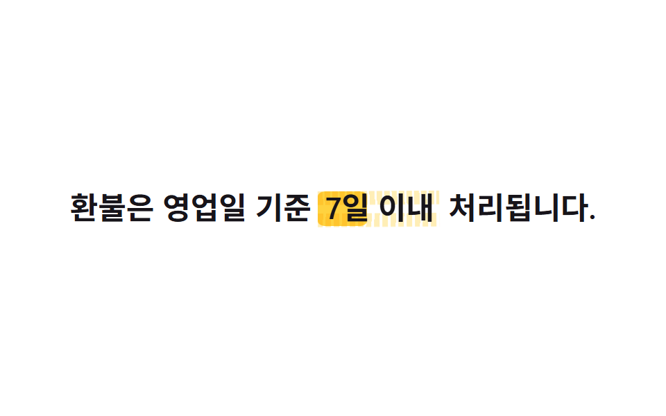 01 text-highlight-underline-highlight-marker
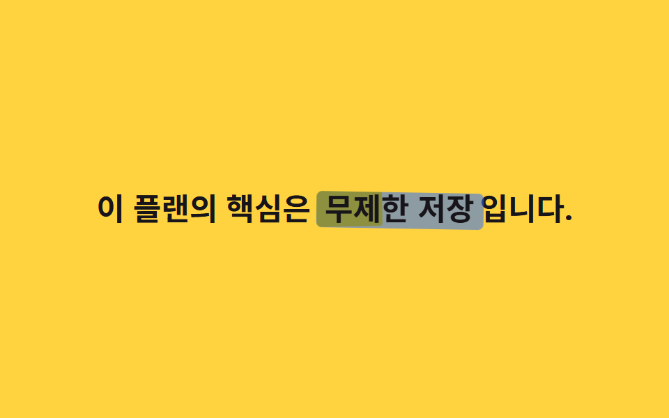 02 text-highlight-underline-marker-overlap
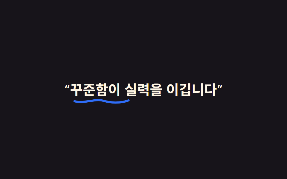 03 text-highlight-underline-handwritten-underline
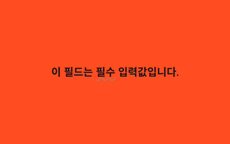 04 text-highlight-underline-underline-wave
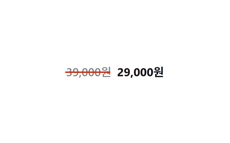 05 text-highlight-underline-strike-draw
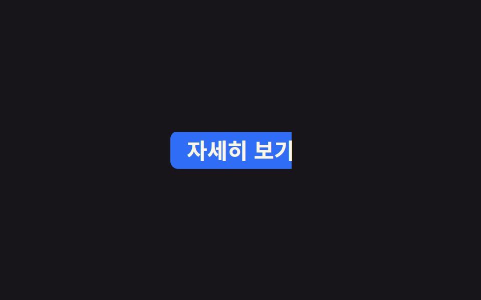 06 text-highlight-underline-bg-fill-hover
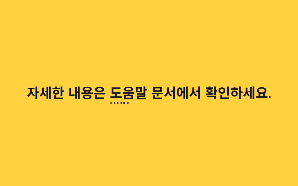 07 text-highlight-underline-dotted-grow
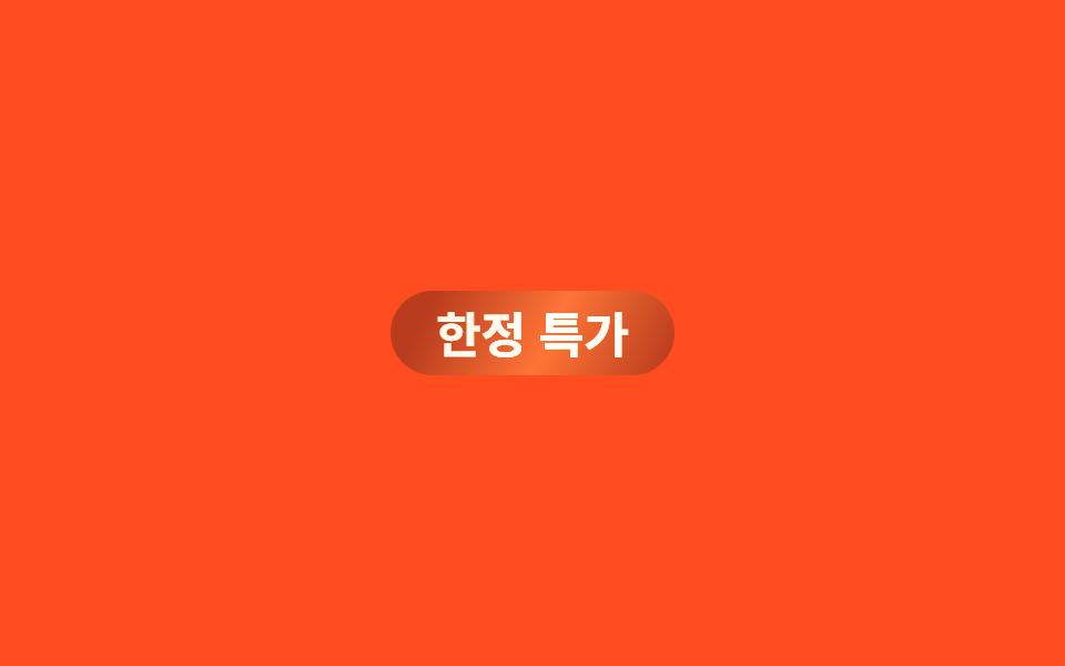 08 text-highlight-underline-color-sweep
 09 text-highlight-underline-text-shadow-pop
Tự chạy · bấm ô để tới mục đó · cả 9 trong một zip
- 01 Marker tô sáng
- 02 Marker chồng lớp
- 03 Gạch chân viết tay
- 04 Gạch chân dạng sóng
- 05 Gạch ngang vẽ dần
- 06 Tô nền lấp đầy
- 07 Đường chấm mọc dần
- 08 Dải màu quét qua
- 09 Bóng chữ bật lên
Chín hiệu ứng dưới đây được xếp theo tình huống cần nhấn mạnh trong câu, không theo mức phổ biến. 01 đến 03 tô đậm một cụm từ then chốt, 04 và 05 đánh dấu cảnh báo hoặc việc đã xong, 06 và 07 dẫn mắt theo liên kết và từng bước, còn 08 và 09 làm badge và con số bật lên. Ở lưới phía trên, chín ô tự lặp lại bên trong một khung iframe cố định vì cả chín đều là animation chạy sẵn, không chờ hover hay JS nào cả. Mỗi mục dưới đây chỉ giữ phần code cốt lõi, bản đầy đủ đã đo khung hình thật nằm trong file zip.
01Marker tô sáng
Bạn thấy gì
Một khối ::before màu vàng nằm sau từ khoá, mọc rộng từ trái sang phải qua transform: scaleX(0 → 1) rồi mix-blend-mode: multiply đặt nó lên trên chữ như vừa tô marker xong. Một lớp nhiễu cùng màu chạy dích dắc ở hai mép trên và dưới, khiến độ dày nét tô phập phù không đều như lực bút thật.
<main class="stage">
  <p class="line">Hoàn tiền được xử lý trong vòng <span class="hl">7 ngày làm việc</span> kể từ khi yêu cầu.</p>
</main>
@use "../../../../site/static/demo-tokens" as *;
// ── 변수 3개. 변형은 이것만 바꾼다 ──────────────────────
$duration: $dur-loop; // 형광펜이 한 번 칠해졌다 지워지는 한 주기
$easing: $ease-spring; // 칠할 때는 빠르게 시작해 부드럽게 멈춘다
$color: $stage-yellow; // 형광펜 색
// ── 데모 무대 ───────────────────────────────
@include stage($stage-paper);
// ── 문장: 키워드 뒤에 형광펜 블록을 겹친다 ─────────────
.line {
max-width: 92%;
margin: 0;
color: $stage-ink;
font-weight: 600;
font-size: clamp(16px, 4.6vw, 22px);
line-height: 1.6;
font-family: inherit;
text-align: center;
}
.hl {
position: relative;
isolation: isolate; // z-index:-1 을 이 안에 가둬 무대 배경 뒤로 숨지 않게 한다
padding: 0 $sp-1;
// 형광펜 블록: 글자 뒤(z-index -1)에서 왼쪽부터 차오른다
&::before {
content: "";
position: absolute;
inset: 12% -2% 6%;
background: $color;
border-radius: $r-xs;
transform: scaleX(0);
transform-origin: left center; // 규칙8: 형광펜 왼쪽에서 칠함
mix-blend-mode: multiply; // 종이 위에 형광펜을 겹친 것처럼 밑 색과 섞인다
z-index: -1;
animation: mark $duration $easing infinite, mark-fill-noise $duration ease-in-out infinite;
}
// 한 겹: 노이즈 가장자리 레이어 — 같은 색을 낮은 불투명도로 위·아래 미세 지그재그
// 가장자리에 깔아 ::before 보다 0.08s 늦게 같은 scaleX 로 펴진다. 두 겹의 시차와
// 지그재그가 겹쳐 펜 두께가 불규칙하게 요동치는 스트로크로 보인다
&::after {
content: "";
position: absolute;
inset: 10.5% -2.2% 4.5%;
background:
repeating-linear-gradient(88deg, $color 0 4px, transparent 4px 5.5px) top / 100% 38% no-repeat,
repeating-linear-gradient(92deg, $color 0 4px, transparent 4px 6px) bottom / 100% 38% no-repeat;
opacity: .38;
transform: scaleX(0);
transform-origin: left center; // 규칙8: ::before 와 같은 방향, 0.08s 위상 차
mix-blend-mode: multiply;
z-index: -1;
rotate: .2deg; // rotate 는 개별 속성 — mark 의 transform(scaleX) 과 충돌 없음
animation: mark $duration $easing infinite .08s, stroke-wobble 1.3s ease-in-out infinite;
}
}
@keyframes mark {
0% { transform: scaleX(0); }
20% { transform: scaleX(1); }
75% { transform: scaleX(1); }
100% { transform: scaleX(0); }
}
// scaleX 확장 중 border-radius 가 출렁인다 — 균일한 사각 블록이 아니게 (transform 아님)
@keyframes mark-fill-noise {
0% { border-radius: 6%; }
30% { border-radius: 20%; }
60% { border-radius: 10%; }
85% { border-radius: 16%; }
100% { border-radius: 6%; }
}
// 노이즈 레이어의 미세 각도 진동 — rotate 개별 속성이라 mark 의 transform 과 병렬 가능
@keyframes stroke-wobble {
0% { rotate: .3deg; }
25% { rotate: -.4deg; }
50% { rotate: .2deg; }
75% { rotate: -.25deg; }
100% { rotate: .3deg; }
}
// ── 접근성: 움직임 줄이기 설정이면 처음부터 칠해진 채로 고정 ──
@media (prefers-reduced-motion: reduce) {
.hl::before { animation: none; transform: scaleX(1); }
.hl::after { animation: none; transform: scaleX(1); rotate: 0deg; }
}html, body {
margin: 0;
overflow: hidden;
}
.stage {
box-sizing: border-box;
min-height: 100vh;
display: grid;
place-items: center;
margin: 0;
background: #ffffff;
font-family: -apple-system, "Segoe UI", "Noto Sans KR", sans-serif;
padding: clamp(8px, 4vw, 24px);
}
.line {
max-width: 92%;
margin: 0;
color: #17141a;
font-weight: 600;
font-size: clamp(16px, 4.6vw, 22px);
line-height: 1.6;
font-family: inherit;
text-align: center;
}
.hl {
position: relative;
isolation: isolate;
padding: 0 4px;
}
.hl::before {
content: "";
position: absolute;
inset: 12% -2% 6%;
background: #ffd23f;
border-radius: 4px;
transform: scaleX(0);
transform-origin: left center;
mix-blend-mode: multiply;
z-index: -1;
animation: mark 2s cubic-bezier(0.2, 0.8, 0.2, 1) infinite, mark-fill-noise 2s ease-in-out infinite;
}
.hl::after {
content: "";
position: absolute;
inset: 10.5% -2.2% 4.5%;
background: repeating-linear-gradient(88deg, #ffd23f 0 4px, transparent 4px 5.5px) top/100% 38% no-repeat, repeating-linear-gradient(92deg, #ffd23f 0 4px, transparent 4px 6px) bottom/100% 38% no-repeat;
opacity: 0.38;
transform: scaleX(0);
transform-origin: left center;
mix-blend-mode: multiply;
z-index: -1;
rotate: 0.2deg;
animation: mark 2s cubic-bezier(0.2, 0.8, 0.2, 1) infinite 0.08s, stroke-wobble 1.3s ease-in-out infinite;
}
@keyframes mark {
0% {
transform: scaleX(0);
}
20% {
transform: scaleX(1);
}
75% {
transform: scaleX(1);
}
100% {
transform: scaleX(0);
}
}
@keyframes mark-fill-noise {
0% {
border-radius: 6%;
}
30% {
border-radius: 20%;
}
60% {
border-radius: 10%;
}
85% {
border-radius: 16%;
}
100% {
border-radius: 6%;
}
}
@keyframes stroke-wobble {
0% {
rotate: 0.3deg;
}
25% {
rotate: -0.4deg;
}
50% {
rotate: 0.2deg;
}
75% {
rotate: -0.25deg;
}
100% {
rotate: 0.3deg;
}
}
@media (prefers-reduced-motion: reduce) {
.hl::before {
animation: none;
transform: scaleX(1);
}
.hl::after {
animation: none;
transform: scaleX(1);
rotate: 0deg;
}
}import type { CSSProperties, ReactNode } from "react";
import styles from "./HighlightMarker.module.scss";
export type HighlightMarkerProps = {
/** 강조어 앞 글자 */
before: ReactNode;
/** 형광펜이 칠해지는 단어 */
keyword: ReactNode;
/** 강조어 뒤 글자 */
after?: ReactNode;
/** 칠해지는 데 걸리는 시간 (기본 2000ms) */
duration?: number;
/** CSS easing */
easing?: string;
/** 형광펜 색 */
color?: string;
};
type Vars = CSSProperties & {
"--duration"?: string;
"--easing"?: string;
"--color"?: string;
};
export default function HighlightMarker({
before,
keyword,
after,
duration = 2000,
easing = "cubic-bezier(.2,.8,.2,1)",
color = "#ffd23f",
}: HighlightMarkerProps) {
const vars: Vars = {
"--duration": `${duration}ms`,
"--easing": easing,
"--color": color,
};
return (
<p className={styles.line}>
{before} <span className={styles.hl} style={vars}>{keyword}</span> {after}
</p>
);
}01 · Marker tô sáng — Diện tích đo được 1.458% · khung hình chuyển động 22/23Nguyên tác GODRICH · SCSS và React nằm trong tệp zip · Xem mật khẩu
Dùng ở đâu
Dùng cho cụm từ then chốt trong điều khoản, thông báo hay từ nhấn mạnh trong bài hướng dẫn.
.hl {
  position: relative;
  isolation: isolate;
  &::before {
    content: ""; position: absolute; inset: 12% -2% 6%;
    background: $color; border-radius: $r-xs;
    transform: scaleX(0); transform-origin: left center;
    mix-blend-mode: multiply; z-index: -1;
    animation: mark $duration $easing infinite;
  }
}
@keyframes mark {
  0%   { transform: scaleX(0); }
  20%  { transform: scaleX(1); }
  75%  { transform: scaleX(1); }
  100% { transform: scaleX(0); }
}
02Marker chồng lớp
Chuyện gì diễn ra trên màn hình
Cùng một khối marker được nhân đôi thành ::before và ::after, mỗi lớp xoay một góc rotate riêng và lớp sau vào trễ .3s ngay trong shorthand animation khi scaleX chạy, nên hai nét chồng lệch như tay tô hai lần. Mỗi lớp còn phồng mép trên dưới lệch pha nhau, giữ cho đường ranh giới chồng lấp luôn chuyển động chứ không đứng yên.
<main class="stage">
  <p class="line">Điều cốt lõi của gói này là <span class="hl">lưu trữ không giới hạn</span>.</p>
</main>
@use "../../../../site/static/demo-tokens" as *;
// ── 변수 3개 ─────────────────────────────
$duration: $dur-loop;
$easing: $ease-spring;
$color: $subject-blue; // 두 번째 스트로크 색 (첫 번째는 무대 노랑)
// ── 데모 무대 ───────────────────────────────
@include stage($stage-yellow);
.line {
max-width: 92%;
margin: 0;
color: $stage-ink;
font-weight: 700;
font-size: clamp(16px, 4.6vw, 22px);
line-height: 1.6;
font-family: inherit;
text-align: center;
}
// 같은 자리에 두 겹의 마커 스트로크를 서로 다른 각도로 겹쳐 칠한다 (018 체크 게이트와 무관 — 여긴 체크 아이콘이 아니다)
.hl {
position: relative;
isolation: isolate; // z-index:-1 을 이 안에 가둬 무대 배경 뒤로 숨지 않게 한다
padding: 0 $sp-1;
&::before, &::after {
content: "";
position: absolute;
inset: 10% -2% 4%;
border-radius: $r-xs;
transform: scaleX(0);
transform-origin: left center; // 규칙8: 마커 겹칠 왼쪽 칠함
mix-blend-mode: multiply;
z-index: -1;
}
&::before {
background: $stage-yellow;
rotate: -1.2deg;
animation: mark $duration $easing infinite, mark-thick-1 $duration ease-in-out infinite;
}
&::after {
background: $color;
opacity: .55;
rotate: 1deg;
animation: mark $duration $easing infinite .3s, mark-thick-2 $duration ease-in-out infinite .15s;
}
}
@keyframes mark {
0% { transform: scaleX(0); }
20% { transform: scaleX(1); }
75% { transform: scaleX(1); }
100% { transform: scaleX(0); }
}
// 한 겹: 각 스트로크의 위·아래 두께 요동 — inset(top/bottom) 변조라 transform 아님.
// 두 스트로크가 서로 다른 위상으로 출렁여 겹침 가장자리가 살아 움직인다
@keyframes mark-thick-1 {
0% { inset: 10% -2% 4%; }
25% { inset: 8% -2% 5.5%; }
50% { inset: 11.5% -2% 3%; }
75% { inset: 9% -2% 6%; }
100% { inset: 10% -2% 4%; }
}
@keyframes mark-thick-2 {
0% { inset: 10% -2% 4%; }
30% { inset: 12% -2% 2.5%; }
55% { inset: 7.5% -2% 6.5%; }
80% { inset: 11% -2% 3.5%; }
100% { inset: 10% -2% 4%; }
}
@media (prefers-reduced-motion: reduce) {
.hl::before, .hl::after { animation: none; transform: scaleX(1); }
}html, body {
margin: 0;
overflow: hidden;
}
.stage {
box-sizing: border-box;
min-height: 100vh;
display: grid;
place-items: center;
margin: 0;
background: #ffd23f;
font-family: -apple-system, "Segoe UI", "Noto Sans KR", sans-serif;
padding: clamp(8px, 4vw, 24px);
}
.line {
max-width: 92%;
margin: 0;
color: #17141a;
font-weight: 700;
font-size: clamp(16px, 4.6vw, 22px);
line-height: 1.6;
font-family: inherit;
text-align: center;
}
.hl {
position: relative;
isolation: isolate;
padding: 0 4px;
}
.hl::before, .hl::after {
content: "";
position: absolute;
inset: 10% -2% 4%;
border-radius: 4px;
transform: scaleX(0);
transform-origin: left center;
mix-blend-mode: multiply;
z-index: -1;
}
.hl::before {
background: #ffd23f;
rotate: -1.2deg;
animation: mark 2s cubic-bezier(0.2, 0.8, 0.2, 1) infinite, mark-thick-1 2s ease-in-out infinite;
}
.hl::after {
background: #2f6df6;
opacity: 0.55;
rotate: 1deg;
animation: mark 2s cubic-bezier(0.2, 0.8, 0.2, 1) infinite 0.3s, mark-thick-2 2s ease-in-out infinite 0.15s;
}
@keyframes mark {
0% {
transform: scaleX(0);
}
20% {
transform: scaleX(1);
}
75% {
transform: scaleX(1);
}
100% {
transform: scaleX(0);
}
}
@keyframes mark-thick-1 {
0% {
inset: 10% -2% 4%;
}
25% {
inset: 8% -2% 5.5%;
}
50% {
inset: 11.5% -2% 3%;
}
75% {
inset: 9% -2% 6%;
}
100% {
inset: 10% -2% 4%;
}
}
@keyframes mark-thick-2 {
0% {
inset: 10% -2% 4%;
}
30% {
inset: 12% -2% 2.5%;
}
55% {
inset: 7.5% -2% 6.5%;
}
80% {
inset: 11% -2% 3.5%;
}
100% {
inset: 10% -2% 4%;
}
}
@media (prefers-reduced-motion: reduce) {
.hl::before, .hl::after {
animation: none;
transform: scaleX(1);
}
}import type { CSSProperties, ReactNode } from "react";
import styles from "./MarkerOverlap.module.scss";
export type MarkerOverlapProps = {
before: ReactNode;
keyword: ReactNode;
after?: ReactNode;
duration?: number;
easing?: string;
/** 두 번째(위) 스트로크 색 */
color?: string;
};
type Vars = CSSProperties & {
"--duration"?: string;
"--easing"?: string;
"--color"?: string;
};
export default function MarkerOverlap({
before,
keyword,
after,
duration = 2000,
easing = "cubic-bezier(.2,.8,.2,1)",
color = "#2f6df6",
}: MarkerOverlapProps) {
const vars: Vars = {
"--duration": `${duration}ms`,
"--easing": easing,
"--color": color,
};
return (
<p className={styles.line}>
{before} <span className={styles.hl} style={vars}>{keyword}</span>{after}
</p>
);
}02 · Marker chồng lớp — Diện tích đo được 1.945% · khung hình chuyển động 14/23Nguyên tác GODRICH · SCSS và React nằm trong tệp zip · Xem mật khẩu
Chỗ dùng
Dùng cho từ quan trọng nhất trên trang hay từ khoá đáp án trong FAQ.
.hl::before, .hl::after {
  content: ""; position: absolute; inset: 10% -2% 4%;
  transform: scaleX(0); transform-origin: left center;
  mix-blend-mode: multiply; z-index: -1;
}
.hl::before { background: $stage-yellow; rotate: -1.2deg; animation: mark $duration $easing infinite; }
.hl::after  { background: $color; opacity: .55; rotate: 1deg; animation: mark $duration $easing infinite .3s; }
03Gạch chân viết tay
Chuyển động thế nào
Một path SVG cong hơi lệch được vẽ bằng stroke-dasharray đúng bằng chiều dài path, còn stroke-dashoffset chạy từ giá trị đó về 0 rồi về âm, khiến gạch chân hiện ra rồi biến mất như bút vừa lướt qua. Trong lúc vẽ, stroke-width dao động giữa 3px và 4.5px nên nét bút dày lên mỏng đi như tay ấn bút thật.
<main class="stage">
  <p class="quote">
    “<span class="hl">Sự kiên trì</span> đánh bại kỹ năng.”
    <svg class="hl__svg" viewBox="0 0 120 20" preserveAspectRatio="none" aria-hidden="true">
      <path class="hl__path" d="M2 12 C 20 18, 45 6, 62 11 S 100 17, 118 9" />
    </svg>
  </p>
</main>
@use "../../../../site/static/demo-tokens" as *;
// ── 변수 3개 ─────────────────────────────
$duration: 600ms; // 손으로 한 획을 긋는 데 걸리는 시간
$easing: $ease-out;
$color: $subject-blue; // 밑줄 색
// ── 데모 무대 ───────────────────────────────
@include stage($stage-ink);
.quote {
position: relative;
display: inline-block;
margin: 0;
color: $subject-cream;
font-weight: 600;
font-size: clamp(17px, 4.8vw, 23px);
line-height: 1.7;
font-family: inherit;
text-align: center;
}
.hl {
position: relative;
color: $subject-cream;
}
// 인용구 바로 아래, 키워드 폭만큼 걸쳐지는 SVG 밑줄 — 살짝 삐뚤한 손글씨 곡선
.hl__svg {
position: absolute;
left: 6%;
right: 46%; // "꾸준함" 위치에 맞춘 대략적 폭 (데모 전용 좌표)
bottom: -6px;
height: 16px;
overflow: visible;
}
.hl__path {
fill: none;
stroke: $color;
stroke-width: 3;
stroke-linecap: round;
stroke-dasharray: 140;
stroke-dashoffset: 140;
animation: draw $duration $easing infinite, draw-thick $duration ease-in-out infinite;
animation-delay: .2s;
}
@keyframes draw {
0% { stroke-dashoffset: 140; }
35% { stroke-dashoffset: 0; }
80% { stroke-dashoffset: 0; }
100% { stroke-dashoffset: -140; }
}
// 한 겹: 그어지는 동안 펜 압력처럼 stroke-width 가 요동 — stroke-width 는 transform 이
// 아니라 draw(stroke-dashoffset) 와 병렬로 돌아도 서로 덮지 않는다
@keyframes draw-thick {
0% { stroke-width: 3px; }
25% { stroke-width: 4.5px; }
45% { stroke-width: 3.5px; }
65% { stroke-width: 4px; }
85% { stroke-width: 3.2px; }
100% { stroke-width: 3px; }
}
@media (prefers-reduced-motion: reduce) {
.hl__path { animation: none; stroke-dashoffset: 0; }
}html, body {
margin: 0;
overflow: hidden;
}
.stage {
box-sizing: border-box;
min-height: 100vh;
display: grid;
place-items: center;
margin: 0;
background: #17141a;
font-family: -apple-system, "Segoe UI", "Noto Sans KR", sans-serif;
padding: clamp(8px, 4vw, 24px);
}
.quote {
position: relative;
display: inline-block;
margin: 0;
color: #fff7e6;
font-weight: 600;
font-size: clamp(17px, 4.8vw, 23px);
line-height: 1.7;
font-family: inherit;
text-align: center;
}
.hl {
position: relative;
color: #fff7e6;
}
.hl__svg {
position: absolute;
left: 6%;
right: 46%;
bottom: -6px;
height: 16px;
overflow: visible;
}
.hl__path {
fill: none;
stroke: #2f6df6;
stroke-width: 3;
stroke-linecap: round;
stroke-dasharray: 140;
stroke-dashoffset: 140;
animation: draw 600ms ease-out infinite, draw-thick 600ms ease-in-out infinite;
animation-delay: 0.2s;
}
@keyframes draw {
0% {
stroke-dashoffset: 140;
}
35% {
stroke-dashoffset: 0;
}
80% {
stroke-dashoffset: 0;
}
100% {
stroke-dashoffset: -140;
}
}
@keyframes draw-thick {
0% {
stroke-width: 3px;
}
25% {
stroke-width: 4.5px;
}
45% {
stroke-width: 3.5px;
}
65% {
stroke-width: 4px;
}
85% {
stroke-width: 3.2px;
}
100% {
stroke-width: 3px;
}
}
@media (prefers-reduced-motion: reduce) {
.hl__path {
animation: none;
stroke-dashoffset: 0;
}
}import type { CSSProperties, ReactNode } from "react";
import styles from "./HandwrittenUnderline.module.scss";
export type HandwrittenUnderlineProps = {
/** 밑줄이 걸리는 강조어 */
keyword: ReactNode;
/** 강조어 뒤 문장 */
after?: ReactNode;
/** 한 획을 긋는 데 걸리는 시간 (기본 600ms) */
duration?: number;
easing?: string;
/** 밑줄 색 */
color?: string;
};
type Vars = CSSProperties & {
"--duration"?: string;
"--easing"?: string;
"--color"?: string;
};
export default function HandwrittenUnderline({
keyword,
after,
duration = 600,
easing = "ease-out",
color = "#2f6df6",
}: HandwrittenUnderlineProps) {
const vars: Vars = {
"--duration": `${duration}ms`,
"--easing": easing,
"--color": color,
};
return (
<p className={styles.quote} style={vars}>
“<span className={styles.hl}>{keyword}</span>{after}
<svg className={styles.svg} viewBox="0 0 120 20" preserveAspectRatio="none" aria-hidden="true">
<path className={styles.path} d="M2 12 C 20 18, 45 6, 62 11 S 100 17, 118 9" />
</svg>
</p>
);
}03 · Gạch chân viết tay — Diện tích đo được 0.301% · khung hình chuyển động 21/23Nguyên tác GODRICH · SCSS và React nằm trong tệp zip · Xem mật khẩu
Dùng khi nào
Dùng cho từ khoá trong trích dẫn bài blog hay từ nhấn mạnh trên trang giới thiệu bản thân.
.hl__path {
  fill: none; stroke: $color; stroke-width: 3; stroke-linecap: round;
  stroke-dasharray: 140; stroke-dashoffset: 140;
  animation: draw $duration $easing infinite;
}
@keyframes draw {
  0%   { stroke-dashoffset: 140; }
  35%  { stroke-dashoffset: 0; }
  80%  { stroke-dashoffset: 0; }
  100% { stroke-dashoffset: -140; }
}
04Gạch chân dạng sóng
Bạn thấy gì
text-decoration-style: wavy vẽ sẵn gạch chân gợn sóng có trong trình duyệt, còn một custom property kiểu
<main class="stage">
  <p class="line">Trường này là <span class="hl">bắt buộc</span> nhập.</p>
</main>
@use "../../../../site/static/demo-tokens" as *;
// ── 변수 3개 ─────────────────────────────
$duration: 1s; // 물결이 한 번 오가는 시간
$easing: $ease-out;
$color: $error; // 경고 색 밑줄
// @property 로 <length> 타입을 등록해야 브라우저가 이 값을 보간(애니메이션)한다
@property --underline-offset {
syntax: "<length>";
inherits: true;
initial-value: 1px;
}
// ── 데모 무대 ───────────────────────────────
@include stage($stage-orange);
.line {
max-width: 92%;
margin: 0;
color: $subject-ink; // 주황 무대 위 글자 — AA 4.5 (blog-design 글자 대비)
font-weight: 600;
font-size: clamp(16px, 4.6vw, 22px);
line-height: 1.6;
font-family: inherit;
text-align: center;
}
// 네이티브 물결 밑줄 — text-decoration-style: wavy 가 곡선을 그리고,
// text-underline-offset 만 --underline-offset 을 통해 오간다
.hl {
text-decoration-line: underline;
text-decoration-style: wavy;
text-decoration-color: $color;
text-decoration-thickness: 2px;
text-underline-offset: var(--underline-offset);
animation: wave $duration linear infinite;
}
// 한 겹: 펜 두께 불균일 — thickness 진동을 wave 안에 싣는다(같은 요소라 별도 키프레임
// 대신 기존 0/50/100% 스텝은 유지하고 사이 스텝에 thickness 요동을 추가)
@keyframes wave {
0% { --underline-offset: 0px; text-decoration-thickness: 2px; text-decoration-color: $color; }
18% { --underline-offset: 1.8px; text-decoration-thickness: 3px; }
34% { --underline-offset: 3.4px; text-decoration-thickness: 2.2px; }
50% { --underline-offset: 5px; text-decoration-thickness: 2.6px; text-decoration-color: color-mix(in srgb, $color 55%, white); }
66% { --underline-offset: 3.6px; text-decoration-thickness: 3.2px; }
82% { --underline-offset: 1.6px; text-decoration-thickness: 2px; }
100% { --underline-offset: 0px; text-decoration-thickness: 2px; text-decoration-color: $color; }
}
@media (prefers-reduced-motion: reduce) {
.hl { animation: none; text-underline-offset: 2px; }
}@property --underline-offset {
syntax: "<length>";
inherits: true;
initial-value: 1px;
}
html, body {
margin: 0;
overflow: hidden;
}
.stage {
box-sizing: border-box;
min-height: 100vh;
display: grid;
place-items: center;
margin: 0;
background: #ff4d1f;
font-family: -apple-system, "Segoe UI", "Noto Sans KR", sans-serif;
padding: clamp(8px, 4vw, 24px);
}
.line {
max-width: 92%;
margin: 0;
color: #17141a;
font-weight: 600;
font-size: clamp(16px, 4.6vw, 22px);
line-height: 1.6;
font-family: inherit;
text-align: center;
}
.hl {
text-decoration-line: underline;
text-decoration-style: wavy;
text-decoration-color: #c2361a;
text-decoration-thickness: 2px;
text-underline-offset: var(--underline-offset);
animation: wave 1s linear infinite;
}
@keyframes wave {
0% {
--underline-offset: 0px;
text-decoration-thickness: 2px;
text-decoration-color: #c2361a;
}
18% {
--underline-offset: 1.8px;
text-decoration-thickness: 3px;
}
34% {
--underline-offset: 3.4px;
text-decoration-thickness: 2.2px;
}
50% {
--underline-offset: 5px;
text-decoration-thickness: 2.6px;
text-decoration-color: color-mix(in srgb, #c2361a 55%, white);
}
66% {
--underline-offset: 3.6px;
text-decoration-thickness: 3.2px;
}
82% {
--underline-offset: 1.6px;
text-decoration-thickness: 2px;
}
100% {
--underline-offset: 0px;
text-decoration-thickness: 2px;
text-decoration-color: #c2361a;
}
}
@media (prefers-reduced-motion: reduce) {
.hl {
animation: none;
text-underline-offset: 2px;
}
}import type { CSSProperties, ReactNode } from "react";
import styles from "./WavyUnderline.module.scss";
export type WavyUnderlineProps = {
before: ReactNode;
keyword: ReactNode;
after?: ReactNode;
/** 한 번 오가는 시간 (기본 1000ms) */
duration?: number;
/** 밑줄 색 */
color?: string;
};
type Vars = CSSProperties & {
"--duration"?: string;
"--color"?: string;
};
export default function WavyUnderline({
before,
keyword,
after,
duration = 1000,
color = "#c2361a",
}: WavyUnderlineProps) {
const vars: Vars = {
"--duration": `${duration}ms`,
"--color": color,
};
return (
<p className={styles.line} style={vars}>
{before} <span className={styles.hl}>{keyword}</span> {after}
</p>
);
}04 · Gạch chân dạng sóng — Diện tích đo được 0.284% · khung hình chuyển động 23/23Nguyên tác GODRICH · SCSS và React nằm trong tệp zip · Xem mật khẩu
Dùng ở đâu
Cả text-decoration-thickness lẫn text-underline-offset đã ổn định từ Chrome/Edge 89+, Safari 15+ và Firefox 70+ theo trang text-underline-offset của MDN.
@property --underline-offset {
  syntax: "<length>"; inherits: true; initial-value: 0px;
}
.hl {
  text-decoration-line: underline;
  text-decoration-style: wavy;
  text-decoration-color: $color;
  text-underline-offset: var(--underline-offset);
  animation: wave $duration linear infinite;
}
@keyframes wave {
  0%, 100% { --underline-offset: 0px; }
  50%      { --underline-offset: 5px; }
}
05Gạch ngang vẽ dần
Chuyện gì diễn ra trên màn hình
Một thanh .price__strike riêng nằm giữa chiều cao chữ mọc rộng qua transform: scaleX(0 → 1) với transform-origin: left, dựng lại đúng khoảnh khắc một mức giá bị gạch ngang trước mắt. Chiều cao thanh dao động giữa 1.5px và 3px khi kéo qua, nên đường kẻ đọc như hai ba lần ấn mạnh chứ không phải một thước kẻ thẳng.
<main class="stage">
  <p class="price">
    <span class="price__old">39,000 KRW<span class="price__strike" aria-hidden="true"></span></span>
    <span class="price__new">29,000 KRW</span>
  </p>
</main>
@use "../../../../site/static/demo-tokens" as *;
// ── 변수 3개 ─────────────────────────────
$duration: 500ms;
$easing: $ease-spring;
$color: $error; // 취소선 색
// ── 데모 무대 ───────────────────────────────
@include stage($stage-paper);
.price {
display: flex;
align-items: baseline;
gap: $sp-3;
margin: 0;
font-weight: 700;
font-size: clamp(18px, 5vw, 24px);
line-height: 1;
font-family: inherit;
}
.price__old {
position: relative;
color: color-mix(in srgb, $stage-ink 55%, transparent);
font-weight: 500;
}
// 글자 중간 높이에 놓인 가로선을 왼쪽부터 그어 취소선을 만든다
.price__strike {
position: absolute;
left: -2%;
right: -2%;
top: 52%;
height: 2px;
background: $color;
transform: scaleX(0);
transform-origin: left center; // 규칙8: 취소선 왼쪽에서 그어짐
animation: strike $duration $easing infinite, strike-thick $duration ease-in-out infinite;
}
.price__new {
color: $stage-ink;
}
@keyframes strike {
0% { transform: scaleX(0); }
30% { transform: scaleX(1); }
80% { transform: scaleX(1); }
100% { transform: scaleX(0); }
}
// 한 겹: 취소선 두께 요동 — height 변조(transform 아님)라 strike 의 scaleX 와 병렬 가능.
// rotate 진동은 transform 충돌이라 생략하고 height 로만 펜 압력을 표현한다
@keyframes strike-thick {
0% { height: 2px; }
25% { height: 3px; }
50% { height: 1.5px; }
75% { height: 2.5px; }
100% { height: 2px; }
}
@media (prefers-reduced-motion: reduce) {
.price__strike { animation: none; transform: scaleX(1); }
}html, body {
margin: 0;
overflow: hidden;
}
.stage {
box-sizing: border-box;
min-height: 100vh;
display: grid;
place-items: center;
margin: 0;
background: #ffffff;
font-family: -apple-system, "Segoe UI", "Noto Sans KR", sans-serif;
padding: clamp(8px, 4vw, 24px);
}
.price {
display: flex;
align-items: baseline;
gap: 12px;
margin: 0;
font-weight: 700;
font-size: clamp(18px, 5vw, 24px);
line-height: 1;
font-family: inherit;
}
.price__old {
position: relative;
color: color-mix(in srgb, #17141a 55%, transparent);
font-weight: 500;
}
.price__strike {
position: absolute;
left: -2%;
right: -2%;
top: 52%;
height: 2px;
background: #c2361a;
transform: scaleX(0);
transform-origin: left center;
animation: strike 500ms cubic-bezier(0.2, 0.8, 0.2, 1) infinite, strike-thick 500ms ease-in-out infinite;
}
.price__new {
color: #17141a;
}
@keyframes strike {
0% {
transform: scaleX(0);
}
30% {
transform: scaleX(1);
}
80% {
transform: scaleX(1);
}
100% {
transform: scaleX(0);
}
}
@keyframes strike-thick {
0% {
height: 2px;
}
25% {
height: 3px;
}
50% {
height: 1.5px;
}
75% {
height: 2.5px;
}
100% {
height: 2px;
}
}
@media (prefers-reduced-motion: reduce) {
.price__strike {
animation: none;
transform: scaleX(1);
}
}import type { CSSProperties } from "react";
import styles from "./StrikeDraw.module.scss";
export type StrikeDrawProps = {
/** 취소선이 그어지는 이전 가격 */
oldPrice: string;
/** 강조되는 새 가격 */
newPrice: string;
/** 선이 그어지는 시간 (기본 500ms) */
duration?: number;
easing?: string;
/** 취소선 색 */
color?: string;
};
type Vars = CSSProperties & {
"--duration"?: string;
"--easing"?: string;
"--color"?: string;
};
export default function StrikeDraw({
oldPrice,
newPrice,
duration = 500,
easing = "cubic-bezier(.2,1.4,.4,1)",
color = "#c2361a",
}: StrikeDrawProps) {
const vars: Vars = {
"--duration": `${duration}ms`,
"--easing": easing,
"--color": color,
};
return (
<p className={styles.price} style={vars}>
<span className={styles.old}>
{oldPrice}
<span className={styles.strike} aria-hidden="true" />
</span>
<span className={styles.new}>{newPrice}</span>
</p>
);
}05 · Gạch ngang vẽ dần — Diện tích đo được 0.204% · khung hình chuyển động 19/23Nguyên tác GODRICH · SCSS và React nằm trong tệp zip · Xem mật khẩu
Chỗ dùng
Dùng cho hiển thị giá trước khi giảm hay mục việc-cần-làm đã hoàn tất.
.price__strike {
  position: absolute; left: -2%; right: -2%; top: 52%; height: 2px;
  background: $color;
  transform: scaleX(0); transform-origin: left center;
  animation: strike $duration $easing infinite;
}
@keyframes strike {
  0%   { transform: scaleX(0); }
  30%  { transform: scaleX(1); }
  80%  { transform: scaleX(1); }
  100% { transform: scaleX(0); }
}
06Tô nền lấp đầy
Chuyển động thế nào
linear-gradient phủ nền liên kết và background-size chạy từ 0% 100% lên 100% 100% để màu lấp đầy từ trái sang, còn background-position: left giữ cố định để phần đã tô không trôi ngược lại. Kích thước dọc cũng bập bồng không đều từ 88% tới 104% lúc đang lấp, khiến mép màu nở ra như sơn ướt chứ không phải một thanh cứng.
<main class="stage">
  <a class="nav" href="#">Xem chi tiết</a>
</main>
@use "../../../../site/static/demo-tokens" as *;
// ── 변수 3개 ─────────────────────────────
$duration: $dur-loop;
$easing: $ease-out;
$color: $subject-blue; // 채워지는 색
// ── 데모 무대 ───────────────────────────────
@include stage($stage-ink);
.nav {
display: inline-block;
padding: $sp-2 $sp-4;
border-radius: $r-sm;
color: $subject-cream;
text-decoration: none;
font-weight: 700;
font-size: clamp(16px, 4.6vw, 22px);
line-height: 1;
font-family: inherit;
// 배경만 왼쪽부터 차오른다. 위치는 left 로 고정해 채워진 가장자리가 밀리지 않는다
background: linear-gradient(90deg, $color, $color);
background-repeat: no-repeat;
background-position: left center;
background-size: 0% 100%;
animation: fill-thickness $duration $easing infinite;
}
@keyframes fill {
0% { background-size: 0% 100%; }
25% { background-size: 100% 100%; }
75% { background-size: 100% 100%; }
100% { background-size: 0% 100%; }
}
// 페인트 물성: 채워지는 동안 수직 두께(펜 압력)가 불규칙 요동친다 — 이중 background-size 값 보간
@keyframes fill-thickness {
0% { background-size: 0% 100%; }
6% { background-size: 22% 92%; }
12% { background-size: 44% 96%; }
18% { background-size: 68% 88%; }
25% { background-size: 100% 104%; }
32% { background-size: 100% 96%; }
45% { background-size: 100% 101%; }
60% { background-size: 100% 94%; }
75% { background-size: 100% 102%; }
82% { background-size: 74% 97%; }
90% { background-size: 38% 93%; }
100% { background-size: 0% 100%; }
}
@media (prefers-reduced-motion: reduce) {
.nav { animation: none; background-size: 100% 100%; }
}html, body {
margin: 0;
overflow: hidden;
}
.stage {
box-sizing: border-box;
min-height: 100vh;
display: grid;
place-items: center;
margin: 0;
background: #17141a;
font-family: -apple-system, "Segoe UI", "Noto Sans KR", sans-serif;
padding: clamp(8px, 4vw, 24px);
}
.nav {
display: inline-block;
padding: 8px 16px;
border-radius: 8px;
color: #fff7e6;
text-decoration: none;
font-weight: 700;
font-size: clamp(16px, 4.6vw, 22px);
line-height: 1;
font-family: inherit;
background: linear-gradient(90deg, #2f6df6, #2f6df6);
background-repeat: no-repeat;
background-position: left center;
background-size: 0% 100%;
animation: fill-thickness 2s ease-out infinite;
}
@keyframes fill {
0% {
background-size: 0% 100%;
}
25% {
background-size: 100% 100%;
}
75% {
background-size: 100% 100%;
}
100% {
background-size: 0% 100%;
}
}
@keyframes fill-thickness {
0% {
background-size: 0% 100%;
}
6% {
background-size: 22% 92%;
}
12% {
background-size: 44% 96%;
}
18% {
background-size: 68% 88%;
}
25% {
background-size: 100% 104%;
}
32% {
background-size: 100% 96%;
}
45% {
background-size: 100% 101%;
}
60% {
background-size: 100% 94%;
}
75% {
background-size: 100% 102%;
}
82% {
background-size: 74% 97%;
}
90% {
background-size: 38% 93%;
}
100% {
background-size: 0% 100%;
}
}
@media (prefers-reduced-motion: reduce) {
.nav {
animation: none;
background-size: 100% 100%;
}
}import type { CSSProperties, ReactNode } from "react";
import styles from "./BgFillLink.module.scss";
export type BgFillLinkProps = {
children: ReactNode;
href?: string;
/** 배경이 다 차는 시간 (기본 2000ms) */
duration?: number;
easing?: string;
/** 채워지는 색 */
color?: string;
};
type Vars = CSSProperties & {
"--duration"?: string;
"--easing"?: string;
"--color"?: string;
};
export default function BgFillLink({
children,
href = "#",
duration = 2000,
easing = "ease-out",
color = "#2f6df6",
}: BgFillLinkProps) {
const vars: Vars = {
"--duration": `${duration}ms`,
"--easing": easing,
"--color": color,
};
return (
<a className={styles.nav} href={href} style={vars}>
{children}
</a>
);
}06 · Tô nền lấp đầy — Diện tích đo được 3.281% · khung hình chuyển động 21/23Nguyên tác GODRICH · SCSS và React nằm trong tệp zip · Xem mật khẩu
Dùng khi nào
Dùng cho liên kết trong menu điều hướng hay nút dạng văn bản trong card.
.nav {
  background: linear-gradient(90deg, $color, $color);
  background-repeat: no-repeat;
  background-position: left center;
  background-size: 0% 100%;
  animation: fill $duration $easing infinite;
}
@keyframes fill {
  0%   { background-size: 0% 100%; }
  25%  { background-size: 100% 100%; }
  75%  { background-size: 100% 100%; }
  100% { background-size: 0% 100%; }
}
07Đường chấm mọc dần
Bạn thấy gì
Một thanh mảnh vẽ chấm cách đều bằng repeating-linear-gradient nằm dưới chữ và mọc rộng qua transform: scaleX(0 → 1), nên đường chấm trông như đang nối thêm từng chấm một từ trái. Chiều cao thanh rung giữa 2.5px và 4px cùng nhịp với độ mọc, nên từng chấm cũng phồng lên và xẹp xuống theo.
<main class="stage">
  <p class="line">Xem chi tiết tại <span class="hl">tài liệu trợ giúp<span class="hl__dots" aria-hidden="true"></span></span>.</p>
</main>
@use "../../../../site/static/demo-tokens" as *;
// ── 변수 3개 ─────────────────────────────
$duration: 700ms;
$easing: $ease-out;
$color: $stage-ink; // 점선 색
// ── 데모 무대 ───────────────────────────────
@include stage($stage-yellow);
.line {
max-width: 92%;
margin: 0;
color: $stage-ink;
font-weight: 600;
font-size: clamp(16px, 4.6vw, 22px);
line-height: 1.6;
font-family: inherit;
text-align: center;
}
.hl {
position: relative;
font-weight: 700;
}
// 일정 간격의 점을 그린 얇은 막대를 글자 아래 두고 왼쪽부터 늘린다
.hl__dots {
position: absolute;
left: 0;
right: 0;
bottom: -4px;
height: 3px;
background-image: repeating-linear-gradient(90deg, $color 0 3px, transparent 3px 8px);
transform: scaleX(0);
transform-origin: left center; // 규칙8: 점선 왼쪽에서 늘어남
animation: grow $duration $easing infinite, grow-thick $duration $easing infinite;
}
@keyframes grow {
0% { transform: scaleX(0); }
40% { transform: scaleX(1); }
80% { transform: scaleX(1); }
100% { transform: scaleX(0); }
}
// 페인트 물성: 점선 두께(펜 압력)가 늘어나는 주기와 같은 리듬으로 불규칙 진동 — height 는 transform 아님
@keyframes grow-thick {
0% { height: 3px; }
15% { height: 4px; }
30% { height: 2.5px; }
45% { height: 3.5px; }
60% { height: 2.5px; }
75% { height: 4px; }
90% { height: 3px; }
100% { height: 3px; }
}
@media (prefers-reduced-motion: reduce) {
.hl__dots { animation: none; transform: scaleX(1); }
}html, body {
margin: 0;
overflow: hidden;
}
.stage {
box-sizing: border-box;
min-height: 100vh;
display: grid;
place-items: center;
margin: 0;
background: #ffd23f;
font-family: -apple-system, "Segoe UI", "Noto Sans KR", sans-serif;
padding: clamp(8px, 4vw, 24px);
}
.line {
max-width: 92%;
margin: 0;
color: #17141a;
font-weight: 600;
font-size: clamp(16px, 4.6vw, 22px);
line-height: 1.6;
font-family: inherit;
text-align: center;
}
.hl {
position: relative;
font-weight: 700;
}
.hl__dots {
position: absolute;
left: 0;
right: 0;
bottom: -4px;
height: 3px;
background-image: repeating-linear-gradient(90deg, #17141a 0 3px, transparent 3px 8px);
transform: scaleX(0);
transform-origin: left center;
animation: grow 700ms ease-out infinite, grow-thick 700ms ease-out infinite;
}
@keyframes grow {
0% {
transform: scaleX(0);
}
40% {
transform: scaleX(1);
}
80% {
transform: scaleX(1);
}
100% {
transform: scaleX(0);
}
}
@keyframes grow-thick {
0% {
height: 3px;
}
15% {
height: 4px;
}
30% {
height: 2.5px;
}
45% {
height: 3.5px;
}
60% {
height: 2.5px;
}
75% {
height: 4px;
}
90% {
height: 3px;
}
100% {
height: 3px;
}
}
@media (prefers-reduced-motion: reduce) {
.hl__dots {
animation: none;
transform: scaleX(1);
}
}import type { CSSProperties, ReactNode } from "react";
import styles from "./DottedGrow.module.scss";
export type DottedGrowProps = {
before: ReactNode;
keyword: ReactNode;
after?: ReactNode;
/** 점선이 다 자라는 시간 (기본 700ms) */
duration?: number;
easing?: string;
/** 점선 색 */
color?: string;
};
type Vars = CSSProperties & {
"--duration"?: string;
"--easing"?: string;
"--color"?: string;
};
export default function DottedGrow({
before,
keyword,
after,
duration = 700,
easing = "ease-out",
color = "#17141a",
}: DottedGrowProps) {
const vars: Vars = {
"--duration": `${duration}ms`,
"--easing": easing,
"--color": color,
};
return (
<p className={styles.line} style={vars}>
{before} <span className={styles.hl}>{keyword}<span className={styles.dots} aria-hidden="true" /></span>{after}
</p>
);
}07 · Đường chấm mọc dần — Diện tích đo được 0.312% · khung hình chuyển động 23/23Nguyên tác GODRICH · SCSS và React nằm trong tệp zip · Xem mật khẩu
Dùng ở đâu
Dùng cho đường dẫn tiến độ trong hướng dẫn từng bước hay đường nối chú thích.
.hl__dots {
  background-image: repeating-linear-gradient(90deg, $color 0 3px, transparent 3px 8px);
  transform: scaleX(0); transform-origin: left center;
  animation: grow $duration $easing infinite;
}
@keyframes grow {
  0%   { transform: scaleX(0); }
  40%  { transform: scaleX(1); }
  80%  { transform: scaleX(1); }
  100% { transform: scaleX(0); }
}
08Dải màu quét qua
Chuyện gì diễn ra trên màn hình
Một dải gradient chéo rộng 250% nằm phía sau badge, background-position trượt liên tục từ 150% xuống -150% theo linear infinite và mix-blend-mode: overlay hoà vào nền badge, tạo một vệt sáng quét qua không dừng. Chiều dày của vệt cũng dịch chuyển chừng một pixel mỗi bên khi lướt qua, cho ánh sáng một kết hạt như sơn ướt thay vì thuỷ tinh.
<main class="stage">
  <span class="badge">Ưu đãi có hạn</span>
</main>
@use "../../../../site/static/demo-tokens" as *;
// ── 변수 3개 ─────────────────────────────
$duration: $dur-loop;
$easing: linear; // 이음새 없이 계속 도는 스윕이라 등속이 맞다
$color: $subject-cream; // 빛 줄기 색
// ── 데모 무대 ───────────────────────────────
@include stage($stage-orange);
.badge {
position: relative;
overflow: hidden;
display: inline-block;
padding: $sp-2 $sp-5;
border-radius: $r-pill;
background: color-mix(in srgb, $stage-ink 30%, $stage-orange);
color: $subject-cream;
font-weight: 700;
font-size: clamp(16px, 4.6vw, 22px);
line-height: 1;
font-family: inherit;
// 대각선 그러데이션을 폭 250% 로 깔고 background-position 을 끝없이 옮긴다 (linear·infinite → 이음새 없음)
&::after {
content: "";
position: absolute;
inset: 0;
background: linear-gradient(115deg, transparent 30%, $color 48%, transparent 66%);
background-size: 250% 100%;
mix-blend-mode: overlay;
animation: sweep $duration $easing infinite, sweep-thick $duration $easing infinite;
}
}
@keyframes sweep {
0% { background-position: 150% 0; }
100% { background-position: -150% 0; }
}
// 페인트 물성: 스윕 줄기의 수직 두께가 불규칙 요동 — inset 진동 (transform 아님, 병렬 안전)
@keyframes sweep-thick {
0% { inset: 0 -1px; }
14% { inset: 1px 0; }
28% { inset: -1px 1px; }
42% { inset: 0.5px -0.5px; }
57% { inset: -0.5px 1px; }
71% { inset: 1px 0.5px; }
85% { inset: -1px -0.5px; }
100% { inset: 0 -1px; }
}
@media (prefers-reduced-motion: reduce) {
.badge::after { animation: none; opacity: 0; }
}html, body {
margin: 0;
overflow: hidden;
}
.stage {
box-sizing: border-box;
min-height: 100vh;
display: grid;
place-items: center;
margin: 0;
background: #ff4d1f;
font-family: -apple-system, "Segoe UI", "Noto Sans KR", sans-serif;
padding: clamp(8px, 4vw, 24px);
}
.badge {
position: relative;
overflow: hidden;
display: inline-block;
padding: 8px 20px;
border-radius: 999px;
background: color-mix(in srgb, #17141a 30%, #ff4d1f);
color: #fff7e6;
font-weight: 700;
font-size: clamp(16px, 4.6vw, 22px);
line-height: 1;
font-family: inherit;
}
.badge::after {
content: "";
position: absolute;
inset: 0;
background: linear-gradient(115deg, transparent 30%, #fff7e6 48%, transparent 66%);
background-size: 250% 100%;
mix-blend-mode: overlay;
animation: sweep 2s linear infinite, sweep-thick 2s linear infinite;
}
@keyframes sweep {
0% {
background-position: 150% 0;
}
100% {
background-position: -150% 0;
}
}
@keyframes sweep-thick {
0% {
inset: 0 -1px;
}
14% {
inset: 1px 0;
}
28% {
inset: -1px 1px;
}
42% {
inset: 0.5px -0.5px;
}
57% {
inset: -0.5px 1px;
}
71% {
inset: 1px 0.5px;
}
85% {
inset: -1px -0.5px;
}
100% {
inset: 0 -1px;
}
}
@media (prefers-reduced-motion: reduce) {
.badge::after {
animation: none;
opacity: 0;
}
}import type { CSSProperties, ReactNode } from "react";
import styles from "./ColorSweepBadge.module.scss";
export type ColorSweepBadgeProps = {
children: ReactNode;
/** 빛 한 줄이 한 바퀴 도는 시간 (기본 2000ms) */
duration?: number;
/** 배지 바탕색 */
bg?: string;
/** 빛 줄기 색 */
color?: string;
};
type Vars = CSSProperties & {
"--duration"?: string;
"--bg"?: string;
"--color"?: string;
};
export default function ColorSweepBadge({
children,
duration = 2000,
bg = "#ff4d1f",
color = "#fff7e6",
}: ColorSweepBadgeProps) {
const vars: Vars = {
"--duration": `${duration}ms`,
"--bg": bg,
"--color": color,
};
return (
<span className={styles.badge} style={vars}>
{children}
</span>
);
}08 · Dải màu quét qua — Diện tích đo được 3.189% · khung hình chuyển động 18/23Nguyên tác GODRICH · SCSS và React nằm trong tệp zip · Xem mật khẩu
Chỗ dùng
Dùng cho badge khuyến mãi hay nhãn mới, giới hạn.
.badge::after {
  background: linear-gradient(115deg, transparent 30%, $color 48%, transparent 66%);
  background-size: 250% 100%;
  mix-blend-mode: overlay;
  animation: sweep $duration linear infinite;
}
@keyframes sweep {
  0%   { background-position: 150% 0; }
  100% { background-position: -150% 0; }
}
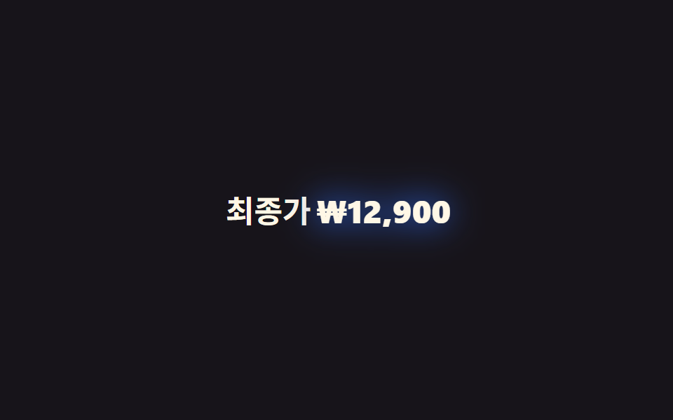
09Bóng chữ bật lên
Chuyển động thế nào
Một custom property kiểu
<main class="stage">
  <p class="line">Giá cuối cùng <span class="hl">₩12,900</span></p>
</main>
@use "../../../../site/static/demo-tokens" as *;
// ── 변수 3개 ─────────────────────────────
$duration: 1s; // 한 번 통통 튀는 데 걸리는 시간
$easing: $ease-pop;
$color: $subject-blue; // 글로우 색
// @property 로 <length> 를 등록해야 filter 안의 흐림 반경이 부드럽게 보간된다
@property --shadow-blur {
syntax: "<length>";
inherits: false;
initial-value: 0px;
}
// 페인트 물성: 글로우의 번짐 위치(x-offset)도 변수로 등록해 따로 보간시킨다
@property --shadow-x {
syntax: "<length>";
inherits: false;
initial-value: 0px;
}
// ── 데모 무대 ───────────────────────────────
@include stage($stage-ink);
.line {
margin: 0;
color: $subject-cream;
font-weight: 600;
font-size: clamp(16px, 4.6vw, 22px);
line-height: 1.4;
font-family: inherit;
}
.hl {
display: inline-block;
color: $subject-cream;
font-weight: 800;
filter: drop-shadow(var(--shadow-x, 0px) 0 var(--shadow-blur) $color);
animation: pop $duration $easing infinite, pop-glow $duration $easing infinite;
}
@keyframes pop {
0% { transform: scale(1); --shadow-blur: 0px; }
40% { transform: scale(1.06); --shadow-blur: 10px; }
70% { transform: scale(1); --shadow-blur: 4px; }
100% { transform: scale(1); --shadow-blur: 0px; }
}
// 페인트 물성: blur 하강을 촘촘히 요동시키고(불균일 번짐) x-offset 도 미세 진동 — 변수 2개가 각자 보간
@keyframes pop-glow {
0% { --shadow-blur: 0px; --shadow-x: 0px; }
12% { --shadow-blur: 11px; --shadow-x: -1px; }
24% { --shadow-blur: 3px; --shadow-x: 1.5px; }
36% { --shadow-blur: 8px; --shadow-x: -0.5px; }
48% { --shadow-blur: 1px; --shadow-x: 1px; }
60% { --shadow-blur: 6px; --shadow-x: -1.5px; }
72% { --shadow-blur: 2px; --shadow-x: 0.5px; }
84% { --shadow-blur: 4px; --shadow-x: -1px; }
100% { --shadow-blur: 0px; --shadow-x: 0px; }
}
@media (prefers-reduced-motion: reduce) {
.hl { animation: none; filter: drop-shadow(0 0 4px $color); }
}@property --shadow-blur {
syntax: "<length>";
inherits: false;
initial-value: 0px;
}
@property --shadow-x {
syntax: "<length>";
inherits: false;
initial-value: 0px;
}
html, body {
margin: 0;
overflow: hidden;
}
.stage {
box-sizing: border-box;
min-height: 100vh;
display: grid;
place-items: center;
margin: 0;
background: #17141a;
font-family: -apple-system, "Segoe UI", "Noto Sans KR", sans-serif;
padding: clamp(8px, 4vw, 24px);
}
.line {
margin: 0;
color: #fff7e6;
font-weight: 600;
font-size: clamp(16px, 4.6vw, 22px);
line-height: 1.4;
font-family: inherit;
}
.hl {
display: inline-block;
color: #fff7e6;
font-weight: 800;
filter: drop-shadow(var(--shadow-x, 0px) 0 var(--shadow-blur) #2f6df6);
animation: pop 1s cubic-bezier(0.2, 1.4, 0.4, 1) infinite, pop-glow 1s cubic-bezier(0.2, 1.4, 0.4, 1) infinite;
}
@keyframes pop {
0% {
transform: scale(1);
--shadow-blur: 0px;
}
40% {
transform: scale(1.06);
--shadow-blur: 10px;
}
70% {
transform: scale(1);
--shadow-blur: 4px;
}
100% {
transform: scale(1);
--shadow-blur: 0px;
}
}
@keyframes pop-glow {
0% {
--shadow-blur: 0px;
--shadow-x: 0px;
}
12% {
--shadow-blur: 11px;
--shadow-x: -1px;
}
24% {
--shadow-blur: 3px;
--shadow-x: 1.5px;
}
36% {
--shadow-blur: 8px;
--shadow-x: -0.5px;
}
48% {
--shadow-blur: 1px;
--shadow-x: 1px;
}
60% {
--shadow-blur: 6px;
--shadow-x: -1.5px;
}
72% {
--shadow-blur: 2px;
--shadow-x: 0.5px;
}
84% {
--shadow-blur: 4px;
--shadow-x: -1px;
}
100% {
--shadow-blur: 0px;
--shadow-x: 0px;
}
}
@media (prefers-reduced-motion: reduce) {
.hl {
animation: none;
filter: drop-shadow(0 0 4px #2f6df6);
}
}import type { CSSProperties, ReactNode } from "react";
import styles from "./TextShadowPop.module.scss";
export type TextShadowPopProps = {
label: ReactNode;
/** 튀는 값 */
value: ReactNode;
/** 한 번 통통 튀는 시간 (기본 1000ms) */
duration?: number;
easing?: string;
/** 글로우 색 */
color?: string;
};
type Vars = CSSProperties & {
"--duration"?: string;
"--easing"?: string;
"--color"?: string;
};
export default function TextShadowPop({
label,
value,
duration = 1000,
easing = "cubic-bezier(.2,1.4,.4,1)",
color = "#2f6df6",
}: TextShadowPopProps) {
const vars: Vars = {
"--duration": `${duration}ms`,
"--easing": easing,
"--color": color,
};
return (
<p className={styles.line}>
{label} <span className={styles.hl} style={vars}>{value}</span>
</p>
);
}09 · Bóng chữ bật lên — Diện tích đo được 3.196% · khung hình chuyển động 23/23Nguyên tác GODRICH · SCSS và React nằm trong tệp zip · Xem mật khẩu
Dùng khi nào
Dùng cho giá cuối trên bảng giá hay số đếm ngược cần nhấn mạnh.
@property --shadow-blur {
  syntax: "<length>"; inherits: false; initial-value: 0px;
}
.hl {
  filter: drop-shadow(0 0 var(--shadow-blur) $color);
  animation: pop $duration $easing infinite;
}
@keyframes pop {
  0%   { transform: scale(1);    --shadow-blur: 0px; }
  40%  { transform: scale(1.06); --shadow-blur: 10px; }
  100% { transform: scale(1);    --shadow-blur: 0px; }
}
Bẫy nằm ở đâu — isolation và biên độ quá hẹp
Isolation và khối marker bị che
Hai trong chín hiệu ứng — 01 marker tô sáng và 02 marker chồng lớp — hoàn toàn vô hình lúc mới dựng xong. Khối marker bị đẩy xuống dưới chữ bằng z-index: -1, nhưng nếu phần tử mang class .hl không có isolation: isolate, trình duyệt vẽ khối đó phía sau lớp nền của tổ tiên gần nhất không định vị (position), trước cả khi chạm tới ::before, nên toàn bộ khối màu bị nền sân khấu che kín dù CSS không báo lỗi gì. Thêm đúng một dòng isolation: isolate là đủ, và số liệu đo khung hình xác nhận điều đó: diện tích tích luỹ nhảy từ 0% lên 0.81% ở mục 01 và 1.12% ở mục 02.
Biên độ quá hẹp ở mục 04
Mục 04 vướng một bẫy khác hẳn. Bản dựng đầu tiên cho text-underline-offset dao động chỉ giữa 1px và 3px, biên độ đó nhỏ hơn ngưỡng đổi màu pixel giữa hai khung liên tiếp, nên phép đo chỉ bắt được 4 trên 23 khung có chuyển động thật, không đạt mức tối thiểu để tính là một animation. Nới biên độ ra 0px đến 5px và đổi timing sang linear, đưa con số đó lên 23/23 — giá trị càng nhỏ trông càng tinh tế, nhưng tinh tế và vô hình chỉ cách nhau một chút, và không đo khung hình thật thì khó biết ranh giới đó nằm ở đâu. Bản đã sửa cả hai chỗ này nằm sẵn trong file nén, mở bằng mật khẩu hx9yh6mr, gõ đúng như nó xuất hiện trên dòng này.
Khả năng tiếp cận
Chín kết quả khi giảm chuyển động
Người bật giảm chuyển động trên hệ điều hành nhận được chín kết quả khác nhau chứ không phải một quy tắc chung cho tất cả. 01 và 02 giữ khối marker ở scaleX(1), coi như đã tô xong và đứng yên tại đó. 03 khoá stroke-dashoffset về 0, nên gạch chân viết tay hiện trọn vẹn ngay từ đầu. 04 cố định text-underline-offset ở 2px, gần giữa khoảng dao động cũ. 05 và 07 cũng dừng ở scaleX(1), đường gạch ngang và đường chấm coi như đã vẽ xong sẵn. 06 giữ background-size: 100% 100%, nền coi như đã tô đầy từ đầu. 08 chuyển hẳn lớp quét sang opacity: 0, gỡ vệt sáng khỏi badge. 09 giữ drop-shadow ở 4px nhưng bỏ phần transform: scale, nên bóng còn mà cú nảy biến mất. Ba mục có thêm lớp trang trí riêng — svg ở 03, đường kẻ ở 05, thanh chấm ở 07 — đều gắn aria-hidden="true" để trình đọc màn hình bỏ qua lớp đó và đọc thẳng câu chữ thật bên dưới. Từng mốc phiên bản trình duyệt bắt đầu hỗ trợ prefers-reduced-motion đều được liệt kê đầy đủ trong tài liệu MDN về prefers-reduced-motion.
Những kiểu tô chữ khác ngoài chín cái này được gom trong danh mục CSS, còn ai đứng sau site thì xem ở trang giới thiệu.
FAQ
Có thể dùng cả chín kiểu trên cùng một trang không?
Được, nhưng mỗi câu chỉ nên mang một kiểu tô. Marker (01, 02) và gạch chân sóng (04) chồng lên cùng một cụm từ sẽ khiến mắt không biết nhìn vào đâu trước. Gạch ngang (05) và badge quét màu (08) thuộc ngữ cảnh khác hẳn nên đứng chung trang vẫn tự nhiên.
Đổi cụm từ được tô sáng bằng cách nào?
Chỉ cần bọc đúng phần chữ cần nhấn trong một span mang class .hl, phần còn lại của đoạn văn giữ nguyên thẻ p bình thường. Bản React trong thư mục react/ của file zip nhận chữ cần tô qua một prop kiểu children hoặc text, nên nội dung động lấy từ server vẫn chạy đúng.
mix-blend-mode: multiply ở mục 01, 02 có vỡ trên nền tối không?
Multiply nhân giá trị màu của lớp trên với lớp dưới, nên trên nền sáng nó chỉ làm màu marker trầm lại một chút rất tự nhiên. Trên nền tối, phép nhân đó kéo cả marker gần về đen và gần như biến mất, vì vậy bản dark mode nên đổi mix-blend-mode sang screen hoặc bỏ hẳn blend.
Có thể bạn cũng thích
 Phản hồi9 CSS Image Hover Effects — dán 1 dòng là chạy
 Phản hồi9 CSS Card Hover Effects — dán 1 dòng là chạy
 Phản hồi9 Tailwind v4 Animations — dán 1 dòng là chạy
 Phản hồi9 cubic bezier css — đường cong copy-paste
 Phản hồi9 css glassmorphism — dán một file là chạy
 Phản hồi9 hiệu ứng css dark mode toggle 1 dòng CSS
 Phản hồi9 micro interactions css — dán 1 dòng chạy ngay
 Phản hồi9 CSS tooltip examples — copy dán một dòng là chạy
 Phản hồi9 hiệu ứng custom cursor css — copy dán một dòng
 Phản hồi9 kiểu css typing animation, copy dán là chạy