9 cubic bezier css — đường cong copy-paste
Cách ghi thay đổi tốc độ của một chuyển động bằng bốn con số trong CSS chính là giá trị cubic bezier css, còn kiểu nảy tưng tưng thì đựng trong linear().
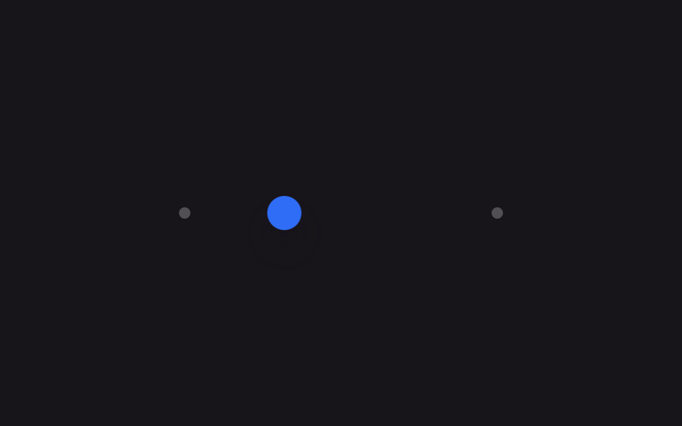 01 easing-curves-springs-ease-out-quart
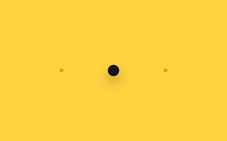 02 easing-curves-springs-ease-in-out-back
 03 easing-curves-springs-ease-out-expo
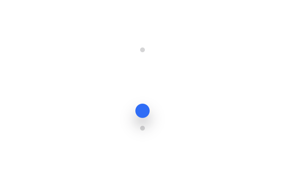 04 easing-curves-springs-bounce-linear
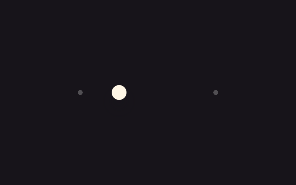 05 easing-curves-springs-spring-gentle
 06 easing-curves-springs-spring-snappy
 07 easing-curves-springs-scss-easing-map
 08 easing-curves-springs-tailwind-ease-token
 09 easing-curves-springs-compare-side-by-side
Tự chạy · bấm ô để tới mục đó · cả 9 trong một zip
- 01 Đường cong ease-out-quart
- 02 Đường cong ease-in-out-back
- 03 Đường cong ease-out-expo
- 04 Nảy bật bằng linear()
- 05 Lò xo dịu dàng
- 06 Lò xo đàn hồi rõ nét
- 07 Map $easings và mixin SCSS
- 08 Token --ease Tailwind v4
- 09 Demo so sánh easing
Giữ nguyên một tốc độ thì nút bấm hay tấm thẻ trông cứng đờ, còn nhanh rồi chậm dần hoặc nảy nhẹ ở cuối thì mới tự nhiên. Riêng linear() là bản chuyển từ phương trình lò xo sang đường cong, thứ bốn con số không diễn tả nổi.
Chín mục không xếp theo độ phổ biến mà theo thứ tự cách xử lý giá trị ngày một nhiều lên: ba đường cong giảm tốc mà phần tử lần đầu hiện ra sẽ trải qua (01~03), ba kiểu nảy mang tính vật lý mà cubic-bezier chịu thua (04~06), hai cách tái sử dụng chính những giá trị đó trong code (07, 08), và demo đặt bốn đường cong cạnh nhau để mắt tự so (09).
| Số | Tên | Hàm easing | Dùng khi |
|---|---|---|---|
| 01 | Đường cong ease-out-quart | cubic-bezier(.25, 1, .5, 1) |
modal, drawer mở ra |
| 02 | Đường cong ease-in-out-back | cubic-bezier(.68, -.6, .32, 1.6) |
toast, huy hiệu bật ra |
| 03 | Đường cong ease-out-expo | cubic-bezier(.16, 1, .3, 1) |
sidebar bung nhanh |
| 04 | Nảy bằng linear() | linear() lấy mẫu 25 điểm |
thêm vào giỏ, huy hiệu mới |
| 05 | Spring êm | zeta .62, omega 7.0 | panel cài đặt trượt vào |
| 06 | Spring đàn hồi | zeta .35, omega 9.0 | nút thích, thả kéo |
| 07 | Mixin map easing SCSS | map.get($easings, $name) |
design system dùng chung |
| 08 | Token --ease Tailwind v4 | var(--ease-spring) |
gọi easing bằng tên |
| 09 | Demo so sánh easing | dùng lại bốn giá trị trên | chọn đường cong bằng mắt |
01Đường cong ease-out-quart
css easing functions dùng mục này ở đâu
Gắn cubic-bezier(.25, 1, .5, 1) vào translateX thì vật thể phóng đi thật nhanh ngay từ đầu rồi dừng êm gần đích, không còn chút quán tính.
<main class="stage is-demo">
  <div class="track">
    <span class="dot dot--start"></span>
    <span class="dot dot--end"></span>
    <div class="puck"></div>
  </div>
</main>
@use "../../../../site/static/demo-tokens" as *;
// ── 변수 3개 ──────────────────────────────────────────
$duration: $dur-loop; // 2s — 왕복 한 주기
$easing: cubic-bezier(.25, 1, .5, 1); // ease-out-quart — 처음부터 빠르게 튀어나가 끝에서 천천히 멈춘다
$color: $subject-blue;
@include stage($stage-ink);
$track-w: 220px;
$puck-w: $sp-6;
$travel: $track-w - $puck-w;
.track {
position: relative;
width: $track-w;
height: $sp-2;
}
.dot {
position: absolute;
top: 50%;
width: $sp-2;
height: $sp-2;
border-radius: $r-pill;
background: rgba(255, 255, 255, .25);
transform: translate(-50%, -50%);
}
.dot--start { left: 0; }
.dot--end { left: $track-w; }
.puck {
position: absolute;
top: 50%;
left: 0;
width: $puck-w;
height: $puck-w;
border-radius: $r-pill;
background: $color;
box-shadow: $shadow-raised;
transform: translate(0, -50%);
}
// transform 만 움직인다 — top/left 는 그대로 두고 puck 만 왕복
.stage.is-demo .puck {
animation: move $duration $easing infinite alternate;
}
@keyframes move {
from { transform: translate(0, -50%); }
to { transform: translate($travel, -50%); }
}
@media (prefers-reduced-motion: reduce) {
.stage.is-demo .puck { animation: none; transform: translate($travel, -50%); }
}html, body {
margin: 0;
overflow: hidden;
}
.stage {
box-sizing: border-box;
min-height: 100vh;
display: grid;
place-items: center;
margin: 0;
background: #17141a;
font-family: -apple-system, "Segoe UI", "Noto Sans KR", sans-serif;
padding: clamp(8px, 4vw, 24px);
}
.track {
position: relative;
width: 220px;
height: 8px;
}
.dot {
position: absolute;
top: 50%;
width: 8px;
height: 8px;
border-radius: 999px;
background: rgba(255, 255, 255, 0.25);
transform: translate(-50%, -50%);
}
.dot--start {
left: 0;
}
.dot--end {
left: 220px;
}
.puck {
position: absolute;
top: 50%;
left: 0;
width: 24px;
height: 24px;
border-radius: 999px;
background: #2f6df6;
box-shadow: 0 14px 24px rgba(23, 20, 26, 0.32);
transform: translate(0, -50%);
}
.stage.is-demo .puck {
animation: move 2s cubic-bezier(0.25, 1, 0.5, 1) infinite alternate;
}
@keyframes move {
from {
transform: translate(0, -50%);
}
to {
transform: translate(196px, -50%);
}
}
@media (prefers-reduced-motion: reduce) {
.stage.is-demo .puck {
animation: none;
transform: translate(196px, -50%);
}
}import type { CSSProperties } from "react";
import styles from "./EaseOutQuart.module.scss";
export type EaseOutQuartProps = {
/** 왕복 한 주기 (기본 2000ms) */
duration?: number;
color?: string;
};
export default function EaseOutQuart({ duration = 2000, color = "#2f6df6" }: EaseOutQuartProps) {
const vars: CSSProperties = { "--duration": `${duration}ms`, "--color": color } as CSSProperties;
return (
<div className={styles.stage} style={vars}>
<div className={styles.track}>
<span className={`${styles.dot} ${styles.dotStart}`} />
<span className={`${styles.dot} ${styles.dotEnd}`} />
<div className={styles.puck} />
</div>
</div>
);
}01 · Đường cong ease-out-quart — Diện tích đo được 3.2% · khung hình chuyển động 22/23Nguyên tác GODRICH · SCSS và React nằm trong tệp zip · Xem mật khẩu
Đọc code như thế nào
Rất hợp lúc modal hay drawer mở ra, lúc thẻ hiện lên màn hình.
$duration: $dur-loop;
$easing: cubic-bezier(.25, 1, .5, 1);   // ease-out-quart

.stage.is-demo .puck {
  animation: move $duration $easing infinite alternate;
}
@keyframes move {
  from { transform: translate(0, -50%); }
  to   { transform: translate($travel, -50%); }
}
02Đường cong ease-in-out-back
Dùng ở đâu
Giá trị y của cubic-bezier(.68, -.6, .32, 1.6) vượt ra ngoài khoảng 0 tới 1.
<main class="stage is-demo">
  <div class="track">
    <span class="dot dot--start"></span>
    <span class="dot dot--end"></span>
    <div class="puck"></div>
  </div>
</main>
@use "../../../../site/static/demo-tokens" as *;
// ── 변수 3개 ──────────────────────────────────────────
$duration: $dur-loop; // 2s
$easing: cubic-bezier(.68, -.6, .32, 1.6); // ease-in-out-back — 출발 전 살짝 뒤로 당겼다가, 도착 전 목표를 넘었다 되돌아온다
$color: $subject-ink;
@include stage($stage-yellow);
$track-w: 220px;
$puck-w: $sp-6;
$travel: $track-w - $puck-w;
.track {
position: relative;
width: $track-w;
height: $sp-2;
}
.dot {
position: absolute;
top: 50%;
width: $sp-2;
height: $sp-2;
border-radius: $r-pill;
background: rgba(23, 20, 26, .25);
transform: translate(-50%, -50%);
}
.dot--start { left: 0; }
.dot--end { left: $track-w; }
.puck {
position: absolute;
top: 50%;
left: 0;
width: $puck-w;
height: $puck-w;
border-radius: $r-pill;
background: $color;
box-shadow: $shadow-raised;
transform: translate(0, -50%);
}
.stage.is-demo .puck {
animation: move $duration $easing infinite alternate;
}
@keyframes move {
from { transform: translate(0, -50%); }
to { transform: translate($travel, -50%); }
}
@media (prefers-reduced-motion: reduce) {
.stage.is-demo .puck { animation: none; transform: translate($travel, -50%); }
}html, body {
margin: 0;
overflow: hidden;
}
.stage {
box-sizing: border-box;
min-height: 100vh;
display: grid;
place-items: center;
margin: 0;
background: #ffd23f;
font-family: -apple-system, "Segoe UI", "Noto Sans KR", sans-serif;
padding: clamp(8px, 4vw, 24px);
}
.track {
position: relative;
width: 220px;
height: 8px;
}
.dot {
position: absolute;
top: 50%;
width: 8px;
height: 8px;
border-radius: 999px;
background: rgba(23, 20, 26, 0.25);
transform: translate(-50%, -50%);
}
.dot--start {
left: 0;
}
.dot--end {
left: 220px;
}
.puck {
position: absolute;
top: 50%;
left: 0;
width: 24px;
height: 24px;
border-radius: 999px;
background: #17141a;
box-shadow: 0 14px 24px rgba(23, 20, 26, 0.32);
transform: translate(0, -50%);
}
.stage.is-demo .puck {
animation: move 2s cubic-bezier(0.68, -0.6, 0.32, 1.6) infinite alternate;
}
@keyframes move {
from {
transform: translate(0, -50%);
}
to {
transform: translate(196px, -50%);
}
}
@media (prefers-reduced-motion: reduce) {
.stage.is-demo .puck {
animation: none;
transform: translate(196px, -50%);
}
}import type { CSSProperties } from "react";
import styles from "./EaseInOutBack.module.scss";
export type EaseInOutBackProps = {
duration?: number;
color?: string;
};
export default function EaseInOutBack({ duration = 2000, color = "#17141a" }: EaseInOutBackProps) {
const vars: CSSProperties = { "--duration": `${duration}ms`, "--color": color } as CSSProperties;
return (
<div className={styles.stage} style={vars}>
<div className={styles.track}>
<span className={`${styles.dot} ${styles.dotStart}`} />
<span className={`${styles.dot} ${styles.dotEnd}`} />
<div className={styles.puck} />
</div>
</div>
);
}02 · Đường cong ease-in-out-back — Diện tích đo được 6.664% · khung hình chuyển động 23/23Nguyên tác GODRICH · SCSS và React nằm trong tệp zip · Xem mật khẩu
Điểm chính của code
Vì thế sinh ra hai động tác chuẩn bị: kéo lùi một chút trước khi xuất phát, rồi vượt quá đích và quay ngược lại sau khi đã tới. Hợp lúc toast hay huy hiệu bật ra.
$easing: cubic-bezier(.68, -.6, .32, 1.6);   // ease-in-out-back

.stage.is-demo .puck {
  animation: move $duration $easing infinite alternate;
}
@keyframes move {
  from { transform: translate(0, -50%); }
  to   { transform: translate($travel, -50%); }
}
03Đường cong ease-out-expo
Bạn nhìn thấy gì
cubic-bezier(.16, 1, .3, 1) xong gần hết quãng đường chỉ trong vài khung hình đầu, đoạn còn lại bò chậm tới mức mắt thường gần như không thấy chuyển động, kéo phần cập bến ra dài.
<main class="stage is-demo">
  <div class="track">
    <span class="dot dot--start"></span>
    <span class="dot dot--end"></span>
    <div class="puck"></div>
  </div>
</main>
@use "../../../../site/static/demo-tokens" as *;
// ── 변수 3개 ──────────────────────────────────────────
$duration: $dur-loop; // 2s
$easing: cubic-bezier(.16, 1, .3, 1); // ease-out-expo — 첫 프레임부터 거의 다 이동해 있고, 나머지 구간은 아주 천천히 기어간다
$color: $subject-cream;
@include stage($stage-orange);
$track-w: 220px;
$puck-w: $sp-6;
$travel: $track-w - $puck-w;
.track {
position: relative;
width: $track-w;
height: $sp-2;
}
.dot {
position: absolute;
top: 50%;
width: $sp-2;
height: $sp-2;
border-radius: $r-pill;
background: rgba(255, 255, 255, .3);
transform: translate(-50%, -50%);
}
.dot--start { left: 0; }
.dot--end { left: $track-w; }
.puck {
position: absolute;
top: 50%;
left: 0;
width: $puck-w;
height: $puck-w;
border-radius: $r-pill;
background: $color;
box-shadow: $shadow-raised;
transform: translate(0, -50%);
}
.stage.is-demo .puck {
animation: move $duration $easing infinite alternate;
}
@keyframes move {
from { transform: translate(0, -50%); }
to { transform: translate($travel, -50%); }
}
@media (prefers-reduced-motion: reduce) {
.stage.is-demo .puck { animation: none; transform: translate($travel, -50%); }
}html, body {
margin: 0;
overflow: hidden;
}
.stage {
box-sizing: border-box;
min-height: 100vh;
display: grid;
place-items: center;
margin: 0;
background: #ff4d1f;
font-family: -apple-system, "Segoe UI", "Noto Sans KR", sans-serif;
padding: clamp(8px, 4vw, 24px);
}
.track {
position: relative;
width: 220px;
height: 8px;
}
.dot {
position: absolute;
top: 50%;
width: 8px;
height: 8px;
border-radius: 999px;
background: rgba(255, 255, 255, 0.3);
transform: translate(-50%, -50%);
}
.dot--start {
left: 0;
}
.dot--end {
left: 220px;
}
.puck {
position: absolute;
top: 50%;
left: 0;
width: 24px;
height: 24px;
border-radius: 999px;
background: #fff7e6;
box-shadow: 0 14px 24px rgba(23, 20, 26, 0.32);
transform: translate(0, -50%);
}
.stage.is-demo .puck {
animation: move 2s cubic-bezier(0.16, 1, 0.3, 1) infinite alternate;
}
@keyframes move {
from {
transform: translate(0, -50%);
}
to {
transform: translate(196px, -50%);
}
}
@media (prefers-reduced-motion: reduce) {
.stage.is-demo .puck {
animation: none;
transform: translate(196px, -50%);
}
}import type { CSSProperties } from "react";
import styles from "./EaseOutExpo.module.scss";
export type EaseOutExpoProps = {
duration?: number;
color?: string;
};
export default function EaseOutExpo({ duration = 2000, color = "#fff7e6" }: EaseOutExpoProps) {
const vars: CSSProperties = { "--duration": `${duration}ms`, "--color": color } as CSSProperties;
return (
<div className={styles.stage} style={vars}>
<div className={styles.track}>
<span className={`${styles.dot} ${styles.dotStart}`} />
<span className={`${styles.dot} ${styles.dotEnd}`} />
<div className={styles.puck} />
</div>
</div>
);
}03 · Đường cong ease-out-expo — Diện tích đo được 5.573% · khung hình chuyển động 21/23Nguyên tác GODRICH · SCSS và React nằm trong tệp zip · Xem mật khẩu
Nguyên lý chạy thế nào
Dùng khi bạn muốn nhấn vào cảm giác tốc độ lúc sidebar bung ra.
$easing: cubic-bezier(.16, 1, .3, 1);   // ease-out-expo

.stage.is-demo .puck {
  animation: move $duration $easing infinite alternate;
}
@keyframes move {
  from { transform: translate(0, -50%); }
  to   { transform: translate($travel, -50%); }
}
04Nảy bằng linear()
Đó là tình huống gì
cubic-bezier là đường cong chỉ lên xuống đúng một lần, nên không dựng nổi kiểu quả bóng nảy thêm mấy nhịp trên mặt sàn. Lấy mẫu công thức easeOutBounce của Robert Penner thành 25 điểm rồi đổ vào linear() thì ra đường cong nảy thật, giá trị cứ tăng lên rồi giảm đi lặp lại.
<main class="stage is-demo">
  <div class="track track--v">
    <span class="dot dot--start"></span>
    <span class="dot dot--end"></span>
    <div class="puck"></div>
  </div>
</main>
@use "../../../../site/static/demo-tokens" as *;
// ── 변수 3개 ──────────────────────────────────────────
$duration: $dur-loop; // 2s
// linear() — Penner easeOutBounce 공식을 25개 점으로 표본화한 값. cubic-bezier 로는 못 만드는,
// 방향이 꺾이는(제자리로 되튀는) 곡선이라 CSS Easing Functions Level 2 의 linear() 가 필요하다
$easing: linear(0, .013, .053, .118, .21, .328, .473, .643, .84, .97, .875, .807, .766, .75, .761, .798, .861, .951, .973, .943, .939, .962, .995, .984, 1);
$color: $subject-blue;
@include stage($stage-paper);
$track-h: 132px; // 320×200 모바일 체크에서 세로 여백을 남겨야 한다 (BD9 실측: 180px 는 넘쳤다)
$puck-w: $sp-6;
$drop: $track-h - $puck-w;
.track--v {
position: relative;
width: $sp-2;
height: $track-h;
}
.dot {
position: absolute;
left: 50%;
width: $sp-2;
height: $sp-2;
border-radius: $r-pill;
background: rgba(23, 20, 26, .18);
transform: translate(-50%, -50%);
}
.dot--start { top: 0; }
.dot--end { top: $track-h; }
.puck {
position: absolute;
top: 0;
left: 50%;
width: $puck-w;
height: $puck-w;
border-radius: $r-pill;
background: $color;
box-shadow: $shadow-raised;
transform: translate(-50%, 0);
}
// 공이 떨어져 튀어오르는 방향이라 alternate 를 안 쓴다 — 한 번 떨어지고 나면 다음 루프에서 제자리로 순간 복귀한다
.stage.is-demo .puck {
animation: drop $duration $easing infinite;
}
@keyframes drop {
from { transform: translate(-50%, 0); }
to { transform: translate(-50%, $drop); }
}
@media (prefers-reduced-motion: reduce) {
.stage.is-demo .puck { animation: none; transform: translate(-50%, $drop); }
}html, body {
margin: 0;
overflow: hidden;
}
.stage {
box-sizing: border-box;
min-height: 100vh;
display: grid;
place-items: center;
margin: 0;
background: #ffffff;
font-family: -apple-system, "Segoe UI", "Noto Sans KR", sans-serif;
padding: clamp(8px, 4vw, 24px);
}
.track--v {
position: relative;
width: 8px;
height: 132px;
}
.dot {
position: absolute;
left: 50%;
width: 8px;
height: 8px;
border-radius: 999px;
background: rgba(23, 20, 26, 0.18);
transform: translate(-50%, -50%);
}
.dot--start {
top: 0;
}
.dot--end {
top: 132px;
}
.puck {
position: absolute;
top: 0;
left: 50%;
width: 24px;
height: 24px;
border-radius: 999px;
background: #2f6df6;
box-shadow: 0 14px 24px rgba(23, 20, 26, 0.32);
transform: translate(-50%, 0);
}
.stage.is-demo .puck {
animation: drop 2s linear(0, 0.013, 0.053, 0.118, 0.21, 0.328, 0.473, 0.643, 0.84, 0.97, 0.875, 0.807, 0.766, 0.75, 0.761, 0.798, 0.861, 0.951, 0.973, 0.943, 0.939, 0.962, 0.995, 0.984, 1) infinite;
}
@keyframes drop {
from {
transform: translate(-50%, 0);
}
to {
transform: translate(-50%, 108px);
}
}
@media (prefers-reduced-motion: reduce) {
.stage.is-demo .puck {
animation: none;
transform: translate(-50%, 108px);
}
}import type { CSSProperties } from "react";
import styles from "./BounceLinear.module.scss";
export type BounceLinearProps = {
duration?: number;
color?: string;
};
export default function BounceLinear({ duration = 2000, color = "#2f6df6" }: BounceLinearProps) {
const vars: CSSProperties = { "--duration": `${duration}ms`, "--color": color } as CSSProperties;
return (
<div className={styles.stage} style={vars}>
<div className={styles.track}>
<span className={`${styles.dot} ${styles.dotStart}`} />
<span className={`${styles.dot} ${styles.dotEnd}`} />
<div className={styles.puck} />
</div>
</div>
);
}04 · Nảy bật bằng linear() — Diện tích đo được 3.203% · khung hình chuyển động 23/23Nguyên tác GODRICH · SCSS và React nằm trong tệp zip · Xem mật khẩu
Cách tạo ra nó
Dùng lúc icon rơi vào giỏ hàng, lúc một huy hiệu thông báo mới hiện lên.
$easing: linear(0, .013, .053, .118, .21, .328, .473, .643, .84, .97, .875, .807, .766, .75, .761, .798, .861, .951, .973, .943, .939, .962, .995, .984, 1);

.stage.is-demo .puck {
  animation: drop $duration $easing infinite;
}
@keyframes drop {
  from { transform: translate(-50%, 0); }
  to   { transform: translate(-50%, $drop); }
}
05Spring êm
Điều gì đang diễn ra
Lấy mẫu 23 điểm từ phương trình lò xo giảm chấn x(t) = 1 - e^(-ζωt)(cos(ω_d t) + (ζω/ω_d)sin(ω_d t)) với hệ số giảm chấn (zeta) .62 và tần số góc (omega) 7.0, bạn được dãy giá trị chỉ vượt đích chừng 8% rồi lắng xuống rất nhanh; hệ số giảm chấn càng tiến gần 1 thì phần vượt đích càng teo lại.
<main class="stage is-demo">
  <div class="track">
    <span class="dot dot--start"></span>
    <span class="dot dot--end"></span>
    <div class="puck"></div>
  </div>
</main>
@use "../../../../site/static/demo-tokens" as *;
// ── 변수 3개 ──────────────────────────────────────────
$duration: $dur-loop; // 2s
// linear() — 감쇠비(zeta) .62 · 각진동수(w) 7.0 인 스프링 방정식을 23개 점으로 표본화했다.
// 목표를 8% 정도만 넘겼다가 금방 가라앉는다 — 감쇠비가 1에 가까울수록 오버슈트가 줄어든다
$easing: linear(0, .044, .153, .297, .452, .602, .736, .849, .937, 1.002, 1.045, 1.071, 1.082, 1.083, 1.077, 1.066, 1.053, 1.04, 1.028, 1.018, 1.009, 1.003, 1);
$color: $subject-cream;
@include stage($stage-ink);
$track-w: 220px;
$puck-w: $sp-6;
$travel: $track-w - $puck-w;
.track {
position: relative;
width: $track-w;
height: $sp-2;
}
.dot {
position: absolute;
top: 50%;
width: $sp-2;
height: $sp-2;
border-radius: $r-pill;
background: rgba(255, 255, 255, .25);
transform: translate(-50%, -50%);
}
.dot--start { left: 0; }
.dot--end { left: $track-w; }
.puck {
position: absolute;
top: 50%;
left: 0;
width: $puck-w;
height: $puck-w;
border-radius: $r-pill;
background: $color;
box-shadow: $shadow-raised;
transform: translate(0, -50%);
}
.stage.is-demo .puck {
animation: move $duration $easing infinite alternate;
}
@keyframes move {
from { transform: translate(0, -50%); }
to { transform: translate($travel, -50%); }
}
@media (prefers-reduced-motion: reduce) {
.stage.is-demo .puck { animation: none; transform: translate($travel, -50%); }
}html, body {
margin: 0;
overflow: hidden;
}
.stage {
box-sizing: border-box;
min-height: 100vh;
display: grid;
place-items: center;
margin: 0;
background: #17141a;
font-family: -apple-system, "Segoe UI", "Noto Sans KR", sans-serif;
padding: clamp(8px, 4vw, 24px);
}
.track {
position: relative;
width: 220px;
height: 8px;
}
.dot {
position: absolute;
top: 50%;
width: 8px;
height: 8px;
border-radius: 999px;
background: rgba(255, 255, 255, 0.25);
transform: translate(-50%, -50%);
}
.dot--start {
left: 0;
}
.dot--end {
left: 220px;
}
.puck {
position: absolute;
top: 50%;
left: 0;
width: 24px;
height: 24px;
border-radius: 999px;
background: #fff7e6;
box-shadow: 0 14px 24px rgba(23, 20, 26, 0.32);
transform: translate(0, -50%);
}
.stage.is-demo .puck {
animation: move 2s linear(0, 0.044, 0.153, 0.297, 0.452, 0.602, 0.736, 0.849, 0.937, 1.002, 1.045, 1.071, 1.082, 1.083, 1.077, 1.066, 1.053, 1.04, 1.028, 1.018, 1.009, 1.003, 1) infinite alternate;
}
@keyframes move {
from {
transform: translate(0, -50%);
}
to {
transform: translate(196px, -50%);
}
}
@media (prefers-reduced-motion: reduce) {
.stage.is-demo .puck {
animation: none;
transform: translate(196px, -50%);
}
}import type { CSSProperties } from "react";
import styles from "./SpringGentle.module.scss";
export type SpringGentleProps = {
duration?: number;
color?: string;
};
export default function SpringGentle({ duration = 2000, color = "#fff7e6" }: SpringGentleProps) {
const vars: CSSProperties = { "--duration": `${duration}ms`, "--color": color } as CSSProperties;
return (
<div className={styles.stage} style={vars}>
<div className={styles.track}>
<span className={`${styles.dot} ${styles.dotStart}`} />
<span className={`${styles.dot} ${styles.dotEnd}`} />
<div className={styles.puck} />
</div>
</div>
);
}05 · Lò xo dịu dàng — Diện tích đo được 3.44% · khung hình chuyển động 23/23Nguyên tác GODRICH · SCSS và React nằm trong tệp zip · Xem mật khẩu
Vì sao làm theo cách này
Vừa vặn với những chuyển cảnh UI thường ngày, như panel cài đặt trượt vào từ bên hông.
$easing: linear(0, .044, .153, .297, .452, .602, .736, .849, .937, 1.002, 1.045, 1.071, 1.082, 1.083, 1.077, 1.066, 1.053, 1.04, 1.028, 1.018, 1.009, 1.003, 1);

.stage.is-demo .puck {
  animation: move $duration $easing infinite alternate;
}
@keyframes move {
  from { transform: translate(0, -50%); }
  to   { transform: translate($travel, -50%); }
}
06Spring đàn hồi
Trên màn hình có gì
Vẫn phương trình đó nhưng hạ hệ số giảm chấn xuống .35 và nâng tần số góc lên 9.0, dãy giá trị vượt đích tới hơn 30% (1.307) rồi dao động qua lại thêm vài lượt, độ đàn hồi hiện rõ.
<main class="stage is-demo">
  <div class="track">
    <span class="dot dot--start"></span>
    <span class="dot dot--end"></span>
    <div class="puck"></div>
  </div>
</main>
@use "../../../../site/static/demo-tokens" as *;
// ── 변수 3개 ──────────────────────────────────────────
$duration: $dur-loop; // 2s
// linear() — 감쇠비(zeta) .35 · 각진동수(w) 9.0 인 스프링 방정식을 27개 점으로 표본화했다.
// 감쇠비를 낮추고 각진동수를 올리면 목표를 30% 넘게 지나쳤다가 몇 번을 더 오간다 — 탄력이 셀수록 오버슈트가 크다
$easing: linear(0, .055, .197, .394, .612, .824, 1.009, 1.153, 1.25, 1.3, 1.307, 1.281, 1.231, 1.167, 1.099, 1.035, .982, .942, .916, .905, .907, .917, .935, .955, .976, .995, 1);
$color: $subject-ink;
@include stage($stage-yellow);
$track-w: 220px;
$puck-w: $sp-6;
$travel: $track-w - $puck-w;
.track {
position: relative;
width: $track-w;
height: $sp-2;
}
.dot {
position: absolute;
top: 50%;
width: $sp-2;
height: $sp-2;
border-radius: $r-pill;
background: rgba(23, 20, 26, .25);
transform: translate(-50%, -50%);
}
.dot--start { left: 0; }
.dot--end { left: $track-w; }
.puck {
position: absolute;
top: 50%;
left: 0;
width: $puck-w;
height: $puck-w;
border-radius: $r-pill;
background: $color;
box-shadow: $shadow-raised;
transform: translate(0, -50%);
}
.stage.is-demo .puck {
animation: move $duration $easing infinite alternate;
}
@keyframes move {
from { transform: translate(0, -50%); }
to { transform: translate($travel, -50%); }
}
@media (prefers-reduced-motion: reduce) {
.stage.is-demo .puck { animation: none; transform: translate($travel, -50%); }
}html, body {
margin: 0;
overflow: hidden;
}
.stage {
box-sizing: border-box;
min-height: 100vh;
display: grid;
place-items: center;
margin: 0;
background: #ffd23f;
font-family: -apple-system, "Segoe UI", "Noto Sans KR", sans-serif;
padding: clamp(8px, 4vw, 24px);
}
.track {
position: relative;
width: 220px;
height: 8px;
}
.dot {
position: absolute;
top: 50%;
width: 8px;
height: 8px;
border-radius: 999px;
background: rgba(23, 20, 26, 0.25);
transform: translate(-50%, -50%);
}
.dot--start {
left: 0;
}
.dot--end {
left: 220px;
}
.puck {
position: absolute;
top: 50%;
left: 0;
width: 24px;
height: 24px;
border-radius: 999px;
background: #17141a;
box-shadow: 0 14px 24px rgba(23, 20, 26, 0.32);
transform: translate(0, -50%);
}
.stage.is-demo .puck {
animation: move 2s linear(0, 0.055, 0.197, 0.394, 0.612, 0.824, 1.009, 1.153, 1.25, 1.3, 1.307, 1.281, 1.231, 1.167, 1.099, 1.035, 0.982, 0.942, 0.916, 0.905, 0.907, 0.917, 0.935, 0.955, 0.976, 0.995, 1) infinite alternate;
}
@keyframes move {
from {
transform: translate(0, -50%);
}
to {
transform: translate(196px, -50%);
}
}
@media (prefers-reduced-motion: reduce) {
.stage.is-demo .puck {
animation: none;
transform: translate(196px, -50%);
}
}import type { CSSProperties } from "react";
import styles from "./SpringSnappy.module.scss";
export type SpringSnappyProps = {
duration?: number;
color?: string;
};
export default function SpringSnappy({ duration = 2000, color = "#17141a" }: SpringSnappyProps) {
const vars: CSSProperties = { "--duration": `${duration}ms`, "--color": color } as CSSProperties;
return (
<div className={styles.stage} style={vars}>
<div className={styles.track}>
<span className={`${styles.dot} ${styles.dotStart}`} />
<span className={`${styles.dot} ${styles.dotEnd}`} />
<div className={styles.puck} />
</div>
</div>
);
}06 · Lò xo đàn hồi rõ nét — Diện tích đo được 6.622% · khung hình chuyển động 23/23Nguyên tác GODRICH · SCSS và React nằm trong tệp zip · Xem mật khẩu
Cốt lõi khi triển khai
Dùng lúc bạn bấm nút thích, lúc thả tay sau khi kéo và thẻ bật ngược về.
$easing: linear(0, .055, .197, .394, .612, .824, 1.009, 1.153, 1.25, 1.3, 1.307, 1.281, 1.231, 1.167, 1.099, 1.035, .982, .942, .916, .905, .907, .917, .935, .955, .976, .995, 1);

.stage.is-demo .puck {
  animation: move $duration $easing infinite alternate;
}
@keyframes move {
  from { transform: translate(0, -50%); }
  to   { transform: translate($travel, -50%); }
}
07Mixin map easing SCSS
Trên màn hình trông thế nào
Để khỏi chép tay giá trị đường cong ở từng bài, mấy giá trị đã dùng được gom theo tên vào map $easings, rồi @mixin ease($name) móc ra bằng map.get.
<main class="stage is-demo">
  <div class="track">
    <span class="dot dot--start"></span>
    <span class="dot dot--end"></span>
    <div class="puck">S</div>
  </div>
</main>
@use "sass:map";
@use "../../../../site/static/demo-tokens" as *;
// ── 변수 3개 ──────────────────────────────────────────
$duration: $dur-loop; // 2s
$easing: spring-snappy; // 아래 $easings 맵의 키 — 값 자체가 아니라 "이름"을 변수로 넘긴다
$color: $subject-cream;
// 이 편 9종에 쓴 곡선을 이름으로 묶어두면, 편마다 값을 복붙하지 않고 이름만 불러 쓴다
$easings: (
"ease-out-quart": cubic-bezier(.25, 1, .5, 1),
"ease-in-out-back": cubic-bezier(.68, -.6, .32, 1.6),
"spring-gentle": linear(0, .044, .153, .297, .452, .602, .736, .849, .937, 1.002, 1.045, 1.071, 1.082, 1.083, 1.077, 1.066, 1.053, 1.04, 1.028, 1.018, 1.009, 1.003, 1),
"spring-snappy": linear(0, .055, .197, .394, .612, .824, 1.009, 1.153, 1.25, 1.3, 1.307, 1.281, 1.231, 1.167, 1.099, 1.035, .982, .942, .916, .905, .907, .917, .935, .955, .976, .995, 1),
);
@mixin ease($name, $prop: animation-timing-function) {
#{$prop}: map.get($easings, $name);
}
@include stage($stage-orange);
$track-w: 220px;
$puck-w: $sp-8;
$travel: $track-w - $puck-w;
.track {
position: relative;
width: $track-w;
height: $sp-2;
}
.dot {
position: absolute;
top: 50%;
width: $sp-2;
height: $sp-2;
border-radius: $r-pill;
background: rgba(255, 255, 255, .3);
transform: translate(-50%, -50%);
}
.dot--start { left: 0; }
.dot--end { left: $track-w; }
.puck {
position: absolute;
top: 50%;
left: 0;
width: $puck-w;
height: $puck-w;
border-radius: $r-pill;
background: $color;
color: $stage-ink;
font: 700 12px/1 -apple-system, "Segoe UI", "Noto Sans KR", sans-serif;
display: grid;
place-items: center;
box-shadow: $shadow-raised;
transform: translate(0, -50%);
}
.stage.is-demo .puck {
animation-name: move;
animation-duration: $duration;
animation-iteration-count: infinite;
animation-direction: alternate;
@include ease($easing); // ← 맵에서 spring-snappy 값을 꺼내 animation-timing-function 에 꽂는다
}
@keyframes move {
from { transform: translate(0, -50%); }
to { transform: translate($travel, -50%); }
}
@media (prefers-reduced-motion: reduce) {
.stage.is-demo .puck { animation: none; transform: translate($travel, -50%); }
}html, body {
margin: 0;
overflow: hidden;
}
.stage {
box-sizing: border-box;
min-height: 100vh;
display: grid;
place-items: center;
margin: 0;
background: #ff4d1f;
font-family: -apple-system, "Segoe UI", "Noto Sans KR", sans-serif;
padding: clamp(8px, 4vw, 24px);
}
.track {
position: relative;
width: 220px;
height: 8px;
}
.dot {
position: absolute;
top: 50%;
width: 8px;
height: 8px;
border-radius: 999px;
background: rgba(255, 255, 255, 0.3);
transform: translate(-50%, -50%);
}
.dot--start {
left: 0;
}
.dot--end {
left: 220px;
}
.puck {
position: absolute;
top: 50%;
left: 0;
width: 32px;
height: 32px;
border-radius: 999px;
background: #fff7e6;
color: #17141a;
font: 700 12px/1 -apple-system, "Segoe UI", "Noto Sans KR", sans-serif;
display: grid;
place-items: center;
box-shadow: 0 14px 24px rgba(23, 20, 26, 0.32);
transform: translate(0, -50%);
}
.stage.is-demo .puck {
animation-name: move;
animation-duration: 2s;
animation-iteration-count: infinite;
animation-direction: alternate;
animation-timing-function: linear(0, 0.055, 0.197, 0.394, 0.612, 0.824, 1.009, 1.153, 1.25, 1.3, 1.307, 1.281, 1.231, 1.167, 1.099, 1.035, 0.982, 0.942, 0.916, 0.905, 0.907, 0.917, 0.935, 0.955, 0.976, 0.995, 1);
}
@keyframes move {
from {
transform: translate(0, -50%);
}
to {
transform: translate(188px, -50%);
}
}
@media (prefers-reduced-motion: reduce) {
.stage.is-demo .puck {
animation: none;
transform: translate(188px, -50%);
}
}import type { CSSProperties } from "react";
import styles from "./EasingMap.module.scss";
// SCSS $easings 맵과 같은 값을 JS 객체로 옮겼다 — 이름으로 곡선을 찾는 패턴은 언어가 달라도 같다
const EASINGS = {
"ease-out-quart": "cubic-bezier(.25, 1, .5, 1)",
"ease-in-out-back": "cubic-bezier(.68, -.6, .32, 1.6)",
"spring-gentle": "linear(0, .044, .153, .297, .452, .602, .736, .849, .937, 1.002, 1.045, 1.071, 1.082, 1.083, 1.077, 1.066, 1.053, 1.04, 1.028, 1.018, 1.009, 1.003, 1)",
"spring-snappy": "linear(0, .055, .197, .394, .612, .824, 1.009, 1.153, 1.25, 1.3, 1.307, 1.281, 1.231, 1.167, 1.099, 1.035, .982, .942, .916, .905, .907, .917, .935, .955, .976, .995, 1)",
} as const;
export type EasingMapProps = {
duration?: number;
color?: string;
/** 위 EASINGS 의 키. 기본은 SCSS 판과 같은 spring-snappy */
easing?: keyof typeof EASINGS;
};
export default function EasingMap({ duration = 2000, color = "#fff7e6", easing = "spring-snappy" }: EasingMapProps) {
const vars: CSSProperties = {
"--duration": `${duration}ms`,
"--color": color,
"--ease": EASINGS[easing],
} as CSSProperties;
return (
<div className={styles.stage} style={vars}>
<div className={styles.track}>
<span className={`${styles.dot} ${styles.dotStart}`} />
<span className={`${styles.dot} ${styles.dotEnd}`} />
<div className={styles.puck}>S</div>
</div>
</div>
);
}07 · Map $easings và mixin SCSS — Diện tích đo được 9.358% · khung hình chuyển động 23/23Nguyên tác GODRICH · SCSS và React nằm trong tệp zip · Xem mật khẩu
Mấu chốt nằm ở đâu
Đây là pattern của các design system nơi nhiều component phải dùng chung một bộ easing thương hiệu.
$easings: (
  "ease-out-quart":   cubic-bezier(.25, 1, .5, 1),
  "ease-in-out-back": cubic-bezier(.68, -.6, .32, 1.6),
  "spring-gentle":    linear(0, .044, .153, .297, .452, .602, .736, .849, .937, 1.002, 1.045, 1.071, 1.082, 1.083, 1.077, 1.066, 1.053, 1.04, 1.028, 1.018, 1.009, 1.003, 1),
  "spring-snappy":    linear(0, .055, .197, .394, .612, .824, 1.009, 1.153, 1.25, 1.3, 1.307, 1.281, 1.231, 1.167, 1.099, 1.035, .982, .942, .916, .905, .907, .917, .935, .955, .976, .995, 1),
);

@mixin ease($name, $prop: animation-timing-function) {
  #{$prop}: map.get($easings, $name);
}

.stage.is-demo .puck {
  animation-name: move;
  animation-duration: $duration;
  animation-iteration-count: infinite;
  animation-direction: alternate;
  @include ease("spring-snappy");   // lấy từ map đúng giá trị của mục 06
}
08Token --ease của Tailwind v4
Khi nào dùng
Tailwind v4 cho phép đăng ký --ease-* trong khối @theme, sau đó gọi easing bằng tên như một utility class.
<main class="stage is-demo">
  <div class="track">
    <span class="dot dot--start"></span>
    <span class="dot dot--end"></span>
    <div class="puck"></div>
  </div>
</main>
@use "../../../../site/static/demo-tokens" as *;
// ── 변수 3개 ──────────────────────────────────────────
$duration: $dur-loop; // 2s
$easing: var(--ease-spring); // 실제로 움직이는 값은 :root 커스텀 프로퍼티에 있다
$color: $subject-blue;
// Tailwind v4 는 @theme 블록에 --ease-* 를 등록하면 ease-(--ease-spring) 유틸이 생긴다.
// 이 zip 은 Tailwind 를 불러오지 않으므로(외부 의존 0), 같은 패턴을 순수 CSS 커스텀 프로퍼티로만 재현했다
:root {
--ease-spring: cubic-bezier(.34, 1.56, .64, 1);
}
@include stage($stage-paper);
$track-w: 220px;
$puck-w: $sp-6;
$travel: $track-w - $puck-w;
.track {
position: relative;
width: $track-w;
height: $sp-2;
}
.dot {
position: absolute;
top: 50%;
width: $sp-2;
height: $sp-2;
border-radius: $r-pill;
background: rgba(23, 20, 26, .18);
transform: translate(-50%, -50%);
}
.dot--start { left: 0; }
.dot--end { left: $track-w; }
.puck {
position: absolute;
top: 50%;
left: 0;
width: $puck-w;
height: $puck-w;
border-radius: $r-pill;
background: $color;
box-shadow: $shadow-raised;
transform: translate(0, -50%);
}
.stage.is-demo .puck {
animation: move $duration $easing infinite alternate;
}
@keyframes move {
from { transform: translate(0, -50%); }
to { transform: translate($travel, -50%); }
}
@media (prefers-reduced-motion: reduce) {
.stage.is-demo .puck { animation: none; transform: translate($travel, -50%); }
}:root {
--ease-spring: cubic-bezier(.34, 1.56, .64, 1);
}
html, body {
margin: 0;
overflow: hidden;
}
.stage {
box-sizing: border-box;
min-height: 100vh;
display: grid;
place-items: center;
margin: 0;
background: #ffffff;
font-family: -apple-system, "Segoe UI", "Noto Sans KR", sans-serif;
padding: clamp(8px, 4vw, 24px);
}
.track {
position: relative;
width: 220px;
height: 8px;
}
.dot {
position: absolute;
top: 50%;
width: 8px;
height: 8px;
border-radius: 999px;
background: rgba(23, 20, 26, 0.18);
transform: translate(-50%, -50%);
}
.dot--start {
left: 0;
}
.dot--end {
left: 220px;
}
.puck {
position: absolute;
top: 50%;
left: 0;
width: 24px;
height: 24px;
border-radius: 999px;
background: #2f6df6;
box-shadow: 0 14px 24px rgba(23, 20, 26, 0.32);
transform: translate(0, -50%);
}
.stage.is-demo .puck {
animation: move 2s var(--ease-spring) infinite alternate;
}
@keyframes move {
from {
transform: translate(0, -50%);
}
to {
transform: translate(196px, -50%);
}
}
@media (prefers-reduced-motion: reduce) {
.stage.is-demo .puck {
animation: none;
transform: translate(196px, -50%);
}
}import type { CSSProperties } from "react";
import styles from "./TailwindEaseToken.module.scss";
export type TailwindEaseTokenProps = {
duration?: number;
color?: string;
};
// Tailwind v4 는 @theme 에 --ease-spring 을 등록하면 ease-(--ease-spring) 유틸이 생긴다.
// 이 컴포넌트는 Tailwind 를 불러오지 않고(외부 의존 0) 같은 --ease-* 커스텀 프로퍼티 패턴만 재현한다
export default function TailwindEaseToken({ duration = 2000, color = "#2f6df6" }: TailwindEaseTokenProps) {
const vars: CSSProperties = {
"--duration": `${duration}ms`,
"--color": color,
"--ease-spring": "cubic-bezier(.34, 1.56, .64, 1)",
} as CSSProperties;
return (
<div className={styles.stage} style={vars}>
<div className={styles.track}>
<span className={`${styles.dot} ${styles.dotStart}`} />
<span className={`${styles.dot} ${styles.dotEnd}`} />
<div className={styles.puck} />
</div>
</div>
);
}08 · Token --ease Tailwind v4 — Diện tích đo được 6.524% · khung hình chuyển động 23/23Nguyên tác GODRICH · SCSS và React nằm trong tệp zip · Xem mật khẩu
Điểm cần nhớ
File zip này không kéo Tailwind về để tránh phụ thuộc bên ngoài, nhưng vẫn tái hiện y hệt pattern đó chỉ bằng custom property trên :root.
$easing: var(--ease-spring);

:root {
  --ease-spring: cubic-bezier(.34, 1.56, .64, 1);
}
.stage.is-demo .puck {
  animation: move $duration $easing infinite alternate;
}
09Demo so sánh easing
Đó là màn hình nào
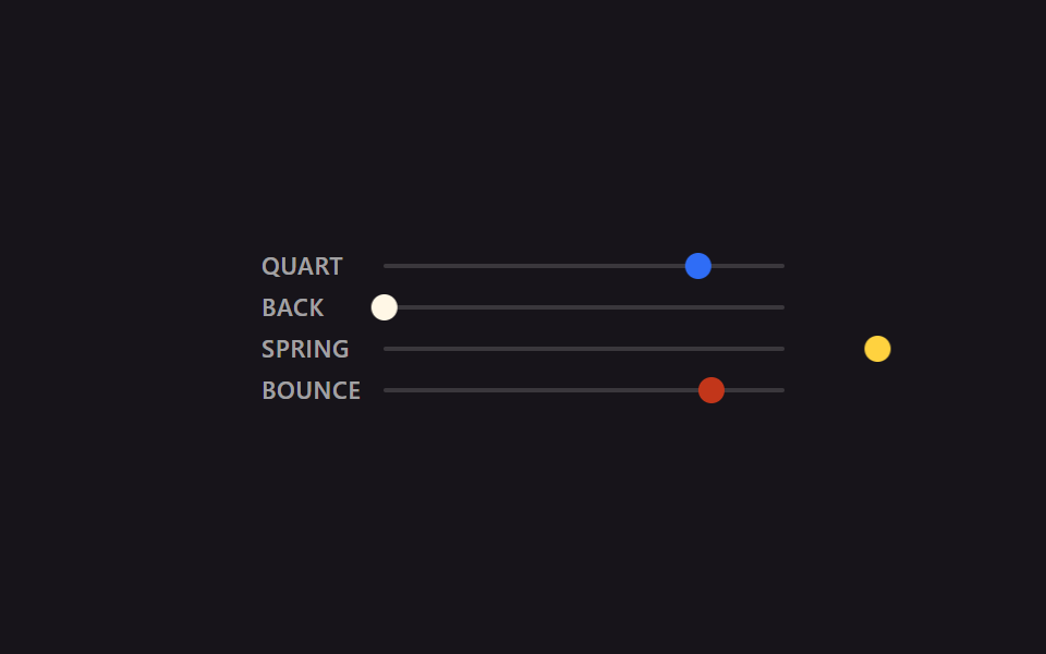
Cho bốn đường cong quart (01), back (02), spring snappy (06) và bounce (04) chạy song song cùng 2 giây, cùng quãng đường, dáng giảm tốc của chúng tách bạch ngay trước mắt bạn.
<main class="stage is-demo">
  <div class="compare">
    <div class="lane">
      <span class="label">quart</span>
      <div class="track"><div class="puck puck--quart"></div></div>
    </div>
    <div class="lane">
      <span class="label">back</span>
      <div class="track"><div class="puck puck--back"></div></div>
    </div>
    <div class="lane">
      <span class="label">spring</span>
      <div class="track"><div class="puck puck--spring"></div></div>
    </div>
    <div class="lane">
      <span class="label">bounce</span>
      <div class="track"><div class="puck puck--bounce"></div></div>
    </div>
  </div>
</main>
@use "../../../../site/static/demo-tokens" as *;
// ── 변수 3개 ──────────────────────────────────────────
$duration: $dur-loop; // 2s — 네 레인 전부 같은 길이라야 곡선 모양만으로 비교가 된다
$easing: cubic-bezier(.25, 1, .5, 1); // 대표값(quart). 레인마다 실제 값은 아래 참고
$color: $subject-blue;
@include stage($stage-ink);
$track-w: 184px;
$puck-w: $sp-3;
$travel: $track-w - $puck-w;
.compare {
display: flex;
flex-direction: column;
gap: $sp-2;
width: $track-w + $sp-12 + $sp-2; // 라벨 폭 + 간격 + 트랙 폭
}
.lane {
display: flex;
align-items: center;
gap: $sp-2;
}
.label {
width: $sp-12;
flex: 0 0 auto;
font: 600 11px/1 -apple-system, "Segoe UI", "Noto Sans KR", sans-serif;
color: rgba(255, 255, 255, .6);
text-transform: uppercase;
letter-spacing: .03em;
}
.track {
position: relative;
flex: 1 1 auto;
width: $track-w;
height: 2px;
background: rgba(255, 255, 255, .15);
border-radius: $r-xs;
}
.puck {
position: absolute;
top: 50%;
left: 0;
width: $puck-w;
height: $puck-w;
border-radius: $r-pill;
transform: translate(0, -50%);
}
.puck--quart { background: $subject-blue; }
.puck--back { background: $subject-cream; }
.puck--spring { background: $stage-yellow; }
.puck--bounce { background: $error; }
.stage.is-demo .puck--quart {
// ease-out-quart — 01번과 같은 값
animation: move $duration cubic-bezier(.25, 1, .5, 1) infinite alternate;
}
.stage.is-demo .puck--back {
// ease-in-out-back — 02번과 같은 값. 출발 전 뒤로 당겼다가 도착 뒤 넘어간다
animation: move $duration cubic-bezier(.68, -.6, .32, 1.6) infinite alternate;
}
.stage.is-demo .puck--spring {
// spring-snappy — 06번과 같은 값. 오버슈트 뒤 여러 번 오간다
animation: move $duration linear(0, .055, .197, .394, .612, .824, 1.009, 1.153, 1.25, 1.3, 1.307, 1.281, 1.231, 1.167, 1.099, 1.035, .982, .942, .916, .905, .907, .917, .935, .955, .976, .995, 1) infinite alternate;
}
.stage.is-demo .puck--bounce {
// bounce-linear — 04번과 같은 값. 방향을 안 바꾸고 매 루프 제자리로 순간 복귀한다
animation: move-once $duration linear(0, .013, .053, .118, .21, .328, .473, .643, .84, .97, .875, .807, .766, .75, .761, .798, .861, .951, .973, .943, .939, .962, .995, .984, 1) infinite;
}
@keyframes move {
from { transform: translate(0, -50%); }
to { transform: translate($travel, -50%); }
}
@keyframes move-once {
from { transform: translate(0, -50%); }
to { transform: translate($travel, -50%); }
}
@media (prefers-reduced-motion: reduce) {
.stage.is-demo .puck { animation: none; transform: translate($travel, -50%); }
}html, body {
margin: 0;
overflow: hidden;
}
.stage {
box-sizing: border-box;
min-height: 100vh;
display: grid;
place-items: center;
margin: 0;
background: #17141a;
font-family: -apple-system, "Segoe UI", "Noto Sans KR", sans-serif;
padding: clamp(8px, 4vw, 24px);
}
.compare {
display: flex;
flex-direction: column;
gap: 8px;
width: 240px;
}
.lane {
display: flex;
align-items: center;
gap: 8px;
}
.label {
width: 48px;
flex: 0 0 auto;
font: 600 11px/1 -apple-system, "Segoe UI", "Noto Sans KR", sans-serif;
color: rgba(255, 255, 255, 0.6);
text-transform: uppercase;
letter-spacing: 0.03em;
}
.track {
position: relative;
flex: 1 1 auto;
width: 184px;
height: 2px;
background: rgba(255, 255, 255, 0.15);
border-radius: 4px;
}
.puck {
position: absolute;
top: 50%;
left: 0;
width: 12px;
height: 12px;
border-radius: 999px;
transform: translate(0, -50%);
}
.puck--quart {
background: #2f6df6;
}
.puck--back {
background: #fff7e6;
}
.puck--spring {
background: #ffd23f;
}
.puck--bounce {
background: #c2361a;
}
.stage.is-demo .puck--quart {
animation: move 2s cubic-bezier(0.25, 1, 0.5, 1) infinite alternate;
}
.stage.is-demo .puck--back {
animation: move 2s cubic-bezier(0.68, -0.6, 0.32, 1.6) infinite alternate;
}
.stage.is-demo .puck--spring {
animation: move 2s linear(0, 0.055, 0.197, 0.394, 0.612, 0.824, 1.009, 1.153, 1.25, 1.3, 1.307, 1.281, 1.231, 1.167, 1.099, 1.035, 0.982, 0.942, 0.916, 0.905, 0.907, 0.917, 0.935, 0.955, 0.976, 0.995, 1) infinite alternate;
}
.stage.is-demo .puck--bounce {
animation: move-once 2s linear(0, 0.013, 0.053, 0.118, 0.21, 0.328, 0.473, 0.643, 0.84, 0.97, 0.875, 0.807, 0.766, 0.75, 0.761, 0.798, 0.861, 0.951, 0.973, 0.943, 0.939, 0.962, 0.995, 0.984, 1) infinite;
}
@keyframes move {
from {
transform: translate(0, -50%);
}
to {
transform: translate(172px, -50%);
}
}
@keyframes move-once {
from {
transform: translate(0, -50%);
}
to {
transform: translate(172px, -50%);
}
}
@media (prefers-reduced-motion: reduce) {
.stage.is-demo .puck {
animation: none;
transform: translate(172px, -50%);
}
}import type { CSSProperties } from "react";
import styles from "./EasingCompare.module.scss";
export type EasingCompareProps = {
/** 네 레인 공통 주기 (기본 2000ms) — 같은 길이라야 곡선 모양만으로 비교가 된다 */
duration?: number;
};
const LANES = [
{ key: "quart", label: "QUART", cls: styles.puckQuart },
{ key: "back", label: "BACK", cls: styles.puckBack },
{ key: "spring", label: "SPRING", cls: styles.puckSpring },
{ key: "bounce", label: "BOUNCE", cls: styles.puckBounce },
] as const;
export default function EasingCompare({ duration = 2000 }: EasingCompareProps) {
return (
<div className={styles.stage} style={{ "--duration": `${duration}ms` } as CSSProperties}>
<div className={styles.compare}>
{LANES.map((lane) => (
<div className={styles.lane} key={lane.key}>
<span className={styles.label}>{lane.label}</span>
<div className={styles.track}>
<div className={`${styles.puck} ${lane.cls}`} />
</div>
</div>
))}
</div>
</div>
);
}09 · Demo so sánh easing — Diện tích đo được 4.24% · khung hình chuyển động 23/23Nguyên tác GODRICH · SCSS và React nằm trong tệp zip · Xem mật khẩu
Làm ra nó thế nào
Ở đây không dựng giá trị mới nào, chỉ dùng lại đúng giá trị của bốn mục phía trên.
.puck--quart  { animation: move $duration cubic-bezier(.25, 1, .5, 1) infinite alternate; }
.puck--back   { animation: move $duration cubic-bezier(.68, -.6, .32, 1.6) infinite alternate; }
.puck--spring { animation: move $duration linear(0, .055, .197, .394, .612, .824, 1.009, 1.153, 1.25, 1.3, 1.307, 1.281, 1.231, 1.167, 1.099, 1.035, .982, .942, .916, .905, .907, .917, .935, .955, .976, .995, 1) infinite alternate; }
.puck--bounce {
  animation: move-once $duration linear(0, .013, .053, .118, .21, .328, .473, .643, .84, .97, .875, .807, .766, .75, .761, .798, .861, .951, .973, .943, .939, .962, .995, .984, 1) infinite;
}
Dễ vỡ ở đâu — track dọc tràn sớm hơn track ngang
Vấn đề nằm ở đâu
Mục 04 (nảy bằng linear()), thứ mà những ví dụ cubic bezier css examples thông thường không dựng nổi, ban đầu được cho rơi 180px chứ không phải 132px. Trên khung desktop 480×300 thì vẫn ổn. Vấn đề nằm ở cách site này đo hiển thị trên mobile: bóp bề ngang về 320px thì chiều cao cũng co theo đúng tỷ lệ (320×300÷480) xuống còn 200px. Track xếp dọc 180px cộng thêm lề trên dưới là vượt quá 200px; render thật rồi đo lại thì đúng là ra phần tràn.
Tránh như thế nào
Track nằm ngang còn dư chỗ trong bề rộng 320px nên thoát, riêng track dọc đụng ngay ngân sách chật hơn hẳn là chiều cao 200px; hạ track xuống 132px thì phần tràn mới biến mất. Mật khẩu được hỏi khi mở file zip là wnxge56e, nhập theo đúng hướng dẫn là bung được. Lúc thêm animation chạy theo chiều dọc, người ta rất dễ chỉ kiểm tra responsive theo bề ngang rồi bỏ qua, nhưng như bài này cho thấy, chiều cao của viewport mobile phải đo riêng.
Khả năng tiếp cận
Còn lại gì khi bật reduced-motion
Cả chín mục đều rơi về animation: none dưới prefers-reduced-motion: reduce, đồng thời ghim transform vào đúng giá trị điểm đến — mục 01, 02, 03, 05, 06, 07, 08 dừng ở cuối track (196px hoặc 188px), mục 04 dừng ở điểm rơi (108px), mục 09 thì cả bốn làn đều dừng ở điểm cuối của riêng mình. Chuyển động tắt đi nhưng khung hình tĩnh không trông như bị kẹt giữa chừng.
Ngoài ra nên chú ý
Mục đích của chính bài này là phô khác biệt hình dáng giữa các đường cong nên bật reduced-motion thì bạn không cảm được khác biệt đó, bù lại thông tin vị trí cuối vẫn còn nguyên và bố cục không hề vỡ.
Hỏi đáp (FAQ)
css transition timing function kiểu cubic-bezier khác linear() chỗ nào?
cubic-bezier() là một đường cong trơn được định nghĩa bằng bốn con số, nên nó chịu thua những chuyển động mà giá trị đổi chiều nhiều lần, kiểu quả bóng nảy thêm mấy nhịp. linear() thì liệt kê bao nhiêu điểm tùy ý để vẽ nên đường cong, nhờ vậy các giá trị lấy mẫu thẳng từ phương trình vật lý như mục 04, 05, 06 cũng bê nguyên vào được.
CSS có sẵn từ khóa riêng cho spring không?
Không có. Hàm easing chuyên dụng kiểu spring() tới giờ vẫn chưa thành chuẩn trong trình duyệt. Muốn có chuyển động trông như lò xo bằng CSS lúc này, cách thực tế là tự tính phương trình lò xo giảm chấn rồi lấy mẫu vào linear(), đúng như mục 05 và 06 đã làm.
Có cách nào lấy được mấy giá trị này mà khỏi tự tính không?
Với cubic-bezier(), bạn chép giá trị từ những danh sách preset đặt tên sẵn như easings.net cũng được, còn bảng animation trong developer tools của Chrome hay Firefox cho bạn vừa chỉnh đường cong bằng mắt vừa đọc ngay con số tương ứng. Riêng dãy mẫu của linear() thì giải thẳng phương trình bằng Python hay JavaScript như mục 04 tới 06 mới chuẩn về vật lý. Cú pháp của hai hàm nằm trong tài liệu easing-function của MDN. Các animation CSS khác bạn tìm ở trang tìm kiếm, còn cách blog này dựng demo thì có ở trang giới thiệu.
Có thể bạn cũng thích
 Phản hồi9 CSS Image Hover Effects — dán 1 dòng là chạy
 Phản hồi9 CSS Card Hover Effects — dán 1 dòng là chạy
 Phản hồi9 Tailwind v4 Animations — dán 1 dòng là chạy
 Phản hồi9 CSS Text Highlight Animation: dán 1 dòng là chạy
 Phản hồi9 css glassmorphism — dán một file là chạy
 Phản hồi9 hiệu ứng css dark mode toggle 1 dòng CSS
 Phản hồi9 micro interactions css — dán 1 dòng chạy ngay
 Phản hồi9 CSS tooltip examples — copy dán một dòng là chạy
 Phản hồi9 hiệu ứng custom cursor css — copy dán một dòng
 Phản hồi9 kiểu css typing animation, copy dán là chạy