9 CSS Particle Backgrounds — dán 1 dòng là chạy
CSS particle background là kỹ thuật rải hàng chục phần tử nhỏ — chấm, vạch, mảnh nhỏ — bằng CSS thuần rồi cho chúng tự chuyển động liên tục, không cần
 01 particle-background-snow-fall
 02 particle-background-stars-twinkle
 03 particle-background-wave-svg
 04 particle-background-rain-lines
 05 particle-background-confetti-css
 06 particle-background-bubbles-rise
 07 particle-background-fireflies
 08 particle-background-sakura-petals
 09 particle-background-fog-drift
Tự chạy · bấm ô để tới mục đó · cả 9 trong một zip
- 01 Tuyết rơi
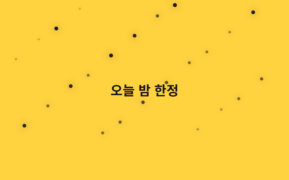
- 02 Ánh sao lấp lánh
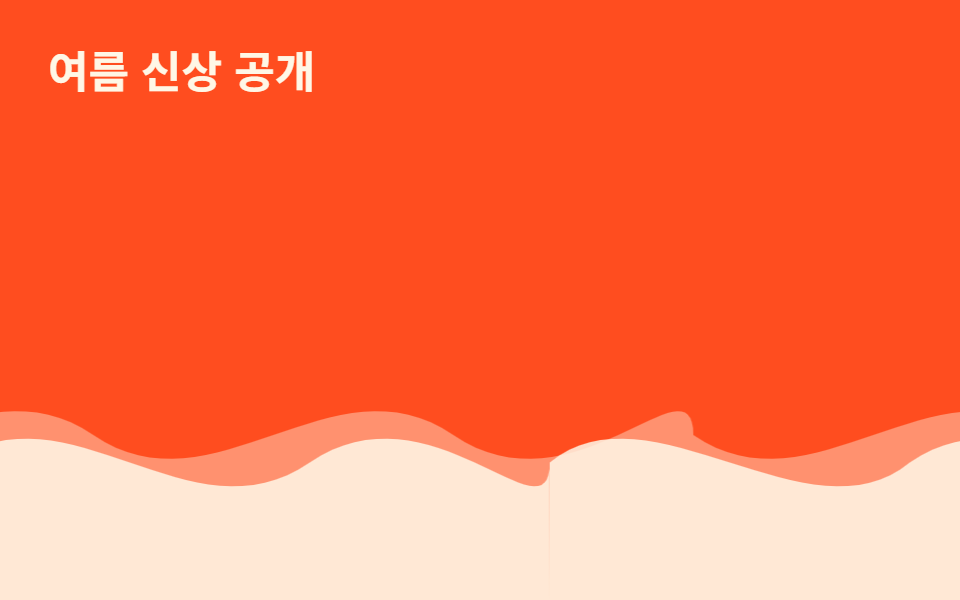
- 03 Sóng SVG
- 04 Mưa rơi
- 05 Confetti rơi
- 06 Bong bóng nổi lên
- 07 Đom đóm
- 08 Cánh hoa anh đào bay
- 09 Sương mù trôi
Chín kiểu dưới đây xếp theo hướng chuyển động của phần tử, không theo mức độ hoành tráng: rơi từ trên xuống (01, 04, 05, 08), đứng yên tại chỗ mà nhấp nháy hoặc trôi ngang (02, 03), nổi từ dưới lên (06), bay dạt bất định tại chỗ (07), rồi cả khung hình cùng dao động qua lại (09). Toàn bộ chỉ dùng transform, opacity, @keyframes, :nth-child() và custom property var() — nhóm thuộc tính này đã ở mức Baseline dùng rộng rãi nên không cần rẽ nhánh cho trình duyệt cũ. Riêng filter: blur() ở mục 09 cần Chrome 53+, Safari 9.1+ và Firefox 35+ theo bảng caniuse css-filters. Mỗi mục dưới đây chỉ trích phần SCSS tính vị trí và tốc độ của các phần tử, bản đầy đủ nằm trong file zip.
01Tuyết rơi
Bạn thấy gì
24 vòng tròn nhỏ bắt đầu từ ngoài mép trên màn hình, mỗi vòng nhận vị trí, kích thước và thời lượng rơi riêng qua nth-child rồi trôi xuống chậm bằng translateY và opacity.
<main class="stage">
  <div class="field" aria-hidden="true">
    <span class="p" style="--i:0"></span>
    <span class="p" style="--i:1"></span>
    <span class="p" style="--i:2"></span>
    <span class="p" style="--i:3"></span>
    <span class="p" style="--i:4"></span>
    <span class="p" style="--i:5"></span>
    <span class="p" style="--i:6"></span>
    <span class="p" style="--i:7"></span>
    <span class="p" style="--i:8"></span>
    <span class="p" style="--i:9"></span>
    <span class="p" style="--i:10"></span>
    <span class="p" style="--i:11"></span>
    <span class="p" style="--i:12"></span>
    <span class="p" style="--i:13"></span>
    <span class="p" style="--i:14"></span>
    <span class="p" style="--i:15"></span>
    <span class="p" style="--i:16"></span>
    <span class="p" style="--i:17"></span>
    <span class="p" style="--i:18"></span>
    <span class="p" style="--i:19"></span>
    <span class="p" style="--i:20"></span>
    <span class="p" style="--i:21"></span>
    <span class="p" style="--i:22"></span>
    <span class="p" style="--i:23"></span>
  </div>
  <p class="caption">Sale Cuối Năm</p>
</main>@use "../../../../site/static/demo-tokens" as *;
// ── 변수 3개 ──────────────────────────────
$duration: $dur-loop * 3; // 6s — 눈송이가 위에서 아래까지 떨어지는 기준 시간
$easing: linear; // 일정한 속도로 낙하 (spring 은 눈에 안 맞는다)
$color: $subject-cream;
// ── 데모 무대 ───────────────────────────────
@include stage($stage-ink);
.field { position: absolute; inset: 0; overflow: hidden; pointer-events: none; }
.caption {
position: relative; z-index: 1; margin: 0;
color: $subject-cream; font-weight: 700; font-size: clamp(16px, 5vw, 22px); line-height: 1; font-family: inherit;
text-shadow: 0 2px 8px rgba($stage-ink, .6);
}
.p {
position: absolute;
top: -8%;
left: 0;
width: 6px; height: 6px;
border-radius: 50%;
background: $color;
opacity: 0;
animation: fall $duration $easing infinite;
animation-delay: calc(var(--i) * -0.28s); // 음수 지연 — 처음부터 이미 흩어져 떨어지고 있는 것처럼
}
// nth-child 로 항목마다 다른 가로 위치·크기·속도 (SCSS 컴파일 시 고정, --i 는 지연에만 쓴다)
@for $i from 1 through 24 {
.p:nth-child(#{$i}) {
left: ((($i * 53) % 97)) * 1%;
$s: 4px + ($i % 4) * 2px;
width: $s; height: $s;
animation-duration: $duration + ($i % 5) * .6s;
}
}
@keyframes fall {
0% { transform: translateY(0) translateX(0); opacity: 0; }
8% { opacity: .9; }
92% { opacity: .85; }
100% { transform: translateY(340px) translateX(14px); opacity: 0; }
}
// ── 접근성: 움직임 줄이기 설정이면 제자리에 흐릿하게만 ────────────
@media (prefers-reduced-motion: reduce) {
.p { animation: none; opacity: .35; top: 40%; }
}html, body {
margin: 0;
overflow: hidden;
}
.stage {
box-sizing: border-box;
min-height: 100vh;
display: grid;
place-items: center;
margin: 0;
background: #17141a;
font-family: -apple-system, "Segoe UI", "Noto Sans KR", sans-serif;
padding: clamp(8px, 4vw, 24px);
}
.field {
position: absolute;
inset: 0;
overflow: hidden;
pointer-events: none;
}
.caption {
position: relative;
z-index: 1;
margin: 0;
color: #fff7e6;
font-weight: 700;
font-size: clamp(16px, 5vw, 22px);
line-height: 1;
font-family: inherit;
text-shadow: 0 2px 8px rgba(23, 20, 26, 0.6);
}
.p {
position: absolute;
top: -8%;
left: 0;
width: 6px;
height: 6px;
border-radius: 50%;
background: #fff7e6;
opacity: 0;
animation: fall 6s linear infinite;
animation-delay: calc(var(--i) * -0.28s);
}
.p:nth-child(1) {
left: 53%;
width: 6px;
height: 6px;
animation-duration: 6.6s;
}
.p:nth-child(2) {
left: 9%;
width: 8px;
height: 8px;
animation-duration: 7.2s;
}
.p:nth-child(3) {
left: 62%;
width: 10px;
height: 10px;
animation-duration: 7.8s;
}
.p:nth-child(4) {
left: 18%;
width: 4px;
height: 4px;
animation-duration: 8.4s;
}
.p:nth-child(5) {
left: 71%;
width: 6px;
height: 6px;
animation-duration: 6s;
}
.p:nth-child(6) {
left: 27%;
width: 8px;
height: 8px;
animation-duration: 6.6s;
}
.p:nth-child(7) {
left: 80%;
width: 10px;
height: 10px;
animation-duration: 7.2s;
}
.p:nth-child(8) {
left: 36%;
width: 4px;
height: 4px;
animation-duration: 7.8s;
}
.p:nth-child(9) {
left: 89%;
width: 6px;
height: 6px;
animation-duration: 8.4s;
}
.p:nth-child(10) {
left: 45%;
width: 8px;
height: 8px;
animation-duration: 6s;
}
.p:nth-child(11) {
left: 1%;
width: 10px;
height: 10px;
animation-duration: 6.6s;
}
.p:nth-child(12) {
left: 54%;
width: 4px;
height: 4px;
animation-duration: 7.2s;
}
.p:nth-child(13) {
left: 10%;
width: 6px;
height: 6px;
animation-duration: 7.8s;
}
.p:nth-child(14) {
left: 63%;
width: 8px;
height: 8px;
animation-duration: 8.4s;
}
.p:nth-child(15) {
left: 19%;
width: 10px;
height: 10px;
animation-duration: 6s;
}
.p:nth-child(16) {
left: 72%;
width: 4px;
height: 4px;
animation-duration: 6.6s;
}
.p:nth-child(17) {
left: 28%;
width: 6px;
height: 6px;
animation-duration: 7.2s;
}
.p:nth-child(18) {
left: 81%;
width: 8px;
height: 8px;
animation-duration: 7.8s;
}
.p:nth-child(19) {
left: 37%;
width: 10px;
height: 10px;
animation-duration: 8.4s;
}
.p:nth-child(20) {
left: 90%;
width: 4px;
height: 4px;
animation-duration: 6s;
}
.p:nth-child(21) {
left: 46%;
width: 6px;
height: 6px;
animation-duration: 6.6s;
}
.p:nth-child(22) {
left: 2%;
width: 8px;
height: 8px;
animation-duration: 7.2s;
}
.p:nth-child(23) {
left: 55%;
width: 10px;
height: 10px;
animation-duration: 7.8s;
}
.p:nth-child(24) {
left: 11%;
width: 4px;
height: 4px;
animation-duration: 8.4s;
}
@keyframes fall {
0% {
transform: translateY(0) translateX(0);
opacity: 0;
}
8% {
opacity: 0.9;
}
92% {
opacity: 0.85;
}
100% {
transform: translateY(340px) translateX(14px);
opacity: 0;
}
}
@media (prefers-reduced-motion: reduce) {
.p {
animation: none;
opacity: 0.35;
top: 40%;
}
}import type { CSSProperties } from "react";
import styles from "./SnowFall.module.scss";
export type SnowFallProps = {
/** 애니메이션 기준 시간(ms) */
duration?: number;
/** CSS easing */
easing?: string;
/** 피사체 색 */
color?: string;
};
type Vars = CSSProperties & { "--i"?: number };
const COUNT = 24;
export default function SnowFall({
duration = 6000,
easing = "linear",
color = "#fff7e6",
}: SnowFallProps) {
const vars = {
"--duration": `${duration}ms`,
"--easing": easing,
"--color": color,
} as CSSProperties;
return (
<div className={styles.field} style={vars} aria-hidden="true">
{Array.from({ length: COUNT }, (_, i) => (
<span key={i} className={styles.p} style={{ "--i": i } as Vars} />
))}
</div>
);
}01 · Tuyết rơi — Diện tích đo được 11.553% · khung hình chuyển động 23/23Nguyên tác GODRICH · SCSS và React nằm trong tệp zip · Xem mật khẩu
Dùng ở đâu
Hợp với nền hero khuyến mãi mùa đông hoặc đầu trang landing cuối năm.
.p {
  position: absolute; top: -8%; left: 0;
  width: 6px; height: 6px; border-radius: 50%;
  animation: fall 6s linear infinite;
  animation-delay: calc(var(--i) * -0.28s);
}
@for $i from 1 through 24 {
  .p:nth-child(#{$i}) { left: #{($i * 53) % 97}%; }
}
@keyframes fall {
  0%   { transform: translateY(0); opacity: 0; }
  100% { transform: translateY(340px); opacity: 0; }
}
02Ánh sao lấp lánh
Chuyện gì diễn ra trên màn hình
24 chấm rải khắp màn hình, mỗi chấm nhận một độ trễ riêng qua nth-child rồi mờ dần giữa opacity 0.2 và 1 không đồng bộ với nhau.
<main class="stage">
  <div class="field" aria-hidden="true">
    <span class="p" style="--i:0"></span>
    <span class="p" style="--i:1"></span>
    <span class="p" style="--i:2"></span>
    <span class="p" style="--i:3"></span>
    <span class="p" style="--i:4"></span>
    <span class="p" style="--i:5"></span>
    <span class="p" style="--i:6"></span>
    <span class="p" style="--i:7"></span>
    <span class="p" style="--i:8"></span>
    <span class="p" style="--i:9"></span>
    <span class="p" style="--i:10"></span>
    <span class="p" style="--i:11"></span>
    <span class="p" style="--i:12"></span>
    <span class="p" style="--i:13"></span>
    <span class="p" style="--i:14"></span>
    <span class="p" style="--i:15"></span>
    <span class="p" style="--i:16"></span>
    <span class="p" style="--i:17"></span>
    <span class="p" style="--i:18"></span>
    <span class="p" style="--i:19"></span>
    <span class="p" style="--i:20"></span>
    <span class="p" style="--i:21"></span>
    <span class="p" style="--i:22"></span>
    <span class="p" style="--i:23"></span>
  </div>
  <p class="caption">Chỉ Đêm Nay</p>
</main>@use "../../../../site/static/demo-tokens" as *;
// ── 변수 3개 ──────────────────────────────
$duration: $dur-base * 6; // 1.8s 기준 — 항목마다 다르게 늘려 불규칙해 보이게 한다
$easing: ease-in-out;
$color: $subject-ink;
// ── 데모 무대 ───────────────────────────────
@include stage($stage-yellow);
.field { position: absolute; inset: 0; overflow: hidden; pointer-events: none; }
.caption {
position: relative; z-index: 1; margin: 0;
color: $subject-ink; font-weight: 700; font-size: clamp(16px, 5vw, 22px); line-height: 1; font-family: inherit;
}
.p {
position: absolute;
width: 5px; height: 5px;
border-radius: 50%;
background: $color;
box-shadow: 0 0 10px rgba($color, .55);
opacity: .2;
animation: twinkle $duration $easing infinite;
animation-delay: calc(var(--i) * -0.31s);
}
@for $i from 1 through 24 {
.p:nth-child(#{$i}) {
left: ((($i * 41) % 93)) * 1%;
top: ((($i * 67) % 80)) * 1%;
animation-duration: $duration + ($i % 5) * .35s;
}
}
@keyframes twinkle {
0%, 100% { transform: scale(.7); opacity: .2; }
50% { transform: scale(1.3); opacity: 1; }
}
// ── 접근성: 반짝임을 끄고 희미한 별만 남긴다 ────────────
@media (prefers-reduced-motion: reduce) {
.p { animation: none; opacity: .55; }
}html, body {
margin: 0;
overflow: hidden;
}
.stage {
box-sizing: border-box;
min-height: 100vh;
display: grid;
place-items: center;
margin: 0;
background: #ffd23f;
font-family: -apple-system, "Segoe UI", "Noto Sans KR", sans-serif;
padding: clamp(8px, 4vw, 24px);
}
.field {
position: absolute;
inset: 0;
overflow: hidden;
pointer-events: none;
}
.caption {
position: relative;
z-index: 1;
margin: 0;
color: #17141a;
font-weight: 700;
font-size: clamp(16px, 5vw, 22px);
line-height: 1;
font-family: inherit;
}
.p {
position: absolute;
width: 5px;
height: 5px;
border-radius: 50%;
background: #17141a;
box-shadow: 0 0 10px rgba(23, 20, 26, 0.55);
opacity: 0.2;
animation: twinkle 1800ms ease-in-out infinite;
animation-delay: calc(var(--i) * -0.31s);
}
.p:nth-child(1) {
left: 41%;
top: 67%;
animation-duration: 2150ms;
}
.p:nth-child(2) {
left: 82%;
top: 54%;
animation-duration: 2500ms;
}
.p:nth-child(3) {
left: 30%;
top: 41%;
animation-duration: 2850ms;
}
.p:nth-child(4) {
left: 71%;
top: 28%;
animation-duration: 3200ms;
}
.p:nth-child(5) {
left: 19%;
top: 15%;
animation-duration: 1800ms;
}
.p:nth-child(6) {
left: 60%;
top: 2%;
animation-duration: 2150ms;
}
.p:nth-child(7) {
left: 8%;
top: 69%;
animation-duration: 2500ms;
}
.p:nth-child(8) {
left: 49%;
top: 56%;
animation-duration: 2850ms;
}
.p:nth-child(9) {
left: 90%;
top: 43%;
animation-duration: 3200ms;
}
.p:nth-child(10) {
left: 38%;
top: 30%;
animation-duration: 1800ms;
}
.p:nth-child(11) {
left: 79%;
top: 17%;
animation-duration: 2150ms;
}
.p:nth-child(12) {
left: 27%;
top: 4%;
animation-duration: 2500ms;
}
.p:nth-child(13) {
left: 68%;
top: 71%;
animation-duration: 2850ms;
}
.p:nth-child(14) {
left: 16%;
top: 58%;
animation-duration: 3200ms;
}
.p:nth-child(15) {
left: 57%;
top: 45%;
animation-duration: 1800ms;
}
.p:nth-child(16) {
left: 5%;
top: 32%;
animation-duration: 2150ms;
}
.p:nth-child(17) {
left: 46%;
top: 19%;
animation-duration: 2500ms;
}
.p:nth-child(18) {
left: 87%;
top: 6%;
animation-duration: 2850ms;
}
.p:nth-child(19) {
left: 35%;
top: 73%;
animation-duration: 3200ms;
}
.p:nth-child(20) {
left: 76%;
top: 60%;
animation-duration: 1800ms;
}
.p:nth-child(21) {
left: 24%;
top: 47%;
animation-duration: 2150ms;
}
.p:nth-child(22) {
left: 65%;
top: 34%;
animation-duration: 2500ms;
}
.p:nth-child(23) {
left: 13%;
top: 21%;
animation-duration: 2850ms;
}
.p:nth-child(24) {
left: 54%;
top: 8%;
animation-duration: 3200ms;
}
@keyframes twinkle {
0%, 100% {
transform: scale(0.7);
opacity: 0.2;
}
50% {
transform: scale(1.3);
opacity: 1;
}
}
@media (prefers-reduced-motion: reduce) {
.p {
animation: none;
opacity: 0.55;
}
}import type { CSSProperties } from "react";
import styles from "./StarsTwinkle.module.scss";
export type StarsTwinkleProps = {
/** 애니메이션 기준 시간(ms) */
duration?: number;
/** CSS easing */
easing?: string;
/** 피사체 색 */
color?: string;
};
type Vars = CSSProperties & { "--i"?: number };
const COUNT = 24;
export default function StarsTwinkle({
duration = 1800,
easing = "ease-in-out",
color = "#17141a",
}: StarsTwinkleProps) {
const vars = {
"--duration": `${duration}ms`,
"--easing": easing,
"--color": color,
} as CSSProperties;
return (
<div className={styles.field} style={vars} aria-hidden="true">
{Array.from({ length: COUNT }, (_, i) => (
<span key={i} className={styles.p} style={{ "--i": i } as Vars} />
))}
</div>
);
}02 · Ánh sao lấp lánh — Diện tích đo được 0.894% · khung hình chuyển động 23/23Nguyên tác GODRICH · SCSS và React nằm trong tệp zip · Xem mật khẩu
Chỗ dùng
Hợp với hero landing chế độ tối hoặc trang sự kiện chủ đề ban đêm.
.p {
  position: absolute; width: 5px; height: 5px; border-radius: 50%;
  box-shadow: 0 0 10px rgba(23, 20, 26, .55);
  animation: twinkle 1.8s ease-in-out infinite;
  animation-delay: calc(var(--i) * -0.31s);
}
@keyframes twinkle {
  0%, 100% { transform: scale(.7); opacity: .2; }
  50%      { transform: scale(1.3); opacity: 1; }
}
03Sóng SVG
Chuyển động thế nào
Hai path sóng SVG chồng lên nhau lặp translateX theo hai hướng ngược nhau; vì đúng chỗ nối lại là cùng một hình nên dòng chảy không lộ đường ghép.
<main class="stage">
  <div class="waves" aria-hidden="true">
  <div class="layer layer--back">
    <svg class="wave" viewBox="0 0 480 120" preserveAspectRatio="none" aria-hidden="true"><path d="M0,60 C60,90 120,30 180,60 C240,90 300,30 360,60 C420,90 480,30 480,60 L480,120 L0,120 Z"/></svg>
    <svg class="wave" viewBox="0 0 480 120" preserveAspectRatio="none" aria-hidden="true"><path d="M0,60 C60,90 120,30 180,60 C240,90 300,30 360,60 C420,90 480,30 480,60 L480,120 L0,120 Z"/></svg>
  </div>
  <div class="layer layer--front">
    <svg class="wave" viewBox="0 0 480 120" preserveAspectRatio="none" aria-hidden="true"><path d="M0,70 C50,40 130,100 180,70 C240,40 300,100 360,70 C420,40 480,100 480,70 L480,120 L0,120 Z"/></svg>
    <svg class="wave" viewBox="0 0 480 120" preserveAspectRatio="none" aria-hidden="true"><path d="M0,70 C50,40 130,100 180,70 C240,40 300,100 360,70 C420,40 480,100 480,70 L480,120 L0,120 Z"/></svg>
  </div>
  </div>
  <p class="caption">Hàng Mới Mùa Hè</p>
</main>
@use "../../../../site/static/demo-tokens" as *;
// ── 변수 3개 ──────────────────────────────
$duration: $dur-loop * 3; // 6s — 뒤 레이어 한 바퀴
$easing: linear;
$color: $subject-cream;
// ── 데모 무대 ───────────────────────────────
@include stage($stage-orange);
.caption {
position: absolute; z-index: 1; top: $sp-6; left: $sp-6; margin: 0;
color: $subject-cream; font-weight: 700; font-size: clamp(16px, 5vw, 22px); line-height: 1; font-family: inherit;
}
// .layer 는 폭 200%로 뷰포트 밖까지 나간다 — 문서 스크롤을 부풀리지 않도록 .waves 로 먼저 가둔다 (BD8)
.waves { position: absolute; inset: 0; overflow: hidden; }
// 물결은 같은 SVG 를 두 장 나란히(각 50%) 붙여 폭 200%로 만들고, 정확히 -50% 만큼 옮기면
// 이어붙인 자리가 서로 같은 그림이라 이음새 없이 반복된다 (마퀴와 같은 원리, flex gap 은 안 쓴다)
.layer {
position: absolute; left: 0; right: 0; bottom: 0; height: 55%;
display: flex; width: 200%;
}
.wave { width: 50%; height: 100%; flex: none; display: block; fill: $color; }
.layer--back {
opacity: .4;
animation: drift $duration $easing infinite;
}
.layer--front {
opacity: .85;
animation: drift ($duration * .65) $easing infinite;
}
@keyframes drift {
from { transform: translateX(0); }
to { transform: translateX(-50%); }
}
// ── 접근성: 물결을 멈추고 정지 이미지로 ────────────
@media (prefers-reduced-motion: reduce) {
.layer { animation: none; }
}html, body {
margin: 0;
overflow: hidden;
}
.stage {
box-sizing: border-box;
min-height: 100vh;
display: grid;
place-items: center;
margin: 0;
background: #ff4d1f;
font-family: -apple-system, "Segoe UI", "Noto Sans KR", sans-serif;
padding: clamp(8px, 4vw, 24px);
}
.caption {
position: absolute;
z-index: 1;
top: 24px;
left: 24px;
margin: 0;
color: #fff7e6;
font-weight: 700;
font-size: clamp(16px, 5vw, 22px);
line-height: 1;
font-family: inherit;
}
.waves {
position: absolute;
inset: 0;
overflow: hidden;
}
.layer {
position: absolute;
left: 0;
right: 0;
bottom: 0;
height: 55%;
display: flex;
width: 200%;
}
.wave {
width: 50%;
height: 100%;
flex: none;
display: block;
fill: #fff7e6;
}
.layer--back {
opacity: 0.4;
animation: drift 6s linear infinite;
}
.layer--front {
opacity: 0.85;
animation: drift 3.9s linear infinite;
}
@keyframes drift {
from {
transform: translateX(0);
}
to {
transform: translateX(-50%);
}
}
@media (prefers-reduced-motion: reduce) {
.layer {
animation: none;
}
}import type { CSSProperties } from "react";
import styles from "./SvgWave.module.scss";
export type SvgWaveProps = {
/** 애니메이션 기준 시간(ms) */
duration?: number;
/** CSS easing */
easing?: string;
/** 피사체 색 */
color?: string;
};
type Vars = CSSProperties & { "--i"?: number };
const COUNT = 4;
export default function SvgWave({
duration = 6000,
easing = "linear",
color = "#fff7e6",
}: SvgWaveProps) {
const vars = {
"--duration": `${duration}ms`,
"--easing": easing,
"--color": color,
} as CSSProperties;
return (
<div className={styles.stage} style={vars}>
<div className={styles.layerBack}>
<svg className={styles.wave} viewBox="0 0 480 120" preserveAspectRatio="none" aria-hidden="true"><path d="M0,60 C60,90 120,30 180,60 C240,90 300,30 360,60 C420,90 480,30 480,60 L480,120 L0,120 Z" /></svg>
<svg className={styles.wave} viewBox="0 0 480 120" preserveAspectRatio="none" aria-hidden="true"><path d="M0,60 C60,90 120,30 180,60 C240,90 300,30 360,60 C420,90 480,30 480,60 L480,120 L0,120 Z" /></svg>
</div>
<div className={styles.layerFront}>
<svg className={styles.wave} viewBox="0 0 480 120" preserveAspectRatio="none" aria-hidden="true"><path d="M0,70 C50,40 130,100 180,70 C240,40 300,100 360,70 C420,40 480,100 480,70 L480,120 L0,120 Z" /></svg>
<svg className={styles.wave} viewBox="0 0 480 120" preserveAspectRatio="none" aria-hidden="true"><path d="M0,70 C50,40 130,100 180,70 C240,40 300,100 360,70 C420,40 480,100 480,70 L480,120 L0,120 Z" /></svg>
</div>
</div>
);
}03 · Sóng SVG — Diện tích đo được 12.781% · khung hình chuyển động 23/23Nguyên tác GODRICH · SCSS và React nằm trong tệp zip · Xem mật khẩu
Dùng khi nào
Hợp với đường viền cuối section giới thiệu sản phẩm hoặc nền landing biển và du lịch.
.layer { position: absolute; left: 0; right: 0; bottom: 0; display: flex; width: 200%; }
.wave { width: 50%; flex: none; }
.layer--back  { animation: drift 6s linear infinite; }
.layer--front { animation: drift 3.9s linear infinite; }
@keyframes drift {
  from { transform: translateX(0); }
  to   { transform: translateX(-50%); }
}
04Mưa rơi
Bạn thấy gì
22 đường kẻ mảnh rơi chéo nhanh bằng translate ở cùng một độ nghiêng cố định, mỗi đường lệch một chút vị trí và thời điểm rơi qua nth-child nên trông như một chùm mưa.
<main class="stage">
  <div class="field" aria-hidden="true">
    <span class="p" style="--i:0"></span>
    <span class="p" style="--i:1"></span>
    <span class="p" style="--i:2"></span>
    <span class="p" style="--i:3"></span>
    <span class="p" style="--i:4"></span>
    <span class="p" style="--i:5"></span>
    <span class="p" style="--i:6"></span>
    <span class="p" style="--i:7"></span>
    <span class="p" style="--i:8"></span>
    <span class="p" style="--i:9"></span>
    <span class="p" style="--i:10"></span>
    <span class="p" style="--i:11"></span>
    <span class="p" style="--i:12"></span>
    <span class="p" style="--i:13"></span>
    <span class="p" style="--i:14"></span>
    <span class="p" style="--i:15"></span>
    <span class="p" style="--i:16"></span>
    <span class="p" style="--i:17"></span>
    <span class="p" style="--i:18"></span>
    <span class="p" style="--i:19"></span>
    <span class="p" style="--i:20"></span>
    <span class="p" style="--i:21"></span>
  </div>
  <p class="caption">Sale Mùa Mưa</p>
</main>@use "../../../../site/static/demo-tokens" as *;
// ── 변수 3개 ──────────────────────────────
$duration: $dur-base * 2; // .6s 기준 — 빗줄기 한 번 떨어지는 시간
$easing: linear;
$color: $subject-blue;
// ── 데모 무대 ───────────────────────────────
@include stage($stage-paper);
.field { position: absolute; inset: 0; overflow: hidden; pointer-events: none; }
.caption {
position: relative; z-index: 1; margin: 0;
color: $subject-ink; font-weight: 700; font-size: clamp(16px, 5vw, 22px); line-height: 1; font-family: inherit;
}
.p {
position: absolute;
top: -12%;
width: 2px; height: 22px;
border-radius: $r-xs;
background: linear-gradient(rgba($color, 0), $color);
opacity: .7;
transform: rotate(12deg);
animation: rain $duration $easing infinite;
animation-delay: calc(var(--i) * -0.07s);
}
@for $i from 1 through 22 {
.p:nth-child(#{$i}) {
left: ((($i * 37) % 96)) * 1%;
animation-duration: $duration + ($i % 4) * .1s;
}
}
@keyframes rain {
0% { transform: translateY(0) translateX(0) rotate(12deg); opacity: .7; }
100% { transform: translateY(380px) translateX(60px) rotate(12deg); opacity: .3; }
}
// ── 접근성: 대각선 낙하를 멈추고 흐린 선만 남긴다 ────────────
@media (prefers-reduced-motion: reduce) {
.p { animation: none; opacity: .25; top: 45%; }
}html, body {
margin: 0;
overflow: hidden;
}
.stage {
box-sizing: border-box;
min-height: 100vh;
display: grid;
place-items: center;
margin: 0;
background: #ffffff;
font-family: -apple-system, "Segoe UI", "Noto Sans KR", sans-serif;
padding: clamp(8px, 4vw, 24px);
}
.field {
position: absolute;
inset: 0;
overflow: hidden;
pointer-events: none;
}
.caption {
position: relative;
z-index: 1;
margin: 0;
color: #17141a;
font-weight: 700;
font-size: clamp(16px, 5vw, 22px);
line-height: 1;
font-family: inherit;
}
.p {
position: absolute;
top: -12%;
width: 2px;
height: 22px;
border-radius: 4px;
background: linear-gradient(rgba(47, 109, 246, 0), #2f6df6);
opacity: 0.7;
transform: rotate(12deg);
animation: rain 600ms linear infinite;
animation-delay: calc(var(--i) * -0.07s);
}
.p:nth-child(1) {
left: 37%;
animation-duration: 700ms;
}
.p:nth-child(2) {
left: 74%;
animation-duration: 800ms;
}
.p:nth-child(3) {
left: 15%;
animation-duration: 900ms;
}
.p:nth-child(4) {
left: 52%;
animation-duration: 600ms;
}
.p:nth-child(5) {
left: 89%;
animation-duration: 700ms;
}
.p:nth-child(6) {
left: 30%;
animation-duration: 800ms;
}
.p:nth-child(7) {
left: 67%;
animation-duration: 900ms;
}
.p:nth-child(8) {
left: 8%;
animation-duration: 600ms;
}
.p:nth-child(9) {
left: 45%;
animation-duration: 700ms;
}
.p:nth-child(10) {
left: 82%;
animation-duration: 800ms;
}
.p:nth-child(11) {
left: 23%;
animation-duration: 900ms;
}
.p:nth-child(12) {
left: 60%;
animation-duration: 600ms;
}
.p:nth-child(13) {
left: 1%;
animation-duration: 700ms;
}
.p:nth-child(14) {
left: 38%;
animation-duration: 800ms;
}
.p:nth-child(15) {
left: 75%;
animation-duration: 900ms;
}
.p:nth-child(16) {
left: 16%;
animation-duration: 600ms;
}
.p:nth-child(17) {
left: 53%;
animation-duration: 700ms;
}
.p:nth-child(18) {
left: 90%;
animation-duration: 800ms;
}
.p:nth-child(19) {
left: 31%;
animation-duration: 900ms;
}
.p:nth-child(20) {
left: 68%;
animation-duration: 600ms;
}
.p:nth-child(21) {
left: 9%;
animation-duration: 700ms;
}
.p:nth-child(22) {
left: 46%;
animation-duration: 800ms;
}
@keyframes rain {
0% {
transform: translateY(0) translateX(0) rotate(12deg);
opacity: 0.7;
}
100% {
transform: translateY(380px) translateX(60px) rotate(12deg);
opacity: 0.3;
}
}
@media (prefers-reduced-motion: reduce) {
.p {
animation: none;
opacity: 0.25;
top: 45%;
}
}import type { CSSProperties } from "react";
import styles from "./RainLines.module.scss";
export type RainLinesProps = {
/** 애니메이션 기준 시간(ms) */
duration?: number;
/** CSS easing */
easing?: string;
/** 피사체 색 */
color?: string;
};
type Vars = CSSProperties & { "--i"?: number };
const COUNT = 22;
export default function RainLines({
duration = 600,
easing = "linear",
color = "#2f6df6",
}: RainLinesProps) {
const vars = {
"--duration": `${duration}ms`,
"--easing": easing,
"--color": color,
} as CSSProperties;
return (
<div className={styles.field} style={vars} aria-hidden="true">
{Array.from({ length: COUNT }, (_, i) => (
<span key={i} className={styles.p} style={{ "--i": i } as Vars} />
))}
</div>
);
}04 · Mưa rơi — Diện tích đo được 12.851% · khung hình chuyển động 23/23Nguyên tác GODRICH · SCSS và React nằm trong tệp zip · Xem mật khẩu
Dùng ở đâu
Hợp với nền khuyến mãi mùa mưa hoặc màn hình giới thiệu app thời tiết.
.p {
  position: absolute; top: -12%; width: 2px; height: 22px;
  transform: rotate(12deg);
  animation: rain .6s linear infinite;
  animation-delay: calc(var(--i) * -0.07s);
}
@keyframes rain {
  0%   { transform: translateY(0) translateX(0) rotate(12deg); opacity: .7; }
  100% { transform: translateY(380px) translateX(60px) rotate(12deg); opacity: .3; }
}
05Confetti rơi
Chuyện gì diễn ra trên màn hình
26 mảnh hình chữ nhật vừa rơi vừa xoay để bay phấp phới, một nửa xoay theo chiều kim đồng hồ và nửa kia ngược lại, còn nth-child đổi màu xen kẽ mỗi 3 phần tử.
<main class="stage">
  <div class="field" aria-hidden="true">
    <span class="p" style="--i:0"></span>
    <span class="p" style="--i:1"></span>
    <span class="p" style="--i:2"></span>
    <span class="p" style="--i:3"></span>
    <span class="p" style="--i:4"></span>
    <span class="p" style="--i:5"></span>
    <span class="p" style="--i:6"></span>
    <span class="p" style="--i:7"></span>
    <span class="p" style="--i:8"></span>
    <span class="p" style="--i:9"></span>
    <span class="p" style="--i:10"></span>
    <span class="p" style="--i:11"></span>
    <span class="p" style="--i:12"></span>
    <span class="p" style="--i:13"></span>
    <span class="p" style="--i:14"></span>
    <span class="p" style="--i:15"></span>
    <span class="p" style="--i:16"></span>
    <span class="p" style="--i:17"></span>
    <span class="p" style="--i:18"></span>
    <span class="p" style="--i:19"></span>
    <span class="p" style="--i:20"></span>
    <span class="p" style="--i:21"></span>
    <span class="p" style="--i:22"></span>
    <span class="p" style="--i:23"></span>
    <span class="p" style="--i:24"></span>
    <span class="p" style="--i:25"></span>
  </div>
  <p class="caption">Chào Mừng Bạn</p>
</main>@use "../../../../site/static/demo-tokens" as *;
// ── 변수 3개 ──────────────────────────────
$duration: $dur-enter * 4; // 2.4s 기준
$easing: linear;
$color: $subject-cream;
// ── 데모 무대 ───────────────────────────────
@include stage($stage-ink);
.field { position: absolute; inset: 0; overflow: hidden; pointer-events: none; }
.caption {
position: relative; z-index: 1; margin: 0;
color: $subject-cream; font-weight: 700; font-size: clamp(16px, 5vw, 22px); line-height: 1; font-family: inherit;
}
.p {
position: absolute;
top: -10%;
width: 7px; height: 11px;
background: $color;
opacity: .95;
animation: confetti $duration $easing infinite;
animation-delay: calc(var(--i) * -0.2s);
}
// 3개마다 색을 cream ↔ blue 로 번갈아 섞는다 (팔레트 안에서만)
.p:nth-child(3n) { background: $subject-blue; }
@for $i from 1 through 26 {
.p:nth-child(#{$i}) {
left: ((($i * 31) % 94)) * 1%;
animation-duration: $duration + ($i % 5) * .3s;
}
}
@for $i from 1 through 13 {
.p:nth-child(#{$i * 2}) {
--spin: #{240deg + ($i % 6) * 60deg};
}
.p:nth-child(#{$i * 2 - 1}) {
--spin: #{-1 * (240deg + ($i % 6) * 60deg)};
}
}
@keyframes confetti {
0% { transform: translateY(0) rotate(0deg); opacity: 0; }
8% { opacity: .95; }
100% { transform: translateY(360px) rotate(var(--spin, 360deg)); opacity: .85; }
}
// ── 접근성: 회전·낙하를 멈추고 흐린 조각만 남긴다 ────────────
@media (prefers-reduced-motion: reduce) {
.p { animation: none; opacity: .3; top: 45%; }
}html, body {
margin: 0;
overflow: hidden;
}
.stage {
box-sizing: border-box;
min-height: 100vh;
display: grid;
place-items: center;
margin: 0;
background: #17141a;
font-family: -apple-system, "Segoe UI", "Noto Sans KR", sans-serif;
padding: clamp(8px, 4vw, 24px);
}
.field {
position: absolute;
inset: 0;
overflow: hidden;
pointer-events: none;
}
.caption {
position: relative;
z-index: 1;
margin: 0;
color: #fff7e6;
font-weight: 700;
font-size: clamp(16px, 5vw, 22px);
line-height: 1;
font-family: inherit;
}
.p {
position: absolute;
top: -10%;
width: 7px;
height: 11px;
background: #fff7e6;
opacity: 0.95;
animation: confetti 2400ms linear infinite;
animation-delay: calc(var(--i) * -0.2s);
}
.p:nth-child(3n) {
background: #2f6df6;
}
.p:nth-child(1) {
left: 31%;
animation-duration: 2700ms;
}
.p:nth-child(2) {
left: 62%;
animation-duration: 3000ms;
}
.p:nth-child(3) {
left: 93%;
animation-duration: 3300ms;
}
.p:nth-child(4) {
left: 30%;
animation-duration: 3600ms;
}
.p:nth-child(5) {
left: 61%;
animation-duration: 2400ms;
}
.p:nth-child(6) {
left: 92%;
animation-duration: 2700ms;
}
.p:nth-child(7) {
left: 29%;
animation-duration: 3000ms;
}
.p:nth-child(8) {
left: 60%;
animation-duration: 3300ms;
}
.p:nth-child(9) {
left: 91%;
animation-duration: 3600ms;
}
.p:nth-child(10) {
left: 28%;
animation-duration: 2400ms;
}
.p:nth-child(11) {
left: 59%;
animation-duration: 2700ms;
}
.p:nth-child(12) {
left: 90%;
animation-duration: 3000ms;
}
.p:nth-child(13) {
left: 27%;
animation-duration: 3300ms;
}
.p:nth-child(14) {
left: 58%;
animation-duration: 3600ms;
}
.p:nth-child(15) {
left: 89%;
animation-duration: 2400ms;
}
.p:nth-child(16) {
left: 26%;
animation-duration: 2700ms;
}
.p:nth-child(17) {
left: 57%;
animation-duration: 3000ms;
}
.p:nth-child(18) {
left: 88%;
animation-duration: 3300ms;
}
.p:nth-child(19) {
left: 25%;
animation-duration: 3600ms;
}
.p:nth-child(20) {
left: 56%;
animation-duration: 2400ms;
}
.p:nth-child(21) {
left: 87%;
animation-duration: 2700ms;
}
.p:nth-child(22) {
left: 24%;
animation-duration: 3000ms;
}
.p:nth-child(23) {
left: 55%;
animation-duration: 3300ms;
}
.p:nth-child(24) {
left: 86%;
animation-duration: 3600ms;
}
.p:nth-child(25) {
left: 23%;
animation-duration: 2400ms;
}
.p:nth-child(26) {
left: 54%;
animation-duration: 2700ms;
}
.p:nth-child(2) {
--spin: 300deg;
}
.p:nth-child(1) {
--spin: -300deg;
}
.p:nth-child(4) {
--spin: 360deg;
}
.p:nth-child(3) {
--spin: -360deg;
}
.p:nth-child(6) {
--spin: 420deg;
}
.p:nth-child(5) {
--spin: -420deg;
}
.p:nth-child(8) {
--spin: 480deg;
}
.p:nth-child(7) {
--spin: -480deg;
}
.p:nth-child(10) {
--spin: 540deg;
}
.p:nth-child(9) {
--spin: -540deg;
}
.p:nth-child(12) {
--spin: 240deg;
}
.p:nth-child(11) {
--spin: -240deg;
}
.p:nth-child(14) {
--spin: 300deg;
}
.p:nth-child(13) {
--spin: -300deg;
}
.p:nth-child(16) {
--spin: 360deg;
}
.p:nth-child(15) {
--spin: -360deg;
}
.p:nth-child(18) {
--spin: 420deg;
}
.p:nth-child(17) {
--spin: -420deg;
}
.p:nth-child(20) {
--spin: 480deg;
}
.p:nth-child(19) {
--spin: -480deg;
}
.p:nth-child(22) {
--spin: 540deg;
}
.p:nth-child(21) {
--spin: -540deg;
}
.p:nth-child(24) {
--spin: 240deg;
}
.p:nth-child(23) {
--spin: -240deg;
}
.p:nth-child(26) {
--spin: 300deg;
}
.p:nth-child(25) {
--spin: -300deg;
}
@keyframes confetti {
0% {
transform: translateY(0) rotate(0deg);
opacity: 0;
}
8% {
opacity: 0.95;
}
100% {
transform: translateY(360px) rotate(var(--spin, 360deg));
opacity: 0.85;
}
}
@media (prefers-reduced-motion: reduce) {
.p {
animation: none;
opacity: 0.3;
top: 45%;
}
}import type { CSSProperties } from "react";
import styles from "./ConfettiFall.module.scss";
export type ConfettiFallProps = {
/** 애니메이션 기준 시간(ms) */
duration?: number;
/** CSS easing */
easing?: string;
/** 피사체 색 */
color?: string;
};
type Vars = CSSProperties & { "--i"?: number };
const COUNT = 26;
export default function ConfettiFall({
duration = 2400,
easing = "linear",
color = "#fff7e6",
}: ConfettiFallProps) {
const vars = {
"--duration": `${duration}ms`,
"--easing": easing,
"--color": color,
} as CSSProperties;
return (
<div className={styles.field} style={vars} aria-hidden="true">
{Array.from({ length: COUNT }, (_, i) => (
<span key={i} className={styles.p} style={{ "--i": i } as Vars} />
))}
</div>
);
}05 · Confetti rơi — Diện tích đo được 23.881% · khung hình chuyển động 23/23Nguyên tác GODRICH · SCSS và React nằm trong tệp zip · Xem mật khẩu
Chỗ dùng
Hợp với màn hình chúc mừng thanh toán hoặc đăng ký thành công, trang trúng thưởng sự kiện.
.p { position: absolute; top: -10%; width: 7px; height: 11px; }
.p:nth-child(3n) { background: #2f6df6; }
@keyframes confetti {
  0%   { transform: translateY(0) rotate(0deg); opacity: 0; }
  100% { transform: translateY(360px) rotate(var(--spin, 360deg)); opacity: .85; }
}
06Bong bóng nổi lên
Chuyển động thế nào
20 vòng tròn chỉ có viền nổi từ dưới lên trên qua translateY, vừa nổi vừa phồng to rồi nhỏ lại bằng scale trên đường đi.
<main class="stage">
  <div class="field" aria-hidden="true">
    <span class="p" style="--i:0"></span>
    <span class="p" style="--i:1"></span>
    <span class="p" style="--i:2"></span>
    <span class="p" style="--i:3"></span>
    <span class="p" style="--i:4"></span>
    <span class="p" style="--i:5"></span>
    <span class="p" style="--i:6"></span>
    <span class="p" style="--i:7"></span>
    <span class="p" style="--i:8"></span>
    <span class="p" style="--i:9"></span>
    <span class="p" style="--i:10"></span>
    <span class="p" style="--i:11"></span>
    <span class="p" style="--i:12"></span>
    <span class="p" style="--i:13"></span>
    <span class="p" style="--i:14"></span>
    <span class="p" style="--i:15"></span>
    <span class="p" style="--i:16"></span>
    <span class="p" style="--i:17"></span>
    <span class="p" style="--i:18"></span>
    <span class="p" style="--i:19"></span>
  </div>
  <p class="caption">Mát Lạnh Mùa Hè</p>
</main>@use "../../../../site/static/demo-tokens" as *;
// ── 변수 3개 ──────────────────────────────
$duration: $dur-loop * 2; // 4s 기준
$easing: $ease-out;
$color: $subject-ink;
// ── 데모 무대 ───────────────────────────────
@include stage($stage-yellow);
.field { position: absolute; inset: 0; overflow: hidden; pointer-events: none; }
.caption {
position: relative; z-index: 1; margin: 0;
color: $subject-ink; font-weight: 700; font-size: clamp(16px, 5vw, 22px); line-height: 1; font-family: inherit;
}
.p {
position: absolute;
bottom: -10%;
width: 10px; height: 10px;
border-radius: 50%;
border: 1.5px solid $color;
background: rgba($color, .1);
opacity: 0;
animation: rise $duration $easing infinite;
animation-delay: calc(var(--i) * -0.24s);
}
@for $i from 1 through 20 {
.p:nth-child(#{$i}) {
left: ((($i * 43) % 92)) * 1%;
$s: 6px + ($i % 5) * 2px;
width: $s; height: $s;
animation-duration: $duration + ($i % 4) * .5s;
}
}
@keyframes rise {
0% { transform: translateY(0) scale(.6); opacity: 0; }
12% { opacity: .8; }
55% { transform: translateY(-170px) scale(1.15); }
100% { transform: translateY(-360px) scale(.8); opacity: 0; }
}
// ── 접근성: 상승을 멈추고 제자리 거품만 남긴다 ────────────
@media (prefers-reduced-motion: reduce) {
.p { animation: none; opacity: .4; bottom: 20%; }
}html, body {
margin: 0;
overflow: hidden;
}
.stage {
box-sizing: border-box;
min-height: 100vh;
display: grid;
place-items: center;
margin: 0;
background: #ffd23f;
font-family: -apple-system, "Segoe UI", "Noto Sans KR", sans-serif;
padding: clamp(8px, 4vw, 24px);
}
.field {
position: absolute;
inset: 0;
overflow: hidden;
pointer-events: none;
}
.caption {
position: relative;
z-index: 1;
margin: 0;
color: #17141a;
font-weight: 700;
font-size: clamp(16px, 5vw, 22px);
line-height: 1;
font-family: inherit;
}
.p {
position: absolute;
bottom: -10%;
width: 10px;
height: 10px;
border-radius: 50%;
border: 1.5px solid #17141a;
background: rgba(23, 20, 26, 0.1);
opacity: 0;
animation: rise 4s ease-out infinite;
animation-delay: calc(var(--i) * -0.24s);
}
.p:nth-child(1) {
left: 43%;
width: 8px;
height: 8px;
animation-duration: 4.5s;
}
.p:nth-child(2) {
left: 86%;
width: 10px;
height: 10px;
animation-duration: 5s;
}
.p:nth-child(3) {
left: 37%;
width: 12px;
height: 12px;
animation-duration: 5.5s;
}
.p:nth-child(4) {
left: 80%;
width: 14px;
height: 14px;
animation-duration: 4s;
}
.p:nth-child(5) {
left: 31%;
width: 6px;
height: 6px;
animation-duration: 4.5s;
}
.p:nth-child(6) {
left: 74%;
width: 8px;
height: 8px;
animation-duration: 5s;
}
.p:nth-child(7) {
left: 25%;
width: 10px;
height: 10px;
animation-duration: 5.5s;
}
.p:nth-child(8) {
left: 68%;
width: 12px;
height: 12px;
animation-duration: 4s;
}
.p:nth-child(9) {
left: 19%;
width: 14px;
height: 14px;
animation-duration: 4.5s;
}
.p:nth-child(10) {
left: 62%;
width: 6px;
height: 6px;
animation-duration: 5s;
}
.p:nth-child(11) {
left: 13%;
width: 8px;
height: 8px;
animation-duration: 5.5s;
}
.p:nth-child(12) {
left: 56%;
width: 10px;
height: 10px;
animation-duration: 4s;
}
.p:nth-child(13) {
left: 7%;
width: 12px;
height: 12px;
animation-duration: 4.5s;
}
.p:nth-child(14) {
left: 50%;
width: 14px;
height: 14px;
animation-duration: 5s;
}
.p:nth-child(15) {
left: 1%;
width: 6px;
height: 6px;
animation-duration: 5.5s;
}
.p:nth-child(16) {
left: 44%;
width: 8px;
height: 8px;
animation-duration: 4s;
}
.p:nth-child(17) {
left: 87%;
width: 10px;
height: 10px;
animation-duration: 4.5s;
}
.p:nth-child(18) {
left: 38%;
width: 12px;
height: 12px;
animation-duration: 5s;
}
.p:nth-child(19) {
left: 81%;
width: 14px;
height: 14px;
animation-duration: 5.5s;
}
.p:nth-child(20) {
left: 32%;
width: 6px;
height: 6px;
animation-duration: 4s;
}
@keyframes rise {
0% {
transform: translateY(0) scale(0.6);
opacity: 0;
}
12% {
opacity: 0.8;
}
55% {
transform: translateY(-170px) scale(1.15);
}
100% {
transform: translateY(-360px) scale(0.8);
opacity: 0;
}
}
@media (prefers-reduced-motion: reduce) {
.p {
animation: none;
opacity: 0.4;
bottom: 20%;
}
}import type { CSSProperties } from "react";
import styles from "./BubblesRise.module.scss";
export type BubblesRiseProps = {
/** 애니메이션 기준 시간(ms) */
duration?: number;
/** CSS easing */
easing?: string;
/** 피사체 색 */
color?: string;
};
type Vars = CSSProperties & { "--i"?: number };
const COUNT = 20;
export default function BubblesRise({
duration = 4000,
easing = "cubic-bezier(.2,.8,.2,1)",
color = "#17141a",
}: BubblesRiseProps) {
const vars = {
"--duration": `${duration}ms`,
"--easing": easing,
"--color": color,
} as CSSProperties;
return (
<div className={styles.field} style={vars} aria-hidden="true">
{Array.from({ length: COUNT }, (_, i) => (
<span key={i} className={styles.p} style={{ "--i": i } as Vars} />
))}
</div>
);
}06 · Bong bóng nổi lên — Diện tích đo được 12.542% · khung hình chuyển động 23/23Nguyên tác GODRICH · SCSS và React nằm trong tệp zip · Xem mật khẩu
Dùng khi nào
Hợp với hero thương hiệu đồ uống, rượu, hoặc nền giới thiệu công viên nước và spa.
.p {
  position: absolute; bottom: -10%; width: 10px; height: 10px;
  border: 1.5px solid currentColor; border-radius: 50%;
  animation: rise 4s cubic-bezier(.2, .8, .2, 1) infinite;
}
@keyframes rise {
  0%   { transform: translateY(0) scale(.6); opacity: 0; }
  55%  { transform: translateY(-170px) scale(1.15); }
  100% { transform: translateY(-360px) scale(.8); opacity: 0; }
}
07Đom đóm
Bạn thấy gì
16 chấm mờ vừa nhấp nháy qua opacity vừa đổi hướng liên tục trong quãng ngắn bằng translate, vẽ ra một quỹ đạo ánh sáng bất quy tắc.
<main class="stage">
  <div class="field" aria-hidden="true">
    <span class="p" style="--i:0"></span>
    <span class="p" style="--i:1"></span>
    <span class="p" style="--i:2"></span>
    <span class="p" style="--i:3"></span>
    <span class="p" style="--i:4"></span>
    <span class="p" style="--i:5"></span>
    <span class="p" style="--i:6"></span>
    <span class="p" style="--i:7"></span>
    <span class="p" style="--i:8"></span>
    <span class="p" style="--i:9"></span>
    <span class="p" style="--i:10"></span>
    <span class="p" style="--i:11"></span>
    <span class="p" style="--i:12"></span>
    <span class="p" style="--i:13"></span>
    <span class="p" style="--i:14"></span>
    <span class="p" style="--i:15"></span>
  </div>
  <p class="caption">Cắm Trại Đêm Hè</p>
</main>
@use "../../../../site/static/demo-tokens" as *;
// ── 변수 3개 ──────────────────────────────
$duration: $dur-loop * 1.75; // 3.5s 기준
$easing: ease-in-out;
$color: $subject-cream;
// ── 데모 무대 ───────────────────────────────
@include stage($stage-orange);
.field { position: absolute; inset: 0; overflow: hidden; pointer-events: none; }
.caption {
position: relative; z-index: 1; margin: 0;
color: $subject-cream; font-weight: 700; font-size: clamp(16px, 5vw, 22px); line-height: 1; font-family: inherit;
}
.p {
position: absolute;
width: 4px; height: 4px;
border-radius: 50%;
background: $color;
box-shadow: 0 0 12px rgba($color, .8);
opacity: 0;
animation: drift $duration $easing infinite;
animation-delay: calc(var(--i) * -0.37s);
}
@for $i from 1 through 16 {
.p:nth-child(#{$i}) {
left: ((($i * 29) % 90)) * 1%;
top: ((($i * 61) % 78)) * 1%;
animation-duration: $duration + ($i % 4) * .4s;
}
}
// 짧게 방향을 바꾸며 떠다니는 불규칙한 궤적 (transform 만)
@keyframes drift {
0% { transform: translate(0, 0); opacity: 0; }
20% { opacity: .9; }
35% { transform: translate(14px, -10px); }
55% { transform: translate(-8px, -20px); opacity: .3; }
70% { opacity: .85; }
85% { transform: translate(10px, -6px); }
100% { transform: translate(0, 0); opacity: 0; }
}
// ── 접근성: 깜빡임·이동을 멈추고 흐린 점만 남긴다 ────────────
@media (prefers-reduced-motion: reduce) {
.p { animation: none; opacity: .45; }
}html, body {
margin: 0;
overflow: hidden;
}
.stage {
box-sizing: border-box;
min-height: 100vh;
display: grid;
place-items: center;
margin: 0;
background: #ff4d1f;
font-family: -apple-system, "Segoe UI", "Noto Sans KR", sans-serif;
padding: clamp(8px, 4vw, 24px);
}
.field {
position: absolute;
inset: 0;
overflow: hidden;
pointer-events: none;
}
.caption {
position: relative;
z-index: 1;
margin: 0;
color: #fff7e6;
font-weight: 700;
font-size: clamp(16px, 5vw, 22px);
line-height: 1;
font-family: inherit;
}
.p {
position: absolute;
width: 4px;
height: 4px;
border-radius: 50%;
background: #fff7e6;
box-shadow: 0 0 12px rgba(255, 247, 230, 0.8);
opacity: 0;
animation: drift 3.5s ease-in-out infinite;
animation-delay: calc(var(--i) * -0.37s);
}
.p:nth-child(1) {
left: 29%;
top: 61%;
animation-duration: 3.9s;
}
.p:nth-child(2) {
left: 58%;
top: 44%;
animation-duration: 4.3s;
}
.p:nth-child(3) {
left: 87%;
top: 27%;
animation-duration: 4.7s;
}
.p:nth-child(4) {
left: 26%;
top: 10%;
animation-duration: 3.5s;
}
.p:nth-child(5) {
left: 55%;
top: 71%;
animation-duration: 3.9s;
}
.p:nth-child(6) {
left: 84%;
top: 54%;
animation-duration: 4.3s;
}
.p:nth-child(7) {
left: 23%;
top: 37%;
animation-duration: 4.7s;
}
.p:nth-child(8) {
left: 52%;
top: 20%;
animation-duration: 3.5s;
}
.p:nth-child(9) {
left: 81%;
top: 3%;
animation-duration: 3.9s;
}
.p:nth-child(10) {
left: 20%;
top: 64%;
animation-duration: 4.3s;
}
.p:nth-child(11) {
left: 49%;
top: 47%;
animation-duration: 4.7s;
}
.p:nth-child(12) {
left: 78%;
top: 30%;
animation-duration: 3.5s;
}
.p:nth-child(13) {
left: 17%;
top: 13%;
animation-duration: 3.9s;
}
.p:nth-child(14) {
left: 46%;
top: 74%;
animation-duration: 4.3s;
}
.p:nth-child(15) {
left: 75%;
top: 57%;
animation-duration: 4.7s;
}
.p:nth-child(16) {
left: 14%;
top: 40%;
animation-duration: 3.5s;
}
@keyframes drift {
0% {
transform: translate(0, 0);
opacity: 0;
}
20% {
opacity: 0.9;
}
35% {
transform: translate(14px, -10px);
}
55% {
transform: translate(-8px, -20px);
opacity: 0.3;
}
70% {
opacity: 0.85;
}
85% {
transform: translate(10px, -6px);
}
100% {
transform: translate(0, 0);
opacity: 0;
}
}
@media (prefers-reduced-motion: reduce) {
.p {
animation: none;
opacity: 0.45;
}
}import type { CSSProperties } from "react";
import styles from "./Fireflies.module.scss";
export type FirefliesProps = {
/** 애니메이션 기준 시간(ms) */
duration?: number;
/** CSS easing */
easing?: string;
/** 피사체 색 */
color?: string;
};
type Vars = CSSProperties & { "--i"?: number };
const COUNT = 16;
export default function Fireflies({
duration = 3500,
easing = "ease-in-out",
color = "#fff7e6",
}: FirefliesProps) {
const vars = {
"--duration": `${duration}ms`,
"--easing": easing,
"--color": color,
} as CSSProperties;
return (
<div className={styles.field} style={vars} aria-hidden="true">
{Array.from({ length: COUNT }, (_, i) => (
<span key={i} className={styles.p} style={{ "--i": i } as Vars} />
))}
</div>
);
}07 · Đom đóm — Diện tích đo được 1.859% · khung hình chuyển động 23/23Nguyên tác GODRICH · SCSS và React nằm trong tệp zip · Xem mật khẩu
Dùng ở đâu
Hợp với nền thương hiệu thiên nhiên, cắm trại, hoặc hero portfolio thiên về cảm xúc.
.p {
  position: absolute; width: 4px; height: 4px; border-radius: 50%;
  box-shadow: 0 0 12px rgba(255, 247, 230, .8);
  animation: drift 3.5s ease-in-out infinite;
}
@keyframes drift {
  0%  { transform: translate(0, 0); opacity: 0; }
  35% { transform: translate(14px, -10px); opacity: .9; }
  55% { transform: translate(-8px, -20px); opacity: .3; }
  100% { transform: translate(0, 0); opacity: 0; }
}
08Cánh hoa anh đào bay
Chuyện gì diễn ra trên màn hình
18 hình elip rơi vừa xoay vừa lắc nhẹ sang hai bên theo translateX, chuyển động như một cánh hoa đang bay trong gió.
<main class="stage">
  <div class="field" aria-hidden="true">
    <span class="p" style="--i:0"></span>
    <span class="p" style="--i:1"></span>
    <span class="p" style="--i:2"></span>
    <span class="p" style="--i:3"></span>
    <span class="p" style="--i:4"></span>
    <span class="p" style="--i:5"></span>
    <span class="p" style="--i:6"></span>
    <span class="p" style="--i:7"></span>
    <span class="p" style="--i:8"></span>
    <span class="p" style="--i:9"></span>
    <span class="p" style="--i:10"></span>
    <span class="p" style="--i:11"></span>
    <span class="p" style="--i:12"></span>
    <span class="p" style="--i:13"></span>
    <span class="p" style="--i:14"></span>
    <span class="p" style="--i:15"></span>
    <span class="p" style="--i:16"></span>
    <span class="p" style="--i:17"></span>
  </div>
  <p class="caption">Bộ Sưu Tập Xuân</p>
</main>
@use "../../../../site/static/demo-tokens" as *;
// ── 변수 3개 ──────────────────────────────
$duration: $dur-loop * 1.4; // 2.8s 기준
$easing: ease-in-out;
$color: $subject-blue; // 팔레트에 분홍이 없어 blue 로 대신한다 (사실.md 참고)
// ── 데모 무대 ───────────────────────────────
@include stage($stage-paper);
.field { position: absolute; inset: 0; overflow: hidden; pointer-events: none; }
.caption {
position: relative; z-index: 1; margin: 0;
color: $subject-ink; font-weight: 700; font-size: clamp(16px, 5vw, 22px); line-height: 1; font-family: inherit;
}
.p {
position: absolute;
top: -10%;
width: 10px; height: 6px;
border-radius: 50%;
background: $color;
opacity: 0;
animation: petal $duration $easing infinite;
animation-delay: calc(var(--i) * -0.28s);
}
@for $i from 1 through 18 {
.p:nth-child(#{$i}) {
left: ((($i * 47) % 95)) * 1%;
animation-duration: $duration + ($i % 5) * .4s;
}
}
// 낙하 + 회전 + 좌우 흔들림, 전부 transform 안에서만
@keyframes petal {
0% { transform: translate(0, 0) rotate(0deg); opacity: 0; }
10% { opacity: .85; }
30% { transform: translate(18px, 110px) rotate(120deg); }
60% { transform: translate(-14px, 240px) rotate(240deg); }
100% { transform: translate(10px, 380px) rotate(360deg); opacity: .3; }
}
// ── 접근성: 회전·낙하를 멈추고 옅은 꽃잎만 남긴다 ────────────
@media (prefers-reduced-motion: reduce) {
.p { animation: none; opacity: .3; top: 45%; }
}html, body {
margin: 0;
overflow: hidden;
}
.stage {
box-sizing: border-box;
min-height: 100vh;
display: grid;
place-items: center;
margin: 0;
background: #ffffff;
font-family: -apple-system, "Segoe UI", "Noto Sans KR", sans-serif;
padding: clamp(8px, 4vw, 24px);
}
.field {
position: absolute;
inset: 0;
overflow: hidden;
pointer-events: none;
}
.caption {
position: relative;
z-index: 1;
margin: 0;
color: #17141a;
font-weight: 700;
font-size: clamp(16px, 5vw, 22px);
line-height: 1;
font-family: inherit;
}
.p {
position: absolute;
top: -10%;
width: 10px;
height: 6px;
border-radius: 50%;
background: #2f6df6;
opacity: 0;
animation: petal 2.8s ease-in-out infinite;
animation-delay: calc(var(--i) * -0.28s);
}
.p:nth-child(1) {
left: 47%;
animation-duration: 3.2s;
}
.p:nth-child(2) {
left: 94%;
animation-duration: 3.6s;
}
.p:nth-child(3) {
left: 46%;
animation-duration: 4s;
}
.p:nth-child(4) {
left: 93%;
animation-duration: 4.4s;
}
.p:nth-child(5) {
left: 45%;
animation-duration: 2.8s;
}
.p:nth-child(6) {
left: 92%;
animation-duration: 3.2s;
}
.p:nth-child(7) {
left: 44%;
animation-duration: 3.6s;
}
.p:nth-child(8) {
left: 91%;
animation-duration: 4s;
}
.p:nth-child(9) {
left: 43%;
animation-duration: 4.4s;
}
.p:nth-child(10) {
left: 90%;
animation-duration: 2.8s;
}
.p:nth-child(11) {
left: 42%;
animation-duration: 3.2s;
}
.p:nth-child(12) {
left: 89%;
animation-duration: 3.6s;
}
.p:nth-child(13) {
left: 41%;
animation-duration: 4s;
}
.p:nth-child(14) {
left: 88%;
animation-duration: 4.4s;
}
.p:nth-child(15) {
left: 40%;
animation-duration: 2.8s;
}
.p:nth-child(16) {
left: 87%;
animation-duration: 3.2s;
}
.p:nth-child(17) {
left: 39%;
animation-duration: 3.6s;
}
.p:nth-child(18) {
left: 86%;
animation-duration: 4s;
}
@keyframes petal {
0% {
transform: translate(0, 0) rotate(0deg);
opacity: 0;
}
10% {
opacity: 0.85;
}
30% {
transform: translate(18px, 110px) rotate(120deg);
}
60% {
transform: translate(-14px, 240px) rotate(240deg);
}
100% {
transform: translate(10px, 380px) rotate(360deg);
opacity: 0.3;
}
}
@media (prefers-reduced-motion: reduce) {
.p {
animation: none;
opacity: 0.3;
top: 45%;
}
}import type { CSSProperties } from "react";
import styles from "./SakuraPetals.module.scss";
export type SakuraPetalsProps = {
/** 애니메이션 기준 시간(ms) */
duration?: number;
/** CSS easing */
easing?: string;
/** 피사체 색 */
color?: string;
};
type Vars = CSSProperties & { "--i"?: number };
const COUNT = 18;
export default function SakuraPetals({
duration = 2800,
easing = "ease-in-out",
color = "#2f6df6",
}: SakuraPetalsProps) {
const vars = {
"--duration": `${duration}ms`,
"--easing": easing,
"--color": color,
} as CSSProperties;
return (
<div className={styles.field} style={vars} aria-hidden="true">
{Array.from({ length: COUNT }, (_, i) => (
<span key={i} className={styles.p} style={{ "--i": i } as Vars} />
))}
</div>
);
}08 · Cánh hoa anh đào bay — Diện tích đo được 9.572% · khung hình chuyển động 23/23Nguyên tác GODRICH · SCSS và React nằm trong tệp zip · Xem mật khẩu
Chỗ dùng
Hợp với nền khuyến mãi mùa xuân hoặc hero thương hiệu cưới và làm đẹp.
.p { position: absolute; top: -10%; width: 10px; height: 6px; border-radius: 50%; }
@keyframes petal {
  0%   { transform: translate(0, 0) rotate(0deg); opacity: 0; }
  30%  { transform: translate(18px, 110px) rotate(120deg); }
  60%  { transform: translate(-14px, 240px) rotate(240deg); }
  100% { transform: translate(10px, 380px) rotate(360deg); opacity: .3; }
}
09Sương mù trôi
Chuyển động thế nào
3 dải mờ cùng tốc độ translateX qua lại nhưng animation-delay lệch nhau nên các dải chồng lên nhau, opacity cũng dao động theo để tạo cảm giác lớp sương đang thở.
<main class="stage">
  <div class="field" aria-hidden="true">
    <span class="p" style="--i:0"></span>
    <span class="p" style="--i:1"></span>
    <span class="p" style="--i:2"></span>
  </div>
  <p class="caption">Bí Ẩn Sắp Hé Lộ</p>
</main>
@use "../../../../site/static/demo-tokens" as *;
// ── 변수 3개 ──────────────────────────────
$duration: $dur-loop; // 2s 기준 — 캡처 구간과 맞춰야 한 번의 이동이 가득 잡힌다
$easing: linear; // 일정한 속도라야 프레임마다 이동량이 고르게 나온다 (ease 는 시작·끝이 너무 느려 측정에 안 걸렸다)
$color: $subject-cream;
// ── 데모 무대 ───────────────────────────────
@include stage($stage-ink);
.field { position: absolute; inset: 0; overflow: hidden; pointer-events: none; }
.caption {
position: relative; z-index: 1; margin: 0;
color: $subject-cream; font-weight: 700; font-size: clamp(16px, 5vw, 22px); line-height: 1; font-family: inherit;
}
// 층마다 폭이 넓은 흐릿한 띠. gap 없이 절대 위치로만 겹친다
// blur 를 세게 주면 가장자리 전이 구간이 넓어져, 몇 px 이동해도 픽셀당 변화가 문턱(12)을 못 넘는다 —
// blur 를 줄이고 이동 폭을 크게 줘야 프레임마다 실제로 측정 가능한 변화가 된다 (실측)
.p {
position: absolute;
left: -20%;
width: 140%;
height: 34%;
border-radius: $r-card;
background: $color;
opacity: .3;
filter: blur(6px); // 정적. 애니메이션은 transform·opacity 만
animation: driftx $duration $easing infinite alternate; // 왕복이라 이음새가 필요 없다
}
.p:nth-child(1) { top: 8%; animation-delay: 0s; }
.p:nth-child(2) { top: 38%; animation-delay: $duration * -.33; }
.p:nth-child(3) { top: 64%; animation-delay: $duration * -.66; }
@keyframes driftx {
from { transform: translateX(-30%); opacity: .18; }
to { transform: translateX(30%); opacity: .42; }
}
// ── 접근성: 흐름을 멈추고 고정된 안개층만 남긴다 ────────────
@media (prefers-reduced-motion: reduce) {
.p { animation: none; }
}html, body {
margin: 0;
overflow: hidden;
}
.stage {
box-sizing: border-box;
min-height: 100vh;
display: grid;
place-items: center;
margin: 0;
background: #17141a;
font-family: -apple-system, "Segoe UI", "Noto Sans KR", sans-serif;
padding: clamp(8px, 4vw, 24px);
}
.field {
position: absolute;
inset: 0;
overflow: hidden;
pointer-events: none;
}
.caption {
position: relative;
z-index: 1;
margin: 0;
color: #fff7e6;
font-weight: 700;
font-size: clamp(16px, 5vw, 22px);
line-height: 1;
font-family: inherit;
}
.p {
position: absolute;
left: -20%;
width: 140%;
height: 34%;
border-radius: 16px;
background: #fff7e6;
opacity: 0.3;
filter: blur(6px);
animation: driftx 2s linear infinite alternate;
}
.p:nth-child(1) {
top: 8%;
animation-delay: 0s;
}
.p:nth-child(2) {
top: 38%;
animation-delay: -0.66s;
}
.p:nth-child(3) {
top: 64%;
animation-delay: -1.32s;
}
@keyframes driftx {
from {
transform: translateX(-30%);
opacity: 0.18;
}
to {
transform: translateX(30%);
opacity: 0.42;
}
}
@media (prefers-reduced-motion: reduce) {
.p {
animation: none;
}
}import type { CSSProperties } from "react";
import styles from "./FogDrift.module.scss";
export type FogDriftProps = {
/** 애니메이션 기준 시간(ms) */
duration?: number;
/** CSS easing */
easing?: string;
/** 피사체 색 */
color?: string;
};
type Vars = CSSProperties & { "--i"?: number };
const COUNT = 3;
export default function FogDrift({
duration = 2000,
easing = "linear",
color = "#fff7e6",
}: FogDriftProps) {
const vars = {
"--duration": `${duration}ms`,
"--easing": easing,
"--color": color,
} as CSSProperties;
return (
<div className={styles.field} style={vars} aria-hidden="true">
<span className={styles.p} />
<span className={styles.p} />
<span className={styles.p} />
</div>
);
}09 · Sương mù trôi — Diện tích đo được 90.962% · khung hình chuyển động 23/23Nguyên tác GODRICH · SCSS và React nằm trong tệp zip · Xem mật khẩu
Dùng khi nào
Hợp với hero nội dung bí ẩn, kinh dị, hoặc nền thương hiệu núi và ngoài trời.
.p {
  position: absolute; left: -20%; width: 140%; height: 34%;
  filter: blur(6px);
  animation: driftx 2s linear infinite alternate;
}
.p:nth-child(2) { animation-delay: -0.66s; }
.p:nth-child(3) { animation-delay: -1.32s; }
@keyframes driftx {
  from { transform: translateX(-30%); opacity: .18; }
  to   { transform: translateX(30%);  opacity: .42; }
}
Ba lỗi dễ vỡ nhất — sai ở đâu?
Phần trăm của translate tính theo đâu
Lỗi đầu tiên nằm ở đơn vị phần trăm của transform: translate(). Phần trăm ở đây tính theo kích thước của chính phần tử đang animate chứ không phải theo khung stage hay phần tử cha. Năm mục rơi — tuyết, mưa, confetti, bong bóng, cánh hoa — lúc mới viết dùng translateY(370%) như một con số trực quan, nhưng span chỉ cao vài pixel nên toàn bộ chuyển động chỉ nhích 6 đến 22px, gần như đứng yên trên màn hình. Đổi sang giá trị px cố định, khớp với chiều cao 300px của khung, mới khiến các hạt thật sự băng ngang màn hình.
Độ mờ và ngưỡng đo khung hình
Lỗi thứ hai liên quan đến filter: blur(). Làm mờ càng mạnh thì vùng chuyển tiếp ở rìa càng rộng, và khi đó chênh lệch giữa hai khung hình liên tiếp có thể tụt xuống dưới ngưỡng 12 pixel dùng để đếm chuyển động. Mục 09 lúc đầu chỉ dùng blur(16px) cùng opacity, đo được 0 khung hình chuyển động dù diện tích thay đổi tích lũy lên tới 94% — blur quá mạnh khiến mỗi bước đổi khung hình vỡ vụn dưới ngưỡng đo, nên phải giảm blur và tăng biên độ dịch chuyển mới đo đúng.
Duration dài cộng easing chậm
Lỗi thứ ba là ghép sai độ dài animation với easing chậm. ease-in-out cộng với một duration dài hơn hẳn khoảng thời gian ghi hình khiến khung ghi chỉ rơi đúng vào đoạn mở đầu chậm rãi của đường cong, nên trông gần như đứng yên dù animation vẫn đang chạy phía sau. Mục 09 thử với 10 giây cho ra kết quả đo bằng 0, còn sau khi rút ngắn duration về đúng khớp hoặc là ước số của khoảng ghi hình thì chuyển động mới hiện rõ trở lại. Chín file đã sửa cả ba lỗi này được gói trong file zip, mở bằng mật khẩu fjv3dy5x.
Khả năng tiếp cận
Trạng thái tĩnh còn mang ý nghĩa
Khi bạn bật "giảm chuyển động" trên hệ điều hành, prefers-reduced-motion: reduce áp cho toàn bộ chín mục nhưng không tắt sạch — mỗi mục giữ lại một trạng thái tĩnh còn mang ý nghĩa thị giác. Tuyết, mưa, confetti và cánh hoa (01, 04, 05, 08) dừng rơi và chỉ còn một chấm mờ đứng yên ở khoảng nửa trên khung hình. Sao và đom đóm (02, 07) dừng nhấp nháy nhưng vẫn giữ một opacity cố định, còn sóng SVG và sương (03, 09) dừng hẳn animation để hiện một hình tĩnh. Bong bóng (06) dừng bay lên và chỉ còn vài vòng tròn đứng yên gần đáy khung.
@media (prefers-reduced-motion: reduce) {
  .p { animation: none; opacity: .35; }
}
Bảng hỗ trợ trình duyệt đầy đủ của media query này nằm trong tài liệu prefers-reduced-motion của MDN.
Nếu bạn tìm hiệu ứng CSS ngoài chủ đề nền và hạt, chuyên mục CSS tập hợp toàn bộ bài cùng dạng của site, còn trang giới thiệu giải thích vì sao mỗi demo ở đây đều đi kèm một file nén có mật khẩu.
FAQ
Có cần thêm JavaScript để chạy chín hiệu ứng này không?
Không cần. Cả chín mục chỉ dùng @keyframes CSS để tự phát và lặp vô hạn, còn animation-delay được tính sẵn qua nth-child hoặc custom property --i ngay lúc biên dịch SCSS. Không mục nào gắn :hover hay lắng nghe sự kiện JS nào cả.
Vì sao cánh hoa anh đào ở mục 08 lại có màu xanh dương?
Vì bảng màu demo của site này không có sắc hồng, nên mục 08 dùng $subject-blue thay cho màu cánh hoa thật. Mở file zip ra thì chỉ cần đổi biến $color ở đầu file .scss là ra đúng màu bạn muốn, không phải sửa lại từng dòng transform hay keyframes.
9 nền hạt này khác gì với bài css background animation trước đó?
Bài trước mỗi hiệu ứng chỉ có một phần tử nền tự đổi màu hay hình dạng, còn ở bài này mỗi hiệu ứng rải từ 3 đến 26 phần tử span riêng biệt qua nth-child và --i, mỗi phần tử tự mang vị trí, kích thước và tốc độ khác nhau. ID của từng mục cũng được đặt mới hoàn toàn nên không trùng với bài kia.
Có thể bạn cũng thích
 Phản hồi9 hiệu ứng css background animation dán là chạy
 Phản hồi9 CSS Text Shine Animation — dán 1 dòng là chạy
 Phản hồi9 hiệu ứng custom cursor css — copy dán một dòng
 Phản hồi9 kiểu css typing animation, copy dán là chạy
 Phản hồi9 CSS Text Animation Effects — dán 1 dòng là chạy
 Phản hồi9 CSS Keyframe Animations — dán 1 dòng là chạy
 Phản hồi9 CSS 3D Cube Effects — dán 1 dòng là chạy
 Phản hồi9 hiệu ứng css dark mode toggle 1 dòng CSS
 Phản hồi9 micro interactions css — dán 1 dòng chạy ngay
 Phản hồi9 CSS tooltip examples — copy dán một dòng là chạy