9 hiệu ứng CSS Sidebar Animation - JS tối thiểu
CSS sidebar animation là cách một drawer đóng mở bằng transform và opacity, còn JavaScript chỉ lo phần bắt buộc: bật trạng thái, khoá nền, focus trap và phím
 01 sidebar-drawer-left-slide
 02 sidebar-drawer-dialog-drawer
 03 sidebar-drawer-overlay-fade
 04 sidebar-drawer-bottom-sheet-snap
 05 sidebar-drawer-push-content
 06 sidebar-drawer-mini-expand
 07 sidebar-drawer-scroll-hide
 08 sidebar-drawer-nested-menu
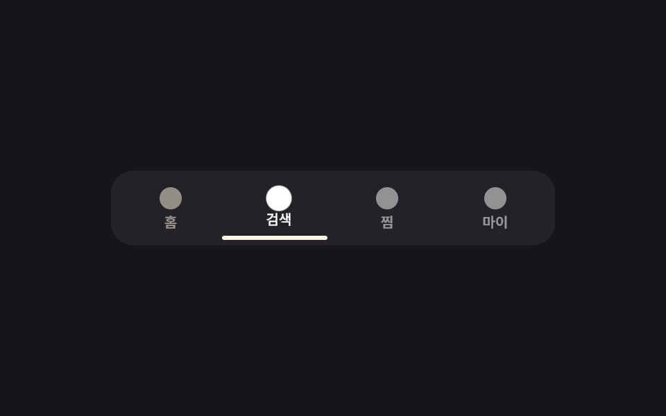 09 sidebar-drawer-tab-bar
Tự chạy · bấm ô để tới mục đó · cả 9 trong một zip
- 01 Trượt từ trái
- 02 Drawer dùng dialog gốc
- 03 Overlay mờ dần
- 04 Bottom sheet snap 3 mức
- 05 Đẩy nội dung
- 06 Mini mở rộng
- 07 Ẩn khi cuộn
- 08 Menu lồng nhau
- 09 Thanh tab dưới cùng
Thứ tự xếp theo lượng JS cần thêm vào. 01 là kiểu slide quen thuộc nhất, phải tự viết tay gần như toàn bộ phần khoá nền. 02 đẩy hẳn việc đó cho thẻ dialog gốc của trình duyệt. 03 đến 07 đổi hẳn cách "mở" nhìn ra sao — đứng yên mà mờ dần, snap theo ba mốc, kéo nội dung đi cùng, hoặc luôn hiện rồi tự ẩn theo scroll. 08 và 09 là hai trường hợp cấu trúc khác hẳn: một sidebar có thêm tầng con, và một sidebar được thay hẳn bằng kiểu UI khác — hợp với màn hình hẹp hơn.
01Trượt từ trái
Bạn thấy gì
Panel bắt đầu ngoài mép trái màn hình rồi trượt vào nhờ transform đổi từ translateX(-100%) sang translateX(0), overlay tối dần theo opacity cùng lúc.
<main class="stage is-demo">
  <div class="page" id="page">
    <button class="trigger" type="button" aria-haspopup="dialog" aria-controls="drawer1">Mở menu</button>
  </div>
  <div class="overlay"></div>
  <nav class="drawer" id="drawer1" role="dialog" aria-modal="true" aria-labelledby="t1">
    <h2 id="t1">Menu</h2>
    <a class="drawer__link" href="#">Trang chủ</a>
    <a class="drawer__link" href="#">Sản phẩm</a>
    <a class="drawer__link" href="#">Hỗ trợ</a>
    <button class="drawer__close" type="button">Đóng</button>
  </nav>
</main>
@use "../../../../site/static/demo-tokens" as *;
// ── 변수 3개 ──────────────────────────────────────────
$duration: $dur-enter; // 600ms — 왼쪽에서 밀려 들어오는 시간
$easing: $ease-spring;
$color: $subject-cream; // 트리거 버튼 강조색
// ── 데모 무대 ───────────────────────────────────────────
@include stage($stage-ink);
.stage { position: relative; }
.page { display: grid; place-items: center; }
.trigger {
border: 0; border-radius: $r-pill;
padding: $sp-3 $sp-6;
font-weight: 600;
font-size: clamp(13px, 4vmin, 16px);
line-height: 1;
font-family: inherit;
color: $stage-ink; background: $color;
cursor: pointer; -webkit-tap-highlight-color: transparent;
}
.overlay {
position: fixed; inset: 0;
background: rgba($stage-ink, .55);
opacity: 0; pointer-events: none;
transition: opacity $duration $easing;
}
.drawer {
position: fixed; left: 0; top: 0; bottom: 0; right: auto;
transform: translateX(-100%);
width: min(76vw, 240px);
box-sizing: border-box;
display: flex; flex-direction: column; gap: $sp-2;
padding: $sp-6 $sp-4;
background: $stage-paper; color: $stage-ink;
box-shadow: $shadow-raised;
pointer-events: none;
transition: transform $duration $easing;
h2 { margin: 0 0 $sp-2; font-size: clamp(13px, 4.2vmin, 17px); }
}
.drawer__link {
padding: $sp-2 $sp-1;
border-radius: $r-sm;
color: $stage-ink; text-decoration: none; font-weight: 500; font-size: 13px; line-height: 1; font-family: inherit;
&:hover, &:focus-visible { background: rgba($stage-ink, .08); }
}
.drawer__close {
margin-top: auto;
border: 0; border-radius: $r-control;
background: $stage-ink; color: $stage-paper;
padding: $sp-2 $sp-4;
font-weight: 600; font-size: 13px; line-height: 1; font-family: inherit; cursor: pointer;
}
.stage.is-open .overlay { opacity: 1; pointer-events: auto; }
.stage.is-open .drawer { transform: translateX(0); pointer-events: auto; }
// 실측: 데모 루프는 열림→머묾→닫힘을 2초 안에 반복(1번 항목과 같은 구조)
.stage.is-demo .overlay { animation: overlay-loop $dur-loop ease-in-out infinite; }
.stage.is-demo .drawer { animation: drawer-loop $dur-loop $easing infinite; }
@keyframes overlay-loop {
0%, 100% { opacity: 0; }
15%, 70% { opacity: 1; }
85% { opacity: 0; }
}
@keyframes drawer-loop {
0%, 100% { transform: translateX(-100%); }
15%, 70% { transform: translateX(0); }
85% { transform: translateX(-100%); }
}
// ── 접근성: 움직임 줄이기 설정이면 여닫힘 애니메이션만 제거 ──────────
@media (prefers-reduced-motion: reduce) {
.stage.is-demo .overlay, .stage.is-demo .drawer { animation: none; }
.overlay, .drawer { transition-duration: 1ms; }
}html, body {
margin: 0;
overflow: hidden;
}
.stage {
box-sizing: border-box;
min-height: 100vh;
display: grid;
place-items: center;
margin: 0;
background: #17141a;
font-family: -apple-system, "Segoe UI", "Noto Sans KR", sans-serif;
padding: clamp(8px, 4vw, 24px);
}
.stage {
position: relative;
}
.page {
display: grid;
place-items: center;
}
.trigger {
border: 0;
border-radius: 999px;
padding: 12px 24px;
font-weight: 600;
font-size: clamp(13px, 4vmin, 16px);
line-height: 1;
font-family: inherit;
color: #17141a;
background: #fff7e6;
cursor: pointer;
-webkit-tap-highlight-color: transparent;
}
.overlay {
position: fixed;
inset: 0;
background: rgba(23, 20, 26, 0.55);
opacity: 0;
pointer-events: none;
transition: opacity 600ms cubic-bezier(0.2, 0.8, 0.2, 1);
}
.drawer {
position: fixed;
left: 0;
top: 0;
bottom: 0;
right: auto;
transform: translateX(-100%);
width: min(76vw, 240px);
box-sizing: border-box;
display: flex;
flex-direction: column;
gap: 8px;
padding: 24px 16px;
background: #ffffff;
color: #17141a;
box-shadow: 0 14px 24px rgba(23, 20, 26, 0.32);
pointer-events: none;
transition: transform 600ms cubic-bezier(0.2, 0.8, 0.2, 1);
}
.drawer h2 {
margin: 0 0 8px;
font-size: clamp(13px, 4.2vmin, 17px);
}
.drawer__link {
padding: 8px 4px;
border-radius: 8px;
color: #17141a;
text-decoration: none;
font-weight: 500;
font-size: 13px;
line-height: 1;
font-family: inherit;
}
.drawer__link:hover, .drawer__link:focus-visible {
background: rgba(23, 20, 26, 0.08);
}
.drawer__close {
margin-top: auto;
border: 0;
border-radius: 12px;
background: #17141a;
color: #ffffff;
padding: 8px 16px;
font-weight: 600;
font-size: 13px;
line-height: 1;
font-family: inherit;
cursor: pointer;
}
.stage.is-open .overlay {
opacity: 1;
pointer-events: auto;
}
.stage.is-open .drawer {
transform: translateX(0);
pointer-events: auto;
}
.stage.is-demo .overlay {
animation: overlay-loop 2s ease-in-out infinite;
}
.stage.is-demo .drawer {
animation: drawer-loop 2s cubic-bezier(0.2, 0.8, 0.2, 1) infinite;
}
@keyframes overlay-loop {
0%, 100% {
opacity: 0;
}
15%, 70% {
opacity: 1;
}
85% {
opacity: 0;
}
}
@keyframes drawer-loop {
0%, 100% {
transform: translateX(-100%);
}
15%, 70% {
transform: translateX(0);
}
85% {
transform: translateX(-100%);
}
}
@media (prefers-reduced-motion: reduce) {
.stage.is-demo .overlay, .stage.is-demo .drawer {
animation: none;
}
.overlay, .drawer {
transition-duration: 1ms;
}
}// 열림: 배경(#page)을 inert 로 막고 첫 링크로 포커스. 닫힘: inert 해제, 트리거로 포커스 복귀.
// Tab 키다운마다 포커스 가능 목록의 처음/끝을 감시해 드로어 밖으로 못 나가게 한다(포커스 트랩).
(function () {
var stage = document.querySelector('.stage');
var page = document.getElementById('page');
var trigger = document.querySelector('.trigger');
var overlay = document.querySelector('.overlay');
var drawer = document.querySelector('.drawer');
var closeBtn = document.querySelector('.drawer__close');
function focusables() { return drawer.querySelectorAll('a, button'); }
function open() {
stage.classList.remove('is-demo'); stage.classList.add('is-open');
page.setAttribute('inert', ''); page.setAttribute('aria-hidden', 'true');
focusables()[0].focus({ preventScroll: true });
}
function shut() {
stage.classList.remove('is-open');
page.removeAttribute('inert'); page.removeAttribute('aria-hidden');
trigger.focus({ preventScroll: true });
}
trigger.addEventListener('click', open);
overlay.addEventListener('click', shut);
closeBtn.addEventListener('click', shut);
document.addEventListener('keydown', function (e) {
if (!stage.classList.contains('is-open')) return;
if (e.key === 'Escape') { shut(); return; }
if (e.key !== 'Tab') return;
var f = focusables(), first = f[0], last = f[f.length - 1];
if (e.shiftKey && document.activeElement === first) { last.focus({ preventScroll: true }); e.preventDefault(); }
else if (!e.shiftKey && document.activeElement === last) { first.focus({ preventScroll: true }); e.preventDefault(); }
});
})();import { useEffect, useRef, useState } from "react";
import type { CSSProperties } from "react";
import styles from "./LeftSlideDrawer.module.scss";
export type LeftSlideDrawerProps = {
/** 왼쪽에서 밀려 들어오는 시간 (기본 600ms) */
duration?: number;
easing?: string;
color?: string;
};
export default function LeftSlideDrawer({
duration = 600,
easing = "cubic-bezier(.2,.8,.2,1)",
color = "#fff7e6",
}: LeftSlideDrawerProps) {
const [open, setOpen] = useState(false);
const drawerRef = useRef<HTMLElement | null>(null);
const triggerRef = useRef<HTMLButtonElement | null>(null);
useEffect(() => {
if (!open) {
triggerRef.current?.focus();
return;
}
const drawer = drawerRef.current;
if (!drawer) return;
const focusables = () => Array.from(drawer.querySelectorAll<HTMLElement>("a, button"));
focusables()[0]?.focus();
function onKey(e: KeyboardEvent) {
if (e.key === "Escape") { setOpen(false); return; }
if (e.key !== "Tab") return;
const f = focusables();
const first = f[0], last = f[f.length - 1];
if (e.shiftKey && document.activeElement === first) { last.focus(); e.preventDefault(); }
else if (!e.shiftKey && document.activeElement === last) { first.focus(); e.preventDefault(); }
}
document.addEventListener("keydown", onKey);
return () => document.removeEventListener("keydown", onKey);
}, [open]);
const vars: CSSProperties = { "--duration": `${duration}ms`, "--easing": easing, "--color": color };
return (
<div className={styles.stage} style={vars}>
<div className={styles.page} inert={open || undefined} aria-hidden={open}>
<button ref={triggerRef} className={styles.trigger} type="button" onClick={() => setOpen(true)}>
메뉴 열기
</button>
</div>
<div className={styles.overlay} data-open={open} onClick={() => setOpen(false)} />
<nav
ref={drawerRef}
className={styles.drawer}
data-open={open}
role="dialog"
aria-modal="true"
aria-label="메뉴"
>
<h2>메뉴</h2>
<a className={styles.link} href="#">홈</a>
<a className={styles.link} href="#">제품</a>
<a className={styles.link} href="#">고객센터</a>
<button className={styles.close} type="button" onClick={() => setOpen(false)}>닫기</button>
</nav>
</div>
);
}01 · Trượt từ trái — Diện tích đo được 48.566% · khung hình chuyển động 9/23Nguyên tác GODRICH · SCSS và React nằm trong tệp zip · Xem mật khẩu
Dùng ở đâu
Ngay khi mở, nội dung nền bị khoá bằng thuộc tính inert nên cả trình đọc màn hình lẫn phím Tab đều không chạm tới được.
.drawer {
  position: fixed; left: 0; top: 0; bottom: 0;
  transform: translateX(-100%);
  width: min(76vw, 240px);
  transition: transform $duration $easing;
}
.overlay {
  position: fixed; inset: 0;
  opacity: 0; pointer-events: none;
  transition: opacity $duration $easing;
}
.stage.is-open .overlay { opacity: 1; pointer-events: auto; }
.stage.is-open .drawer  { transform: translateX(0); pointer-events: auto; }
02Drawer dùng dialog gốc
Chuyện gì diễn ra trên màn hình
Thẻ <dialog> gốc được ghim sát bên trái và mở bằng đúng một dòng showModal(), nên focus, phím Escape và việc chặn click ra ngoài đều do trình duyệt lo thay vì tự viết.
<main class="stage is-demo">
  <div class="page">
    <button class="trigger" type="button">Mở thiết lập</button>
  </div>
  <dialog class="drawer" id="d2" aria-labelledby="t2">
    <h2 id="t2">Thiết lập</h2>
    <p>Bảng này chính là phần tử dialog gốc của trình duyệt — ESC, click ra ngoài và bẫy focus không phải tự viết tay.</p>
    <button class="drawer__close" type="button">Đóng</button>
  </dialog>
</main>
@use "../../../../site/static/demo-tokens" as *;
// ── 변수 3개 ──────────────────────────────────────────
$duration: $dur-base; // 300ms — 실사용 여닫힘 속도
$easing: $ease-spring;
$color: $subject-cream; // 트리거·닫기 버튼 강조색
// ── 데모 무대 ───────────────────────────────────────────
@include stage($stage-yellow);
.stage { position: relative; }
.page { display: grid; place-items: center; }
.trigger {
border: 0; border-radius: $r-pill;
padding: $sp-3 $sp-6;
font-weight: 600;
font-size: clamp(13px, 4vmin, 16px);
line-height: 1;
font-family: inherit;
color: $stage-yellow; background: $stage-ink;
cursor: pointer; -webkit-tap-highlight-color: transparent;
}
// UA 기본(가운데 고정·테두리·max-width)을 지우고 좌측 전체 높이 패널로
.drawer {
position: fixed; inset: 0 auto 0 0; margin: 0;
width: min(76vw, 240px); height: 100%; max-height: none;
box-sizing: border-box;
display: flex; flex-direction: column; gap: $sp-2;
padding: $sp-6 $sp-4;
border: 0; border-radius: 0;
background: $stage-paper; color: $stage-ink;
box-shadow: $shadow-raised;
h2 { margin: 0 0 $sp-2; font-size: clamp(13px, 4.2vmin, 17px); }
p { margin: 0 0 $sp-4; font-size: clamp(10px, 3.2vmin, 13px); color: rgba($stage-ink, .7); }
&::backdrop { background: rgba($stage-ink, .55); }
}
.drawer__close {
margin-top: auto;
border: 0; border-radius: $r-control;
background: $color; color: $stage-ink;
padding: $sp-2 $sp-4;
font-weight: 600; font-size: 13px; line-height: 1; font-family: inherit; cursor: pointer;
}
// 실사용(모던 브라우저): [open] 이 붙는 순간·떨어지는 순간에도 트랜지션이 걸리도록
// @starting-style + transition-behavior: allow-discrete. 값은 transform 만 움직인다.
.drawer {
transition: transform $duration $easing, overlay $duration allow-discrete, display $duration allow-discrete;
transform: translateX(-100%);
}
.drawer[open] { transform: translateX(0); }
@starting-style {
.drawer[open] { transform: translateX(-100%); }
}
// 데모 루프(.is-demo): showModal 로 이미 열려 있는 상태에서 keyframes 로 2초 주기 재생
.stage.is-demo .drawer { animation: drawer-loop $dur-loop $easing infinite; }
.stage.is-demo .drawer::backdrop { animation: backdrop-loop $dur-loop ease-in-out infinite; }
@keyframes drawer-loop {
0%, 100% { transform: translateX(-100%); }
15%, 70% { transform: translateX(0); }
85% { transform: translateX(-100%); }
}
@keyframes backdrop-loop {
0%, 100% { opacity: 0; }
15%, 70% { opacity: 1; }
85% { opacity: 0; }
}
// ── 접근성: 움직임 줄이기 설정이면 애니메이션 제거. ESC·포커스 트랩은 브라우저 기본이라 그대로 남는다 ──
@media (prefers-reduced-motion: reduce) {
.stage.is-demo .drawer, .stage.is-demo .drawer::backdrop { animation: none; }
.drawer { transition-duration: 1ms; }
}html, body {
margin: 0;
overflow: hidden;
}
.stage {
box-sizing: border-box;
min-height: 100vh;
display: grid;
place-items: center;
margin: 0;
background: #ffd23f;
font-family: -apple-system, "Segoe UI", "Noto Sans KR", sans-serif;
padding: clamp(8px, 4vw, 24px);
}
.stage {
position: relative;
}
.page {
display: grid;
place-items: center;
}
.trigger {
border: 0;
border-radius: 999px;
padding: 12px 24px;
font-weight: 600;
font-size: clamp(13px, 4vmin, 16px);
line-height: 1;
font-family: inherit;
color: #ffd23f;
background: #17141a;
cursor: pointer;
-webkit-tap-highlight-color: transparent;
}
.drawer {
position: fixed;
inset: 0 auto 0 0;
margin: 0;
width: min(76vw, 240px);
height: 100%;
max-height: none;
box-sizing: border-box;
display: flex;
flex-direction: column;
gap: 8px;
padding: 24px 16px;
border: 0;
border-radius: 0;
background: #ffffff;
color: #17141a;
box-shadow: 0 14px 24px rgba(23, 20, 26, 0.32);
}
.drawer h2 {
margin: 0 0 8px;
font-size: clamp(13px, 4.2vmin, 17px);
}
.drawer p {
margin: 0 0 16px;
font-size: clamp(10px, 3.2vmin, 13px);
color: rgba(23, 20, 26, 0.7);
}
.drawer::backdrop {
background: rgba(23, 20, 26, 0.55);
}
.drawer__close {
margin-top: auto;
border: 0;
border-radius: 12px;
background: #fff7e6;
color: #17141a;
padding: 8px 16px;
font-weight: 600;
font-size: 13px;
line-height: 1;
font-family: inherit;
cursor: pointer;
}
.drawer {
transition: transform 300ms cubic-bezier(0.2, 0.8, 0.2, 1), overlay 300ms allow-discrete, display 300ms allow-discrete;
transform: translateX(-100%);
}
.drawer[open] {
transform: translateX(0);
}
@starting-style {
.drawer[open] {
transform: translateX(-100%);
}
}
.stage.is-demo .drawer {
animation: drawer-loop 2s cubic-bezier(0.2, 0.8, 0.2, 1) infinite;
}
.stage.is-demo .drawer::backdrop {
animation: backdrop-loop 2s ease-in-out infinite;
}
@keyframes drawer-loop {
0%, 100% {
transform: translateX(-100%);
}
15%, 70% {
transform: translateX(0);
}
85% {
transform: translateX(-100%);
}
}
@keyframes backdrop-loop {
0%, 100% {
opacity: 0;
}
15%, 70% {
opacity: 1;
}
85% {
opacity: 0;
}
}
@media (prefers-reduced-motion: reduce) {
.stage.is-demo .drawer, .stage.is-demo .drawer::backdrop {
animation: none;
}
.drawer {
transition-duration: 1ms;
}
}// showModal 한 줄로 열면 포커스 이동·ESC Đóng·바깥 클릭 차단을 브라우저가 대신 한다.
// 로드 시엔 is-demo 를 그대로 두고 열어 데모 루프(keyframes)가 재생되게 한다.
// 실제 클릭(Đóng·바깥·재오픈)이 오면 그때 is-demo 를 떼 실제 상호작용으로 넘긴다.
(function () {
var stage = document.querySelector('.stage');
var trigger = document.querySelector('.trigger');
var dlg = document.getElementById('d2');
var closeBtn = document.querySelector('.drawer__close');
function realOpen() { stage.classList.remove('is-demo'); dlg.showModal(); }
dlg.addEventListener('close', function () { stage.classList.remove('is-demo'); });
closeBtn.addEventListener('click', function () { dlg.close(); });
dlg.addEventListener('click', function (e) { if (e.target === dlg) dlg.close(); }); // ::backdrop 클릭과 같은 효과
trigger.addEventListener('click', realOpen);
dlg.showModal();
})();import { useEffect, useRef, useState } from "react";
import type { CSSProperties, MouseEvent } from "react";
import styles from "./DialogDrawer.module.scss";
export type DialogDrawerProps = {
duration?: number;
easing?: string;
color?: string;
/** 마운트되면 바로 열어 보여줄지(데모용) */
defaultOpen?: boolean;
};
export default function DialogDrawer({
duration = 300,
easing = "cubic-bezier(.2,.8,.2,1)",
color = "#fff7e6",
defaultOpen = false,
}: DialogDrawerProps) {
const dialogRef = useRef<HTMLDialogElement | null>(null);
const [open, setOpen] = useState(defaultOpen);
useEffect(() => {
const dlg = dialogRef.current;
if (!dlg) return;
if (open && !dlg.open) dlg.showModal();
if (!open && dlg.open) dlg.close();
}, [open]);
useEffect(() => {
const dlg = dialogRef.current;
if (!dlg) return;
const onClose = () => setOpen(false);
dlg.addEventListener("close", onClose);
return () => dlg.removeEventListener("close", onClose);
}, []);
const vars: CSSProperties = { "--duration": `${duration}ms`, "--easing": easing, "--color": color };
return (
<div className={styles.stage} style={vars}>
<button className={styles.trigger} type="button" onClick={() => setOpen(true)}>설정 열기</button>
<dialog
ref={dialogRef}
className={styles.drawer}
aria-label="설정"
onClick={(e: MouseEvent<HTMLDialogElement>) => { if (e.target === dialogRef.current) setOpen(false); }}
>
<h2>설정</h2>
<p>브라우저의 dialog 요소가 ESC·포커스 가두기를 대신 관리한다.</p>
<button className={styles.close} type="button" onClick={() => setOpen(false)}>닫기</button>
</dialog>
</div>
);
}02 · Drawer dùng dialog gốc — Diện tích đo được 98.965% · khung hình chuyển động 9/23Nguyên tác GODRICH · SCSS và React nằm trong tệp zip · Xem mật khẩu
Chỗ dùng
Bản chuyển động thật dùng @starting-style cùng allow-discrete để transition vẫn chạy trong lúc dialog vừa bật display.
.drawer {
  position: fixed; inset: 0 auto 0 0; margin: 0;
  width: min(76vw, 240px); height: 100%;
  transition: transform $duration $easing,
    overlay $duration allow-discrete, display $duration allow-discrete;
  transform: translateX(-100%);
}
.drawer[open] { transform: translateX(0); }
@starting-style {
  .drawer[open] { transform: translateX(-100%); }
}
03Overlay mờ dần
Chuyển động thế nào
Panel đứng nguyên bên trái, chỉ hiện ra bằng opacity cùng transform: scale từ .96 lên 1 — không hề có chuyển động ngang.
<main class="stage is-demo">
  <div class="page" id="page">
    <button class="trigger" type="button" aria-haspopup="dialog" aria-controls="drawer3">Mở bộ lọc</button>
  </div>
  <div class="overlay"></div>
  <div class="drawer" id="drawer3" role="dialog" aria-modal="true" aria-labelledby="t3">
    <h2 id="t3">Bộ lọc</h2>
    <p>Chọn giá, vận chuyển và màu sắc ở đây.</p>
    <button class="drawer__close" type="button">Đóng</button>
  </div>
</main>
@use "../../../../site/static/demo-tokens" as *;
// ── 변수 3개 ──────────────────────────────────────────
$duration: $dur-base; // 300ms — 자리에서 나타나는 시간
$easing: $ease-out;
$color: $subject-cream; // 트리거 강조색
// ── 데모 무대 ───────────────────────────────────────────
@include stage($stage-orange);
.stage { position: relative; }
.page { display: grid; place-items: center; }
.trigger {
border: 0; border-radius: $r-pill;
padding: $sp-3 $sp-6;
font-weight: 600;
font-size: clamp(13px, 4vmin, 16px);
line-height: 1;
font-family: inherit;
color: $subject-orange-deep; background: $color; // AA: 크림 면 위 주황 글자 5.04:1
cursor: pointer; -webkit-tap-highlight-color: transparent;
}
// 프로스트 유리 느낌: opacity + backdrop-filter 로 흐려진다(01 의 단색 어둡기와 다르다)
.overlay {
position: fixed; inset: 0;
background: rgba($stage-ink, .28);
backdrop-filter: blur(0px);
opacity: 0; pointer-events: none;
transition: opacity $duration $easing, backdrop-filter $duration $easing;
}
// 패널은 왼쪽에서 움직이지 않는다 — opacity·transform:scale 만으로 나타난다
.drawer {
position: fixed; left: 0; top: 0; bottom: 0; right: auto;
transform: scale(.96);
transform-origin: left center; // 규칙8: 왼쪽 붙은 패널 좌변 기준
opacity: 0;
width: min(76vw, 240px);
box-sizing: border-box;
display: flex; flex-direction: column; gap: $sp-2;
padding: $sp-6 $sp-4;
background: $stage-paper; color: $stage-ink;
box-shadow: $shadow-raised;
pointer-events: none;
transition: transform $duration $easing, opacity $duration $easing;
h2 { margin: 0 0 $sp-2; font-size: clamp(13px, 4.2vmin, 17px); }
p { margin: 0 0 $sp-4; font-size: clamp(10px, 3.2vmin, 13px); color: rgba($stage-ink, .7); }
}
.drawer__close {
margin-top: auto;
border: 0; border-radius: $r-control;
background: $stage-orange; color: $stage-paper;
padding: $sp-2 $sp-4;
font-weight: 600; font-size: 13px; line-height: 1; font-family: inherit; cursor: pointer;
}
.stage.is-open .overlay { opacity: 1; backdrop-filter: blur(6px); pointer-events: auto; }
.stage.is-open .drawer { opacity: 1; transform: scale(1); pointer-events: auto; }
.stage.is-demo .overlay { animation: overlay-loop $dur-loop ease-in-out infinite; }
.stage.is-demo .drawer { animation: drawer-loop $dur-loop $easing infinite; }
@keyframes overlay-loop {
0%, 100% { opacity: 0; backdrop-filter: blur(0px); }
15%, 70% { opacity: 1; backdrop-filter: blur(6px); }
85% { opacity: 0; backdrop-filter: blur(0px); }
}
@keyframes drawer-loop {
0%, 100% { opacity: 0; transform: scale(.96); }
15%, 70% { opacity: 1; transform: scale(1); }
85% { opacity: 0; transform: scale(.96); }
}
@media (prefers-reduced-motion: reduce) {
.stage.is-demo .overlay, .stage.is-demo .drawer { animation: none; }
.overlay, .drawer { transition-duration: 1ms; }
}html, body {
margin: 0;
overflow: hidden;
}
.stage {
box-sizing: border-box;
min-height: 100vh;
display: grid;
place-items: center;
margin: 0;
background: #ff4d1f;
font-family: -apple-system, "Segoe UI", "Noto Sans KR", sans-serif;
padding: clamp(8px, 4vw, 24px);
}
.stage {
position: relative;
}
.page {
display: grid;
place-items: center;
}
.trigger {
border: 0;
border-radius: 999px;
padding: 12px 24px;
font-weight: 600;
font-size: clamp(13px, 4vmin, 16px);
line-height: 1;
font-family: inherit;
color: #c93000;
background: #fff7e6;
cursor: pointer;
-webkit-tap-highlight-color: transparent;
}
.overlay {
position: fixed;
inset: 0;
background: rgba(23, 20, 26, 0.28);
backdrop-filter: blur(0px);
opacity: 0;
pointer-events: none;
transition: opacity 300ms ease-out, backdrop-filter 300ms ease-out;
}
.drawer {
position: fixed;
left: 0;
top: 0;
bottom: 0;
right: auto;
transform: scale(0.96);
transform-origin: left center;
opacity: 0;
width: min(76vw, 240px);
box-sizing: border-box;
display: flex;
flex-direction: column;
gap: 8px;
padding: 24px 16px;
background: #ffffff;
color: #17141a;
box-shadow: 0 14px 24px rgba(23, 20, 26, 0.32);
pointer-events: none;
transition: transform 300ms ease-out, opacity 300ms ease-out;
}
.drawer h2 {
margin: 0 0 8px;
font-size: clamp(13px, 4.2vmin, 17px);
}
.drawer p {
margin: 0 0 16px;
font-size: clamp(10px, 3.2vmin, 13px);
color: rgba(23, 20, 26, 0.7);
}
.drawer__close {
margin-top: auto;
border: 0;
border-radius: 12px;
background: #ff4d1f;
color: #ffffff;
padding: 8px 16px;
font-weight: 600;
font-size: 13px;
line-height: 1;
font-family: inherit;
cursor: pointer;
}
.stage.is-open .overlay {
opacity: 1;
backdrop-filter: blur(6px);
pointer-events: auto;
}
.stage.is-open .drawer {
opacity: 1;
transform: scale(1);
pointer-events: auto;
}
.stage.is-demo .overlay {
animation: overlay-loop 2s ease-in-out infinite;
}
.stage.is-demo .drawer {
animation: drawer-loop 2s ease-out infinite;
}
@keyframes overlay-loop {
0%, 100% {
opacity: 0;
backdrop-filter: blur(0px);
}
15%, 70% {
opacity: 1;
backdrop-filter: blur(6px);
}
85% {
opacity: 0;
backdrop-filter: blur(0px);
}
}
@keyframes drawer-loop {
0%, 100% {
opacity: 0;
transform: scale(0.96);
}
15%, 70% {
opacity: 1;
transform: scale(1);
}
85% {
opacity: 0;
transform: scale(0.96);
}
}
@media (prefers-reduced-motion: reduce) {
.stage.is-demo .overlay, .stage.is-demo .drawer {
animation: none;
}
.overlay, .drawer {
transition-duration: 1ms;
}
}// 패널은 이동하지 않고 자리에서 opacity·scale 로만 나타난다. 열림 시 #page 를 inert 로 막는다.
(function () {
var stage = document.querySelector('.stage');
var page = document.getElementById('page');
var trigger = document.querySelector('.trigger');
var overlay = document.querySelector('.overlay');
var panel = document.querySelector('.drawer');
var closeBtn = document.querySelector('.drawer__close');
function focusables() { return panel.querySelectorAll('a, button'); }
function open() {
stage.classList.remove('is-demo'); stage.classList.add('is-open');
page.setAttribute('inert', ''); page.setAttribute('aria-hidden', 'true');
focusables()[0].focus({ preventScroll: true });
}
function shut() {
stage.classList.remove('is-open');
page.removeAttribute('inert'); page.removeAttribute('aria-hidden');
trigger.focus({ preventScroll: true });
}
trigger.addEventListener('click', open);
overlay.addEventListener('click', shut);
closeBtn.addEventListener('click', shut);
document.addEventListener('keydown', function (e) {
if (!stage.classList.contains('is-open')) return;
if (e.key === 'Escape') { shut(); return; }
if (e.key !== 'Tab') return;
var f = focusables(), first = f[0], last = f[f.length - 1];
if (e.shiftKey && document.activeElement === first) { last.focus({ preventScroll: true }); e.preventDefault(); }
else if (!e.shiftKey && document.activeElement === last) { first.focus({ preventScroll: true }); e.preventDefault(); }
});
})();import { useEffect, useRef, useState } from "react";
import type { CSSProperties } from "react";
import styles from "./OverlayFadeDrawer.module.scss";
export type OverlayFadeDrawerProps = {
duration?: number;
easing?: string;
color?: string;
};
export default function OverlayFadeDrawer({
duration = 300,
easing = "ease-out",
color = "#fff7e6",
}: OverlayFadeDrawerProps) {
const [open, setOpen] = useState(false);
const panelRef = useRef<HTMLDivElement | null>(null);
const triggerRef = useRef<HTMLButtonElement | null>(null);
useEffect(() => {
if (!open) { triggerRef.current?.focus({ preventScroll: true }); return; }
const panel = panelRef.current;
if (!panel) return;
const focusables = () => Array.from(panel.querySelectorAll<HTMLElement>("a, button"));
focusables()[0]?.focus({ preventScroll: true });
function onKey(e: KeyboardEvent) {
if (e.key === "Escape") { setOpen(false); return; }
if (e.key !== "Tab") return;
const f = focusables();
const first = f[0], last = f[f.length - 1];
if (e.shiftKey && document.activeElement === first) { last.focus({ preventScroll: true }); e.preventDefault(); }
else if (!e.shiftKey && document.activeElement === last) { first.focus({ preventScroll: true }); e.preventDefault(); }
}
document.addEventListener("keydown", onKey);
return () => document.removeEventListener("keydown", onKey);
}, [open]);
const vars: CSSProperties = { "--duration": `${duration}ms`, "--easing": easing, "--color": color };
return (
<div className={styles.stage} style={vars}>
<div className={styles.page} inert={open || undefined} aria-hidden={open}>
<button ref={triggerRef} className={styles.trigger} type="button" onClick={() => setOpen(true)}>
필터 열기
</button>
</div>
<div className={styles.overlay} data-open={open} onClick={() => setOpen(false)} />
<div ref={panelRef} className={styles.drawer} data-open={open} role="dialog" aria-modal="true" aria-label="필터">
<h2>필터</h2>
<p>가격·배송·색상 옵션을 여기서 고른다.</p>
<button className={styles.close} type="button" onClick={() => setOpen(false)}>닫기</button>
</div>
</div>
);
}03 · Overlay mờ dần — Diện tích đo được 100.0% · khung hình chuyển động 8/23Nguyên tác GODRICH · SCSS và React nằm trong tệp zip · Xem mật khẩu
Dùng khi nào
Overlay phía sau dùng backdrop-filter: blur() để làm mờ nội dung, khác hẳn lớp phủ màu đặc của mục 01.
.overlay {
  opacity: 0; backdrop-filter: blur(0px);
  transition: opacity $duration $easing, backdrop-filter $duration $easing;
}
.drawer {
  transform: scale(.96); transform-origin: left center; opacity: 0;
  transition: transform $duration $easing, opacity $duration $easing;
}
.stage.is-open .overlay { opacity: 1; backdrop-filter: blur(6px); }
.stage.is-open .drawer  { opacity: 1; transform: scale(1); }
04Bottom sheet snap 3 mức
Bạn thấy gì
Mỗi lần chạm tay cầm, thuộc tính data-snap đổi vòng qua ba giá trị peek, half, full, và mỗi giá trị chỉ khớp đúng một rule translate cố định.
<main class="stage is-demo">
  <div class="page" id="page">
    <button class="trigger" type="button" aria-haspopup="dialog" aria-controls="sheet4">Mở danh sách</button>
  </div>
  <div class="overlay"></div>
  <div class="sheet" id="sheet4" role="dialog" aria-modal="true" aria-labelledby="t4" data-snap="half">
    <button class="sheet__handle" type="button" aria-label="Chuyển cỡ sheet (peek, half, full)"></button>
    <h2 id="t4">12 địa điểm gần đây</h2>
    <p>Mỗi lần chạm vào tay cầm sẽ chuyển lần lượt peek → half → full.</p>
  </div>
</main>
@use "../../../../site/static/demo-tokens" as *;
// ── 변수 3개 ──────────────────────────────────────────
$duration: $dur-base; // 300ms — 스냅마다 딱 멈추는 시간
$easing: $ease-out; // 관성 없이 멈춘다(스프링 아님)
$color: $subject-ink; // 손잡이·강조색
// ── 데모 무대 ───────────────────────────────────────────
@include stage($stage-paper);
.stage { position: relative; }
.page { display: grid; place-items: center; }
.trigger {
border: 0; border-radius: $r-pill;
padding: $sp-3 $sp-6;
font-weight: 600;
font-size: clamp(13px, 4vmin, 16px);
line-height: 1;
font-family: inherit;
color: $stage-paper; background: $color;
cursor: pointer; -webkit-tap-highlight-color: transparent;
}
.overlay {
position: fixed; inset: 0;
background: rgba($stage-ink, .45);
opacity: 0; pointer-events: none;
transition: opacity $duration $easing;
}
// 세 스냅 값은 시트 자기 높이 기준 %(transform 만 사용)
.sheet {
position: fixed; left: 50%; bottom: 0; top: auto;
transform: translate(-50%, 100%);
width: min(94vw, 300px);
box-sizing: border-box;
padding: $sp-2 $sp-4 $sp-6;
border-radius: $r-card $r-card 0 0;
background: $subject-cream; color: $stage-ink;
box-shadow: $shadow-raised;
pointer-events: none;
transition: transform $duration $easing;
h2 { margin: $sp-2 0 $sp-1; font-size: clamp(13px, 4.2vmin, 17px); }
p { margin: 0; font-size: clamp(10px, 3.2vmin, 13px); color: rgba($stage-ink, .7); }
}
.sheet__handle {
display: block;
width: 36px; height: $sp-1; margin: 0 auto;
border: 0; border-radius: $r-pill; background: rgba($stage-ink, .28);
cursor: pointer;
}
.stage.is-open .overlay { opacity: 1; pointer-events: auto; }
.stage.is-open .sheet { pointer-events: auto; }
.stage.is-open .sheet[data-snap="peek"] { transform: translate(-50%, 78%); }
.stage.is-open .sheet[data-snap="half"] { transform: translate(-50%, 40%); }
.stage.is-open .sheet[data-snap="full"] { transform: translate(-50%, 0); }
// 데모 루프: 닫힘 → peek → half → full → peek 순으로 2초 안에 한 바퀴
.stage.is-demo .overlay { animation: overlay-loop $dur-loop ease-in-out infinite; }
.stage.is-demo .sheet { animation: sheet-loop $dur-loop $easing infinite; }
@keyframes overlay-loop {
0%, 100% { opacity: 0; }
10%, 90% { opacity: 1; }
95% { opacity: 0; }
}
@keyframes sheet-loop {
0% { transform: translate(-50%, 100%); }
10% { transform: translate(-50%, 78%); }
40% { transform: translate(-50%, 40%); }
70% { transform: translate(-50%, 0); }
90% { transform: translate(-50%, 78%); }
100% { transform: translate(-50%, 100%); }
}
@media (prefers-reduced-motion: reduce) {
.stage.is-demo .overlay, .stage.is-demo .sheet { animation: none; }
.overlay, .sheet { transition-duration: 1ms; }
}html, body {
margin: 0;
overflow: hidden;
}
.stage {
box-sizing: border-box;
min-height: 100vh;
display: grid;
place-items: center;
margin: 0;
background: #ffffff;
font-family: -apple-system, "Segoe UI", "Noto Sans KR", sans-serif;
padding: clamp(8px, 4vw, 24px);
}
.stage {
position: relative;
}
.page {
display: grid;
place-items: center;
}
.trigger {
border: 0;
border-radius: 999px;
padding: 12px 24px;
font-weight: 600;
font-size: clamp(13px, 4vmin, 16px);
line-height: 1;
font-family: inherit;
color: #ffffff;
background: #17141a;
cursor: pointer;
-webkit-tap-highlight-color: transparent;
}
.overlay {
position: fixed;
inset: 0;
background: rgba(23, 20, 26, 0.45);
opacity: 0;
pointer-events: none;
transition: opacity 300ms ease-out;
}
.sheet {
position: fixed;
left: 50%;
bottom: 0;
top: auto;
transform: translate(-50%, 100%);
width: min(94vw, 300px);
box-sizing: border-box;
padding: 8px 16px 24px;
border-radius: 16px 16px 0 0;
background: #fff7e6;
color: #17141a;
box-shadow: 0 14px 24px rgba(23, 20, 26, 0.32);
pointer-events: none;
transition: transform 300ms ease-out;
}
.sheet h2 {
margin: 8px 0 4px;
font-size: clamp(13px, 4.2vmin, 17px);
}
.sheet p {
margin: 0;
font-size: clamp(10px, 3.2vmin, 13px);
color: rgba(23, 20, 26, 0.7);
}
.sheet__handle {
display: block;
width: 36px;
height: 4px;
margin: 0 auto;
border: 0;
border-radius: 999px;
background: rgba(23, 20, 26, 0.28);
cursor: pointer;
}
.stage.is-open .overlay {
opacity: 1;
pointer-events: auto;
}
.stage.is-open .sheet {
pointer-events: auto;
}
.stage.is-open .sheet[data-snap=peek] {
transform: translate(-50%, 78%);
}
.stage.is-open .sheet[data-snap=half] {
transform: translate(-50%, 40%);
}
.stage.is-open .sheet[data-snap=full] {
transform: translate(-50%, 0);
}
.stage.is-demo .overlay {
animation: overlay-loop 2s ease-in-out infinite;
}
.stage.is-demo .sheet {
animation: sheet-loop 2s ease-out infinite;
}
@keyframes overlay-loop {
0%, 100% {
opacity: 0;
}
10%, 90% {
opacity: 1;
}
95% {
opacity: 0;
}
}
@keyframes sheet-loop {
0% {
transform: translate(-50%, 100%);
}
10% {
transform: translate(-50%, 78%);
}
40% {
transform: translate(-50%, 40%);
}
70% {
transform: translate(-50%, 0);
}
90% {
transform: translate(-50%, 78%);
}
100% {
transform: translate(-50%, 100%);
}
}
@media (prefers-reduced-motion: reduce) {
.stage.is-demo .overlay, .stage.is-demo .sheet {
animation: none;
}
.overlay, .sheet {
transition-duration: 1ms;
}
}// 손잡이를 누를 때마다 data-snap 을 세 값 사이로 순환시킨다. CSS 는 그 값에 맞는 translateY 로만 반응.
(function () {
var stage = document.querySelector('.stage');
var page = document.getElementById('page');
var trigger = document.querySelector('.trigger');
var overlay = document.querySelector('.overlay');
var sheet = document.querySelector('.sheet');
var handle = document.querySelector('.sheet__handle');
var steps = ['peek', 'half', 'full'];
function open() {
stage.classList.remove('is-demo'); stage.classList.add('is-open');
page.setAttribute('inert', ''); page.setAttribute('aria-hidden', 'true');
handle.focus({ preventScroll: true });
}
function shut() {
stage.classList.remove('is-open'); sheet.dataset.snap = 'half';
page.removeAttribute('inert'); page.removeAttribute('aria-hidden');
trigger.focus({ preventScroll: true });
}
handle.addEventListener('click', function () {
var i = steps.indexOf(sheet.dataset.snap);
sheet.dataset.snap = steps[(i + 1) % steps.length];
});
trigger.addEventListener('click', open);
overlay.addEventListener('click', shut);
document.addEventListener('keydown', function (e) {
if (stage.classList.contains('is-open') && e.key === 'Escape') shut();
});
})();import { useState } from "react";
import type { CSSProperties } from "react";
import styles from "./BottomSheetSnap.module.scss";
export type SnapStep = "closed" | "peek" | "half" | "full";
export type BottomSheetSnapProps = {
duration?: number;
easing?: string;
color?: string;
};
const STEPS: SnapStep[] = ["peek", "half", "full"];
export default function BottomSheetSnap({
duration = 300,
easing = "ease-out",
color = "#17141a",
}: BottomSheetSnapProps) {
const [snap, setSnap] = useState<SnapStep>("closed");
const open = snap !== "closed";
function cycle() {
const i = STEPS.indexOf(snap === "closed" ? "peek" : snap);
setSnap(STEPS[(i + 1) % STEPS.length]);
}
const vars: CSSProperties = { "--duration": `${duration}ms`, "--easing": easing, "--color": color };
return (
<div className={styles.stage} style={vars}>
<button className={styles.trigger} type="button" onClick={() => setSnap("half")}>목록 열기</button>
<div className={styles.overlay} data-open={open} onClick={() => setSnap("closed")} />
<div className={styles.sheet} data-snap={snap} role="dialog" aria-modal="true" aria-label="주변 장소 12곳">
<button
className={styles.handle}
type="button"
aria-label="시트 크기 전환(peek·half·full)"
onClick={cycle}
/>
<h2>주변 장소 12곳</h2>
<p>손잡이를 누를 때마다 peek → half → full 순으로 바뀐다.</p>
</div>
</div>
);
}04 · Bottom sheet snap 3 mức — Diện tích đo được 97.949% · khung hình chuyển động 23/23Nguyên tác GODRICH · SCSS và React nằm trong tệp zip · Xem mật khẩu
Dùng ở đâu
Không có phép tính toạ độ kéo thả nào cả, chỉ là đổi trạng thái rồi CSS tự snap tới điểm đã định sẵn.
.sheet {
  transform: translate(-50%, 100%);
  transition: transform $duration $easing;
}
.stage.is-open .sheet[data-snap="peek"] { transform: translate(-50%, 78%); }
.stage.is-open .sheet[data-snap="half"] { transform: translate(-50%, 40%); }
.stage.is-open .sheet[data-snap="full"] { transform: translate(-50%, 0); }
05Đẩy nội dung
Chuyện gì diễn ra trên màn hình
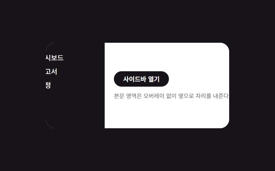
Sidebar và nội dung bên cạnh chạy trong cùng một duration: sidebar đi từ translateX(-100%) về 0, còn nội dung đi từ translateX(0) sang 40%, không đụng tới margin.
<main class="stage is-demo">
  <div class="layout">
    <nav class="drawer" aria-label="Điều hướng bên" aria-hidden="true">
      <a class="drawer__link" href="#" tabindex="-1">Bảng điều khiển</a>
      <a class="drawer__link" href="#" tabindex="-1">Báo cáo</a>
      <a class="drawer__link" href="#" tabindex="-1">Thiết lập</a>
    </nav>
    <div class="content">
      <button class="trigger" type="button" aria-expanded="false">Mở sidebar</button>
      <p class="content__line">Vùng nội dung dịch sang bên mà không cần lớp phủ.</p>
    </div>
  </div>
</main>
@use "../../../../site/static/demo-tokens" as *;
// ── 변수 3개 ──────────────────────────────────────────
$duration: $dur-enter; // 600ms — 사이드바·콘텐츠가 함께 이동하는 시간
$easing: $ease-spring;
$color: $subject-blue; // 링크 hover 강조색
// ── 데모 무대 ───────────────────────────────────────────
@include stage($stage-ink);
.stage { position: relative; }
.layout {
position: relative;
overflow: hidden;
width: min(88vw, 320px);
height: min(50vw, 150px);
border-radius: $r-card;
background: $stage-paper;
}
// 드로어는 콘텐츠 밑에 고정, 처음엔 왼쪽 밖으로 밀려 있다
.drawer {
position: absolute; inset: 0 auto 0 0;
width: 40%;
box-sizing: border-box;
display: flex; flex-direction: column; gap: $sp-1;
padding: $sp-4 $sp-2;
background: $stage-ink; color: $stage-paper;
transform: translateX(-100%);
transition: transform $duration $easing;
z-index: 1;
}
.drawer__link {
padding: $sp-1;
border-radius: $r-xs;
color: $stage-paper; text-decoration: none; font-weight: 500; font-size: 12px; line-height: 1; font-family: inherit;
&:hover, &:focus-visible { background: rgba($stage-paper, .16); color: $color; }
}
// 콘텐츠는 항상 레이아웃 전체 폭 — 오른쪽으로 밀려 드로어를 드러낸다(오버레이 없음)
.content {
position: relative;
height: 100%;
box-sizing: border-box;
display: flex; flex-direction: column; gap: $sp-2; justify-content: center;
padding: $sp-4;
background: $stage-paper; color: $stage-ink;
transform: translateX(0);
transition: transform $duration $easing;
z-index: 2;
}
.content__line { margin: 0; font-size: clamp(10px, 3vmin, 12px); color: rgba($stage-ink, .65); }
.trigger {
align-self: flex-start;
border: 0; border-radius: $r-pill;
padding: $sp-2 $sp-4;
font-weight: 600;
font-size: clamp(11px, 3.4vmin, 13px);
line-height: 1;
font-family: inherit;
color: $stage-paper; background: $stage-ink;
cursor: pointer; -webkit-tap-highlight-color: transparent;
}
.stage.is-open .drawer { transform: translateX(0); }
.stage.is-open .content { transform: translateX(40%); }
// 데모 루프: 닫힘 → 밀려남 → 닫힘 순으로 2초에 한 바퀴
.stage.is-demo .drawer { animation: drawer-loop $dur-loop $easing infinite; }
.stage.is-demo .content { animation: content-loop $dur-loop $easing infinite; }
@keyframes drawer-loop {
0%, 100% { transform: translateX(-100%); }
15%, 70% { transform: translateX(0); }
85% { transform: translateX(-100%); }
}
@keyframes content-loop {
0%, 100% { transform: translateX(0); }
15%, 70% { transform: translateX(40%); }
85% { transform: translateX(0); }
}
@media (prefers-reduced-motion: reduce) {
.stage.is-demo .drawer, .stage.is-demo .content { animation: none; }
.drawer, .content { transition-duration: 1ms; }
}html, body {
margin: 0;
overflow: hidden;
}
.stage {
box-sizing: border-box;
min-height: 100vh;
display: grid;
place-items: center;
margin: 0;
background: #17141a;
font-family: -apple-system, "Segoe UI", "Noto Sans KR", sans-serif;
padding: clamp(8px, 4vw, 24px);
}
.stage {
position: relative;
}
.layout {
position: relative;
overflow: hidden;
width: min(88vw, 320px);
height: min(50vw, 150px);
border-radius: 16px;
background: #ffffff;
}
.drawer {
position: absolute;
inset: 0 auto 0 0;
width: 40%;
box-sizing: border-box;
display: flex;
flex-direction: column;
gap: 4px;
padding: 16px 8px;
background: #17141a;
color: #ffffff;
transform: translateX(-100%);
transition: transform 600ms cubic-bezier(0.2, 0.8, 0.2, 1);
z-index: 1;
}
.drawer__link {
padding: 4px;
border-radius: 4px;
color: #ffffff;
text-decoration: none;
font-weight: 500;
font-size: 12px;
line-height: 1;
font-family: inherit;
}
.drawer__link:hover, .drawer__link:focus-visible {
background: rgba(255, 255, 255, 0.16);
color: #2f6df6;
}
.content {
position: relative;
height: 100%;
box-sizing: border-box;
display: flex;
flex-direction: column;
gap: 8px;
justify-content: center;
padding: 16px;
background: #ffffff;
color: #17141a;
transform: translateX(0);
transition: transform 600ms cubic-bezier(0.2, 0.8, 0.2, 1);
z-index: 2;
}
.content__line {
margin: 0;
font-size: clamp(10px, 3vmin, 12px);
color: rgba(23, 20, 26, 0.65);
}
.trigger {
align-self: flex-start;
border: 0;
border-radius: 999px;
padding: 8px 16px;
font-weight: 600;
font-size: clamp(11px, 3.4vmin, 13px);
line-height: 1;
font-family: inherit;
color: #ffffff;
background: #17141a;
cursor: pointer;
-webkit-tap-highlight-color: transparent;
}
.stage.is-open .drawer {
transform: translateX(0);
}
.stage.is-open .content {
transform: translateX(40%);
}
.stage.is-demo .drawer {
animation: drawer-loop 2s cubic-bezier(0.2, 0.8, 0.2, 1) infinite;
}
.stage.is-demo .content {
animation: content-loop 2s cubic-bezier(0.2, 0.8, 0.2, 1) infinite;
}
@keyframes drawer-loop {
0%, 100% {
transform: translateX(-100%);
}
15%, 70% {
transform: translateX(0);
}
85% {
transform: translateX(-100%);
}
}
@keyframes content-loop {
0%, 100% {
transform: translateX(0);
}
15%, 70% {
transform: translateX(40%);
}
85% {
transform: translateX(0);
}
}
@media (prefers-reduced-motion: reduce) {
.stage.is-demo .drawer, .stage.is-demo .content {
animation: none;
}
.drawer, .content {
transition-duration: 1ms;
}
}// 모달이 아니라 상시 내비게이션이라 inert 대신 aria-hidden·tabindex 로만 여닫힘을 알린다.
(function () {
var stage = document.querySelector('.stage');
var trigger = document.querySelector('.trigger');
var drawer = document.querySelector('.drawer');
var links = drawer.querySelectorAll('a');
function set(open) {
stage.classList.remove('is-demo');
stage.classList.toggle('is-open', open);
trigger.setAttribute('aria-expanded', String(open));
drawer.setAttribute('aria-hidden', String(!open));
links.forEach(function (a) { a.tabIndex = open ? 0 : -1; });
}
trigger.addEventListener('click', function () { set(!stage.classList.contains('is-open')); });
document.addEventListener('keydown', function (e) {
if (e.key === 'Escape' && stage.classList.contains('is-open')) { set(false); trigger.focus({ preventScroll: true }); }
});
})();import { useState } from "react";
import type { CSSProperties } from "react";
import styles from "./PushContentDrawer.module.scss";
export type PushContentDrawerProps = {
duration?: number;
easing?: string;
color?: string;
};
export default function PushContentDrawer({
duration = 600,
easing = "cubic-bezier(.2,.8,.2,1)",
color = "#2f6df6",
}: PushContentDrawerProps) {
const [open, setOpen] = useState(false);
const vars: CSSProperties = { "--duration": `${duration}ms`, "--easing": easing, "--color": color };
return (
<div className={styles.stage} style={vars}>
<div className={styles.layout}>
<nav className={styles.drawer} data-open={open} aria-label="사이드 내비게이션" aria-hidden={!open}>
<a className={styles.link} href="#" tabIndex={open ? 0 : -1}>대시보드</a>
<a className={styles.link} href="#" tabIndex={open ? 0 : -1}>보고서</a>
<a className={styles.link} href="#" tabIndex={open ? 0 : -1}>설정</a>
</nav>
<div className={styles.content} data-open={open}>
<button className={styles.trigger} type="button" aria-expanded={open} onClick={() => setOpen((v) => !v)}>
사이드바 열기
</button>
<p className={styles.line}>본문 영역은 오버레이 없이 옆으로 자리를 내준다.</p>
</div>
</div>
</div>
);
}05 · Đẩy nội dung — Diện tích đo được 15.844% · khung hình chuyển động 9/23Nguyên tác GODRICH · SCSS và React nằm trong tệp zip · Xem mật khẩu
Chỗ dùng
Vì không có overlay nên nội dung vẫn bấm được bình thường trong lúc sidebar đang mở.
.drawer {
  transform: translateX(-100%);
  transition: transform $duration $easing;
}
.content {
  transform: translateX(0);
  transition: transform $duration $easing;
}
.stage.is-open .drawer  { transform: translateX(0); }
.stage.is-open .content { transform: translateX(40%); }
06Mini mở rộng
Chuyển động thế nào
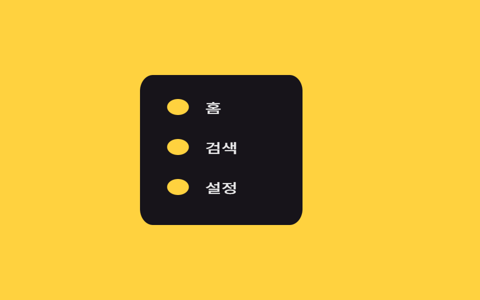
Rail thu nhỏ nguyên khối bằng scaleX(56/200), còn nội dung bên trong dùng đúng số nghịch đảo để chữ và icon không bị bóp méo lúc còn hẹp.
<main class="stage is-demo">
  <nav class="rail" tabindex="0" aria-label="Điều hướng bên">
    <div class="rail__inner">
      <a class="rail__item" href="#"><span class="rail__ic" aria-hidden="true"></span><span class="rail__label">Trang chủ</span></a>
      <a class="rail__item" href="#"><span class="rail__ic" aria-hidden="true"></span><span class="rail__label">Tìm kiếm</span></a>
      <a class="rail__item" href="#"><span class="rail__ic" aria-hidden="true"></span><span class="rail__label">Thiết lập</span></a>
    </div>
  </nav>
</main>
@use "sass:math";
@use "../../../../site/static/demo-tokens" as *;
// ── 변수 3개 ──────────────────────────────────────────
$duration: $dur-base; // 300ms — 넓어지는 시간
$easing: $ease-out;
$color: $stage-yellow; // 활성 아이콘 강조색(배경 대비용, 아래서 재사용)
// ── 데모 무대 ───────────────────────────────────────────
@include stage($stage-yellow);
$collapsed: 56px;
$expanded: 200px;
$ratio: math.div($collapsed, $expanded);
.rail {
position: relative;
overflow: hidden;
width: $expanded;
height: min(50vw, 150px);
border-radius: $r-card;
background: $stage-ink;
transform: scaleX($ratio);
transform-origin: left center; // 규칙8: 레일 좌변 scaleX 접힘·펼침
transition: transform $duration $easing;
cursor: pointer;
}
// 안쪽은 바깥의 scaleX 를 역으로 상쇄해, 글자·아이콘이 눌리지 않는다
.rail__inner {
width: $expanded;
height: 100%;
box-sizing: border-box;
display: flex; flex-direction: column; gap: $sp-2;
padding: $sp-4 $sp-3;
transform: scaleX(math.div(1, $ratio));
transform-origin: left center; // 규칙8: 역상쇄 scaleX 좌변 축
transition: transform $duration $easing;
}
.rail__item {
display: flex; align-items: center; gap: $sp-3;
padding: $sp-2;
border-radius: $r-sm;
color: $stage-paper; text-decoration: none;
&:hover, &:focus-visible { background: rgba($stage-paper, .12); }
}
.rail__ic {
flex: none;
width: $sp-4; height: $sp-4;
border-radius: 50%;
background: $stage-yellow;
}
.rail__label {
font-weight: 500;
font-size: 13px;
line-height: 1;
font-family: inherit;
white-space: nowrap;
opacity: .9;
}
.rail:hover, .rail:focus-within {
transform: scaleX(1);
.rail__inner { transform: scaleX(1); }
}
// 데모 루프: 좁음 → 넓음 → 좁음, 안팎이 반대 배율로 같이 애니메이션
.stage.is-demo .rail { animation: rail-loop $dur-loop $easing infinite; }
.stage.is-demo .rail__inner { animation: rail-inner-loop $dur-loop $easing infinite; }
@keyframes rail-loop {
0%, 100% { transform: scaleX(#{$ratio}); }
30%, 75% { transform: scaleX(1); }
}
@keyframes rail-inner-loop {
0%, 100% { transform: scaleX(#{math.div(1, $ratio)}); }
30%, 75% { transform: scaleX(1); }
}
@media (prefers-reduced-motion: reduce) {
.stage.is-demo .rail, .stage.is-demo .rail__inner { animation: none; }
.rail, .rail__inner { transition-duration: 1ms; }
}html, body {
margin: 0;
overflow: hidden;
}
.stage {
box-sizing: border-box;
min-height: 100vh;
display: grid;
place-items: center;
margin: 0;
background: #ffd23f;
font-family: -apple-system, "Segoe UI", "Noto Sans KR", sans-serif;
padding: clamp(8px, 4vw, 24px);
}
.rail {
position: relative;
overflow: hidden;
width: 200px;
height: min(50vw, 150px);
border-radius: 16px;
background: #17141a;
transform: scaleX(0.28);
transform-origin: left center;
transition: transform 300ms ease-out;
cursor: pointer;
}
.rail__inner {
width: 200px;
height: 100%;
box-sizing: border-box;
display: flex;
flex-direction: column;
gap: 8px;
padding: 16px 12px;
transform: scaleX(3.5714285714);
transform-origin: left center;
transition: transform 300ms ease-out;
}
.rail__item {
display: flex;
align-items: center;
gap: 12px;
padding: 8px;
border-radius: 8px;
color: #ffffff;
text-decoration: none;
}
.rail__item:hover, .rail__item:focus-visible {
background: rgba(255, 255, 255, 0.12);
}
.rail__ic {
flex: none;
width: 16px;
height: 16px;
border-radius: 50%;
background: #ffd23f;
}
.rail__label {
font-weight: 500;
font-size: 13px;
line-height: 1;
font-family: inherit;
white-space: nowrap;
opacity: 0.9;
}
.rail:hover, .rail:focus-within {
transform: scaleX(1);
}
.rail:hover .rail__inner, .rail:focus-within .rail__inner {
transform: scaleX(1);
}
.stage.is-demo .rail {
animation: rail-loop 2s ease-out infinite;
}
.stage.is-demo .rail__inner {
animation: rail-inner-loop 2s ease-out infinite;
}
@keyframes rail-loop {
0%, 100% {
transform: scaleX(0.28);
}
30%, 75% {
transform: scaleX(1);
}
}
@keyframes rail-inner-loop {
0%, 100% {
transform: scaleX(3.5714285714);
}
30%, 75% {
transform: scaleX(1);
}
}
@media (prefers-reduced-motion: reduce) {
.stage.is-demo .rail, .stage.is-demo .rail__inner {
animation: none;
}
.rail, .rail__inner {
transition-duration: 1ms;
}
}// 실제 hover·focus 는 CSS 만으로 동작한다. 이 한 줄은 데모 루프를 실제 상호작용으로 넘겨주는 역할뿐이다.
document.querySelector('.rail').addEventListener('pointerenter', function () {
document.querySelector('.stage').classList.remove('is-demo');
});import type { CSSProperties } from "react";
import styles from "./MiniExpandRail.module.scss";
export type MiniExpandRailProps = {
duration?: number;
easing?: string;
color?: string;
};
const ITEMS = ["홈", "검색", "설정"];
export default function MiniExpandRail({
duration = 300,
easing = "ease-out",
color = "#ffd23f",
}: MiniExpandRailProps) {
const vars: CSSProperties = { "--duration": `${duration}ms`, "--easing": easing, "--color": color };
return (
<div className={styles.stage} style={vars}>
<nav className={styles.rail} tabIndex={0} aria-label="사이드 내비게이션">
<div className={styles.inner}>
{ITEMS.map((label) => (
<a key={label} className={styles.item} href="#">
<span className={styles.ic} aria-hidden="true" />
<span className={styles.label}>{label}</span>
</a>
))}
</div>
</nav>
</div>
);
}06 · Mini mở rộng — Diện tích đo được 16.075% · khung hình chuyển động 13/23Nguyên tác GODRICH · SCSS và React nằm trong tệp zip · Xem mật khẩu
Dùng khi nào
Khi hover hoặc focus-within, cả hai cùng trả về scaleX(1) — width chưa từng được dùng tới.
.rail {
  transform: scaleX(.28);
  transform-origin: left center;
  transition: transform $duration $easing;
  &:hover, &:focus-within { transform: scaleX(1); }
}
.rail__inner {
  transform: scaleX(3.57);
  transform-origin: left center;
  .rail:hover &, .rail:focus-within & { transform: scaleX(1); }
}
07Ẩn khi cuộn
Bạn thấy gì
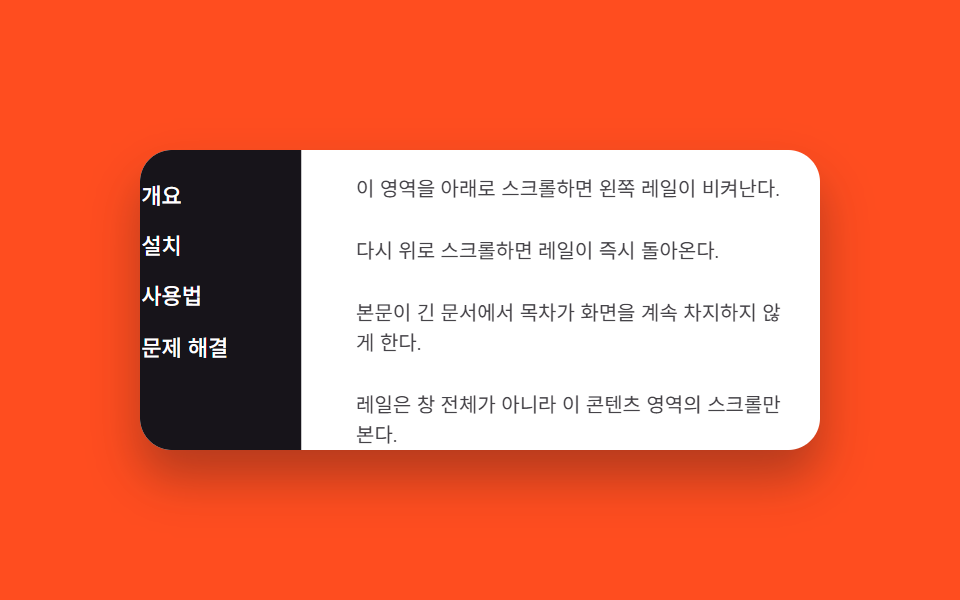
Sự kiện scroll được gắn trên chính panel nội dung bên cạnh, không phải trên cửa sổ, so sánh scrollTop hiện tại với lần trước để bật hoặc gỡ class is-hidden trên rail.
<main class="stage is-demo">
  <div class="layout">
    <nav class="rail" aria-label="Mục lục">
      <a class="rail__link" href="#">Tổng quan</a>
      <a class="rail__link" href="#">Cài đặt</a>
      <a class="rail__link" href="#">Cách dùng</a>
      <a class="rail__link" href="#">Khắc phục sự cố</a>
    </nav>
    <div class="content" id="content">
      <p>Cuộn vùng này xuống thì thanh ray bên trái sẽ lùi sang một bên.</p>
      <p>Cuộn lên lại thì thanh ray quay về ngay lập tức.</p>
      <p>Giúp mục lục không chiếm màn hình mãi trong tài liệu dài.</p>
      <p>Thanh ray theo dõi việc cuộn của vùng nội dung này, không phải cả cửa sổ.</p>
    </div>
  </div>
</main>
@use "../../../../site/static/demo-tokens" as *;
// ── 변수 3개 ──────────────────────────────────────────
$duration: $dur-quick; // 220ms — 실제 스크롤 시 숨는 속도
$easing: $ease-out;
$color: $subject-cream; // 레일 링크 강조색
// ── 데모 무대 ───────────────────────────────────────────
@include stage($stage-orange);
.layout {
display: flex;
width: min(90vw, 340px);
height: min(50vw, 150px);
border-radius: $r-card;
overflow: hidden;
background: $stage-paper;
box-shadow: $shadow-raised;
}
.rail {
flex: none;
width: 96px;
box-sizing: border-box;
display: flex; flex-direction: column; gap: $sp-1;
padding: $sp-3 $sp-2;
background: $stage-ink;
transform: translateX(0);
transition: transform $duration $easing;
}
.rail__link {
padding: $sp-1 $sp-2;
border-radius: $r-xs;
color: $stage-paper; text-decoration: none; font-weight: 500; font-size: 11px; line-height: 1.2; font-family: inherit;
&:hover, &:focus-visible { color: $color; background: rgba($stage-paper, .12); }
}
.rail.is-hidden { transform: translateX(-100%); }
.content {
flex: 1;
overflow-y: auto;
box-sizing: border-box;
padding: $sp-3;
display: flex; flex-direction: column; gap: $sp-4;
color: $stage-ink;
p { margin: 0; font-size: clamp(10px, 3vmin, 12px); line-height: 1.5; opacity: .8; }
}
// 데모 루프: 레일이 나갔다 들어왔다를 2초에 한 바퀴(실제 스크롤 여부와 무관)
.stage.is-demo .rail { animation: rail-loop $dur-loop ease-in-out infinite; }
@keyframes rail-loop {
0%, 100% { transform: translateX(0); }
40%, 70% { transform: translateX(-100%); }
}
@media (prefers-reduced-motion: reduce) {
.stage.is-demo .rail { animation: none; }
.rail { transition-duration: 1ms; }
}html, body {
margin: 0;
overflow: hidden;
}
.stage {
box-sizing: border-box;
min-height: 100vh;
display: grid;
place-items: center;
margin: 0;
background: #ff4d1f;
font-family: -apple-system, "Segoe UI", "Noto Sans KR", sans-serif;
padding: clamp(8px, 4vw, 24px);
}
.layout {
display: flex;
width: min(90vw, 340px);
height: min(50vw, 150px);
border-radius: 16px;
overflow: hidden;
background: #ffffff;
box-shadow: 0 14px 24px rgba(23, 20, 26, 0.32);
}
.rail {
flex: none;
width: 96px;
box-sizing: border-box;
display: flex;
flex-direction: column;
gap: 4px;
padding: 12px 8px;
background: #17141a;
transform: translateX(0);
transition: transform 220ms ease-out;
}
.rail__link {
padding: 4px 8px;
border-radius: 4px;
color: #ffffff;
text-decoration: none;
font-weight: 500;
font-size: 11px;
line-height: 1.2;
font-family: inherit;
}
.rail__link:hover, .rail__link:focus-visible {
color: #fff7e6;
background: rgba(255, 255, 255, 0.12);
}
.rail.is-hidden {
transform: translateX(-100%);
}
.content {
flex: 1;
overflow-y: auto;
box-sizing: border-box;
padding: 12px;
display: flex;
flex-direction: column;
gap: 16px;
color: #17141a;
}
.content p {
margin: 0;
font-size: clamp(10px, 3vmin, 12px);
line-height: 1.5;
opacity: 0.8;
}
.stage.is-demo .rail {
animation: rail-loop 2s ease-in-out infinite;
}
@keyframes rail-loop {
0%, 100% {
transform: translateX(0);
}
40%, 70% {
transform: translateX(-100%);
}
}
@media (prefers-reduced-motion: reduce) {
.stage.is-demo .rail {
animation: none;
}
.rail {
transition-duration: 1ms;
}
}// 콘텐츠 스크롤 방향을 비교해 레일을 translateX 로 숨기고 보인다. 실제 스크롤이 오면 데모 루프를 넘긴다.
(function () {
var stage = document.querySelector('.stage');
var rail = document.querySelector('.rail');
var content = document.getElementById('content');
var last = 0;
content.addEventListener('scroll', function () {
stage.classList.remove('is-demo');
var y = content.scrollTop;
if (y > last + 4) rail.classList.add('is-hidden');
else if (y < last - 4) rail.classList.remove('is-hidden');
last = y;
});
})();import { useRef, useState } from "react";
import type { CSSProperties } from "react";
import styles from "./ScrollHideRail.module.scss";
type ScrollEv = { currentTarget: HTMLDivElement };
export type ScrollHideRailProps = {
duration?: number;
easing?: string;
color?: string;
};
const LINKS = ["개요", "설치", "사용법", "문제 해결"];
export default function ScrollHideRail({
duration = 220,
easing = "ease-out",
color = "#fff7e6",
}: ScrollHideRailProps) {
const [hidden, setHidden] = useState(false);
const lastY = useRef(0);
function onScroll(e: ScrollEv) {
const y = e.currentTarget.scrollTop;
const last = lastY.current ?? 0;
if (y > last + 4) setHidden(true);
else if (y < last - 4) setHidden(false);
lastY.current = y;
}
const vars: CSSProperties = { "--duration": `${duration}ms`, "--easing": easing, "--color": color };
return (
<div className={styles.stage} style={vars}>
<div className={styles.layout}>
<nav className={styles.rail} data-hidden={hidden} aria-label="목차">
{LINKS.map((label) => (
<a key={label} className={styles.link} href="#">{label}</a>
))}
</nav>
<div className={styles.content} onScroll={onScroll}>
<p>이 영역을 아래로 스크롤하면 왼쪽 레일이 비켜난다.</p>
<p>다시 위로 스크롤하면 레일이 즉시 돌아온다.</p>
<p>본문이 긴 문서에서 목차가 화면을 계속 차지하지 않게 한다.</p>
<p>레일은 창 전체가 아니라 이 콘텐츠 영역의 스크롤만 본다.</p>
</div>
</div>
</div>
);
}07 · Ẩn khi cuộn — Diện tích đo được 9.937% · khung hình chuyển động 17/23Nguyên tác GODRICH · SCSS và React nằm trong tệp zip · Xem mật khẩu
Dùng ở đâu
Ngưỡng lệch 4px giúp bỏ qua rung nhẹ của trackpad khi cuộn gần như đứng yên.
content.addEventListener('scroll', function () {
  var y = content.scrollTop;
  if (y > last + 4) rail.classList.add('is-hidden');
  else if (y < last - 4) rail.classList.remove('is-hidden');
  last = y;
});
08Menu lồng nhau
Chuyện gì diễn ra trên màn hình
Sidebar mở theo đúng kiểu trượt của mục 01, còn submenu bên trong xoè ra bằng grid-template-rows từ 0fr sang 1fr.
<main class="stage is-demo">
  <div class="page" id="page8">
    <button class="trigger" type="button" aria-haspopup="dialog" aria-controls="drawer8">Mở menu</button>
  </div>
  <div class="overlay"></div>
  <nav class="drawer" id="drawer8" role="dialog" aria-modal="true" aria-labelledby="t8">
    <h2 id="t8">Danh mục</h2>
    <a class="drawer__link" href="#">Tất cả</a>
    <div class="group">
      <button class="group__toggle" type="button" aria-expanded="false" aria-controls="sub8">
        Nữ <span class="chevron" aria-hidden="true"></span>
      </button>
      <div class="submenu" id="sub8">
        <div class="submenu__inner">
          <a href="#">Áo</a>
          <a href="#">Quần</a>
          <a href="#">Giày</a>
        </div>
      </div>
    </div>
    <a class="drawer__link" href="#">Thương hiệu</a>
    <button class="drawer__close" type="button">Đóng</button>
  </nav>
</main>
@use "../../../../site/static/demo-tokens" as *;
// ── 변수 3개 ──────────────────────────────────────────
$duration: $dur-enter; // 600ms — 드로어가 밀려 들어오는 시간
$easing: $ease-spring;
$color: $subject-blue; // 하위 메뉴 강조색
// ── 데모 무대 ───────────────────────────────────────────
@include stage($stage-paper);
.stage { position: relative; }
.page { display: grid; place-items: center; }
.trigger {
border: 0; border-radius: $r-pill;
padding: $sp-3 $sp-6;
font-weight: 600;
font-size: clamp(13px, 4vmin, 16px);
line-height: 1;
font-family: inherit;
color: $stage-paper; background: $color;
cursor: pointer; -webkit-tap-highlight-color: transparent;
}
.overlay {
position: fixed; inset: 0;
background: rgba($stage-ink, .5);
opacity: 0; pointer-events: none;
transition: opacity $duration $easing;
}
.drawer {
position: fixed; left: 0; top: 0; bottom: 0; right: auto;
transform: translateX(-100%);
width: min(76vw, 240px);
box-sizing: border-box;
display: flex; flex-direction: column; gap: $sp-1;
padding: $sp-6 $sp-4;
background: $stage-ink; color: $stage-paper;
box-shadow: $shadow-raised;
pointer-events: none;
transition: transform $duration $easing;
h2 { margin: 0 0 $sp-2; font-size: clamp(13px, 4.2vmin, 17px); }
}
.drawer__link, .group__toggle {
padding: $sp-2 $sp-1;
border-radius: $r-sm;
color: $stage-paper; text-decoration: none; font-weight: 500; font-size: 13px; line-height: 1; font-family: inherit;
&:hover, &:focus-visible { background: rgba($stage-paper, .1); }
}
.group__toggle {
border: 0; background: transparent;
display: flex; align-items: center; justify-content: space-between;
width: 100%; cursor: pointer;
font-family: inherit;
}
// 체크와 같은 원리: 한 요소의 border 코너를 45° 돌려 화살표를 만든다(BD16)
.chevron {
width: $sp-2; height: $sp-2;
border-right: 2px solid currentColor;
border-bottom: 2px solid currentColor;
transform: rotate(45deg);
transition: transform $dur-base $ease-out;
}
.group.is-open .chevron { transform: rotate(225deg); }
// height:auto 트랜지션 — grid-template-rows 0fr → 1fr (017-01 과 같은 방식)
.submenu {
display: grid;
grid-template-rows: 0fr;
transition: grid-template-rows $dur-base $ease-out;
}
.submenu__inner {
overflow: hidden;
display: flex; flex-direction: column; gap: $sp-1;
padding-left: $sp-4;
a { color: $stage-paper; opacity: .8; text-decoration: none; font-weight: 400; font-size: 12px; line-height: 1.8; font-family: inherit; }
a:hover, a:focus-visible { opacity: 1; color: $color; }
}
.group.is-open .submenu { grid-template-rows: 1fr; }
.drawer__close {
margin-top: auto;
border: 0; border-radius: $r-control;
background: $color; color: $stage-paper;
padding: $sp-2 $sp-4;
font-weight: 600; font-size: 13px; line-height: 1; font-family: inherit; cursor: pointer;
}
.stage.is-open .overlay { opacity: 1; pointer-events: auto; }
.stage.is-open .drawer { transform: translateX(0); pointer-events: auto; }
// 데모 루프: 드로어가 들어온 뒤 하위 메뉴가 펼쳐졌다 접히고, 드로어가 다시 나간다
.stage.is-demo .overlay { animation: overlay-loop $dur-loop ease-in-out infinite; }
.stage.is-demo .drawer { animation: drawer-loop $dur-loop $easing infinite; }
.stage.is-demo .submenu { animation: submenu-loop $dur-loop $ease-out infinite; }
.stage.is-demo .chevron { animation: chevron-loop $dur-loop $ease-out infinite; }
@keyframes overlay-loop {
0%, 100% { opacity: 0; }
12%, 90% { opacity: 1; }
96% { opacity: 0; }
}
@keyframes drawer-loop {
0%, 100% { transform: translateX(-100%); }
12%, 90% { transform: translateX(0); }
96% { transform: translateX(-100%); }
}
@keyframes submenu-loop {
0%, 25%, 100% { grid-template-rows: 0fr; }
45%, 75% { grid-template-rows: 1fr; }
}
@keyframes chevron-loop {
0%, 25%, 100% { transform: rotate(45deg); }
45%, 75% { transform: rotate(225deg); }
}
@media (prefers-reduced-motion: reduce) {
.stage.is-demo .overlay, .stage.is-demo .drawer, .stage.is-demo .submenu, .stage.is-demo .chevron { animation: none; }
.overlay, .drawer, .submenu, .chevron { transition-duration: 1ms; }
}html, body {
margin: 0;
overflow: hidden;
}
.stage {
box-sizing: border-box;
min-height: 100vh;
display: grid;
place-items: center;
margin: 0;
background: #ffffff;
font-family: -apple-system, "Segoe UI", "Noto Sans KR", sans-serif;
padding: clamp(8px, 4vw, 24px);
}
.stage {
position: relative;
}
.page {
display: grid;
place-items: center;
}
.trigger {
border: 0;
border-radius: 999px;
padding: 12px 24px;
font-weight: 600;
font-size: clamp(13px, 4vmin, 16px);
line-height: 1;
font-family: inherit;
color: #ffffff;
background: #2f6df6;
cursor: pointer;
-webkit-tap-highlight-color: transparent;
}
.overlay {
position: fixed;
inset: 0;
background: rgba(23, 20, 26, 0.5);
opacity: 0;
pointer-events: none;
transition: opacity 600ms cubic-bezier(0.2, 0.8, 0.2, 1);
}
.drawer {
position: fixed;
left: 0;
top: 0;
bottom: 0;
right: auto;
transform: translateX(-100%);
width: min(76vw, 240px);
box-sizing: border-box;
display: flex;
flex-direction: column;
gap: 4px;
padding: 24px 16px;
background: #17141a;
color: #ffffff;
box-shadow: 0 14px 24px rgba(23, 20, 26, 0.32);
pointer-events: none;
transition: transform 600ms cubic-bezier(0.2, 0.8, 0.2, 1);
}
.drawer h2 {
margin: 0 0 8px;
font-size: clamp(13px, 4.2vmin, 17px);
}
.drawer__link, .group__toggle {
padding: 8px 4px;
border-radius: 8px;
color: #ffffff;
text-decoration: none;
font-weight: 500;
font-size: 13px;
line-height: 1;
font-family: inherit;
}
.drawer__link:hover, .drawer__link:focus-visible, .group__toggle:hover, .group__toggle:focus-visible {
background: rgba(255, 255, 255, 0.1);
}
.group__toggle {
border: 0;
background: transparent;
display: flex;
align-items: center;
justify-content: space-between;
width: 100%;
cursor: pointer;
font-family: inherit;
}
.chevron {
width: 8px;
height: 8px;
border-right: 2px solid currentColor;
border-bottom: 2px solid currentColor;
transform: rotate(45deg);
transition: transform 300ms ease-out;
}
.group.is-open .chevron {
transform: rotate(225deg);
}
.submenu {
display: grid;
grid-template-rows: 0fr;
transition: grid-template-rows 300ms ease-out;
}
.submenu__inner {
overflow: hidden;
display: flex;
flex-direction: column;
gap: 4px;
padding-left: 16px;
}
.submenu__inner a {
color: #ffffff;
opacity: 0.8;
text-decoration: none;
font-weight: 400;
font-size: 12px;
line-height: 1.8;
font-family: inherit;
}
.submenu__inner a:hover, .submenu__inner a:focus-visible {
opacity: 1;
color: #2f6df6;
}
.group.is-open .submenu {
grid-template-rows: 1fr;
}
.drawer__close {
margin-top: auto;
border: 0;
border-radius: 12px;
background: #2f6df6;
color: #ffffff;
padding: 8px 16px;
font-weight: 600;
font-size: 13px;
line-height: 1;
font-family: inherit;
cursor: pointer;
}
.stage.is-open .overlay {
opacity: 1;
pointer-events: auto;
}
.stage.is-open .drawer {
transform: translateX(0);
pointer-events: auto;
}
.stage.is-demo .overlay {
animation: overlay-loop 2s ease-in-out infinite;
}
.stage.is-demo .drawer {
animation: drawer-loop 2s cubic-bezier(0.2, 0.8, 0.2, 1) infinite;
}
.stage.is-demo .submenu {
animation: submenu-loop 2s ease-out infinite;
}
.stage.is-demo .chevron {
animation: chevron-loop 2s ease-out infinite;
}
@keyframes overlay-loop {
0%, 100% {
opacity: 0;
}
12%, 90% {
opacity: 1;
}
96% {
opacity: 0;
}
}
@keyframes drawer-loop {
0%, 100% {
transform: translateX(-100%);
}
12%, 90% {
transform: translateX(0);
}
96% {
transform: translateX(-100%);
}
}
@keyframes submenu-loop {
0%, 25%, 100% {
grid-template-rows: 0fr;
}
45%, 75% {
grid-template-rows: 1fr;
}
}
@keyframes chevron-loop {
0%, 25%, 100% {
transform: rotate(45deg);
}
45%, 75% {
transform: rotate(225deg);
}
}
@media (prefers-reduced-motion: reduce) {
.stage.is-demo .overlay, .stage.is-demo .drawer, .stage.is-demo .submenu, .stage.is-demo .chevron {
animation: none;
}
.overlay, .drawer, .submenu, .chevron {
transition-duration: 1ms;
}
}(function () {
var stage = document.querySelector('.stage');
var page = document.getElementById('page8');
var trigger = document.querySelector('.trigger');
var overlay = document.querySelector('.overlay');
var drawer = document.querySelector('.drawer');
var closeBtn = document.querySelector('.drawer__close');
var group = document.querySelector('.group');
var groupToggle = document.querySelector('.group__toggle');
function focusables() { return drawer.querySelectorAll('a, button'); }
function open() {
stage.classList.remove('is-demo'); stage.classList.add('is-open');
page.setAttribute('inert', ''); page.setAttribute('aria-hidden', 'true');
focusables()[0].focus({ preventScroll: true });
}
function shut() {
stage.classList.remove('is-open');
page.removeAttribute('inert'); page.removeAttribute('aria-hidden');
trigger.focus({ preventScroll: true });
}
trigger.addEventListener('click', open);
overlay.addEventListener('click', shut);
closeBtn.addEventListener('click', shut);
groupToggle.addEventListener('click', function () {
var open = group.classList.toggle('is-open');
groupToggle.setAttribute('aria-expanded', String(open));
});
document.addEventListener('keydown', function (e) {
if (!stage.classList.contains('is-open')) return;
if (e.key === 'Escape') { shut(); return; }
if (e.key !== 'Tab') return;
var f = focusables(), first = f[0], last = f[f.length - 1];
if (e.shiftKey && document.activeElement === first) { last.focus({ preventScroll: true }); e.preventDefault(); }
else if (!e.shiftKey && document.activeElement === last) { first.focus({ preventScroll: true }); e.preventDefault(); }
});
})();import { useEffect, useRef, useState } from "react";
import type { CSSProperties } from "react";
import styles from "./NestedMenuDrawer.module.scss";
export type NestedMenuDrawerProps = {
duration?: number;
easing?: string;
color?: string;
};
export default function NestedMenuDrawer({
duration = 600,
easing = "cubic-bezier(.2,.8,.2,1)",
color = "#2f6df6",
}: NestedMenuDrawerProps) {
const [open, setOpen] = useState(false);
const [groupOpen, setGroupOpen] = useState(false);
const drawerRef = useRef<HTMLElement | null>(null);
const triggerRef = useRef<HTMLButtonElement | null>(null);
useEffect(() => {
if (!open) { triggerRef.current?.focus(); return; }
const drawer = drawerRef.current;
if (!drawer) return;
const focusables = () => Array.from(drawer.querySelectorAll<HTMLElement>("a, button"));
focusables()[0]?.focus();
function onKey(e: KeyboardEvent) {
if (e.key === "Escape") { setOpen(false); return; }
if (e.key !== "Tab") return;
const f = focusables();
const first = f[0], last = f[f.length - 1];
if (e.shiftKey && document.activeElement === first) { last.focus(); e.preventDefault(); }
else if (!e.shiftKey && document.activeElement === last) { first.focus(); e.preventDefault(); }
}
document.addEventListener("keydown", onKey);
return () => document.removeEventListener("keydown", onKey);
}, [open]);
const vars: CSSProperties = { "--duration": `${duration}ms`, "--easing": easing, "--color": color };
return (
<div className={styles.stage} style={vars}>
<div className={styles.page} inert={open || undefined} aria-hidden={open}>
<button ref={triggerRef} className={styles.trigger} type="button" onClick={() => setOpen(true)}>
메뉴 열기
</button>
</div>
<div className={styles.overlay} data-open={open} onClick={() => setOpen(false)} />
<nav ref={drawerRef} className={styles.drawer} data-open={open} role="dialog" aria-modal="true" aria-label="카테고리">
<h2>카테고리</h2>
<a className={styles.link} href="#">전체</a>
<div className={styles.group}>
<button
className={styles.groupToggle}
type="button"
aria-expanded={groupOpen}
onClick={() => setGroupOpen((v) => !v)}
>
여성 <span className={styles.chevron} data-open={groupOpen} aria-hidden="true" />
</button>
<div className={styles.submenu} data-open={groupOpen}>
<div className={styles.submenuInner}>
<a href="#">상의</a>
<a href="#">하의</a>
<a href="#">신발</a>
</div>
</div>
</div>
<a className={styles.link} href="#">브랜드</a>
<button className={styles.close} type="button" onClick={() => setOpen(false)}>닫기</button>
</nav>
</div>
);
}08 · Menu lồng nhau — Diện tích đo được 100.0% · khung hình chuyển động 13/23Nguyên tác GODRICH · SCSS và React nằm trong tệp zip · Xem mật khẩu
Chỗ dùng
Chevron không phải một ký tự mũi tên mà là góc của một khối border được xoay từ 45deg sang 225deg khi submenu mở.
.submenu {
  display: grid;
  grid-template-rows: 0fr;
  transition: grid-template-rows $dur-base $ease-out;
}
.group.is-open .submenu { grid-template-rows: 1fr; }
.chevron {
  border-right: 2px solid currentColor;
  border-bottom: 2px solid currentColor;
  transform: rotate(45deg);
}
.group.is-open .chevron { transform: rotate(225deg); }
09Thanh tab dưới cùng
Chuyển động thế nào
Chạm vào một tab, JS tính vị trí theo chỉ số rồi gán thẳng indicator.style.transform = translateX(i * 100%), CSS chỉ khai báo sẵn transition cho thuộc tính transform.
<main class="stage is-demo">
  <nav class="tabbar" aria-label="Điều hướng dưới">
    <button class="tab is-active" type="button" aria-current="page"><span class="tab__ic" aria-hidden="true"></span><span class="tab__label">Trang chủ</span></button>
    <button class="tab" type="button"><span class="tab__ic" aria-hidden="true"></span><span class="tab__label">Tìm kiếm</span></button>
    <button class="tab" type="button"><span class="tab__ic" aria-hidden="true"></span><span class="tab__label">Đã lưu</span></button>
    <button class="tab" type="button"><span class="tab__ic" aria-hidden="true"></span><span class="tab__label">Cá nhân</span></button>
    <span class="indicator" aria-hidden="true"></span>
  </nav>
</main>
@use "../../../../site/static/demo-tokens" as *;
// ── 변수 3개 ──────────────────────────────────────────
$duration: $dur-quick; // 220ms — 인디케이터가 옆 탭으로 미끄러지는 시간
$easing: $ease-spring;
$color: $subject-cream; // 활성 탭 강조색
// ── 데모 무대 ───────────────────────────────────────────
@include stage($stage-ink);
.tabbar {
position: relative;
display: flex;
width: min(92vw, 320px);
border-radius: $r-card;
background: rgba($stage-paper, .06);
padding: $sp-1;
box-sizing: border-box;
}
.tab {
flex: 1;
display: flex; flex-direction: column; align-items: center; gap: $sp-1;
border: 0; background: transparent; cursor: pointer;
padding: $sp-2 $sp-1;
color: $stage-paper;
font-family: inherit;
-webkit-tap-highlight-color: transparent;
}
.tab__ic {
width: $sp-4; height: $sp-4;
border-radius: 50%;
background: currentColor;
opacity: .5;
transform: scale(1);
transition: opacity $duration $easing, transform $duration $easing;
}
.tab__label {
font-weight: 500;
font-size: 10px;
line-height: 1;
font-family: inherit;
opacity: .55;
transform: translateY(0);
transition: opacity $duration $easing, transform $duration $easing;
}
.tab.is-active {
color: $color;
.tab__ic { opacity: 1; transform: scale(1.15); }
.tab__label { opacity: 1; transform: translateY(-2px); }
}
.indicator {
position: absolute; left: $sp-1; bottom: $sp-1;
width: calc(25% - #{$sp-1});
height: 3px;
border-radius: $r-xs;
background: $color;
transform: translateX(0);
transition: transform $duration $easing;
}
// 데모 루프: 인디케이터가 네 탭을 순서대로 돌고, 각 탭은 도착하는 구간에서만 밝아진다
.stage.is-demo .indicator { animation: indicator-loop $dur-loop $easing infinite; }
.stage.is-demo .tab:nth-child(1) .tab__ic { animation: tab-ic-loop $dur-loop $easing infinite; animation-delay: 0ms; }
.stage.is-demo .tab:nth-child(2) .tab__ic { animation: tab-ic-loop $dur-loop $easing infinite; animation-delay: 500ms; }
.stage.is-demo .tab:nth-child(3) .tab__ic { animation: tab-ic-loop $dur-loop $easing infinite; animation-delay: 1000ms; }
.stage.is-demo .tab:nth-child(4) .tab__ic { animation: tab-ic-loop $dur-loop $easing infinite; animation-delay: 1500ms; }
.stage.is-demo .tab:nth-child(1) .tab__label { animation: tab-label-loop $dur-loop $easing infinite; animation-delay: 0ms; }
.stage.is-demo .tab:nth-child(2) .tab__label { animation: tab-label-loop $dur-loop $easing infinite; animation-delay: 500ms; }
.stage.is-demo .tab:nth-child(3) .tab__label { animation: tab-label-loop $dur-loop $easing infinite; animation-delay: 1000ms; }
.stage.is-demo .tab:nth-child(4) .tab__label { animation: tab-label-loop $dur-loop $easing infinite; animation-delay: 1500ms; }
@keyframes indicator-loop {
0%, 20% { transform: translateX(0); }
25%, 45% { transform: translateX(100%); }
50%, 70% { transform: translateX(200%); }
75%, 95% { transform: translateX(300%); }
100% { transform: translateX(0); }
}
@keyframes tab-ic-loop {
0%, 20% { opacity: 1; transform: scale(1.15); }
25%, 100% { opacity: .5; transform: scale(1); }
}
@keyframes tab-label-loop {
0%, 20% { opacity: 1; transform: translateY(-2px); }
25%, 100% { opacity: .55; transform: translateY(0); }
}
@media (prefers-reduced-motion: reduce) {
.stage.is-demo .indicator,
.stage.is-demo .tab .tab__ic,
.stage.is-demo .tab .tab__label { animation: none; }
.indicator, .tab__ic, .tab__label { transition-duration: 1ms; }
}html, body {
margin: 0;
overflow: hidden;
}
.stage {
box-sizing: border-box;
min-height: 100vh;
display: grid;
place-items: center;
margin: 0;
background: #17141a;
font-family: -apple-system, "Segoe UI", "Noto Sans KR", sans-serif;
padding: clamp(8px, 4vw, 24px);
}
.tabbar {
position: relative;
display: flex;
width: min(92vw, 320px);
border-radius: 16px;
background: rgba(255, 255, 255, 0.06);
padding: 4px;
box-sizing: border-box;
}
.tab {
flex: 1;
display: flex;
flex-direction: column;
align-items: center;
gap: 4px;
border: 0;
background: transparent;
cursor: pointer;
padding: 8px 4px;
color: #ffffff;
font-family: inherit;
-webkit-tap-highlight-color: transparent;
}
.tab__ic {
width: 16px;
height: 16px;
border-radius: 50%;
background: currentColor;
opacity: 0.5;
transform: scale(1);
transition: opacity 220ms cubic-bezier(0.2, 0.8, 0.2, 1), transform 220ms cubic-bezier(0.2, 0.8, 0.2, 1);
}
.tab__label {
font-weight: 500;
font-size: 10px;
line-height: 1;
font-family: inherit;
opacity: 0.55;
transform: translateY(0);
transition: opacity 220ms cubic-bezier(0.2, 0.8, 0.2, 1), transform 220ms cubic-bezier(0.2, 0.8, 0.2, 1);
}
.tab.is-active {
color: #fff7e6;
}
.tab.is-active .tab__ic {
opacity: 1;
transform: scale(1.15);
}
.tab.is-active .tab__label {
opacity: 1;
transform: translateY(-2px);
}
.indicator {
position: absolute;
left: 4px;
bottom: 4px;
width: calc(25% - 4px);
height: 3px;
border-radius: 4px;
background: #fff7e6;
transform: translateX(0);
transition: transform 220ms cubic-bezier(0.2, 0.8, 0.2, 1);
}
.stage.is-demo .indicator {
animation: indicator-loop 2s cubic-bezier(0.2, 0.8, 0.2, 1) infinite;
}
.stage.is-demo .tab:nth-child(1) .tab__ic {
animation: tab-ic-loop 2s cubic-bezier(0.2, 0.8, 0.2, 1) infinite;
animation-delay: 0ms;
}
.stage.is-demo .tab:nth-child(2) .tab__ic {
animation: tab-ic-loop 2s cubic-bezier(0.2, 0.8, 0.2, 1) infinite;
animation-delay: 500ms;
}
.stage.is-demo .tab:nth-child(3) .tab__ic {
animation: tab-ic-loop 2s cubic-bezier(0.2, 0.8, 0.2, 1) infinite;
animation-delay: 1000ms;
}
.stage.is-demo .tab:nth-child(4) .tab__ic {
animation: tab-ic-loop 2s cubic-bezier(0.2, 0.8, 0.2, 1) infinite;
animation-delay: 1500ms;
}
.stage.is-demo .tab:nth-child(1) .tab__label {
animation: tab-label-loop 2s cubic-bezier(0.2, 0.8, 0.2, 1) infinite;
animation-delay: 0ms;
}
.stage.is-demo .tab:nth-child(2) .tab__label {
animation: tab-label-loop 2s cubic-bezier(0.2, 0.8, 0.2, 1) infinite;
animation-delay: 500ms;
}
.stage.is-demo .tab:nth-child(3) .tab__label {
animation: tab-label-loop 2s cubic-bezier(0.2, 0.8, 0.2, 1) infinite;
animation-delay: 1000ms;
}
.stage.is-demo .tab:nth-child(4) .tab__label {
animation: tab-label-loop 2s cubic-bezier(0.2, 0.8, 0.2, 1) infinite;
animation-delay: 1500ms;
}
@keyframes indicator-loop {
0%, 20% {
transform: translateX(0);
}
25%, 45% {
transform: translateX(100%);
}
50%, 70% {
transform: translateX(200%);
}
75%, 95% {
transform: translateX(300%);
}
100% {
transform: translateX(0);
}
}
@keyframes tab-ic-loop {
0%, 20% {
opacity: 1;
transform: scale(1.15);
}
25%, 100% {
opacity: 0.5;
transform: scale(1);
}
}
@keyframes tab-label-loop {
0%, 20% {
opacity: 1;
transform: translateY(-2px);
}
25%, 100% {
opacity: 0.55;
transform: translateY(0);
}
}
@media (prefers-reduced-motion: reduce) {
.stage.is-demo .indicator,
.stage.is-demo .tab .tab__ic,
.stage.is-demo .tab .tab__label {
animation: none;
}
.indicator, .tab__ic, .tab__label {
transition-duration: 1ms;
}
}(function () {
var stage = document.querySelector('.stage');
var tabs = document.querySelectorAll('.tab');
var indicator = document.querySelector('.indicator');
tabs.forEach(function (tab, i) {
tab.addEventListener('click', function () {
stage.classList.remove('is-demo');
tabs.forEach(function (t) { t.classList.remove('is-active'); t.removeAttribute('aria-current'); });
tab.classList.add('is-active'); tab.setAttribute('aria-current', 'page');
indicator.style.transform = 'translateX(' + (i * 100) + '%)';
});
});
})();import { useState } from "react";
import type { CSSProperties } from "react";
import styles from "./BottomTabBar.module.scss";
export type BottomTabBarProps = {
duration?: number;
easing?: string;
color?: string;
};
const TABS = ["홈", "검색", "찜", "마이"];
export default function BottomTabBar({
duration = 220,
easing = "cubic-bezier(.2,.8,.2,1)",
color = "#fff7e6",
}: BottomTabBarProps) {
const [active, setActive] = useState(0);
const vars: CSSProperties = {
"--duration": `${duration}ms`,
"--easing": easing,
"--color": color,
"--i": active,
};
return (
<div className={styles.stage} style={vars}>
<nav className={styles.tabbar} aria-label="하단 내비게이션">
{TABS.map((label, i) => (
<button
key={label}
className={styles.tab}
type="button"
data-active={i === active}
aria-current={i === active ? "page" : undefined}
onClick={() => setActive(i)}
>
<span className={styles.ic} aria-hidden="true" />
<span className={styles.label}>{label}</span>
</button>
))}
<span className={styles.indicator} aria-hidden="true" />
</nav>
</div>
);
}09 · Thanh tab dưới cùng — Diện tích đo được 1.886% · khung hình chuyển động 7/23Nguyên tác GODRICH · SCSS và React nằm trong tệp zip · Xem mật khẩu
Dùng khi nào
Icon của tab vừa chọn phóng to nhẹ qua scale, còn nhãn dịch lên nhẹ qua translateY, cả hai cùng rõ hơn qua opacity.
.indicator {
  position: absolute; left: $sp-1; bottom: $sp-1;
  width: calc(25% - #{$sp-1});
  transform: translateX(0);
  transition: transform $duration $easing;
}
.tab.is-active .tab__ic { opacity: 1; transform: scale(1.15); }
Chỗ dễ hỏng ở đâu? — cái bẫy
Style mặc định của dialog
Chỗ dễ vỡ nhất là style mặc định của <dialog> ở mục 02. Trình duyệt tự căn nó vào giữa màn hình theo đúng kích thước nội dung, nên nếu không xoá hết inset, margin và border, thứ hiện ra không phải panel cao hết màn hình bên trái mà là một hộp nhỏ nằm giữa. Mục 06 vấp lỗi tương tự theo hướng khác — quên đặt scaleX nghịch đảo cho .rail__inner thì chữ bên trong sẽ bị bóp dẹt trước khi rail kịp mở rộng.
Ngưỡng scroll và iframe
Chỗ thứ hai từng gặp là ngưỡng scroll ở mục 07: để giá trị 0 thì mỗi rung nhẹ của trackpad cũng làm rail nhấp nháy, phải nâng lên 4px mới hết. Bộ chín file đã chỉnh sẵn hai lỗi đó nằm trong file nén, mở bằng mật khẩu 2g6qnjwn, gõ đúng như nó hiện trên dòng này. Một chỗ cần cẩn thận khác không nằm trong CSS: vì demo này được nhúng qua iframe ngay trên trang chủ, mọi lệnh .focus() trong JS thật đều phải kèm { preventScroll: true } — thiếu cờ đó thì việc mở drawer sẽ kéo luôn scroll của trang cha.
Khả năng tiếp cận
Khoá nền và bẫy focus
Các mục 01, 03, 08 khoá nền y hệt nhau khi mở: gắn inert và aria-hidden="true" lên vùng nội dung phía sau, đưa focus tới phần tử có thể focus đầu tiên trong drawer, rồi giữ phím Tab xoay vòng bên trong bằng cách theo dõi phần tử đầu và cuối. Đoạn JS thật trong cả ba mục gần như giống hệt nhau:
function open() {
  page.setAttribute('inert', '');
  page.setAttribute('aria-hidden', 'true');
  focusables()[0].focus({ preventScroll: true });
}
document.addEventListener('keydown', function (e) {
  if (e.key === 'Escape') { shut(); return; }
  if (e.key !== 'Tab') return;
  var f = focusables(), first = f[0], last = f[f.length - 1];
  if (e.shiftKey && document.activeElement === first) {
    last.focus({ preventScroll: true }); e.preventDefault();
  } else if (!e.shiftKey && document.activeElement === last) {
    first.focus({ preventScroll: true }); e.preventDefault();
  }
});
Mục 02 không cần đoạn code này vì <dialog> cùng showModal() đã tự làm mọi việc — focus trap, Escape, chặn tương tác nền đều là hành vi mặc định của trình duyệt, MDN xác nhận rõ điều này. Mục 05 không phải modal mà là điều hướng luôn hiện diện, nên thay vì inert nó chỉ đổi aria-hidden và tabIndex của các link theo trạng thái đóng mở, còn mục 09 để mỗi tab tự mang aria-current="page" khi đang chọn. Thuộc tính inert được trình duyệt hiện đại hỗ trợ rộng, còn cách prefers-reduced-motion: reduce tắt animation ở cả chín mục được ghi rõ trong trang MDN về reduced-motion.
Các hiệu ứng CSS khác của site nằm trong chuyên mục CSS, còn trang giới thiệu nói rõ vì sao mỗi bài ở đây đều đóng gói kèm bản đo đạc thật.
FAQ
Sidebar và drawer có phải cùng một thứ không?
Gần như vậy. Sidebar là tên chung cho một panel dính vào mép màn hình, còn drawer chỉ cách nó xuất hiện — kiểu trượt ra như ngăn kéo. Chín mục trong bài này đều là sidebar, chỉ khác nhau ở cách mở.
Bản React trong file nén quản lý trạng thái kiểu gì?
Phần lớn chỉ cần một useState boolean để đóng mở. Riêng mục 04 giữ ba mốc peek, half, full bằng một state kiểu chuỗi, còn mục 09 giữ chỉ số tab đang chọn bằng một state kiểu số.
Trên di động nên chọn kiểu nào?
Nếu màn hình hẹp, mục 09 thanh tab dưới cùng tự nhiên hơn hẳn một sidebar thu nhỏ. Còn khi vẫn cần đúng nghĩa sidebar, mục 04 bottom sheet hoặc mục 01 trượt từ trái là hai kiểu dễ thao tác bằng ngón tay nhất.
Có thể bạn cũng thích
 Chuyển cảnh9 hiệu ứng css page transition animation không JS
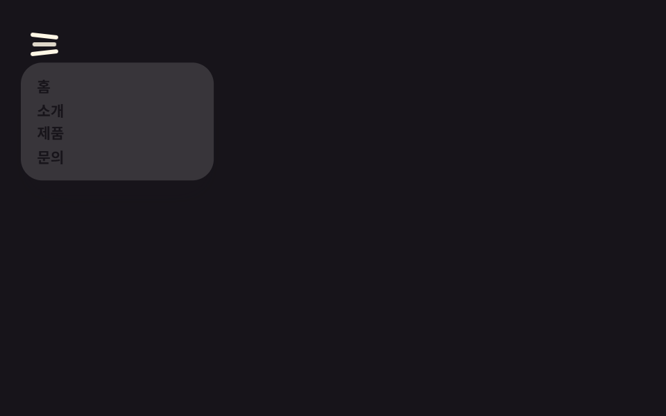 Chuyển cảnh9 hiệu ứng css hamburger menu animation không JS
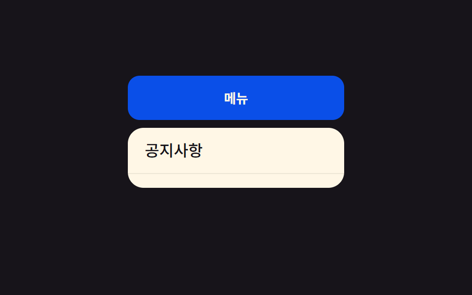 Chuyển cảnh9 css dropdown menu animation — không JS, chỉ CSS
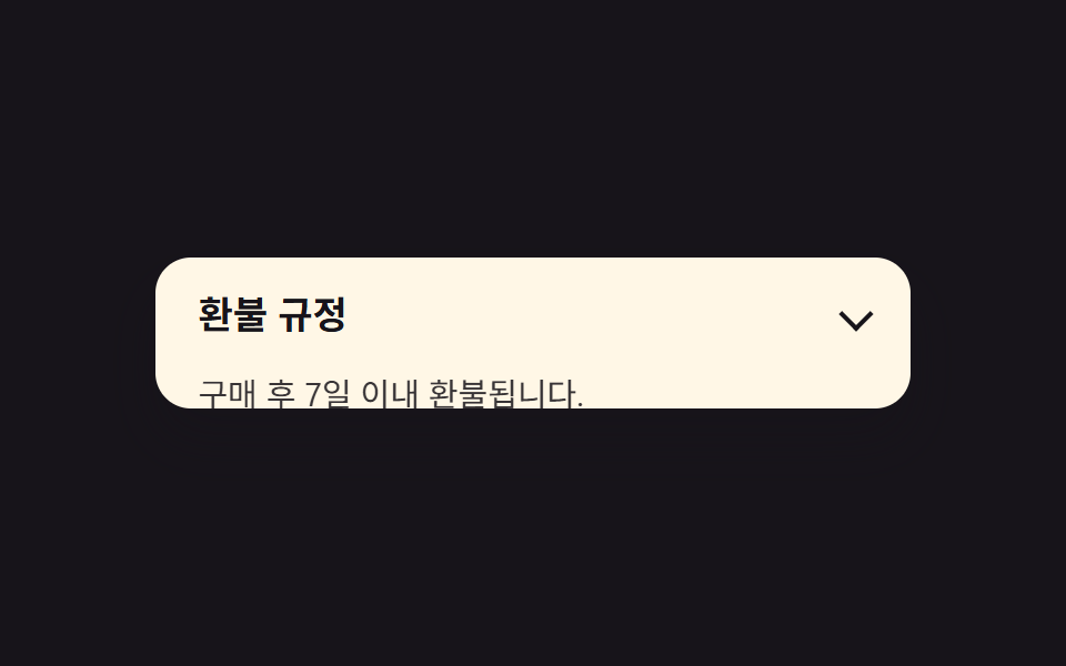 Chuyển cảnh9 hiệu ứng css accordion animation không JS
 Chuyển cảnh9 CSS Toast Notification — không cần JS
 Chuyển cảnh9 CSS Tab Switch Animations — gần như chỉ CSS
 Chuyển cảnh9 hiệu ứng css modal animation gọn nhẹ
 Phản hồi9 SVG Icon Animation CSS — dán 1 dòng là chạy
 Nút bấm9 hiệu ứng css button animation copy-paste
 Cuộn trang9 CSS sticky header không cần JS