9 CSS sticky header không cần JS
Css sticky header là kiểu header dùng position: sticky để dính lại trên đầu màn hình khi bạn cuộn trang, thay vì trôi mất theo nội dung.
 01 sticky-header-hide-reveal
 02 sticky-header-shadow-on-scroll
 03 sticky-header-color-invert
 04 sticky-header-logo-shrink
 05 sticky-header-progress-bar
 06 sticky-header-sub-nav-sticky
 07 sticky-header-section-title-sticky
 08 sticky-header-backdrop-blur
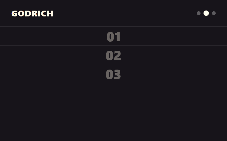 09 sticky-header-scroll-snap
Tự chạy · bấm ô để tới mục đó · cả 9 trong một zip
- 01 Ẩn rồi hiện lại
- 02 Đổ bóng khi cuộn
- 03 Đảo màu khi cuộn
- 04 Chỉ logo thu nhỏ
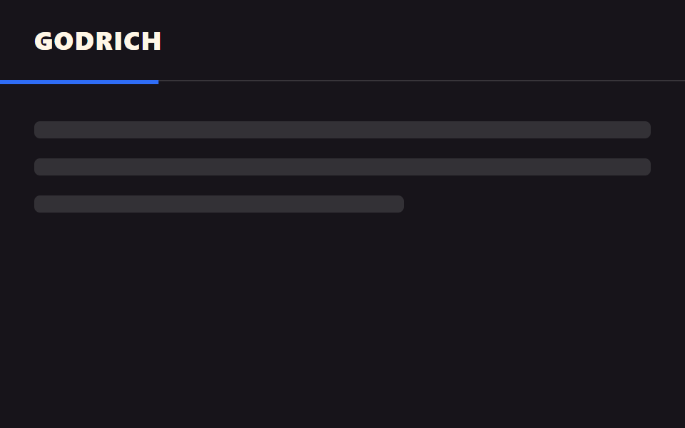
- 05 Gắn thanh tiến độ
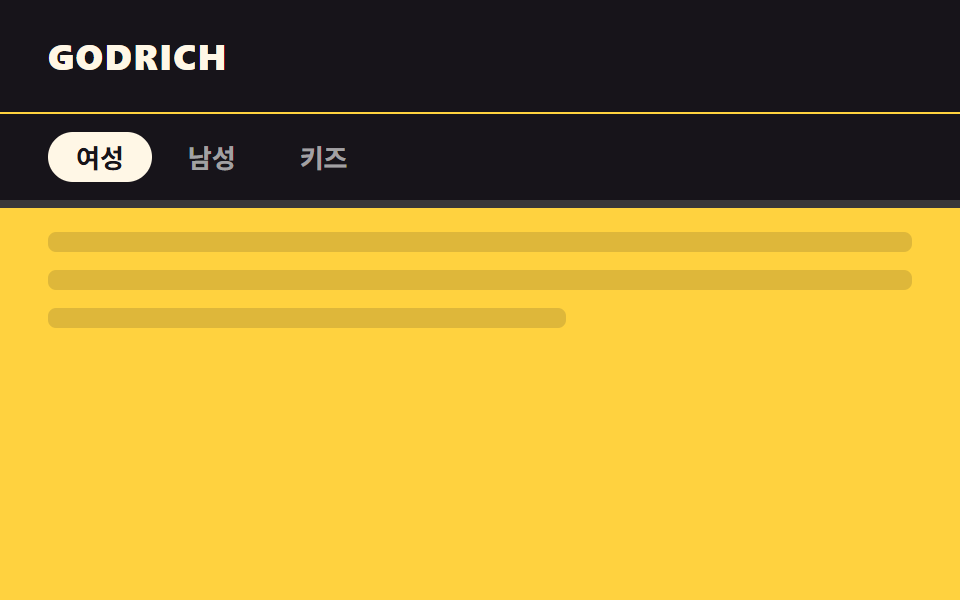
- 06 Sub-nav dính theo
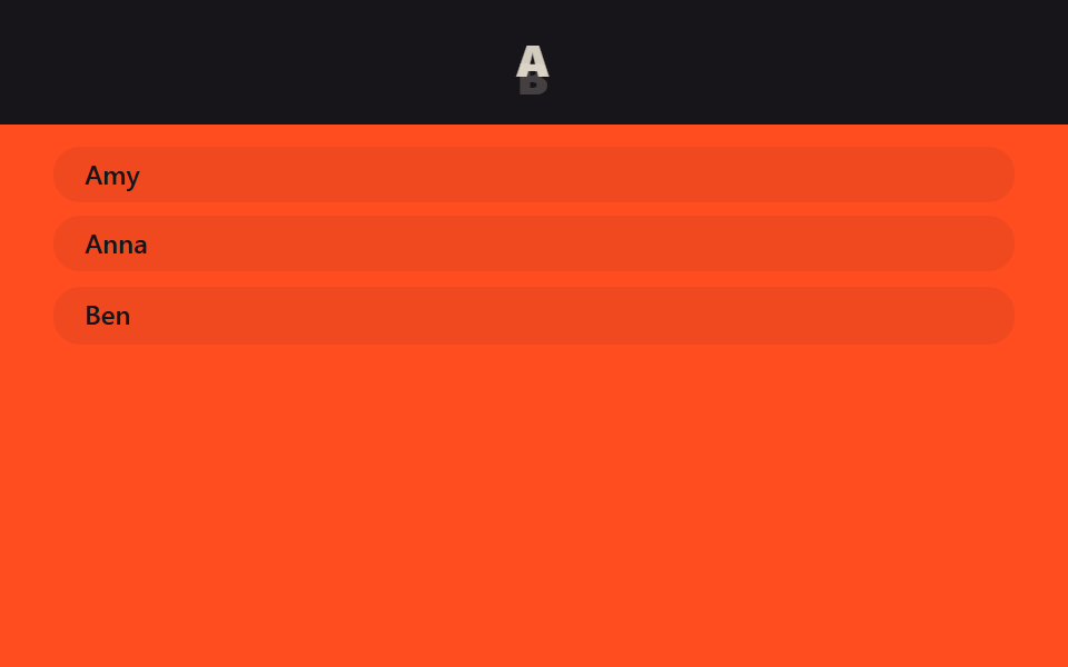
- 07 Tiêu đề section dính theo
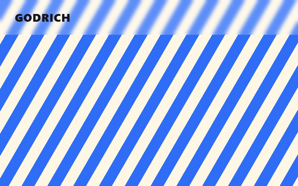
- 08 Header backdrop blur
- 09 Header đồng bộ scroll-snap
Chín kiểu này không xếp theo mức phổ biến mà theo trình tự mà một header thật sự trải qua khi bạn cuộn trang: nhận ra hướng cuộn (01), báo hiệu đã rời khỏi đỉnh trang (02), đổi hẳn diện mạo qua khỏi hero (03), giảm bớt sức nặng thị giác (04), dẫn dắt tiến độ đọc (05), mở rộng thêm một tầng điều hướng (06), cập nhật đúng ngữ cảnh đang xem (07), cho nền phía sau xuyên qua (08), rồi báo đúng vị trí đang đứng trong một trang chia section (09). Mỗi khối code dưới đây chỉ giữ phần lõi tạo nên chuyển động; bản đầy đủ, không cắt dòng nào, nằm trong file zip.
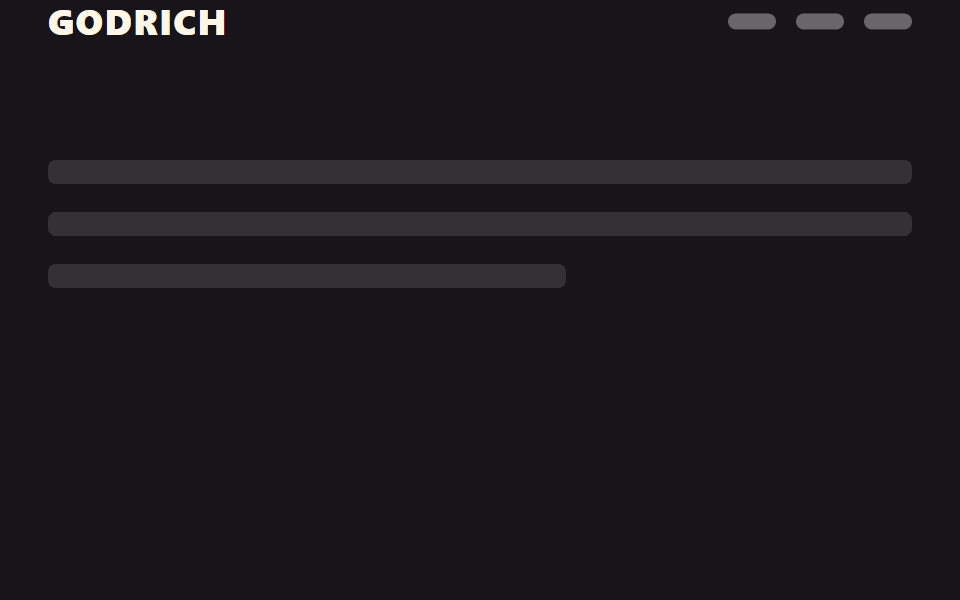
01Ẩn rồi hiện lại
Bạn thấy gì
Một đoạn JS ngắn theo dõi hướng cuộn: cuộn xuống thì gắn class .is-hidden khiến header trượt lên bằng transform: translateY(-100%), còn cuộn ngược lên thì gỡ ngay class đó.
<main class="stage">
  <header class="head is-demo">
    <span class="head__logo">GODRICH</span>
    <nav class="head__nav" aria-hidden="true"><span></span><span></span><span></span></nav>
  </header>
  <div class="page">
    <p class="page__line"></p>
    <p class="page__line"></p>
    <p class="page__line short"></p>
  </div>
</main>
@use "../../../../site/static/demo-tokens" as *;
// ── 변수 3개. 변형은 이것만 바꾼다 ──────────────────────────
$duration: $dur-base; // 숨고 나타나는 시간
$easing: $ease-out;
$color: $stage-ink; // 헤더 배경
// ── 데모 무대 ──────────────────────────────────────────
html, body { margin: 0; overflow: hidden; }
.stage {
min-height: 100vh;
margin: 0;
background: $stage-ink;
font-family: -apple-system, "Segoe UI", "Noto Sans KR", sans-serif;
}
.head {
position: sticky;
top: 0;
height: 56px;
display: flex;
align-items: center;
justify-content: space-between;
padding: 0 clamp(16px, 5vw, 24px);
background: $color;
transition: transform $duration $easing;
&__logo { color: $subject-cream; font-weight: 800; font-size: 18px; line-height: 1; font-family: inherit; letter-spacing: .04em; }
&__nav { display: flex; gap: 10px; span { width: 24px; height: 8px; border-radius: 4px; background: rgba(255, 255, 255, .35); } }
// 실제 사용: 아래로 스크롤하면 위로 숨는다 (JS 가 .is-hidden 을 토글)
&.is-hidden { transform: translateY(-100%); }
}
// ── 데모(.is-demo): 숨었다 나타났다 2초 루프 ──────────────
.head.is-demo {
animation: hide-reveal-loop $dur-loop $easing infinite;
}
@keyframes hide-reveal-loop {
0%, 20% { transform: translateY(0); }
45%, 70% { transform: translateY(-100%); }
95%, 100% { transform: translateY(0); }
}
// ── 배경: 문서처럼 보이는 자리 ─────────────────────────
.page { padding: 24px 24px 0; }
.page__line {
height: 12px;
margin: 0 0 14px;
border-radius: 4px;
background: rgba(255, 255, 255, .12);
&.short { width: 60%; }
}
// ── 접근성: 움직임 줄이기 설정이면 즉시 상태만 바뀐다 ────────
@media (prefers-reduced-motion: reduce) {
.head { transition: none; }
.head.is-demo { animation: none !important; transform: translateY(0); }
}html, body {
margin: 0;
overflow: hidden;
}
.stage {
min-height: 100vh;
margin: 0;
background: #17141a;
font-family: -apple-system, "Segoe UI", "Noto Sans KR", sans-serif;
}
.head {
position: sticky;
top: 0;
height: 56px;
display: flex;
align-items: center;
justify-content: space-between;
padding: 0 clamp(16px, 5vw, 24px);
background: #17141a;
transition: transform 300ms ease-out;
}
.head__logo {
color: #fff7e6;
font-weight: 800;
font-size: 18px;
line-height: 1;
font-family: inherit;
letter-spacing: 0.04em;
}
.head__nav {
display: flex;
gap: 10px;
}
.head__nav span {
width: 24px;
height: 8px;
border-radius: 4px;
background: rgba(255, 255, 255, 0.35);
}
.head.is-hidden {
transform: translateY(-100%);
}
.head.is-demo {
animation: hide-reveal-loop 2s ease-out infinite;
}
@keyframes hide-reveal-loop {
0%, 20% {
transform: translateY(0);
}
45%, 70% {
transform: translateY(-100%);
}
95%, 100% {
transform: translateY(0);
}
}
.page {
padding: 24px 24px 0;
}
.page__line {
height: 12px;
margin: 0 0 14px;
border-radius: 4px;
background: rgba(255, 255, 255, 0.12);
}
.page__line.short {
width: 60%;
}
@media (prefers-reduced-motion: reduce) {
.head {
transition: none;
}
.head.is-demo {
animation: none !important;
transform: translateY(0);
}
}// 실제 페이지: 아래로 스크롤하면 숨기고 위로 스크롤하는 순간에만 다시 보인다 (방향 감지, 8줄)
var head = document.querySelector('.head');
var lastY = window.scrollY;
window.addEventListener('scroll', function () {
  var y = window.scrollY;
  head.classList.toggle('is-hidden', y > lastY && y > 40);
  lastY = y;
}, { passive: true });import { useEffect, useRef } from "react";
import type { CSSProperties, ReactNode } from "react";
import styles from "./HideRevealHeader.module.scss";
export type HideRevealHeaderProps = {
logo: string;
children?: ReactNode;
/** 숨고 나타나는 시간 (기본 300ms) */
duration?: number;
easing?: string;
color?: string;
};
type Vars = CSSProperties & { "--duration"?: string; "--easing"?: string; "--color"?: string };
export default function HideRevealHeader({
logo,
children,
duration = 300,
easing = "ease-out",
color = "#17141a",
}: HideRevealHeaderProps) {
const ref = useRef<HTMLElement>(null);
const vars: Vars = { "--duration": `${duration}ms`, "--easing": easing, "--color": color };
useEffect(() => {
let lastY = window.scrollY;
function onScroll() {
const y = window.scrollY;
ref.current?.classList.toggle("is-hidden", y > lastY && y > 40);
lastY = y;
}
window.addEventListener("scroll", onScroll, { passive: true });
return () => window.removeEventListener("scroll", onScroll);
}, []);
return (
<header ref={ref} className={styles.head} style={vars}>
<span className={styles.logo}>{logo}</span>
<nav className={styles.nav}>{children}</nav>
</header>
);
}01 · Ẩn rồi hiện lại — Diện tích đo được 3.501% · khung hình chuyển động 9/23Nguyên tác GODRICH · SCSS và React nằm trong tệp zip · Xem mật khẩu
Dùng ở đâu
Hợp cho header bài viết dài hoặc thanh trên cùng của trang mua sắm trên di động, nơi header không nên chiếm màn hình quá lâu.
var head = document.querySelector('.head');
var lastY = window.scrollY;
window.addEventListener('scroll', function () {
var y = window.scrollY;
head.classList.toggle('is-hidden', y > lastY && y > 40);
lastY = y;
}, { passive: true });
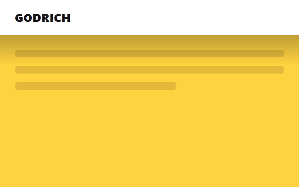
02Đổ bóng khi cuộn
Chuyện gì diễn ra trên màn hình
Một sentinel cao 1px được đặt ngay đỉnh trang; IntersectionObserver theo dõi sentinel đó và bật opacity của lớp gradient phía dưới header lên 1 ngay khi sentinel rời khung nhìn.
<main class="stage">
  <div class="sentinel"></div>
  <header class="head is-demo">
    <span class="head__logo">GODRICH</span>
    <span class="head__shadow" aria-hidden="true"></span>
  </header>
  <div class="page">
    <p class="page__line"></p>
    <p class="page__line"></p>
    <p class="page__line short"></p>
  </div>
</main>
@use "../../../../site/static/demo-tokens" as *;
// ── 변수 3개 ──────────────────────────────────────────
$duration: $dur-quick; // 그림자가 번지는 시간
$easing: $ease-out;
$color: $stage-paper; // 헤더 배경
// ── 데모 무대 ──────────────────────────────────────────
html, body { margin: 0; overflow: hidden; }
.stage {
min-height: 100vh;
margin: 0;
background: $stage-yellow;
font-family: -apple-system, "Segoe UI", "Noto Sans KR", sans-serif;
}
.sentinel { position: absolute; top: 0; height: 1px; width: 1px; }
.head {
position: sticky;
top: 0;
height: 56px;
display: flex;
align-items: center;
padding: 0 clamp(16px, 5vw, 24px);
background: $color;
&__logo { color: $stage-ink; font-weight: 800; font-size: 18px; line-height: 1; font-family: inherit; letter-spacing: .04em; }
// 그림자는 요소를 새로 그리지 않고 미리 그려둔 그라데이션 레이어의 opacity 만 켠다 (범위·대비를 키워 눈에 띄게)
&__shadow {
position: absolute;
left: 0; right: 0; bottom: -48px;
height: 48px;
background: linear-gradient(rgba($stage-ink, .85), rgba($stage-ink, 0));
opacity: 0;
transition: opacity $duration $easing;
}
// 실제 사용: 센티넬이 사라지면 JS 가 .is-scrolled 를 붙인다
&.is-scrolled &__shadow { opacity: 1; }
}
// ── 데모(.is-demo): 그림자가 켜졌다 꺼졌다 2초 루프 ────────
.head.is-demo .head__shadow {
animation: shadow-loop $dur-loop $easing infinite;
}
@keyframes shadow-loop {
0%, 5% { opacity: 0; }
40%, 60% { opacity: 1; }
95%, 100% { opacity: 0; }
}
// ── 배경: 문서처럼 보이는 자리 ─────────────────────────
.page { padding: 24px 24px 0; }
.page__line {
height: 12px;
margin: 0 0 14px;
border-radius: 4px;
background: rgba($stage-ink, .12);
&.short { width: 60%; }
}
@media (prefers-reduced-motion: reduce) {
.head__shadow { transition: none; }
.head.is-demo .head__shadow { animation: none !important; opacity: 1; }
}html, body {
margin: 0;
overflow: hidden;
}
.stage {
min-height: 100vh;
margin: 0;
background: #ffd23f;
font-family: -apple-system, "Segoe UI", "Noto Sans KR", sans-serif;
}
.sentinel {
position: absolute;
top: 0;
height: 1px;
width: 1px;
}
.head {
position: sticky;
top: 0;
height: 56px;
display: flex;
align-items: center;
padding: 0 clamp(16px, 5vw, 24px);
background: #ffffff;
}
.head__logo {
color: #17141a;
font-weight: 800;
font-size: 18px;
line-height: 1;
font-family: inherit;
letter-spacing: 0.04em;
}
.head__shadow {
position: absolute;
left: 0;
right: 0;
bottom: -48px;
height: 48px;
background: linear-gradient(rgba(23, 20, 26, 0.85), rgba(23, 20, 26, 0));
opacity: 0;
transition: opacity 220ms ease-out;
}
.head.is-scrolled .head__shadow {
opacity: 1;
}
.head.is-demo .head__shadow {
animation: shadow-loop 2s ease-out infinite;
}
@keyframes shadow-loop {
0%, 5% {
opacity: 0;
}
40%, 60% {
opacity: 1;
}
95%, 100% {
opacity: 0;
}
}
.page {
padding: 24px 24px 0;
}
.page__line {
height: 12px;
margin: 0 0 14px;
border-radius: 4px;
background: rgba(23, 20, 26, 0.12);
}
.page__line.short {
width: 60%;
}
@media (prefers-reduced-motion: reduce) {
.head__shadow {
transition: none;
}
.head.is-demo .head__shadow {
animation: none !important;
opacity: 1;
}
}// 실제 페이지: 맨 위 1px 센티넬이 화면을 벗어나는 순간 그림자를 켠다 (IntersectionObserver, 6줄)
var head = document.querySelector('.head');
new IntersectionObserver(function (es) {
head.classList.toggle('is-scrolled', !es[0].isIntersecting);
}).observe(document.querySelector('.sentinel'));import { useEffect, useRef } from "react";
import type { CSSProperties } from "react";
import styles from "./ShadowOnScrollHeader.module.scss";
export type ShadowOnScrollHeaderProps = {
logo: string;
/** 그림자가 번지는 시간 (기본 220ms) */
duration?: number;
easing?: string;
color?: string;
};
type Vars = CSSProperties & { "--duration"?: string; "--easing"?: string; "--color"?: string };
export default function ShadowOnScrollHeader({
logo,
duration = 220,
easing = "ease-out",
color = "#fff",
}: ShadowOnScrollHeaderProps) {
const head = useRef<HTMLElement>(null);
const sentinel = useRef<HTMLDivElement>(null);
const vars: Vars = { "--duration": `${duration}ms`, "--easing": easing, "--color": color };
useEffect(() => {
if (!sentinel.current) return;
const io = new IntersectionObserver(([e]) => {
head.current?.classList.toggle("is-scrolled", !e.isIntersecting);
});
io.observe(sentinel.current);
return () => io.disconnect();
}, []);
return (
<>
<div ref={sentinel} className={styles.sentinel} />
<header ref={head} className={styles.head} style={vars}>
<span className={styles.logo}>{logo}</span>
<span className={styles.shadow} aria-hidden="true" />
</header>
</>
);
}02 · Đổ bóng khi cuộn — Diện tích đo được 15.0% · khung hình chuyển động 13/23Nguyên tác GODRICH · SCSS và React nằm trong tệp zip · Xem mật khẩu
Chỗ dùng
Hợp cho header tài liệu hoặc blog, nơi nền nhạt cần một đường ranh giới rõ với nội dung.
.head__shadow {
  position: absolute;
  left: 0; right: 0; bottom: -48px;
  height: 48px;
  background: linear-gradient(rgba($ink, .85), rgba($ink, 0));
  opacity: 0;
  transition: opacity $duration $easing;
}
.head.is-scrolled .head__shadow { opacity: 1; }
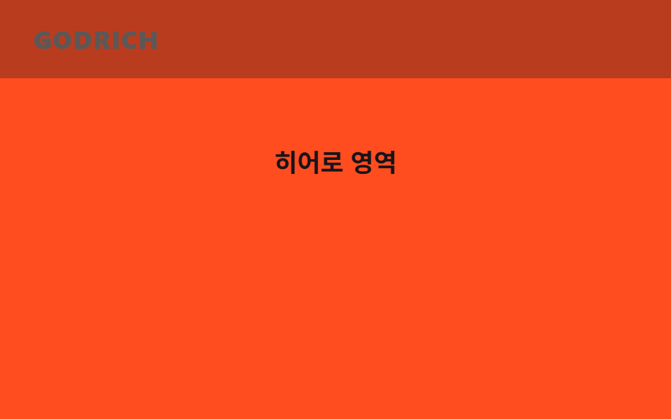
03Đảo màu khi cuộn
Chuyển động thế nào
Hai lớp nền được đặt chồng lên nhau — một trong suốt, một có màu đặc — và khi qua khỏi hero thì lớp trong suốt mờ dần trong lúc lớp có màu hiện lên, nên cả header đảo màu cùng lúc.
<main class="stage">
  <header class="head is-demo">
    <span class="head__layer head__layer--dark"></span>
    <span class="head__layer head__layer--light"></span>
    <span class="head__logo">GODRICH</span>
  </header>
  <div class="hero">
    <div class="hero__sentinel"></div>
    <p class="hero__title">Khu vực hero</p>
  </div>
</main>
@use "../../../../site/static/demo-tokens" as *;
// ── 변수 3개 ──────────────────────────────────────────
$duration: $dur-base; // 색이 뒤집히는 시간
$easing: $ease-out;
$color: $subject-ink; // 반전 뒤 헤더 배경
// ── 데모 무대 ──────────────────────────────────────────
html, body { margin: 0; overflow: hidden; }
.stage {
min-height: 100vh;
margin: 0;
background: $stage-orange;
font-family: -apple-system, "Segoe UI", "Noto Sans KR", sans-serif;
}
.head {
position: sticky;
top: 0;
height: 56px;
display: flex;
align-items: center;
padding: 0 clamp(16px, 5vw, 24px);
// 두 배경 레이어를 겹쳐 두고 opacity 만 크로스페이드한다 (배경색 자체는 애니메이션하지 않는다)
&__layer { position: absolute; inset: 0; }
&__layer--dark { background: transparent; opacity: 1; transition: opacity $duration $easing; }
&__layer--light { background: $color; opacity: 0; transition: opacity $duration $easing; }
&.is-inverted &__layer--dark { opacity: 0; }
&.is-inverted &__layer--light { opacity: 1; }
// 로고도 헤더와 같이 뒤집힌다 — 주황(투명) 구간에선 잉크, 먹 구간에선 크림이라야 둘 다 AA 를 넘는다
&__logo { position: relative; color: $subject-ink; font-weight: 800; font-size: 18px; line-height: 1; font-family: inherit; letter-spacing: .04em; transition: color $duration $easing; }
&.is-inverted &__logo { color: $subject-cream; }
}
// ── 데모(.is-demo): 뒤집혔다 돌아왔다 2초 루프 ─────────────
.head.is-demo .head__layer--light {
animation: invert-loop $dur-loop $easing infinite;
}
.head.is-demo .head__logo {
animation: logo-invert $dur-loop $easing infinite;
}
@keyframes invert-loop {
0%, 15% { opacity: 0; }
45%, 70% { opacity: 1; }
95%, 100% { opacity: 0; }
}
@keyframes logo-invert {
0%, 15% { color: $subject-ink; }
45%, 70% { color: $subject-cream; }
95%, 100% { color: $subject-ink; }
}
// ── 히어로: 어두운 배경 위 흰 글자 자리 ───────────────────
.hero { position: relative; height: clamp(100px, 40vh, 220px); display: grid; place-items: center; }
.hero__sentinel { position: absolute; bottom: 0; height: 1px; width: 1px; }
.hero__title { color: $subject-ink; font-weight: 700; font-size: clamp(14px, 4vw, 18px); line-height: 1; font-family: inherit; margin: 0; }
@media (prefers-reduced-motion: reduce) {
.head__layer { transition: none; }
.head__logo { transition: none; }
.head.is-demo .head__layer--light { animation: none !important; opacity: 1; }
.head.is-demo .head__logo { animation: none !important; color: $subject-cream; }
}html, body {
margin: 0;
overflow: hidden;
}
.stage {
min-height: 100vh;
margin: 0;
background: #ff4d1f;
font-family: -apple-system, "Segoe UI", "Noto Sans KR", sans-serif;
}
.head {
position: sticky;
top: 0;
height: 56px;
display: flex;
align-items: center;
padding: 0 clamp(16px, 5vw, 24px);
}
.head__layer {
position: absolute;
inset: 0;
}
.head__layer--dark {
background: transparent;
opacity: 1;
transition: opacity 300ms ease-out;
}
.head__layer--light {
background: #17141a;
opacity: 0;
transition: opacity 300ms ease-out;
}
.head.is-inverted .head__layer--dark {
opacity: 0;
}
.head.is-inverted .head__layer--light {
opacity: 1;
}
.head__logo {
position: relative;
color: #17141a;
font-weight: 800;
font-size: 18px;
line-height: 1;
font-family: inherit;
letter-spacing: 0.04em;
transition: color 300ms ease-out;
}
.head.is-inverted .head__logo {
color: #fff7e6;
}
.head.is-demo .head__layer--light {
animation: invert-loop 2s ease-out infinite;
}
.head.is-demo .head__logo {
animation: logo-invert 2s ease-out infinite;
}
@keyframes invert-loop {
0%, 15% {
opacity: 0;
}
45%, 70% {
opacity: 1;
}
95%, 100% {
opacity: 0;
}
}
@keyframes logo-invert {
0%, 15% {
color: #17141a;
}
45%, 70% {
color: #fff7e6;
}
95%, 100% {
color: #17141a;
}
}
.hero {
position: relative;
height: clamp(100px, 40vh, 220px);
display: grid;
place-items: center;
}
.hero__sentinel {
position: absolute;
bottom: 0;
height: 1px;
width: 1px;
}
.hero__title {
color: #17141a;
font-weight: 700;
font-size: clamp(14px, 4vw, 18px);
line-height: 1;
font-family: inherit;
margin: 0;
}
@media (prefers-reduced-motion: reduce) {
.head__layer {
transition: none;
}
.head__logo {
transition: none;
}
.head.is-demo .head__layer--light {
animation: none !important;
opacity: 1;
}
.head.is-demo .head__logo {
animation: none !important;
color: #fff7e6;
}
}// 실제 페이지: 히어로 하단 센티넬을 지나면 색이 뒤집힌다 (IntersectionObserver, 6줄)
var head = document.querySelector('.head');
new IntersectionObserver(function (es) {
head.classList.toggle('is-inverted', !es[0].isIntersecting);
}).observe(document.querySelector('.hero__sentinel'));import { useEffect, useRef } from "react";
import type { CSSProperties } from "react";
import styles from "./ColorInvertHeader.module.scss";
export type ColorInvertHeaderProps = {
logo: string;
heroSentinelRef: { current: HTMLElement | null };
/** 색이 뒤집히는 시간 (기본 300ms) */
duration?: number;
easing?: string;
color?: string;
};
type Vars = CSSProperties & { "--duration"?: string; "--easing"?: string; "--color"?: string };
export default function ColorInvertHeader({
logo,
heroSentinelRef,
duration = 300,
easing = "ease-out",
color = "#17141a",
}: ColorInvertHeaderProps) {
const head = useRef<HTMLElement>(null);
const vars: Vars = { "--duration": `${duration}ms`, "--easing": easing, "--color": color };
useEffect(() => {
if (!heroSentinelRef.current) return;
const io = new IntersectionObserver(([e]) => {
head.current?.classList.toggle("is-inverted", !e.isIntersecting);
});
io.observe(heroSentinelRef.current);
return () => io.disconnect();
}, [heroSentinelRef]);
return (
<header ref={head} className={styles.head} style={vars}>
<span className={styles.layerDark} />
<span className={styles.layerLight} />
<span className={styles.logo}>{logo}</span>
</header>
);
}03 · Đảo màu khi cuộn — Diện tích đo được 18.667% · khung hình chuyển động 13/23Nguyên tác GODRICH · SCSS và React nằm trong tệp zip · Xem mật khẩu
Dùng khi nào
Hợp cho trang landing có hero toàn màn hình hoặc đầu trang portfolio.
.head__layer--dark {
  opacity: 1;
  transition: opacity $duration $easing;
}
.head__layer--light {
  background: $color;
  opacity: 0;
  transition: opacity $duration $easing;
}
.head.is-inverted .head__layer--dark  { opacity: 0; }
.head.is-inverted .head__layer--light { opacity: 1; }
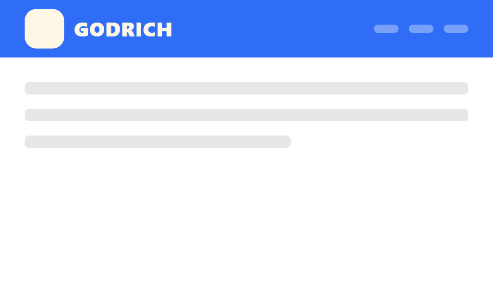
04Chỉ logo thu nhỏ
Bạn thấy gì
Chiều cao và nền của header giữ nguyên suốt quá trình cuộn, chỉ riêng logo co lại theo scale nhờ animation-timeline: scroll(root), nên layout không hề xê dịch dù logo đổi kích thước.
<main class="stage">
  <header class="head is-demo">
    <span class="head__logo"><span class="head__mark" aria-hidden="true"></span>GODRICH</span>
    <nav class="head__nav" aria-hidden="true"><span></span><span></span><span></span></nav>
  </header>
  <div class="page">
    <p class="page__line"></p>
    <p class="page__line"></p>
    <p class="page__line short"></p>
  </div>
</main>
@use "../../../../site/static/demo-tokens" as *;
// ── 변수 3개 ──────────────────────────────────────────
$duration: $dur-enter; // 로고가 줄어드는 시간
$easing: $ease-out;
$scale-to: .72; // 줄어든 비율
// ── 데모 무대 ──────────────────────────────────────────
html, body { margin: 0; overflow: hidden; }
.stage {
min-height: 100vh;
margin: 0;
background: $stage-paper;
font-family: -apple-system, "Segoe UI", "Noto Sans KR", sans-serif;
}
// 헤더 높이·배경은 고정. 로고만 scale 로 줄어든다 (레이아웃은 절대 바뀌지 않는다)
.head {
position: sticky;
top: 0;
height: 56px;
display: flex;
align-items: center;
justify-content: space-between;
padding: 0 clamp(16px, 5vw, 24px);
background: $subject-blue;
&__logo {
display: flex; align-items: center; gap: 10px;
color: $subject-cream; font-weight: 800; font-size: 20px; line-height: 1; font-family: inherit; letter-spacing: .04em;
transform-origin: left center; // 규칙8: 헤더 좌변 붙은 로고 축소
}
&__mark { width: 40px; height: 40px; border-radius: $r-control; background: $subject-cream; }
&__nav { display: flex; gap: 10px; span { width: 24px; height: 8px; border-radius: 4px; background: rgba(255, 255, 255, .35); } }
// 실제 사용: 문서 스크롤이 진행되는 동안 로고만 줄어든다
@supports (animation-timeline: scroll()) {
.head__logo { animation: logo-shrink linear both; animation-timeline: scroll(root); animation-range: 0 150px; }
}
}
@keyframes logo-shrink {
from { transform: scale(1); }
to { transform: scale($scale-to); }
}
// ── 데모(.is-demo): 로고가 줄었다 늘었다 2초 루프 ──────────
.head.is-demo .head__logo {
animation: logo-shrink-loop $dur-loop $easing infinite;
}
@keyframes logo-shrink-loop {
0%, 15% { transform: scale(1); }
45%, 70% { transform: scale($scale-to); }
95%, 100% { transform: scale(1); }
}
// ── 배경: 문서처럼 보이는 자리 ─────────────────────────
.page { padding: 24px 24px 0; }
.page__line {
height: 12px;
margin: 0 0 14px;
border-radius: 4px;
background: rgba($stage-ink, .1);
&.short { width: 60%; }
}
@media (prefers-reduced-motion: reduce) {
.head.is-demo .head__logo { animation: none !important; transform: scale($scale-to); }
}html, body {
margin: 0;
overflow: hidden;
}
.stage {
min-height: 100vh;
margin: 0;
background: #ffffff;
font-family: -apple-system, "Segoe UI", "Noto Sans KR", sans-serif;
}
.head {
position: sticky;
top: 0;
height: 56px;
display: flex;
align-items: center;
justify-content: space-between;
padding: 0 clamp(16px, 5vw, 24px);
background: #2f6df6;
}
.head__logo {
display: flex;
align-items: center;
gap: 10px;
color: #fff7e6;
font-weight: 800;
font-size: 20px;
line-height: 1;
font-family: inherit;
letter-spacing: 0.04em;
transform-origin: left center;
}
.head__mark {
width: 40px;
height: 40px;
border-radius: 12px;
background: #fff7e6;
}
.head__nav {
display: flex;
gap: 10px;
}
.head__nav span {
width: 24px;
height: 8px;
border-radius: 4px;
background: rgba(255, 255, 255, 0.35);
}
@supports (animation-timeline: scroll()) {
.head .head__logo {
animation: logo-shrink linear both;
animation-timeline: scroll(root);
animation-range: 0 150px;
}
}
@keyframes logo-shrink {
from {
transform: scale(1);
}
to {
transform: scale(0.72);
}
}
.head.is-demo .head__logo {
animation: logo-shrink-loop 2s ease-out infinite;
}
@keyframes logo-shrink-loop {
0%, 15% {
transform: scale(1);
}
45%, 70% {
transform: scale(0.72);
}
95%, 100% {
transform: scale(1);
}
}
.page {
padding: 24px 24px 0;
}
.page__line {
height: 12px;
margin: 0 0 14px;
border-radius: 4px;
background: rgba(23, 20, 26, 0.1);
}
.page__line.short {
width: 60%;
}
@media (prefers-reduced-motion: reduce) {
.head.is-demo .head__logo {
animation: none !important;
transform: scale(0.72);
}
}import type { CSSProperties, ReactNode } from "react";
import styles from "./LogoShrinkHeader.module.scss";
export type LogoShrinkHeaderProps = {
logo: string;
children?: ReactNode;
/** 로고가 줄어드는 시간 (기본 600ms) — 실제 사용은 scroll() 타임라인이 대신한다 */
duration?: number;
easing?: string;
/** 줄어든 비율 (기본 .72) */
scaleTo?: number;
};
type Vars = CSSProperties & { "--duration"?: string; "--easing"?: string; "--scale-to"?: number };
export default function LogoShrinkHeader({
logo,
children,
duration = 600,
easing = "ease-out",
scaleTo = 0.72,
}: LogoShrinkHeaderProps) {
const vars: Vars = { "--duration": `${duration}ms`, "--easing": easing, "--scale-to": scaleTo };
return (
<header className={styles.head} style={vars}>
<span className={styles.logo}>
<span className={styles.mark} aria-hidden="true" />
{logo}
</span>
<nav className={styles.nav}>{children}</nav>
</header>
);
}04 · Chỉ logo thu nhỏ — Diện tích đo được 1.585% · khung hình chuyển động 15/23Nguyên tác GODRICH · SCSS và React nằm trong tệp zip · Xem mật khẩu
Dùng ở đâu
Hợp cho trang landing SaaS có logo lớn, nơi header cần tránh layout shift bằng mọi giá.
.head__logo {
  transform-origin: left center;
  @supports (animation-timeline: scroll()) {
    animation: logo-shrink linear both;
    animation-timeline: scroll(root);
    animation-range: 0 150px;
  }
}
@keyframes logo-shrink {
  from { transform: scale(1); }
  to   { transform: scale($scale-to); }
}
05Gắn thanh tiến độ
Chuyện gì diễn ra trên màn hình
Thanh mỏng ở mép dưới header là phần tử con của chính header đó nên cả hai luôn di chuyển liền một khối, và animation-timeline: scroll(root) lấp đầy nó theo đúng tiến độ đọc mà không cần listener tính lại mỗi frame.
<main class="stage">
  <header class="head">
    <span class="head__logo">GODRICH</span>
    <span class="head__bar is-demo" aria-hidden="true"></span>
  </header>
  <div class="page">
    <p class="page__line"></p>
    <p class="page__line"></p>
    <p class="page__line short"></p>
  </div>
</main>
@use "../../../../site/static/demo-tokens" as *;
// ── 변수 3개 ──────────────────────────────────────────
$thickness: 3px; // 바 두께. 굵게 6px
$color: $subject-blue; // 바 색
$track: rgba(255, 255, 255, .14); // 안 읽은 구간
// ── 데모 무대 ──────────────────────────────────────────
html, body { margin: 0; overflow: hidden; }
.stage {
min-height: 100vh;
margin: 0;
background: $stage-ink;
font-family: -apple-system, "Segoe UI", "Noto Sans KR", sans-serif;
}
.head {
position: sticky;
top: 0;
height: 56px;
display: flex;
align-items: center;
padding: 0 clamp(16px, 5vw, 24px);
background: $stage-ink;
border-bottom: 1px solid $track;
&__logo { color: $subject-cream; font-weight: 800; font-size: 18px; line-height: 1; font-family: inherit; letter-spacing: .04em; }
// 진행 바는 헤더의 자식 요소라 헤더와 한 덩어리로 스크롤을 따라간다
&__bar {
position: absolute;
left: 0; bottom: -$thickness;
width: 100%;
height: $thickness;
background: $color;
transform: scaleX(0);
transform-origin: left; // 규칙8: 스크롤 진행띠 좌측 채움
// 실제 사용: 문서 전체 스크롤 진행률이 곧 바 길이다
@supports (animation-timeline: scroll()) {
animation: fill-bar linear both;
animation-timeline: scroll(root);
}
}
}
@keyframes fill-bar {
from { transform: scaleX(0); }
to { transform: scaleX(1); }
}
// ── 데모(.is-demo): 2초 루프로 흉내 ────────────────────
.head__bar.is-demo {
animation: fill-loop $dur-loop linear infinite;
}
@keyframes fill-loop {
0% { transform: scaleX(0); }
90% { transform: scaleX(1); }
100% { transform: scaleX(1); }
}
// ── 배경: 문서처럼 보이는 자리 ─────────────────────────
.page { padding: 28px 24px 0; }
.page__line {
height: 12px;
margin: 0 0 14px;
border-radius: 4px;
background: rgba(255, 255, 255, .12);
&.short { width: 60%; }
}
@media (prefers-reduced-motion: reduce) {
.head__bar, .head__bar.is-demo { animation: none !important; transform: scaleX(1); }
}html, body {
margin: 0;
overflow: hidden;
}
.stage {
min-height: 100vh;
margin: 0;
background: #17141a;
font-family: -apple-system, "Segoe UI", "Noto Sans KR", sans-serif;
}
.head {
position: sticky;
top: 0;
height: 56px;
display: flex;
align-items: center;
padding: 0 clamp(16px, 5vw, 24px);
background: #17141a;
border-bottom: 1px solid rgba(255, 255, 255, 0.14);
}
.head__logo {
color: #fff7e6;
font-weight: 800;
font-size: 18px;
line-height: 1;
font-family: inherit;
letter-spacing: 0.04em;
}
.head__bar {
position: absolute;
left: 0;
bottom: -3px;
width: 100%;
height: 3px;
background: #2f6df6;
transform: scaleX(0);
transform-origin: left;
}
@supports (animation-timeline: scroll()) {
.head__bar {
animation: fill-bar linear both;
animation-timeline: scroll(root);
}
}
@keyframes fill-bar {
from {
transform: scaleX(0);
}
to {
transform: scaleX(1);
}
}
.head__bar.is-demo {
animation: fill-loop 2s linear infinite;
}
@keyframes fill-loop {
0% {
transform: scaleX(0);
}
90% {
transform: scaleX(1);
}
100% {
transform: scaleX(1);
}
}
.page {
padding: 28px 24px 0;
}
.page__line {
height: 12px;
margin: 0 0 14px;
border-radius: 4px;
background: rgba(255, 255, 255, 0.12);
}
.page__line.short {
width: 60%;
}
@media (prefers-reduced-motion: reduce) {
.head__bar, .head__bar.is-demo {
animation: none !important;
transform: scaleX(1);
}
}import type { CSSProperties } from "react";
import styles from "./HeaderProgressBar.module.scss";
export type HeaderProgressBarProps = {
logo: string;
/** 바 두께 (기본 3px) */
thickness?: number;
color?: string;
track?: string;
};
type Vars = CSSProperties & { "--thickness"?: string; "--color"?: string; "--track"?: string };
export default function HeaderProgressBar({
logo,
thickness = 3,
color = "#2f6df6",
track = "rgba(255,255,255,.14)",
}: HeaderProgressBarProps) {
const vars: Vars = { "--thickness": `${thickness}px`, "--color": color, "--track": track };
return (
<header className={styles.head} style={vars}>
<span className={styles.logo}>{logo}</span>
{/* scroll() 타임라인만으로 채워진다 — JS 없이 */}
<span className={styles.bar} aria-hidden="true" />
</header>
);
}05 · Gắn thanh tiến độ — Diện tích đo được 1.0% · khung hình chuyển động 22/23Nguyên tác GODRICH · SCSS và React nằm trong tệp zip · Xem mật khẩu
Chỗ dùng
Hợp cho header bài blog dài hoặc đầu trang tài liệu hướng dẫn.
.head__bar {
  position: absolute;
  left: 0; bottom: -$thickness;
  width: 100%; height: $thickness;
  background: $color;
  transform: scaleX(0);
  transform-origin: left;
  animation: fill-bar linear both;
  animation-timeline: scroll(root);
}
06Sub-nav dính theo
Chuyển động thế nào
Sub-nav được đặt sticky với top bằng đúng chiều cao header chính nên nó luôn dừng lại sát mép dưới header thay vì chồng lên, và class .is-stuck chỉ đổi màu viền để báo đã dính chứ không đổi vị trí.
<main class="stage">
  <header class="head">GODRICH</header>
  <div class="sentinel"></div>
  <nav class="subnav is-demo">
    <span class="subnav__tab is-active">Nữ</span>
    <span class="subnav__tab">Nam</span>
    <span class="subnav__tab">Trẻ em</span>
  </nav>
  <div class="page">
    <p class="page__line"></p>
    <p class="page__line"></p>
    <p class="page__line short"></p>
  </div>
</main>
@use "../../../../site/static/demo-tokens" as *;
// ── 변수 3개 ──────────────────────────────────────────
$head-h: 56px; // 메인 헤더 높이 — 서브 내비가 이 값 아래 붙는다
$duration: $dur-quick; // 테두리가 켜지는 시간
$color: $subject-ink; // 서브 내비 배경
// ── 데모 무대 ──────────────────────────────────────────
html, body { margin: 0; overflow: hidden; }
.stage {
min-height: 100vh;
margin: 0;
background: $stage-yellow;
font-family: -apple-system, "Segoe UI", "Noto Sans KR", sans-serif;
}
.sentinel { height: 1px; }
.head {
position: sticky;
top: 0;
z-index: 2;
height: $head-h;
display: flex;
align-items: center;
padding: 0 clamp(16px, 5vw, 24px);
background: $stage-ink;
color: $subject-cream;
font-weight: 800;
font-size: 18px;
line-height: 1;
font-family: inherit;
letter-spacing: .04em;
}
// 서브 내비는 메인 헤더 바로 아래에 두 번째 줄로 붙는다 (이중 sticky, 겹침 없음)
.subnav {
position: sticky;
top: $head-h;
z-index: 1;
display: flex;
gap: 4px;
padding: clamp(6px, 3vh, 10px) clamp(16px, 5vw, 24px);
background: $color;
border-bottom: 4px solid transparent;
transition: border-color $duration $ease-out;
&.is-stuck { border-bottom-color: $subject-cream; }
&__tab {
padding: 6px 14px;
border-radius: $r-pill;
font-weight: 600;
font-size: 13px;
line-height: 1;
font-family: inherit;
color: rgba(255, 255, 255, .6);
&.is-active { color: $stage-ink; background: $subject-cream; }
}
}
// ── 데모(.is-demo): 테두리가 켜졌다 꺼졌다 2초 루프 ────────
.subnav.is-demo {
animation: stuck-loop $dur-loop $ease-out infinite;
}
@keyframes stuck-loop {
0%, 5% { border-bottom-color: transparent; }
40%, 60% { border-bottom-color: $subject-cream; }
95%, 100% { border-bottom-color: transparent; }
}
// ── 배경: 문서처럼 보이는 자리 (칸이 좁으면 줄인다) ────────────
.page { padding: clamp(8px, 4vh, 20px) 24px 0; }
.page__line {
height: 10px;
margin: 0 0 clamp(6px, 3vh, 14px);
border-radius: 4px;
background: rgba($stage-ink, .14);
&.short { width: 60%; }
}
@media (prefers-reduced-motion: reduce) {
.subnav { transition: none; }
.subnav.is-demo { animation: none !important; border-bottom-color: $subject-cream; }
}html, body {
margin: 0;
overflow: hidden;
}
.stage {
min-height: 100vh;
margin: 0;
background: #ffd23f;
font-family: -apple-system, "Segoe UI", "Noto Sans KR", sans-serif;
}
.sentinel {
height: 1px;
}
.head {
position: sticky;
top: 0;
z-index: 2;
height: 56px;
display: flex;
align-items: center;
padding: 0 clamp(16px, 5vw, 24px);
background: #17141a;
color: #fff7e6;
font-weight: 800;
font-size: 18px;
line-height: 1;
font-family: inherit;
letter-spacing: 0.04em;
}
.subnav {
position: sticky;
top: 56px;
z-index: 1;
display: flex;
gap: 4px;
padding: clamp(6px, 3vh, 10px) clamp(16px, 5vw, 24px);
background: #17141a;
border-bottom: 4px solid transparent;
transition: border-color 220ms ease-out;
}
.subnav.is-stuck {
border-bottom-color: #fff7e6;
}
.subnav__tab {
padding: 6px 14px;
border-radius: 999px;
font-weight: 600;
font-size: 13px;
line-height: 1;
font-family: inherit;
color: rgba(255, 255, 255, 0.6);
}
.subnav__tab.is-active {
color: #17141a;
background: #fff7e6;
}
.subnav.is-demo {
animation: stuck-loop 2s ease-out infinite;
}
@keyframes stuck-loop {
0%, 5% {
border-bottom-color: transparent;
}
40%, 60% {
border-bottom-color: #fff7e6;
}
95%, 100% {
border-bottom-color: transparent;
}
}
.page {
padding: clamp(8px, 4vh, 20px) 24px 0;
}
.page__line {
height: 10px;
margin: 0 0 clamp(6px, 3vh, 14px);
border-radius: 4px;
background: rgba(23, 20, 26, 0.14);
}
.page__line.short {
width: 60%;
}
@media (prefers-reduced-motion: reduce) {
.subnav {
transition: none;
}
.subnav.is-demo {
animation: none !important;
border-bottom-color: #fff7e6;
}
}// 실제 페이지: 서브 내비가 헤더 밑에 닿는 순간 테두리를 켠다 (IntersectionObserver, 6줄)
var sub = document.querySelector('.subnav');
new IntersectionObserver(function (es) {
sub.classList.toggle('is-stuck', !es[0].isIntersecting);
}, { rootMargin: '-56px 0px 0px 0px', threshold: 1 }).observe(document.querySelector('.sentinel'));import { useEffect, useRef } from "react";
import type { CSSProperties } from "react";
import styles from "./StickySubNav.module.scss";
export type StickySubNavProps = {
tabs: string[];
activeIndex?: number;
/** 메인 헤더 높이 (기본 56px) — 서브 내비가 이 값 아래 붙는다 */
headHeight?: number;
duration?: number;
color?: string;
};
type Vars = CSSProperties & { "--head-h"?: string; "--duration"?: string; "--color"?: string };
export default function StickySubNav({
tabs,
activeIndex = 0,
headHeight = 56,
duration = 220,
color = "#17141a",
}: StickySubNavProps) {
const nav = useRef<HTMLElement>(null);
const sentinel = useRef<HTMLDivElement>(null);
const vars: Vars = { "--head-h": `${headHeight}px`, "--duration": `${duration}ms`, "--color": color };
useEffect(() => {
if (!sentinel.current) return;
const io = new IntersectionObserver(
([e]) => nav.current?.classList.toggle("is-stuck", !e.isIntersecting),
{ rootMargin: `-${headHeight}px 0px 0px 0px`, threshold: 1 }
);
io.observe(sentinel.current);
return () => io.disconnect();
}, [headHeight]);
return (
<>
<div ref={sentinel} className={styles.sentinel} />
<nav ref={nav} className={styles.subnav} style={vars}>
{tabs.map((t, i) => (
<span key={t} className={i === activeIndex ? `${styles.tab} ${styles.active}` : styles.tab}>{t}</span>
))}
</nav>
</>
);
}06 · Sub-nav dính theo — Diện tích đo được 1.333% · khung hình chuyển động 14/23Nguyên tác GODRICH · SCSS và React nằm trong tệp zip · Xem mật khẩu
Dùng khi nào
Hợp cho tab danh mục trang thương mại điện tử hoặc tab mục lục trang tài liệu.
.subnav {
  position: sticky;
  top: $head-h;
  border-bottom: 4px solid transparent;
  transition: border-color $duration $ease-out;
}
.subnav.is-stuck { border-bottom-color: $subject-cream; }
07Tiêu đề section dính theo
Bạn thấy gì
Mỗi đoạn trong danh sách có một sentinel riêng; IntersectionObserver theo dõi cả loạt sentinel đó và chỉ bật class .is-current cho nhãn tương ứng với sentinel vừa vào khung nhìn, còn nhãn cũ tự tắt.
<main class="stage">
  <header class="head is-demo">
    <span class="head__label head__label--a">A</span>
    <span class="head__label head__label--b">B</span>
  </header>
  <div class="list">
    <p class="list__sentinel" data-label="A"></p>
    <p class="list__row">Amy</p>
    <p class="list__row">Anna</p>
    <p class="list__sentinel" data-label="B"></p>
    <p class="list__row">Ben</p>
  </div>
</main>
@use "../../../../site/static/demo-tokens" as *;
// ── 변수 3개 ──────────────────────────────────────────
$duration: $dur-quick; // 제목이 교체되는 시간
$easing: $ease-out;
$color: $stage-orange; // 헤더 배경
// ── 데모 무대 ──────────────────────────────────────────
html, body { margin: 0; overflow: hidden; }
.stage {
min-height: 100vh;
margin: 0;
background: $stage-orange;
font-family: -apple-system, "Segoe UI", "Noto Sans KR", sans-serif;
}
.head {
position: sticky;
top: 0;
height: 56px;
display: grid;
place-items: center;
background: $subject-ink;
overflow: hidden;
// 두 라벨을 겹쳐 두고 opacity + translateY 로 교체한다
&__label {
grid-area: 1 / 1;
color: $subject-cream;
font-weight: 800;
font-size: 20px;
line-height: 1;
font-family: inherit;
letter-spacing: .06em;
opacity: 0;
transform: translateY(8px);
transition: opacity $duration $easing, transform $duration $easing;
}
&__label.is-current { opacity: 1; transform: translateY(0); }
&__label--a.is-current ~ &__label--b { opacity: 0; }
}
// 기본 상태: A 가 보인다
.head__label--a { opacity: 1; transform: translateY(0); }
// ── 데모(.is-demo): A ↔ B 2초 루프로 교체 ─────────────────
.head.is-demo .head__label--a { animation: label-a-loop $dur-loop $easing infinite; }
.head.is-demo .head__label--b { animation: label-b-loop $dur-loop $easing infinite; }
@keyframes label-a-loop {
0%, 20% { opacity: 1; transform: translateY(0); }
45%, 75% { opacity: 0; transform: translateY(-8px); }
95%, 100% { opacity: 1; transform: translateY(0); }
}
@keyframes label-b-loop {
0%, 20% { opacity: 0; transform: translateY(8px); }
45%, 75% { opacity: 1; transform: translateY(0); }
95%, 100% { opacity: 0; transform: translateY(8px); }
}
// ── 목록: 알파벳 구간이 있는 연락처 흉내 (칸이 좁으면 줄인다) ───
.list { padding: clamp(4px, 3vh, 16px) 24px 0; }
.list__sentinel { height: 1px; margin: 0; }
.list__row {
margin: 0 0 clamp(3px, 2vh, 12px);
padding: clamp(3px, 2vh, 10px) 14px;
border-radius: $r-control;
background: rgba($subject-ink, .06);
color: $subject-ink;
font-weight: 600;
font-size: 12px;
line-height: 1.1;
font-family: inherit;
}
@media (prefers-reduced-motion: reduce) {
.head__label { transition: none; }
.head.is-demo .head__label--a, .head.is-demo .head__label--b { animation: none !important; }
}html, body {
margin: 0;
overflow: hidden;
}
.stage {
min-height: 100vh;
margin: 0;
background: #ff4d1f;
font-family: -apple-system, "Segoe UI", "Noto Sans KR", sans-serif;
}
.head {
position: sticky;
top: 0;
height: 56px;
display: grid;
place-items: center;
background: #17141a;
overflow: hidden;
}
.head__label {
grid-area: 1/1;
color: #fff7e6;
font-weight: 800;
font-size: 20px;
line-height: 1;
font-family: inherit;
letter-spacing: 0.06em;
opacity: 0;
transform: translateY(8px);
transition: opacity 220ms ease-out, transform 220ms ease-out;
}
.head__label.is-current {
opacity: 1;
transform: translateY(0);
}
.head__label--a.is-current ~ .head__label--b {
opacity: 0;
}
.head__label--a {
opacity: 1;
transform: translateY(0);
}
.head.is-demo .head__label--a {
animation: label-a-loop 2s ease-out infinite;
}
.head.is-demo .head__label--b {
animation: label-b-loop 2s ease-out infinite;
}
@keyframes label-a-loop {
0%, 20% {
opacity: 1;
transform: translateY(0);
}
45%, 75% {
opacity: 0;
transform: translateY(-8px);
}
95%, 100% {
opacity: 1;
transform: translateY(0);
}
}
@keyframes label-b-loop {
0%, 20% {
opacity: 0;
transform: translateY(8px);
}
45%, 75% {
opacity: 1;
transform: translateY(0);
}
95%, 100% {
opacity: 0;
transform: translateY(8px);
}
}
.list {
padding: clamp(4px, 3vh, 16px) 24px 0;
}
.list__sentinel {
height: 1px;
margin: 0;
}
.list__row {
margin: 0 0 clamp(3px, 2vh, 12px);
padding: clamp(3px, 2vh, 10px) 14px;
border-radius: 12px;
background: rgba(23, 20, 26, 0.06);
color: #17141a;
font-weight: 600;
font-size: 12px;
line-height: 1.1;
font-family: inherit;
}
@media (prefers-reduced-motion: reduce) {
.head__label {
transition: none;
}
.head.is-demo .head__label--a, .head.is-demo .head__label--b {
animation: none !important;
}
}// 실제 페이지: 지금 통과 중인 구간 센티넬의 글자를 헤더 라벨에 올린다 (IntersectionObserver, 7줄)
var labels = document.querySelectorAll('.head__label');
document.querySelectorAll('.list__sentinel').forEach(function (s) {
new IntersectionObserver(function (es) {
if (es[0].isIntersecting) labels.forEach(function (l) { l.classList.toggle('is-current', l.textContent === s.dataset.label); });
}, { rootMargin: '-56px 0px -80% 0px' }).observe(s);
});import { useEffect, useRef, useState } from "react";
import type { CSSProperties } from "react";
import styles from "./SectionTitleHeader.module.scss";
export type SectionTitleHeaderProps = {
/** 구간 이름과, 그 구간이 시작하는 지점의 센티넬 ref */
sections: { label: string; sentinelRef: { current: HTMLElement | null } }[];
duration?: number;
easing?: string;
};
type Vars = CSSProperties & { "--duration"?: string; "--easing"?: string };
export default function SectionTitleHeader({ sections, duration = 220, easing = "ease-out" }: SectionTitleHeaderProps) {
const [current, setCurrent] = useState(sections[0]?.label ?? "");
const vars: Vars = { "--duration": `${duration}ms`, "--easing": easing };
const observers = useRef<IntersectionObserver[]>([]);
useEffect(() => {
observers.current = sections.map(({ label, sentinelRef }) => {
const io = new IntersectionObserver(
([e]) => { if (e.isIntersecting) setCurrent(label); },
{ rootMargin: "-56px 0px -80% 0px" }
);
if (sentinelRef.current) io.observe(sentinelRef.current);
return io;
});
return () => observers.current?.forEach((io) => io.disconnect());
}, [sections]);
return (
<header className={styles.head} style={vars}>
<span key={current} className={styles.label}>{current}</span>
</header>
);
}07 · Tiêu đề section dính theo — Diện tích đo được 0.241% · khung hình chuyển động 12/23Nguyên tác GODRICH · SCSS và React nằm trong tệp zip · Xem mật khẩu
Dùng ở đâu
Hợp cho danh sách chia theo chữ cái như danh bạ hoặc từ điển thuật ngữ, hay một trang FAQ dài.
document.querySelectorAll('.list__sentinel').forEach(function (s) {
  new IntersectionObserver(function (es) {
    if (es[0].isIntersecting) {
      labels.forEach(function (l) {
        l.classList.toggle('is-current', l.textContent === s.dataset.label);
      });
    }
  }, { rootMargin: '-56px 0px -80% 0px' }).observe(s);
});
08Header backdrop blur
Chuyện gì diễn ra trên màn hình
Header giữ nền gần như trong suốt và backdrop-filter: blur(0) khi ở đỉnh trang, rồi bật cả nền đục nhẹ lẫn giá trị blur thật cùng lúc khi sentinel rời khung nhìn, nên nội dung phía sau vẫn hiện ra nhưng nhoè hẳn đi.
<main class="stage">
  <div class="photo"></div>
  <div class="sentinel"></div>
  <header class="head is-demo">
    <span class="head__logo">GODRICH</span>
  </header>
</main>
@use "../../../../site/static/demo-tokens" as *;
// ── 변수 3개 ──────────────────────────────────────────
$duration: $dur-base; // 블러가 켜지는 시간
$easing: $ease-out;
$blur: 10px; // 블러 강도
// ── 데모 무대 ──────────────────────────────────────────
html, body { margin: 0; overflow: hidden; }
.stage {
position: relative;
min-height: 100vh;
margin: 0;
background: $stage-paper;
font-family: -apple-system, "Segoe UI", "Noto Sans KR", sans-serif;
}
.sentinel { position: absolute; top: 0; height: 1px; width: 1px; }
// 뒤 화면 흉내 — 단색 배경만으로는 블러가 안 보여 줄무늬를 둔다
.photo {
position: absolute; inset: 0;
background: repeating-linear-gradient(120deg, $subject-blue 0 18px, $subject-cream 18px 36px);
}
.head {
position: sticky;
top: 0;
height: 56px;
display: flex;
align-items: center;
padding: 0 clamp(16px, 5vw, 24px);
background: rgba(255, 255, 255, .08);
backdrop-filter: blur(0);
transition: background $duration $easing, backdrop-filter $duration $easing;
&__logo { color: $subject-ink; font-weight: 800; font-size: 18px; line-height: 1; font-family: inherit; letter-spacing: .04em; }
// 실제 사용: 센티넬이 사라지면 반투명 유리 배경이 켜진다
&.is-scrolled { background: rgba(255, 255, 255, .55); backdrop-filter: blur($blur); }
}
// ── 데모(.is-demo): 블러가 켜졌다 꺼졌다 2초 루프 ──────────
.head.is-demo {
animation: blur-loop $dur-loop $easing infinite;
}
@keyframes blur-loop {
0%, 15% { background: rgba(255, 255, 255, .08); backdrop-filter: blur(0); }
45%, 70% { background: rgba(255, 255, 255, .55); backdrop-filter: blur($blur); }
95%, 100% { background: rgba(255, 255, 255, .08); backdrop-filter: blur(0); }
}
@media (prefers-reduced-motion: reduce) {
.head { transition: none; }
.head.is-demo { animation: none !important; background: rgba(255, 255, 255, .55); backdrop-filter: blur($blur); }
}html, body {
margin: 0;
overflow: hidden;
}
.stage {
position: relative;
min-height: 100vh;
margin: 0;
background: #ffffff;
font-family: -apple-system, "Segoe UI", "Noto Sans KR", sans-serif;
}
.sentinel {
position: absolute;
top: 0;
height: 1px;
width: 1px;
}
.photo {
position: absolute;
inset: 0;
background: repeating-linear-gradient(120deg, #2f6df6 0 18px, #fff7e6 18px 36px);
}
.head {
position: sticky;
top: 0;
height: 56px;
display: flex;
align-items: center;
padding: 0 clamp(16px, 5vw, 24px);
background: rgba(255, 255, 255, 0.08);
backdrop-filter: blur(0);
transition: background 300ms ease-out, backdrop-filter 300ms ease-out;
}
.head__logo {
color: #17141a;
font-weight: 800;
font-size: 18px;
line-height: 1;
font-family: inherit;
letter-spacing: 0.04em;
}
.head.is-scrolled {
background: rgba(255, 255, 255, 0.55);
backdrop-filter: blur(10px);
}
.head.is-demo {
animation: blur-loop 2s ease-out infinite;
}
@keyframes blur-loop {
0%, 15% {
background: rgba(255, 255, 255, 0.08);
backdrop-filter: blur(0);
}
45%, 70% {
background: rgba(255, 255, 255, 0.55);
backdrop-filter: blur(10px);
}
95%, 100% {
background: rgba(255, 255, 255, 0.08);
backdrop-filter: blur(0);
}
}
@media (prefers-reduced-motion: reduce) {
.head {
transition: none;
}
.head.is-demo {
animation: none !important;
background: rgba(255, 255, 255, 0.55);
backdrop-filter: blur(10px);
}
}// 실제 페이지: 센티넬을 지나면 블러 유리 배경을 켠다 (IntersectionObserver, 6줄)
var head = document.querySelector('.head');
new IntersectionObserver(function (es) {
head.classList.toggle('is-scrolled', !es[0].isIntersecting);
}).observe(document.querySelector('.sentinel'));import { useEffect, useRef } from "react";
import type { CSSProperties } from "react";
import styles from "./BackdropBlurHeader.module.scss";
export type BackdropBlurHeaderProps = {
logo: string;
duration?: number;
easing?: string;
/** 블러 강도 (기본 10px) */
blur?: number;
};
type Vars = CSSProperties & { "--duration"?: string; "--easing"?: string; "--blur"?: string };
export default function BackdropBlurHeader({
logo,
duration = 300,
easing = "ease-out",
blur = 10,
}: BackdropBlurHeaderProps) {
const head = useRef<HTMLElement>(null);
const sentinel = useRef<HTMLDivElement>(null);
const vars: Vars = { "--duration": `${duration}ms`, "--easing": easing, "--blur": `${blur}px` };
useEffect(() => {
if (!sentinel.current) return;
const io = new IntersectionObserver(([e]) => {
head.current?.classList.toggle("is-scrolled", !e.isIntersecting);
});
io.observe(sentinel.current);
return () => io.disconnect();
}, []);
return (
<>
<div ref={sentinel} className={styles.sentinel} />
<header ref={head} className={styles.head} style={vars}>
<span className={styles.logo}>{logo}</span>
</header>
</>
);
}08 · Header backdrop blur — Diện tích đo được 18.283% · khung hình chuyển động 11/23Nguyên tác GODRICH · SCSS và React nằm trong tệp zip · Xem mật khẩu
Chỗ dùng
Hợp cho header đặt trên ảnh hoặc video, hay thanh trên cùng kiểu ứng dụng iOS.
.head {
  background: rgba(255, 255, 255, .08);
  backdrop-filter: blur(0);
  transition: background $duration $easing, backdrop-filter $duration $easing;
}
.head.is-scrolled {
  background: rgba(255, 255, 255, .55);
  backdrop-filter: blur($blur);
}
09Header đồng bộ scroll-snap
Chuyển động thế nào
Mỗi section có một sentinel riêng; IntersectionObserver theo dõi section nào đang cắt ngang khung nhìn rồi bật class .is-current cho đúng chấm tương ứng trong header, khớp với đà scroll-snap của trang.
<main class="stage">
  <header class="head is-demo">
    <span class="head__logo">GODRICH</span>
    <span class="head__dots"><i class="is-current"></i><i></i><i></i></span>
  </header>
  <section class="snap-section" data-i="0"><p>01</p></section>
  <section class="snap-section" data-i="1"><p>02</p></section>
  <section class="snap-section" data-i="2"><p>03</p></section>
</main>
@use "../../../../site/static/demo-tokens" as *;
// ── 변수 3개 ──────────────────────────────────────────
$duration: $dur-quick; // 점이 옮겨가는 시간
$easing: $ease-pop;
$color: $subject-cream; // 활성 점 색
// ── 데모 무대 ──────────────────────────────────────────
html, body { margin: 0; overflow: hidden; }
.stage {
min-height: 100vh;
margin: 0;
background: $stage-ink;
font-family: -apple-system, "Segoe UI", "Noto Sans KR", sans-serif;
scroll-snap-type: y mandatory; // 본문이 섹션 단위로 멈춘다
}
.head {
position: sticky;
top: 0;
z-index: 1;
height: 56px;
display: flex;
align-items: center;
justify-content: space-between;
padding: 0 clamp(16px, 5vw, 24px);
background: $stage-ink;
&__logo { color: $subject-cream; font-weight: 800; font-size: 18px; line-height: 1; font-family: inherit; letter-spacing: .04em; }
// 인디케이터: 점 3개 중 지금 멈춘 섹션의 것만 커진다
&__dots {
display: flex; gap: 8px;
i {
width: 8px; height: 8px; border-radius: 50%;
background: rgba(255, 255, 255, .3);
transform: scale(1);
transition: transform $duration $easing, background $duration $easing;
&.is-current { background: $color; transform: scale(1.4); }
}
}
}
// ── 데모(.is-demo): 점이 1→2→3→1 순서로 2초 루프 ──────────
.head.is-demo .head__dots i:nth-child(1) { animation: dot-1 $dur-loop $easing infinite; }
.head.is-demo .head__dots i:nth-child(2) { animation: dot-2 $dur-loop $easing infinite; }
.head.is-demo .head__dots i:nth-child(3) { animation: dot-3 $dur-loop $easing infinite; }
@mixin dot-phase($on-from, $on-to) {
0%, #{$on-from - 1}#{'%'} { background: rgba(255, 255, 255, .3); transform: scale(1); }
#{$on-from}#{'%'}, #{$on-to}#{'%'} { background: $color; transform: scale(1.4); }
#{$on-to + 1}#{'%'}, 100% { background: rgba(255, 255, 255, .3); transform: scale(1); }
}
@keyframes dot-1 { @include dot-phase(5, 25); }
@keyframes dot-2 { @include dot-phase(38, 58); }
@keyframes dot-3 { @include dot-phase(71, 91); }
// ── 섹션: 순서를 알아볼 수 있는 카드 3개 ───────────────────
// 실제 페이지에서는 섹션 하나가 화면 높이만큼(scroll-snap-align: start) 이어진다.
// 데모 무대에서는 세 칸을 압축해 보여준다 — 320×200 렌더에서도 넘치면 안 되니 vh 로 줄인다
.snap-section {
height: clamp(24px, 13vh, 78px);
display: grid;
place-items: center;
scroll-snap-align: start;
border-top: 1px solid rgba(255, 255, 255, .08);
p { margin: 0; color: $subject-cream; font-weight: 800; font-size: 28px; line-height: 1; font-family: inherit; opacity: .35; }
}
@media (prefers-reduced-motion: reduce) {
.head__dots i { transition: none; }
.head.is-demo .head__dots i { animation: none !important; }
.head.is-demo .head__dots i:first-child { background: $color; transform: scale(1.4); }
}html, body {
margin: 0;
overflow: hidden;
}
.stage {
min-height: 100vh;
margin: 0;
background: #17141a;
font-family: -apple-system, "Segoe UI", "Noto Sans KR", sans-serif;
scroll-snap-type: y mandatory;
}
.head {
position: sticky;
top: 0;
z-index: 1;
height: 56px;
display: flex;
align-items: center;
justify-content: space-between;
padding: 0 clamp(16px, 5vw, 24px);
background: #17141a;
}
.head__logo {
color: #fff7e6;
font-weight: 800;
font-size: 18px;
line-height: 1;
font-family: inherit;
letter-spacing: 0.04em;
}
.head__dots {
display: flex;
gap: 8px;
}
.head__dots i {
width: 8px;
height: 8px;
border-radius: 50%;
background: rgba(255, 255, 255, 0.3);
transform: scale(1);
transition: transform 220ms cubic-bezier(0.2, 1.4, 0.4, 1), background 220ms cubic-bezier(0.2, 1.4, 0.4, 1);
}
.head__dots i.is-current {
background: #fff7e6;
transform: scale(1.4);
}
.head.is-demo .head__dots i:nth-child(1) {
animation: dot-1 2s cubic-bezier(0.2, 1.4, 0.4, 1) infinite;
}
.head.is-demo .head__dots i:nth-child(2) {
animation: dot-2 2s cubic-bezier(0.2, 1.4, 0.4, 1) infinite;
}
.head.is-demo .head__dots i:nth-child(3) {
animation: dot-3 2s cubic-bezier(0.2, 1.4, 0.4, 1) infinite;
}
@keyframes dot-1 {
0%, 4% {
background: rgba(255, 255, 255, 0.3);
transform: scale(1);
}
5%, 25% {
background: #fff7e6;
transform: scale(1.4);
}
26%, 100% {
background: rgba(255, 255, 255, 0.3);
transform: scale(1);
}
}
@keyframes dot-2 {
0%, 37% {
background: rgba(255, 255, 255, 0.3);
transform: scale(1);
}
38%, 58% {
background: #fff7e6;
transform: scale(1.4);
}
59%, 100% {
background: rgba(255, 255, 255, 0.3);
transform: scale(1);
}
}
@keyframes dot-3 {
0%, 70% {
background: rgba(255, 255, 255, 0.3);
transform: scale(1);
}
71%, 91% {
background: #fff7e6;
transform: scale(1.4);
}
92%, 100% {
background: rgba(255, 255, 255, 0.3);
transform: scale(1);
}
}
.snap-section {
height: clamp(24px, 13vh, 78px);
display: grid;
place-items: center;
scroll-snap-align: start;
border-top: 1px solid rgba(255, 255, 255, 0.08);
}
.snap-section p {
margin: 0;
color: #fff7e6;
font-weight: 800;
font-size: 28px;
line-height: 1;
font-family: inherit;
opacity: 0.35;
}
@media (prefers-reduced-motion: reduce) {
.head__dots i {
transition: none;
}
.head.is-demo .head__dots i {
animation: none !important;
}
.head.is-demo .head__dots i:first-child {
background: #fff7e6;
transform: scale(1.4);
}
}// 실제 페이지: scroll-snap 으로 멈춘 섹션 번호에 맞춰 점을 옮긴다 (IntersectionObserver, 7줄)
var dots = document.querySelectorAll('.head__dots i');
document.querySelectorAll('.snap-section').forEach(function (s) {
new IntersectionObserver(function (es) {
if (es[0].isIntersecting) dots.forEach(function (d, i) { d.classList.toggle('is-current', i == s.dataset.i); });
}, { threshold: .6 }).observe(s);
});import { useEffect, useState } from "react";
import type { CSSProperties } from "react";
import styles from "./ScrollSnapHeader.module.scss";
export type ScrollSnapHeaderProps = {
logo: string;
/** 스냅 섹션 개수만큼의 ref */
sectionRefs: { current: HTMLElement | null }[];
};
type Vars = CSSProperties;
export default function ScrollSnapHeader({ logo, sectionRefs }: ScrollSnapHeaderProps) {
const [active, setActive] = useState(0);
const vars: Vars = {};
useEffect(() => {
const observers = sectionRefs.map((ref, i) => {
const io = new IntersectionObserver(([e]) => { if (e.isIntersecting) setActive(i); }, { threshold: 0.6 });
if (ref.current) io.observe(ref.current);
return io;
});
return () => observers.forEach((io) => io.disconnect());
}, [sectionRefs]);
return (
<header className={styles.head} style={vars}>
<span className={styles.logo}>{logo}</span>
<span className={styles.dots}>
{sectionRefs.map((_, i) => (
<i key={i} className={i === active ? styles.current : undefined} />
))}
</span>
</header>
);
}09 · Header đồng bộ scroll-snap — Diện tích đo được 0.281% · khung hình chuyển động 9/23Nguyên tác GODRICH · SCSS và React nằm trong tệp zip · Xem mật khẩu
Dùng khi nào
Hợp cho trang kể chuyện dạng full-page scroll-snap hoặc phần giới thiệu sản phẩm kiểu slide.
document.querySelectorAll('.snap-section').forEach(function (s) {
  new IntersectionObserver(function (es) {
    if (es[0].isIntersecting) {
      dots.forEach(function (d, i) {
        d.classList.toggle('is-current', i == s.dataset.i);
      });
    }
  }, { threshold: .6 }).observe(s);
});
Chỗ dễ hỏng ở đâu? — ba cái bẫy
animation-timeline scroll root và mức hỗ trợ
04, 05 và 09 đều dựa vào animation-timeline: scroll(root), và mức hỗ trợ của nó còn chưa đều: theo tài liệu MDN về animation-timeline, Chrome chạy được từ bản 115, Safari từ bản 26, còn Firefox bản ổn định tính đến 9/2026 vẫn cần bật cờ thử nghiệm mới dùng được. Mục 08 backdrop blur cũng đáng nhắc riêng, vì tài liệu MDN về backdrop-filter ghi Chrome hỗ trợ từ bản 76, Safari từ bản 18, Firefox từ bản 103 — ba trình duyệt lớn đều đã qua ngưỡng đó khá lâu nên riêng thuộc tính này an toàn hơn animation-timeline nhiều.
rootMargin cố định của IntersectionObserver
02 và 08 cũng có một bẫy tương tự nhau: cả hai đặt rootMargin của IntersectionObserver bằng một con số cố định, và nếu sau này bạn đổi chiều cao header thì sentinel vẫn phán đoán theo con số cũ nên hiệu ứng bật sai thời điểm — tài liệu MDN về IntersectionObserver khuyên đọc lại getBoundingClientRect().height mỗi khi layout đổi thay vì hardcode một con số. 06 còn thêm một bẫy riêng: top của sub-nav phải khớp đúng chiều cao thật của header chính, và nếu hai giá trị lệch nhau dù chỉ vài pixel thì sub-nav sẽ đè lên một mép header hoặc để lộ một khe hở trắng ngay dưới nó — chín file trong zip đã canh đúng các con số này rồi, và mật khẩu để mở ra xem tận mắt là u9rbcprm.
Lưới xem trước 480×300
Bẫy cuối nằm ngay ở lưới xem trước phía trên: khung đó là một iframe cố định 480×300, quá thấp để chứa một cú cuộn thật, nên mỗi ô tự chuyển sang một vòng lặp .is-demo dài hai giây thay cho hành vi cuộn thật của nó. Bạn chỉ đang xem chuyển động lặp lại ở đây; muốn thấy thanh của mục 05 hay chấm của mục 09 phản hồi đúng theo vị trí cuộn thật, hãy mở riêng file vanilla trong tab của bạn rồi tự tay cuộn trang đó.
Khả năng tiếp cận
Cách xử lý theo từng nhóm demo
Cả chín demo đều xử lý prefers-reduced-motion, nhưng cách xử lý khác nhau theo từng nhóm thay vì tắt sạch mọi thứ. 01 bỏ transition và giữ header ở đúng vị trí đang có; 02, 03 và 08 khoá luôn ở trạng thái cuối — bóng đã hiện, màu đã đảo, blur đã bật — vì đó mới là trạng thái người dùng cần thấy. 04 và 06 giữ logo cùng viền sub-nav ở kích thước và màu đích thay vì dừng giữa chừng quá trình biến đổi, còn 05, 07 và 09 tắt animation-timeline nhưng vẫn giữ nguyên chức năng cập nhật qua IntersectionObserver, vì bản thân việc header đổi nội dung theo đúng ngữ cảnh không phải là chuyển động trang trí nên không cần tắt. Tài liệu MDN về prefers-reduced-motion ghi rõ trình duyệt nào đã hỗ trợ media query này.
@media (prefers-reduced-motion: reduce) {
  .head, .head__shadow, .head__layer--dark, .head__layer--light,
  .head__logo, .head__bar, .subnav, .head__label {
    transition: none !important;
    animation: none !important;
  }
}
Các kiểu header khác đang cuộn theo cách riêng của chúng nằm trong chuyên mục CSS, còn lý do trang này chỉ bán đúng chín kiểu mỗi lần được giải thích ở trang giới thiệu.
FAQ
CSS sticky header có bắt buộc dùng JavaScript không?
Không hoàn toàn. 04 và 05 chỉ cần animation-timeline: scroll(root) để chạy, không có một dòng JS nào điều khiển chuyển động. Bảy mục còn lại dùng vài dòng IntersectionObserver hoặc một listener scroll ngắn để phán đoán hướng, thời điểm hoặc vị trí — mức JS đó rất nhỏ so với một thư viện sticky-header đầy đủ.
position: sticky không hoạt động, vì sao?
Nguyên nhân phổ biến nhất là một phần tử tổ tiên của header đang có overflow: hidden hoặc overflow: auto. Sticky chỉ hoạt động bên trong vùng cuộn của tổ tiên gần nhất có overflow khác visible, nên chỉ cần một div cha bị cắt overflow là header sẽ đứng yên tại chỗ như position: static bình thường.
Header dính đè lên nội dung bên dưới thì sửa thế nào?
Thường là do header không có background đặc hoặc nền trong suốt trong lúc position: sticky vẫn giữ nó nổi trên các phần tử phía sau. Bạn cần đặt sẵn một nền đặc — như 02 và 08 đã làm bằng gradient hoặc backdrop-filter — và kiểm tra z-index của mọi khối cùng cấp để header luôn ở trên cùng chứ không phải chỉ đứng yên.
Có thể bạn cũng thích
 Cuộn trang9 nút back to top button css — hiện khi cuộn
 Cuộn trang9 mẫu css sticky header — copy-paste là chạy
 Cuộn trang9 hiệu ứng css scroll animation không cần JS
 Cuộn trang9 hiệu ứng css parallax scrolling, không cần JS
 Cuộn trang9 CSS Marquee Infinite Loop — chỉ CSS, không JS
 Cuộn trang9 CSS Scroll Progress Bar — không cần JS
 Cuộn trangCSS only carousel — 9 image slider css dán là chạy
 Cuộn trang9 hero section css animation — không cần JS
 Cuộn trang9 css timeline animation không JS, copy-paste
 Cuộn trang9 CSS Stagger Animation Demos Copy-Paste Là Chạy