9 CSS Marquee Infinite Loop — chỉ CSS, không JS
CSS marquee infinite loop là kỹ thuật giúp một dải nội dung trôi liên tục, không lộ đường nối, dựng hoàn toàn bằng CSS và không cần một dòng JS nào.
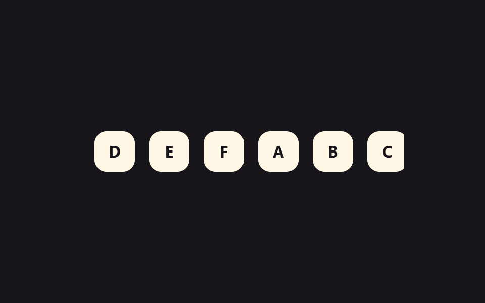 01 marquee-infinite-scroll-seamless-loop
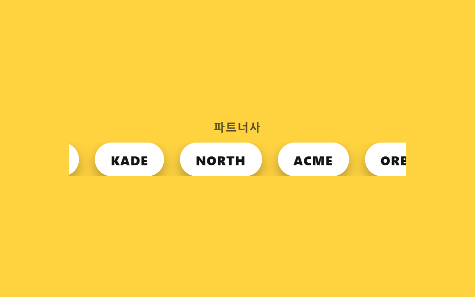 02 marquee-infinite-scroll-logo-marquee
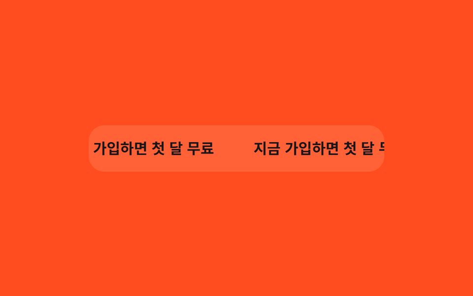 03 marquee-infinite-scroll-pause-hover
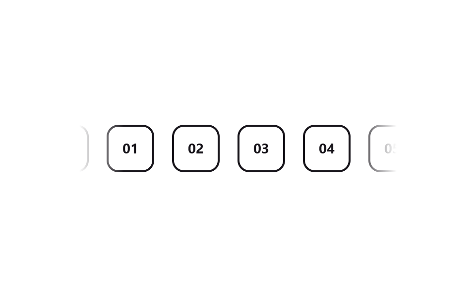 04 marquee-infinite-scroll-fade-edges-mask
 05 marquee-infinite-scroll-vertical-ticker
 06 marquee-infinite-scroll-dual-direction
 07 marquee-infinite-scroll-variable-speed
 08 marquee-infinite-scroll-3d-curve
 09 marquee-infinite-scroll-reduced-motion-static
Tự chạy · bấm ô để tới mục đó · cả 9 trong một zip
- 01 Công thức loop liền mạch
- 02 Marquee logo vô hạn
- 03 Dừng khi hover
- 04 Làm mờ hai đầu bằng mask
- 05 Ticker chạy dọc
- 06 Hai dòng chạy ngược chiều
- 07 Nhịp độ nhanh chậm
- 08 Marquee cong 3D
- 09 Bản tĩnh khi giảm chuyển động
Chín demo dưới đây không xếp theo độ nổi bật mà theo lớp kỹ thuật chồng dần lên nhau: công thức không lộ đường nối (01) được đưa thẳng vào một cách bố trí thực tế, hay được dùng (02), rồi cộng thêm tương tác (03) và làm mịn thị giác (04), sau đó đổi trục và nhân đôi hướng chạy (05–06), khép lại bằng nhịp độ và chiều sâu (07–08) trước khi dừng ở khả năng tiếp cận (09). Khung iframe cố định phía trên không nhận sự kiện cuộn hay hover thật nên mỗi ô tự lặp lại một chu kỳ hai giây bằng keyframes riêng của nó — trên một trang thật, một vòng thường mất từ mười đến hai mươi giây, và tên logo hay dòng chữ trong demo chỉ là chỗ để bạn thay bằng nội dung thật.
01Công thức loop liền mạch
Bạn thấy gì
Sáu chip được nhân đôi thành mười hai và xếp chung một track flex, mỗi chip mang margin-right cố định thay vì gap của track, rồi transform chỉ dịch từ 0 đến đúng -50% — nhờ vậy bề rộng của một bộ sáu chip đúng bằng nửa track, bản sao rơi đúng vào chỗ bản gốc từng đứng mà không lệch một pixel nào.
<main class="stage">
  <div class="marquee">
    <div class="marquee__track">
      <span class="marquee__chip">A</span>
      <span class="marquee__chip">B</span>
      <span class="marquee__chip">C</span>
      <span class="marquee__chip">D</span>
      <span class="marquee__chip">E</span>
      <span class="marquee__chip">F</span>
      <span class="marquee__chip" aria-hidden="true">A</span>
      <span class="marquee__chip" aria-hidden="true">B</span>
      <span class="marquee__chip" aria-hidden="true">C</span>
      <span class="marquee__chip" aria-hidden="true">D</span>
      <span class="marquee__chip" aria-hidden="true">E</span>
      <span class="marquee__chip" aria-hidden="true">F</span>
    </div>
  </div>
</main>
@use "../../../../site/static/demo-tokens" as *;
$duration: $dur-loop; // 실제 서비스는 12~20s 가 보통. 데모는 gif 루프에 맞춰 2s 로 배속
$easing: linear; // 등속 — 완급을 준 버전은 07
$color: $subject-cream;
@include stage($stage-ink);
.marquee {
width: min(320px, 84vw);
overflow: hidden;
}
.marquee__track {
display: flex;
width: max-content;
animation: marquee-scroll $duration $easing infinite;
}
.marquee__chip {
margin-right: 14px; // 트랙의 gap 대신 — 세트 폭이 정확히 절반이 되어 -50% 이음새가 0px 이 된다
display: grid;
place-items: center;
flex-shrink: 0;
width: 40px;
height: 40px;
border-radius: $r-control;
background: $color;
color: $stage-ink;
font-weight: 700; font-size: 16px; line-height: 1; font-family: inherit;
}
// 6개를 그대로 한 번 더 복제해 트랙 하나에 12개를 나란히 두었다.
// 간격은 트랙의 gap 이 아니라 칩의 margin-right 로 준다. gap 은 12개 사이에 11번만 생겨
// -50% 가 gap 의 절반만큼 모자라고, 한 바퀴마다 그만큼 튄다 (이 편 9개 전부에서 4~20px 실측).
// margin-right 면 세트 하나의 폭 = (칩 + 간격) × 6 이라 -50% 가 픽셀 단위로 겹친다.
@keyframes marquee-scroll {
from { transform: translateX(0); }
to { transform: translateX(-50%); }
}
@media (prefers-reduced-motion: reduce) {
.marquee__track { animation: none; transform: translateX(0); }
}html, body {
margin: 0;
overflow: hidden;
}
.stage {
box-sizing: border-box;
min-height: 100vh;
display: grid;
place-items: center;
margin: 0;
background: #17141a;
font-family: -apple-system, "Segoe UI", "Noto Sans KR", sans-serif;
padding: clamp(8px, 4vw, 24px);
}
.marquee {
width: min(320px, 84vw);
overflow: hidden;
}
.marquee__track {
display: flex;
width: max-content;
animation: marquee-scroll 2s linear infinite;
}
.marquee__chip {
margin-right: 14px;
display: grid;
place-items: center;
flex-shrink: 0;
width: 40px;
height: 40px;
border-radius: 12px;
background: #fff7e6;
color: #17141a;
font-weight: 700;
font-size: 16px;
line-height: 1;
font-family: inherit;
}
@keyframes marquee-scroll {
from {
transform: translateX(0);
}
to {
transform: translateX(-50%);
}
}
@media (prefers-reduced-motion: reduce) {
.marquee__track {
animation: none;
transform: translateX(0);
}
}import type { CSSProperties } from "react";
import styles from "./SeamlessLoopMarquee.module.scss";
export type SeamlessLoopMarqueeProps = {
items?: string[];
/** 한 바퀴가 도는 시간 (기본 12000ms — 데모 gif 는 2000ms 로 배속) */
duration?: number;
easing?: string;
color?: string;
};
type Vars = CSSProperties & { "--duration"?: string; "--easing"?: string; "--color"?: string };
export default function SeamlessLoopMarquee({
items = ["A", "B", "C", "D", "E", "F"],
duration = 12000,
easing = "linear",
color = "#fff7e6",
}: SeamlessLoopMarqueeProps) {
const vars: Vars = { "--duration": `${duration}ms`, "--easing": easing, "--color": color };
return (
<div className={styles.marquee} style={vars}>
<div className={styles.track}>
{items.map((it) => (
<span key={it} className={styles.chip}>{it}</span>
))}
{items.map((it) => (
<span key={"dup-" + it} className={styles.chip} aria-hidden="true">{it}</span>
))}
</div>
</div>
);
}01 · Công thức loop liền mạch — Diện tích đo được 8.889% · khung hình chuyển động 23/23Nguyên tác GODRICH · SCSS và React nằm trong tệp zip · Xem mật khẩu
Dùng ở đâu
.marquee__track {
  display: flex;
  width: max-content;
  animation: marquee-scroll 12s linear infinite;
}
.marquee__chip {
  margin-right: 14px;
}
@keyframes marquee-scroll {
  from { transform: translateX(0); }
  to   { transform: translateX(-50%); }
}
02Marquee logo vô hạn
Chuyện gì diễn ra trên màn hình
Năm wordmark đối tác được xếp thành thẻ viên thuốc rồi chảy qua đúng track liền mạch của mục 01, còn năm thẻ nhân bản phía sau mang aria-hidden="true" để trình đọc màn hình chỉ đọc từng tên đối tác một lần.
<main class="stage">
  <div class="marquee">
    <p class="marquee__label">Đối tác</p>
    <div class="marquee__row">
      <div class="marquee__track">
        <span class="marquee__logo">NORTH</span>
        <span class="marquee__logo">ACME</span>
        <span class="marquee__logo">ORBIT</span>
        <span class="marquee__logo">VELA</span>
        <span class="marquee__logo">KADE</span>
        <span class="marquee__logo" aria-hidden="true">NORTH</span>
        <span class="marquee__logo" aria-hidden="true">ACME</span>
        <span class="marquee__logo" aria-hidden="true">ORBIT</span>
        <span class="marquee__logo" aria-hidden="true">VELA</span>
        <span class="marquee__logo" aria-hidden="true">KADE</span>
      </div>
    </div>
  </div>
</main>
@use "../../../../site/static/demo-tokens" as *;
$duration: $dur-loop;
$easing: linear;
$color: $stage-ink;
@include stage($stage-yellow);
.marquee { width: min(340px, 88vw); display: grid; gap: 10px; justify-items: center; }
.marquee__label {
margin: 0;
font-weight: 700; font-size: clamp(11px, 3vw, 12px); line-height: 1; font-family: inherit;
letter-spacing: .08em;
color: rgba($color, .68);
text-transform: uppercase;
}
.marquee__row { width: 100%; overflow: hidden; }
.marquee__track {
display: flex;
width: max-content;
animation: logo-scroll $duration $easing infinite;
}
.marquee__logo {
margin-right: 16px; // 트랙의 gap 대신 — 세트 폭이 정확히 절반이 되어 -50% 이음새가 0px 이 된다
flex-shrink: 0;
display: grid;
place-items: center;
height: 34px;
padding: 0 16px;
border-radius: $r-pill;
background: $stage-paper;
color: $color;
font-weight: 800; font-size: 13px; line-height: 1; font-family: inherit;
letter-spacing: .04em;
box-shadow: $shadow-press;
}
@keyframes logo-scroll {
from { transform: translateX(0); }
to { transform: translateX(-50%); }
}
@media (prefers-reduced-motion: reduce) {
.marquee__track { animation: none; transform: translateX(0); }
}html, body {
margin: 0;
overflow: hidden;
}
.stage {
box-sizing: border-box;
min-height: 100vh;
display: grid;
place-items: center;
margin: 0;
background: #ffd23f;
font-family: -apple-system, "Segoe UI", "Noto Sans KR", sans-serif;
padding: clamp(8px, 4vw, 24px);
}
.marquee {
width: min(340px, 88vw);
display: grid;
gap: 10px;
justify-items: center;
}
.marquee__label {
margin: 0;
font-weight: 700;
font-size: clamp(11px, 3vw, 12px);
line-height: 1;
font-family: inherit;
letter-spacing: 0.08em;
color: rgba(23, 20, 26, 0.68);
text-transform: uppercase;
}
.marquee__row {
width: 100%;
overflow: hidden;
}
.marquee__track {
display: flex;
width: max-content;
animation: logo-scroll 2s linear infinite;
}
.marquee__logo {
margin-right: 16px;
flex-shrink: 0;
display: grid;
place-items: center;
height: 34px;
padding: 0 16px;
border-radius: 999px;
background: #ffffff;
color: #17141a;
font-weight: 800;
font-size: 13px;
line-height: 1;
font-family: inherit;
letter-spacing: 0.04em;
box-shadow: 0 6px 12px rgba(23, 20, 26, 0.32);
}
@keyframes logo-scroll {
from {
transform: translateX(0);
}
to {
transform: translateX(-50%);
}
}
@media (prefers-reduced-motion: reduce) {
.marquee__track {
animation: none;
transform: translateX(0);
}
}import type { CSSProperties } from "react";
import styles from "./LogoMarquee.module.scss";
export type LogoMarqueeProps = {
label?: string;
logos?: string[];
duration?: number;
easing?: string;
color?: string;
};
type Vars = CSSProperties & { "--duration"?: string; "--easing"?: string; "--color"?: string };
export default function LogoMarquee({
label = "Partners",
logos = ["NORTH", "ACME", "ORBIT", "VELA", "KADE"],
duration = 12000,
easing = "linear",
color = "#17141a",
}: LogoMarqueeProps) {
const vars: Vars = { "--duration": `${duration}ms`, "--easing": easing, "--color": color };
return (
<div className={styles.marquee} style={vars}>
<p className={styles.label}>{label}</p>
<div className={styles.row}>
<div className={styles.track}>
{logos.map((l) => (
<span key={l} className={styles.logo}>{l}</span>
))}
{logos.map((l) => (
<span key={"dup-" + l} className={styles.logo} aria-hidden="true">{l}</span>
))}
</div>
</div>
</div>
);
}02 · Marquee logo vô hạn — Diện tích đo được 8.028% · khung hình chuyển động 23/23Nguyên tác GODRICH · SCSS và React nằm trong tệp zip · Xem mật khẩu
Chỗ dùng
.marquee__track {
  display: flex;
  animation: logo-scroll 12s linear infinite;
}
.marquee__logo {
  margin-right: 16px;
  height: 34px;
  padding: 0 16px;
  border-radius: 999px;
  background: #fff;
}
03Dừng khi hover
Chuyển động thế nào
Ngay khi con trỏ chạm vào banner, animation-play-state chuyển sang paused và giữ nguyên đúng khung hình đang chạy, không giật ngược về đầu vòng lặp như nhiều bản tự viết vẫn mắc phải.
<main class="stage">
  <div class="marquee is-demo" tabindex="0">
    <div class="marquee__track">
      <span class="marquee__chip">Đăng ký hôm nay, miễn phí tháng đầu</span>
      <span class="marquee__chip" aria-hidden="true">Đăng ký hôm nay, miễn phí tháng đầu</span>
    </div>
    <span class="marquee__cursor" aria-hidden="true"></span>
  </div>
</main>
@use "../../../../site/static/demo-tokens" as *;
$duration: 10s; // 실서비스 속도 — 데모는 아래 .is-demo 가 별도로 2s 루프에 맞춘다
$easing: linear;
$color: $subject-cream;
@include stage($stage-orange);
.marquee {
position: relative;
width: min(300px, 82vw);
overflow: hidden;
border-radius: $r-card;
padding: 16px 0;
background: rgba($color, .12);
outline: none;
}
.marquee__track {
display: flex;
width: max-content;
animation: marquee-scroll $duration $easing infinite;
}
.marquee__chip {
margin-right: 40px; // 트랙의 gap 대신 — 세트 폭이 정확히 절반이 되어 -50% 이음새가 0px 이 된다
flex-shrink: 0;
white-space: nowrap;
font-weight: 700; font-size: clamp(13px, 3.6vw, 15px); line-height: 1; font-family: inherit;
color: $subject-ink; // 주황 면 위 글자 — AA 4.5 (blog-design 글자 대비)
}
.marquee__cursor {
position: absolute;
top: 8px;
right: 22px;
width: 16px;
height: 16px;
border-radius: 50%;
background: $subject-blue;
box-shadow: 0 0 0 3px rgba($subject-blue, .28);
opacity: 0;
}
// 실제 사용자는 마우스를 올리면 여기서 멈춘다 — 읽던 문구가 그대로 남는다
.marquee:hover .marquee__track,
.marquee:focus-within .marquee__track,
.marquee:active .marquee__track {
animation-play-state: paused;
}
// 데모 · 문서용: 진짜 hover 는 렌더에서 못 일으키니, 흐르다 멈췄다 다시 흐르는 한 사이클을
// 트랙 자신의 keyframes 안에 구간(plateau)으로 넣어 2초마다 반복시킨다. 커서 점은 그 구간에서만 보인다
.marquee.is-demo .marquee__track {
animation: marquee-hover-cycle $dur-loop $easing infinite;
}
.marquee.is-demo .marquee__cursor {
animation: cursor-hover $dur-loop $easing infinite;
}
@keyframes marquee-hover-cycle {
0% { transform: translateX(0); }
38% { transform: translateX(-32%); }
62% { transform: translateX(-32%); } // 정지 구간 — 실제 hover 로 멈춘 순간을 흉내
100% { transform: translateX(-50%); }
}
@keyframes cursor-hover {
0%, 30% { opacity: 0; transform: translateY(6px) scale(.6); }
38%, 62% { opacity: 1; transform: translateY(0) scale(1); }
70%, 100% { opacity: 0; transform: translateY(6px) scale(.6); }
}
@media (prefers-reduced-motion: reduce) {
.marquee__track { animation: none; transform: translateX(0); }
.marquee__cursor { animation: none; opacity: 0; }
}html, body {
margin: 0;
overflow: hidden;
}
.stage {
box-sizing: border-box;
min-height: 100vh;
display: grid;
place-items: center;
margin: 0;
background: #ff4d1f;
font-family: -apple-system, "Segoe UI", "Noto Sans KR", sans-serif;
padding: clamp(8px, 4vw, 24px);
}
.marquee {
position: relative;
width: min(300px, 82vw);
overflow: hidden;
border-radius: 16px;
padding: 16px 0;
background: rgba(255, 247, 230, 0.12);
outline: none;
}
.marquee__track {
display: flex;
width: max-content;
animation: marquee-scroll 10s linear infinite;
}
.marquee__chip {
margin-right: 40px;
flex-shrink: 0;
white-space: nowrap;
font-weight: 700;
font-size: clamp(13px, 3.6vw, 15px);
line-height: 1;
font-family: inherit;
color: #17141a;
}
.marquee__cursor {
position: absolute;
top: 8px;
right: 22px;
width: 16px;
height: 16px;
border-radius: 50%;
background: #2f6df6;
box-shadow: 0 0 0 3px rgba(47, 109, 246, 0.28);
opacity: 0;
}
.marquee:hover .marquee__track,
.marquee:focus-within .marquee__track,
.marquee:active .marquee__track {
animation-play-state: paused;
}
.marquee.is-demo .marquee__track {
animation: marquee-hover-cycle 2s linear infinite;
}
.marquee.is-demo .marquee__cursor {
animation: cursor-hover 2s linear infinite;
}
@keyframes marquee-hover-cycle {
0% {
transform: translateX(0);
}
38% {
transform: translateX(-32%);
}
62% {
transform: translateX(-32%);
}
100% {
transform: translateX(-50%);
}
}
@keyframes cursor-hover {
0%, 30% {
opacity: 0;
transform: translateY(6px) scale(0.6);
}
38%, 62% {
opacity: 1;
transform: translateY(0) scale(1);
}
70%, 100% {
opacity: 0;
transform: translateY(6px) scale(0.6);
}
}
@media (prefers-reduced-motion: reduce) {
.marquee__track {
animation: none;
transform: translateX(0);
}
.marquee__cursor {
animation: none;
opacity: 0;
}
}import type { CSSProperties } from "react";
import styles from "./PauseHoverMarquee.module.scss";
export type PauseHoverMarqueeProps = {
text?: string;
/** 한 바퀴가 도는 시간 (기본 10000ms) */
duration?: number;
easing?: string;
color?: string;
};
type Vars = CSSProperties & { "--duration"?: string; "--easing"?: string; "--color"?: string };
export default function PauseHoverMarquee({
text = "지금 가입하면 첫 달 무료",
duration = 10000,
easing = "linear",
color = "#fff7e6",
}: PauseHoverMarqueeProps) {
const vars: Vars = { "--duration": `${duration}ms`, "--easing": easing, "--color": color };
return (
<div className={styles.marquee} style={vars} tabIndex={0}>
<div className={styles.track}>
<span className={styles.chip}>{text}</span>
<span className={styles.chip} aria-hidden="true">{text}</span>
</div>
</div>
);
}03 · Dừng khi hover — Diện tích đo được 3.244% · khung hình chuyển động 19/23Nguyên tác GODRICH · SCSS và React nằm trong tệp zip · Xem mật khẩu
Dùng khi nào
.marquee:hover .marquee__track,
.marquee:focus-within .marquee__track {
  animation-play-state: paused;
}
@keyframes marquee-hover-cycle {
  0%   { transform: translateX(0); }
  38%  { transform: translateX(-32%); }
  62%  { transform: translateX(-32%); }
  100% { transform: translateX(-50%); }
}
04Làm mờ hai đầu bằng mask
Bạn thấy gì
Một linear-gradient được gán vào mask-image, kèm bản có tiền tố -webkit-mask-image cho Safari, phủ lên hai đầu track khiến từng thẻ mờ dần vào nền thay vì bị cắt cụt như khi chỉ dùng overflow: hidden.
<main class="stage">
  <div class="marquee">
    <div class="marquee__track">
      <span class="marquee__chip">01</span>
      <span class="marquee__chip">02</span>
      <span class="marquee__chip">03</span>
      <span class="marquee__chip">04</span>
      <span class="marquee__chip">05</span>
      <span class="marquee__chip" aria-hidden="true">01</span>
      <span class="marquee__chip" aria-hidden="true">02</span>
      <span class="marquee__chip" aria-hidden="true">03</span>
      <span class="marquee__chip" aria-hidden="true">04</span>
      <span class="marquee__chip" aria-hidden="true">05</span>
    </div>
  </div>
</main>
@use "../../../../site/static/demo-tokens" as *;
$duration: $dur-loop;
$easing: linear;
$color: $subject-ink;
@include stage($stage-paper);
.marquee {
width: min(320px, 84vw);
overflow: hidden;
mask-image: linear-gradient(to right, transparent, #000 14%, #000 86%, transparent);
-webkit-mask-image: linear-gradient(to right, transparent, #000 14%, #000 86%, transparent);
}
.marquee__track {
display: flex;
width: max-content;
animation: marquee-scroll $duration $easing infinite;
}
.marquee__chip {
margin-right: 18px; // 트랙의 gap 대신 — 세트 폭이 정확히 절반이 되어 -50% 이음새가 0px 이 된다
flex-shrink: 0;
display: grid;
place-items: center;
width: 44px;
height: 44px;
border-radius: $r-control;
border: 2px solid $color;
color: $color;
font-weight: 700; font-size: 14px; line-height: 1; font-family: inherit;
}
@keyframes marquee-scroll {
from { transform: translateX(0); }
to { transform: translateX(-50%); }
}
@media (prefers-reduced-motion: reduce) {
.marquee__track { animation: none; transform: translateX(0); }
}html, body {
margin: 0;
overflow: hidden;
}
.stage {
box-sizing: border-box;
min-height: 100vh;
display: grid;
place-items: center;
margin: 0;
background: #ffffff;
font-family: -apple-system, "Segoe UI", "Noto Sans KR", sans-serif;
padding: clamp(8px, 4vw, 24px);
}
.marquee {
width: min(320px, 84vw);
overflow: hidden;
mask-image: linear-gradient(to right, transparent, #000 14%, #000 86%, transparent);
-webkit-mask-image: linear-gradient(to right, transparent, #000 14%, #000 86%, transparent);
}
.marquee__track {
display: flex;
width: max-content;
animation: marquee-scroll 2s linear infinite;
}
.marquee__chip {
margin-right: 18px;
flex-shrink: 0;
display: grid;
place-items: center;
width: 44px;
height: 44px;
border-radius: 12px;
border: 2px solid #17141a;
color: #17141a;
font-weight: 700;
font-size: 14px;
line-height: 1;
font-family: inherit;
}
@keyframes marquee-scroll {
from {
transform: translateX(0);
}
to {
transform: translateX(-50%);
}
}
@media (prefers-reduced-motion: reduce) {
.marquee__track {
animation: none;
transform: translateX(0);
}
}import type { CSSProperties } from "react";
import styles from "./FadeEdgeMarquee.module.scss";
export type FadeEdgeMarqueeProps = {
items?: string[];
duration?: number;
easing?: string;
color?: string;
};
type Vars = CSSProperties & { "--duration"?: string; "--easing"?: string; "--color"?: string };
export default function FadeEdgeMarquee({
items = ["01", "02", "03", "04", "05"],
duration = 12000,
easing = "linear",
color = "#17141a",
}: FadeEdgeMarqueeProps) {
const vars: Vars = { "--duration": `${duration}ms`, "--easing": easing, "--color": color };
return (
<div className={styles.marquee} style={vars}>
<div className={styles.track}>
{items.map((it) => (
<span key={it} className={styles.chip}>{it}</span>
))}
{items.map((it) => (
<span key={"dup-" + it} className={styles.chip} aria-hidden="true">{it}</span>
))}
</div>
</div>
);
}04 · Làm mờ hai đầu bằng mask — Diện tích đo được 10.501% · khung hình chuyển động 23/23Nguyên tác GODRICH · SCSS và React nằm trong tệp zip · Xem mật khẩu
Dùng ở đâu
.marquee {
  overflow: hidden;
  mask-image: linear-gradient(to right,
    transparent, #000 14%, #000 86%, transparent);
  -webkit-mask-image: linear-gradient(to right,
    transparent, #000 14%, #000 86%, transparent);
}
05Ticker chạy dọc
Chuyện gì diễn ra trên màn hình
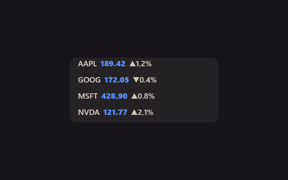
Đúng công thức nhân đôi của mục 01 được chuyển sang trục dọc — translateY thay cho translateX — để một dòng gồm tên và giá cuộn lên bên trong một khung có chiều cao cố định.
<main class="stage">
  <div class="ticker">
    <div class="ticker__track">
      <span class="ticker__row">AAPL <b>189.42</b> ▲1.2%</span>
      <span class="ticker__row">GOOG <b>172.05</b> ▼0.4%</span>
      <span class="ticker__row">MSFT <b>428.90</b> ▲0.8%</span>
      <span class="ticker__row">NVDA <b>121.77</b> ▲2.1%</span>
      <span class="ticker__row" aria-hidden="true">AAPL <b>189.42</b> ▲1.2%</span>
      <span class="ticker__row" aria-hidden="true">GOOG <b>172.05</b> ▼0.4%</span>
      <span class="ticker__row" aria-hidden="true">MSFT <b>428.90</b> ▲0.8%</span>
      <span class="ticker__row" aria-hidden="true">NVDA <b>121.77</b> ▲2.1%</span>
    </div>
  </div>
</main>
@use "../../../../site/static/demo-tokens" as *;
$duration: $dur-loop;
$easing: linear;
$color: $subject-blue;
@include stage($stage-ink);
.ticker {
width: min(220px, 76vw);
height: 108px;
overflow: hidden;
border-radius: $r-control;
background: rgba($subject-cream, .06);
padding: 0 14px;
}
.ticker__track {
display: flex;
flex-direction: column;
animation: ticker-scroll $duration $easing infinite;
}
.ticker__row {
flex-shrink: 0;
height: 27px;
display: flex;
align-items: center;
gap: 6px;
font-weight: 600; font-size: clamp(11px, 3.2vw, 13px); line-height: 1; font-family: inherit;
color: rgba($subject-cream, .78);
b { color: $subject-blue-light; font-weight: 800; } // 어두운 면 위 파란 글자 — AA 4.5
}
// 세로 축에도 같은 2벌 복제 공식을 그대로 적용 — translateX 대신 translateY 로 -50%
@keyframes ticker-scroll {
from { transform: translateY(0); }
to { transform: translateY(-50%); }
}
@media (prefers-reduced-motion: reduce) {
.ticker__track { animation: none; transform: translateY(0); }
}html, body {
margin: 0;
overflow: hidden;
}
.stage {
box-sizing: border-box;
min-height: 100vh;
display: grid;
place-items: center;
margin: 0;
background: #17141a;
font-family: -apple-system, "Segoe UI", "Noto Sans KR", sans-serif;
padding: clamp(8px, 4vw, 24px);
}
.ticker {
width: min(220px, 76vw);
height: 108px;
overflow: hidden;
border-radius: 12px;
background: rgba(255, 247, 230, 0.06);
padding: 0 14px;
}
.ticker__track {
display: flex;
flex-direction: column;
animation: ticker-scroll 2s linear infinite;
}
.ticker__row {
flex-shrink: 0;
height: 27px;
display: flex;
align-items: center;
gap: 6px;
font-weight: 600;
font-size: clamp(11px, 3.2vw, 13px);
line-height: 1;
font-family: inherit;
color: rgba(255, 247, 230, 0.78);
}
.ticker__row b {
color: #5b8cf8;
font-weight: 800;
}
@keyframes ticker-scroll {
from {
transform: translateY(0);
}
to {
transform: translateY(-50%);
}
}
@media (prefers-reduced-motion: reduce) {
.ticker__track {
animation: none;
transform: translateY(0);
}
}import type { CSSProperties } from "react";
import styles from "./VerticalTicker.module.scss";
export type TickerRow = { symbol: string; price: string; change: string; up: boolean };
export type VerticalTickerProps = {
rows?: TickerRow[];
duration?: number;
easing?: string;
color?: string;
};
type Vars = CSSProperties & { "--duration"?: string; "--easing"?: string; "--color"?: string };
const defaultRows: TickerRow[] = [
{ symbol: "AAPL", price: "189.42", change: "▲1.2%", up: true },
{ symbol: "GOOG", price: "172.05", change: "▼0.4%", up: false },
{ symbol: "MSFT", price: "428.90", change: "▲0.8%", up: true },
{ symbol: "NVDA", price: "121.77", change: "▲2.1%", up: true },
];
export default function VerticalTicker({
rows = defaultRows,
duration = 12000,
easing = "linear",
color = "#2f6df6",
}: VerticalTickerProps) {
const vars: Vars = { "--duration": `${duration}ms`, "--easing": easing, "--color": color };
const doubled = [...rows, ...rows];
return (
<div className={styles.ticker} style={vars}>
<div className={styles.track}>
{doubled.map((r, i) => (
<span key={r.symbol + i} className={styles.row} aria-hidden={i >= rows.length}>
{r.symbol} <b>{r.price}</b> {r.change}
</span>
))}
</div>
</div>
);
}05 · Ticker chạy dọc — Diện tích đo được 9.767% · khung hình chuyển động 23/23Nguyên tác GODRICH · SCSS và React nằm trong tệp zip · Xem mật khẩu
Chỗ dùng
.ticker__track {
  display: flex;
  flex-direction: column;
  animation: ticker-scroll 12s linear infinite;
}
@keyframes ticker-scroll {
  from { transform: translateY(0); }
  to   { transform: translateY(-50%); }
}
06Hai dòng chạy ngược chiều
Chuyển động thế nào
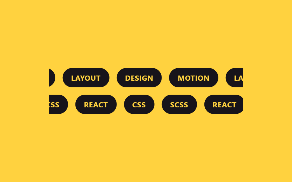
Hai track dùng chung một animation-name và cùng thời lượng, chỉ hàng phía dưới nhận thêm animation-direction: reverse nên hai dòng chip trôi ngược chiều nhau mà không cần viết thêm một bộ keyframes nào khác.
<main class="stage">
  <div class="marquee">
    <div class="marquee__row marquee__row--fwd">
      <div class="marquee__track">
        <span class="marquee__chip">DESIGN</span>
        <span class="marquee__chip">MOTION</span>
        <span class="marquee__chip">LAYOUT</span>
        <span class="marquee__chip" aria-hidden="true">DESIGN</span>
        <span class="marquee__chip" aria-hidden="true">MOTION</span>
        <span class="marquee__chip" aria-hidden="true">LAYOUT</span>
      </div>
    </div>
    <div class="marquee__row marquee__row--rev">
      <div class="marquee__track">
        <span class="marquee__chip">CSS</span>
        <span class="marquee__chip">SCSS</span>
        <span class="marquee__chip">REACT</span>
        <span class="marquee__chip" aria-hidden="true">CSS</span>
        <span class="marquee__chip" aria-hidden="true">SCSS</span>
        <span class="marquee__chip" aria-hidden="true">REACT</span>
      </div>
    </div>
  </div>
</main>
@use "../../../../site/static/demo-tokens" as *;
$duration: $dur-loop;
$easing: linear;
$color: $stage-ink;
@include stage($stage-yellow);
.marquee { width: min(320px, 84vw); display: grid; gap: 12px; }
.marquee__row { overflow: hidden; }
.marquee__track {
display: flex;
width: max-content;
animation-duration: $duration;
animation-timing-function: $easing;
animation-iteration-count: infinite;
}
.marquee__row--fwd .marquee__track { animation-name: marquee-scroll; }
// 같은 애니메이션을 그대로 쓰되 animation-direction 만 뒤집는다 — 별도 keyframes 를 만들 필요가 없다
.marquee__row--rev .marquee__track { animation-name: marquee-scroll; animation-direction: reverse; }
.marquee__chip {
margin-right: 12px; // 트랙의 gap 대신 — 세트 폭이 정확히 절반이 되어 -50% 이음새가 0px 이 된다
flex-shrink: 0;
display: grid;
place-items: center;
height: 32px;
padding: 0 14px;
border-radius: $r-pill;
background: $color;
color: $stage-yellow;
font-weight: 700; font-size: 12px; line-height: 1; font-family: inherit;
letter-spacing: .04em;
}
@keyframes marquee-scroll {
from { transform: translateX(0); }
to { transform: translateX(-50%); }
}
@media (prefers-reduced-motion: reduce) {
.marquee__track { animation: none; transform: translateX(0); }
}html, body {
margin: 0;
overflow: hidden;
}
.stage {
box-sizing: border-box;
min-height: 100vh;
display: grid;
place-items: center;
margin: 0;
background: #ffd23f;
font-family: -apple-system, "Segoe UI", "Noto Sans KR", sans-serif;
padding: clamp(8px, 4vw, 24px);
}
.marquee {
width: min(320px, 84vw);
display: grid;
gap: 12px;
}
.marquee__row {
overflow: hidden;
}
.marquee__track {
display: flex;
width: max-content;
animation-duration: 2s;
animation-timing-function: linear;
animation-iteration-count: infinite;
}
.marquee__row--fwd .marquee__track {
animation-name: marquee-scroll;
}
.marquee__row--rev .marquee__track {
animation-name: marquee-scroll;
animation-direction: reverse;
}
.marquee__chip {
margin-right: 12px;
flex-shrink: 0;
display: grid;
place-items: center;
height: 32px;
padding: 0 14px;
border-radius: 999px;
background: #17141a;
color: #ffd23f;
font-weight: 700;
font-size: 12px;
line-height: 1;
font-family: inherit;
letter-spacing: 0.04em;
}
@keyframes marquee-scroll {
from {
transform: translateX(0);
}
to {
transform: translateX(-50%);
}
}
@media (prefers-reduced-motion: reduce) {
.marquee__track {
animation: none;
transform: translateX(0);
}
}import type { CSSProperties } from "react";
import styles from "./DualDirectionMarquee.module.scss";
export type DualDirectionMarqueeProps = {
forward?: string[];
reverse?: string[];
duration?: number;
easing?: string;
color?: string;
};
type Vars = CSSProperties & { "--duration"?: string; "--easing"?: string; "--color"?: string };
function Row({ items, reverse }: { items: string[]; reverse?: boolean }) {
return (
<div className={styles.row}>
<div className={reverse ? `${styles.track} ${styles.reverse}` : styles.track}>
{items.map((it) => (
<span key={it} className={styles.chip}>{it}</span>
))}
{items.map((it) => (
<span key={"dup-" + it} className={styles.chip} aria-hidden="true">{it}</span>
))}
</div>
</div>
);
}
export default function DualDirectionMarquee({
forward = ["DESIGN", "MOTION", "LAYOUT"],
reverse = ["CSS", "SCSS", "REACT"],
duration = 12000,
easing = "linear",
color = "#17141a",
}: DualDirectionMarqueeProps) {
const vars: Vars = { "--duration": `${duration}ms`, "--easing": easing, "--color": color };
return (
<div className={styles.marquee} style={vars}>
<Row items={forward} />
<Row items={reverse} reverse />
</div>
);
}06 · Hai dòng chạy ngược chiều — Diện tích đo được 14.222% · khung hình chuyển động 23/23Nguyên tác GODRICH · SCSS và React nằm trong tệp zip · Xem mật khẩu
Dùng khi nào
.marquee__track {
  animation-name: marquee-scroll;
  animation-duration: 12s;
  animation-timing-function: linear;
  animation-iteration-count: infinite;
}
.marquee__row--rev .marquee__track {
  animation-direction: reverse;
}
07Nhịp độ nhanh chậm
Bạn thấy gì
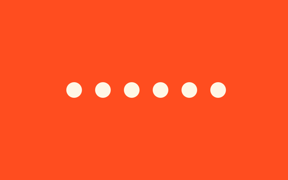
Thay timing-function linear bằng cubic-bezier(.65,0,.35,1) khiến vòng lặp chậm lại ngay tại đường nối rồi nhanh hơn ở giữa quãng đường, trong khi quãng dịch chuyển vẫn giữ nguyên đúng -50% như công thức gốc.
<main class="stage">
  <div class="marquee">
    <div class="marquee__track">
      <span class="marquee__chip"></span>
      <span class="marquee__chip"></span>
      <span class="marquee__chip"></span>
      <span class="marquee__chip"></span>
      <span class="marquee__chip"></span>
      <span class="marquee__chip" aria-hidden="true"></span>
      <span class="marquee__chip" aria-hidden="true"></span>
      <span class="marquee__chip" aria-hidden="true"></span>
      <span class="marquee__chip" aria-hidden="true"></span>
      <span class="marquee__chip" aria-hidden="true"></span>
    </div>
  </div>
</main>
@use "../../../../site/static/demo-tokens" as *;
$duration: $dur-loop;
$easing: cubic-bezier(.65, 0, .35, 1); // 비선형 — 이음매 근처는 느리고 중간은 빠르다
$color: $subject-cream;
@include stage($stage-orange);
.marquee {
width: min(300px, 80vw);
overflow: hidden;
}
.marquee__track {
display: flex;
width: max-content;
animation: marquee-scroll $duration $easing infinite;
}
.marquee__chip {
margin-right: 22px; // 트랙의 gap 대신 — 세트 폭이 정확히 절반이 되어 -50% 이음새가 0px 이 된다
flex-shrink: 0;
width: 26px;
height: 26px;
border-radius: 50%;
background: $color;
}
// linear 대신 커스텀 cubic-bezier 를 타이밍 함수로 써도 -50% 이동량은 그대로다.
// 이음매(0%·100%)에선 느리게 붙고 구간 중간에서 빨라지는 리듬만 달라진다 — JS 없이, 한 줄로
@keyframes marquee-scroll {
from { transform: translateX(0); }
to { transform: translateX(-50%); }
}
@media (prefers-reduced-motion: reduce) {
.marquee__track { animation: none; transform: translateX(0); }
}html, body {
margin: 0;
overflow: hidden;
}
.stage {
box-sizing: border-box;
min-height: 100vh;
display: grid;
place-items: center;
margin: 0;
background: #ff4d1f;
font-family: -apple-system, "Segoe UI", "Noto Sans KR", sans-serif;
padding: clamp(8px, 4vw, 24px);
}
.marquee {
width: min(300px, 80vw);
overflow: hidden;
}
.marquee__track {
display: flex;
width: max-content;
animation: marquee-scroll 2s cubic-bezier(0.65, 0, 0.35, 1) infinite;
}
.marquee__chip {
margin-right: 22px;
flex-shrink: 0;
width: 26px;
height: 26px;
border-radius: 50%;
background: #fff7e6;
}
@keyframes marquee-scroll {
from {
transform: translateX(0);
}
to {
transform: translateX(-50%);
}
}
@media (prefers-reduced-motion: reduce) {
.marquee__track {
animation: none;
transform: translateX(0);
}
}import type { CSSProperties } from "react";
import styles from "./VariableSpeedMarquee.module.scss";
export type VariableSpeedMarqueeProps = {
count?: number;
duration?: number;
/** 비선형 타이밍 함수 — 이음매 근처는 느리고 가운데는 빠르다 */
easing?: string;
color?: string;
};
type Vars = CSSProperties & { "--duration"?: string; "--easing"?: string; "--color"?: string };
export default function VariableSpeedMarquee({
count = 5,
duration = 9000,
easing = "cubic-bezier(.65,0,.35,1)",
color = "#fff7e6",
}: VariableSpeedMarqueeProps) {
const vars: Vars = { "--duration": `${duration}ms`, "--easing": easing, "--color": color };
const dots = Array.from({ length: count * 2 });
return (
<div className={styles.marquee} style={vars}>
<div className={styles.track}>
{dots.map((_, i) => (
<span key={i} className={styles.chip} aria-hidden={i >= count} />
))}
</div>
</div>
);
}07 · Nhịp độ nhanh chậm — Diện tích đo được 5.417% · khung hình chuyển động 23/23Nguyên tác GODRICH · SCSS và React nằm trong tệp zip · Xem mật khẩu
Dùng ở đâu
.marquee__track {
  animation: marquee-scroll 9s
    cubic-bezier(.65, 0, .35, 1) infinite;
}
@keyframes marquee-scroll {
  from { transform: translateX(0); }
  to   { transform: translateX(-50%); }
}
08Marquee cong 3D
Chuyện gì diễn ra trên màn hình
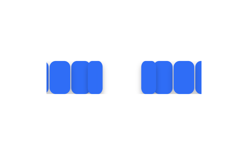
Stage nhận perspective còn track nhận preserve-3d, rồi mỗi thẻ trong năm thẻ được gán một bước rotateY riêng qua nth-child để cả dải uốn cong thành mặt trong của một hình trụ.
<main class="stage">
  <div class="marquee">
    <div class="marquee__track">
      <span class="marquee__card"></span>
      <span class="marquee__card"></span>
      <span class="marquee__card"></span>
      <span class="marquee__card"></span>
      <span class="marquee__card"></span>
      <span class="marquee__card" aria-hidden="true"></span>
      <span class="marquee__card" aria-hidden="true"></span>
      <span class="marquee__card" aria-hidden="true"></span>
      <span class="marquee__card" aria-hidden="true"></span>
      <span class="marquee__card" aria-hidden="true"></span>
    </div>
  </div>
</main>
@use "../../../../site/static/demo-tokens" as *;
$duration: $dur-loop;
$easing: linear;
$color: $subject-blue;
@include stage($stage-paper);
.stage { perspective: 420px; }
.marquee {
width: min(300px, 80vw);
overflow: hidden;
}
.marquee__track {
display: flex;
width: max-content;
transform-style: preserve-3d;
animation: marquee-scroll $duration $easing infinite;
}
.marquee__card {
margin-right: 8px; // 트랙의 gap 대신 — 세트 폭이 정확히 절반이 되어 -50% 이음새가 0px 이 된다
flex-shrink: 0;
width: 40px;
height: 64px;
border-radius: $r-control;
background: $color;
box-shadow: $shadow-press;
transform-style: preserve-3d;
}
// 카드 5장을 부채꼴로 기울여 원통 벽처럼 보이게 한다 — 같은 각도 표를 복제본(6~10번째)에도 그대로 반복해
// 이음매에서 곡률이 끊기지 않는다
@for $i from 1 through 10 {
$step: ($i - 1) % 5;
.marquee__card:nth-child(#{$i}) {
transform: rotateY(#{($step - 2) * 22}deg) translateZ(#{-1 * (2 - if($step > 2, 4 - $step, $step)) * 20}px);
}
}
@keyframes marquee-scroll {
from { transform: translateX(0); }
to { transform: translateX(-50%); }
}
@media (prefers-reduced-motion: reduce) {
.marquee__track { animation: none; transform: translateX(0); }
}html, body {
margin: 0;
overflow: hidden;
}
.stage {
box-sizing: border-box;
min-height: 100vh;
display: grid;
place-items: center;
margin: 0;
background: #ffffff;
font-family: -apple-system, "Segoe UI", "Noto Sans KR", sans-serif;
padding: clamp(8px, 4vw, 24px);
}
.stage {
perspective: 420px;
}
.marquee {
width: min(300px, 80vw);
overflow: hidden;
}
.marquee__track {
display: flex;
width: max-content;
transform-style: preserve-3d;
animation: marquee-scroll 2s linear infinite;
}
.marquee__card {
margin-right: 8px;
flex-shrink: 0;
width: 40px;
height: 64px;
border-radius: 12px;
background: #2f6df6;
box-shadow: 0 6px 12px rgba(23, 20, 26, 0.32);
transform-style: preserve-3d;
}
.marquee__card:nth-child(1) {
transform: rotateY(-44deg) translateZ(-40px);
}
.marquee__card:nth-child(2) {
transform: rotateY(-22deg) translateZ(-20px);
}
.marquee__card:nth-child(3) {
transform: rotateY(0deg) translateZ(-0px);
}
.marquee__card:nth-child(4) {
transform: rotateY(22deg) translateZ(-20px);
}
.marquee__card:nth-child(5) {
transform: rotateY(44deg) translateZ(-40px);
}
.marquee__card:nth-child(6) {
transform: rotateY(-44deg) translateZ(-40px);
}
.marquee__card:nth-child(7) {
transform: rotateY(-22deg) translateZ(-20px);
}
.marquee__card:nth-child(8) {
transform: rotateY(0deg) translateZ(-0px);
}
.marquee__card:nth-child(9) {
transform: rotateY(22deg) translateZ(-20px);
}
.marquee__card:nth-child(10) {
transform: rotateY(44deg) translateZ(-40px);
}
@keyframes marquee-scroll {
from {
transform: translateX(0);
}
to {
transform: translateX(-50%);
}
}
@media (prefers-reduced-motion: reduce) {
.marquee__track {
animation: none;
transform: translateX(0);
}
}import type { CSSProperties } from "react";
import styles from "./Curved3DMarquee.module.scss";
export type Curved3DMarqueeProps = {
count?: number;
duration?: number;
easing?: string;
color?: string;
};
type Vars = CSSProperties & { "--duration"?: string; "--easing"?: string; "--color"?: string };
export default function Curved3DMarquee({
count = 5,
duration = 12000,
easing = "linear",
color = "#2f6df6",
}: Curved3DMarqueeProps) {
const vars: Vars = { "--duration": `${duration}ms`, "--easing": easing, "--color": color };
const cards = Array.from({ length: count * 2 });
return (
<div className={styles.stage3d}>
<div className={styles.marquee} style={vars}>
<div className={styles.track}>
{cards.map((_, i) => (
<span key={i} className={styles.card} aria-hidden={i >= count} />
))}
</div>
</div>
</div>
);
}08 · Marquee cong 3D — Diện tích đo được 13.333% · khung hình chuyển động 23/23Nguyên tác GODRICH · SCSS và React nằm trong tệp zip · Xem mật khẩu
Chỗ dùng
.stage { perspective: 420px; }
.marquee__track { transform-style: preserve-3d; }
.marquee__card:nth-child(1),
.marquee__card:nth-child(6) {
  transform: rotateY(-44deg) translateZ(-40px);
}
.marquee__card:nth-child(3),
.marquee__card:nth-child(8) {
  transform: rotateY(0deg) translateZ(0px);
}
09Bản tĩnh khi giảm chuyển động
Chuyển động thế nào
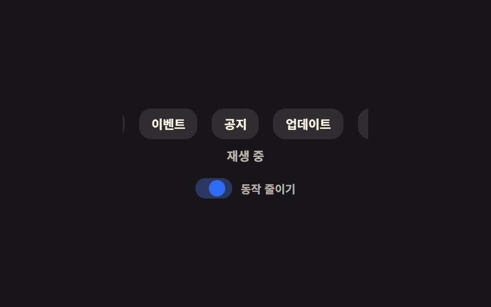
Công tắc trên demo cho xem song song track đang chạy và trạng thái tĩnh mà prefers-reduced-motion: reduce thực sự hiển thị cho người dùng thật, dừng đúng khung hình đang ở giữa vòng lặp chứ không phải khung đầu tiên.
<main class="stage">
  <div class="panel is-demo">
    <div class="panel__row">
      <div class="marquee">
        <div class="marquee__track">
          <span class="marquee__chip">Thông báo</span>
          <span class="marquee__chip">Cập nhật</span>
          <span class="marquee__chip">Sự kiện</span>
          <span class="marquee__chip" aria-hidden="true">Thông báo</span>
          <span class="marquee__chip" aria-hidden="true">Cập nhật</span>
          <span class="marquee__chip" aria-hidden="true">Sự kiện</span>
        </div>
      </div>
      <span class="panel__state">
        <span class="panel__state-text panel__state-text--play">Đang chạy</span>
        <span class="panel__state-text panel__state-text--pause">Đã dừng</span>
      </span>
    </div>
    <label class="panel__toggle" aria-hidden="true">
      <span class="panel__toggle-track"><span class="panel__toggle-knob"></span></span>
      <span class="panel__toggle-label">Giảm chuyển động</span>
    </label>
  </div>
</main>
@use "../../../../site/static/demo-tokens" as *;
$duration: $dur-loop;
$easing: $ease-spring;
$color: $subject-blue;
$fg: $subject-cream;
@include stage($stage-ink);
.panel {
display: grid;
gap: 14px;
justify-items: center;
font-family: -apple-system, "Segoe UI", "Noto Sans KR", sans-serif;
}
.panel__row {
display: grid;
gap: 8px;
justify-items: center;
}
.marquee {
width: min(240px, 70vw);
overflow: hidden;
}
.marquee__track {
display: flex;
width: max-content;
}
.marquee__chip {
margin-right: 14px; // 트랙의 gap 대신 — 세트 폭이 정확히 절반이 되어 -50% 이음새가 0px 이 된다
flex-shrink: 0;
display: grid;
place-items: center;
height: 30px;
padding: 0 12px;
border-radius: $r-control;
background: rgba($fg, .1);
color: $fg;
font-weight: 700; font-size: 12px; line-height: 1; font-family: inherit;
}
.panel__state { position: relative; width: 100%; min-width: 84px; height: 16px; }
.panel__state-text {
position: absolute;
inset: 0;
width: 100%;
text-align: center;
white-space: nowrap;
font-weight: 700; font-size: 12px; line-height: 16px; font-family: inherit;
color: rgba($fg, .7);
}
.panel__toggle { display: flex; align-items: center; gap: 8px; }
.panel__toggle-track {
position: relative;
width: 36px;
height: 20px;
border-radius: $r-pill;
background: rgba($fg, .18);
}
.panel__toggle-knob {
position: absolute;
top: 2px;
left: 2px;
width: 16px;
height: 16px;
border-radius: 50%;
background: $color;
}
.panel__toggle-label {
font-weight: 600; font-size: 11px; line-height: 1; font-family: inherit;
color: rgba($fg, .68);
}
// 트랙은 토글이 꺼진 55% 구간까지만 움직이고, 켜진 뒤로는 그 자리에 그대로 멈춘다 —
// 실제 prefers-reduced-motion: reduce 사용자에게 나가는 화면과 같은 정지 상태다
.panel.is-demo .marquee__track { animation: marquee-toggle $duration linear infinite; }
.panel.is-demo .panel__toggle-knob { animation: toggle-knob $duration $easing infinite; }
.panel.is-demo .panel__toggle-track { animation: toggle-track $duration $easing infinite; }
.panel.is-demo .panel__state-text--play { animation: state-play $duration steps(1) infinite; }
.panel.is-demo .panel__state-text--pause { animation: state-pause $duration steps(1) infinite; }
@keyframes marquee-toggle {
0% { transform: translateX(0); }
55% { transform: translateX(-30%); }
100% { transform: translateX(-30%); }
}
@keyframes toggle-knob {
0%, 50% { transform: translateX(0); }
70%, 100% { transform: translateX(16px); }
}
@keyframes toggle-track {
0%, 50% { background: rgba($fg, .18); }
70%, 100% { background: rgba($color, .38); }
}
@keyframes state-play {
0%, 50% { opacity: 1; }
60%, 100% { opacity: 0; }
}
@keyframes state-pause {
0%, 50% { opacity: 0; }
60%, 100% { opacity: 1; }
}
@media (prefers-reduced-motion: reduce) {
.marquee__track, .panel__toggle-knob, .panel__toggle-track,
.panel__state-text--play, .panel__state-text--pause {
animation: none !important;
}
.panel.is-demo .marquee__track { transform: translateX(-30%); }
.panel.is-demo .panel__toggle-knob { transform: translateX(16px); }
.panel.is-demo .panel__toggle-track { background: rgba($color, .38); }
.panel.is-demo .panel__state-text--play { opacity: 0; }
.panel.is-demo .panel__state-text--pause { opacity: 1; }
}html, body {
margin: 0;
overflow: hidden;
}
.stage {
box-sizing: border-box;
min-height: 100vh;
display: grid;
place-items: center;
margin: 0;
background: #17141a;
font-family: -apple-system, "Segoe UI", "Noto Sans KR", sans-serif;
padding: clamp(8px, 4vw, 24px);
}
.panel {
display: grid;
gap: 14px;
justify-items: center;
font-family: -apple-system, "Segoe UI", "Noto Sans KR", sans-serif;
}
.panel__row {
display: grid;
gap: 8px;
justify-items: center;
}
.marquee {
width: min(240px, 70vw);
overflow: hidden;
}
.marquee__track {
display: flex;
width: max-content;
}
.marquee__chip {
margin-right: 14px;
flex-shrink: 0;
display: grid;
place-items: center;
height: 30px;
padding: 0 12px;
border-radius: 12px;
background: rgba(255, 247, 230, 0.1);
color: #fff7e6;
font-weight: 700;
font-size: 12px;
line-height: 1;
font-family: inherit;
}
.panel__state {
position: relative;
width: 100%;
min-width: 84px;
height: 16px;
}
.panel__state-text {
position: absolute;
inset: 0;
width: 100%;
text-align: center;
white-space: nowrap;
font-weight: 700;
font-size: 12px;
line-height: 16px;
font-family: inherit;
color: rgba(255, 247, 230, 0.7);
}
.panel__toggle {
display: flex;
align-items: center;
gap: 8px;
}
.panel__toggle-track {
position: relative;
width: 36px;
height: 20px;
border-radius: 999px;
background: rgba(255, 247, 230, 0.18);
}
.panel__toggle-knob {
position: absolute;
top: 2px;
left: 2px;
width: 16px;
height: 16px;
border-radius: 50%;
background: #2f6df6;
}
.panel__toggle-label {
font-weight: 600;
font-size: 11px;
line-height: 1;
font-family: inherit;
color: rgba(255, 247, 230, 0.68);
}
.panel.is-demo .marquee__track {
animation: marquee-toggle 2s linear infinite;
}
.panel.is-demo .panel__toggle-knob {
animation: toggle-knob 2s cubic-bezier(0.2, 0.8, 0.2, 1) infinite;
}
.panel.is-demo .panel__toggle-track {
animation: toggle-track 2s cubic-bezier(0.2, 0.8, 0.2, 1) infinite;
}
.panel.is-demo .panel__state-text--play {
animation: state-play 2s steps(1) infinite;
}
.panel.is-demo .panel__state-text--pause {
animation: state-pause 2s steps(1) infinite;
}
@keyframes marquee-toggle {
0% {
transform: translateX(0);
}
55% {
transform: translateX(-30%);
}
100% {
transform: translateX(-30%);
}
}
@keyframes toggle-knob {
0%, 50% {
transform: translateX(0);
}
70%, 100% {
transform: translateX(16px);
}
}
@keyframes toggle-track {
0%, 50% {
background: rgba(255, 247, 230, 0.18);
}
70%, 100% {
background: rgba(47, 109, 246, 0.38);
}
}
@keyframes state-play {
0%, 50% {
opacity: 1;
}
60%, 100% {
opacity: 0;
}
}
@keyframes state-pause {
0%, 50% {
opacity: 0;
}
60%, 100% {
opacity: 1;
}
}
@media (prefers-reduced-motion: reduce) {
.marquee__track, .panel__toggle-knob, .panel__toggle-track,
.panel__state-text--play, .panel__state-text--pause {
animation: none !important;
}
.panel.is-demo .marquee__track {
transform: translateX(-30%);
}
.panel.is-demo .panel__toggle-knob {
transform: translateX(16px);
}
.panel.is-demo .panel__toggle-track {
background: rgba(47, 109, 246, 0.38);
}
.panel.is-demo .panel__state-text--play {
opacity: 0;
}
.panel.is-demo .panel__state-text--pause {
opacity: 1;
}
}import { useState } from "react";
import type { CSSProperties } from "react";
import styles from "./ReducedMotionMarquee.module.scss";
export type ReducedMotionMarqueeProps = {
items?: string[];
duration?: number;
easing?: string;
color?: string;
};
type Vars = CSSProperties & { "--duration"?: string; "--easing"?: string; "--color"?: string };
export default function ReducedMotionMarquee({
items = ["공지", "업데이트", "이벤트"],
duration = 12000,
easing = "linear",
color = "#2f6df6",
}: ReducedMotionMarqueeProps) {
const [reduced, setReduced] = useState(false);
const vars: Vars = {
"--duration": `${duration}ms`,
"--easing": easing,
"--color": color,
animationPlayState: reduced ? "paused" : "running",
} as Vars;
return (
<div className={styles.panel}>
<div className={styles.marquee}>
<div className={styles.track} style={vars}>
{items.map((it) => (
<span key={it} className={styles.chip}>{it}</span>
))}
{items.map((it) => (
<span key={"dup-" + it} className={styles.chip} aria-hidden="true">{it}</span>
))}
</div>
</div>
<span className={styles.state}>{reduced ? "정지됨" : "재생 중"}</span>
<button type="button" className={styles.toggle} aria-pressed={reduced} onClick={() => setReduced((v) => !v)}>
<span className={styles.switchTrack} data-on={reduced}><span className={styles.knob} /></span>
동작 줄이기
</button>
</div>
);
}09 · Bản tĩnh khi giảm chuyển động — Diện tích đo được 5.672% · khung hình chuyển động 16/23Nguyên tác GODRICH · SCSS và React nằm trong tệp zip · Xem mật khẩu
Dùng khi nào
@media (prefers-reduced-motion: reduce) {
  .marquee__track {
    animation: none !important;
    transform: translateX(-30%);
  }
  .panel__toggle-knob {
    transform: translateX(16px);
  }
}
Bẫy nằm ở đâu? — hai chỗ dễ hỏng
Bản nhân đôi và trình đọc màn hình
Lần đầu dựng mục 02, năm thẻ logo nhân bản không được gắn thuộc tính ẩn khỏi trình đọc màn hình. Bật thử một trình đọc màn hình thì mười cái tên được đọc hết, tưởng như có mười đối tác trong khi thực chỉ có năm. Trang tham chiếu aria-hidden của MDN nói rõ thuộc tính này chỉ giấu phần tử khỏi công nghệ hỗ trợ chứ không giấu khỏi màn hình, nên chỉ cần gắn aria-hidden="true" cho từng span nhân bản là giọng đọc dừng lại đúng ở năm cái tên gốc.
Khoảng gap và đường nối
Bản dựng đầu của mục 06 lại vấp bẫy khác, và bẫy này lặp lại ở tám trong chín mục: mỗi mục nhân đôi bộ chip gốc rồi xếp chung một track có gap, nhưng vì gap chỉ nằm giữa hai chip liền kề nên tổng số khoảng gap luôn ít hơn tổng số chip đúng một, khiến translateX(-50%) hụt mất nửa gap và mỗi vòng lặp giật một cái rất ngắn ngay tại đường nối — đo trên Chrome, mục 06 giật 5,8px, còn cả tám mục dao động 4–20px tuỳ độ rộng gap của từng mục. Đổi khoảng cách đó từ gap của track sang margin-right trên chính từng chip — bề rộng một bộ chip khi đó đúng bằng nửa track theo pixel — đưa đường nối của cả tám mục xuống còn 0–0,2px, coi như không còn giật.
Chín file đã được canh lại đường nối và sửa cả hai lỗi trên, nằm gọn trong một file nén, mở bằng mật khẩu gcjydr57, gõ đúng như nó hiện ở đây thì file sẽ mở.
Khả năng tiếp cận
Giảm chuyển động và điều hướng bàn phím
Cả chín demo đều tắt animation dưới prefers-reduced-motion: reduce và giữ track đứng yên ở vị trí cuối thay vì biến mất khỏi màn hình. Mục 03 còn giữ nguyên trạng thái dừng đó khi bàn phím điều hướng tới banner qua focus-within, nên người dùng Tab qua không bao giờ bỏ lỡ dòng chữ đang đọc dở. Mục 09 đi xa hơn một bước — nó dựng sẵn cả hai trạng thái cạnh nhau trên cùng một công tắc để bạn nhìn trực tiếp sự khác biệt thay vì phải đổi cài đặt hệ điều hành rồi tải lại trang mới thấy. Ticker dọc ở mục 05 tuân theo đúng quy tắc đó, không có ngoại lệ nào cho trục dọc. Trang prefers-reduced-motion của MDN liệt kê hai giá trị của media feature này cùng mức hỗ trợ theo từng trình duyệt.
Nếu bạn muốn xem thêm demo chạy theo cuộn trang, mục lục nằm trong danh mục CSS, còn lý do trang này chọn đúng chín kiểu marquee để viết nằm ở trang giới thiệu.
FAQ
Có bắt buộc phải nhân đôi nội dung thành hai bản y hệt không?
Có, với đúng công thức -50% dùng ở tám trong chín mục. Vòng lặp chỉ liền mạch khi bản sao là bản sao chính xác của bản gốc, kể cả khoảng cách margin-right giữa các phần tử; thiếu một item hay lệch một khoảng cách thì đường nối lộ ra ngay ở khung hình cuối mỗi vòng.
Chín marquee này có xung đột với một trang dùng Tailwind không?
Không. Chín file biên dịch từ SCSS ra CSS thuần, không đụng vào cấu hình build nào cả, nên display: flex, gap và @keyframes map thẳng sang các utility tương ứng của Tailwind. Chỉ riêng mục 08 cần khai báo perspective và transform-style: preserve-3d ngoài bộ utility mặc định vì đó là thuộc tính 3D mà Tailwind ít khi có sẵn utility class riêng.
Marquee chạy bằng CSS này có nặng hơn một thư viện marquee viết bằng JS không?
Nhẹ hơn. Cả chín mục chỉ animate transform, thuộc tính mà trình duyệt xử lý ở bước hợp thành mà không phải tính lại layout mỗi khung hình, còn phần lớn thư viện JS phải đo lại chiều rộng nội dung bằng tay ở mỗi lần render. Cái giá phải trả là bạn tự chịu trách nhiệm giữ hai bản nội dung khớp nhau tuyệt đối, việc mà một thư viện JS thường tự động hoá.
Có thể bạn cũng thích
 Cuộn trang9 hiệu ứng css scroll animation không cần JS
 Cuộn trang9 CSS Scroll Progress Bar — không cần JS
 Cuộn trangCSS only carousel — 9 image slider css dán là chạy
 Cuộn trang9 css timeline animation không JS, copy-paste
 Cuộn trang9 hiệu ứng css parallax scrolling, không cần JS
 Cuộn trang9 CSS sticky header không cần JS
 Cuộn trang9 CSS Stagger Animation Demos Copy-Paste Là Chạy
 Cuộn trang9 hero section css animation — không cần JS
 Cuộn trang9 nút back to top button css — hiện khi cuộn
 Cuộn trang9 mẫu css sticky header — copy-paste là chạy