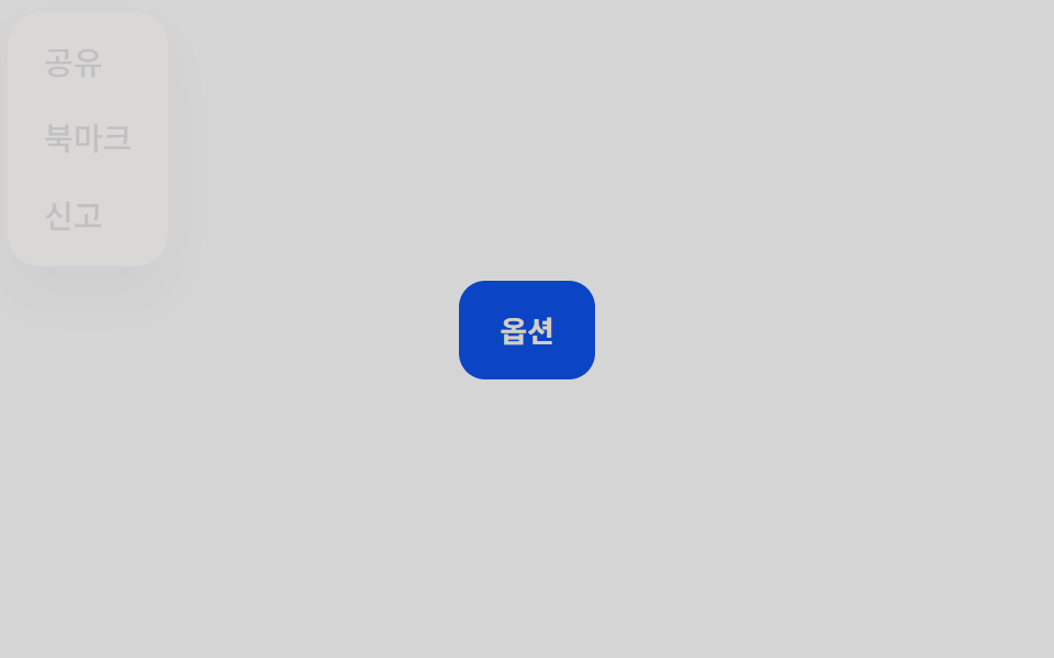
05Dialog gốc
Animation cho việc mở/đóng thẻ <dialog> chỉ bằng @starting-style, không cần JS.
Dùng choMọi modal muốn có sẵn focus trap và phím ESC
@starting-styleallow-discrete::backdrop

<main class="stage">
  <button class="trigger" type="button">Mở lại</button>
  <div class="overlay is-demo"></div>
  <dialog class="modal is-demo" open aria-labelledby="t5">
    <h2 id="t5">Lưu thay đổi?</h2>
    <p>Thẻ dialog tự động khóa focus khi mở và đóng.</p>
    <button class="modal__close" type="button">Đóng</button>
  </dialog>
</main>
@use "../../../../site/static/demo-tokens" as *;
// ── 변수 3개 ──────────────────────────────────────────
$duration: $dur-base; // 대화상자가 뜨는 시간
$easing: $ease-out;
$color: $subject-cream; // 강조색(버튼)
@include stage($stage-ink);
.stage { position: relative; }
.trigger {
border: 0; border-radius: $r-pill;
padding: clamp(10px, 3.4vmin, 14px) clamp(20px, 7vmin, 30px);
font-weight: 600;
font-size: clamp(13px, 4vmin, 16px);
line-height: 1;
font-family: inherit;
color: $stage-ink; background: $color;
cursor: pointer; -webkit-tap-highlight-color: transparent;
}
.overlay {
position: fixed; inset: 0;
background: rgba($stage-ink, .55);
opacity: 0; pointer-events: none;
}
// 진짜 showModal() 로 열렸을 때만 브라우저가 만드는 배경 — 우리 overlay 와 겹치지 않게 투명하게 둔다
dialog.modal::backdrop { background: transparent; }
dialog.modal {
border: 0; margin: auto;
position: fixed; inset: 0;
width: min(78vw, 300px); height: fit-content;
padding: clamp(12px, 4.5vmin, 22px);
border-radius: $r-card; background: $stage-paper; color: $stage-ink;
box-shadow: $shadow-raised;
opacity: 0; transform: scale(.92) translateY(10px);
h2 { margin: 0 0 6px; font-size: clamp(13px, 4.4vmin, 18px); }
p { margin: 0 0 14px; font-size: clamp(10px, 3.2vmin, 13px); color: rgba($stage-ink, .65); }
// 실제 open 전환: display·overlay 가 discrete 라 @starting-style 없이는 즉시 나타난다
transition: opacity $duration $easing, transform $duration $easing,
overlay $duration allow-discrete, display $duration allow-discrete;
&[open] { opacity: 1; transform: none; }
@starting-style { &[open] { opacity: 0; transform: scale(.92) translateY(10px); } }
}
.modal__close {
border: 0; border-radius: $r-control; background: $subject-blue; color: $stage-paper;
padding: clamp(7px, 2.6vmin, 9px) clamp(14px, 4.6vmin, 18px);
font-weight: 600;
font-size: clamp(11px, 3.4vmin, 13px);
line-height: 1;
font-family: inherit;
cursor: pointer;
}
// 데모: open 속성은 그대로 두고 keyframes 로만 접었다 편다
.overlay.is-demo { animation: overlay-loop $dur-loop ease-in-out infinite; }
dialog.modal.is-demo { animation: dialog-loop $dur-loop $easing infinite; }
@keyframes overlay-loop {
0% { opacity: 0; }
15% { opacity: 1; }
70% { opacity: 1; }
85% { opacity: 0; }
100% { opacity: 0; }
}
@keyframes dialog-loop {
0% { opacity: 0; transform: scale(.92) translateY(10px); }
15% { opacity: 1; transform: scale(1) translateY(0); }
70% { opacity: 1; transform: scale(1) translateY(0); }
85% { opacity: 0; transform: scale(.92) translateY(10px); }
100% { opacity: 0; transform: scale(.92) translateY(10px); }
}
@media (prefers-reduced-motion: reduce) {
.overlay.is-demo, dialog.modal.is-demo { animation: none; }
dialog.modal { transition-duration: 1ms; }
}html, body {
margin: 0;
overflow: hidden;
}
.stage {
box-sizing: border-box;
min-height: 100vh;
display: grid;
place-items: center;
margin: 0;
background: #17141a;
font-family: -apple-system, "Segoe UI", "Noto Sans KR", sans-serif;
padding: clamp(8px, 4vw, 24px);
}
.stage {
position: relative;
}
.trigger {
border: 0;
border-radius: 999px;
padding: clamp(10px, 3.4vmin, 14px) clamp(20px, 7vmin, 30px);
font-weight: 600;
font-size: clamp(13px, 4vmin, 16px);
line-height: 1;
font-family: inherit;
color: #17141a;
background: #fff7e6;
cursor: pointer;
-webkit-tap-highlight-color: transparent;
}
.overlay {
position: fixed;
inset: 0;
background: rgba(23, 20, 26, 0.55);
opacity: 0;
pointer-events: none;
}
dialog.modal::backdrop {
background: transparent;
}
dialog.modal {
border: 0;
margin: auto;
position: fixed;
inset: 0;
width: min(78vw, 300px);
height: fit-content;
padding: clamp(12px, 4.5vmin, 22px);
border-radius: 16px;
background: #ffffff;
color: #17141a;
box-shadow: 0 14px 24px rgba(23, 20, 26, 0.32);
opacity: 0;
transform: scale(0.92) translateY(10px);
}
dialog.modal h2 {
margin: 0 0 6px;
font-size: clamp(13px, 4.4vmin, 18px);
}
dialog.modal p {
margin: 0 0 14px;
font-size: clamp(10px, 3.2vmin, 13px);
color: rgba(23, 20, 26, 0.65);
}
dialog.modal {
transition: opacity 300ms ease-out, transform 300ms ease-out, overlay 300ms allow-discrete, display 300ms allow-discrete;
}
dialog.modal[open] {
opacity: 1;
transform: none;
}
@starting-style {
dialog.modal[open] {
opacity: 0;
transform: scale(0.92) translateY(10px);
}
}
.modal__close {
border: 0;
border-radius: 12px;
background: #2f6df6;
color: #ffffff;
padding: clamp(7px, 2.6vmin, 9px) clamp(14px, 4.6vmin, 18px);
font-weight: 600;
font-size: clamp(11px, 3.4vmin, 13px);
line-height: 1;
font-family: inherit;
cursor: pointer;
}
.overlay.is-demo {
animation: overlay-loop 2s ease-in-out infinite;
}
dialog.modal.is-demo {
animation: dialog-loop 2s ease-out infinite;
}
@keyframes overlay-loop {
0% {
opacity: 0;
}
15% {
opacity: 1;
}
70% {
opacity: 1;
}
85% {
opacity: 0;
}
100% {
opacity: 0;
}
}
@keyframes dialog-loop {
0% {
opacity: 0;
transform: scale(0.92) translateY(10px);
}
15% {
opacity: 1;
transform: scale(1) translateY(0);
}
70% {
opacity: 1;
transform: scale(1) translateY(0);
}
85% {
opacity: 0;
transform: scale(0.92) translateY(10px);
}
100% {
opacity: 0;
transform: scale(0.92) translateY(10px);
}
}
@media (prefers-reduced-motion: reduce) {
.overlay.is-demo, dialog.modal.is-demo {
animation: none;
}
dialog.modal {
transition-duration: 1ms;
}
}// 데모는 open 속성이 그대로 켜진 <dialog> 를 keyframes 로 접었다 편다.
// 실제 클릭은 진짜 close()/showModal() 을 불러 top layer·::backdrop·포커스 트랩까지 켠다.
(function () {
var stage = document.querySelector('.stage');
var overlay = document.querySelector('.overlay');
var dialog = document.querySelector('.modal');
var trigger = document.querySelector('.trigger');
var close = document.querySelector('.modal__close');
function stopDemo() { stage.classList.add('is-real'); overlay.classList.remove('is-demo'); dialog.classList.remove('is-demo'); }
close.addEventListener('click', function () { stopDemo(); dialog.close(); });
trigger.addEventListener('click', function () { stopDemo(); dialog.showModal(); });
dialog.addEventListener('cancel', function () { stopDemo(); });
})();import { useEffect, useRef, useState } from "react";
import type { CSSProperties } from "react";
import styles from "./NativeDialog.module.scss";
export type NativeDialogProps = {
triggerLabel: string;
title: string;
description: string;
closeLabel: string;
/** 대화상자가 뜨는 시간 (기본 300ms) */
duration?: number;
easing?: string;
color?: string;
};
type Vars = CSSProperties & { "--duration"?: string; "--easing"?: string; "--color"?: string };
export default function NativeDialog({
triggerLabel,
title,
description,
closeLabel,
duration = 300,
easing = "ease-out",
color = "#fff7e6",
}: NativeDialogProps) {
const ref = useRef<HTMLDialogElement>(null);
const [open, setOpen] = useState(false);
const vars: Vars = { "--duration": `${duration}ms`, "--easing": easing, "--color": color };
useEffect(() => {
const el = ref.current;
if (!el) return;
if (open && !el.open) el.showModal();
if (!open && el.open) el.close();
}, [open]);
return (
<div className={styles.stage} style={vars}>
<button type="button" className={styles.trigger} onClick={() => setOpen(true)}>
{triggerLabel}
</button>
<dialog
ref={ref}
className={styles.modal}
onCancel={() => setOpen(false)}
onClose={() => setOpen(false)}
>
<h2>{title}</h2>
<p>{description}</p>
<button type="button" className={styles.close} onClick={() => setOpen(false)}>
{closeLabel}
</button>
</dialog>
</div>
);
}05 Dialog gốc — Diện tích đo được 25.228% · khung hình chuyển động 8/23Nguyên tác GODRICH · SCSS và React nằm trong tệp zip · 9 hiệu ứng css modal animation gọn nhẹ
Bài viết chứa demo này
 9 hiệu ứng css modal animation gọn nhẹMột css modal animation là chuyển động khi hộp thoại xuất hiện và biến mất, thay vì bật thẳng từ ẩn sang hiện. Chín kiểu Xem tất cả demo trong bài này