07Nút mở rộng toàn màn hình
Nút vừa nhấn phóng to thành modal toàn màn hình.
Dùng choGallery, xem chi tiết
420ms둥글게 유지페이드 섞기
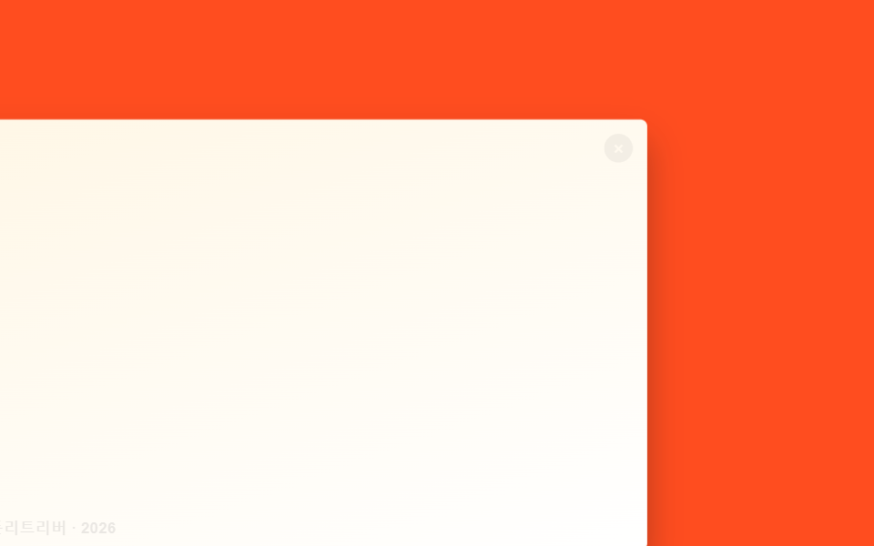
<main class="stage is-demo">
  <button class="thumb" type="button" aria-label="Xem ảnh cỡ lớn">
    <span class="thumb__caption">Golden Retriever · 2026</span>
    <span class="thumb__close" aria-hidden="true">×</span>
  </button>
</main>
@use "../../../../site/static/demo-tokens" as *;
// ── 변수 3개 ──────────────────────────────────────────
$duration: $dur-enter; // 커지는 시간
$easing: $ease-spring;
$color: $subject-cream; // 강조색(캡션·닫기)
@include stage($stage-orange);
// 실제로는 width/height 를 바꾸지 않는다. inset:0 인 상자를 transform: scale 로만 줄여
// "작은 썸네일" 처럼 보이게 한다 — 커질 때도 레이아웃 재계산이 없다
.thumb {
position: fixed; inset: 0; margin: 0; padding: 0; border: 0;
border-radius: $r-card; overflow: hidden; cursor: pointer;
background: linear-gradient(160deg, $subject-cream, $stage-paper);
box-shadow: $shadow-raised;
transform: translate(-30%, 20%) scale(.3);
transform-origin: 20% 75%; // 규칙8: 썸네일 자리 앵커 확대
transition: transform $duration $easing, border-radius $duration $easing;
-webkit-tap-highlight-color: transparent;
}
.thumb__caption {
position: absolute; left: clamp(10px, 3vmin, 16px); bottom: clamp(10px, 3vmin, 16px);
font-weight: 600;
font-size: clamp(11px, 3.4vmin, 14px);
line-height: 1;
font-family: inherit;
color: $stage-ink;
opacity: 0; transition: opacity $duration $easing;
}
.thumb__close {
position: absolute; right: clamp(10px, 3vmin, 16px); top: clamp(10px, 3vmin, 16px);
width: clamp(20px, 6vmin, 26px); height: clamp(20px, 6vmin, 26px);
display: grid; place-items: center; border-radius: 50%;
background: rgba($stage-ink, .55); color: $color; font-size: clamp(13px, 3.8vmin, 16px);
opacity: 0; transition: opacity $duration $easing;
}
.stage.is-open .thumb {
transform: translate(0, 0) scale(1);
border-radius: 0;
}
.stage.is-open .thumb__caption,
.stage.is-open .thumb__close { opacity: 1; }
.stage.is-demo .thumb { animation: thumb-loop $dur-loop $easing infinite; }
.stage.is-demo .thumb__caption,
.stage.is-demo .thumb__close { animation: fade-loop $dur-loop ease-in-out infinite; }
@keyframes thumb-loop {
0% { transform: translate(-30%, 20%) scale(.3); border-radius: $r-card; }
20% { transform: translate(0, 0) scale(1); border-radius: 0; }
65% { transform: translate(0, 0) scale(1); border-radius: 0; }
85% { transform: translate(-30%, 20%) scale(.3); border-radius: $r-card; }
100% { transform: translate(-30%, 20%) scale(.3); border-radius: $r-card; }
}
@keyframes fade-loop {
0% { opacity: 0; }
20% { opacity: 1; }
65% { opacity: 1; }
85% { opacity: 0; }
100% { opacity: 0; }
}
@media (prefers-reduced-motion: reduce) {
.stage.is-demo .thumb,
.stage.is-demo .thumb__caption,
.stage.is-demo .thumb__close { animation: none; }
.thumb, .thumb__caption, .thumb__close { transition-duration: 1ms; }
}html, body {
margin: 0;
overflow: hidden;
}
.stage {
box-sizing: border-box;
min-height: 100vh;
display: grid;
place-items: center;
margin: 0;
background: #ff4d1f;
font-family: -apple-system, "Segoe UI", "Noto Sans KR", sans-serif;
padding: clamp(8px, 4vw, 24px);
}
.thumb {
position: fixed;
inset: 0;
margin: 0;
padding: 0;
border: 0;
border-radius: 16px;
overflow: hidden;
cursor: pointer;
background: linear-gradient(160deg, #fff7e6, #ffffff);
box-shadow: 0 14px 24px rgba(23, 20, 26, 0.32);
transform: translate(-30%, 20%) scale(0.3);
transform-origin: 20% 75%;
transition: transform 600ms cubic-bezier(0.2, 0.8, 0.2, 1), border-radius 600ms cubic-bezier(0.2, 0.8, 0.2, 1);
-webkit-tap-highlight-color: transparent;
}
.thumb__caption {
position: absolute;
left: clamp(10px, 3vmin, 16px);
bottom: clamp(10px, 3vmin, 16px);
font-weight: 600;
font-size: clamp(11px, 3.4vmin, 14px);
line-height: 1;
font-family: inherit;
color: #17141a;
opacity: 0;
transition: opacity 600ms cubic-bezier(0.2, 0.8, 0.2, 1);
}
.thumb__close {
position: absolute;
right: clamp(10px, 3vmin, 16px);
top: clamp(10px, 3vmin, 16px);
width: clamp(20px, 6vmin, 26px);
height: clamp(20px, 6vmin, 26px);
display: grid;
place-items: center;
border-radius: 50%;
background: rgba(23, 20, 26, 0.55);
color: #fff7e6;
font-size: clamp(13px, 3.8vmin, 16px);
opacity: 0;
transition: opacity 600ms cubic-bezier(0.2, 0.8, 0.2, 1);
}
.stage.is-open .thumb {
transform: translate(0, 0) scale(1);
border-radius: 0;
}
.stage.is-open .thumb__caption,
.stage.is-open .thumb__close {
opacity: 1;
}
.stage.is-demo .thumb {
animation: thumb-loop 2s cubic-bezier(0.2, 0.8, 0.2, 1) infinite;
}
.stage.is-demo .thumb__caption,
.stage.is-demo .thumb__close {
animation: fade-loop 2s ease-in-out infinite;
}
@keyframes thumb-loop {
0% {
transform: translate(-30%, 20%) scale(0.3);
border-radius: 16px;
}
20% {
transform: translate(0, 0) scale(1);
border-radius: 0;
}
65% {
transform: translate(0, 0) scale(1);
border-radius: 0;
}
85% {
transform: translate(-30%, 20%) scale(0.3);
border-radius: 16px;
}
100% {
transform: translate(-30%, 20%) scale(0.3);
border-radius: 16px;
}
}
@keyframes fade-loop {
0% {
opacity: 0;
}
20% {
opacity: 1;
}
65% {
opacity: 1;
}
85% {
opacity: 0;
}
100% {
opacity: 0;
}
}
@media (prefers-reduced-motion: reduce) {
.stage.is-demo .thumb,
.stage.is-demo .thumb__caption,
.stage.is-demo .thumb__close {
animation: none;
}
.thumb, .thumb__caption, .thumb__close {
transition-duration: 1ms;
}
}(function () {
var stage = document.querySelector('.stage');
var thumb = document.querySelector('.thumb');
var isOpen = false;
thumb.addEventListener('click', function () {
stage.classList.remove('is-demo');
isOpen = !isOpen;
stage.classList.toggle('is-open', isOpen);
});
document.addEventListener('keydown', function (e) {
if (e.key === 'Escape' && isOpen) { isOpen = false; stage.classList.remove('is-open'); }
});
})();import { useState } from "react";
import type { CSSProperties } from "react";
import styles from "./FullscreenTakeover.module.scss";
export type FullscreenTakeoverProps = {
caption: string;
/** 커지는 시간 (기본 600ms) */
duration?: number;
easing?: string;
color?: string;
};
type Vars = CSSProperties & { "--duration"?: string; "--easing"?: string; "--color"?: string };
export default function FullscreenTakeover({
caption,
duration = 600,
easing = "cubic-bezier(.2,.8,.2,1)",
color = "#fff7e6",
}: FullscreenTakeoverProps) {
const [open, setOpen] = useState(false);
const vars: Vars = { "--duration": `${duration}ms`, "--easing": easing, "--color": color };
return (
<div className={styles.stage} style={vars}>
<button
type="button"
className={open ? `${styles.thumb} ${styles.isOpen}` : styles.thumb}
aria-label={caption}
onClick={() => setOpen((v) => !v)}
>
<span className={styles.caption}>{caption}</span>
<span className={styles.close} aria-hidden="true">×</span>
</button>
</div>
);
}07 Nút mở rộng toàn màn hình — Diện tích đo được 96.809% · khung hình chuyển động 11/23Nguyên tác GODRICH · SCSS và React nằm trong tệp zip · 9 hiệu ứng css modal animation gọn nhẹ
Bài viết chứa demo này
 9 hiệu ứng css modal animation gọn nhẹMột css modal animation là chuyển động khi hộp thoại xuất hiện và biến mất, thay vì bật thẳng từ ẩn sang hiện. Chín kiểu Xem tất cả demo trong bài này