08Rung khi nhấn ra ngoài
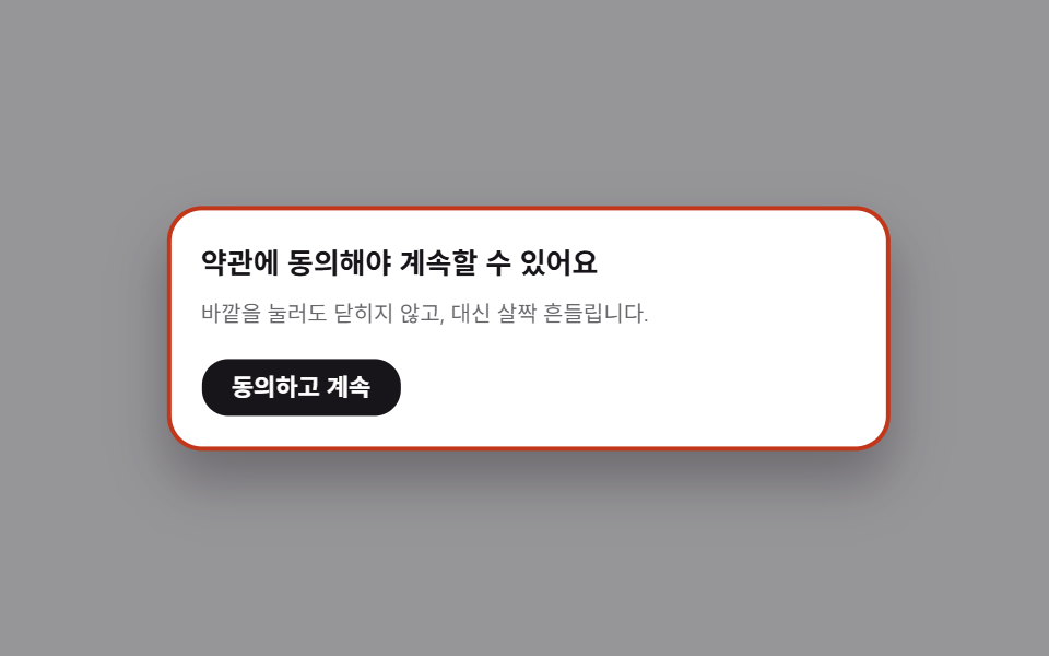
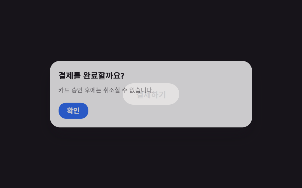
Nhấn ra ngoài modal bắt buộc thì rung nhẹ để báo hiệu.
Dùng choĐồng ý điều khoản, nhập bắt buộc
4px두 번테두리 강조
<main class="stage is-demo">
  <div class="overlay"></div>
  <div class="modal" role="dialog" aria-modal="true" aria-labelledby="t8">
    <h2 id="t8">Bạn cần đồng ý điều khoản để tiếp tục</h2>
    <p>Nhấn ra ngoài sẽ không đóng, mà chỉ rung nhẹ.</p>
    <button class="modal__accept" type="button">Đồng ý và tiếp tục</button>
  </div>
</main>
@use "../../../../site/static/demo-tokens" as *;
// ── 변수 3개 ──────────────────────────────────────────
$duration: $dur-base; // 흔들림 지속 시간
$easing: $ease-spring; // 실제 흔들림엔 별도 cubic-bezier 를 쓴다(아래)
$color: $subject-ink; // 강조색(버튼)
@include stage($stage-paper);
.stage { position: relative; }
// 닫을 수 없는 모달이라 열린 채로 고정. 오버레이는 어둡게만 유지한다
.overlay {
position: fixed; inset: 0;
background: rgba($stage-ink, .45);
}
.modal {
position: fixed; left: 50%; top: 50%;
transform: translate(-50%, -50%);
width: min(80vw, 300px);
padding: clamp(12px, 4.5vmin, 22px);
border-radius: $r-card; background: $stage-paper; color: $stage-ink;
border: 2px solid rgba($stage-ink, .12);
box-shadow: $shadow-raised;
h2 { margin: 0 0 6px; font-size: clamp(13px, 4.2vmin, 17px); }
p { margin: 0 0 14px; font-size: clamp(10px, 3.2vmin, 13px); color: rgba($stage-ink, .65); }
}
.modal__accept {
border: 0; border-radius: $r-control; background: $color; color: $stage-paper;
padding: clamp(7px, 2.6vmin, 9px) clamp(14px, 4.6vmin, 18px);
font-weight: 600;
font-size: clamp(11px, 3.4vmin, 13px);
line-height: 1;
font-family: inherit;
cursor: pointer;
}
.modal.is-shaking {
animation: shake $duration cubic-bezier(.36, .07, .19, .97) both;
border-color: $error;
}
@keyframes shake {
10%, 90% { transform: translate(calc(-50% - 3px), -50%); }
20%, 80% { transform: translate(calc(-50% + 4px), -50%); border-color: $error; }
30%, 70% { transform: translate(calc(-50% - 4px), -50%); }
40%, 60% { transform: translate(calc(-50% + 3px), -50%); }
50% { transform: translate(calc(-50% - 3px), -50%); border-color: $error; }
}
// 데모: 2초마다 두 번씩 흔든다
.stage.is-demo .modal { animation: shake-loop $dur-loop cubic-bezier(.36, .07, .19, .97) infinite; }
@keyframes shake-loop {
0%, 40%, 100% { transform: translate(-50%, -50%); border-color: rgba($stage-ink, .12); }
44% { transform: translate(calc(-50% - 4px), -50%); border-color: $error; }
48% { transform: translate(calc(-50% + 4px), -50%); }
52% { transform: translate(calc(-50% - 4px), -50%); border-color: $error; }
56% { transform: translate(calc(-50% + 3px), -50%); }
60% { transform: translate(-50%, -50%); border-color: rgba($stage-ink, .12); }
}
@media (prefers-reduced-motion: reduce) {
.stage.is-demo .modal, .modal.is-shaking { animation: none; }
.modal.is-shaking { border-color: $error; }
}html, body {
margin: 0;
overflow: hidden;
}
.stage {
box-sizing: border-box;
min-height: 100vh;
display: grid;
place-items: center;
margin: 0;
background: #ffffff;
font-family: -apple-system, "Segoe UI", "Noto Sans KR", sans-serif;
padding: clamp(8px, 4vw, 24px);
}
.stage {
position: relative;
}
.overlay {
position: fixed;
inset: 0;
background: rgba(23, 20, 26, 0.45);
}
.modal {
position: fixed;
left: 50%;
top: 50%;
transform: translate(-50%, -50%);
width: min(80vw, 300px);
padding: clamp(12px, 4.5vmin, 22px);
border-radius: 16px;
background: #ffffff;
color: #17141a;
border: 2px solid rgba(23, 20, 26, 0.12);
box-shadow: 0 14px 24px rgba(23, 20, 26, 0.32);
}
.modal h2 {
margin: 0 0 6px;
font-size: clamp(13px, 4.2vmin, 17px);
}
.modal p {
margin: 0 0 14px;
font-size: clamp(10px, 3.2vmin, 13px);
color: rgba(23, 20, 26, 0.65);
}
.modal__accept {
border: 0;
border-radius: 12px;
background: #17141a;
color: #ffffff;
padding: clamp(7px, 2.6vmin, 9px) clamp(14px, 4.6vmin, 18px);
font-weight: 600;
font-size: clamp(11px, 3.4vmin, 13px);
line-height: 1;
font-family: inherit;
cursor: pointer;
}
.modal.is-shaking {
animation: shake 300ms cubic-bezier(0.36, 0.07, 0.19, 0.97) both;
border-color: #c2361a;
}
@keyframes shake {
10%, 90% {
transform: translate(calc(-50% - 3px), -50%);
}
20%, 80% {
transform: translate(calc(-50% + 4px), -50%);
border-color: #c2361a;
}
30%, 70% {
transform: translate(calc(-50% - 4px), -50%);
}
40%, 60% {
transform: translate(calc(-50% + 3px), -50%);
}
50% {
transform: translate(calc(-50% - 3px), -50%);
border-color: #c2361a;
}
}
.stage.is-demo .modal {
animation: shake-loop 2s cubic-bezier(0.36, 0.07, 0.19, 0.97) infinite;
}
@keyframes shake-loop {
0%, 40%, 100% {
transform: translate(-50%, -50%);
border-color: rgba(23, 20, 26, 0.12);
}
44% {
transform: translate(calc(-50% - 4px), -50%);
border-color: #c2361a;
}
48% {
transform: translate(calc(-50% + 4px), -50%);
}
52% {
transform: translate(calc(-50% - 4px), -50%);
border-color: #c2361a;
}
56% {
transform: translate(calc(-50% + 3px), -50%);
}
60% {
transform: translate(-50%, -50%);
border-color: rgba(23, 20, 26, 0.12);
}
}
@media (prefers-reduced-motion: reduce) {
.stage.is-demo .modal, .modal.is-shaking {
animation: none;
}
.modal.is-shaking {
border-color: #c2361a;
}
}// 실제 클릭: 바깥(overlay)을 누르면 닫히는 대신 흔들린다.
(function () {
var stage = document.querySelector('.stage');
var overlay = document.querySelector('.overlay');
var modal = document.querySelector('.modal');
overlay.addEventListener('click', function () {
stage.classList.remove('is-demo');
modal.classList.remove('is-shaking');
void modal.offsetWidth;
modal.classList.add('is-shaking');
});
modal.addEventListener('animationend', function (e) {
if (e.animationName === 'shake') modal.classList.remove('is-shaking');
});
})();import { useState } from "react";
import type { CSSProperties } from "react";
import styles from "./ShakeOutsideModal.module.scss";
export type ShakeOutsideModalProps = {
title: string;
description: string;
acceptLabel: string;
onAccept?: () => void;
/** 흔들림 지속 시간 (기본 300ms) */
duration?: number;
easing?: string;
color?: string;
};
type Vars = CSSProperties & { "--duration"?: string; "--easing"?: string; "--color"?: string };
export default function ShakeOutsideModal({
title,
description,
acceptLabel,
onAccept,
duration = 300,
easing = "cubic-bezier(.36,.07,.19,.97)",
color = "#17141a",
}: ShakeOutsideModalProps) {
const [shakeKey, setShakeKey] = useState(0);
const vars: Vars = { "--duration": `${duration}ms`, "--easing": easing, "--color": color };
return (
<div className={styles.stage} style={vars}>
<div className={styles.overlay} onClick={() => setShakeKey((k) => k + 1)} />
<div
key={shakeKey}
className={shakeKey ? `${styles.modal} ${styles.isShaking}` : styles.modal}
role="dialog"
aria-modal="true"
>
<h2>{title}</h2>
<p>{description}</p>
<button type="button" className={styles.accept} onClick={onAccept}>
{acceptLabel}
</button>
</div>
</div>
);
}08 Rung khi nhấn ra ngoài — Diện tích đo được 5.663% · khung hình chuyển động 6/23Nguyên tác GODRICH · SCSS và React nằm trong tệp zip · 9 hiệu ứng css modal animation gọn nhẹ
Bài viết chứa demo này
 9 hiệu ứng css modal animation gọn nhẹMột css modal animation là chuyển động khi hộp thoại xuất hiện và biến mất, thay vì bật thẳng từ ẩn sang hiện. Chín kiểu Xem tất cả demo trong bài này