04Thẻ nghiêng 3D
Thẻ nghiêng theo không gian 3D tùy vị trí con trỏ, kèm ánh sáng chéo lướt qua.
Dùng choThẻ bảng giá SaaS, thẻ giới thiệu sản phẩm
perspective + rotateX/rotateYbackground-position 스윕신뢰감 있는 밝은 톤

<main class="stage">
  <div class="tilt-wrap">
    <div class="tilt-card is-demo">
      <span class="tilt-card__badge">
        <svg viewBox="0 0 256 256" aria-hidden="true"><g fill="currentColor"><path d="m229.06 108.79l-48.7 42l14.88 62.79a8.4 8.4 0 0 1-12.52 9.17L128 189.09l-54.72 33.65a8.4 8.4 0 0 1-12.52-9.17l14.88-62.79l-48.7-42A8.46 8.46 0 0 1 31.73 94l63.91-5.2l24.62-59.6a8.36 8.36 0 0 1 15.48 0l24.62 59.6l63.91 5.2a8.46 8.46 0 0 1 4.79 14.79" opacity=".2"/><path d="M239.18 97.26A16.38 16.38 0 0 0 224.92 86l-59-4.76l-22.78-55.09a16.36 16.36 0 0 0-30.27 0L90.11 81.23L31.08 86a16.46 16.46 0 0 0-9.37 28.86l45 38.83L53 211.75a16.38 16.38 0 0 0 24.5 17.82l50.5-31.08l50.53 31.08A16.4 16.4 0 0 0 203 211.75l-13.76-58.07l45-38.83a16.43 16.43 0 0 0 4.94-17.59m-15.34 5.47l-48.7 42a8 8 0 0 0-2.56 7.91l14.88 62.8a.37.37 0 0 1-.17.48c-.18.14-.23.11-.38 0l-54.72-33.65a8 8 0 0 0-8.38 0l-54.72 33.67c-.15.09-.19.12-.38 0a.37.37 0 0 1-.17-.48l14.88-62.8a8 8 0 0 0-2.56-7.91l-48.7-42c-.12-.1-.23-.19-.13-.5s.18-.27.33-.29l63.92-5.16a8 8 0 0 0 6.72-4.94l24.62-59.61c.08-.17.11-.25.35-.25s.27.08.35.25L153 91.86a8 8 0 0 0 6.75 4.92l63.92 5.16c.15 0 .24 0 .33.29s0 .4-.16.5"/></g></svg>
      </span>
      <p class="tilt-card__title">Gói Pro</p>
      <p class="tilt-card__desc">Gói cả nhóm cùng dùng</p>
      <span class="tilt-card__sheen" aria-hidden="true"></span>
    </div>
  </div>
</main>
@use "../../../../site/static/demo-tokens" as *;
$duration: $dur-instant; // 기울기 반응 시간
$easing: $ease-out;
$color: $subject-blue;
@include stage(#eef3fb);
.tilt-wrap {
width: min(200px, 62vw);
height: 130px;
display: grid;
place-items: center;
}
.tilt-card {
position: relative;
width: 100%;
height: 100%;
overflow: hidden;
padding: $sp-6 $sp-5;
border-radius: $r-card;
background: $stage-paper;
border: 1px solid rgba(47, 109, 246, .14);
box-shadow: 0 10px 26px rgba(47, 109, 246, .16);
transform: perspective(600px) rotateX(0) rotateY(0);
transition: transform $duration $easing;
will-change: transform;
}
.tilt-card__badge {
display: grid;
place-items: center;
width: 32px;
height: 32px;
border-radius: $r-sm;
background: rgba(47, 109, 246, .12);
color: $color;
margin-bottom: $sp-3;
}
.tilt-card__badge svg { width: 18px; height: 18px; }
.tilt-card__title { margin: 0 0 $sp-1; font-size: 16px; font-weight: 800; color: #16213a; }
.tilt-card__desc { margin: 0; font-size: 12.5px; color: #5b6b8c; }
.tilt-card__sheen {
position: absolute;
inset: -40% -60%;
background: linear-gradient(115deg, transparent 35%, rgba(255, 255, 255, .55) 50%, transparent 65%);
background-size: 220% 220%;
background-position: 0% 50%;
pointer-events: none;
}
@media (hover: none), (pointer: coarse) {
.tilt-card { transition: none; } // 터치엔 기울기를 줄 좌표가 없다 — 평평한 카드로 둔다
}
// 데모 강제 루프 — 포인터가 카드 네 모서리를 도는 것을 흉내
.tilt-card.is-demo { animation: tilt-loop $dur-loop $easing infinite; transition: none; }
.tilt-card.is-demo .tilt-card__sheen { animation: tilt-sheen $dur-loop $easing infinite; }
@keyframes tilt-loop {
0%, 8% { transform: perspective(600px) rotateX(0) rotateY(0); }
30% { transform: perspective(600px) rotateX(6deg) rotateY(-6deg); }
55% { transform: perspective(600px) rotateX(-6deg) rotateY(6deg); }
80%, 100% { transform: perspective(600px) rotateX(0) rotateY(0); }
}
@keyframes tilt-sheen {
0%, 8% { background-position: 10% 50%; }
30% { background-position: 70% 20%; }
55% { background-position: 30% 80%; }
80%, 100% { background-position: 10% 50%; }
}
@media (prefers-reduced-motion: reduce) {
.tilt-card, .tilt-card__sheen { animation: none !important; transition: none !important; transform: none; }
}html, body {
margin: 0;
overflow: hidden;
}
.stage {
box-sizing: border-box;
min-height: 100vh;
display: grid;
place-items: center;
margin: 0;
background: #eef3fb;
font-family: -apple-system, "Segoe UI", "Noto Sans KR", sans-serif;
padding: clamp(8px, 4vw, 24px);
}
.tilt-wrap {
width: min(200px, 62vw);
height: 130px;
display: grid;
place-items: center;
}
.tilt-card {
position: relative;
width: 100%;
height: 100%;
overflow: hidden;
padding: 24px 20px;
border-radius: 16px;
background: #ffffff;
border: 1px solid rgba(47, 109, 246, 0.14);
box-shadow: 0 10px 26px rgba(47, 109, 246, 0.16);
transform: perspective(600px) rotateX(0) rotateY(0);
transition: transform 140ms ease-out;
will-change: transform;
}
.tilt-card__badge {
display: grid;
place-items: center;
width: 32px;
height: 32px;
border-radius: 8px;
background: rgba(47, 109, 246, 0.12);
color: #2f6df6;
margin-bottom: 12px;
}
.tilt-card__badge svg {
width: 18px;
height: 18px;
}
.tilt-card__title {
margin: 0 0 4px;
font-size: 16px;
font-weight: 800;
color: #16213a;
}
.tilt-card__desc {
margin: 0;
font-size: 12.5px;
color: #5b6b8c;
}
.tilt-card__sheen {
position: absolute;
inset: -40% -60%;
background: linear-gradient(115deg, transparent 35%, rgba(255, 255, 255, 0.55) 50%, transparent 65%);
background-size: 220% 220%;
background-position: 0% 50%;
pointer-events: none;
}
@media (hover: none), (pointer: coarse) {
.tilt-card {
transition: none;
}
}
.tilt-card.is-demo {
animation: tilt-loop 2s ease-out infinite;
transition: none;
}
.tilt-card.is-demo .tilt-card__sheen {
animation: tilt-sheen 2s ease-out infinite;
}
@keyframes tilt-loop {
0%, 8% {
transform: perspective(600px) rotateX(0) rotateY(0);
}
30% {
transform: perspective(600px) rotateX(6deg) rotateY(-6deg);
}
55% {
transform: perspective(600px) rotateX(-6deg) rotateY(6deg);
}
80%, 100% {
transform: perspective(600px) rotateX(0) rotateY(0);
}
}
@keyframes tilt-sheen {
0%, 8% {
background-position: 10% 50%;
}
30% {
background-position: 70% 20%;
}
55% {
background-position: 30% 80%;
}
80%, 100% {
background-position: 10% 50%;
}
}
@media (prefers-reduced-motion: reduce) {
.tilt-card, .tilt-card__sheen {
animation: none !important;
transition: none !important;
transform: none;
}
}(function () {
var wrap = document.querySelector('.tilt-wrap');
var card = wrap.querySelector('.tilt-card');
var MAX = 6; // 최대 기울기(deg)
wrap.addEventListener('pointermove', function (e) {
if (card.classList.contains('is-demo')) return;
var r = wrap.getBoundingClientRect();
var px = (e.clientX - r.left) / r.width; // 0~1
var py = (e.clientY - r.top) / r.height;
var rx = (0.5 - py) * MAX * 2;
var ry = (px - 0.5) * MAX * 2;
card.style.transform = 'perspective(600px) rotateX(' + rx + 'deg) rotateY(' + ry + 'deg)';
});
wrap.addEventListener('pointerleave', function () { card.style.transform = ''; });
})();import { useRef, type CSSProperties, type PointerEvent } from "react";
import styles from "./CursorTilt3dCard.module.scss";
export type CursorTilt3dCardProps = {
title?: string;
desc?: string;
duration?: number;
easing?: string;
color?: string;
};
type Vars = CSSProperties & { "--duration"?: string; "--easing"?: string; "--color"?: string };
const MAX_DEG = 6;
/** offsetX/Y 비율로 rotateX/rotateY 를 계산해 perspective 카드에 적용한다 */
export default function CursorTilt3dCard({
title = "Pro 플랜",
desc = "팀 전체가 쓰는 요금제",
duration = 140,
easing = "ease-out",
color = "#2f6df6",
}: CursorTilt3dCardProps) {
const cardRef = useRef<HTMLDivElement>(null);
const vars: Vars = { "--duration": `${duration}ms`, "--easing": easing, "--color": color };
const move = (e: PointerEvent<HTMLDivElement>) => {
const card = cardRef.current;
if (!card) return;
const r = e.currentTarget.getBoundingClientRect();
const px = (e.clientX - r.left) / r.width;
const py = (e.clientY - r.top) / r.height;
const rx = (0.5 - py) * MAX_DEG * 2;
const ry = (px - 0.5) * MAX_DEG * 2;
card.style.transform = `perspective(600px) rotateX(${rx}deg) rotateY(${ry}deg)`;
};
const leave = () => { if (cardRef.current) cardRef.current.style.transform = ""; };
return (
<div className={styles.wrap} style={vars} onPointerMove={move} onPointerLeave={leave}>
<div ref={cardRef} className={styles.card}>
<span className={styles.badge}>
<svg viewBox="0 0 256 256" aria-hidden="true"><g fill="currentColor"><path d="m229.06 108.79l-48.7 42l14.88 62.79a8.4 8.4 0 0 1-12.52 9.17L128 189.09l-54.72 33.65a8.4 8.4 0 0 1-12.52-9.17l14.88-62.79l-48.7-42A8.46 8.46 0 0 1 31.73 94l63.91-5.2l24.62-59.6a8.36 8.36 0 0 1 15.48 0l24.62 59.6l63.91 5.2a8.46 8.46 0 0 1 4.79 14.79" opacity=".2" /><path d="M239.18 97.26A16.38 16.38 0 0 0 224.92 86l-59-4.76l-22.78-55.09a16.36 16.36 0 0 0-30.27 0L90.11 81.23L31.08 86a16.46 16.46 0 0 0-9.37 28.86l45 38.83L53 211.75a16.38 16.38 0 0 0 24.5 17.82l50.5-31.08l50.53 31.08A16.4 16.4 0 0 0 203 211.75l-13.76-58.07l45-38.83a16.43 16.43 0 0 0 4.94-17.59m-15.34 5.47l-48.7 42a8 8 0 0 0-2.56 7.91l14.88 62.8a.37.37 0 0 1-.17.48c-.18.14-.23.11-.38 0l-54.72-33.65a8 8 0 0 0-8.38 0l-54.72 33.67c-.15.09-.19.12-.38 0a.37.37 0 0 1-.17-.48l14.88-62.8a8 8 0 0 0-2.56-7.91l-48.7-42c-.12-.1-.23-.19-.13-.5s.18-.27.33-.29l63.92-5.16a8 8 0 0 0 6.72-4.94l24.62-59.61c.08-.17.11-.25.35-.25s.27.08.35.25L153 91.86a8 8 0 0 0 6.75 4.92l63.92 5.16c.15 0 .24 0 .33.29s0 .4-.16.5" /></g></svg>
</span>
<p className={styles.title}>{title}</p>
<p className={styles.desc}>{desc}</p>
<span className={styles.sheen} aria-hidden="true" />
</div>
</div>
);
}04 Thẻ nghiêng 3D — Diện tích đo được 3.769% · khung hình chuyển động 17/23Nguyên tác GODRICH · SCSS và React nằm trong tệp zip · 9 hiệu ứng chuột máy tính bạn có thể copy-paste
Bài viết chứa demo này
 9 hiệu ứng chuột máy tính bạn có thể copy-pasteHiệu ứng chuột máy tính là tương tác nhỏ phản ứng theo cách con trỏ di chuyển, click, kéo hoặc cuộn. Chỉ mới di chuyển c Xem tất cả demo trong bài này
Nếu bạn thích hiệu ứng này - demo tương tự
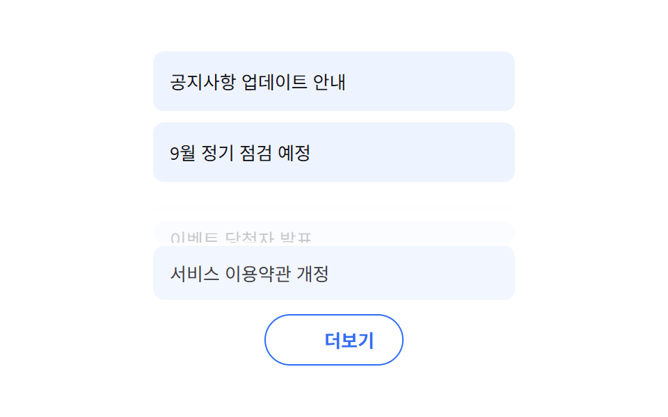 Giao diện danh sách · bảng04 Nút tải thêm danh sách9 mẫu List UI: accordion list css và checklist
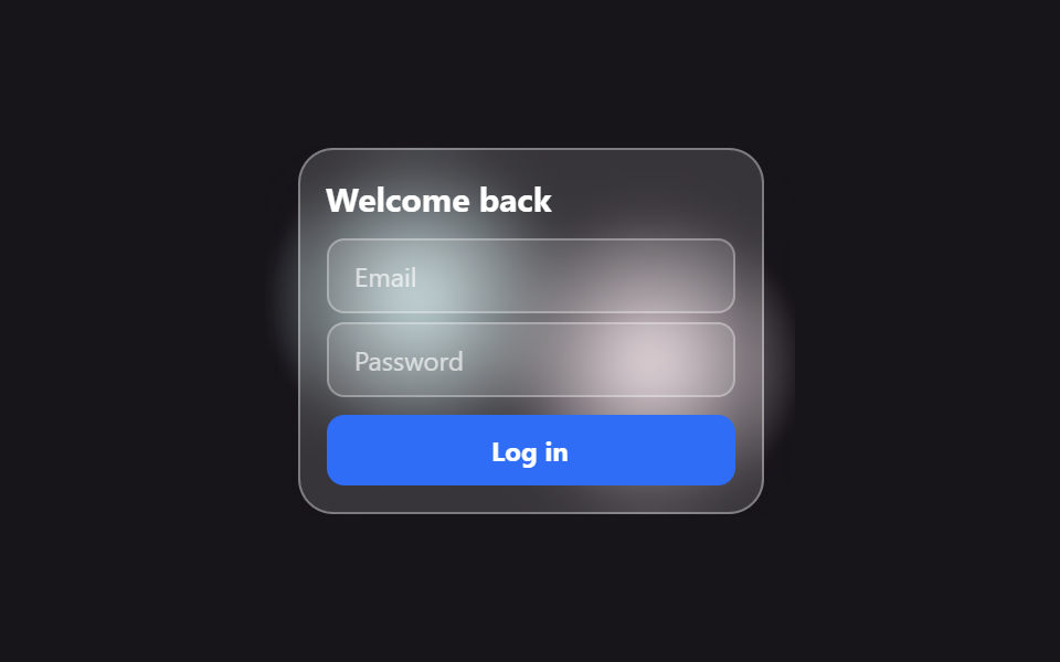 Giao diện đăng nhập · xác thực01 Thẻ đăng nhập kiểu kính mờ (glassmorphism)9 mẫu form đăng ký & đăng nhập copy-paste được
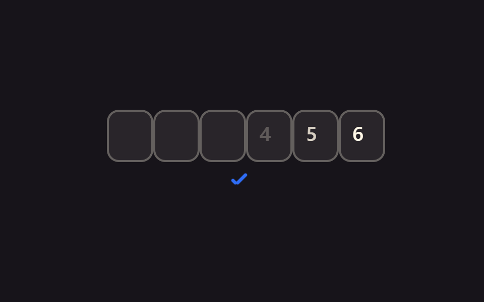 Giao diện nhập liệu01 Tự chuyển sang ô kế tiếpOTP Input UI: 9 tình huống kèm validation