02Nảy bật đàn hồi (poyon)
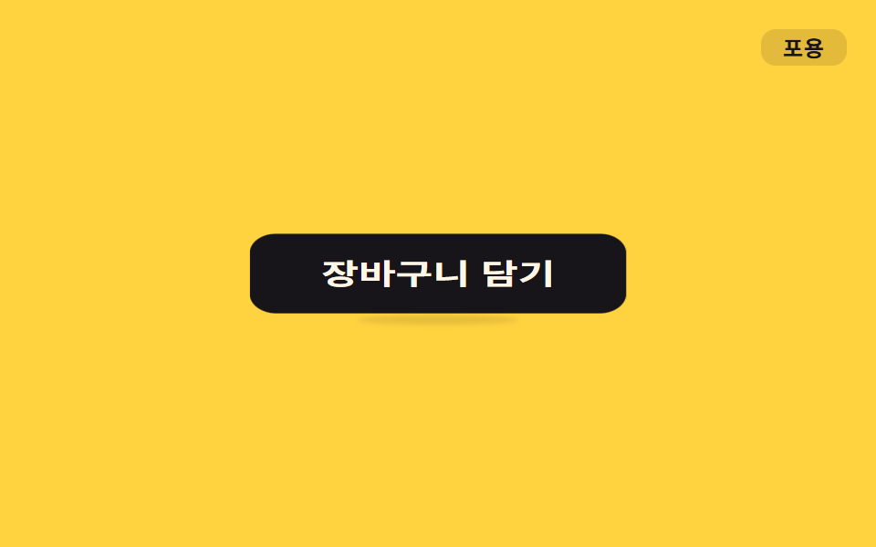
Khi hover, `.o-poyon` làm scale lún xuống rồi bật quá đà bằng easing elastic, khiến nút thêm vào giỏ trông như đang mời bấm.
Dùng choNút thêm vào giỏ, nút like, nút xác nhận
scale overshootelastic550ms
<main class="stage">
  <button class="btn o-poyon is-demo" type="button">Thêm vào giỏ</button>
  <span class="tag">Nảy bật</span>
</main>
@use "../../../../site/static/demo-tokens" as *;
// ── 변수 3개 ──────────────────────────────────────────
$duration: 550ms;
$easing: cubic-bezier(.34, 1.56, .64, 1); // 넘겼다 돌아오는 elastic overshoot
$color: $subject-cream;
// ── 데모 무대 ───────────────────────────────
@include stage($stage-yellow);
.stage { position: relative; }
.btn {
position: relative;
border: 0;
border-radius: $r-control;
padding: $sp-4 $sp-8;
background: $stage-ink;
color: $color;
font-weight: 700;
font-size: clamp(15px, 4vw, 18px);
line-height: 1;
font-family: inherit;
cursor: pointer;
-webkit-tap-highlight-color: transparent;
}
// 바닥 접촉 그림자 — 몸이 눌릴 때(스쿼시) 넓고 짙게, 늘어날 때(오버슛) 좁고 옅게. 역수 관계 (형태 2차)
.btn::after {
content: "";
position: absolute;
left: 50%;
bottom: -8px;
width: 70%;
height: 8px;
border-radius: 50%;
background: rgba($stage-ink, .35);
filter: blur(2px);
transform: translateX(-50%) scale(1, 1);
}
.tag {
position: absolute;
top: $sp-4;
right: $sp-4;
padding: $sp-1 $sp-3;
border-radius: $r-sm;
background: rgba(23, 20, 26, .12);
color: $stage-ink;
font-weight: 700;
font-size: 12px;
line-height: 1;
font-family: inherit;
letter-spacing: .04em;
}
// ── 실제 쓰임: 마우스를 올리면(또는 포커스) 한 번 튕긴다 ─────
.btn.o-poyon:hover,
.btn.o-poyon:focus-visible { animation: o-poyon $duration $easing 1; }
.btn.o-poyon:hover::after,
.btn.o-poyon:focus-visible::after { animation: o-poyon-shadow $duration $easing 1; }
// ── 데모: 클릭 전까지 2초마다 스스로 튕긴다 ─────
.btn.o-poyon.is-demo { animation: o-poyon-loop $dur-loop $easing infinite; }
.btn.o-poyon.is-demo::after { animation: o-poyon-shadow-loop $dur-loop $easing infinite; }
// 사인파 soft-body — scale 을 두 직교 성분 scale(1+δ, 1-δ·.55) 로 갈라 면적을 대략 보존한다.
// δ 는 탄성 정착 진동의 표본(30%→-.16 · 55%→+.20 · 75%→-.06) — 몸이 가로로 눌리는 순간 세로는
// 역위상으로 상승한다. 서로 반대로 출렁여야 말랑한 인상이 산다 (형태 2차, 사용자 2026-09-14).
@keyframes o-poyon {
0% { transform: scale(1, 1); }
30% { transform: scale(.84, 1.09); }
55% { transform: scale(1.20, .89); }
75% { transform: scale(.94, 1.03); }
100% { transform: scale(1, 1); }
}
// 같은 모양을 2초 루프의 뒤쪽 40% 구간에 압축해 넣고 나머지는 쉰다
@keyframes o-poyon-loop {
0%, 60% { transform: scale(1, 1); }
74% { transform: scale(.84, 1.09); }
85% { transform: scale(1.20, .89); }
93% { transform: scale(.94, 1.03); }
100% { transform: scale(1, 1); }
}
// 그림자는 몸의 역(逆): 스쿼시(30·74%) 땐 가로 1.25배·진하게 — 무게가 바닥에 실리고,
// 오버슛(55·85%) 땐 .65배·옅게 — 몸이 떠 있음을 그림자가 알린다.
@keyframes o-poyon-shadow {
0% { transform: translateX(-50%) scale(1, 1); opacity: .85; }
30% { transform: translateX(-50%) scale(1.25, 1.35); opacity: 1; }
55% { transform: translateX(-50%) scale(.65, .8); opacity: .35; }
75% { transform: translateX(-50%) scale(1.08, 1.15); opacity: .9; }
100% { transform: translateX(-50%) scale(1, 1); opacity: .85; }
}
@keyframes o-poyon-shadow-loop {
0%, 60% { transform: translateX(-50%) scale(1, 1); opacity: .85; }
74% { transform: translateX(-50%) scale(1.25, 1.35); opacity: 1; }
85% { transform: translateX(-50%) scale(.65, .8); opacity: .35; }
93% { transform: translateX(-50%) scale(1.08, 1.15); opacity: .9; }
100% { transform: translateX(-50%) scale(1, 1); opacity: .85; }
}
// ── 접근성 ──────────────────────────────────────────
@media (prefers-reduced-motion: reduce) {
.btn.o-poyon:hover, .btn.o-poyon:focus-visible,
.btn.o-poyon:hover::after, .btn.o-poyon:focus-visible::after,
.btn.o-poyon.is-demo, .btn.o-poyon.is-demo::after { animation: none; }
}html, body {
margin: 0;
overflow: hidden;
}
.stage {
box-sizing: border-box;
min-height: 100vh;
display: grid;
place-items: center;
margin: 0;
background: #ffd23f;
font-family: -apple-system, "Segoe UI", "Noto Sans KR", sans-serif;
padding: clamp(8px, 4vw, 24px);
}
.stage {
position: relative;
}
.btn {
position: relative;
border: 0;
border-radius: 12px;
padding: 16px 32px;
background: #17141a;
color: #fff7e6;
font-weight: 700;
font-size: clamp(15px, 4vw, 18px);
line-height: 1;
font-family: inherit;
cursor: pointer;
-webkit-tap-highlight-color: transparent;
}
.btn::after {
content: "";
position: absolute;
left: 50%;
bottom: -8px;
width: 70%;
height: 8px;
border-radius: 50%;
background: rgba(23, 20, 26, 0.35);
filter: blur(2px);
transform: translateX(-50%) scale(1, 1);
}
.tag {
position: absolute;
top: 16px;
right: 16px;
padding: 4px 12px;
border-radius: 8px;
background: rgba(23, 20, 26, 0.12);
color: #17141a;
font-weight: 700;
font-size: 12px;
line-height: 1;
font-family: inherit;
letter-spacing: 0.04em;
}
.btn.o-poyon:hover,
.btn.o-poyon:focus-visible {
animation: o-poyon 550ms cubic-bezier(0.34, 1.56, 0.64, 1) 1;
}
.btn.o-poyon:hover::after,
.btn.o-poyon:focus-visible::after {
animation: o-poyon-shadow 550ms cubic-bezier(0.34, 1.56, 0.64, 1) 1;
}
.btn.o-poyon.is-demo {
animation: o-poyon-loop 2s cubic-bezier(0.34, 1.56, 0.64, 1) infinite;
}
.btn.o-poyon.is-demo::after {
animation: o-poyon-shadow-loop 2s cubic-bezier(0.34, 1.56, 0.64, 1) infinite;
}
@keyframes o-poyon {
0% {
transform: scale(1, 1);
}
30% {
transform: scale(0.84, 1.09);
}
55% {
transform: scale(1.2, 0.89);
}
75% {
transform: scale(0.94, 1.03);
}
100% {
transform: scale(1, 1);
}
}
@keyframes o-poyon-loop {
0%, 60% {
transform: scale(1, 1);
}
74% {
transform: scale(0.84, 1.09);
}
85% {
transform: scale(1.2, 0.89);
}
93% {
transform: scale(0.94, 1.03);
}
100% {
transform: scale(1, 1);
}
}
@keyframes o-poyon-shadow {
0% {
transform: translateX(-50%) scale(1, 1);
opacity: 0.85;
}
30% {
transform: translateX(-50%) scale(1.25, 1.35);
opacity: 1;
}
55% {
transform: translateX(-50%) scale(0.65, 0.8);
opacity: 0.35;
}
75% {
transform: translateX(-50%) scale(1.08, 1.15);
opacity: 0.9;
}
100% {
transform: translateX(-50%) scale(1, 1);
opacity: 0.85;
}
}
@keyframes o-poyon-shadow-loop {
0%, 60% {
transform: translateX(-50%) scale(1, 1);
opacity: 0.85;
}
74% {
transform: translateX(-50%) scale(1.25, 1.35);
opacity: 1;
}
85% {
transform: translateX(-50%) scale(0.65, 0.8);
opacity: 0.35;
}
93% {
transform: translateX(-50%) scale(1.08, 1.15);
opacity: 0.9;
}
100% {
transform: translateX(-50%) scale(1, 1);
opacity: 0.85;
}
}
@media (prefers-reduced-motion: reduce) {
.btn.o-poyon:hover, .btn.o-poyon:focus-visible,
.btn.o-poyon:hover::after, .btn.o-poyon:focus-visible::after,
.btn.o-poyon.is-demo, .btn.o-poyon.is-demo::after {
animation: none;
}
}import type { CSSProperties, MouseEvent, ReactNode } from "react";
import styles from "./PoyonButton.module.scss";
export type PoyonButtonProps = {
children: ReactNode;
/** 한 번 튕기는 데 걸리는 시간 (기본 550ms) */
duration?: number;
/** CSS easing (기본 넘겼다 돌아오는 elastic overshoot) */
easing?: string;
color?: string;
onClick?: (e: MouseEvent<HTMLButtonElement>) => void;
};
type Vars = CSSProperties & {
"--duration"?: string;
"--easing"?: string;
"--color"?: string;
};
// 마우스를 올리거나 키보드로 포커스하면 한 번 튕긴다. 상태 없이 :hover·:focus-visible 로 CSS 가 처리한다.
export default function PoyonButton({
children,
duration = 550,
easing = "cubic-bezier(.34,1.56,.64,1)",
color = "#fff7e6",
onClick,
}: PoyonButtonProps) {
const vars: Vars = {
"--duration": `${duration}ms`,
"--easing": easing,
"--color": color,
};
return (
<button type="button" className={styles.btn} style={vars} onClick={onClick}>
{children}
</button>
);
}02 Nảy bật đàn hồi (poyon) — Diện tích đo được 5.788% · khung hình chuyển động 10/23Nguyên tác GODRICH · SCSS và React nằm trong tệp zip · 9 css bounce animation — dán một dòng là chạy
Bài viết chứa demo này
 9 css bounce animation — dán một dòng là chạycss bounce animation là chuyển động cho phần tử nổi lên, nảy, rung và đung đưa như đang sống. Chín mục gọi theo từ tượng Xem tất cả demo trong bài này