9 css bounce animation — dán một dòng là chạy
css bounce animation là chuyển động cho phần tử nổi lên, nảy, rung và đung đưa như đang sống.
 01 onomatopoeia-motion-fuwafuwa-float
 02 onomatopoeia-motion-poyon-bounce
 03 onomatopoeia-motion-purupuru-jelly
 04 onomatopoeia-motion-yurayura-sway
 05 onomatopoeia-motion-kurukuru-spin
 06 onomatopoeia-motion-pyonpyon-hop
 07 onomatopoeia-motion-gunya-blob
 08 onomatopoeia-motion-kira-sparkle
 09 onomatopoeia-motion-nuru-smooth
Tự chạy · bấm ô để tới mục đó · cả 9 trong một zip
- 01 Bồng bềnh trôi (fuwafuwa)
- 02 Nảy bật đàn hồi (poyon)
- 03 Rung như thạch (purupuru)
- 04 Đung đưa nhẹ (yurayura)
- 05 Xoay vòng (kurukuru)
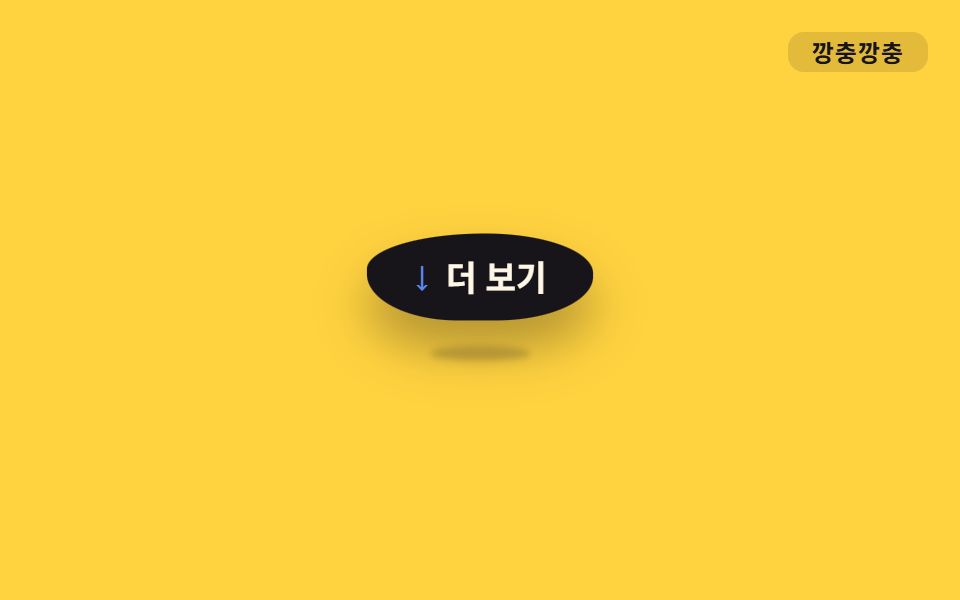
- 06 Tưng tưng nhảy (pyonpyon)
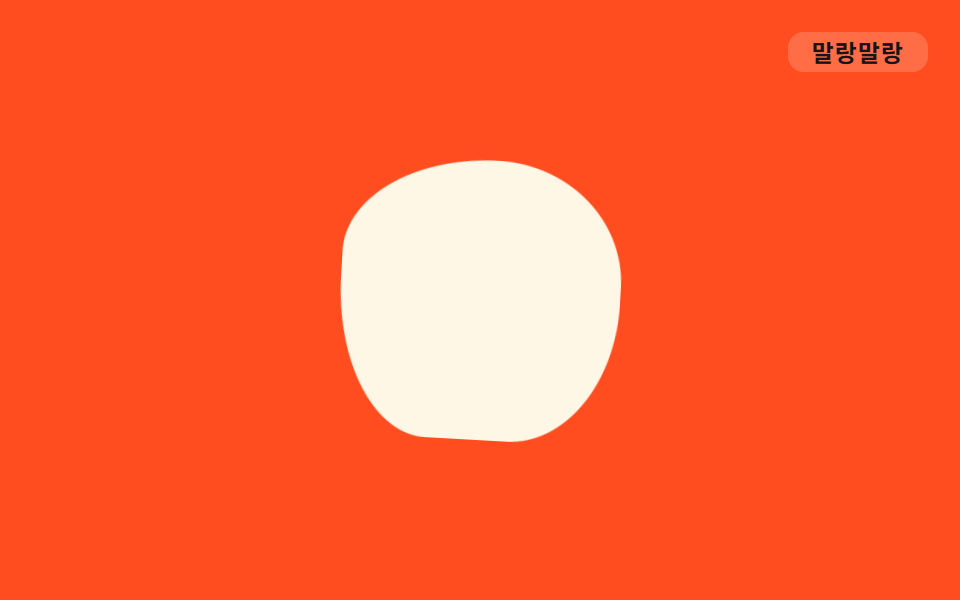
- 07 Uốn mềm dẻo (gunyagunya)
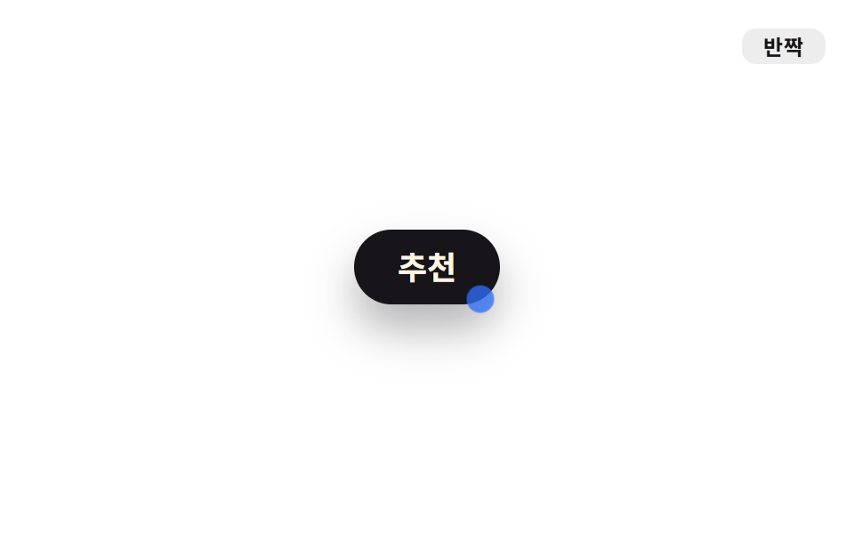
- 08 Lóe lấp lánh (kira)
- 09 Trượt mượt mà (nurutto)
Chín mục không xếp theo bảng chữ cái mà theo lộ trình một cái nút đi qua trên màn hình. Đầu tiên là báo mình có mặt (01), rồi nài người ta bấm vào (02, 03), thở khe khẽ ở một góc (04, 05), vẫy tay mời xem thêm (06), trang trí nền phía sau (07), lấp lánh khen bạn chọn đúng (08) và trượt sang màn hình kế tiếp (09). Bạn hãy lướt bảng duration và trigger trước, rồi mở code thật ở từng mục.
| Class | Cái gì chuyển động | duration | Trigger |
|---|---|---|---|
.o-float |
translateY·rotate | 2.8s | luôn chạy |
.o-poyon |
scale | 550ms | hover, focus |
.o-puru |
scale ngang·dọc | 900ms | luôn chạy |
.o-yura |
rotate | 2.4s | luôn chạy |
.o-kuru |
rotate | 1.6s | luôn chạy |
.o-pyon |
translateY·scale | 900ms | luôn chạy |
.o-gunya |
border-radius | 3.2s | luôn chạy |
.o-kira |
opacity·scale | 1.8s | luôn chạy |
.o-nuru |
translateX·scale | 700ms | hover, focus |
01Bồng bềnh trôi nổi (fuwafuwa)
Màn hình trông thế nào
Chỉ gắn .o-float là chiếc badge đã lên xuống chậm rãi bằng translateY kèm một chút rotate.
<main class="stage">
  <div class="badge o-float">
    <span class="badge__dot" aria-hidden="true"></span>
    Hàng mới
  </div>
  <span class="tag">Bồng bềnh</span>
</main>
@use "../../../../site/static/demo-tokens" as *;
// ── 변수 3개. 변형은 이것만 바꾼다 ──────────────────────
$duration: 2.8s;
$easing: ease-in-out;
$color: $subject-blue;
// ── 데모 무대 ───────────────────────────────
@include stage($stage-ink);
.stage { position: relative; }
.badge {
display: inline-flex;
align-items: center;
gap: $sp-2;
padding: $sp-3 $sp-6;
border-radius: $r-pill;
background: $subject-cream;
color: $stage-ink;
font-weight: 700;
font-size: clamp(16px, 4.5vw, 20px);
line-height: 1;
font-family: inherit;
box-shadow: $shadow-raised;
}
.badge__dot {
width: 10px;
height: 10px;
border-radius: 50%;
background: $color;
flex: none;
}
.tag {
position: absolute;
top: $sp-4;
right: $sp-4;
padding: $sp-1 $sp-3;
border-radius: $r-sm;
background: rgba(255, 255, 255, .12);
color: $subject-cream;
font-weight: 700;
font-size: 12px;
line-height: 1;
font-family: inherit;
letter-spacing: .04em;
}
// ── .o-float 하나만 붙이면 어떤 요소든 떠오른다 ─────
.o-float {
animation: o-float $duration $easing infinite;
}
@keyframes o-float {
0%, 100% { transform: translateY(0) rotate(0deg); }
50% { transform: translateY(-14px) rotate(-3deg); }
}
// ── 접근성 ──────────────────────────────────────────
@media (prefers-reduced-motion: reduce) {
.o-float { animation: none; }
}html, body {
margin: 0;
overflow: hidden;
}
.stage {
box-sizing: border-box;
min-height: 100vh;
display: grid;
place-items: center;
margin: 0;
background: #17141a;
font-family: -apple-system, "Segoe UI", "Noto Sans KR", sans-serif;
padding: clamp(8px, 4vw, 24px);
}
.stage {
position: relative;
}
.badge {
display: inline-flex;
align-items: center;
gap: 8px;
padding: 12px 24px;
border-radius: 999px;
background: #fff7e6;
color: #17141a;
font-weight: 700;
font-size: clamp(16px, 4.5vw, 20px);
line-height: 1;
font-family: inherit;
box-shadow: 0 14px 24px rgba(23, 20, 26, 0.32);
}
.badge__dot {
width: 10px;
height: 10px;
border-radius: 50%;
background: #2f6df6;
flex: none;
}
.tag {
position: absolute;
top: 16px;
right: 16px;
padding: 4px 12px;
border-radius: 8px;
background: rgba(255, 255, 255, 0.12);
color: #fff7e6;
font-weight: 700;
font-size: 12px;
line-height: 1;
font-family: inherit;
letter-spacing: 0.04em;
}
.o-float {
animation: o-float 2.8s ease-in-out infinite;
}
@keyframes o-float {
0%, 100% {
transform: translateY(0) rotate(0deg);
}
50% {
transform: translateY(-14px) rotate(-3deg);
}
}
@media (prefers-reduced-motion: reduce) {
.o-float {
animation: none;
}
}import type { CSSProperties, ReactNode } from "react";
import styles from "./FloatBadge.module.scss";
export type FloatBadgeProps = {
children: ReactNode;
/** 한 번 오가는 데 걸리는 시간 (기본 2800ms) */
duration?: number;
/** CSS easing (기본 ease-in-out) */
easing?: string;
/** 점 색 */
color?: string;
};
type Vars = CSSProperties & {
"--duration"?: string;
"--easing"?: string;
"--color"?: string;
};
export default function FloatBadge({
children,
duration = 2800,
easing = "ease-in-out",
color = "#2f6df6",
}: FloatBadgeProps) {
const vars: Vars = {
"--duration": `${duration}ms`,
"--easing": easing,
"--color": color,
};
return (
<div className={styles.badge} style={vars}>
<span className={styles.dot} aria-hidden="true" />
{children}
</div>
);
}01 · Bồng bềnh trôi (fuwafuwa) — Diện tích đo được 3.606% · khung hình chuyển động 23/23Nguyên tác GODRICH · SCSS và React nằm trong tệp zip · Xem mật khẩu
Nguyên lý hoạt động
Dùng cho badge hàng mới hay chip thông báo khuyến mãi, thứ phải báo mình có mặt ở một góc màn hình.
$duration: 2.8s;
$easing: ease-in-out;
$color: $subject-blue;

.o-float {
  animation: o-float $duration $easing infinite;
}

@keyframes o-float {
  0%, 100% { transform: translateY(0) rotate(0deg); }
  50%      { transform: translateY(-14px) rotate(-3deg); }
}
02Nảy đàn hồi (poyon)
Hiệu ứng hover cho nút dùng ở đâu
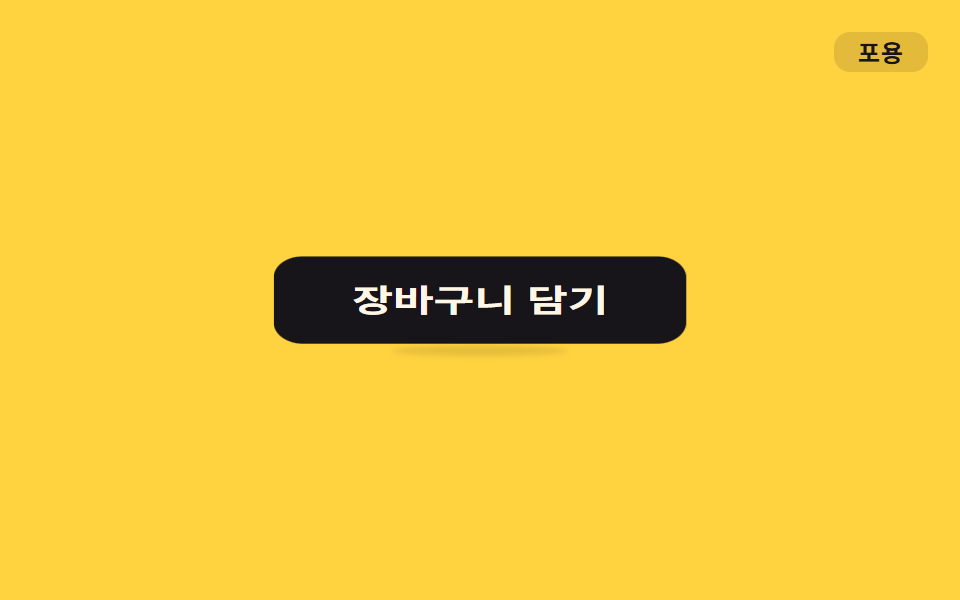
.o-poyon chạy một lần khi bạn đưa chuột lên hoặc focus bằng bàn phím, scale bị nén xuống rồi bật to ra theo easing đàn hồi.
<main class="stage">
  <button class="btn o-poyon is-demo" type="button">Thêm vào giỏ</button>
  <span class="tag">Nảy bật</span>
</main>
@use "../../../../site/static/demo-tokens" as *;
// ── 변수 3개 ──────────────────────────────────────────
$duration: 550ms;
$easing: cubic-bezier(.34, 1.56, .64, 1); // 넘겼다 돌아오는 elastic overshoot
$color: $subject-cream;
// ── 데모 무대 ───────────────────────────────
@include stage($stage-yellow);
.stage { position: relative; }
.btn {
position: relative;
border: 0;
border-radius: $r-control;
padding: $sp-4 $sp-8;
background: $stage-ink;
color: $color;
font-weight: 700;
font-size: clamp(15px, 4vw, 18px);
line-height: 1;
font-family: inherit;
cursor: pointer;
-webkit-tap-highlight-color: transparent;
}
// 바닥 접촉 그림자 — 몸이 눌릴 때(스쿼시) 넓고 짙게, 늘어날 때(오버슛) 좁고 옅게. 역수 관계 (형태 2차)
.btn::after {
content: "";
position: absolute;
left: 50%;
bottom: -8px;
width: 70%;
height: 8px;
border-radius: 50%;
background: rgba($stage-ink, .35);
filter: blur(2px);
transform: translateX(-50%) scale(1, 1);
}
.tag {
position: absolute;
top: $sp-4;
right: $sp-4;
padding: $sp-1 $sp-3;
border-radius: $r-sm;
background: rgba(23, 20, 26, .12);
color: $stage-ink;
font-weight: 700;
font-size: 12px;
line-height: 1;
font-family: inherit;
letter-spacing: .04em;
}
// ── 실제 쓰임: 마우스를 올리면(또는 포커스) 한 번 튕긴다 ─────
.btn.o-poyon:hover,
.btn.o-poyon:focus-visible { animation: o-poyon $duration $easing 1; }
.btn.o-poyon:hover::after,
.btn.o-poyon:focus-visible::after { animation: o-poyon-shadow $duration $easing 1; }
// ── 데모: 클릭 전까지 2초마다 스스로 튕긴다 ─────
.btn.o-poyon.is-demo { animation: o-poyon-loop $dur-loop $easing infinite; }
.btn.o-poyon.is-demo::after { animation: o-poyon-shadow-loop $dur-loop $easing infinite; }
// 사인파 soft-body — scale 을 두 직교 성분 scale(1+δ, 1-δ·.55) 로 갈라 면적을 대략 보존한다.
// δ 는 탄성 정착 진동의 표본(30%→-.16 · 55%→+.20 · 75%→-.06) — 몸이 가로로 눌리는 순간 세로는
// 역위상으로 상승한다. 서로 반대로 출렁여야 말랑한 인상이 산다 (형태 2차, 사용자 2026-09-14).
@keyframes o-poyon {
0% { transform: scale(1, 1); }
30% { transform: scale(.84, 1.09); }
55% { transform: scale(1.20, .89); }
75% { transform: scale(.94, 1.03); }
100% { transform: scale(1, 1); }
}
// 같은 모양을 2초 루프의 뒤쪽 40% 구간에 압축해 넣고 나머지는 쉰다
@keyframes o-poyon-loop {
0%, 60% { transform: scale(1, 1); }
74% { transform: scale(.84, 1.09); }
85% { transform: scale(1.20, .89); }
93% { transform: scale(.94, 1.03); }
100% { transform: scale(1, 1); }
}
// 그림자는 몸의 역(逆): 스쿼시(30·74%) 땐 가로 1.25배·진하게 — 무게가 바닥에 실리고,
// 오버슛(55·85%) 땐 .65배·옅게 — 몸이 떠 있음을 그림자가 알린다.
@keyframes o-poyon-shadow {
0% { transform: translateX(-50%) scale(1, 1); opacity: .85; }
30% { transform: translateX(-50%) scale(1.25, 1.35); opacity: 1; }
55% { transform: translateX(-50%) scale(.65, .8); opacity: .35; }
75% { transform: translateX(-50%) scale(1.08, 1.15); opacity: .9; }
100% { transform: translateX(-50%) scale(1, 1); opacity: .85; }
}
@keyframes o-poyon-shadow-loop {
0%, 60% { transform: translateX(-50%) scale(1, 1); opacity: .85; }
74% { transform: translateX(-50%) scale(1.25, 1.35); opacity: 1; }
85% { transform: translateX(-50%) scale(.65, .8); opacity: .35; }
93% { transform: translateX(-50%) scale(1.08, 1.15); opacity: .9; }
100% { transform: translateX(-50%) scale(1, 1); opacity: .85; }
}
// ── 접근성 ──────────────────────────────────────────
@media (prefers-reduced-motion: reduce) {
.btn.o-poyon:hover, .btn.o-poyon:focus-visible,
.btn.o-poyon:hover::after, .btn.o-poyon:focus-visible::after,
.btn.o-poyon.is-demo, .btn.o-poyon.is-demo::after { animation: none; }
}html, body {
margin: 0;
overflow: hidden;
}
.stage {
box-sizing: border-box;
min-height: 100vh;
display: grid;
place-items: center;
margin: 0;
background: #ffd23f;
font-family: -apple-system, "Segoe UI", "Noto Sans KR", sans-serif;
padding: clamp(8px, 4vw, 24px);
}
.stage {
position: relative;
}
.btn {
position: relative;
border: 0;
border-radius: 12px;
padding: 16px 32px;
background: #17141a;
color: #fff7e6;
font-weight: 700;
font-size: clamp(15px, 4vw, 18px);
line-height: 1;
font-family: inherit;
cursor: pointer;
-webkit-tap-highlight-color: transparent;
}
.btn::after {
content: "";
position: absolute;
left: 50%;
bottom: -8px;
width: 70%;
height: 8px;
border-radius: 50%;
background: rgba(23, 20, 26, 0.35);
filter: blur(2px);
transform: translateX(-50%) scale(1, 1);
}
.tag {
position: absolute;
top: 16px;
right: 16px;
padding: 4px 12px;
border-radius: 8px;
background: rgba(23, 20, 26, 0.12);
color: #17141a;
font-weight: 700;
font-size: 12px;
line-height: 1;
font-family: inherit;
letter-spacing: 0.04em;
}
.btn.o-poyon:hover,
.btn.o-poyon:focus-visible {
animation: o-poyon 550ms cubic-bezier(0.34, 1.56, 0.64, 1) 1;
}
.btn.o-poyon:hover::after,
.btn.o-poyon:focus-visible::after {
animation: o-poyon-shadow 550ms cubic-bezier(0.34, 1.56, 0.64, 1) 1;
}
.btn.o-poyon.is-demo {
animation: o-poyon-loop 2s cubic-bezier(0.34, 1.56, 0.64, 1) infinite;
}
.btn.o-poyon.is-demo::after {
animation: o-poyon-shadow-loop 2s cubic-bezier(0.34, 1.56, 0.64, 1) infinite;
}
@keyframes o-poyon {
0% {
transform: scale(1, 1);
}
30% {
transform: scale(0.84, 1.09);
}
55% {
transform: scale(1.2, 0.89);
}
75% {
transform: scale(0.94, 1.03);
}
100% {
transform: scale(1, 1);
}
}
@keyframes o-poyon-loop {
0%, 60% {
transform: scale(1, 1);
}
74% {
transform: scale(0.84, 1.09);
}
85% {
transform: scale(1.2, 0.89);
}
93% {
transform: scale(0.94, 1.03);
}
100% {
transform: scale(1, 1);
}
}
@keyframes o-poyon-shadow {
0% {
transform: translateX(-50%) scale(1, 1);
opacity: 0.85;
}
30% {
transform: translateX(-50%) scale(1.25, 1.35);
opacity: 1;
}
55% {
transform: translateX(-50%) scale(0.65, 0.8);
opacity: 0.35;
}
75% {
transform: translateX(-50%) scale(1.08, 1.15);
opacity: 0.9;
}
100% {
transform: translateX(-50%) scale(1, 1);
opacity: 0.85;
}
}
@keyframes o-poyon-shadow-loop {
0%, 60% {
transform: translateX(-50%) scale(1, 1);
opacity: 0.85;
}
74% {
transform: translateX(-50%) scale(1.25, 1.35);
opacity: 1;
}
85% {
transform: translateX(-50%) scale(0.65, 0.8);
opacity: 0.35;
}
93% {
transform: translateX(-50%) scale(1.08, 1.15);
opacity: 0.9;
}
100% {
transform: translateX(-50%) scale(1, 1);
opacity: 0.85;
}
}
@media (prefers-reduced-motion: reduce) {
.btn.o-poyon:hover, .btn.o-poyon:focus-visible,
.btn.o-poyon:hover::after, .btn.o-poyon:focus-visible::after,
.btn.o-poyon.is-demo, .btn.o-poyon.is-demo::after {
animation: none;
}
}import type { CSSProperties, MouseEvent, ReactNode } from "react";
import styles from "./PoyonButton.module.scss";
export type PoyonButtonProps = {
children: ReactNode;
/** 한 번 튕기는 데 걸리는 시간 (기본 550ms) */
duration?: number;
/** CSS easing (기본 넘겼다 돌아오는 elastic overshoot) */
easing?: string;
color?: string;
onClick?: (e: MouseEvent<HTMLButtonElement>) => void;
};
type Vars = CSSProperties & {
"--duration"?: string;
"--easing"?: string;
"--color"?: string;
};
// 마우스를 올리거나 키보드로 포커스하면 한 번 튕긴다. 상태 없이 :hover·:focus-visible 로 CSS 가 처리한다.
export default function PoyonButton({
children,
duration = 550,
easing = "cubic-bezier(.34,1.56,.64,1)",
color = "#fff7e6",
onClick,
}: PoyonButtonProps) {
const vars: Vars = {
"--duration": `${duration}ms`,
"--easing": easing,
"--color": color,
};
return (
<button type="button" className={styles.btn} style={vars} onClick={onClick}>
{children}
</button>
);
}02 · Nảy bật đàn hồi (poyon) — Diện tích đo được 5.788% · khung hình chuyển động 10/23Nguyên tác GODRICH · SCSS và React nằm trong tệp zip · Xem mật khẩu
Cách dựng
Dùng cho nút thêm vào giỏ hay nút thích, loại nút phải khiến người ta muốn bấm.
$duration: 550ms;
$easing: cubic-bezier(.34, 1.56, .64, 1);
$color: $subject-cream;

.btn.o-poyon:hover,
.btn.o-poyon:focus-visible { animation: o-poyon $duration $easing 1; }

@keyframes o-poyon {
  0%   { transform: scale(1, 1); }
  30%  { transform: scale(.84, 1.09); }
  55%  { transform: scale(1.20, .89); }
  75%  { transform: scale(.94, 1.03); }
  100% { transform: scale(1, 1); }
}
03Thạch rung rinh (purupuru)
Dùng ở đâu
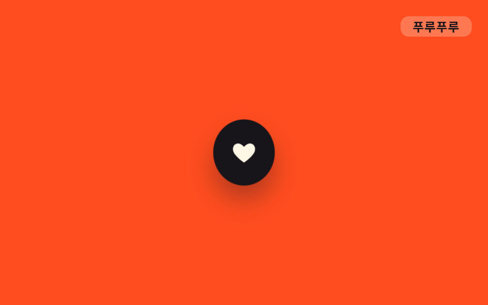
.o-puru lặp lại scale ngang và dọc với biên độ rất nhỏ và lệch pha nhau.
<main class="stage">
  <button class="icon o-puru is-demo" type="button" aria-label="Yêu thích">
    <svg viewBox="0 0 24 24" width="26" height="26" aria-hidden="true"><path d="M12 21s-7.5-4.6-10-9.3C.4 8 2 4.5 5.6 4 8 3.6 10 5 12 7c2-2 4-3.4 6.4-3 3.6.5 5.2 4 3.6 7.7C19.5 16.4 12 21 12 21z" fill="currentColor"/></svg>
  </button>
  <span class="tag">Rung rinh</span>
</main>
@use "../../../../site/static/demo-tokens" as *;
// ── 변수 3개 ──────────────────────────────────────────
$duration: 900ms;
$easing: ease-in-out;
$color: $subject-cream;
// ── 데모 무대 ───────────────────────────────
@include stage($stage-orange);
.stage { position: relative; }
.icon {
width: 64px;
height: 64px;
border: 0;
border-radius: 50%;
display: grid;
place-items: center;
background: $stage-ink;
color: $color;
cursor: pointer;
box-shadow: $shadow-raised;
}
.tag {
position: absolute;
top: $sp-4;
right: $sp-4;
padding: $sp-1 $sp-3;
border-radius: $r-sm;
background: rgba($subject-cream, .25); // 먹 틴트는 주황 면을 어둡게 해 잉크 글자가 4.32:1 이었다 — 크림 틴트로 7.00:1
color: $stage-ink;
font-weight: 700;
font-size: 12px;
line-height: 1;
font-family: inherit;
letter-spacing: .04em;
}
// ── 사인파 soft-body 진동 — scale(1+δ, 1-δ·φ) 로 부피를 보존한 채 위상차로 흔든다 ──
// δ = 0.07·sin(2πt), 세로는 가로보다 위상이 π/2 늦는 cos 을 쓴다(직교 성분 — 서로 반대로 출렁).
// scaleX 가 최대인 순간 scaleY 는 0을 지난다 — 몸이 한 방향으로 눌리면 다른 방향은 잠시 쉰다 (형태 2차, 사용자 2026-09-14).
// keyframes 네 지점은 t = pct/100·2π 대입 결과: 25%→sin 1·cos 0 / 50%→sin 0·cos -1 / 75%→sin -1·cos 0
.o-puru {
animation: o-puru $duration $easing infinite;
}
@keyframes o-puru {
0%, 100% { transform: scale(1, 1); }
25% { transform: scale(1.07, .94); }
50% { transform: scale(1, 1.07); }
75% { transform: scale(.93, 1); }
}
// ── 접근성 ──────────────────────────────────────────
@media (prefers-reduced-motion: reduce) {
.o-puru { animation: none; }
}html, body {
margin: 0;
overflow: hidden;
}
.stage {
box-sizing: border-box;
min-height: 100vh;
display: grid;
place-items: center;
margin: 0;
background: #ff4d1f;
font-family: -apple-system, "Segoe UI", "Noto Sans KR", sans-serif;
padding: clamp(8px, 4vw, 24px);
}
.stage {
position: relative;
}
.icon {
width: 64px;
height: 64px;
border: 0;
border-radius: 50%;
display: grid;
place-items: center;
background: #17141a;
color: #fff7e6;
cursor: pointer;
box-shadow: 0 14px 24px rgba(23, 20, 26, 0.32);
}
.tag {
position: absolute;
top: 16px;
right: 16px;
padding: 4px 12px;
border-radius: 8px;
background: rgba(255, 247, 230, 0.25);
color: #17141a;
font-weight: 700;
font-size: 12px;
line-height: 1;
font-family: inherit;
letter-spacing: 0.04em;
}
.o-puru {
animation: o-puru 900ms ease-in-out infinite;
}
@keyframes o-puru {
0%, 100% {
transform: scale(1, 1);
}
25% {
transform: scale(1.07, 0.94);
}
50% {
transform: scale(1, 1.07);
}
75% {
transform: scale(0.93, 1);
}
}
@media (prefers-reduced-motion: reduce) {
.o-puru {
animation: none;
}
}import type { CSSProperties, MouseEvent } from "react";
import styles from "./JellyHeartIcon.module.scss";
export type JellyHeartIconProps = {
/** 스크린리더용 라벨 (기본 "찜하기") */
label?: string;
/** 한 번 떠는 데 걸리는 시간 (기본 900ms) */
duration?: number;
easing?: string;
color?: string;
onClick?: (e: MouseEvent<HTMLButtonElement>) => void;
};
type Vars = CSSProperties & {
"--duration"?: string;
"--easing"?: string;
"--color"?: string;
};
export default function JellyHeartIcon({
label = "찜하기",
duration = 900,
easing = "ease-in-out",
color = "#fff7e6",
onClick,
}: JellyHeartIconProps) {
const vars: Vars = {
"--duration": `${duration}ms`,
"--easing": easing,
"--color": color,
};
return (
<button type="button" className={styles.icon} style={vars} aria-label={label} onClick={onClick}>
<svg viewBox="0 0 24 24" width="26" height="26" aria-hidden="true">
<path
d="M12 21s-7.5-4.6-10-9.3C.4 8 2 4.5 5.6 4 8 3.6 10 5 12 7c2-2 4-3.4 6.4-3 3.6.5 5.2 4 3.6 7.7C19.5 16.4 12 21 12 21z"
fill="currentColor"
/>
</svg>
</button>
);
}03 · Rung như thạch (purupuru) — Diện tích đo được 0.772% · khung hình chuyển động 23/23Nguyên tác GODRICH · SCSS và React nằm trong tệp zip · Xem mật khẩu
Vì sao dựng như vậy
Nó tạo cảm giác icon trái tim lưu tin hay chuông thông báo cứ rung li ti như đang xin bạn chạm vào.
$duration: 900ms;
$easing: ease-in-out;
$color: $subject-cream;

.o-puru {
  animation: o-puru $duration $easing infinite;
}

@keyframes o-puru {
  0%, 100% { transform: scale(1, 1); }
  25%      { transform: scale(1.07, .94); }
  50%      { transform: scale(1, 1.07); }
  75%      { transform: scale(.93, 1); }
}
04Đung đưa nhè nhẹ (yurayura)
Điều mắt thấy
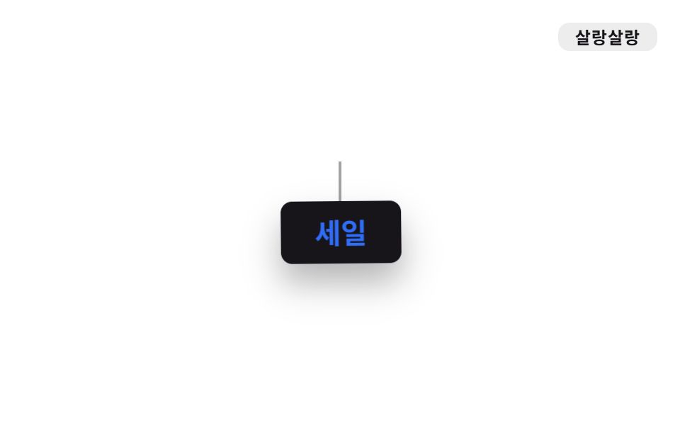
.o-yura ghim transform-origin lên cạnh trên rồi chỉ xoay qua lại thật chậm bằng rotate.
<main class="stage">
  <div class="tagwrap">
    <span class="tagwrap__string" aria-hidden="true"></span>
    <span class="tagwrap__tag o-yura">Giảm giá</span>
  </div>
  <span class="tag">Đung đưa</span>
</main>
@use "../../../../site/static/demo-tokens" as *;
// ── 변수 3개 ──────────────────────────────────────────
$duration: 2.4s;
$easing: ease-in-out;
$color: $subject-blue;
// ── 데모 무대 ───────────────────────────────
@include stage($stage-paper);
.stage { position: relative; }
.tagwrap {
display: flex;
flex-direction: column;
align-items: center;
}
.tagwrap__string {
width: 2px;
height: 28px;
background: $stage-ink;
opacity: .4;
}
.tagwrap__tag {
padding: $sp-3 $sp-6;
border-radius: $r-sm;
background: $stage-ink;
color: $subject-cream;
font-weight: 700;
font-size: clamp(16px, 4.5vw, 20px);
line-height: 1;
font-family: inherit;
box-shadow: $shadow-raised;
transform-origin: top center; // 규칙8: 줄 매달림 top 피벗
}
.tag {
position: absolute;
top: $sp-4;
right: $sp-4;
padding: $sp-1 $sp-3;
border-radius: $r-sm;
background: rgba(23, 20, 26, .08);
color: $stage-ink;
font-weight: 700;
font-size: 12px;
line-height: 1;
font-family: inherit;
letter-spacing: .04em;
}
// ── transform-origin 을 위쪽에 고정하고 rotate 만 아주 천천히 오간다 ─────
.o-yura {
animation: o-yura $duration $easing infinite;
color: $color;
}
@keyframes o-yura {
0%, 100% { transform: rotate(-6deg); }
50% { transform: rotate(6deg); }
}
// ── 접근성 ──────────────────────────────────────────
@media (prefers-reduced-motion: reduce) {
.o-yura { animation: none; }
}html, body {
margin: 0;
overflow: hidden;
}
.stage {
box-sizing: border-box;
min-height: 100vh;
display: grid;
place-items: center;
margin: 0;
background: #ffffff;
font-family: -apple-system, "Segoe UI", "Noto Sans KR", sans-serif;
padding: clamp(8px, 4vw, 24px);
}
.stage {
position: relative;
}
.tagwrap {
display: flex;
flex-direction: column;
align-items: center;
}
.tagwrap__string {
width: 2px;
height: 28px;
background: #17141a;
opacity: 0.4;
}
.tagwrap__tag {
padding: 12px 24px;
border-radius: 8px;
background: #17141a;
color: #fff7e6;
font-weight: 700;
font-size: clamp(16px, 4.5vw, 20px);
line-height: 1;
font-family: inherit;
box-shadow: 0 14px 24px rgba(23, 20, 26, 0.32);
transform-origin: top center;
}
.tag {
position: absolute;
top: 16px;
right: 16px;
padding: 4px 12px;
border-radius: 8px;
background: rgba(23, 20, 26, 0.08);
color: #17141a;
font-weight: 700;
font-size: 12px;
line-height: 1;
font-family: inherit;
letter-spacing: 0.04em;
}
.o-yura {
animation: o-yura 2.4s ease-in-out infinite;
color: #2f6df6;
}
@keyframes o-yura {
0%, 100% {
transform: rotate(-6deg);
}
50% {
transform: rotate(6deg);
}
}
@media (prefers-reduced-motion: reduce) {
.o-yura {
animation: none;
}
}import type { CSSProperties, ReactNode } from "react";
import styles from "./SwayTag.module.scss";
export type SwayTagProps = {
children: ReactNode;
/** 한 번 오가는 데 걸리는 시간 (기본 2400ms) */
duration?: number;
easing?: string;
color?: string;
};
type Vars = CSSProperties & {
"--duration"?: string;
"--easing"?: string;
"--color"?: string;
};
export default function SwayTag({
children,
duration = 2400,
easing = "ease-in-out",
color = "#2f6df6",
}: SwayTagProps) {
const vars: Vars = {
"--duration": `${duration}ms`,
"--easing": easing,
"--color": color,
};
return (
<div className={styles.wrap}>
<span className={styles.string} aria-hidden="true" />
<span className={styles.tag} style={vars}>
{children}
</span>
</div>
);
}04 · Đung đưa nhẹ (yurayura) — Diện tích đo được 1.628% · khung hình chuyển động 22/23Nguyên tác GODRICH · SCSS và React nằm trong tệp zip · Xem mật khẩu
Cốt lõi phần dựng
Dùng khi muốn thẻ giảm giá treo lơ lửng hay chuông thông báo trông như đang lay trong gió.
$duration: 2.4s;
$easing: ease-in-out;
$color: $subject-blue;

.o-yura {
  animation: o-yura $duration $easing infinite;
  transform-origin: top center;
}

@keyframes o-yura {
  0%, 100% { transform: rotate(-6deg); }
  50%      { transform: rotate(6deg); }
}
05Xoay tròn (kurukuru)
Tình huống nào
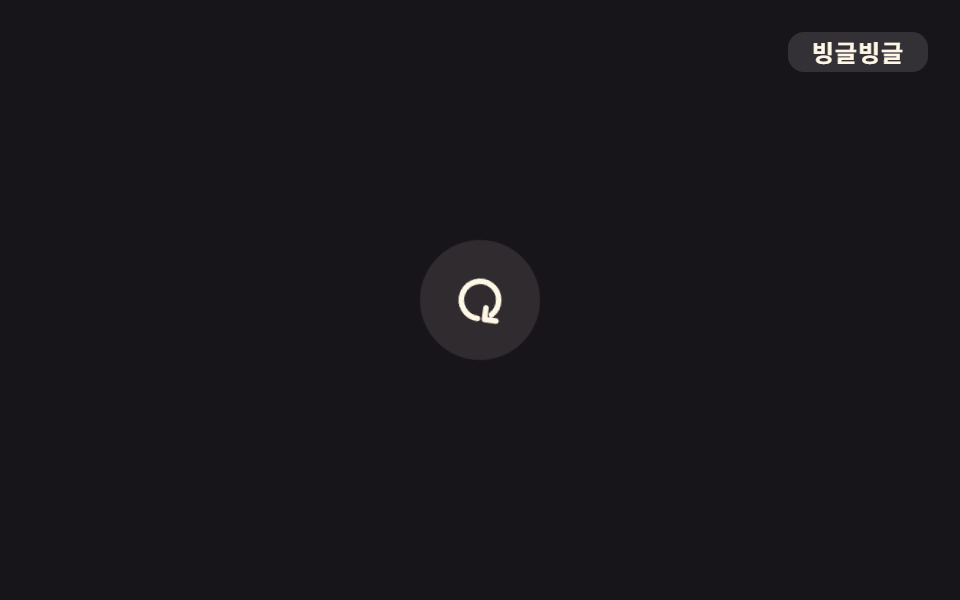
.o-kuru không đẩy trọn 360 độ bằng linear mà đặt các điểm đi qua lệch nhau ở từng chặng để tạo nhịp hẫng một phách. Dùng cho icon tải lại hay đồng bộ.
<main class="stage">
  <button class="icon o-kuru is-demo" type="button" aria-label="Làm mới">
    <svg viewBox="0 0 24 24" width="28" height="28" aria-hidden="true"><path d="M20 12a8 8 0 1 1-2.34-5.66" fill="none" stroke="currentColor" stroke-width="2.4" stroke-linecap="round"/><path d="M20 4v5h-5" fill="none" stroke="currentColor" stroke-width="2.4" stroke-linecap="round" stroke-linejoin="round"/></svg>
  </button>
  <span class="tag">Xoay tít</span>
</main>
@use "../../../../site/static/demo-tokens" as *;
// ── 변수 3개 ──────────────────────────────────────────
$duration: 1.6s;
$easing: cubic-bezier(.65, 0, .35, 1);
$color: $subject-cream;
// ── 데모 무대 ───────────────────────────────
@include stage($stage-ink);
.stage { position: relative; }
.icon {
width: 60px;
height: 60px;
border: 0;
border-radius: 50%;
display: grid;
place-items: center;
background: rgba(255, 247, 230, .1);
color: $color;
cursor: pointer;
}
.tag {
position: absolute;
top: $sp-4;
right: $sp-4;
padding: $sp-1 $sp-3;
border-radius: $r-sm;
background: rgba(255, 255, 255, .12);
color: $subject-cream;
font-weight: 700;
font-size: 12px;
line-height: 1;
font-family: inherit;
letter-spacing: .04em;
}
// ── linear 대신 구간마다 다른 지점을 지나게 해 한 박자 튕기는 듯한 회전을 만든다 ─────
.o-kuru {
animation: o-kuru $duration $easing infinite;
}
@keyframes o-kuru {
0% { transform: rotate(0deg); }
55% { transform: rotate(230deg); }
80% { transform: rotate(330deg); }
100% { transform: rotate(360deg); }
}
// ── 접근성 ──────────────────────────────────────────
@media (prefers-reduced-motion: reduce) {
.o-kuru { animation: none; }
}html, body {
margin: 0;
overflow: hidden;
}
.stage {
box-sizing: border-box;
min-height: 100vh;
display: grid;
place-items: center;
margin: 0;
background: #17141a;
font-family: -apple-system, "Segoe UI", "Noto Sans KR", sans-serif;
padding: clamp(8px, 4vw, 24px);
}
.stage {
position: relative;
}
.icon {
width: 60px;
height: 60px;
border: 0;
border-radius: 50%;
display: grid;
place-items: center;
background: rgba(255, 247, 230, 0.1);
color: #fff7e6;
cursor: pointer;
}
.tag {
position: absolute;
top: 16px;
right: 16px;
padding: 4px 12px;
border-radius: 8px;
background: rgba(255, 255, 255, 0.12);
color: #fff7e6;
font-weight: 700;
font-size: 12px;
line-height: 1;
font-family: inherit;
letter-spacing: 0.04em;
}
.o-kuru {
animation: o-kuru 1.6s cubic-bezier(0.65, 0, 0.35, 1) infinite;
}
@keyframes o-kuru {
0% {
transform: rotate(0deg);
}
55% {
transform: rotate(230deg);
}
80% {
transform: rotate(330deg);
}
100% {
transform: rotate(360deg);
}
}
@media (prefers-reduced-motion: reduce) {
.o-kuru {
animation: none;
}
}import type { CSSProperties, MouseEvent } from "react";
import styles from "./SpinRefreshIcon.module.scss";
export type SpinRefreshIconProps = {
label?: string;
/** 한 바퀴 도는 데 걸리는 시간 (기본 1600ms) */
duration?: number;
easing?: string;
color?: string;
onClick?: (e: MouseEvent<HTMLButtonElement>) => void;
};
type Vars = CSSProperties & {
"--duration"?: string;
"--easing"?: string;
"--color"?: string;
};
export default function SpinRefreshIcon({
label = "새로고침",
duration = 1600,
easing = "cubic-bezier(.65,0,.35,1)",
color = "#fff7e6",
onClick,
}: SpinRefreshIconProps) {
const vars: Vars = {
"--duration": `${duration}ms`,
"--easing": easing,
"--color": color,
};
return (
<button type="button" className={styles.icon} style={vars} aria-label={label} onClick={onClick}>
<svg viewBox="0 0 24 24" width="28" height="28" aria-hidden="true">
<path d="M20 12a8 8 0 1 1-2.34-5.66" fill="none" stroke="currentColor" strokeWidth={2.4} strokeLinecap="round" />
<path d="M20 4v5h-5" fill="none" stroke="currentColor" strokeWidth={2.4} strokeLinecap="round" strokeLinejoin="round" />
</svg>
</button>
);
}05 · Xoay vòng (kurukuru) — Diện tích đo được 0.403% · khung hình chuyển động 23/23Nguyên tác GODRICH · SCSS và React nằm trong tệp zip · Xem mật khẩu
Điểm mấu chốt là gì
$duration: 1.6s;
$easing: cubic-bezier(.65, 0, .35, 1);
$color: $subject-cream;

.o-kuru {
  animation: o-kuru $duration $easing infinite;
}

@keyframes o-kuru {
  0%   { transform: rotate(0deg); }
  55%  { transform: rotate(230deg); }
  80%  { transform: rotate(330deg); }
  100% { transform: rotate(360deg); }
}
06Nhảy tưng tưng (pyonpyon)
Chuyện gì xảy ra
.o-pyon nén scale dọc cho bẹt xuống ngay trước lúc tiếp đất, rồi kéo translateY cùng scale lên lúc bật nhảy để tạo nhịp tưng tưng.
<main class="stage">
  <div class="hint o-pyon is-demo">
    <span class="hint__arrow" aria-hidden="true">↓</span>
    Xem thêm
  </div>
  <span class="tag">Tưng tưng</span>
</main>
@use "../../../../site/static/demo-tokens" as *;
// ── 변수 3개 ──────────────────────────────────────────
$duration: 900ms;
$easing: ease-in-out;
$color: $subject-blue;
// ── 데모 무대 ───────────────────────────────
@include stage($stage-yellow);
.stage { position: relative; }
.hint {
position: relative;
display: inline-flex;
align-items: center;
gap: $sp-2;
padding: $sp-3 $sp-6;
border-radius: $r-pill;
background: $stage-ink;
color: $subject-cream;
font-weight: 700;
font-size: clamp(14px, 4vw, 17px);
line-height: 1;
font-family: inherit;
box-shadow: $shadow-raised;
}
// 바닥 접촉 그림자 — 알약 자체와 별개 레이어. 착지 순간(스쿼시) 넓고 짙게, 정점(공중)엔 좁고 옅게 ──
.hint::after {
content: "";
position: absolute;
left: 50%;
bottom: -8px;
width: 60%;
height: 8px;
border-radius: 50%;
background: rgba($stage-ink, .38);
filter: blur(2px);
transform: translateX(-50%) scale(1, 1);
}
.hint__arrow { font-size: 18px; line-height: 1; color: $subject-blue-light; } // 먹 알약 위 파란 글자 — AA 4.5
.tag {
position: absolute;
top: $sp-4;
right: $sp-4;
padding: $sp-1 $sp-3;
border-radius: $r-sm;
background: rgba(23, 20, 26, .12);
color: $stage-ink;
font-weight: 700;
font-size: 12px;
line-height: 1;
font-family: inherit;
letter-spacing: .04em;
}
// ── 사인파 soft-body + 바닥 그림자 (형태 2차, 사용자 2026-09-14) ─────
// 몸: border-radius 여덟 값(가로4·세로4)을 위상차 π/4 사인파 r_k = 50 + 10·sin(2πt + k·π/4) 로 흔들고,
// scaleX·scaleY 는 곱이 1 (면적 보존) — 눌리면 옆으로 퍼지고 늘어나면 가늘어진다.
// keyframes 다섯 지점(0·10·40·70·85%)은 t = pct/100·2π 를 대입한 계산 결과값.
// 그림자: 몸이 -16px 뜬 순간 +16px 내려와 바닥에 붙어 있다(상쇄). 착지 스쿼시 땐 넓고 짙게(무게),
// 공중 정점 땐 좁고 옅게 — 몸이 높을수록 그림자는 퍼져 약해진다는 역수 관계로 계산했다.
.o-pyon {
animation: o-pyon $duration $easing infinite;
}
.o-pyon::after {
animation: o-pyon-shadow $duration $easing infinite;
}
@keyframes o-pyon {
0%, 100% { transform: translateY(0) scale(1, 1); border-radius: 50% 57% 60% 57% / 50% 43% 40% 43%; }
10% { transform: translateY(2px) scale(1.11, .9); border-radius: 56% 60% 58% 52% / 44% 40% 42% 48%; }
40% { transform: translateY(-16px) scale(.93, 1.08); border-radius: 56% 48% 42% 40% / 44% 52% 58% 60%; }
70% { transform: translateY(2px) scale(1.11, .9); border-radius: 40% 41% 47% 55% / 60% 59% 53% 45%; }
85% { transform: translateY(0) scale(1.02, 1.03); border-radius: 42% 48% 56% 60% / 58% 52% 44% 40%; }
}
@keyframes o-pyon-shadow {
0%, 100% { transform: translate(-50%, 0) scale(1, 1); opacity: .9; }
10% { transform: translate(-50%, 0) scale(1.14, 1.3); opacity: 1; }
40% { transform: translate(-50%, 16px) scale(.6, .75); opacity: .4; }
70% { transform: translate(-50%, 0) scale(1.14, 1.3); opacity: 1; }
85% { transform: translate(-50%, 0) scale(1.05, 1.1); opacity: .95; }
}
// ── 접근성 ──────────────────────────────────────────
@media (prefers-reduced-motion: reduce) {
.o-pyon, .o-pyon::after { animation: none; }
}html, body {
margin: 0;
overflow: hidden;
}
.stage {
box-sizing: border-box;
min-height: 100vh;
display: grid;
place-items: center;
margin: 0;
background: #ffd23f;
font-family: -apple-system, "Segoe UI", "Noto Sans KR", sans-serif;
padding: clamp(8px, 4vw, 24px);
}
.stage {
position: relative;
}
.hint {
position: relative;
display: inline-flex;
align-items: center;
gap: 8px;
padding: 12px 24px;
border-radius: 999px;
background: #17141a;
color: #fff7e6;
font-weight: 700;
font-size: clamp(14px, 4vw, 17px);
line-height: 1;
font-family: inherit;
box-shadow: 0 14px 24px rgba(23, 20, 26, 0.32);
}
.hint::after {
content: "";
position: absolute;
left: 50%;
bottom: -8px;
width: 60%;
height: 8px;
border-radius: 50%;
background: rgba(23, 20, 26, 0.38);
filter: blur(2px);
transform: translateX(-50%) scale(1, 1);
}
.hint__arrow {
font-size: 18px;
line-height: 1;
color: #5b8cf8;
}
.tag {
position: absolute;
top: 16px;
right: 16px;
padding: 4px 12px;
border-radius: 8px;
background: rgba(23, 20, 26, 0.12);
color: #17141a;
font-weight: 700;
font-size: 12px;
line-height: 1;
font-family: inherit;
letter-spacing: 0.04em;
}
.o-pyon {
animation: o-pyon 900ms ease-in-out infinite;
}
.o-pyon::after {
animation: o-pyon-shadow 900ms ease-in-out infinite;
}
@keyframes o-pyon {
0%, 100% {
transform: translateY(0) scale(1, 1);
border-radius: 50% 57% 60% 57%/50% 43% 40% 43%;
}
10% {
transform: translateY(2px) scale(1.11, 0.9);
border-radius: 56% 60% 58% 52%/44% 40% 42% 48%;
}
40% {
transform: translateY(-16px) scale(0.93, 1.08);
border-radius: 56% 48% 42% 40%/44% 52% 58% 60%;
}
70% {
transform: translateY(2px) scale(1.11, 0.9);
border-radius: 40% 41% 47% 55%/60% 59% 53% 45%;
}
85% {
transform: translateY(0) scale(1.02, 1.03);
border-radius: 42% 48% 56% 60%/58% 52% 44% 40%;
}
}
@keyframes o-pyon-shadow {
0%, 100% {
transform: translate(-50%, 0) scale(1, 1);
opacity: 0.9;
}
10% {
transform: translate(-50%, 0) scale(1.14, 1.3);
opacity: 1;
}
40% {
transform: translate(-50%, 16px) scale(0.6, 0.75);
opacity: 0.4;
}
70% {
transform: translate(-50%, 0) scale(1.14, 1.3);
opacity: 1;
}
85% {
transform: translate(-50%, 0) scale(1.05, 1.1);
opacity: 0.95;
}
}
@media (prefers-reduced-motion: reduce) {
.o-pyon, .o-pyon::after {
animation: none;
}
}import type { CSSProperties, ReactNode } from "react";
import styles from "./HopHint.module.scss";
export type HopHintProps = {
children: ReactNode;
/** 한 번 뛰는 데 걸리는 시간 (기본 900ms) */
duration?: number;
easing?: string;
color?: string;
};
type Vars = CSSProperties & {
"--duration"?: string;
"--easing"?: string;
"--color"?: string;
};
export default function HopHint({
children,
duration = 900,
easing = "ease-in-out",
color = "#2f6df6",
}: HopHintProps) {
const vars: Vars = {
"--duration": `${duration}ms`,
"--easing": easing,
"--color": color,
};
return (
<div className={styles.hint} style={vars}>
<span className={styles.arrow} aria-hidden="true">
↓
</span>
{children}
</div>
);
}06 · Tưng tưng nhảy (pyonpyon) — Diện tích đo được 5.925% · khung hình chuyển động 23/23Nguyên tác GODRICH · SCSS và React nằm trong tệp zip · Xem mật khẩu
Điều đáng lưu ý
Dùng cho mũi tên "xem thêm" hay icon mời cuộn xuống.
$duration: 900ms;
$easing: ease-in-out;
$color: $subject-blue;

.o-pyon {
  animation: o-pyon $duration $easing infinite;
}

@keyframes o-pyon {
  0%, 100% { transform: translateY(0)     scale(1, 1); }
  10%      { transform: translateY(2px)   scale(1.11, .9); }
  40%      { transform: translateY(-16px) scale(.93, 1.08); }
  70%      { transform: translateY(2px)   scale(1.11, .9); }
  85%      { transform: translateY(0)     scale(1.02, 1.03); }
}
07Uốn mềm oặt (gunyagunya)
Trên màn hình diễn ra gì
.o-gunya đổi bốn góc border-radius theo bốn nhịp khác nhau ngay trong keyframes, khiến khối blob nền vừa trôi vừa biến dạng mềm oặt.
<main class="stage">
  <div class="blob o-gunya" aria-hidden="true"></div>
  <span class="tag">Mềm oặt</span>
</main>
@use "../../../../site/static/demo-tokens" as *;
// ── 변수 3개 ──────────────────────────────────────────
$duration: 3.2s;
$easing: ease-in-out;
$color: $subject-cream;
// ── 데모 무대 ───────────────────────────────
@include stage($stage-orange);
.stage { position: relative; }
.blob {
width: 140px;
height: 140px;
background: $color;
}
.tag {
position: absolute;
top: $sp-4;
right: $sp-4;
padding: $sp-1 $sp-3;
border-radius: $r-sm;
background: rgba(255, 255, 255, .18);
color: $stage-ink;
font-weight: 700;
font-size: 12px;
line-height: 1;
font-family: inherit;
letter-spacing: .04em;
}
// ── 사인파 soft-body — border-radius 여덟 값(가로4·세로4)을 위상차 π/4 의 사인파로 흔든다 ──
// r_k = 50 + 18·sin(2πt + k·π/4). 매끈한 원이 아니라 **여러 지점이 각자 다른 위상으로** 출렁여야
// 말랑한 덩어리로 보인다 — 한 값만 흔들면 타원이 커졌다 작아질 뿐이다 (형태 2차, 사용자 2026-09-14).
// keyframes 다섯 지점(0·20·45·70·95%)은 이 식을 t = pct/100·2π 로 대입한 계산 결과값이다.
.o-gunya {
animation: o-gunya $duration $easing infinite;
}
@keyframes o-gunya {
0%, 100% { border-radius: 50% 63% 68% 63% / 50% 37% 32% 37%; transform: rotate(0deg); }
20% { border-radius: 67% 66% 56% 42% / 33% 34% 44% 58%; transform: rotate(5deg); }
45% { border-radius: 56% 42% 33% 34% / 44% 58% 67% 66%; transform: rotate(2deg); }
70% { border-radius: 33% 34% 44% 58% / 67% 66% 56% 42%; transform: rotate(-5deg); }
95% { border-radius: 44% 58% 67% 66% / 56% 42% 33% 34%; transform: rotate(-2deg); }
}
// ── 접근성 ──────────────────────────────────────────
@media (prefers-reduced-motion: reduce) {
.o-gunya { animation: none; }
}html, body {
margin: 0;
overflow: hidden;
}
.stage {
box-sizing: border-box;
min-height: 100vh;
display: grid;
place-items: center;
margin: 0;
background: #ff4d1f;
font-family: -apple-system, "Segoe UI", "Noto Sans KR", sans-serif;
padding: clamp(8px, 4vw, 24px);
}
.stage {
position: relative;
}
.blob {
width: 140px;
height: 140px;
background: #fff7e6;
}
.tag {
position: absolute;
top: 16px;
right: 16px;
padding: 4px 12px;
border-radius: 8px;
background: rgba(255, 255, 255, 0.18);
color: #17141a;
font-weight: 700;
font-size: 12px;
line-height: 1;
font-family: inherit;
letter-spacing: 0.04em;
}
.o-gunya {
animation: o-gunya 3.2s ease-in-out infinite;
}
@keyframes o-gunya {
0%, 100% {
border-radius: 50% 63% 68% 63%/50% 37% 32% 37%;
transform: rotate(0deg);
}
20% {
border-radius: 67% 66% 56% 42%/33% 34% 44% 58%;
transform: rotate(5deg);
}
45% {
border-radius: 56% 42% 33% 34%/44% 58% 67% 66%;
transform: rotate(2deg);
}
70% {
border-radius: 33% 34% 44% 58%/67% 66% 56% 42%;
transform: rotate(-5deg);
}
95% {
border-radius: 44% 58% 67% 66%/56% 42% 33% 34%;
transform: rotate(-2deg);
}
}
@media (prefers-reduced-motion: reduce) {
.o-gunya {
animation: none;
}
}import type { CSSProperties } from "react";
import styles from "./BlobMorph.module.scss";
export type BlobMorphProps = {
/** 한 바퀴(세 모양) 도는 데 걸리는 시간 (기본 3200ms) */
duration?: number;
easing?: string;
color?: string;
size?: number;
};
type Vars = CSSProperties & {
"--duration"?: string;
"--easing"?: string;
"--color"?: string;
"--size"?: string;
};
export default function BlobMorph({
duration = 3200,
easing = "ease-in-out",
color = "#fff7e6",
size = 140,
}: BlobMorphProps) {
const vars: Vars = {
"--duration": `${duration}ms`,
"--easing": easing,
"--color": color,
"--size": `${size}px`,
};
return <div className={styles.blob} style={vars} aria-hidden="true" />;
}07 · Uốn mềm dẻo (gunyagunya) — Diện tích đo được 1.768% · khung hình chuyển động 23/23Nguyên tác GODRICH · SCSS và React nằm trong tệp zip · Xem mật khẩu
Cách tạo ra nó
Dùng cho nền hero hay hình khối nhấn nằm sau card giới thiệu tính năng.
$duration: 3.2s;
$easing: ease-in-out;
$color: $subject-cream;

.o-gunya {
  animation: o-gunya $duration $easing infinite;
}

@keyframes o-gunya {
  0%, 100% { border-radius: 50% 63% 68% 63% / 50% 37% 32% 37%; transform: rotate(0deg); }
  20%      { border-radius: 67% 66% 56% 42% / 33% 34% 44% 58%; transform: rotate(5deg); }
  45%      { border-radius: 56% 42% 33% 34% / 44% 58% 67% 66%; transform: rotate(2deg); }
  70%      { border-radius: 33% 34% 44% 58% / 67% 66% 56% 42%; transform: rotate(-5deg); }
  95%      { border-radius: 44% 58% 67% 66% / 56% 42% 33% 34%; transform: rotate(-2deg); }
}
08Lóe sáng (kira)
Nhìn thấy thế nào
.o-kira đặt hai ngôi sao nhỏ dựng bằng ::before và ::after, cho mỗi cái một delay riêng để chúng thay phiên lóe lên bằng scale với opacity.
<main class="stage">
  <div class="badge o-kira">Đề xuất</div>
  <span class="tag">Lấp lánh</span>
</main>
@use "../../../../site/static/demo-tokens" as *;
// ── 변수 3개 ──────────────────────────────────────────
$duration: 1.8s;
$easing: ease-in-out;
$color: $subject-blue;
// ── 데모 무대 ───────────────────────────────
@include stage($stage-paper);
.stage { position: relative; }
.badge {
position: relative;
display: inline-flex;
align-items: center;
padding: $sp-3 $sp-6;
border-radius: $r-pill;
background: $stage-ink;
color: $subject-cream;
font-weight: 700;
font-size: clamp(15px, 4vw, 18px);
line-height: 1;
font-family: inherit;
box-shadow: $shadow-raised;
}
// ── 실제 두 개의 ::before·::after 별을 서로 다른 delay 로 반짝인다 ─────
.badge::before,
.badge::after {
content: "";
position: absolute;
width: 14px;
height: 14px;
border-radius: 50%;
background: $color;
opacity: 0;
}
.badge::before { top: -5px; left: 8px; }
.badge::after { bottom: -4px; right: 4px; }
.badge.o-kira::before { animation: o-kira $duration $easing infinite; }
.badge.o-kira::after { animation: o-kira $duration $easing infinite; animation-delay: .4s; }
@keyframes o-kira {
0%, 45%, 100% { opacity: 0; transform: scale(.4); }
62% { opacity: 1; transform: scale(1.3); }
78% { opacity: 0; transform: scale(.6); }
}
.tag {
position: absolute;
top: $sp-4;
right: $sp-4;
padding: $sp-1 $sp-3;
border-radius: $r-sm;
background: rgba(23, 20, 26, .08);
color: $stage-ink;
font-weight: 700;
font-size: 12px;
line-height: 1;
font-family: inherit;
letter-spacing: .04em;
}
// ── 접근성 ──────────────────────────────────────────
@media (prefers-reduced-motion: reduce) {
.badge.o-kira::before, .badge.o-kira::after { animation: none; }
}html, body {
margin: 0;
overflow: hidden;
}
.stage {
box-sizing: border-box;
min-height: 100vh;
display: grid;
place-items: center;
margin: 0;
background: #ffffff;
font-family: -apple-system, "Segoe UI", "Noto Sans KR", sans-serif;
padding: clamp(8px, 4vw, 24px);
}
.stage {
position: relative;
}
.badge {
position: relative;
display: inline-flex;
align-items: center;
padding: 12px 24px;
border-radius: 999px;
background: #17141a;
color: #fff7e6;
font-weight: 700;
font-size: clamp(15px, 4vw, 18px);
line-height: 1;
font-family: inherit;
box-shadow: 0 14px 24px rgba(23, 20, 26, 0.32);
}
.badge::before,
.badge::after {
content: "";
position: absolute;
width: 14px;
height: 14px;
border-radius: 50%;
background: #2f6df6;
opacity: 0;
}
.badge::before {
top: -5px;
left: 8px;
}
.badge::after {
bottom: -4px;
right: 4px;
}
.badge.o-kira::before {
animation: o-kira 1.8s ease-in-out infinite;
}
.badge.o-kira::after {
animation: o-kira 1.8s ease-in-out infinite;
animation-delay: 0.4s;
}
@keyframes o-kira {
0%, 45%, 100% {
opacity: 0;
transform: scale(0.4);
}
62% {
opacity: 1;
transform: scale(1.3);
}
78% {
opacity: 0;
transform: scale(0.6);
}
}
.tag {
position: absolute;
top: 16px;
right: 16px;
padding: 4px 12px;
border-radius: 8px;
background: rgba(23, 20, 26, 0.08);
color: #17141a;
font-weight: 700;
font-size: 12px;
line-height: 1;
font-family: inherit;
letter-spacing: 0.04em;
}
@media (prefers-reduced-motion: reduce) {
.badge.o-kira::before, .badge.o-kira::after {
animation: none;
}
}import type { CSSProperties, ReactNode } from "react";
import styles from "./SparkleBadge.module.scss";
export type SparkleBadgeProps = {
children: ReactNode;
/** 한 번 반짝이는 주기 (기본 1800ms) */
duration?: number;
easing?: string;
color?: string;
};
type Vars = CSSProperties & {
"--duration"?: string;
"--easing"?: string;
"--color"?: string;
};
export default function SparkleBadge({
children,
duration = 1800,
easing = "ease-in-out",
color = "#2f6df6",
}: SparkleBadgeProps) {
const vars: Vars = {
"--duration": `${duration}ms`,
"--easing": easing,
"--color": color,
};
return (
<div className={styles.badge} style={vars}>
{children}
</div>
);
}08 · Lóe lấp lánh (kira) — Diện tích đo được 0.399% · khung hình chuyển động 12/23Nguyên tác GODRICH · SCSS và React nằm trong tệp zip · Xem mật khẩu
Đọc code thế nào
Giúp badge gợi ý hay nhãn tính năng mới lóe sáng theo chu kỳ mà hút mắt người xem.
$duration: 1.8s;
$easing: ease-in-out;
$color: $subject-blue;

.badge.o-kira::before { animation: o-kira $duration $easing infinite; }
.badge.o-kira::after  { animation: o-kira $duration $easing infinite; animation-delay: .4s; }

@keyframes o-kira {
  0%, 45%, 100% { opacity: 0; transform: scale(.4); }
  62%           { opacity: 1; transform: scale(1.3); }
  78%           { opacity: 0; transform: scale(.6); }
}
09Trơn mượt (nuru)
Dùng khi nào
Khi bạn hover hoặc focus, .o-nuru cho mũi tên trượt đi mượt bằng một cubic-bezier gần với ease-out-expo.
<main class="stage">
  <a class="link o-nuru is-demo" href="#">
    Tìm hiểu thêm
    <span class="link__arrow" aria-hidden="true">→</span>
  </a>
  <span class="tag">Mượt mà</span>
</main>
@use "../../../../site/static/demo-tokens" as *;
// ── 변수 3개 ──────────────────────────────────────────
$duration: 700ms;
$easing: cubic-bezier(.16, 1, .3, 1); // ease-out-expo 근사 — 매끄럽게 감속한다
$color: $subject-blue;
// ── 데모 무대 ───────────────────────────────
@include stage($stage-ink);
.stage { position: relative; }
.link {
display: inline-flex;
align-items: center;
gap: $sp-2;
padding: $sp-3 $sp-2;
color: $subject-cream;
text-decoration: none;
font-weight: 700;
font-size: clamp(16px, 4.5vw, 19px);
line-height: 1;
font-family: inherit;
border-bottom: 2px solid rgba(255, 247, 230, .3);
}
.link__arrow {
display: inline-block;
color: $color;
font-size: 22px;
}
.tag {
position: absolute;
top: $sp-4;
right: $sp-4;
padding: $sp-1 $sp-3;
border-radius: $r-sm;
background: rgba(255, 255, 255, .12);
color: $subject-cream;
font-weight: 700;
font-size: 12px;
line-height: 1;
font-family: inherit;
letter-spacing: .04em;
}
// ── 실제 쓰임: 마우스를 올리면(또는 포커스) 화살표가 미끄러지듯 이동한다 ─────
.link.o-nuru:hover .link__arrow,
.link.o-nuru:focus-visible .link__arrow { animation: o-nuru $duration $easing 1; }
// ── 데모: 2초마다 스스로 미끄러진다 ─────
.link.o-nuru.is-demo .link__arrow { animation: o-nuru-loop $dur-loop $easing infinite; }
@keyframes o-nuru {
0% { transform: translateX(0) scale(1); }
100% { transform: translateX(28px) scale(1.15); }
}
@keyframes o-nuru-loop {
0%, 40% { transform: translateX(0) scale(1); }
78% { transform: translateX(28px) scale(1.15); }
100% { transform: translateX(0) scale(1); }
}
// ── 접근성 ──────────────────────────────────────────
@media (prefers-reduced-motion: reduce) {
.link.o-nuru:hover .link__arrow, .link.o-nuru:focus-visible .link__arrow,
.link.o-nuru.is-demo .link__arrow { animation: none; }
}html, body {
margin: 0;
overflow: hidden;
}
.stage {
box-sizing: border-box;
min-height: 100vh;
display: grid;
place-items: center;
margin: 0;
background: #17141a;
font-family: -apple-system, "Segoe UI", "Noto Sans KR", sans-serif;
padding: clamp(8px, 4vw, 24px);
}
.stage {
position: relative;
}
.link {
display: inline-flex;
align-items: center;
gap: 8px;
padding: 12px 8px;
color: #fff7e6;
text-decoration: none;
font-weight: 700;
font-size: clamp(16px, 4.5vw, 19px);
line-height: 1;
font-family: inherit;
border-bottom: 2px solid rgba(255, 247, 230, 0.3);
}
.link__arrow {
display: inline-block;
color: #2f6df6;
font-size: 22px;
}
.tag {
position: absolute;
top: 16px;
right: 16px;
padding: 4px 12px;
border-radius: 8px;
background: rgba(255, 255, 255, 0.12);
color: #fff7e6;
font-weight: 700;
font-size: 12px;
line-height: 1;
font-family: inherit;
letter-spacing: 0.04em;
}
.link.o-nuru:hover .link__arrow,
.link.o-nuru:focus-visible .link__arrow {
animation: o-nuru 700ms cubic-bezier(0.16, 1, 0.3, 1) 1;
}
.link.o-nuru.is-demo .link__arrow {
animation: o-nuru-loop 2s cubic-bezier(0.16, 1, 0.3, 1) infinite;
}
@keyframes o-nuru {
0% {
transform: translateX(0) scale(1);
}
100% {
transform: translateX(28px) scale(1.15);
}
}
@keyframes o-nuru-loop {
0%, 40% {
transform: translateX(0) scale(1);
}
78% {
transform: translateX(28px) scale(1.15);
}
100% {
transform: translateX(0) scale(1);
}
}
@media (prefers-reduced-motion: reduce) {
.link.o-nuru:hover .link__arrow, .link.o-nuru:focus-visible .link__arrow,
.link.o-nuru.is-demo .link__arrow {
animation: none;
}
}import type { CSSProperties, ReactNode } from "react";
import styles from "./SmoothLink.module.scss";
export type SmoothLinkProps = {
children: ReactNode;
href?: string;
/** 미끄러지는 데 걸리는 시간 (기본 700ms) */
duration?: number;
/** CSS easing (기본 ease-out-expo 근사) */
easing?: string;
color?: string;
};
type Vars = CSSProperties & {
"--duration"?: string;
"--easing"?: string;
"--color"?: string;
};
export default function SmoothLink({
children,
href = "#",
duration = 700,
easing = "cubic-bezier(.16,1,.3,1)",
color = "#2f6df6",
}: SmoothLinkProps) {
const vars: Vars = {
"--duration": `${duration}ms`,
"--easing": easing,
"--color": color,
};
return (
<a className={styles.link} href={href} style={vars}>
{children}
<span className={styles.arrow} aria-hidden="true">
→
</span>
</a>
);
}09 · Trượt mượt mà (nurutto) — Diện tích đo được 0.172% · khung hình chuyển động 13/23Nguyên tác GODRICH · SCSS và React nằm trong tệp zip · Xem mật khẩu
Điểm chính của code
Cảm giác trơn mượt này trái ngược hẳn độ đàn hồi của tám mục còn lại nên hợp với link "xem chi tiết".
$duration: 700ms;
$easing: cubic-bezier(.16, 1, .3, 1);
$color: $subject-blue;

.link.o-nuru:hover .link__arrow,
.link.o-nuru:focus-visible .link__arrow { animation: o-nuru $duration $easing 1; }

@keyframes o-nuru {
  0%   { transform: translateX(0)    scale(1); }
  100% { transform: translateX(28px) scale(1.15); }
}
Dễ vỡ ở đâu — cái bẫy khi quên xóa class is-demo
Vấn đề là gì
Những mục chạy bằng hover như 02 và 09, chứ không phải bằng cú click, đặt chung trên một phần tử cả quy tắc dùng thật (:hover, :focus-visible) lẫn quy tắc vòng lặp .is-demo để trang này tự phát. Hai quy tắc có độ đặc hiệu ngang nhau (hai ba class, hòa điểm) nên bên khai báo sau sẽ thắng. Vậy nên nếu bạn mang .is-demo lên màn hình thật mà quên gỡ, người dùng đưa chuột lên sẽ thấy vòng lặp demo 2 giây thay cho cú chạy ngắn của trigger. Khi chép code từ zip vào dự án, bạn chỉ cần xóa class is-demo; ngược lại muốn giữ is-demo thì phải viết quy tắc dùng thật xuống phía dưới trong stylesheet.
Tránh thế nào
Tra css bounce effect hay button bounce effect css thì được hàng loạt kết quả, nhưng ở đây bạn dán một tệp là chạy ngay không cần tuyển chọn. Trong chín mục, mục 07 uốn mềm oặt có cường độ trung bình đo được 42.9, thấp nhất cả nhóm, vì đường cong dựng chỉ bằng border-radius nên độ chênh với nền rất thoải. Đặt nó lên nền tương phản yếu thì gần như không nhìn ra, vậy hãy chọn chỗ có màu khác hẳn nền. Bộ zip gói chín bản vanilla và React đã khớp sẵn duration, easing cùng màu sắc, và nó mở bằng đúng mật khẩu nén kxj6u9k6 ghi ở đoạn này.
Khả năng tiếp cận
Bật reduced-motion còn lại gì
Nếu hệ điều hành bật chế độ giảm chuyển động, cả chín mục đều xóa chuyển động bằng animation: none trong khối @media (prefers-reduced-motion: reduce). Những mục chỉ trang trí nền như 01 bồng bềnh, 04 đung đưa, 07 uốn mềm có tắt đi cũng không mất thông tin nào; còn 02 poyon và 09 nuru dù mất animation thì chức năng thật là bấm nút hay chuyển link vẫn nguyên. Danh sách trình duyệt hỗ trợ media query này nằm ở bảng tương thích cuối tài liệu prefers-reduced-motion của MDN.
@media (prefers-reduced-motion: reduce) {
  .o-float, .o-puru, .o-yura,
  .o-kuru, .o-pyon, .o-gunya { animation: none; }
  .badge.o-kira::before, .badge.o-kira::after { animation: none; }
  .btn.o-poyon:hover, .btn.o-poyon:focus-visible,
  .link.o-nuru:hover .link__arrow,
  .link.o-nuru:focus-visible .link__arrow { animation: none; }
}
Bài nên đọc tiếp
Các bộ khác cùng loạt bài nằm ở danh mục CSS animation, còn nếu lần đầu ghé trang này, bạn xem qua trang giới thiệu trước.
FAQ
Dùng cả chín animation lặp vô hạn trên một màn hình có được không?
Về kỹ thuật thì được, nhưng tôi khuyên chỉ nên hai ba mục một màn hình. Mục 02 poyon và 08 lóe sáng cùng đóng vai "nhìn chỗ này đi" nên đặt chung một màn hình sẽ khiến mắt người xem bị chia ra hai hướng. Ngược lại, mục yên ắng như 01 bồng bềnh và mục báo trạng thái như 05 xoay tròn không giẫm vai nhau nên đặt cùng nhau vẫn ổn.
Tại sao trên màn hình demo mục 02 và 09 cứ chạy mãi?
Ở màn hình thật, 02 và 09 là trigger hover, chỉ chạy khi bạn đưa chuột lên hoặc focus. Demo trên trang này phải trình diễn chuyển động dù không ai chạm vào, nên tôi ép nó tự phát mỗi 2 giây bằng class .is-demo; lúc chép vào code thật, bạn xóa class đó đi là xong.
Trong React tái hiện trigger hover ra sao?
Thư mục react/ trong zip nhận duration, easing, color qua props rồi đẩy sang biến CSS, và các mục chạy bằng hover như 02, 09 cũng xử lý thẳng bằng selector :hover và :focus-visible của CSS module, không cần state. Những mục lặp liên tục như 01 và 03 đến 08 thì animation chạy ngay từ lúc component được mount.
Có thể bạn cũng thích
 Phản hồi9 hiệu ứng css dark mode toggle 1 dòng CSS
 Phản hồi9 micro interactions css — dán 1 dòng chạy ngay
 Phản hồi9 CSS Heart Like Animations — dán 1 dòng là chạy
 Phản hồi9 CSS Border Animations — dán 1 dòng là chạy
 Phản hồi9 css glow effect — nút chữ phát sáng như neon
 Phản hồi9 css confetti animation — dán một file là chạy
 Phản hồi9 css arrow animation — dán một dòng là chạy
 Phản hồi9 CSS tooltip examples — copy dán một dòng là chạy
 Phản hồi9 hiệu ứng custom cursor css — copy dán một dòng
 Phản hồi9 kiểu css typing animation, copy dán là chạy