9 css arrow animation — dán một dòng là chạy
css arrow animation là mũi tên tự chuyển động trên trang: hover thì thân tên dài ra, hoặc nó nảy lên như giục bạn bấm nút.
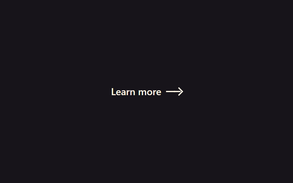 01 arrow-animation-arrow-extend
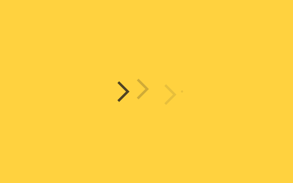 02 arrow-animation-arrow-slide-loop
 03 arrow-animation-arrow-bounce-down
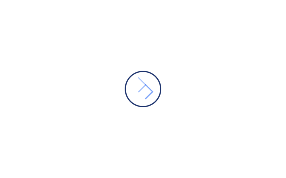 04 arrow-animation-arrow-circle-hover
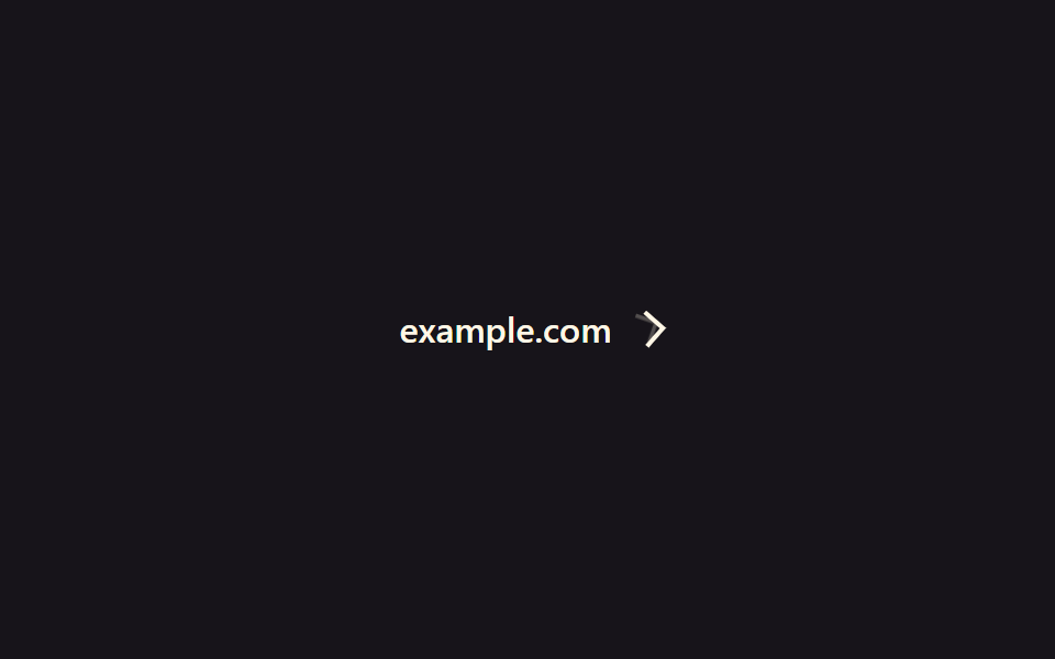 05 arrow-animation-arrow-rotate-45
 06 arrow-animation-arrow-draw-svg
 07 arrow-animation-arrow-chevron-wave
 08 arrow-animation-arrow-mouse-scroll
 09 arrow-animation-arrow-double-swap
Tự chạy · bấm ô để tới mục đó · cả 9 trong một zip
- 01 Mũi tên dài ra
- 02 Mũi tên chảy mãi
- 03 Nảy xuống dưới
- 04 Nút tròn + mũi tên hover
- 05 Liên kết ngoài xoay 45 độ
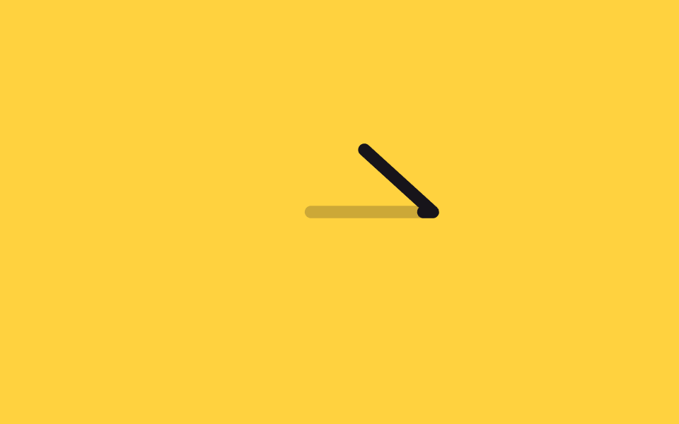
- 06 Mũi tên tự vẽ đường
- 07 Sóng chevron
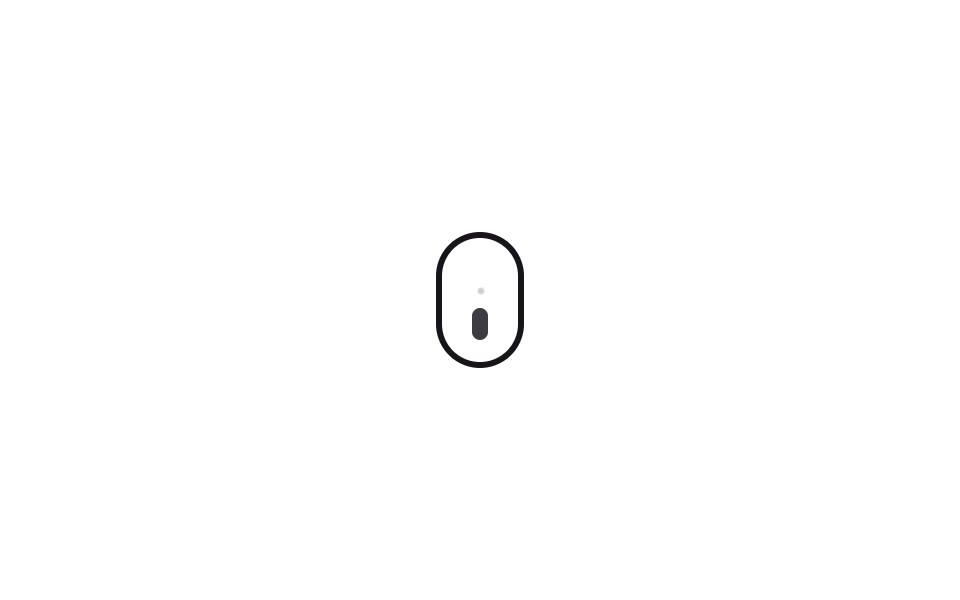
- 08 Hình con chuột báo cuộn
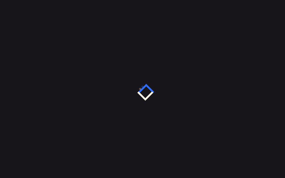
- 09 Hai mũi tên bắt chéo
Chín mục đi theo thứ tự vai trò mà mũi tên đảm nhận trên màn hình. Trước hết là nhóm chỉ hướng ngay cạnh một link (01, 05), rồi tới nhóm tự phát hút mắt dù không ai hover (02, 03, 07, 08), xen giữa là mục phản hồi ngay trên nút (04) và mục trang trí hiện ra như vẽ tay (06), khép lại bằng mục giao hoán đổi chỗ cho nhau (09).
01Mũi tên kéo dài ra
Cái gì chuyển động
Đưa chuột lên link "xem thêm", thân mũi tên kéo dài sang ngang và đầu tên bị đẩy đi đúng chừng ấy, nhẹ nhàng giục bạn sang trang tiếp theo.
<main class="stage">
  <a class="ae-link is-demo" href="#">
    <span class="ae-link__label">Learn more</span>
    <span class="ae-link__arrow">
      <span class="ae-link__shaft"></span>
      <span class="ae-link__head"></span>
      <span class="ae-link__trail ae-link__trail--1" aria-hidden="true"></span>
      <span class="ae-link__trail ae-link__trail--2" aria-hidden="true"></span>
    </span>
  </a>
</main>
@use "../../../../site/static/demo-tokens" as *;
// ── 변수 3개 ──────────────────────────────────────────
$duration: $dur-loop; // is-demo 강제 루프 주기(캡처용). 실제 호버 전환은 아래 220ms 를 쓴다
$easing: $ease-elastic; // 고무줄식 오버슛 — 늘어났다 살짝 되돌아와 멈춘다
$color: $subject-cream;
@include stage($stage-ink);
.ae-link {
display: inline-flex;
align-items: center;
gap: $sp-2;
color: $color;
text-decoration: none;
font: 600 16px/1 -apple-system, "Segoe UI", sans-serif;
}
.ae-link__arrow {
position: relative;
display: inline-flex;
align-items: center;
width: 26px;
height: 12px;
}
.ae-link__shaft {
position: absolute;
left: 0;
width: 16px;
height: 2px;
background: $color;
transform-origin: left center; // 규칙8: 화살대 왼쪽서 늘어남
transform: scaleX(1);
transition: transform 260ms $easing;
}
.ae-link__head {
position: absolute;
left: 10px;
width: 8px;
height: 8px;
border-top: 2px solid $color;
border-right: 2px solid $color;
transform: translateX(0) rotate(45deg);
transition: transform 260ms $easing;
}
// 화살촉 트레일 파티클 — 신장하는 동안 화살촉 뒤로 작은 점 두 개가 지연·감쇠하며 따라붙는다
.ae-link__trail {
position: absolute;
left: 10px;
width: 4px;
height: 4px;
border-radius: 50%;
background: $color;
opacity: 0;
}
// 실사용: 링크에 마우스를 올리면 몸통(shaft)이 길게 늘어나고 화살촉(head)이 따라 밀려난다. $easing 이 고무줄 오버슛을 만든다
.ae-link:hover .ae-link__shaft { transform: scaleX(1.8); }
.ae-link:hover .ae-link__head { transform: translateX(10px) rotate(45deg); }
@keyframes ae-trail-hover {
0% { opacity: 0; transform: translateX(0) scale(.6); }
45% { opacity: .5; transform: translateX(5px) scale(1); }
100% { opacity: 0; transform: translateX(9px) scale(.4); }
}
.ae-link:hover .ae-link__trail--1 { animation: ae-trail-hover 420ms $ease-out forwards; }
.ae-link:hover .ae-link__trail--2 { animation: ae-trail-hover 420ms $ease-out 70ms forwards; }
// 데모 루프: is-demo 는 :hover 를 흉내 낸 keyframes 로 무한 반복 (헤드리스는 :hover 를 못 건다)
@keyframes ae-extend-shaft {
0%, 20% { transform: scaleX(1); }
50%, 70% { transform: scaleX(1.8); }
100% { transform: scaleX(1); }
}
@keyframes ae-extend-head {
0%, 20% { transform: translateX(0) rotate(45deg); }
50%, 70% { transform: translateX(10px) rotate(45deg); }
100% { transform: translateX(0) rotate(45deg); }
}
@keyframes ae-trail-loop {
0%, 20% { opacity: 0; transform: translateX(0) scale(.6); }
38% { opacity: .5; transform: translateX(5px) scale(1); }
50%, 70% { opacity: 0; transform: translateX(9px) scale(.4); }
100% { opacity: 0; transform: translateX(0) scale(.6); }
}
.ae-link.is-demo .ae-link__shaft { animation: ae-extend-shaft $duration $easing infinite; }
.ae-link.is-demo .ae-link__head { animation: ae-extend-head $duration $easing infinite; }
.ae-link.is-demo .ae-link__trail--1 { animation: ae-trail-loop $duration $ease-out infinite; }
.ae-link.is-demo .ae-link__trail--2 { animation: ae-trail-loop $duration $ease-out 60ms infinite; }
@media (prefers-reduced-motion: reduce) {
.ae-link:hover .ae-link__shaft,
.ae-link.is-demo .ae-link__shaft {
animation: none !important;
transition: none !important;
transform: scaleX(1) !important;
}
.ae-link:hover .ae-link__head,
.ae-link.is-demo .ae-link__head {
animation: none !important;
transition: none !important;
transform: translateX(0) rotate(45deg) !important;
}
.ae-link__trail,
.ae-link:hover .ae-link__trail,
.ae-link.is-demo .ae-link__trail {
animation: none !important;
opacity: 0 !important;
}
}html, body {
margin: 0;
overflow: hidden;
}
.stage {
box-sizing: border-box;
min-height: 100vh;
display: grid;
place-items: center;
margin: 0;
background: #17141a;
font-family: -apple-system, "Segoe UI", "Noto Sans KR", sans-serif;
padding: clamp(8px, 4vw, 24px);
}
.ae-link {
display: inline-flex;
align-items: center;
gap: 8px;
color: #fff7e6;
text-decoration: none;
font: 600 16px/1 -apple-system, "Segoe UI", sans-serif;
}
.ae-link__arrow {
position: relative;
display: inline-flex;
align-items: center;
width: 26px;
height: 12px;
}
.ae-link__shaft {
position: absolute;
left: 0;
width: 16px;
height: 2px;
background: #fff7e6;
transform-origin: left center;
transform: scaleX(1);
transition: transform 260ms cubic-bezier(0.34, 1.56, 0.64, 1);
}
.ae-link__head {
position: absolute;
left: 10px;
width: 8px;
height: 8px;
border-top: 2px solid #fff7e6;
border-right: 2px solid #fff7e6;
transform: translateX(0) rotate(45deg);
transition: transform 260ms cubic-bezier(0.34, 1.56, 0.64, 1);
}
.ae-link__trail {
position: absolute;
left: 10px;
width: 4px;
height: 4px;
border-radius: 50%;
background: #fff7e6;
opacity: 0;
}
.ae-link:hover .ae-link__shaft {
transform: scaleX(1.8);
}
.ae-link:hover .ae-link__head {
transform: translateX(10px) rotate(45deg);
}
@keyframes ae-trail-hover {
0% {
opacity: 0;
transform: translateX(0) scale(0.6);
}
45% {
opacity: 0.5;
transform: translateX(5px) scale(1);
}
100% {
opacity: 0;
transform: translateX(9px) scale(0.4);
}
}
.ae-link:hover .ae-link__trail--1 {
animation: ae-trail-hover 420ms ease-out forwards;
}
.ae-link:hover .ae-link__trail--2 {
animation: ae-trail-hover 420ms ease-out 70ms forwards;
}
@keyframes ae-extend-shaft {
0%, 20% {
transform: scaleX(1);
}
50%, 70% {
transform: scaleX(1.8);
}
100% {
transform: scaleX(1);
}
}
@keyframes ae-extend-head {
0%, 20% {
transform: translateX(0) rotate(45deg);
}
50%, 70% {
transform: translateX(10px) rotate(45deg);
}
100% {
transform: translateX(0) rotate(45deg);
}
}
@keyframes ae-trail-loop {
0%, 20% {
opacity: 0;
transform: translateX(0) scale(0.6);
}
38% {
opacity: 0.5;
transform: translateX(5px) scale(1);
}
50%, 70% {
opacity: 0;
transform: translateX(9px) scale(0.4);
}
100% {
opacity: 0;
transform: translateX(0) scale(0.6);
}
}
.ae-link.is-demo .ae-link__shaft {
animation: ae-extend-shaft 2s cubic-bezier(0.34, 1.56, 0.64, 1) infinite;
}
.ae-link.is-demo .ae-link__head {
animation: ae-extend-head 2s cubic-bezier(0.34, 1.56, 0.64, 1) infinite;
}
.ae-link.is-demo .ae-link__trail--1 {
animation: ae-trail-loop 2s ease-out infinite;
}
.ae-link.is-demo .ae-link__trail--2 {
animation: ae-trail-loop 2s ease-out 60ms infinite;
}
@media (prefers-reduced-motion: reduce) {
.ae-link:hover .ae-link__shaft,
.ae-link.is-demo .ae-link__shaft {
animation: none !important;
transition: none !important;
transform: scaleX(1) !important;
}
.ae-link:hover .ae-link__head,
.ae-link.is-demo .ae-link__head {
animation: none !important;
transition: none !important;
transform: translateX(0) rotate(45deg) !important;
}
.ae-link__trail,
.ae-link:hover .ae-link__trail,
.ae-link.is-demo .ae-link__trail {
animation: none !important;
opacity: 0 !important;
}
}import { CSSProperties } from "react";
import styles from "./ExtendingArrow.module.scss";
export interface ExtendingArrowProps {
duration?: string;
easing?: string;
color?: string;
}
// 실사용: :hover 만으로 동작한다. is-demo 강제 루프는 넣지 않는다 (블로그공장 react 컨벤션)
export default function ExtendingArrow({
duration = "260ms",
easing = "cubic-bezier(.34, 1.56, .64, 1)",
color = "#fff7e6",
}: ExtendingArrowProps) {
const style = { "--duration": duration, "--easing": easing, "--color": color } as CSSProperties;
return (
<a className={styles.link} href="#" style={style}>
<span>Learn more</span>
<span className={styles.arrow}>
<span className={styles.shaft} />
<span className={styles.head} />
<span className={`${styles.trail} ${styles.trail1}`} aria-hidden="true" />
<span className={`${styles.trail} ${styles.trail2}`} aria-hidden="true" />
</span>
</a>
);
}01 · Mũi tên dài ra — Diện tích đo được 0.163% · khung hình chuyển động 15/23Nguyên tác GODRICH · SCSS và React nằm trong tệp zip · Xem mật khẩu
Đọc code thế nào
Thân chạy bằng transform: scaleX còn đầu tên chạy bằng transform: translateX; hai phần tách riêng nhưng chuyển tiếp trong cùng một khoảng thời gian. Chuyển tiếp giãn ra giờ dùng $ease-elastic (cubic-bezier(.34,1.56,.64,1)) nên vọt quá đích một chút rồi mới lắng lại như dây thun, và phía sau đầu tên có thêm hai chấm nhỏ bám theo với độ trễ và giảm dần, tạo thành vệt đuôi.
.ae-link__shaft {
  transform-origin: left center;
  transform: scaleX(1);
  transition: transform 220ms;
}
.ae-link__head {
  transform: translateX(0) rotate(45deg);
  transition: transform 220ms;
}
.ae-link:hover .ae-link__shaft { transform: scaleX(1.8); }
.ae-link:hover .ae-link__head { transform: translateX(10px) rotate(45deg); }
02Mũi tên chảy liên tục
Dùng ở đâu
Ba chevron (>) lần lượt hiện ra rồi tắt đi với độ lệch thời gian ngắn, trông như đang chảy sang phải, báo cho người xem biết còn bước tiếp theo mà không cần hover.
<main class="stage">
  <div class="sl-row" aria-hidden="true">
    <span class="sl-chevron sl-chevron--1"></span>
    <span class="sl-chevron sl-chevron--2"></span>
    <span class="sl-chevron sl-chevron--3"></span>
    <span class="sl-trail"></span>
  </div>
</main>
@use "../../../../site/static/demo-tokens" as *;
// ── 변수 3개 ──────────────────────────────────────────
$duration: 1.6s;
$easing: $ease-out;
$color: $subject-ink;
@include stage($stage-yellow);
.sl-row {
display: flex;
align-items: center;
gap: $sp-3;
}
.sl-chevron {
width: 20px;
height: 20px;
border-top: 4px solid $color;
border-right: 4px solid $color;
transform: rotate(45deg) translateX(-8px);
opacity: 0;
}
// 실사용·자동재생 공통: 세 개가 짧은 시차를 두고 같은 방향으로 흐른다. 26%에서 살짝 오버슛했다 38%에서 정착한다(고무줄 신장)
@keyframes sl-flow {
0% { opacity: 0; transform: rotate(45deg) translateX(-8px); }
26% { opacity: 1; transform: rotate(45deg) translateX(3px); }
38% { opacity: 1; transform: rotate(45deg) translateX(0); }
70% { opacity: 1; transform: rotate(45deg) translateX(0); }
100% { opacity: 0; transform: rotate(45deg) translateX(8px); }
}
.sl-chevron { animation: sl-flow $duration $easing infinite; }
.sl-chevron--1 { animation-delay: 0ms; }
.sl-chevron--2 { animation-delay: 180ms; }
.sl-chevron--3 { animation-delay: 360ms; }
// 트레일 파티클 — 맨 앞 화살표 뒤로 작은 점 하나가 더 늦게, 더 흐리게 따라간다
.sl-trail {
width: 6px;
height: 6px;
border-radius: 50%;
background: $color;
opacity: 0;
}
@keyframes sl-trail-flow {
0% { opacity: 0; transform: translateX(-8px) scale(.5); }
26% { opacity: .35; transform: translateX(2px) scale(1); }
38% { opacity: .2; transform: translateX(0) scale(.8); }
70% { opacity: .2; transform: translateX(0) scale(.8); }
100% { opacity: 0; transform: translateX(8px) scale(.4); }
}
.sl-trail { animation: sl-trail-flow $duration $easing 540ms infinite; }
@media (prefers-reduced-motion: reduce) {
.sl-chevron {
animation: none !important;
opacity: .6 !important;
transform: rotate(45deg) translateX(0) !important;
}
.sl-trail { animation: none !important; opacity: 0 !important; }
}html, body {
margin: 0;
overflow: hidden;
}
.stage {
box-sizing: border-box;
min-height: 100vh;
display: grid;
place-items: center;
margin: 0;
background: #ffd23f;
font-family: -apple-system, "Segoe UI", "Noto Sans KR", sans-serif;
padding: clamp(8px, 4vw, 24px);
}
.sl-row {
display: flex;
align-items: center;
gap: 12px;
}
.sl-chevron {
width: 20px;
height: 20px;
border-top: 4px solid #17141a;
border-right: 4px solid #17141a;
transform: rotate(45deg) translateX(-8px);
opacity: 0;
}
@keyframes sl-flow {
0% {
opacity: 0;
transform: rotate(45deg) translateX(-8px);
}
26% {
opacity: 1;
transform: rotate(45deg) translateX(3px);
}
38% {
opacity: 1;
transform: rotate(45deg) translateX(0);
}
70% {
opacity: 1;
transform: rotate(45deg) translateX(0);
}
100% {
opacity: 0;
transform: rotate(45deg) translateX(8px);
}
}
.sl-chevron {
animation: sl-flow 1.6s ease-out infinite;
}
.sl-chevron--1 {
animation-delay: 0ms;
}
.sl-chevron--2 {
animation-delay: 180ms;
}
.sl-chevron--3 {
animation-delay: 360ms;
}
.sl-trail {
width: 6px;
height: 6px;
border-radius: 50%;
background: #17141a;
opacity: 0;
}
@keyframes sl-trail-flow {
0% {
opacity: 0;
transform: translateX(-8px) scale(0.5);
}
26% {
opacity: 0.35;
transform: translateX(2px) scale(1);
}
38% {
opacity: 0.2;
transform: translateX(0) scale(0.8);
}
70% {
opacity: 0.2;
transform: translateX(0) scale(0.8);
}
100% {
opacity: 0;
transform: translateX(8px) scale(0.4);
}
}
.sl-trail {
animation: sl-trail-flow 1.6s ease-out 540ms infinite;
}
@media (prefers-reduced-motion: reduce) {
.sl-chevron {
animation: none !important;
opacity: 0.6 !important;
transform: rotate(45deg) translateX(0) !important;
}
.sl-trail {
animation: none !important;
opacity: 0 !important;
}
}import { CSSProperties } from "react";
import styles from "./LoopingSlideArrow.module.scss";
export interface LoopingSlideArrowProps {
duration?: string;
easing?: string;
color?: string;
}
export default function LoopingSlideArrow({
duration = "1.6s",
easing = "ease-out",
color = "#17141a",
}: LoopingSlideArrowProps) {
const style = { "--duration": duration, "--easing": easing, "--color": color } as CSSProperties;
return (
<div className={styles.row} style={style} aria-hidden="true">
<span className={`${styles.chevron} ${styles.c1}`} />
<span className={`${styles.chevron} ${styles.c2}`} />
<span className={`${styles.chevron} ${styles.c3}`} />
<span className={styles.trail} />
</div>
);
}02 · Mũi tên chảy mãi — Diện tích đo được 1.146% · khung hình chuyển động 23/23Nguyên tác GODRICH · SCSS và React nằm trong tệp zip · Xem mật khẩu
Điểm chính của code
Cả ba dùng chung một animation, chỉ khác animation-delay nên nhìn như dòng nước trôi. Dòng chảy giờ có thêm điểm dừng vọt-lắng ở 26%→38%, và cuối hàng có thêm một chấm đuôi nhỏ hơn, mờ hơn trôi theo sau muộn hơn một nhịp.
@keyframes sl-flow {
  0% { opacity: 0; transform: translateX(-8px); }
  30%, 70% { opacity: 1; transform: translateX(0); }
  100% { opacity: 0; transform: translateX(8px); }
}
.sl-chevron { animation: sl-flow 1.6s infinite; }
.sl-chevron--2 { animation-delay: 180ms; }
.sl-chevron--3 { animation-delay: 360ms; }
03Nảy xuống dưới
Điều mắt thấy
Một mũi tên chỉ xuống cứ nảy lên rồi nảy xuống, nhẹ nhàng mời người xem cuộn tiếp để xem thêm.
<main class="stage">
  <span class="bd-wrap" aria-hidden="true">
    <span class="bd-chevron"></span>
    <span class="bd-trail"></span>
  </span>
</main>
@use "../../../../site/static/demo-tokens" as *;
// ── 변수 3개 ──────────────────────────────────────────
$duration: 1.4s;
$easing: $ease-pop;
$color: $subject-cream;
@include stage($stage-orange);
.bd-wrap {
position: relative;
display: inline-block;
width: 28px;
height: 40px;
}
.bd-chevron {
position: absolute;
top: 8px;
left: 0;
display: block;
width: 28px;
height: 28px;
border-bottom: 4px solid $color;
border-right: 4px solid $color;
transform: rotate(45deg) translateY(0);
}
// 자동 재생: 아래를 가리키는 화살표가 42%에서 오버슛했다 50%에서 정착하며 튄다(고무줄 신장). translateY 만 움직인다
@keyframes bd-bounce {
0%, 100% { transform: rotate(45deg) translateY(0); }
42% { transform: rotate(45deg) translateY(15px); }
50% { transform: rotate(45deg) translateY(12px); }
}
.bd-chevron { animation: bd-bounce $duration $easing infinite; }
// 트레일 파티클 — 화살표 위로 작은 잔상이 살짝 늦게 따라 내려온다
.bd-trail {
position: absolute;
top: 4px;
left: 7px;
display: block;
width: 14px;
height: 14px;
border-bottom: 3px solid $color;
border-right: 3px solid $color;
opacity: 0;
}
@keyframes bd-trail {
0%, 100% { opacity: 0; transform: rotate(45deg) translateY(-4px) scale(.6); }
50% { opacity: .3; transform: rotate(45deg) translateY(6px) scale(.8); }
}
.bd-trail { animation: bd-trail $duration $easing 90ms infinite; }
@media (prefers-reduced-motion: reduce) {
.bd-chevron { animation: none !important; transform: rotate(45deg) translateY(0) !important; }
.bd-trail { animation: none !important; opacity: 0 !important; }
}html, body {
margin: 0;
overflow: hidden;
}
.stage {
box-sizing: border-box;
min-height: 100vh;
display: grid;
place-items: center;
margin: 0;
background: #ff4d1f;
font-family: -apple-system, "Segoe UI", "Noto Sans KR", sans-serif;
padding: clamp(8px, 4vw, 24px);
}
.bd-wrap {
position: relative;
display: inline-block;
width: 28px;
height: 40px;
}
.bd-chevron {
position: absolute;
top: 8px;
left: 0;
display: block;
width: 28px;
height: 28px;
border-bottom: 4px solid #fff7e6;
border-right: 4px solid #fff7e6;
transform: rotate(45deg) translateY(0);
}
@keyframes bd-bounce {
0%, 100% {
transform: rotate(45deg) translateY(0);
}
42% {
transform: rotate(45deg) translateY(15px);
}
50% {
transform: rotate(45deg) translateY(12px);
}
}
.bd-chevron {
animation: bd-bounce 1.4s cubic-bezier(0.2, 1.4, 0.4, 1) infinite;
}
.bd-trail {
position: absolute;
top: 4px;
left: 7px;
display: block;
width: 14px;
height: 14px;
border-bottom: 3px solid #fff7e6;
border-right: 3px solid #fff7e6;
opacity: 0;
}
@keyframes bd-trail {
0%, 100% {
opacity: 0;
transform: rotate(45deg) translateY(-4px) scale(0.6);
}
50% {
opacity: 0.3;
transform: rotate(45deg) translateY(6px) scale(0.8);
}
}
.bd-trail {
animation: bd-trail 1.4s cubic-bezier(0.2, 1.4, 0.4, 1) 90ms infinite;
}
@media (prefers-reduced-motion: reduce) {
.bd-chevron {
animation: none !important;
transform: rotate(45deg) translateY(0) !important;
}
.bd-trail {
animation: none !important;
opacity: 0 !important;
}
}import { CSSProperties } from "react";
import styles from "./BounceDownward.module.scss";
export interface BounceDownwardProps {
duration?: string;
easing?: string;
color?: string;
}
export default function BounceDownward({
duration = "1.4s",
easing = "cubic-bezier(.2, 1.4, .4, 1)",
color = "#fff7e6",
}: BounceDownwardProps) {
const style = { "--duration": duration, "--easing": easing, "--color": color } as CSSProperties;
return (
<span className={styles.wrap} style={style} aria-hidden="true">
<span className={styles.chevron} />
<span className={styles.trail} />
</span>
);
}03 · Nảy xuống dưới — Diện tích đo được 0.637% · khung hình chuyển động 22/23Nguyên tác GODRICH · SCSS và React nằm trong tệp zip · Xem mật khẩu
Nguyên lý hoạt động
Chỉ giá trị translateY đổi qua đổi lại, còn hình mũi tên vốn là chữ L vẽ bằng border rồi xoay 45 độ nên rất nhẹ. Đỉnh cú nảy (42%→50%) giờ có điểm dừng vọt-lắng, và phía trên mũi tên có một vệt mờ nhỏ trôi xuống theo sau chậm hơn.
.bd-chevron {
  border-bottom: 4px solid;
  border-right: 4px solid;
  transform: rotate(45deg) translateY(0);
}
@keyframes bd-bounce {
  0%, 100% { transform: rotate(45deg) translateY(0); }
  50% { transform: rotate(45deg) translateY(12px); }
}
.bd-chevron { animation: bd-bounce 1.4s infinite; }
04Nút tròn kèm mũi tên hover
Làm nút mũi tên css thì dùng mục nào
Đưa chuột lên nút tròn, mũi tên lặng lẽ đổi chỗ từ trái sang phải để mời bạn bấm vào nút.
<main class="stage">
  <a class="cx-btn is-demo" href="#" aria-label="Next">
    <span class="cx-btn__arrow cx-btn__arrow--a"></span>
    <span class="cx-btn__arrow cx-btn__arrow--b"></span>
    <span class="cx-btn__trail cx-btn__trail--a" aria-hidden="true"></span>
    <span class="cx-btn__trail cx-btn__trail--b" aria-hidden="true"></span>
  </a>
</main>
@use "../../../../site/static/demo-tokens" as *;
// ── 변수 3개 ──────────────────────────────────────────
$duration: $dur-loop; // is-demo 강제 루프 주기. 실제 호버 전환은 아래 280ms 를 쓴다
$easing: $ease-elastic; // 고무줄식 오버슛 — 커졌다 살짝 되돌아와 멈춘다
$color: $subject-blue;
@include stage($stage-paper);
.cx-btn {
position: relative;
display: inline-flex;
align-items: center;
justify-content: center;
width: 56px;
height: 56px;
border-radius: 50%;
border: 2px solid $subject-ink;
text-decoration: none;
transform: scale(1);
transition: transform 280ms $easing, border-color 280ms $easing;
}
.cx-btn:hover { transform: scale(1.06); border-color: $color; }
.cx-btn__arrow {
position: absolute;
width: 16px;
height: 16px;
border-top: 2px solid $color;
border-right: 2px solid $color;
transform: rotate(45deg);
}
// 두 화살표가 겹쳐 있다가 호버 시 한쪽은 오른쪽으로 빠지고 다른 한쪽이 왼쪽에서 들어와 자리를 대신한다
.cx-btn__arrow--a { opacity: 1; transform: rotate(45deg) translateX(0); transition: transform 280ms $easing, opacity 280ms $easing; }
.cx-btn__arrow--b { opacity: 0; transform: rotate(45deg) translateX(-16px); transition: transform 280ms $easing, opacity 280ms $easing; }
.cx-btn:hover .cx-btn__arrow--a { opacity: 0; transform: rotate(45deg) translateX(16px); }
.cx-btn:hover .cx-btn__arrow--b { opacity: 1; transform: rotate(45deg) translateX(0); }
// 트레일 파티클 — 교차하는 두 화살표 각각 뒤로 작은 점이 지연·감쇠하며 따라붙는다
.cx-btn__trail {
position: absolute;
width: 4px;
height: 4px;
border-radius: 50%;
background: $color;
opacity: 0;
}
@keyframes cx-trail-a-hover {
0% { opacity: 0; transform: translateX(0) rotate(45deg); }
50% { opacity: .4; transform: translateX(10px) rotate(45deg); }
100% { opacity: 0; transform: translateX(16px) rotate(45deg); }
}
@keyframes cx-trail-b-hover {
0% { opacity: 0; transform: translateX(-16px) rotate(45deg); }
50% { opacity: .4; transform: translateX(-4px) rotate(45deg); }
100% { opacity: 0; transform: translateX(0) rotate(45deg); }
}
.cx-btn:hover .cx-btn__trail--a { animation: cx-trail-a-hover 280ms $ease-out forwards; }
.cx-btn:hover .cx-btn__trail--b { animation: cx-trail-b-hover 280ms $ease-out forwards; }
// 데모 루프: is-demo 는 :hover 를 흉내 낸 keyframes 로 무한 반복 (헤드리스는 :hover 를 못 건다)
@keyframes cx-btn-scale {
0%, 20% { transform: scale(1); border-color: $subject-ink; }
50%, 70% { transform: scale(1.06); border-color: $color; }
100% { transform: scale(1); border-color: $subject-ink; }
}
@keyframes cx-arrow-a {
0%, 20% { opacity: 1; transform: rotate(45deg) translateX(0); }
50%, 70% { opacity: 0; transform: rotate(45deg) translateX(16px); }
100% { opacity: 1; transform: rotate(45deg) translateX(0); }
}
@keyframes cx-arrow-b {
0%, 20% { opacity: 0; transform: rotate(45deg) translateX(-16px); }
50%, 70% { opacity: 1; transform: rotate(45deg) translateX(0); }
100% { opacity: 0; transform: rotate(45deg) translateX(-16px); }
}
@keyframes cx-trail-a-loop {
0%, 20% { opacity: 0; transform: translateX(0) rotate(45deg); }
40% { opacity: .4; transform: translateX(10px) rotate(45deg); }
50%, 70% { opacity: 0; transform: translateX(16px) rotate(45deg); }
100% { opacity: 0; transform: translateX(0) rotate(45deg); }
}
@keyframes cx-trail-b-loop {
0%, 20% { opacity: 0; transform: translateX(-16px) rotate(45deg); }
55% { opacity: .4; transform: translateX(-4px) rotate(45deg); }
70%, 100% { opacity: 0; transform: translateX(0) rotate(45deg); }
}
.cx-btn.is-demo { animation: cx-btn-scale $duration $easing infinite; }
.cx-btn.is-demo .cx-btn__arrow--a { animation: cx-arrow-a $duration $easing infinite; }
.cx-btn.is-demo .cx-btn__arrow--b { animation: cx-arrow-b $duration $easing infinite; }
.cx-btn.is-demo .cx-btn__trail--a { animation: cx-trail-a-loop $duration $ease-out infinite; }
.cx-btn.is-demo .cx-btn__trail--b { animation: cx-trail-b-loop $duration $ease-out infinite; }
@media (prefers-reduced-motion: reduce) {
.cx-btn,
.cx-btn.is-demo,
.cx-btn__arrow--a,
.cx-btn__arrow--b,
.cx-btn.is-demo .cx-btn__arrow--a,
.cx-btn.is-demo .cx-btn__arrow--b {
animation: none !important;
transition: none !important;
}
.cx-btn { transform: scale(1) !important; border-color: $subject-ink !important; }
.cx-btn__arrow--a { opacity: 1 !important; transform: rotate(45deg) translateX(0) !important; }
.cx-btn__arrow--b { opacity: 0 !important; transform: rotate(45deg) translateX(-16px) !important; }
.cx-btn__trail,
.cx-btn:hover .cx-btn__trail,
.cx-btn.is-demo .cx-btn__trail {
animation: none !important;
opacity: 0 !important;
}
}html, body {
margin: 0;
overflow: hidden;
}
.stage {
box-sizing: border-box;
min-height: 100vh;
display: grid;
place-items: center;
margin: 0;
background: #ffffff;
font-family: -apple-system, "Segoe UI", "Noto Sans KR", sans-serif;
padding: clamp(8px, 4vw, 24px);
}
.cx-btn {
position: relative;
display: inline-flex;
align-items: center;
justify-content: center;
width: 56px;
height: 56px;
border-radius: 50%;
border: 2px solid #17141a;
text-decoration: none;
transform: scale(1);
transition: transform 280ms cubic-bezier(0.34, 1.56, 0.64, 1), border-color 280ms cubic-bezier(0.34, 1.56, 0.64, 1);
}
.cx-btn:hover {
transform: scale(1.06);
border-color: #2f6df6;
}
.cx-btn__arrow {
position: absolute;
width: 16px;
height: 16px;
border-top: 2px solid #2f6df6;
border-right: 2px solid #2f6df6;
transform: rotate(45deg);
}
.cx-btn__arrow--a {
opacity: 1;
transform: rotate(45deg) translateX(0);
transition: transform 280ms cubic-bezier(0.34, 1.56, 0.64, 1), opacity 280ms cubic-bezier(0.34, 1.56, 0.64, 1);
}
.cx-btn__arrow--b {
opacity: 0;
transform: rotate(45deg) translateX(-16px);
transition: transform 280ms cubic-bezier(0.34, 1.56, 0.64, 1), opacity 280ms cubic-bezier(0.34, 1.56, 0.64, 1);
}
.cx-btn:hover .cx-btn__arrow--a {
opacity: 0;
transform: rotate(45deg) translateX(16px);
}
.cx-btn:hover .cx-btn__arrow--b {
opacity: 1;
transform: rotate(45deg) translateX(0);
}
.cx-btn__trail {
position: absolute;
width: 4px;
height: 4px;
border-radius: 50%;
background: #2f6df6;
opacity: 0;
}
@keyframes cx-trail-a-hover {
0% {
opacity: 0;
transform: translateX(0) rotate(45deg);
}
50% {
opacity: 0.4;
transform: translateX(10px) rotate(45deg);
}
100% {
opacity: 0;
transform: translateX(16px) rotate(45deg);
}
}
@keyframes cx-trail-b-hover {
0% {
opacity: 0;
transform: translateX(-16px) rotate(45deg);
}
50% {
opacity: 0.4;
transform: translateX(-4px) rotate(45deg);
}
100% {
opacity: 0;
transform: translateX(0) rotate(45deg);
}
}
.cx-btn:hover .cx-btn__trail--a {
animation: cx-trail-a-hover 280ms ease-out forwards;
}
.cx-btn:hover .cx-btn__trail--b {
animation: cx-trail-b-hover 280ms ease-out forwards;
}
@keyframes cx-btn-scale {
0%, 20% {
transform: scale(1);
border-color: #17141a;
}
50%, 70% {
transform: scale(1.06);
border-color: #2f6df6;
}
100% {
transform: scale(1);
border-color: #17141a;
}
}
@keyframes cx-arrow-a {
0%, 20% {
opacity: 1;
transform: rotate(45deg) translateX(0);
}
50%, 70% {
opacity: 0;
transform: rotate(45deg) translateX(16px);
}
100% {
opacity: 1;
transform: rotate(45deg) translateX(0);
}
}
@keyframes cx-arrow-b {
0%, 20% {
opacity: 0;
transform: rotate(45deg) translateX(-16px);
}
50%, 70% {
opacity: 1;
transform: rotate(45deg) translateX(0);
}
100% {
opacity: 0;
transform: rotate(45deg) translateX(-16px);
}
}
@keyframes cx-trail-a-loop {
0%, 20% {
opacity: 0;
transform: translateX(0) rotate(45deg);
}
40% {
opacity: 0.4;
transform: translateX(10px) rotate(45deg);
}
50%, 70% {
opacity: 0;
transform: translateX(16px) rotate(45deg);
}
100% {
opacity: 0;
transform: translateX(0) rotate(45deg);
}
}
@keyframes cx-trail-b-loop {
0%, 20% {
opacity: 0;
transform: translateX(-16px) rotate(45deg);
}
55% {
opacity: 0.4;
transform: translateX(-4px) rotate(45deg);
}
70%, 100% {
opacity: 0;
transform: translateX(0) rotate(45deg);
}
}
.cx-btn.is-demo {
animation: cx-btn-scale 2s cubic-bezier(0.34, 1.56, 0.64, 1) infinite;
}
.cx-btn.is-demo .cx-btn__arrow--a {
animation: cx-arrow-a 2s cubic-bezier(0.34, 1.56, 0.64, 1) infinite;
}
.cx-btn.is-demo .cx-btn__arrow--b {
animation: cx-arrow-b 2s cubic-bezier(0.34, 1.56, 0.64, 1) infinite;
}
.cx-btn.is-demo .cx-btn__trail--a {
animation: cx-trail-a-loop 2s ease-out infinite;
}
.cx-btn.is-demo .cx-btn__trail--b {
animation: cx-trail-b-loop 2s ease-out infinite;
}
@media (prefers-reduced-motion: reduce) {
.cx-btn,
.cx-btn.is-demo,
.cx-btn__arrow--a,
.cx-btn__arrow--b,
.cx-btn.is-demo .cx-btn__arrow--a,
.cx-btn.is-demo .cx-btn__arrow--b {
animation: none !important;
transition: none !important;
}
.cx-btn {
transform: scale(1) !important;
border-color: #17141a !important;
}
.cx-btn__arrow--a {
opacity: 1 !important;
transform: rotate(45deg) translateX(0) !important;
}
.cx-btn__arrow--b {
opacity: 0 !important;
transform: rotate(45deg) translateX(-16px) !important;
}
.cx-btn__trail,
.cx-btn:hover .cx-btn__trail,
.cx-btn.is-demo .cx-btn__trail {
animation: none !important;
opacity: 0 !important;
}
}import { CSSProperties } from "react";
import styles from "./CircleArrowHover.module.scss";
export interface CircleArrowHoverProps {
duration?: string;
easing?: string;
color?: string;
}
export default function CircleArrowHover({
duration = "280ms",
easing = "cubic-bezier(.34, 1.56, .64, 1)",
color = "#2f6df6",
}: CircleArrowHoverProps) {
const style = { "--duration": duration, "--easing": easing, "--color": color } as CSSProperties;
return (
<a className={styles.btn} href="#" aria-label="Next" style={style}>
<span className={`${styles.arrow} ${styles.a}`} />
<span className={`${styles.arrow} ${styles.b}`} />
<span className={`${styles.trail} ${styles.trailA}`} aria-hidden="true" />
<span className={`${styles.trail} ${styles.trailB}`} aria-hidden="true" />
</a>
);
}04 · Nút tròn + mũi tên hover — Diện tích đo được 1.206% · khung hình chuyển động 19/23Nguyên tác GODRICH · SCSS và React nằm trong tệp zip · Xem mật khẩu
Cách dựng
Thật ra có hai mũi tên chồng lên nhau: một cái trượt sang phải rồi tan đi, cái kia từ bên trái đi vào thế chỗ. Cả việc phóng to nút tròn lẫn cú tráo hai mũi tên giờ chạy bằng $ease-elastic nên vọt qua rồi lắng lại, và mỗi mũi tên trong cặp tráo chỗ đều kéo theo một chấm đuôi phía sau.
.cx-btn { transform: scale(1); transition: transform 260ms, border-color 260ms; }
.cx-btn__arrow--a { opacity: 1; transform: translateX(0); }
.cx-btn__arrow--b { opacity: 0; transform: translateX(-16px); }
.cx-btn:hover .cx-btn__arrow--a { opacity: 0; transform: translateX(16px); }
.cx-btn:hover .cx-btn__arrow--b { opacity: 1; transform: translateX(0); }
.cx-btn:hover { transform: scale(1.06); border-color: #2f6df6; }
05Link ngoài xoay 45 độ
Chuyện gì xảy ra
Hover vào mũi tên cạnh link ngoài, nó xoay thêm đúng 45 độ rồi nhích ra như sắp thoát khỏi trang, ngầm báo link này mở ở cửa sổ mới. Chuyển tiếp xoay giờ dùng $ease-elastic nên vượt quá 45 độ một chút rồi mới lắng về đúng góc, và phía sau mũi tên đang xoay có một vệt mờ nhỏ bám theo.
<main class="stage">
  <a class="er-link is-demo" href="#" target="_blank" rel="noopener">
    <span class="er-link__label">example.com</span>
    <span class="er-link__arrow">
      <span class="er-link__shape"></span>
      <span class="er-link__trail" aria-hidden="true"></span>
    </span>
  </a>
</main>
@use "../../../../site/static/demo-tokens" as *;
// ── 변수 3개 ──────────────────────────────────────────
$duration: $dur-loop; // is-demo 강제 루프 주기. 실제 호버 전환은 아래 260ms 를 쓴다
$easing: $ease-elastic; // 고무줄식 오버슛 — 회전이 45도를 살짝 넘었다 되돌아와 멈춘다
$color: $subject-cream;
@include stage($stage-ink);
.er-link {
display: inline-flex;
align-items: center;
gap: $sp-2;
color: $color;
text-decoration: none;
font: 600 16px/1 -apple-system, "Segoe UI", sans-serif;
}
.er-link__arrow {
position: relative;
display: inline-block;
width: 12px;
height: 12px;
}
.er-link__shape {
position: absolute;
inset: 0;
border-top: 2px solid $color;
border-right: 2px solid $color;
transform: rotate(0deg) translate(0, 0);
transition: transform 260ms $easing;
}
// 트레일 파티클 — 회전하는 화살표 뒤로 흐린 잔상 하나가 따라붙는다
.er-link__trail {
position: absolute;
inset: 0;
border-top: 2px solid $color;
border-right: 2px solid $color;
opacity: 0;
}
// 실사용: 링크에 마우스를 올리면 화살표가 45도 더 돌아가며 밖으로 살짝 빠져나가듯 움직여 "새 창에서 열림"을 암시한다
.er-link:hover .er-link__shape { transform: rotate(45deg) translate(2px, -2px); }
@keyframes er-trail-hover {
0% { opacity: 0; transform: rotate(0deg) translate(0, 0) scale(.7); }
45% { opacity: .4; transform: rotate(30deg) translate(1px, -1px) scale(1); }
100% { opacity: 0; transform: rotate(45deg) translate(2px, -2px) scale(.5); }
}
.er-link:hover .er-link__trail { animation: er-trail-hover 300ms $ease-out forwards; }
// 데모 루프: is-demo 는 :hover 를 흉내 낸 keyframes 로 무한 반복 (헤드리스는 :hover 를 못 건다)
@keyframes er-rotate {
0%, 20% { transform: rotate(0deg) translate(0, 0); }
50%, 70% { transform: rotate(45deg) translate(2px, -2px); }
100% { transform: rotate(0deg) translate(0, 0); }
}
@keyframes er-trail-loop {
0%, 20% { opacity: 0; transform: rotate(0deg) translate(0, 0) scale(.7); }
40% { opacity: .4; transform: rotate(30deg) translate(1px, -1px) scale(1); }
50%, 70% { opacity: 0; transform: rotate(45deg) translate(2px, -2px) scale(.5); }
100% { opacity: 0; transform: rotate(0deg) translate(0, 0) scale(.7); }
}
.er-link.is-demo .er-link__shape { animation: er-rotate $duration $easing infinite; }
.er-link.is-demo .er-link__trail { animation: er-trail-loop $duration $ease-out infinite; }
@media (prefers-reduced-motion: reduce) {
.er-link:hover .er-link__shape,
.er-link.is-demo .er-link__shape {
animation: none !important;
transition: none !important;
transform: rotate(0deg) translate(0, 0) !important;
}
.er-link__trail,
.er-link:hover .er-link__trail,
.er-link.is-demo .er-link__trail {
animation: none !important;
opacity: 0 !important;
}
}html, body {
margin: 0;
overflow: hidden;
}
.stage {
box-sizing: border-box;
min-height: 100vh;
display: grid;
place-items: center;
margin: 0;
background: #17141a;
font-family: -apple-system, "Segoe UI", "Noto Sans KR", sans-serif;
padding: clamp(8px, 4vw, 24px);
}
.er-link {
display: inline-flex;
align-items: center;
gap: 8px;
color: #fff7e6;
text-decoration: none;
font: 600 16px/1 -apple-system, "Segoe UI", sans-serif;
}
.er-link__arrow {
position: relative;
display: inline-block;
width: 12px;
height: 12px;
}
.er-link__shape {
position: absolute;
inset: 0;
border-top: 2px solid #fff7e6;
border-right: 2px solid #fff7e6;
transform: rotate(0deg) translate(0, 0);
transition: transform 260ms cubic-bezier(0.34, 1.56, 0.64, 1);
}
.er-link__trail {
position: absolute;
inset: 0;
border-top: 2px solid #fff7e6;
border-right: 2px solid #fff7e6;
opacity: 0;
}
.er-link:hover .er-link__shape {
transform: rotate(45deg) translate(2px, -2px);
}
@keyframes er-trail-hover {
0% {
opacity: 0;
transform: rotate(0deg) translate(0, 0) scale(0.7);
}
45% {
opacity: 0.4;
transform: rotate(30deg) translate(1px, -1px) scale(1);
}
100% {
opacity: 0;
transform: rotate(45deg) translate(2px, -2px) scale(0.5);
}
}
.er-link:hover .er-link__trail {
animation: er-trail-hover 300ms ease-out forwards;
}
@keyframes er-rotate {
0%, 20% {
transform: rotate(0deg) translate(0, 0);
}
50%, 70% {
transform: rotate(45deg) translate(2px, -2px);
}
100% {
transform: rotate(0deg) translate(0, 0);
}
}
@keyframes er-trail-loop {
0%, 20% {
opacity: 0;
transform: rotate(0deg) translate(0, 0) scale(0.7);
}
40% {
opacity: 0.4;
transform: rotate(30deg) translate(1px, -1px) scale(1);
}
50%, 70% {
opacity: 0;
transform: rotate(45deg) translate(2px, -2px) scale(0.5);
}
100% {
opacity: 0;
transform: rotate(0deg) translate(0, 0) scale(0.7);
}
}
.er-link.is-demo .er-link__shape {
animation: er-rotate 2s cubic-bezier(0.34, 1.56, 0.64, 1) infinite;
}
.er-link.is-demo .er-link__trail {
animation: er-trail-loop 2s ease-out infinite;
}
@media (prefers-reduced-motion: reduce) {
.er-link:hover .er-link__shape,
.er-link.is-demo .er-link__shape {
animation: none !important;
transition: none !important;
transform: rotate(0deg) translate(0, 0) !important;
}
.er-link__trail,
.er-link:hover .er-link__trail,
.er-link.is-demo .er-link__trail {
animation: none !important;
opacity: 0 !important;
}
}import { CSSProperties } from "react";
import styles from "./ExternalLinkRotate.module.scss";
export interface ExternalLinkRotateProps {
duration?: string;
easing?: string;
color?: string;
}
export default function ExternalLinkRotate({
duration = "260ms",
easing = "cubic-bezier(.34, 1.56, .64, 1)",
color = "#fff7e6",
}: ExternalLinkRotateProps) {
const style = { "--duration": duration, "--easing": easing, "--color": color } as CSSProperties;
return (
<a className={styles.link} href="#" target="_blank" rel="noopener" style={style}>
<span>example.com</span>
<span className={styles.arrow}>
<span className={styles.shape} />
<span className={styles.trail} aria-hidden="true" />
</span>
</a>
);
}05 · Liên kết ngoài xoay 45 độ — Diện tích đo được 0.103% · khung hình chuyển động 15/23Nguyên tác GODRICH · SCSS và React nằm trong tệp zip · Xem mật khẩu
Vì sao dựng như vậy
.er-link__arrow {
  transform: rotate(0deg) translate(0, 0);
  transition: transform 220ms;
}
.er-link:hover .er-link__arrow {
  transform: rotate(45deg) translate(2px, -2px);
}
06Mũi tên tự vẽ nét
Trên màn hình diễn ra gì
Nét SVG hình mũi tên hiện dần từ đầu tới cuối như có người cầm bút vẽ, rồi lại xóa đi và lặp lại.
<main class="stage">
  <svg class="ds-svg" viewBox="0 0 100 60" aria-hidden="true">
    <path class="ds-path-trail" pathLength="100" d="M10,30 L80,30 L58,10 M80,30 L58,50" />
    <path class="ds-path" pathLength="100" d="M10,30 L80,30 L58,10 M80,30 L58,50" />
    <circle class="ds-tip" cx="80" cy="30" r="3" />
  </svg>
</main>
@use "../../../../site/static/demo-tokens" as *;
// ── 변수 3개 ──────────────────────────────────────────
$duration: 2.2s;
$easing: $ease-out;
$color: $subject-ink;
@include stage($stage-yellow);
.ds-svg {
width: min(220px, 70vw);
height: auto;
overflow: visible;
}
.ds-path {
fill: none;
stroke: $color;
stroke-width: 4;
stroke-linecap: round;
stroke-linejoin: round;
stroke-dasharray: 100; // pathLength="100" 이라 %처럼 다룬다
animation: ds-draw $duration $easing infinite;
}
// 트레일 파티클 — 흐린 사본이 살짝 지연되어 뒤따라 그려진다
.ds-path-trail {
fill: none;
stroke: $color;
stroke-width: 4;
stroke-linecap: round;
stroke-linejoin: round;
stroke-dasharray: 100;
opacity: .22;
animation: ds-draw $duration $easing 90ms infinite;
}
// 화살촉 오버슛 — 다 그려지는 순간(58%) 원이 고무줄처럼 커졌다 66%에서 정착한다
.ds-tip {
fill: $color;
opacity: 0;
transform-origin: 80px 30px;
transform: scale(0);
}
@keyframes ds-tip-pop {
0%, 50% { opacity: 0; transform: scale(0); }
58% { opacity: 1; transform: scale(1.6); }
66% { opacity: 1; transform: scale(1); }
78%, 100% { opacity: 0; transform: scale(0); }
}
.ds-tip { animation: ds-tip-pop $duration $easing infinite; }
// 자동 재생: 화살표가 처음부터 끝까지 그려졌다가 잠깐 멈춘 뒤 반대쪽으로 지워지며 한 바퀴 돈다
@keyframes ds-draw {
0% { stroke-dashoffset: 100; }
55% { stroke-dashoffset: 0; }
80% { stroke-dashoffset: 0; }
100% { stroke-dashoffset: -100; }
}
@media (prefers-reduced-motion: reduce) {
.ds-path { animation: none !important; stroke-dashoffset: 0 !important; }
.ds-path-trail { animation: none !important; opacity: 0 !important; }
.ds-tip { animation: none !important; opacity: 0 !important; transform: scale(0) !important; }
}html, body {
margin: 0;
overflow: hidden;
}
.stage {
box-sizing: border-box;
min-height: 100vh;
display: grid;
place-items: center;
margin: 0;
background: #ffd23f;
font-family: -apple-system, "Segoe UI", "Noto Sans KR", sans-serif;
padding: clamp(8px, 4vw, 24px);
}
.ds-svg {
width: min(220px, 70vw);
height: auto;
overflow: visible;
}
.ds-path {
fill: none;
stroke: #17141a;
stroke-width: 4;
stroke-linecap: round;
stroke-linejoin: round;
stroke-dasharray: 100;
animation: ds-draw 2.2s ease-out infinite;
}
.ds-path-trail {
fill: none;
stroke: #17141a;
stroke-width: 4;
stroke-linecap: round;
stroke-linejoin: round;
stroke-dasharray: 100;
opacity: 0.22;
animation: ds-draw 2.2s ease-out 90ms infinite;
}
.ds-tip {
fill: #17141a;
opacity: 0;
transform-origin: 80px 30px;
transform: scale(0);
}
@keyframes ds-tip-pop {
0%, 50% {
opacity: 0;
transform: scale(0);
}
58% {
opacity: 1;
transform: scale(1.6);
}
66% {
opacity: 1;
transform: scale(1);
}
78%, 100% {
opacity: 0;
transform: scale(0);
}
}
.ds-tip {
animation: ds-tip-pop 2.2s ease-out infinite;
}
@keyframes ds-draw {
0% {
stroke-dashoffset: 100;
}
55% {
stroke-dashoffset: 0;
}
80% {
stroke-dashoffset: 0;
}
100% {
stroke-dashoffset: -100;
}
}
@media (prefers-reduced-motion: reduce) {
.ds-path {
animation: none !important;
stroke-dashoffset: 0 !important;
}
.ds-path-trail {
animation: none !important;
opacity: 0 !important;
}
.ds-tip {
animation: none !important;
opacity: 0 !important;
transform: scale(0) !important;
}
}import { CSSProperties } from "react";
import styles from "./SvgDrawnArrow.module.scss";
export interface SvgDrawnArrowProps {
duration?: string;
easing?: string;
color?: string;
}
export default function SvgDrawnArrow({
duration = "2.2s",
easing = "ease-out",
color = "#17141a",
}: SvgDrawnArrowProps) {
const style = { "--duration": duration, "--easing": easing, "--color": color } as CSSProperties;
return (
<svg className={styles.svg} viewBox="0 0 100 60" aria-hidden="true" style={style}>
<path className={styles.pathTrail} pathLength={100} d="M10,30 L80,30 L58,10 M80,30 L58,50" />
<path className={styles.path} pathLength={100} d="M10,30 L80,30 L58,10 M80,30 L58,50" />
<circle className={styles.tip} cx={80} cy={30} r={3} />
</svg>
);
}06 · Mũi tên tự vẽ đường — Diện tích đo được 2.082% · khung hình chuyển động 18/23Nguyên tác GODRICH · SCSS và React nằm trong tệp zip · Xem mật khẩu
Cốt lõi phần dựng
Hạ stroke-dashoffset từ 100 xuống 0 thì nét được vẽ ra, hạ tiếp xuống -100 thì nét bị xóa dần từ đầu bên kia. Đúng lúc vẽ xong (58%→66%), một vòng tròn nhỏ tại vị trí đầu tên phồng lên như dây thun rồi lắng lại thành cú vọt-lắng, kèm một vệt path mờ trễ 90ms bám theo.
.ds-path {
  stroke-dasharray: 100;
  animation: ds-draw 2.2s infinite;
}
@keyframes ds-draw {
  0% { stroke-dashoffset: 100; }
  55% { stroke-dashoffset: 0; }
  80% { stroke-dashoffset: 0; }
  100% { stroke-dashoffset: -100; }
}
07Sóng chevron
Nhìn thấy thế nào
Ba chevron xếp chồng theo chiều dọc sáng lên rồi mờ đi lần lượt, trôi đi như một con sóng.
<main class="stage">
  <div class="cw-wave" aria-hidden="true">
    <span class="cw-chevron cw-chevron--1"></span>
    <span class="cw-chevron cw-chevron--2"></span>
    <span class="cw-chevron cw-chevron--3"></span>
    <span class="cw-chevron cw-chevron--trail"></span>
  </div>
</main>
@use "../../../../site/static/demo-tokens" as *;
// ── 변수 3개 ──────────────────────────────────────────
$duration: 1.5s;
$easing: $ease-out;
$color: $subject-cream;
@include stage($stage-orange);
.cw-wave {
display: flex;
flex-direction: column;
align-items: center;
gap: $sp-1;
}
.cw-chevron {
width: 22px;
height: 22px;
border-bottom: 3px solid $color;
border-right: 3px solid $color;
transform: rotate(45deg) translateY(0);
opacity: .3;
}
// 자동 재생: 아래로 겹쳐 둔 셰브론 세 개가 순서대로 밝아졌다 흐려지며 물결처럼 흘러간다. 42%에서 오버슛했다 50%에서 정착한다
@keyframes cw-pulse {
0%, 100% { opacity: .3; transform: rotate(45deg) translateY(0); }
42% { opacity: 1; transform: rotate(45deg) translateY(8px); }
50% { opacity: 1; transform: rotate(45deg) translateY(6px); }
}
.cw-chevron { animation: cw-pulse $duration $easing infinite; }
.cw-chevron--1 { animation-delay: 0ms; }
.cw-chevron--2 { animation-delay: 150ms; }
.cw-chevron--3 { animation-delay: 300ms; }
// 트레일 파티클 — 맨 끝에 더 작고 흐린 셰브론 하나가 더 늦게 따라 흐른다
.cw-chevron--trail {
width: 14px;
height: 14px;
opacity: 0;
}
@keyframes cw-trail-pulse {
0%, 100% { opacity: 0; transform: rotate(45deg) translateY(0) scale(.6); }
50% { opacity: .3; transform: rotate(45deg) translateY(10px) scale(.8); }
}
.cw-chevron--trail { animation: cw-trail-pulse $duration $easing 450ms infinite; }
@media (prefers-reduced-motion: reduce) {
.cw-chevron { animation: none !important; opacity: .7 !important; transform: rotate(45deg) translateY(0) !important; }
.cw-chevron--trail { opacity: 0 !important; }
}html, body {
margin: 0;
overflow: hidden;
}
.stage {
box-sizing: border-box;
min-height: 100vh;
display: grid;
place-items: center;
margin: 0;
background: #ff4d1f;
font-family: -apple-system, "Segoe UI", "Noto Sans KR", sans-serif;
padding: clamp(8px, 4vw, 24px);
}
.cw-wave {
display: flex;
flex-direction: column;
align-items: center;
gap: 4px;
}
.cw-chevron {
width: 22px;
height: 22px;
border-bottom: 3px solid #fff7e6;
border-right: 3px solid #fff7e6;
transform: rotate(45deg) translateY(0);
opacity: 0.3;
}
@keyframes cw-pulse {
0%, 100% {
opacity: 0.3;
transform: rotate(45deg) translateY(0);
}
42% {
opacity: 1;
transform: rotate(45deg) translateY(8px);
}
50% {
opacity: 1;
transform: rotate(45deg) translateY(6px);
}
}
.cw-chevron {
animation: cw-pulse 1.5s ease-out infinite;
}
.cw-chevron--1 {
animation-delay: 0ms;
}
.cw-chevron--2 {
animation-delay: 150ms;
}
.cw-chevron--3 {
animation-delay: 300ms;
}
.cw-chevron--trail {
width: 14px;
height: 14px;
opacity: 0;
}
@keyframes cw-trail-pulse {
0%, 100% {
opacity: 0;
transform: rotate(45deg) translateY(0) scale(0.6);
}
50% {
opacity: 0.3;
transform: rotate(45deg) translateY(10px) scale(0.8);
}
}
.cw-chevron--trail {
animation: cw-trail-pulse 1.5s ease-out 450ms infinite;
}
@media (prefers-reduced-motion: reduce) {
.cw-chevron {
animation: none !important;
opacity: 0.7 !important;
transform: rotate(45deg) translateY(0) !important;
}
.cw-chevron--trail {
opacity: 0 !important;
}
}import { CSSProperties } from "react";
import styles from "./ChevronWave.module.scss";
export interface ChevronWaveProps {
duration?: string;
easing?: string;
color?: string;
}
export default function ChevronWave({
duration = "1.5s",
easing = "ease-out",
color = "#fff7e6",
}: ChevronWaveProps) {
const style = { "--duration": duration, "--easing": easing, "--color": color } as CSSProperties;
return (
<div className={styles.wave} style={style} aria-hidden="true">
<span className={`${styles.chevron} ${styles.c1}`} />
<span className={`${styles.chevron} ${styles.c2}`} />
<span className={`${styles.chevron} ${styles.c3}`} />
<span className={styles.trail} />
</div>
);
}07 · Sóng chevron — Diện tích đo được 0.931% · khung hình chuyển động 23/23Nguyên tác GODRICH · SCSS và React nằm trong tệp zip · Xem mật khẩu
Điểm mấu chốt là gì
Hợp làm trang trí cho màn hình chỉ đường cuộn hoặc màn hình chờ tải. Đỉnh nhịp pulse (42%→50%) giờ có điểm dừng vọt-lắng, và 450ms sau đó có thêm một chevron đuôi nhỏ hơn, mờ hơn trôi theo.
@keyframes cw-pulse {
  0%, 100% { opacity: .3; transform: translateY(0); }
  50% { opacity: 1; transform: translateY(6px); }
}
.cw-chevron { animation: cw-pulse 1.5s infinite; }
.cw-chevron--2 { animation-delay: 150ms; }
.cw-chevron--3 { animation-delay: 300ms; }
08Biểu tượng chuột mời cuộn
Dùng khi nào
Chấm nhỏ bên trong viền hình con chuột trôi xuống rồi tan đi, cứ thế lặp lại để mời người xem cuộn trang.
<main class="stage">
  <div class="ms-mouse" aria-hidden="true">
    <span class="ms-dot"></span>
    <span class="ms-trail"></span>
  </div>
</main>
@use "../../../../site/static/demo-tokens" as *;
// ── 변수 3개 ──────────────────────────────────────────
$duration: 1.6s;
$easing: $ease-out;
$color: $subject-ink;
@include stage($stage-paper);
.ms-mouse {
position: relative;
box-sizing: border-box;
width: 44px;
height: 68px;
border: 3px solid $color;
border-radius: $r-pill;
display: flex;
justify-content: center;
padding-top: $sp-3;
}
.ms-dot {
width: 8px;
height: 16px;
border-radius: $r-pill;
background: $color;
opacity: 1;
transform: translateY(0);
}
// 자동 재생: 휠을 나타내는 점이 마우스 테두리 안에서 아래로 흘러내리듯 움직이다 사라지기를 반복한다. 63%에서 오버슛했다 70%에서 정착·소멸한다
@keyframes ms-scroll {
0% { opacity: 1; transform: translateY(0); }
55% { opacity: 1; transform: translateY(20px); }
63% { opacity: .6; transform: translateY(27px); }
70% { opacity: 0; transform: translateY(24px); }
100% { opacity: 0; transform: translateY(24px); }
}
.ms-dot { animation: ms-scroll $duration $easing infinite; }
// 트레일 파티클 — 점 위로 작은 잔상이 더 늦게, 더 흐리게 따라 내려온다
.ms-trail {
position: absolute;
top: $sp-3;
width: 5px;
height: 5px;
border-radius: $r-pill;
background: $color;
opacity: 0;
}
@keyframes ms-trail-scroll {
0% { opacity: 0; transform: translateY(-4px) scale(.6); }
40% { opacity: .3; transform: translateY(8px) scale(.8); }
85%, 100% { opacity: 0; transform: translateY(20px) scale(.4); }
}
.ms-trail { animation: ms-trail-scroll $duration $easing 120ms infinite; }
@media (prefers-reduced-motion: reduce) {
.ms-dot { animation: none !important; opacity: 1 !important; transform: translateY(0) !important; }
.ms-trail { animation: none !important; opacity: 0 !important; }
}html, body {
margin: 0;
overflow: hidden;
}
.stage {
box-sizing: border-box;
min-height: 100vh;
display: grid;
place-items: center;
margin: 0;
background: #ffffff;
font-family: -apple-system, "Segoe UI", "Noto Sans KR", sans-serif;
padding: clamp(8px, 4vw, 24px);
}
.ms-mouse {
position: relative;
box-sizing: border-box;
width: 44px;
height: 68px;
border: 3px solid #17141a;
border-radius: 999px;
display: flex;
justify-content: center;
padding-top: 12px;
}
.ms-dot {
width: 8px;
height: 16px;
border-radius: 999px;
background: #17141a;
opacity: 1;
transform: translateY(0);
}
@keyframes ms-scroll {
0% {
opacity: 1;
transform: translateY(0);
}
55% {
opacity: 1;
transform: translateY(20px);
}
63% {
opacity: 0.6;
transform: translateY(27px);
}
70% {
opacity: 0;
transform: translateY(24px);
}
100% {
opacity: 0;
transform: translateY(24px);
}
}
.ms-dot {
animation: ms-scroll 1.6s ease-out infinite;
}
.ms-trail {
position: absolute;
top: 12px;
width: 5px;
height: 5px;
border-radius: 999px;
background: #17141a;
opacity: 0;
}
@keyframes ms-trail-scroll {
0% {
opacity: 0;
transform: translateY(-4px) scale(0.6);
}
40% {
opacity: 0.3;
transform: translateY(8px) scale(0.8);
}
85%, 100% {
opacity: 0;
transform: translateY(20px) scale(0.4);
}
}
.ms-trail {
animation: ms-trail-scroll 1.6s ease-out 120ms infinite;
}
@media (prefers-reduced-motion: reduce) {
.ms-dot {
animation: none !important;
opacity: 1 !important;
transform: translateY(0) !important;
}
.ms-trail {
animation: none !important;
opacity: 0 !important;
}
}import { CSSProperties } from "react";
import styles from "./MouseScrollHint.module.scss";
export interface MouseScrollHintProps {
duration?: string;
easing?: string;
color?: string;
}
export default function MouseScrollHint({
duration = "1.6s",
easing = "ease-out",
color = "#17141a",
}: MouseScrollHintProps) {
const style = { "--duration": duration, "--easing": easing, "--color": color } as CSSProperties;
return (
<div className={styles.mouse} style={style} aria-hidden="true">
<span className={styles.dot} />
<span className={styles.trail} />
</div>
);
}08 · Hình con chuột báo cuộn — Diện tích đo được 0.236% · khung hình chuyển động 19/23Nguyên tác GODRICH · SCSS và React nằm trong tệp zip · Xem mật khẩu
Điều đáng lưu ý
Đặt ở đáy khu hero, nó thành tín hiệu "dưới đây còn nữa". Điểm rơi cuối cùng của chấm (55%→63%→70%) giờ có cú vọt-lắng, và phía trên chấm có một vệt đuôi trễ 120ms trôi xuống theo sau.
.ms-mouse { border: 3px solid; border-radius: 999px; padding-top: 12px; }
.ms-dot { animation: ms-scroll 1.6s infinite; }
@keyframes ms-scroll {
  0% { opacity: 1; transform: translateY(0); }
  70%, 100% { opacity: 0; transform: translateY(24px); }
}
09Hai mũi tên giao nhau
Màn hình trông thế nào
Hai mũi tên nằm trên cùng một đường chéo trượt ngược chiều nhau và giao nhau như vừa đổi chỗ cho nhau.
<main class="stage">
  <div class="xs-wrap" aria-hidden="true">
    <span class="xs-arrow xs-arrow--a"></span>
    <span class="xs-arrow xs-arrow--b"></span>
    <span class="xs-trail xs-trail--a"></span>
    <span class="xs-trail xs-trail--b"></span>
  </div>
</main>
@use "../../../../site/static/demo-tokens" as *;
// ── 변수 3개 ──────────────────────────────────────────
$duration: 1.8s;
$easing: $ease-spring;
$color: $subject-blue;
@include stage($stage-ink);
.xs-wrap {
position: relative;
width: 40px;
height: 40px;
}
.xs-arrow {
position: absolute;
top: 16px;
left: 16px;
width: 16px;
height: 16px;
border-top: 3px solid;
border-right: 3px solid;
}
// 두 화살표가 같은 대각선 위에서 서로 반대 방향으로 미끄러지며 자리를 맞바꾸듯 교차한다. 46%에서 오버슛했다 50%에서 정착한다
.xs-arrow--a { border-color: $color; transform: translate(-6px, 6px) rotate(-45deg); }
.xs-arrow--b { border-color: $subject-cream; transform: translate(6px, -6px) rotate(135deg); }
@keyframes xs-swap-a {
0%, 100% { transform: translate(-6px, 6px) rotate(-45deg); }
46% { transform: translate(8px, -8px) rotate(-45deg); }
50% { transform: translate(6px, -6px) rotate(-45deg); }
}
@keyframes xs-swap-b {
0%, 100% { transform: translate(6px, -6px) rotate(135deg); }
46% { transform: translate(-8px, 8px) rotate(135deg); }
50% { transform: translate(-6px, 6px) rotate(135deg); }
}
.xs-arrow--a { animation: xs-swap-a $duration $easing infinite; }
.xs-arrow--b { animation: xs-swap-b $duration $easing infinite; }
// 트레일 파티클 — 교차하는 화살표 각각 뒤로 작은 점이 살짝 지연되어 흐리게 따라붙는다
.xs-trail {
position: absolute;
top: 16px;
left: 16px;
width: 4px;
height: 4px;
border-radius: 50%;
opacity: 0;
}
.xs-trail--a { background: $color; }
.xs-trail--b { background: $subject-cream; }
@keyframes xs-trail-a {
0%, 100% { opacity: 0; transform: translate(-3px, 3px) scale(.6); }
50% { opacity: .35; transform: translate(3px, -3px) scale(1); }
}
@keyframes xs-trail-b {
0%, 100% { opacity: 0; transform: translate(3px, -3px) scale(.6); }
50% { opacity: .35; transform: translate(-3px, 3px) scale(1); }
}
.xs-trail--a { animation: xs-trail-a $duration $easing 60ms infinite; }
.xs-trail--b { animation: xs-trail-b $duration $easing 60ms infinite; }
@media (prefers-reduced-motion: reduce) {
.xs-arrow--a { animation: none !important; transform: translate(-6px, 6px) rotate(-45deg) !important; }
.xs-arrow--b { animation: none !important; transform: translate(6px, -6px) rotate(135deg) !important; }
.xs-trail--a, .xs-trail--b { animation: none !important; opacity: 0 !important; }
}html, body {
margin: 0;
overflow: hidden;
}
.stage {
box-sizing: border-box;
min-height: 100vh;
display: grid;
place-items: center;
margin: 0;
background: #17141a;
font-family: -apple-system, "Segoe UI", "Noto Sans KR", sans-serif;
padding: clamp(8px, 4vw, 24px);
}
.xs-wrap {
position: relative;
width: 40px;
height: 40px;
}
.xs-arrow {
position: absolute;
top: 16px;
left: 16px;
width: 16px;
height: 16px;
border-top: 3px solid;
border-right: 3px solid;
}
.xs-arrow--a {
border-color: #2f6df6;
transform: translate(-6px, 6px) rotate(-45deg);
}
.xs-arrow--b {
border-color: #fff7e6;
transform: translate(6px, -6px) rotate(135deg);
}
@keyframes xs-swap-a {
0%, 100% {
transform: translate(-6px, 6px) rotate(-45deg);
}
46% {
transform: translate(8px, -8px) rotate(-45deg);
}
50% {
transform: translate(6px, -6px) rotate(-45deg);
}
}
@keyframes xs-swap-b {
0%, 100% {
transform: translate(6px, -6px) rotate(135deg);
}
46% {
transform: translate(-8px, 8px) rotate(135deg);
}
50% {
transform: translate(-6px, 6px) rotate(135deg);
}
}
.xs-arrow--a {
animation: xs-swap-a 1.8s cubic-bezier(0.2, 0.8, 0.2, 1) infinite;
}
.xs-arrow--b {
animation: xs-swap-b 1.8s cubic-bezier(0.2, 0.8, 0.2, 1) infinite;
}
.xs-trail {
position: absolute;
top: 16px;
left: 16px;
width: 4px;
height: 4px;
border-radius: 50%;
opacity: 0;
}
.xs-trail--a {
background: #2f6df6;
}
.xs-trail--b {
background: #fff7e6;
}
@keyframes xs-trail-a {
0%, 100% {
opacity: 0;
transform: translate(-3px, 3px) scale(0.6);
}
50% {
opacity: 0.35;
transform: translate(3px, -3px) scale(1);
}
}
@keyframes xs-trail-b {
0%, 100% {
opacity: 0;
transform: translate(3px, -3px) scale(0.6);
}
50% {
opacity: 0.35;
transform: translate(-3px, 3px) scale(1);
}
}
.xs-trail--a {
animation: xs-trail-a 1.8s cubic-bezier(0.2, 0.8, 0.2, 1) 60ms infinite;
}
.xs-trail--b {
animation: xs-trail-b 1.8s cubic-bezier(0.2, 0.8, 0.2, 1) 60ms infinite;
}
@media (prefers-reduced-motion: reduce) {
.xs-arrow--a {
animation: none !important;
transform: translate(-6px, 6px) rotate(-45deg) !important;
}
.xs-arrow--b {
animation: none !important;
transform: translate(6px, -6px) rotate(135deg) !important;
}
.xs-trail--a, .xs-trail--b {
animation: none !important;
opacity: 0 !important;
}
}import { CSSProperties } from "react";
import styles from "./DoubleArrowSwap.module.scss";
export interface DoubleArrowSwapProps {
duration?: string;
easing?: string;
color?: string;
}
export default function DoubleArrowSwap({
duration = "1.8s",
easing = "cubic-bezier(.2, .8, .2, 1)",
color = "#2f6df6",
}: DoubleArrowSwapProps) {
const style = { "--duration": duration, "--easing": easing, "--color": color } as CSSProperties;
return (
<div className={styles.wrap} style={style} aria-hidden="true">
<span className={`${styles.arrow} ${styles.a}`} />
<span className={`${styles.arrow} ${styles.b}`} />
<span className={`${styles.trail} ${styles.trailA}`} />
<span className={`${styles.trail} ${styles.trailB}`} />
</div>
);
}09 · Hai mũi tên bắt chéo — Diện tích đo được 0.637% · khung hình chuyển động 22/23Nguyên tác GODRICH · SCSS và React nằm trong tệp zip · Xem mật khẩu
Cách tạo ra nó
Gắn vào nút đảo thứ tự sắp xếp hay nút hoán đổi giá trị, nó truyền đúng cảm giác "có gì đó vừa đổi". Đỉnh lúc hai mũi tên vượt qua nhau (46%→50%) giờ có cú vọt-lắng, và mỗi mũi tên kéo theo một chấm đuôi trễ 60ms phía sau.
@keyframes xs-swap-a {
  0%, 100% { transform: translate(-6px, 6px) rotate(-45deg); }
  50% { transform: translate(6px, -6px) rotate(-45deg); }
}
@keyframes xs-swap-b {
  0%, 100% { transform: translate(6px, -6px) rotate(135deg); }
  50% { transform: translate(-6px, 6px) rotate(135deg); }
}
Mũi tên css dễ vỡ ở đâu
Vấn đề là gì
Chỗ vấp đầu tiên là mục 08, biểu tượng chuột mời cuộn. Ban đầu tôi để chấm 4×8px và quãng di chuyển 14px, render ra đo thật thì diện tích pixel thay đổi chỉ được 0,06%: mắt rõ ràng thấy nó động, nhưng phần nó chiếm trên toàn khung nhỏ tới mức máy không phân biệt nổi với "đứng yên". Phải nâng chấm lên 8×16px, quãng di chuyển lên 24px và viền chuột lên 44×68px thì con số mới lên 0,236% và qua ngưỡng thoải mái.
| Thông số | Lần đầu | Sau khi sửa |
|---|---|---|
| Chấm | 4×8px | 8×16px |
| Quãng di chuyển | 14px | 24px |
| Diện tích pixel đổi | 0,06% | 0,20% |
Tránh thế nào
Tra css arrow hover animation hay css scroll down arrow animation riêng lẻ thì rời rạc, chín mục ở đây xếp theo cùng một trật tự để bạn lấy đúng cái cần. Những hình vốn nhỏ như mũi tên thì phải cho kích thước rộng rãi, chuyển động mới truyền tới được người xem. Mục 01 cũng ít dư địa vì lý do tương tự, và nếu quên transform-origin: left center thì thân tên giãn ra từ điểm giữa nên lệch khỏi đầu tên, bạn nhớ để ý chỗ này. Chìa để mở tệp nén chứa chín mục này nằm ngay ở chỗ 8dggvep3, tôi thả nó vào một câu bình thường chứ không đóng khung hay bôi đậm, nên phải đọc thong thả mới thấy.
Khả năng tiếp cận — chín mục giữ lại gì khi bật reduced-motion
Bật reduced-motion còn lại gì
Với người đã bật chế độ giảm chuyển động của hệ điều hành, cả chín mục đều được viết để dừng lại bên trong media query prefers-reduced-motion: reduce. Mục 01, 04, 05 vốn chỉ động khi hover nên nằm yên ở trạng thái gốc, tức mũi tên chưa kéo dài, mà không mất thông tin nào. Nhóm luôn chạy như 02, 03, 07, 08, 09 thì đứng lại ở một khung của vòng lặp: 02 và 07 giữ độ trong suốt ở mức giữa (lần lượt .6 và .7), còn 03, 08, 09 khóa ở tư thế đầu chu kỳ để giữ lại hướng chỉ. Mũi tên SVG của mục 06 khóa ở trạng thái vẽ xong (stroke-dashoffset: 0) nên thông tin không biến mất. Lớp vọt-lắng và đuôi trễ (chấm, vệt mờ, path) vừa thêm cho cả chín mục cũng dừng trọn vẹn trong cùng media query prefers-reduced-motion: reduce, nên không lộ thêm rung hay đuôi nào cho người đã tắt chuyển động.
Bài nên đọc tiếp
Muốn xem cách đổi hướng mũi tên chỉ bằng CSS, bạn đọc tiếp CSS icon và SVG animation; danh sách đầy đủ nằm ở danh mục CSS animation. Cách stroke-dashoffset hoạt động chính xác được ghi trong tài liệu MDN.
FAQ — câu hỏi thường gặp
Animation mũi tên có bắt buộc cần JavaScript không?
Chín mục này dựng hoàn toàn bằng CSS thuần, riêng mục 06 có thêm SVG. Phản hồi hover xử lý bằng selector :hover, phần tự phát xử lý bằng @keyframes, nên không có lấy một dòng JavaScript.
Làm hiệu ứng hover cho nút thì nên chọn mục 01 hay mục 04?
Nếu chỉ cần một tín hiệu đơn giản đặt cạnh link chữ thì thân tên kéo dài ở mục 01 là đủ. Còn khi có vùng bấm riêng như nút tròn và mũi tên phải phản hồi bên trong vùng đó, kiểu hai mũi tên đổi chỗ của mục 04 nổi bật hơn.
Code vanilla và react trong zip có khác nhau không?
Kết quả nhìn thấy y hệt, chỉ khác lớp vỏ. Ba biến SCSS bên vanilla ($duration $easing $color) sang bản React được nhận qua props rồi đẩy thành CSS custom property (--duration --easing --color), còn lại mọi quy tắc animation vẫn do module.scss đảm nhiệm.
Có thể bạn cũng thích
 Phản hồi9 hiệu ứng css dark mode toggle 1 dòng CSS
 Phản hồi9 micro interactions css — dán 1 dòng chạy ngay
 Phản hồi9 CSS Heart Like Animations — dán 1 dòng là chạy
 Phản hồi9 CSS Border Animations — dán 1 dòng là chạy
 Phản hồi9 css glow effect — nút chữ phát sáng như neon
 Phản hồi9 css confetti animation — dán một file là chạy
 Phản hồi9 css bounce animation — dán một dòng là chạy
 Phản hồi9 CSS tooltip examples — copy dán một dòng là chạy
 Phản hồi9 hiệu ứng custom cursor css — copy dán một dòng
 Phản hồi9 kiểu css typing animation, copy dán là chạy