9 CSS Border Animations — dán 1 dòng là chạy
CSS border animation là hiệu ứng viền của card hay ô nhập di chuyển, phát sáng hoặc đổi màu bằng thuần CSS để báo một trạng thái đang diễn ra.
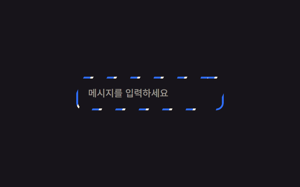 01 border-animation-rotating-gradient-border
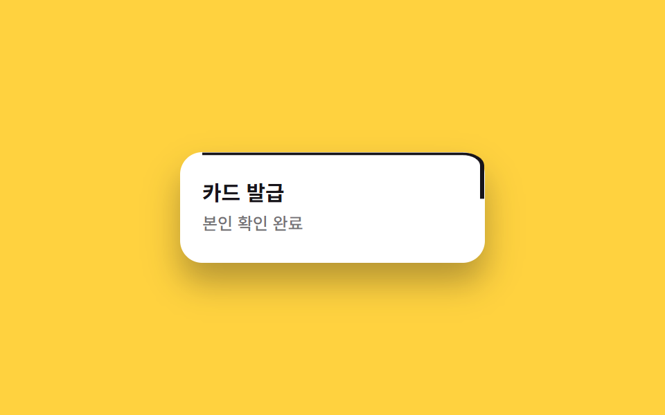 02 border-animation-draw-border-svg
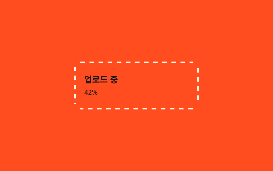 03 border-animation-dashed-run
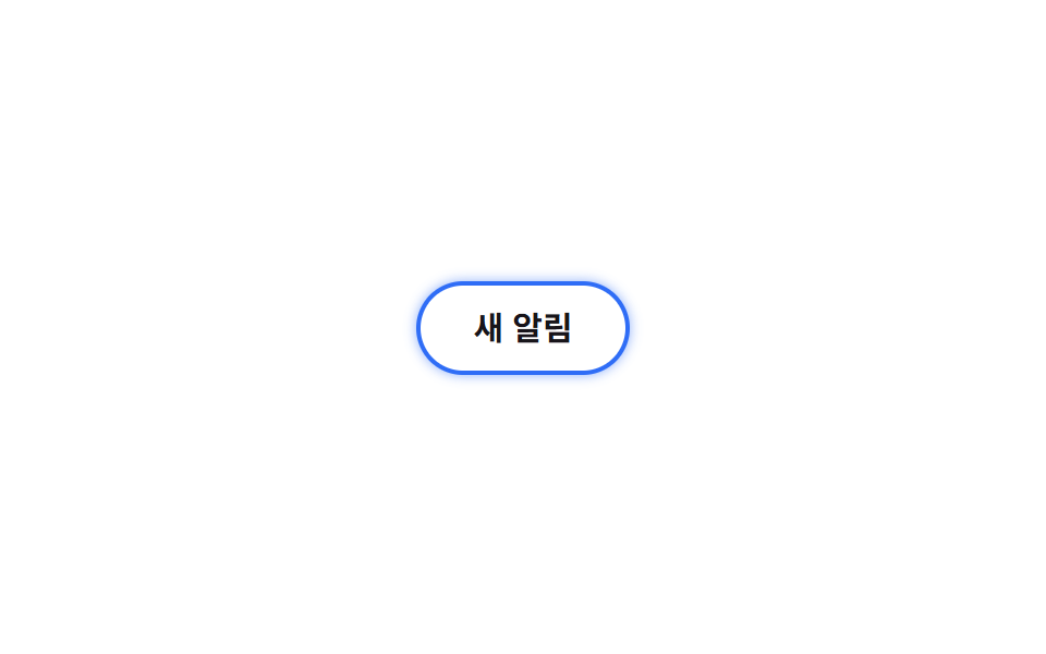 04 border-animation-glow-pulse-border
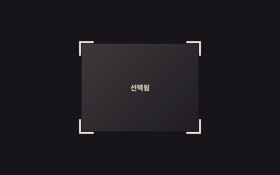 05 border-animation-corner-brackets
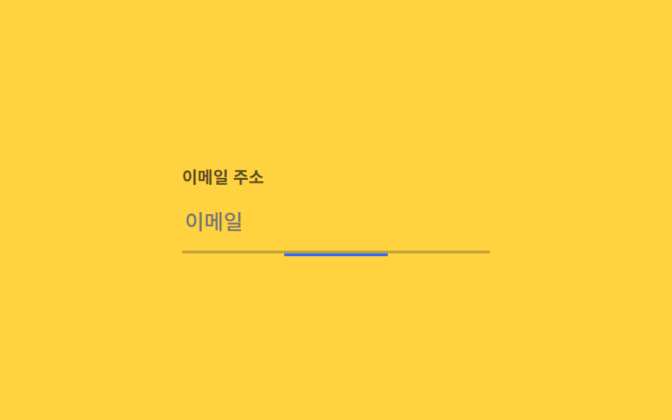 06 border-animation-underline-grow
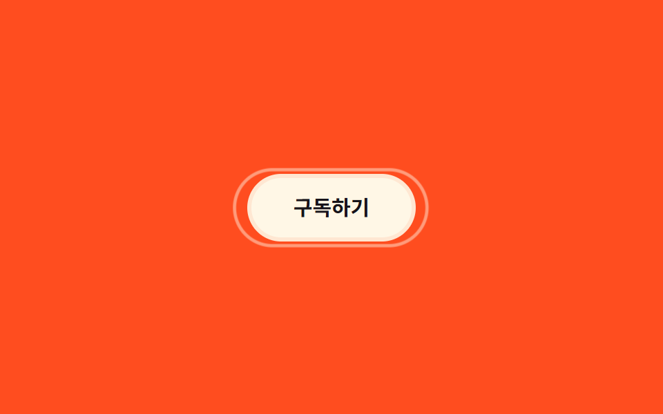 07 border-animation-double-ring
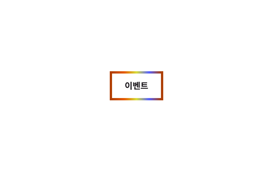 08 border-animation-rainbow-border
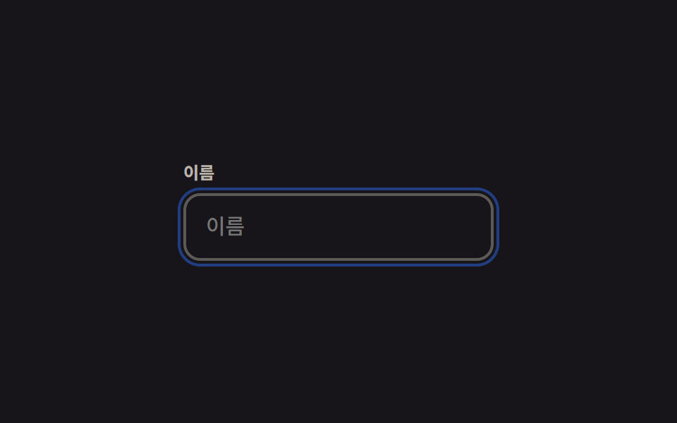 09 border-animation-focus-ring-animate
Tự chạy · bấm ô để tới mục đó · cả 9 trong một zip
- 01 Viền quét sáng chéo
- 02 Vẽ viền bằng SVG
- 03 Nét đứt chạy quanh viền
- 04 Viền phát sáng nhấp nháy
- 05 Ngoặc góc
- 06 Gạch chân mở rộng
- 07 Viền vòng đôi
- 08 Viền cầu vồng
- 09 Vòng focus có animation
Thứ tự chín viền dưới đây đi theo loại tín hiệu mà chúng đang báo: 01 đến 04 báo có gì đó đang xử lý hoặc đang tải, 05 và 06 đánh dấu chỗ bạn vừa chọn hoặc vừa đưa focus tới, 07 chỉ phản hồi khi bạn hover vào, 08 dành cho một khoảnh khắc đặc biệt, còn 09 là vòng focus dành riêng cho bàn phím. Mỗi phần dưới đây chỉ trích đoạn SCSS quyết định chuyển động, còn phần thiết lập HTML đầy đủ của cả chín file nằm gọn trong bản nén ở cuối bài.
01Viền quét sáng chéo
Bạn thấy gì
Một vòng mỏng cắt đúng hình viền mang gradient sọc chéo, rồi trượt background-position không ngừng khiến cả khung trông như đang chảy sáng cùng lúc.
<main class="stage">
  <div class="frame is-demo">
    <input class="frame__input" type="text" placeholder="Nhập tin nhắn" readonly>
  </div>
</main>
@use "../../../../site/static/demo-tokens" as *;
$duration: $dur-loop; // 줄무늬가 한 바퀴 흐르는 시간
$easing: linear; // 흐름은 일정 속도로
$color: $subject-blue; // 줄무늬 색
@include stage($stage-ink);
.stage { padding: clamp(6px, 2.4vw, 16px); }
.frame {
position: relative;
width: min(230px, 74vw);
border-radius: $r-control;
padding: 3px;
isolation: isolate;
}
// 테두리 자리에만 보이게 잘라낸 링 위에 대각선 줄무늬를 흘려보낸다
.frame::before {
content: "";
position: absolute;
inset: 0;
border-radius: $r-control;
padding: 3px;
background: repeating-linear-gradient(115deg, $color 0 10px, $subject-cream 10px 14px, transparent 14px 34px);
-webkit-mask: linear-gradient(#000 0 0) content-box, linear-gradient(#000 0 0);
-webkit-mask-composite: xor; // 옛 사파리
mask-composite: exclude; // 표준 (mask 무접두사 지원표: blog-topic 편브리프)
}
.frame.is-demo::before,
.frame:focus-within::before { animation: sweep $duration $easing infinite; }
.frame__input {
position: relative;
display: block;
box-sizing: border-box;
width: 100%;
border: 0;
border-radius: $r-control - 3px;
padding: 14px 16px;
font-weight: 500; font-size: clamp(13px, 3.6vw, 15px); line-height: 1.3; font-family: inherit;
color: $subject-cream;
background: $stage-ink;
}
.frame__input::placeholder { color: rgba($subject-cream, .55); }
@keyframes sweep { to { background-position: 220px 0; } }
@media (prefers-reduced-motion: reduce) {
.frame.is-demo::before, .frame:focus-within::before { animation: none; }
}html, body {
margin: 0;
overflow: hidden;
}
.stage {
box-sizing: border-box;
min-height: 100vh;
display: grid;
place-items: center;
margin: 0;
background: #17141a;
font-family: -apple-system, "Segoe UI", "Noto Sans KR", sans-serif;
padding: clamp(8px, 4vw, 24px);
}
.stage {
padding: clamp(6px, 2.4vw, 16px);
}
.frame {
position: relative;
width: min(230px, 74vw);
border-radius: 12px;
padding: 3px;
isolation: isolate;
}
.frame::before {
content: "";
position: absolute;
inset: 0;
border-radius: 12px;
padding: 3px;
background: repeating-linear-gradient(115deg, #2f6df6 0 10px, #fff7e6 10px 14px, transparent 14px 34px);
-webkit-mask: linear-gradient(#000 0 0) content-box, linear-gradient(#000 0 0);
-webkit-mask-composite: xor;
mask-composite: exclude;
}
.frame.is-demo::before,
.frame:focus-within::before {
animation: sweep 2s linear infinite;
}
.frame__input {
position: relative;
display: block;
box-sizing: border-box;
width: 100%;
border: 0;
border-radius: 9px;
padding: 14px 16px;
font-weight: 500;
font-size: clamp(13px, 3.6vw, 15px);
line-height: 1.3;
font-family: inherit;
color: #fff7e6;
background: #17141a;
}
.frame__input::placeholder {
color: rgba(255, 247, 230, 0.55);
}
@keyframes sweep {
to {
background-position: 220px 0;
}
}
@media (prefers-reduced-motion: reduce) {
.frame.is-demo::before, .frame:focus-within::before {
animation: none;
}
}import type { CSSProperties } from "react";
import styles from "./SweepBorderInput.module.scss";
export type SweepBorderInputProps = {
placeholder: string;
/** 줄무늬가 한 바퀴 흐르는 시간 (기본 2000ms) */
duration?: number;
easing?: string;
/** 줄무늬 색 */
color?: string;
};
type Vars = CSSProperties & { "--duration"?: string; "--easing"?: string; "--color"?: string };
export default function SweepBorderInput({
placeholder,
duration = 2000,
easing = "linear",
color = "#2f6df6",
}: SweepBorderInputProps) {
const vars: Vars = { "--duration": `${duration}ms`, "--easing": easing, "--color": color };
return (
<div className={styles.frame} style={vars}>
<input className={styles.input} type="text" placeholder={placeholder} readOnly />
</div>
);
}01 · Viền quét sáng chéo — Diện tích đo được 1.167% · khung hình chuyển động 23/23Nguyên tác GODRICH · SCSS và React nằm trong tệp zip · Xem mật khẩu
Dùng ở đâu
Bạn đặt kiểu này ở viền ô input trong lúc AI đang trả lời, hoặc quanh card gói cước cao cấp.
.frame::before {
  content: "";
  position: absolute; inset: 0; padding: 3px;
  background: repeating-linear-gradient(115deg, $color 0 10px, $subject-cream 10px 14px, transparent 14px 34px);
  -webkit-mask: linear-gradient(#000 0 0) content-box, linear-gradient(#000 0 0);
  -webkit-mask-composite: xor;
  mask-composite: exclude;
  animation: sweep $duration linear infinite;
}
@keyframes sweep { to { background-position: 220px 0; } }
02Vẽ viền bằng SVG
Chuyện gì diễn ra trên màn hình
Viền card được vẽ bằng thẻ rect trong SVG với pathLength="100", nên bạn luôn làm việc với thang 0–100 bất kể chu vi thật của card là bao nhiêu pixel.
<main class="stage">
  <div class="card is-demo">
    <svg class="card__svg" viewBox="0 0 220 130" preserveAspectRatio="none" aria-hidden="true">
      <rect class="card__rect" x="2" y="2" width="216" height="126" rx="14" pathLength="100"></rect>
    </svg>
    <div class="card__body">
      <h3 class="card__title">Phát hành thẻ</h3>
      <p class="card__meta">Đã xác minh danh tính</p>
    </div>
  </div>
</main>
@use "../../../../site/static/demo-tokens" as *;
$duration: $dur-enter; // 실제 트리거(등장) 시 테두리가 다 그려지는 시간
$easing: $ease-out;
$color: $subject-ink; // 선 색
@include stage($stage-yellow);
.stage { padding: clamp(6px, 2.4vw, 16px); }
.card {
position: relative;
width: min(220px, 70vw);
border-radius: $r-card;
background: $stage-paper;
box-shadow: $shadow-raised;
}
.card__svg { position: absolute; inset: 0; width: 100%; height: 100%; overflow: visible; }
.card__rect {
fill: none;
stroke: $color;
stroke-width: 3;
stroke-dasharray: 100; // pathLength="100" 이라 둘레와 무관하게 0~100 단위로 잰다
stroke-dashoffset: 100;
}
// 등장 시 1회는 이 값으로 (예: 카드가 로드된 직후 JS 로 .is-drawn 을 붙인다)
.card.is-drawn .card__rect { animation: draw $duration $easing forwards; }
// 데모 · 문서용 루프: 2초 안에 그려짐 → 유지 → 지워짐을 반복
.card.is-demo .card__rect { animation: draw-loop $dur-loop $easing infinite; }
.card__body { position: relative; padding: 20px 16px; }
.card__title { margin: 0 0 4px; font-weight: 700; font-size: clamp(13px, 3.6vw, 15px); line-height: 1.3; font-family: inherit; color: $stage-ink; }
.card__meta { margin: 0; font-weight: 500; font-size: clamp(11px, 3vw, 12px); line-height: 1.3; font-family: inherit; color: rgba($stage-ink, .6); }
@keyframes draw { to { stroke-dashoffset: 0; } }
@keyframes draw-loop {
0%, 5% { stroke-dashoffset: 100; }
35%, 60% { stroke-dashoffset: 0; }
100% { stroke-dashoffset: -100; }
}
@media (prefers-reduced-motion: reduce) {
.card.is-drawn .card__rect, .card.is-demo .card__rect { animation: none; stroke-dashoffset: 0; }
}html, body {
margin: 0;
overflow: hidden;
}
.stage {
box-sizing: border-box;
min-height: 100vh;
display: grid;
place-items: center;
margin: 0;
background: #ffd23f;
font-family: -apple-system, "Segoe UI", "Noto Sans KR", sans-serif;
padding: clamp(8px, 4vw, 24px);
}
.stage {
padding: clamp(6px, 2.4vw, 16px);
}
.card {
position: relative;
width: min(220px, 70vw);
border-radius: 16px;
background: #ffffff;
box-shadow: 0 14px 24px rgba(23, 20, 26, 0.32);
}
.card__svg {
position: absolute;
inset: 0;
width: 100%;
height: 100%;
overflow: visible;
}
.card__rect {
fill: none;
stroke: #17141a;
stroke-width: 3;
stroke-dasharray: 100;
stroke-dashoffset: 100;
}
.card.is-drawn .card__rect {
animation: draw 600ms ease-out forwards;
}
.card.is-demo .card__rect {
animation: draw-loop 2s ease-out infinite;
}
.card__body {
position: relative;
padding: 20px 16px;
}
.card__title {
margin: 0 0 4px;
font-weight: 700;
font-size: clamp(13px, 3.6vw, 15px);
line-height: 1.3;
font-family: inherit;
color: #17141a;
}
.card__meta {
margin: 0;
font-weight: 500;
font-size: clamp(11px, 3vw, 12px);
line-height: 1.3;
font-family: inherit;
color: rgba(23, 20, 26, 0.6);
}
@keyframes draw {
to {
stroke-dashoffset: 0;
}
}
@keyframes draw-loop {
0%, 5% {
stroke-dashoffset: 100;
}
35%, 60% {
stroke-dashoffset: 0;
}
100% {
stroke-dashoffset: -100;
}
}
@media (prefers-reduced-motion: reduce) {
.card.is-drawn .card__rect, .card.is-demo .card__rect {
animation: none;
stroke-dashoffset: 0;
}
}import type { CSSProperties } from "react";
import styles from "./DrawBorderCard.module.scss";
export type DrawBorderCardProps = {
title: string;
meta: string;
/** 테두리가 다 그려지는 시간 (기본 2000ms, 루프용) */
duration?: number;
easing?: string;
/** 선 색 */
color?: string;
};
type Vars = CSSProperties & { "--duration"?: string; "--easing"?: string; "--color"?: string };
export default function DrawBorderCard({
title,
meta,
duration = 2000,
easing = "ease-out",
color = "#17141a",
}: DrawBorderCardProps) {
const vars: Vars = { "--duration": `${duration}ms`, "--easing": easing, "--color": color };
return (
<div className={styles.card} style={vars}>
<svg className={styles.svg} viewBox="0 0 220 130" preserveAspectRatio="none" aria-hidden="true">
<rect className={styles.rect} x="2" y="2" width="216" height="126" rx="14" pathLength={100} />
</svg>
<div className={styles.body}>
<h3 className={styles.title}>{title}</h3>
<p className={styles.meta}>{meta}</p>
</div>
</div>
);
}02 · Vẽ viền bằng SVG — Diện tích đo được 1.148% · khung hình chuyển động 17/23Nguyên tác GODRICH · SCSS và React nằm trong tệp zip · Xem mật khẩu
Chỗ dùng
Giảm stroke-dashoffset từ 100 về 0 khiến đường viền nối lại như một cây bút đang vẽ, hợp với khoảnh khắc thẻ vừa được phát hành.
// pathLength="100" trên rect — làm việc theo thang 0–100, không quan tâm chu vi thật là bao nhiêu px
.card__rect {
  stroke-dasharray: 100;
  stroke-dashoffset: 100;
  animation: draw-loop $dur-loop $easing infinite;
}
@keyframes draw-loop {
  0%, 5%   { stroke-dashoffset: 100; }
  35%, 60% { stroke-dashoffset: 0; }
  100%     { stroke-dashoffset: -100; }
}
03Nét đứt chạy quanh viền
Chuyển động thế nào
Mỗi cạnh trong số bốn cạnh mang một nền gradient nét đứt của riêng nó, và trượt background-position theo đúng hướng cạnh đó khiến nét đứt trông như đang chạy vòng theo chiều kim đồng hồ.
<main class="stage">
  <div class="frame is-demo">
    <span class="frame__edge frame__edge--top" aria-hidden="true"></span>
    <span class="frame__edge frame__edge--right" aria-hidden="true"></span>
    <span class="frame__edge frame__edge--bottom" aria-hidden="true"></span>
    <span class="frame__edge frame__edge--left" aria-hidden="true"></span>
    <div class="frame__body">
      <p class="frame__label">Đang tải lên</p>
      <p class="frame__pct">42%</p>
    </div>
  </div>
</main>
@use "../../../../site/static/demo-tokens" as *;
$duration: $dur-loop; // 한 바퀴 도는 시간
$easing: linear;
$color: $subject-cream; // 점선 색
@include stage($stage-orange);
.stage { padding: clamp(6px, 2.4vw, 16px); }
.frame {
position: relative;
width: min(220px, 70vw);
border-radius: 10px;
}
// 네 변을 따로 두고 각자의 방향으로 점선 배경을 흘려보낸다 — 한꺼번에 돌면 시계 방향으로 도는 것처럼 보인다
.frame__edge { position: absolute; }
.frame__edge--top, .frame__edge--bottom {
left: 10px; right: 10px; height: 3px;
background-image: repeating-linear-gradient(90deg, $color 0 8px, transparent 8px 16px);
}
.frame__edge--left, .frame__edge--right {
top: 10px; bottom: 10px; width: 3px;
background-image: repeating-linear-gradient(180deg, $color 0 8px, transparent 8px 16px);
}
.frame__edge--top { top: 0; }
.frame__edge--bottom { bottom: 0; }
.frame__edge--left { left: 0; }
.frame__edge--right { right: 0; }
.frame.is-demo .frame__edge--top { animation: run-x $duration $easing infinite; }
.frame.is-demo .frame__edge--bottom { animation: run-x-rev $duration $easing infinite; }
.frame.is-demo .frame__edge--left { animation: run-y-rev $duration $easing infinite; }
.frame.is-demo .frame__edge--right { animation: run-y $duration $easing infinite; }
@keyframes run-x { to { background-position: 32px 0; } }
@keyframes run-x-rev { to { background-position: -32px 0; } }
@keyframes run-y { to { background-position: 0 32px; } }
@keyframes run-y-rev { to { background-position: 0 -32px; } }
.frame__body { padding: 22px 18px; }
.frame__label { margin: 0 0 4px; font-weight: 700; font-size: clamp(13px, 3.6vw, 15px); line-height: 1.3; font-family: inherit; color: $subject-ink; }
.frame__pct { margin: 0; font-weight: 500; font-size: clamp(11px, 3vw, 12px); line-height: 1.3; font-family: inherit; color: $subject-ink; }
@media (prefers-reduced-motion: reduce) {
.frame.is-demo .frame__edge { animation: none; }
}html, body {
margin: 0;
overflow: hidden;
}
.stage {
box-sizing: border-box;
min-height: 100vh;
display: grid;
place-items: center;
margin: 0;
background: #ff4d1f;
font-family: -apple-system, "Segoe UI", "Noto Sans KR", sans-serif;
padding: clamp(8px, 4vw, 24px);
}
.stage {
padding: clamp(6px, 2.4vw, 16px);
}
.frame {
position: relative;
width: min(220px, 70vw);
border-radius: 10px;
}
.frame__edge {
position: absolute;
}
.frame__edge--top, .frame__edge--bottom {
left: 10px;
right: 10px;
height: 3px;
background-image: repeating-linear-gradient(90deg, #fff7e6 0 8px, transparent 8px 16px);
}
.frame__edge--left, .frame__edge--right {
top: 10px;
bottom: 10px;
width: 3px;
background-image: repeating-linear-gradient(180deg, #fff7e6 0 8px, transparent 8px 16px);
}
.frame__edge--top {
top: 0;
}
.frame__edge--bottom {
bottom: 0;
}
.frame__edge--left {
left: 0;
}
.frame__edge--right {
right: 0;
}
.frame.is-demo .frame__edge--top {
animation: run-x 2s linear infinite;
}
.frame.is-demo .frame__edge--bottom {
animation: run-x-rev 2s linear infinite;
}
.frame.is-demo .frame__edge--left {
animation: run-y-rev 2s linear infinite;
}
.frame.is-demo .frame__edge--right {
animation: run-y 2s linear infinite;
}
@keyframes run-x {
to {
background-position: 32px 0;
}
}
@keyframes run-x-rev {
to {
background-position: -32px 0;
}
}
@keyframes run-y {
to {
background-position: 0 32px;
}
}
@keyframes run-y-rev {
to {
background-position: 0 -32px;
}
}
.frame__body {
padding: 22px 18px;
}
.frame__label {
margin: 0 0 4px;
font-weight: 700;
font-size: clamp(13px, 3.6vw, 15px);
line-height: 1.3;
font-family: inherit;
color: #17141a;
}
.frame__pct {
margin: 0;
font-weight: 500;
font-size: clamp(11px, 3vw, 12px);
line-height: 1.3;
font-family: inherit;
color: #17141a;
}
@media (prefers-reduced-motion: reduce) {
.frame.is-demo .frame__edge {
animation: none;
}
}import type { CSSProperties } from "react";
import styles from "./DashedRunFrame.module.scss";
export type DashedRunFrameProps = {
label: string;
pct: string;
/** 한 바퀴 도는 시간 (기본 2000ms) */
duration?: number;
easing?: string;
/** 점선 색 */
color?: string;
};
type Vars = CSSProperties & { "--duration"?: string; "--easing"?: string; "--color"?: string };
export default function DashedRunFrame({
label,
pct,
duration = 2000,
easing = "linear",
color = "#fff7e6",
}: DashedRunFrameProps) {
const vars: Vars = { "--duration": `${duration}ms`, "--easing": easing, "--color": color };
return (
<div className={styles.frame} style={vars}>
<span className={`${styles.edge} ${styles.top}`} aria-hidden="true" />
<span className={`${styles.edge} ${styles.right}`} aria-hidden="true" />
<span className={`${styles.edge} ${styles.bottom}`} aria-hidden="true" />
<span className={`${styles.edge} ${styles.left}`} aria-hidden="true" />
<div className={styles.body}>
<p className={styles.label}>{label}</p>
<p className={styles.pct}>{pct}</p>
</div>
</div>
);
}03 · Nét đứt chạy quanh viền — Diện tích đo được 1.1% · khung hình chuyển động 23/23Nguyên tác GODRICH · SCSS và React nằm trong tệp zip · Xem mật khẩu
Dùng khi nào
Đặt nó ở viền của card đang tải lên, hoặc ở bất kỳ đâu cần báo trạng thái chờ.
.frame__edge--top, .frame__edge--bottom {
  background-image: repeating-linear-gradient(90deg, $color 0 8px, transparent 8px 16px);
}
.frame__edge--left, .frame__edge--right {
  background-image: repeating-linear-gradient(180deg, $color 0 8px, transparent 8px 16px);
}
.frame.is-demo .frame__edge--top    { animation: run-x $duration linear infinite; }
.frame.is-demo .frame__edge--bottom { animation: run-x-rev $duration linear infinite; }
@keyframes run-x     { to { background-position: 32px 0; } }
@keyframes run-x-rev { to { background-position: -32px 0; } }
04Viền phát sáng nhấp nháy
Bạn thấy gì
Một giá trị kiểu <length> mang tên --glow được đăng ký qua @property rồi animate từ 0 lên 16px, nên bán kính mờ của box-shadow lớn dần và nhỏ lại mượt mà thay vì nhảy khựng.
<main class="stage">
  <span class="badge is-demo">Thông báo mới</span>
</main>
@use "../../../../site/static/demo-tokens" as *;
$duration: $dur-loop; // 한 번 번졌다 가라앉는 시간
$easing: $ease-spring;
$color: $subject-blue; // 번짐 색
@include stage($stage-paper);
.stage { padding: clamp(6px, 2.4vw, 16px); }
// @property 로 길이를 등록해야 box-shadow 번짐 반경이 중간값을 거치며 부드럽게 바뀐다
@property --glow {
syntax: "<length>";
inherits: false;
initial-value: 0px;
}
.badge {
display: inline-block;
border: 2px solid $color;
border-radius: $r-pill;
padding: 12px 24px;
font-weight: 700; font-size: clamp(13px, 3.6vw, 15px); line-height: 1; font-family: inherit;
color: $stage-ink;
background: $stage-paper;
box-shadow: 0 0 var(--glow) 0 rgba($color, .55);
}
.badge.is-demo { animation: glow $duration $easing infinite; }
@keyframes glow {
0%, 100% { --glow: 0px; }
50% { --glow: 16px; }
}
@media (prefers-reduced-motion: reduce) {
.badge.is-demo { animation: none; --glow: 8px; }
}html, body {
margin: 0;
overflow: hidden;
}
.stage {
box-sizing: border-box;
min-height: 100vh;
display: grid;
place-items: center;
margin: 0;
background: #ffffff;
font-family: -apple-system, "Segoe UI", "Noto Sans KR", sans-serif;
padding: clamp(8px, 4vw, 24px);
}
.stage {
padding: clamp(6px, 2.4vw, 16px);
}
@property --glow {
syntax: "<length>";
inherits: false;
initial-value: 0px;
}
.badge {
display: inline-block;
border: 2px solid #2f6df6;
border-radius: 999px;
padding: 12px 24px;
font-weight: 700;
font-size: clamp(13px, 3.6vw, 15px);
line-height: 1;
font-family: inherit;
color: #17141a;
background: #ffffff;
box-shadow: 0 0 var(--glow) 0 rgba(47, 109, 246, 0.55);
}
.badge.is-demo {
animation: glow 2s cubic-bezier(0.2, 0.8, 0.2, 1) infinite;
}
@keyframes glow {
0%, 100% {
--glow: 0px;
}
50% {
--glow: 16px;
}
}
@media (prefers-reduced-motion: reduce) {
.badge.is-demo {
animation: none;
--glow: 8px;
}
}import type { CSSProperties } from "react";
import styles from "./GlowPulseBadge.module.scss";
export type GlowPulseBadgeProps = {
label: string;
/** 번졌다 가라앉는 한 번의 시간 (기본 2000ms) */
duration?: number;
easing?: string;
/** 번짐 색 */
color?: string;
};
type Vars = CSSProperties & { "--duration"?: string; "--easing"?: string; "--color"?: string };
export default function GlowPulseBadge({
label,
duration = 2000,
easing = "cubic-bezier(.2,.8,.2,1)",
color = "#2f6df6",
}: GlowPulseBadgeProps) {
const vars: Vars = { "--duration": `${duration}ms`, "--easing": easing, "--color": color };
return <span className={styles.badge} style={vars}>{label}</span>;
}04 · Viền phát sáng nhấp nháy — Diện tích đo được 1.765% · khung hình chuyển động 8/23Nguyên tác GODRICH · SCSS và React nằm trong tệp zip · Xem mật khẩu
Dùng ở đâu
Đây là kiểu bạn gắn cho badge thông báo hay card đang cập nhật theo thời gian thực.
@property --glow {
  syntax: "<length>";
  inherits: false;
  initial-value: 0px;
}
.badge {
  box-shadow: 0 0 var(--glow) 0 rgba($color, .55);
  animation: glow $duration $easing infinite;
}
@keyframes glow { 0%, 100% { --glow: 0px; } 50% { --glow: 16px; } }
05Ngoặc góc
Chuyện gì diễn ra trên màn hình
Bốn ngoặc chữ L đặt riêng ở bốn góc, mỗi cái mở ra theo đúng hướng chéo của góc đó khi hover hoặc focus, tạo cảm giác giống khung lấy nét của máy ảnh đang mở ra.
<main class="stage">
  <div class="frame is-demo" tabindex="0">
    <span class="frame__bracket frame__bracket--tl" aria-hidden="true"></span>
    <span class="frame__bracket frame__bracket--tr" aria-hidden="true"></span>
    <span class="frame__bracket frame__bracket--bl" aria-hidden="true"></span>
    <span class="frame__bracket frame__bracket--br" aria-hidden="true"></span>
    <span class="frame__label">Đã chọn</span>
  </div>
</main>
@use "../../../../site/static/demo-tokens" as *;
$duration: $dur-base; // 실제 호버 시 브래킷이 벌어지는 시간
$easing: $ease-pop;
$color: $subject-cream; // 브래킷 색
@include stage($stage-ink);
.stage { padding: clamp(6px, 2.4vw, 16px); }
.frame {
position: relative;
width: min(200px, 64vw);
aspect-ratio: 4 / 3;
border-radius: 4px;
background: linear-gradient(135deg, rgba($color, .16), rgba($color, .04));
display: grid;
place-items: center;
outline: none;
}
.frame__bracket {
position: absolute;
width: 22px;
height: 22px;
border: 3px solid $color;
transition: transform $duration $easing;
}
.frame__bracket--tl { top: -3px; left: -3px; border-right: 0; border-bottom: 0; }
.frame__bracket--tr { top: -3px; right: -3px; border-left: 0; border-bottom: 0; }
.frame__bracket--bl { bottom: -3px; left: -3px; border-right: 0; border-top: 0; }
.frame__bracket--br { bottom: -3px; right: -3px; border-left: 0; border-top: 0; }
.frame:hover .frame__bracket--tl, .frame:focus-visible .frame__bracket--tl { transform: translate(-6px, -6px); }
.frame:hover .frame__bracket--tr, .frame:focus-visible .frame__bracket--tr { transform: translate(6px, -6px); }
.frame:hover .frame__bracket--bl, .frame:focus-visible .frame__bracket--bl { transform: translate(-6px, 6px); }
.frame:hover .frame__bracket--br, .frame:focus-visible .frame__bracket--br { transform: translate(6px, 6px); }
// 데모 루프: 2초 안에서 벌어짐 → 유지 → 되돌아옴
.frame.is-demo .frame__bracket--tl { animation: open-tl $dur-loop $easing infinite; }
.frame.is-demo .frame__bracket--tr { animation: open-tr $dur-loop $easing infinite; }
.frame.is-demo .frame__bracket--bl { animation: open-bl $dur-loop $easing infinite; }
.frame.is-demo .frame__bracket--br { animation: open-br $dur-loop $easing infinite; }
@keyframes open-tl { 0%, 15% { transform: translate(0, 0); } 50%, 70% { transform: translate(-6px, -6px); } 100% { transform: translate(0, 0); } }
@keyframes open-tr { 0%, 15% { transform: translate(0, 0); } 50%, 70% { transform: translate(6px, -6px); } 100% { transform: translate(0, 0); } }
@keyframes open-bl { 0%, 15% { transform: translate(0, 0); } 50%, 70% { transform: translate(-6px, 6px); } 100% { transform: translate(0, 0); } }
@keyframes open-br { 0%, 15% { transform: translate(0, 0); } 50%, 70% { transform: translate(6px, 6px); } 100% { transform: translate(0, 0); } }
.frame__label { font-weight: 600; font-size: clamp(11px, 3vw, 12px); line-height: 1; font-family: inherit; color: rgba($color, .8); }
@media (prefers-reduced-motion: reduce) {
.frame.is-demo .frame__bracket { animation: none; }
}html, body {
margin: 0;
overflow: hidden;
}
.stage {
box-sizing: border-box;
min-height: 100vh;
display: grid;
place-items: center;
margin: 0;
background: #17141a;
font-family: -apple-system, "Segoe UI", "Noto Sans KR", sans-serif;
padding: clamp(8px, 4vw, 24px);
}
.stage {
padding: clamp(6px, 2.4vw, 16px);
}
.frame {
position: relative;
width: min(200px, 64vw);
aspect-ratio: 4/3;
border-radius: 4px;
background: linear-gradient(135deg, rgba(255, 247, 230, 0.16), rgba(255, 247, 230, 0.04));
display: grid;
place-items: center;
outline: none;
}
.frame__bracket {
position: absolute;
width: 22px;
height: 22px;
border: 3px solid #fff7e6;
transition: transform 300ms cubic-bezier(0.2, 1.4, 0.4, 1);
}
.frame__bracket--tl {
top: -3px;
left: -3px;
border-right: 0;
border-bottom: 0;
}
.frame__bracket--tr {
top: -3px;
right: -3px;
border-left: 0;
border-bottom: 0;
}
.frame__bracket--bl {
bottom: -3px;
left: -3px;
border-right: 0;
border-top: 0;
}
.frame__bracket--br {
bottom: -3px;
right: -3px;
border-left: 0;
border-top: 0;
}
.frame:hover .frame__bracket--tl, .frame:focus-visible .frame__bracket--tl {
transform: translate(-6px, -6px);
}
.frame:hover .frame__bracket--tr, .frame:focus-visible .frame__bracket--tr {
transform: translate(6px, -6px);
}
.frame:hover .frame__bracket--bl, .frame:focus-visible .frame__bracket--bl {
transform: translate(-6px, 6px);
}
.frame:hover .frame__bracket--br, .frame:focus-visible .frame__bracket--br {
transform: translate(6px, 6px);
}
.frame.is-demo .frame__bracket--tl {
animation: open-tl 2s cubic-bezier(0.2, 1.4, 0.4, 1) infinite;
}
.frame.is-demo .frame__bracket--tr {
animation: open-tr 2s cubic-bezier(0.2, 1.4, 0.4, 1) infinite;
}
.frame.is-demo .frame__bracket--bl {
animation: open-bl 2s cubic-bezier(0.2, 1.4, 0.4, 1) infinite;
}
.frame.is-demo .frame__bracket--br {
animation: open-br 2s cubic-bezier(0.2, 1.4, 0.4, 1) infinite;
}
@keyframes open-tl {
0%, 15% {
transform: translate(0, 0);
}
50%, 70% {
transform: translate(-6px, -6px);
}
100% {
transform: translate(0, 0);
}
}
@keyframes open-tr {
0%, 15% {
transform: translate(0, 0);
}
50%, 70% {
transform: translate(6px, -6px);
}
100% {
transform: translate(0, 0);
}
}
@keyframes open-bl {
0%, 15% {
transform: translate(0, 0);
}
50%, 70% {
transform: translate(-6px, 6px);
}
100% {
transform: translate(0, 0);
}
}
@keyframes open-br {
0%, 15% {
transform: translate(0, 0);
}
50%, 70% {
transform: translate(6px, 6px);
}
100% {
transform: translate(0, 0);
}
}
.frame__label {
font-weight: 600;
font-size: clamp(11px, 3vw, 12px);
line-height: 1;
font-family: inherit;
color: rgba(255, 247, 230, 0.8);
}
@media (prefers-reduced-motion: reduce) {
.frame.is-demo .frame__bracket {
animation: none;
}
}import type { CSSProperties } from "react";
import styles from "./CornerBracketsFrame.module.scss";
export type CornerBracketsFrameProps = {
label: string;
/** 브래킷이 벌어지는 시간 (기본 2000ms, 루프용) */
duration?: number;
easing?: string;
/** 브래킷 색 */
color?: string;
};
type Vars = CSSProperties & { "--duration"?: string; "--easing"?: string; "--color"?: string };
export default function CornerBracketsFrame({
label,
duration = 2000,
easing = "cubic-bezier(.2,1.4,.4,1)",
color = "#fff7e6",
}: CornerBracketsFrameProps) {
const vars: Vars = { "--duration": `${duration}ms`, "--easing": easing, "--color": color };
return (
<div className={styles.frame} style={vars} tabIndex={0}>
<span className={`${styles.bracket} ${styles.tl}`} aria-hidden="true" />
<span className={`${styles.bracket} ${styles.tr}`} aria-hidden="true" />
<span className={`${styles.bracket} ${styles.bl}`} aria-hidden="true" />
<span className={`${styles.bracket} ${styles.br}`} aria-hidden="true" />
<span className={styles.label}>{label}</span>
</div>
);
}05 · Ngoặc góc — Diện tích đo được 1.503% · khung hình chuyển động 15/23Nguyên tác GODRICH · SCSS và React nằm trong tệp zip · Xem mật khẩu
Chỗ dùng
Card trong thư viện ảnh dùng kiểu này để đánh dấu ảnh bạn vừa chọn.
.frame__bracket--tl { top: -3px; left: -3px; border-right: 0; border-bottom: 0; }
.frame__bracket--tr { top: -3px; right: -3px; border-left: 0; border-bottom: 0; }
.frame.is-demo .frame__bracket--tl { animation: open-tl $dur-loop $easing infinite; }
@keyframes open-tl {
  0%, 15%  { transform: translate(0, 0); }
  50%, 70% { transform: translate(-6px, -6px); }
  100%     { transform: translate(0, 0); }
}
06Gạch chân mở rộng
Chuyển động thế nào
Thanh chỉ báo dưới ô nhập giữ left: 50%; right: 50% để gập lại ở giữa, và khi ô nhập nhận focus cả hai giá trị chuyển về 0 cùng lúc nên thanh nở ra đều về hai bên.
<main class="stage">
  <div class="field is-demo">
    <label class="field__label" for="email">Địa chỉ email</label>
    <input class="field__input" id="email" type="email" placeholder="Email">
    <span class="field__bar" aria-hidden="true"></span>
  </div>
</main>
@use "../../../../site/static/demo-tokens" as *;
$duration: $dur-quick; // 실제 포커스 시 밑줄이 벌어지는 시간
$easing: $ease-out;
$color: $subject-blue; // 밑줄 색
@include stage($stage-yellow);
.stage { padding: clamp(6px, 2.4vw, 16px); }
.field {
position: relative;
width: min(220px, 70vw);
}
.field__label {
display: block;
margin-bottom: 4px;
font-weight: 600; font-size: clamp(11px, 3vw, 12px); line-height: 1.3; font-family: inherit;
color: rgba($stage-ink, .7);
}
.field__input {
box-sizing: border-box;
width: 100%;
border: 0;
border-bottom: 2px solid rgba($stage-ink, .25);
background: transparent;
padding: 10px 2px;
font-weight: 500; font-size: clamp(13px, 3.6vw, 15px); line-height: 1.3; font-family: inherit;
color: $stage-ink;
}
.field__bar {
position: absolute;
left: 50%; right: 50%; bottom: -2px;
height: 2px;
background: $color;
transition: left $duration $easing, right $duration $easing;
}
.field__input:focus + .field__bar { left: 0; right: 0; }
// 데모 루프: 가운데서 시작 → 양쪽으로 채워짐 → 다시 가운데로
.field.is-demo .field__bar { animation: grow $dur-loop $easing infinite; }
@keyframes grow {
0%, 10% { left: 50%; right: 50%; }
40%, 60% { left: 0; right: 0; }
100% { left: 50%; right: 50%; }
}
@media (prefers-reduced-motion: reduce) {
.field__bar { transition: none; }
.field.is-demo .field__bar { animation: none; left: 0; right: 0; }
}html, body {
margin: 0;
overflow: hidden;
}
.stage {
box-sizing: border-box;
min-height: 100vh;
display: grid;
place-items: center;
margin: 0;
background: #ffd23f;
font-family: -apple-system, "Segoe UI", "Noto Sans KR", sans-serif;
padding: clamp(8px, 4vw, 24px);
}
.stage {
padding: clamp(6px, 2.4vw, 16px);
}
.field {
position: relative;
width: min(220px, 70vw);
}
.field__label {
display: block;
margin-bottom: 4px;
font-weight: 600;
font-size: clamp(11px, 3vw, 12px);
line-height: 1.3;
font-family: inherit;
color: rgba(23, 20, 26, 0.7);
}
.field__input {
box-sizing: border-box;
width: 100%;
border: 0;
border-bottom: 2px solid rgba(23, 20, 26, 0.25);
background: transparent;
padding: 10px 2px;
font-weight: 500;
font-size: clamp(13px, 3.6vw, 15px);
line-height: 1.3;
font-family: inherit;
color: #17141a;
}
.field__bar {
position: absolute;
left: 50%;
right: 50%;
bottom: -2px;
height: 2px;
background: #2f6df6;
transition: left 220ms ease-out, right 220ms ease-out;
}
.field__input:focus + .field__bar {
left: 0;
right: 0;
}
.field.is-demo .field__bar {
animation: grow 2s ease-out infinite;
}
@keyframes grow {
0%, 10% {
left: 50%;
right: 50%;
}
40%, 60% {
left: 0;
right: 0;
}
100% {
left: 50%;
right: 50%;
}
}
@media (prefers-reduced-motion: reduce) {
.field__bar {
transition: none;
}
.field.is-demo .field__bar {
animation: none;
left: 0;
right: 0;
}
}import type { CSSProperties } from "react";
import styles from "./UnderlineGrowField.module.scss";
export type UnderlineGrowFieldProps = {
label: string;
placeholder: string;
/** 실제 포커스 시 밑줄이 벌어지는 시간 (기본 220ms) */
duration?: number;
easing?: string;
/** 밑줄 색 */
color?: string;
};
type Vars = CSSProperties & { "--duration"?: string; "--easing"?: string; "--color"?: string };
export default function UnderlineGrowField({
label,
placeholder,
duration = 220,
easing = "ease-out",
color = "#2f6df6",
}: UnderlineGrowFieldProps) {
const vars: Vars = { "--duration": `${duration}ms`, "--easing": easing, "--color": color };
const id = "field-" + label.replace(/\s+/g, "-").toLowerCase();
return (
<div className={styles.field} style={vars}>
<label className={styles.label} htmlFor={id}>{label}</label>
<input className={styles.input} id={id} type="text" placeholder={placeholder} />
<span className={styles.bar} aria-hidden="true" />
</div>
);
}06 · Gạch chân mở rộng — Diện tích đo được 0.306% · khung hình chuyển động 17/23Nguyên tác GODRICH · SCSS và React nằm trong tệp zip · Xem mật khẩu
Dùng khi nào
Dùng left/right thay vì scaleX vì cách này cho phép mở rộng đúng tâm mà không cần khai riêng transform-origin.
.field__bar {
  position: absolute;
  left: 50%; right: 50%; bottom: -2px;
  background: $color;
  transition: left $duration $easing, right $duration $easing;
}
.field__input:focus + .field__bar { left: 0; right: 0; }
07Viền vòng đôi
Bạn thấy gì
box-shadow giữ một vòng trong cố định, còn ::after dựng thêm vòng thứ hai vốn ẩn đi lúc bình thường, khi hover hay focus nó scale lớn dần trong lúc opacity tăng dần nên trông như gợn sóng lan ra.
<main class="stage">
  <button class="btn is-demo" type="button">Đăng ký</button>
</main>
@use "../../../../site/static/demo-tokens" as *;
$duration: $dur-base; // 실제 호버 시 바깥 링이 퍼지는 시간
$easing: $ease-out;
$color: $subject-cream; // 링 색
@include stage($stage-orange);
.stage { padding: clamp(6px, 2.4vw, 16px); }
.btn {
position: relative;
border: 0;
border-radius: $r-pill;
padding: 14px 30px;
font-weight: 700; font-size: clamp(13px, 3.6vw, 15px); line-height: 1; font-family: inherit;
color: $stage-ink;
background: $color;
cursor: pointer;
box-shadow: 0 0 0 3px rgba($color, .9); // 안쪽 고정 링
}
.btn::after { // 바깥 링 — 평소엔 숨어 있다
content: "";
position: absolute;
inset: -3px;
border-radius: inherit;
border: 2px solid $color;
opacity: 0;
transform: scale(1);
transition: transform $duration $easing, opacity $duration $easing;
}
.btn:hover::after, .btn:focus-visible::after { opacity: 1; transform: scale(1.3); }
.btn.is-demo::after { animation: ring-pulse $dur-loop $easing infinite; }
@keyframes ring-pulse {
0%, 15% { transform: scale(1); opacity: .9; }
70% { transform: scale(1.35); opacity: 0; }
100% { transform: scale(1.35); opacity: 0; }
}
@media (prefers-reduced-motion: reduce) {
.btn::after { transition: none; }
.btn.is-demo::after { animation: none; opacity: 0; }
}html, body {
margin: 0;
overflow: hidden;
}
.stage {
box-sizing: border-box;
min-height: 100vh;
display: grid;
place-items: center;
margin: 0;
background: #ff4d1f;
font-family: -apple-system, "Segoe UI", "Noto Sans KR", sans-serif;
padding: clamp(8px, 4vw, 24px);
}
.stage {
padding: clamp(6px, 2.4vw, 16px);
}
.btn {
position: relative;
border: 0;
border-radius: 999px;
padding: 14px 30px;
font-weight: 700;
font-size: clamp(13px, 3.6vw, 15px);
line-height: 1;
font-family: inherit;
color: #17141a;
background: #fff7e6;
cursor: pointer;
box-shadow: 0 0 0 3px rgba(255, 247, 230, 0.9);
}
.btn::after {
content: "";
position: absolute;
inset: -3px;
border-radius: inherit;
border: 2px solid #fff7e6;
opacity: 0;
transform: scale(1);
transition: transform 300ms ease-out, opacity 300ms ease-out;
}
.btn:hover::after, .btn:focus-visible::after {
opacity: 1;
transform: scale(1.3);
}
.btn.is-demo::after {
animation: ring-pulse 2s ease-out infinite;
}
@keyframes ring-pulse {
0%, 15% {
transform: scale(1);
opacity: 0.9;
}
70% {
transform: scale(1.35);
opacity: 0;
}
100% {
transform: scale(1.35);
opacity: 0;
}
}
@media (prefers-reduced-motion: reduce) {
.btn::after {
transition: none;
}
.btn.is-demo::after {
animation: none;
opacity: 0;
}
}import type { CSSProperties } from "react";
import styles from "./DoubleRingButton.module.scss";
export type DoubleRingButtonProps = {
label: string;
/** 실제 호버 시 바깥 링이 퍼지는 시간 (기본 300ms) */
duration?: number;
easing?: string;
/** 링 색 */
color?: string;
};
type Vars = CSSProperties & { "--duration"?: string; "--easing"?: string; "--color"?: string };
export default function DoubleRingButton({
label,
duration = 300,
easing = "ease-out",
color = "#fff7e6",
}: DoubleRingButtonProps) {
const vars: Vars = { "--duration": `${duration}ms`, "--easing": easing, "--color": color };
return (
<button className={styles.btn} style={vars} type="button">
{label}
</button>
);
}07 · Viền vòng đôi — Diện tích đo được 2.954% · khung hình chuyển động 12/23Nguyên tác GODRICH · SCSS và React nằm trong tệp zip · Xem mật khẩu
Dùng ở đâu
Đây là cách nhấn hover cho nút bấm hay icon thông báo.
.btn::after {
  content: "";
  position: absolute; inset: -3px;
  border: 2px solid $color;
  opacity: 0;
  transform: scale(1);
  transition: transform $duration $easing, opacity $duration $easing;
}
.btn:hover::after, .btn:focus-visible::after { opacity: 1; transform: scale(1.3); }
08Viền cầu vồng
Chuyện gì diễn ra trên màn hình
border-image-source giữ nguyên một gradient cầu vồng đứng yên, chỉ mỗi giá trị filter: hue-rotate quay từ 0deg đến 360deg khiến màu viền tuần hoàn tại chỗ mà gradient không hề dịch chuyển — khác với cú trượt nền ở mục 01.
<main class="stage">
  <span class="badge is-demo">Sự kiện</span>
</main>
@use "../../../../site/static/demo-tokens" as *;
$duration: $dur-loop; // 색이 한 바퀴 도는 시간
$easing: linear;
$color: $stage-orange; // (참고용, 실제 색은 아래 무지개 그라데이션)
@include stage($stage-paper);
.stage { padding: clamp(6px, 2.4vw, 16px); }
.badge {
display: inline-block;
border: 4px solid;
border-image-slice: 1;
// 토큰 4색으로 이은 그라데이션 — 팔레트 밖 hex 를 새로 쓰지 않는다 (blog-design)
border-image-source: linear-gradient(90deg, $error, $stage-orange, $stage-yellow, $subject-blue, $error);
border-radius: 4px;
padding: 14px 22px;
font-weight: 700; font-size: clamp(13px, 3.6vw, 15px); line-height: 1; font-family: inherit;
color: $stage-ink;
background: $stage-paper;
}
// 그라데이션 각도는 그대로 두고 filter: hue-rotate 만 돌려 색만 자리에서 순환시킨다
.badge.is-demo { animation: hue $duration $easing infinite; }
@keyframes hue { to { filter: hue-rotate(360deg); } }
@media (prefers-reduced-motion: reduce) {
.badge.is-demo { animation: none; filter: none; }
}html, body {
margin: 0;
overflow: hidden;
}
.stage {
box-sizing: border-box;
min-height: 100vh;
display: grid;
place-items: center;
margin: 0;
background: #ffffff;
font-family: -apple-system, "Segoe UI", "Noto Sans KR", sans-serif;
padding: clamp(8px, 4vw, 24px);
}
.stage {
padding: clamp(6px, 2.4vw, 16px);
}
.badge {
display: inline-block;
border: 4px solid;
border-image-slice: 1;
border-image-source: linear-gradient(90deg, #c2361a, #ff4d1f, #ffd23f, #2f6df6, #c2361a);
border-radius: 4px;
padding: 14px 22px;
font-weight: 700;
font-size: clamp(13px, 3.6vw, 15px);
line-height: 1;
font-family: inherit;
color: #17141a;
background: #ffffff;
}
.badge.is-demo {
animation: hue 2s linear infinite;
}
@keyframes hue {
to {
filter: hue-rotate(360deg);
}
}
@media (prefers-reduced-motion: reduce) {
.badge.is-demo {
animation: none;
filter: none;
}
}import type { CSSProperties } from "react";
import styles from "./RainbowBorderBadge.module.scss";
export type RainbowBorderBadgeProps = {
label: string;
/** 색이 한 바퀴 도는 시간 (기본 2000ms) */
duration?: number;
};
type Vars = CSSProperties & { "--duration"?: string };
export default function RainbowBorderBadge({ label, duration = 2000 }: RainbowBorderBadgeProps) {
const vars: Vars = { "--duration": `${duration}ms` };
return <span className={styles.badge} style={vars}>{label}</span>;
}08 · Viền cầu vồng — Diện tích đo được 0.761% · khung hình chuyển động 23/23Nguyên tác GODRICH · SCSS và React nằm trong tệp zip · Xem mật khẩu
Chỗ dùng
Banner sự kiện hay thiệp chúc mừng hợp với sắc màu xoay vòng này.
.badge {
  border: 4px solid;
  border-image-slice: 1;
  border-image-source: linear-gradient(90deg, $error, $stage-orange, $stage-yellow, $subject-blue, $error);
  animation: hue $duration linear infinite;
}
@keyframes hue { to { filter: hue-rotate(360deg); } }
09Vòng focus có animation
Chuyển động thế nào
outline giữ trong suốt lúc bình thường, chỉ khi :focus-visible mới đổi màu và kéo outline-offset từ 0 lên 4px cùng lúc nên vòng trông như bật ra rồi dừng lại.
<main class="stage">
  <div class="field">
    <label class="field__label" for="name">Tên</label>
    <input class="field__input is-demo" id="name" type="text" placeholder="Tên">
  </div>
</main>
@use "../../../../site/static/demo-tokens" as *;
$duration: $dur-quick; // 실제 포커스 시 링이 벌어지는 시간
$easing: $ease-out;
$color: $subject-blue; // 링 색
@include stage($stage-ink);
.stage { padding: clamp(6px, 2.4vw, 16px); }
.field { width: min(220px, 70vw); }
.field__label {
display: block;
margin-bottom: 6px;
font-weight: 600; font-size: clamp(11px, 3vw, 12px); line-height: 1.3; font-family: inherit;
color: rgba($subject-cream, .7);
}
.field__input {
box-sizing: border-box;
width: 100%;
border: 2px solid rgba($subject-cream, .3);
border-radius: $r-control;
padding: 12px 14px;
font-weight: 500; font-size: clamp(13px, 3.6vw, 15px); line-height: 1.3; font-family: inherit;
color: $subject-cream;
background: transparent;
outline: 2px solid transparent;
outline-offset: 0;
transition: outline-color $duration $easing, outline-offset $duration $easing;
}
.field__input:focus-visible { outline-color: $color; outline-offset: 4px; }
// 데모 루프: 링이 붙어 있다가 튀어나오듯 벌어지고 다시 붙는다
.field__input.is-demo { animation: ring $dur-loop $easing infinite; }
@keyframes ring {
0%, 10% { outline-offset: 0; outline-color: rgba($color, .9); }
45%, 65% { outline-offset: 4px; outline-color: rgba($color, .2); }
100% { outline-offset: 0; outline-color: rgba($color, .9); }
}
@media (prefers-reduced-motion: reduce) {
.field__input { transition: none; }
.field__input.is-demo { animation: none; outline-color: rgba($color, .9); }
}html, body {
margin: 0;
overflow: hidden;
}
.stage {
box-sizing: border-box;
min-height: 100vh;
display: grid;
place-items: center;
margin: 0;
background: #17141a;
font-family: -apple-system, "Segoe UI", "Noto Sans KR", sans-serif;
padding: clamp(8px, 4vw, 24px);
}
.stage {
padding: clamp(6px, 2.4vw, 16px);
}
.field {
width: min(220px, 70vw);
}
.field__label {
display: block;
margin-bottom: 6px;
font-weight: 600;
font-size: clamp(11px, 3vw, 12px);
line-height: 1.3;
font-family: inherit;
color: rgba(255, 247, 230, 0.7);
}
.field__input {
box-sizing: border-box;
width: 100%;
border: 2px solid rgba(255, 247, 230, 0.3);
border-radius: 12px;
padding: 12px 14px;
font-weight: 500;
font-size: clamp(13px, 3.6vw, 15px);
line-height: 1.3;
font-family: inherit;
color: #fff7e6;
background: transparent;
outline: 2px solid transparent;
outline-offset: 0;
transition: outline-color 220ms ease-out, outline-offset 220ms ease-out;
}
.field__input:focus-visible {
outline-color: #2f6df6;
outline-offset: 4px;
}
.field__input.is-demo {
animation: ring 2s ease-out infinite;
}
@keyframes ring {
0%, 10% {
outline-offset: 0;
outline-color: rgba(47, 109, 246, 0.9);
}
45%, 65% {
outline-offset: 4px;
outline-color: rgba(47, 109, 246, 0.2);
}
100% {
outline-offset: 0;
outline-color: rgba(47, 109, 246, 0.9);
}
}
@media (prefers-reduced-motion: reduce) {
.field__input {
transition: none;
}
.field__input.is-demo {
animation: none;
outline-color: rgba(47, 109, 246, 0.9);
}
}import type { CSSProperties } from "react";
import styles from "./FocusRingField.module.scss";
export type FocusRingFieldProps = {
label: string;
placeholder: string;
/** 실제 포커스 시 링이 벌어지는 시간 (기본 220ms) */
duration?: number;
easing?: string;
/** 링 색 */
color?: string;
};
type Vars = CSSProperties & { "--duration"?: string; "--easing"?: string; "--color"?: string };
export default function FocusRingField({
label,
placeholder,
duration = 220,
easing = "ease-out",
color = "#2f6df6",
}: FocusRingFieldProps) {
const vars: Vars = { "--duration": `${duration}ms`, "--easing": easing, "--color": color };
const id = "focus-" + label.replace(/\s+/g, "-").toLowerCase();
return (
<div className={styles.field} style={vars}>
<label className={styles.label} htmlFor={id}>{label}</label>
<input className={styles.input} id={id} type="text" placeholder={placeholder} />
</div>
);
}09 · Vòng focus có animation — Diện tích đo được 2.264% · khung hình chuyển động 15/23Nguyên tác GODRICH · SCSS và React nằm trong tệp zip · Xem mật khẩu
Dùng khi nào
Nó không phản ứng với cú click chuột, chỉ phản ứng khi focus đến từ bàn phím.
.field__input {
  outline: 2px solid transparent;
  outline-offset: 0;
  transition: outline-color $duration $easing, outline-offset $duration $easing;
}
.field__input:focus-visible { outline-color: $color; outline-offset: 4px; }
Bẫy nằm ở đâu?
Vùng hỗ trợ mask-composite
01 dựa vào mask-composite để chỉ giữ lại phần viền và khoét bỏ phần giữa. Không kèm tiền tố, thuộc tính này chạy được từ Chrome/Edge 120, Safari 15.4 và Firefox 53 (trang mask-composite của MDN); Chrome cũ hơn mốc đó chỉ đọc được bản có tiền tố -webkit-mask-composite: xor. Bỏ sót một trong hai dòng thì bản demo bạn tự dựng và test trên máy chạy đẹp, nhưng trên trình duyệt cũ hơn cả khối viền lại hiện ra như một ô vuông đặc, không khoét được phần giữa như mong đợi.
Đăng ký kiểu cho @property
Còn một điểm khác đáng nhớ ở 04, thuộc tính @property. Nếu chỉ animate một custom property mà không đăng ký kiểu dữ liệu, trình duyệt không nội suy được giá trị giữa hai mốc nên bước nhảy diễn ra tức thì thay vì mượt. Khai syntax: "<length>" qua @property mới khiến bán kính mờ của 04 lớn nhỏ trơn tru, và cú đăng ký đó chạy từ Chrome/Edge 85, Safari 16.4, Firefox 128 (trang @property của MDN). Bộ file đã gộp sẵn cả hai điểm vừa nói nằm trong bản nén, và mật khẩu mở nó là 4vruzyhz, gõ đúng như bạn thấy, không thêm khoảng trắng.
Chi phí vẽ lại của filter
Điểm thứ ba nằm ở 08, thuộc tính filter. filter vẽ lại toàn bộ nội dung con bên trong phần tử, nên nếu badge chứa nhiều chữ hay icon thì mỗi vòng quay hue-rotate sẽ buộc trình duyệt hợp thành lại cả vùng đó. Viền cầu vồng nên dừng ở kích thước badge nhỏ, đừng gắn lên cả một card lớn hay khung chứa rộng.
Khả năng tiếp cận
Giảm chuyển động theo từng viền
Chín viền đều lắng nghe prefers-reduced-motion: reduce, nhưng không phải viền nào cũng chỉ đơn giản tắt animation. 01, 03 và 08 đứng lại ở một khung hình tĩnh thay vì tiếp tục trượt hay xoay, còn 04 giữ nguyên bán kính mờ ở giá trị giữa. 09 là ngoại lệ có chủ đích: vòng focus bàn phím không phải trang trí mà là tín hiệu "bạn đang ở đây", nên chỉ transition bị tắt còn màu vẫn giữ nguyên.
@media (prefers-reduced-motion: reduce) {
  .frame.is-demo::before, .badge.is-demo, .field__bar { animation: none; transition: none; }
}
Bạn xem thêm các hiệu ứng CSS khác trong chuyên mục CSS, và trang giới thiệu nói rõ site này bán gì.
FAQ
Có thể lấy đúng một hiệu ứng trong chín cái, bỏ phần còn lại không?
Được. Mỗi hiệu ứng đóng gói trong một khối class riêng như .frame, .badge, .btn hay .field, không chia sẻ trạng thái với mục khác, nên copy phần SCSS của một mục cùng khung HTML đi kèm là chạy độc lập ngay. Mục 06 và 09 là hai bản gọn nhất nếu bạn chỉ cần một chỉ báo focus đơn giản.
mask-composite thay bằng border-image được không?
Được một phần. 08 chỉ cần màu đứng yên nên border-image là đủ gọn, nhưng 01 cần trượt nền theo thời gian thực, mà border-image không có thuộc tính tương đương background-position để làm việc đó, nên buộc bạn quay lại mask-composite hoặc SVG như 02.
Bản React trong zip nhận biến CSS qua đâu?
Thư mục react/ trong file nén nhận duration, easing, color làm props rồi ghi vào style inline dưới dạng custom property. Các module SCSS chỉ đọc var(--duration) như vậy, nên đổi tốc độ hay màu chỉ cần sửa props ở nơi gọi component.
Có thể bạn cũng thích
 Phản hồi9 hiệu ứng css dark mode toggle 1 dòng CSS
 Phản hồi9 micro interactions css — dán 1 dòng chạy ngay
 Phản hồi9 CSS Heart Like Animations — dán 1 dòng là chạy
 Phản hồi9 css glow effect — nút chữ phát sáng như neon
 Phản hồi9 css confetti animation — dán một file là chạy
 Phản hồi9 css bounce animation — dán một dòng là chạy
 Phản hồi9 css arrow animation — dán một dòng là chạy
 Phản hồi9 CSS tooltip examples — copy dán một dòng là chạy
 Phản hồi9 hiệu ứng custom cursor css — copy dán một dòng
 Phản hồi9 kiểu css typing animation, copy dán là chạy