08Animation di chuyển khi sắp xếp lại
Đổi tiêu chí sắp xếp thì từng mục trượt mượt về vị trí mới.
Dùng choSắp xếp theo giá, bảng xếp hạng
FLIP 기법300ms순위 뱃지 강조
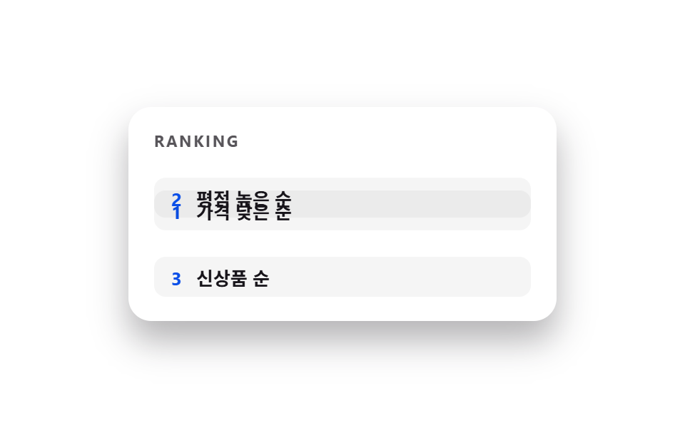
<main class="stage">
  <div class="pages is-demo">
    <p class="page__tag">RANKING</p>
    <div class="rows">
      <div class="row row--1"><span class="row__rank">1</span><span class="row__name">Giá thấp đến cao</span></div>
      <div class="row row--2"><span class="row__rank">2</span><span class="row__name">Đánh giá cao nhất</span></div>
      <div class="row row--3"><span class="row__rank">3</span><span class="row__name">Mới nhất</span></div>
    </div>
  </div>
</main>
@use "../../../../site/static/demo-tokens" as *;
// ── 변수 3개. 변형은 이것만 바꾼다 (값은 토큰에서 받는다) ──────
$duration: $dur-base;
$easing: $ease-spring;
$color: $subject-blue-deep;
// ── 데모 무대 ───────────────────────────────
@include stage($stage-paper);
.pages { position: relative; width: min(300px, 88%); height: 150px; border-radius: $r-card; overflow: hidden; box-shadow: $shadow-raised; background: #fff; box-sizing: border-box; padding: clamp(12px, 5vw, 18px); }
.page__tag { margin: 0 0 8px; font-weight: 700; font-size: clamp(9px, 2.6vw, 11px); line-height: 1; font-family: inherit; letter-spacing: .12em; color: $subject-ink; opacity: .72; }
.rows { position: relative; height: 96px; }
.row {
position: absolute; left: 0; right: 0; height: 28px; border-radius: 8px;
background: rgba(0, 0, 0, .04); display: flex; align-items: center; gap: 10px;
padding: 0 12px; box-sizing: border-box; font-weight: 600; font-size: clamp(11px, 3.2vw, 13px); line-height: 1; font-family: inherit; color: $subject-ink;
}
.row__rank { color: $color; font-weight: 700; }
.row--1 { top: 0; }
.row--2 { top: 34px; }
.row--3 { top: 68px; }
// 1위와 2위가 자리를 바꾼다. FLIP 처럼 최종 위치 차이만큼만 translateY 로 옮긴다.
.row--1 { animation: swap-down $dur-loop $easing infinite; }
.row--2 { animation: swap-up $dur-loop $easing infinite; }
@keyframes swap-down {
0%, 5% { transform: translateY(0); }
50% { transform: translateY(34px); }
95%, 100% { transform: translateY(0); }
}
@keyframes swap-up {
0%, 5% { transform: translateY(0); }
50% { transform: translateY(-34px); }
95%, 100% { transform: translateY(0); }
}
// ── 접근성: 움직임 줄이기 설정이면 최종 상태만 고정으로 ────────
@media (prefers-reduced-motion: reduce) {
.row--1, .row--2 { animation: none !important; transform: translateY(0); }
}html, body {
margin: 0;
overflow: hidden;
}
.stage {
box-sizing: border-box;
min-height: 100vh;
display: grid;
place-items: center;
margin: 0;
background: #ffffff;
font-family: -apple-system, "Segoe UI", "Noto Sans KR", sans-serif;
padding: clamp(8px, 4vw, 24px);
}
.pages {
position: relative;
width: min(300px, 88%);
height: 150px;
border-radius: 16px;
overflow: hidden;
box-shadow: 0 14px 24px rgba(23, 20, 26, 0.32);
background: #fff;
box-sizing: border-box;
padding: clamp(12px, 5vw, 18px);
}
.page__tag {
margin: 0 0 8px;
font-weight: 700;
font-size: clamp(9px, 2.6vw, 11px);
line-height: 1;
font-family: inherit;
letter-spacing: 0.12em;
color: #17141a;
opacity: 0.72;
}
.rows {
position: relative;
height: 96px;
}
.row {
position: absolute;
left: 0;
right: 0;
height: 28px;
border-radius: 8px;
background: rgba(0, 0, 0, 0.04);
display: flex;
align-items: center;
gap: 10px;
padding: 0 12px;
box-sizing: border-box;
font-weight: 600;
font-size: clamp(11px, 3.2vw, 13px);
line-height: 1;
font-family: inherit;
color: #17141a;
}
.row__rank {
color: #0a4fe8;
font-weight: 700;
}
.row--1 {
top: 0;
}
.row--2 {
top: 34px;
}
.row--3 {
top: 68px;
}
.row--1 {
animation: swap-down 2s cubic-bezier(0.2, 0.8, 0.2, 1) infinite;
}
.row--2 {
animation: swap-up 2s cubic-bezier(0.2, 0.8, 0.2, 1) infinite;
}
@keyframes swap-down {
0%, 5% {
transform: translateY(0);
}
50% {
transform: translateY(34px);
}
95%, 100% {
transform: translateY(0);
}
}
@keyframes swap-up {
0%, 5% {
transform: translateY(0);
}
50% {
transform: translateY(-34px);
}
95%, 100% {
transform: translateY(0);
}
}
@media (prefers-reduced-motion: reduce) {
.row--1, .row--2 {
animation: none !important;
transform: translateY(0);
}
}import type { CSSProperties, ReactNode } from "react";
import styles from "./ListReorderTransition.module.scss";
export type ListReorderTransitionProps = {
/** "asc": 기본 순서, "swapped": 1·2위가 바뀐 순서 */
active: "asc" | "swapped";
row1: ReactNode;
row2: ReactNode;
row3: ReactNode;
/** 이동이 끝나는 시간 (기본 300ms) */
duration?: number;
easing?: string;
color?: string;
className?: string;
};
type Vars = CSSProperties & { "--duration"?: string; "--easing"?: string; "--color"?: string };
export default function ListReorderTransition({
active,
row1,
row2,
row3,
duration = 300,
easing = "cubic-bezier(.2,.8,.2,1)",
color = "#0a4fe8",
className = "",
}: ListReorderTransitionProps) {
const vars: Vars = { "--duration": `${duration}ms`, "--easing": easing, "--color": color };
return (
<div className={`${styles.pages} ${className}`} style={vars} data-active={active}>
<div className={styles.rows}>
<div className={styles.row1}>{row1}</div>
<div className={styles.row2}>{row2}</div>
<div className={styles.row3}>{row3}</div>
</div>
</div>
);
}08 Animation di chuyển khi sắp xếp lại — Diện tích đo được 2.935% · khung hình chuyển động 19/23Nguyên tác GODRICH · SCSS và React nằm trong tệp zip · 9 hiệu ứng css page transition animation không JS
Bài viết chứa demo này
 9 hiệu ứng css page transition animation không JSCss page transition animation là hiệu ứng chuyển trang dựng bằng transform, opacity và clip-path thay vì đợi router vẽ l Xem tất cả demo trong bài này