02Ánh sao lấp lánh
24 chấm rải khắp màn hình, mỗi chấm nhận một độ trễ riêng qua nth-child rồi mờ dần giữa opacity 0.2 và 1 không đồng bộ với nhau.
Dùng choHero landing chế độ tối, trang sự kiện chủ đề ban đêm
opacity 트윙클nth-child 지연1.5~3s
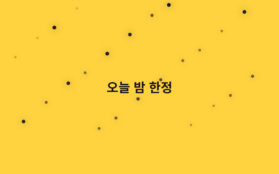
<main class="stage">
  <div class="field" aria-hidden="true">
    <span class="p" style="--i:0"></span>
    <span class="p" style="--i:1"></span>
    <span class="p" style="--i:2"></span>
    <span class="p" style="--i:3"></span>
    <span class="p" style="--i:4"></span>
    <span class="p" style="--i:5"></span>
    <span class="p" style="--i:6"></span>
    <span class="p" style="--i:7"></span>
    <span class="p" style="--i:8"></span>
    <span class="p" style="--i:9"></span>
    <span class="p" style="--i:10"></span>
    <span class="p" style="--i:11"></span>
    <span class="p" style="--i:12"></span>
    <span class="p" style="--i:13"></span>
    <span class="p" style="--i:14"></span>
    <span class="p" style="--i:15"></span>
    <span class="p" style="--i:16"></span>
    <span class="p" style="--i:17"></span>
    <span class="p" style="--i:18"></span>
    <span class="p" style="--i:19"></span>
    <span class="p" style="--i:20"></span>
    <span class="p" style="--i:21"></span>
    <span class="p" style="--i:22"></span>
    <span class="p" style="--i:23"></span>
  </div>
  <p class="caption">Chỉ Đêm Nay</p>
</main>@use "../../../../site/static/demo-tokens" as *;
// ── 변수 3개 ──────────────────────────────
$duration: $dur-base * 6; // 1.8s 기준 — 항목마다 다르게 늘려 불규칙해 보이게 한다
$easing: ease-in-out;
$color: $subject-ink;
// ── 데모 무대 ───────────────────────────────
@include stage($stage-yellow);
.field { position: absolute; inset: 0; overflow: hidden; pointer-events: none; }
.caption {
position: relative; z-index: 1; margin: 0;
color: $subject-ink; font-weight: 700; font-size: clamp(16px, 5vw, 22px); line-height: 1; font-family: inherit;
}
.p {
position: absolute;
width: 5px; height: 5px;
border-radius: 50%;
background: $color;
box-shadow: 0 0 10px rgba($color, .55);
opacity: .2;
animation: twinkle $duration $easing infinite;
animation-delay: calc(var(--i) * -0.31s);
}
@for $i from 1 through 24 {
.p:nth-child(#{$i}) {
left: ((($i * 41) % 93)) * 1%;
top: ((($i * 67) % 80)) * 1%;
animation-duration: $duration + ($i % 5) * .35s;
}
}
@keyframes twinkle {
0%, 100% { transform: scale(.7); opacity: .2; }
50% { transform: scale(1.3); opacity: 1; }
}
// ── 접근성: 반짝임을 끄고 희미한 별만 남긴다 ────────────
@media (prefers-reduced-motion: reduce) {
.p { animation: none; opacity: .55; }
}html, body {
margin: 0;
overflow: hidden;
}
.stage {
box-sizing: border-box;
min-height: 100vh;
display: grid;
place-items: center;
margin: 0;
background: #ffd23f;
font-family: -apple-system, "Segoe UI", "Noto Sans KR", sans-serif;
padding: clamp(8px, 4vw, 24px);
}
.field {
position: absolute;
inset: 0;
overflow: hidden;
pointer-events: none;
}
.caption {
position: relative;
z-index: 1;
margin: 0;
color: #17141a;
font-weight: 700;
font-size: clamp(16px, 5vw, 22px);
line-height: 1;
font-family: inherit;
}
.p {
position: absolute;
width: 5px;
height: 5px;
border-radius: 50%;
background: #17141a;
box-shadow: 0 0 10px rgba(23, 20, 26, 0.55);
opacity: 0.2;
animation: twinkle 1800ms ease-in-out infinite;
animation-delay: calc(var(--i) * -0.31s);
}
.p:nth-child(1) {
left: 41%;
top: 67%;
animation-duration: 2150ms;
}
.p:nth-child(2) {
left: 82%;
top: 54%;
animation-duration: 2500ms;
}
.p:nth-child(3) {
left: 30%;
top: 41%;
animation-duration: 2850ms;
}
.p:nth-child(4) {
left: 71%;
top: 28%;
animation-duration: 3200ms;
}
.p:nth-child(5) {
left: 19%;
top: 15%;
animation-duration: 1800ms;
}
.p:nth-child(6) {
left: 60%;
top: 2%;
animation-duration: 2150ms;
}
.p:nth-child(7) {
left: 8%;
top: 69%;
animation-duration: 2500ms;
}
.p:nth-child(8) {
left: 49%;
top: 56%;
animation-duration: 2850ms;
}
.p:nth-child(9) {
left: 90%;
top: 43%;
animation-duration: 3200ms;
}
.p:nth-child(10) {
left: 38%;
top: 30%;
animation-duration: 1800ms;
}
.p:nth-child(11) {
left: 79%;
top: 17%;
animation-duration: 2150ms;
}
.p:nth-child(12) {
left: 27%;
top: 4%;
animation-duration: 2500ms;
}
.p:nth-child(13) {
left: 68%;
top: 71%;
animation-duration: 2850ms;
}
.p:nth-child(14) {
left: 16%;
top: 58%;
animation-duration: 3200ms;
}
.p:nth-child(15) {
left: 57%;
top: 45%;
animation-duration: 1800ms;
}
.p:nth-child(16) {
left: 5%;
top: 32%;
animation-duration: 2150ms;
}
.p:nth-child(17) {
left: 46%;
top: 19%;
animation-duration: 2500ms;
}
.p:nth-child(18) {
left: 87%;
top: 6%;
animation-duration: 2850ms;
}
.p:nth-child(19) {
left: 35%;
top: 73%;
animation-duration: 3200ms;
}
.p:nth-child(20) {
left: 76%;
top: 60%;
animation-duration: 1800ms;
}
.p:nth-child(21) {
left: 24%;
top: 47%;
animation-duration: 2150ms;
}
.p:nth-child(22) {
left: 65%;
top: 34%;
animation-duration: 2500ms;
}
.p:nth-child(23) {
left: 13%;
top: 21%;
animation-duration: 2850ms;
}
.p:nth-child(24) {
left: 54%;
top: 8%;
animation-duration: 3200ms;
}
@keyframes twinkle {
0%, 100% {
transform: scale(0.7);
opacity: 0.2;
}
50% {
transform: scale(1.3);
opacity: 1;
}
}
@media (prefers-reduced-motion: reduce) {
.p {
animation: none;
opacity: 0.55;
}
}import type { CSSProperties } from "react";
import styles from "./StarsTwinkle.module.scss";
export type StarsTwinkleProps = {
/** 애니메이션 기준 시간(ms) */
duration?: number;
/** CSS easing */
easing?: string;
/** 피사체 색 */
color?: string;
};
type Vars = CSSProperties & { "--i"?: number };
const COUNT = 24;
export default function StarsTwinkle({
duration = 1800,
easing = "ease-in-out",
color = "#17141a",
}: StarsTwinkleProps) {
const vars = {
"--duration": `${duration}ms`,
"--easing": easing,
"--color": color,
} as CSSProperties;
return (
<div className={styles.field} style={vars} aria-hidden="true">
{Array.from({ length: COUNT }, (_, i) => (
<span key={i} className={styles.p} style={{ "--i": i } as Vars} />
))}
</div>
);
}02 Ánh sao lấp lánh — Diện tích đo được 0.894% · khung hình chuyển động 23/23Nguyên tác GODRICH · SCSS và React nằm trong tệp zip · 9 CSS Particle Backgrounds — dán 1 dòng là chạy
Bài viết chứa demo này
 9 CSS Particle Backgrounds — dán 1 dòng là chạyCSS particle background là kỹ thuật rải hàng chục phần tử nhỏ — chấm, vạch, mảnh nhỏ — bằng CSS thuần rồi cho chúng tự c Xem tất cả demo trong bài này