03Sóng SVG
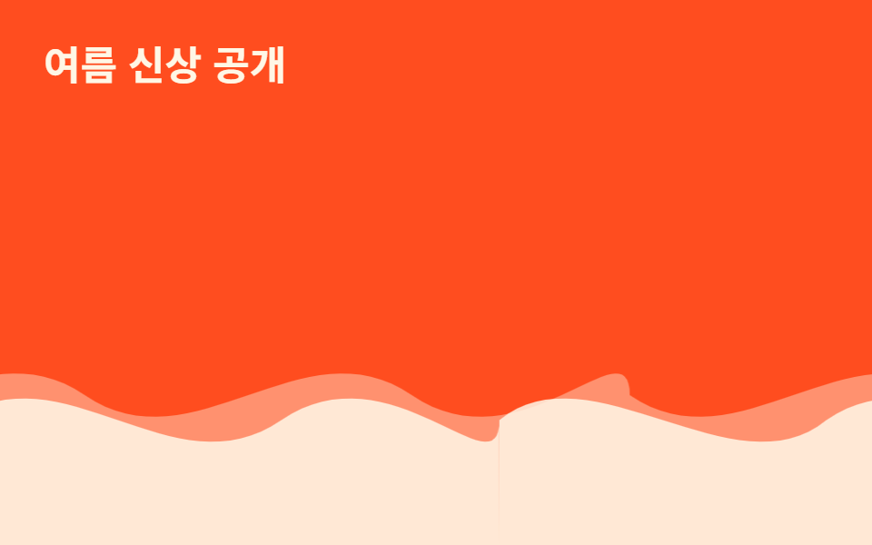
Hai path sóng SVG chồng lên nhau lặp translateX theo hai hướng ngược nhau, độ lệch pha giữa hai lớp khiến mặt nước trông như đang chảy.
Dùng choĐường viền cuối section giới thiệu sản phẩm, nền landing biển và du lịch
SVG pathtranslateX 루프레이어 시차
<main class="stage">
  <div class="waves" aria-hidden="true">
  <div class="layer layer--back">
    <svg class="wave" viewBox="0 0 480 120" preserveAspectRatio="none" aria-hidden="true"><path d="M0,60 C60,90 120,30 180,60 C240,90 300,30 360,60 C420,90 480,30 480,60 L480,120 L0,120 Z"/></svg>
    <svg class="wave" viewBox="0 0 480 120" preserveAspectRatio="none" aria-hidden="true"><path d="M0,60 C60,90 120,30 180,60 C240,90 300,30 360,60 C420,90 480,30 480,60 L480,120 L0,120 Z"/></svg>
  </div>
  <div class="layer layer--front">
    <svg class="wave" viewBox="0 0 480 120" preserveAspectRatio="none" aria-hidden="true"><path d="M0,70 C50,40 130,100 180,70 C240,40 300,100 360,70 C420,40 480,100 480,70 L480,120 L0,120 Z"/></svg>
    <svg class="wave" viewBox="0 0 480 120" preserveAspectRatio="none" aria-hidden="true"><path d="M0,70 C50,40 130,100 180,70 C240,40 300,100 360,70 C420,40 480,100 480,70 L480,120 L0,120 Z"/></svg>
  </div>
  </div>
  <p class="caption">Hàng Mới Mùa Hè</p>
</main>
@use "../../../../site/static/demo-tokens" as *;
// ── 변수 3개 ──────────────────────────────
$duration: $dur-loop * 3; // 6s — 뒤 레이어 한 바퀴
$easing: linear;
$color: $subject-cream;
// ── 데모 무대 ───────────────────────────────
@include stage($stage-orange);
.caption {
position: absolute; z-index: 1; top: $sp-6; left: $sp-6; margin: 0;
color: $subject-cream; font-weight: 700; font-size: clamp(16px, 5vw, 22px); line-height: 1; font-family: inherit;
}
// .layer 는 폭 200%로 뷰포트 밖까지 나간다 — 문서 스크롤을 부풀리지 않도록 .waves 로 먼저 가둔다 (BD8)
.waves { position: absolute; inset: 0; overflow: hidden; }
// 물결은 같은 SVG 를 두 장 나란히(각 50%) 붙여 폭 200%로 만들고, 정확히 -50% 만큼 옮기면
// 이어붙인 자리가 서로 같은 그림이라 이음새 없이 반복된다 (마퀴와 같은 원리, flex gap 은 안 쓴다)
.layer {
position: absolute; left: 0; right: 0; bottom: 0; height: 55%;
display: flex; width: 200%;
}
.wave { width: 50%; height: 100%; flex: none; display: block; fill: $color; }
.layer--back {
opacity: .4;
animation: drift $duration $easing infinite;
}
.layer--front {
opacity: .85;
animation: drift ($duration * .65) $easing infinite;
}
@keyframes drift {
from { transform: translateX(0); }
to { transform: translateX(-50%); }
}
// ── 접근성: 물결을 멈추고 정지 이미지로 ────────────
@media (prefers-reduced-motion: reduce) {
.layer { animation: none; }
}html, body {
margin: 0;
overflow: hidden;
}
.stage {
box-sizing: border-box;
min-height: 100vh;
display: grid;
place-items: center;
margin: 0;
background: #ff4d1f;
font-family: -apple-system, "Segoe UI", "Noto Sans KR", sans-serif;
padding: clamp(8px, 4vw, 24px);
}
.caption {
position: absolute;
z-index: 1;
top: 24px;
left: 24px;
margin: 0;
color: #fff7e6;
font-weight: 700;
font-size: clamp(16px, 5vw, 22px);
line-height: 1;
font-family: inherit;
}
.waves {
position: absolute;
inset: 0;
overflow: hidden;
}
.layer {
position: absolute;
left: 0;
right: 0;
bottom: 0;
height: 55%;
display: flex;
width: 200%;
}
.wave {
width: 50%;
height: 100%;
flex: none;
display: block;
fill: #fff7e6;
}
.layer--back {
opacity: 0.4;
animation: drift 6s linear infinite;
}
.layer--front {
opacity: 0.85;
animation: drift 3.9s linear infinite;
}
@keyframes drift {
from {
transform: translateX(0);
}
to {
transform: translateX(-50%);
}
}
@media (prefers-reduced-motion: reduce) {
.layer {
animation: none;
}
}import type { CSSProperties } from "react";
import styles from "./SvgWave.module.scss";
export type SvgWaveProps = {
/** 애니메이션 기준 시간(ms) */
duration?: number;
/** CSS easing */
easing?: string;
/** 피사체 색 */
color?: string;
};
type Vars = CSSProperties & { "--i"?: number };
const COUNT = 4;
export default function SvgWave({
duration = 6000,
easing = "linear",
color = "#fff7e6",
}: SvgWaveProps) {
const vars = {
"--duration": `${duration}ms`,
"--easing": easing,
"--color": color,
} as CSSProperties;
return (
<div className={styles.stage} style={vars}>
<div className={styles.layerBack}>
<svg className={styles.wave} viewBox="0 0 480 120" preserveAspectRatio="none" aria-hidden="true"><path d="M0,60 C60,90 120,30 180,60 C240,90 300,30 360,60 C420,90 480,30 480,60 L480,120 L0,120 Z" /></svg>
<svg className={styles.wave} viewBox="0 0 480 120" preserveAspectRatio="none" aria-hidden="true"><path d="M0,60 C60,90 120,30 180,60 C240,90 300,30 360,60 C420,90 480,30 480,60 L480,120 L0,120 Z" /></svg>
</div>
<div className={styles.layerFront}>
<svg className={styles.wave} viewBox="0 0 480 120" preserveAspectRatio="none" aria-hidden="true"><path d="M0,70 C50,40 130,100 180,70 C240,40 300,100 360,70 C420,40 480,100 480,70 L480,120 L0,120 Z" /></svg>
<svg className={styles.wave} viewBox="0 0 480 120" preserveAspectRatio="none" aria-hidden="true"><path d="M0,70 C50,40 130,100 180,70 C240,40 300,100 360,70 C420,40 480,100 480,70 L480,120 L0,120 Z" /></svg>
</div>
</div>
);
}03 Sóng SVG — Diện tích đo được 12.781% · khung hình chuyển động 23/23Nguyên tác GODRICH · SCSS và React nằm trong tệp zip · 9 CSS Particle Backgrounds — dán 1 dòng là chạy
Bài viết chứa demo này
 9 CSS Particle Backgrounds — dán 1 dòng là chạyCSS particle background là kỹ thuật rải hàng chục phần tử nhỏ — chấm, vạch, mảnh nhỏ — bằng CSS thuần rồi cho chúng tự c Xem tất cả demo trong bài này