09Thanh tab dưới cùng
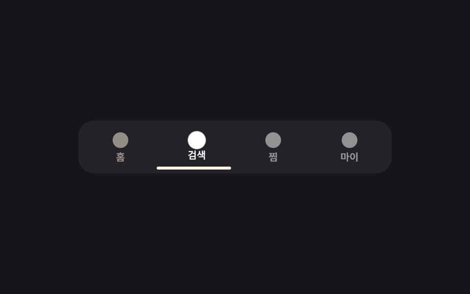
Chạm vào tab làm thanh chỉ báo trượt bằng translateX xuống dưới tab vừa chọn, icon hơi nhô lên.
Dùng choĐiều hướng tab dưới cùng trên web di động — bản thay thế sidebar cho màn hình nhỏ
탭 인디케이터translateX 슬라이드하단 고정
<main class="stage is-demo">
  <nav class="tabbar" aria-label="Điều hướng dưới">
    <button class="tab is-active" type="button" aria-current="page"><span class="tab__ic" aria-hidden="true"></span><span class="tab__label">Trang chủ</span></button>
    <button class="tab" type="button"><span class="tab__ic" aria-hidden="true"></span><span class="tab__label">Tìm kiếm</span></button>
    <button class="tab" type="button"><span class="tab__ic" aria-hidden="true"></span><span class="tab__label">Đã lưu</span></button>
    <button class="tab" type="button"><span class="tab__ic" aria-hidden="true"></span><span class="tab__label">Cá nhân</span></button>
    <span class="indicator" aria-hidden="true"></span>
  </nav>
</main>
@use "../../../../site/static/demo-tokens" as *;
// ── 변수 3개 ──────────────────────────────────────────
$duration: $dur-quick; // 220ms — 인디케이터가 옆 탭으로 미끄러지는 시간
$easing: $ease-spring;
$color: $subject-cream; // 활성 탭 강조색
// ── 데모 무대 ───────────────────────────────────────────
@include stage($stage-ink);
.tabbar {
position: relative;
display: flex;
width: min(92vw, 320px);
border-radius: $r-card;
background: rgba($stage-paper, .06);
padding: $sp-1;
box-sizing: border-box;
}
.tab {
flex: 1;
display: flex; flex-direction: column; align-items: center; gap: $sp-1;
border: 0; background: transparent; cursor: pointer;
padding: $sp-2 $sp-1;
color: $stage-paper;
font-family: inherit;
-webkit-tap-highlight-color: transparent;
}
.tab__ic {
width: $sp-4; height: $sp-4;
border-radius: 50%;
background: currentColor;
opacity: .5;
transform: scale(1);
transition: opacity $duration $easing, transform $duration $easing;
}
.tab__label {
font-weight: 500;
font-size: 10px;
line-height: 1;
font-family: inherit;
opacity: .55;
transform: translateY(0);
transition: opacity $duration $easing, transform $duration $easing;
}
.tab.is-active {
color: $color;
.tab__ic { opacity: 1; transform: scale(1.15); }
.tab__label { opacity: 1; transform: translateY(-2px); }
}
.indicator {
position: absolute; left: $sp-1; bottom: $sp-1;
width: calc(25% - #{$sp-1});
height: 3px;
border-radius: $r-xs;
background: $color;
transform: translateX(0);
transition: transform $duration $easing;
}
// 데모 루프: 인디케이터가 네 탭을 순서대로 돌고, 각 탭은 도착하는 구간에서만 밝아진다
.stage.is-demo .indicator { animation: indicator-loop $dur-loop $easing infinite; }
.stage.is-demo .tab:nth-child(1) .tab__ic { animation: tab-ic-loop $dur-loop $easing infinite; animation-delay: 0ms; }
.stage.is-demo .tab:nth-child(2) .tab__ic { animation: tab-ic-loop $dur-loop $easing infinite; animation-delay: 500ms; }
.stage.is-demo .tab:nth-child(3) .tab__ic { animation: tab-ic-loop $dur-loop $easing infinite; animation-delay: 1000ms; }
.stage.is-demo .tab:nth-child(4) .tab__ic { animation: tab-ic-loop $dur-loop $easing infinite; animation-delay: 1500ms; }
.stage.is-demo .tab:nth-child(1) .tab__label { animation: tab-label-loop $dur-loop $easing infinite; animation-delay: 0ms; }
.stage.is-demo .tab:nth-child(2) .tab__label { animation: tab-label-loop $dur-loop $easing infinite; animation-delay: 500ms; }
.stage.is-demo .tab:nth-child(3) .tab__label { animation: tab-label-loop $dur-loop $easing infinite; animation-delay: 1000ms; }
.stage.is-demo .tab:nth-child(4) .tab__label { animation: tab-label-loop $dur-loop $easing infinite; animation-delay: 1500ms; }
@keyframes indicator-loop {
0%, 20% { transform: translateX(0); }
25%, 45% { transform: translateX(100%); }
50%, 70% { transform: translateX(200%); }
75%, 95% { transform: translateX(300%); }
100% { transform: translateX(0); }
}
@keyframes tab-ic-loop {
0%, 20% { opacity: 1; transform: scale(1.15); }
25%, 100% { opacity: .5; transform: scale(1); }
}
@keyframes tab-label-loop {
0%, 20% { opacity: 1; transform: translateY(-2px); }
25%, 100% { opacity: .55; transform: translateY(0); }
}
@media (prefers-reduced-motion: reduce) {
.stage.is-demo .indicator,
.stage.is-demo .tab .tab__ic,
.stage.is-demo .tab .tab__label { animation: none; }
.indicator, .tab__ic, .tab__label { transition-duration: 1ms; }
}html, body {
margin: 0;
overflow: hidden;
}
.stage {
box-sizing: border-box;
min-height: 100vh;
display: grid;
place-items: center;
margin: 0;
background: #17141a;
font-family: -apple-system, "Segoe UI", "Noto Sans KR", sans-serif;
padding: clamp(8px, 4vw, 24px);
}
.tabbar {
position: relative;
display: flex;
width: min(92vw, 320px);
border-radius: 16px;
background: rgba(255, 255, 255, 0.06);
padding: 4px;
box-sizing: border-box;
}
.tab {
flex: 1;
display: flex;
flex-direction: column;
align-items: center;
gap: 4px;
border: 0;
background: transparent;
cursor: pointer;
padding: 8px 4px;
color: #ffffff;
font-family: inherit;
-webkit-tap-highlight-color: transparent;
}
.tab__ic {
width: 16px;
height: 16px;
border-radius: 50%;
background: currentColor;
opacity: 0.5;
transform: scale(1);
transition: opacity 220ms cubic-bezier(0.2, 0.8, 0.2, 1), transform 220ms cubic-bezier(0.2, 0.8, 0.2, 1);
}
.tab__label {
font-weight: 500;
font-size: 10px;
line-height: 1;
font-family: inherit;
opacity: 0.55;
transform: translateY(0);
transition: opacity 220ms cubic-bezier(0.2, 0.8, 0.2, 1), transform 220ms cubic-bezier(0.2, 0.8, 0.2, 1);
}
.tab.is-active {
color: #fff7e6;
}
.tab.is-active .tab__ic {
opacity: 1;
transform: scale(1.15);
}
.tab.is-active .tab__label {
opacity: 1;
transform: translateY(-2px);
}
.indicator {
position: absolute;
left: 4px;
bottom: 4px;
width: calc(25% - 4px);
height: 3px;
border-radius: 4px;
background: #fff7e6;
transform: translateX(0);
transition: transform 220ms cubic-bezier(0.2, 0.8, 0.2, 1);
}
.stage.is-demo .indicator {
animation: indicator-loop 2s cubic-bezier(0.2, 0.8, 0.2, 1) infinite;
}
.stage.is-demo .tab:nth-child(1) .tab__ic {
animation: tab-ic-loop 2s cubic-bezier(0.2, 0.8, 0.2, 1) infinite;
animation-delay: 0ms;
}
.stage.is-demo .tab:nth-child(2) .tab__ic {
animation: tab-ic-loop 2s cubic-bezier(0.2, 0.8, 0.2, 1) infinite;
animation-delay: 500ms;
}
.stage.is-demo .tab:nth-child(3) .tab__ic {
animation: tab-ic-loop 2s cubic-bezier(0.2, 0.8, 0.2, 1) infinite;
animation-delay: 1000ms;
}
.stage.is-demo .tab:nth-child(4) .tab__ic {
animation: tab-ic-loop 2s cubic-bezier(0.2, 0.8, 0.2, 1) infinite;
animation-delay: 1500ms;
}
.stage.is-demo .tab:nth-child(1) .tab__label {
animation: tab-label-loop 2s cubic-bezier(0.2, 0.8, 0.2, 1) infinite;
animation-delay: 0ms;
}
.stage.is-demo .tab:nth-child(2) .tab__label {
animation: tab-label-loop 2s cubic-bezier(0.2, 0.8, 0.2, 1) infinite;
animation-delay: 500ms;
}
.stage.is-demo .tab:nth-child(3) .tab__label {
animation: tab-label-loop 2s cubic-bezier(0.2, 0.8, 0.2, 1) infinite;
animation-delay: 1000ms;
}
.stage.is-demo .tab:nth-child(4) .tab__label {
animation: tab-label-loop 2s cubic-bezier(0.2, 0.8, 0.2, 1) infinite;
animation-delay: 1500ms;
}
@keyframes indicator-loop {
0%, 20% {
transform: translateX(0);
}
25%, 45% {
transform: translateX(100%);
}
50%, 70% {
transform: translateX(200%);
}
75%, 95% {
transform: translateX(300%);
}
100% {
transform: translateX(0);
}
}
@keyframes tab-ic-loop {
0%, 20% {
opacity: 1;
transform: scale(1.15);
}
25%, 100% {
opacity: 0.5;
transform: scale(1);
}
}
@keyframes tab-label-loop {
0%, 20% {
opacity: 1;
transform: translateY(-2px);
}
25%, 100% {
opacity: 0.55;
transform: translateY(0);
}
}
@media (prefers-reduced-motion: reduce) {
.stage.is-demo .indicator,
.stage.is-demo .tab .tab__ic,
.stage.is-demo .tab .tab__label {
animation: none;
}
.indicator, .tab__ic, .tab__label {
transition-duration: 1ms;
}
}(function () {
var stage = document.querySelector('.stage');
var tabs = document.querySelectorAll('.tab');
var indicator = document.querySelector('.indicator');
tabs.forEach(function (tab, i) {
tab.addEventListener('click', function () {
stage.classList.remove('is-demo');
tabs.forEach(function (t) { t.classList.remove('is-active'); t.removeAttribute('aria-current'); });
tab.classList.add('is-active'); tab.setAttribute('aria-current', 'page');
indicator.style.transform = 'translateX(' + (i * 100) + '%)';
});
});
})();import { useState } from "react";
import type { CSSProperties } from "react";
import styles from "./BottomTabBar.module.scss";
export type BottomTabBarProps = {
duration?: number;
easing?: string;
color?: string;
};
const TABS = ["홈", "검색", "찜", "마이"];
export default function BottomTabBar({
duration = 220,
easing = "cubic-bezier(.2,.8,.2,1)",
color = "#fff7e6",
}: BottomTabBarProps) {
const [active, setActive] = useState(0);
const vars: CSSProperties = {
"--duration": `${duration}ms`,
"--easing": easing,
"--color": color,
"--i": active,
};
return (
<div className={styles.stage} style={vars}>
<nav className={styles.tabbar} aria-label="하단 내비게이션">
{TABS.map((label, i) => (
<button
key={label}
className={styles.tab}
type="button"
data-active={i === active}
aria-current={i === active ? "page" : undefined}
onClick={() => setActive(i)}
>
<span className={styles.ic} aria-hidden="true" />
<span className={styles.label}>{label}</span>
</button>
))}
<span className={styles.indicator} aria-hidden="true" />
</nav>
</div>
);
}09 Thanh tab dưới cùng — Diện tích đo được 1.886% · khung hình chuyển động 7/23Nguyên tác GODRICH · SCSS và React nằm trong tệp zip · 9 hiệu ứng CSS Sidebar Animation - JS tối thiểu
Bài viết chứa demo này
 9 hiệu ứng CSS Sidebar Animation - JS tối thiểuCSS sidebar animation là cách một drawer đóng mở bằng transform và opacity, còn JavaScript chỉ lo phần bắt buộc: bật trạ Xem tất cả demo trong bài này