04Chỉ logo thu nhỏ
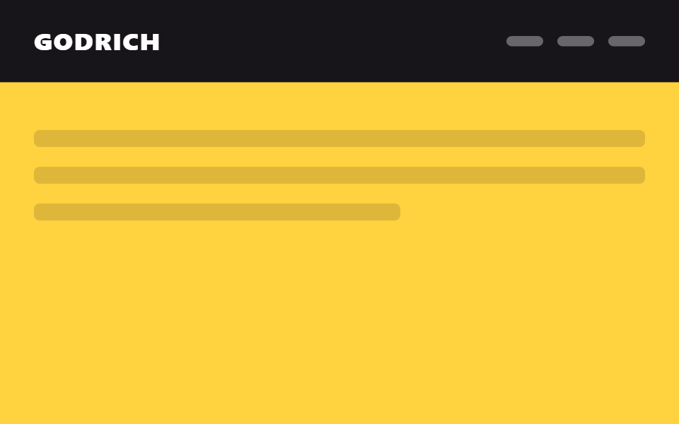
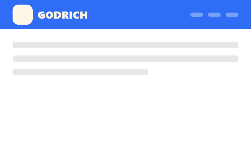
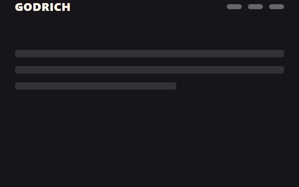
Chiều cao và nền của header giữ nguyên, chỉ logo co lại bằng scale, nên layout không hề xê dịch khi cuộn.
Dùng choTrang landing SaaS có logo lớn, header cần tránh layout shift
transform:scale높이 고정transform-origin:left
<main class="stage">
  <header class="head is-demo">
    <span class="head__logo"><span class="head__mark" aria-hidden="true"></span>GODRICH</span>
    <nav class="head__nav" aria-hidden="true"><span></span><span></span><span></span></nav>
  </header>
  <div class="page">
    <p class="page__line"></p>
    <p class="page__line"></p>
    <p class="page__line short"></p>
  </div>
</main>
@use "../../../../site/static/demo-tokens" as *;
// ── 변수 3개 ──────────────────────────────────────────
$duration: $dur-enter; // 로고가 줄어드는 시간
$easing: $ease-out;
$scale-to: .72; // 줄어든 비율
// ── 데모 무대 ──────────────────────────────────────────
html, body { margin: 0; overflow: hidden; }
.stage {
min-height: 100vh;
margin: 0;
background: $stage-paper;
font-family: -apple-system, "Segoe UI", "Noto Sans KR", sans-serif;
}
// 헤더 높이·배경은 고정. 로고만 scale 로 줄어든다 (레이아웃은 절대 바뀌지 않는다)
.head {
position: sticky;
top: 0;
height: 56px;
display: flex;
align-items: center;
justify-content: space-between;
padding: 0 clamp(16px, 5vw, 24px);
background: $subject-blue;
&__logo {
display: flex; align-items: center; gap: 10px;
color: $subject-cream; font-weight: 800; font-size: 20px; line-height: 1; font-family: inherit; letter-spacing: .04em;
transform-origin: left center; // 규칙8: 헤더 좌변 붙은 로고 축소
}
&__mark { width: 40px; height: 40px; border-radius: $r-control; background: $subject-cream; }
&__nav { display: flex; gap: 10px; span { width: 24px; height: 8px; border-radius: 4px; background: rgba(255, 255, 255, .35); } }
// 실제 사용: 문서 스크롤이 진행되는 동안 로고만 줄어든다
@supports (animation-timeline: scroll()) {
.head__logo { animation: logo-shrink linear both; animation-timeline: scroll(root); animation-range: 0 150px; }
}
}
@keyframes logo-shrink {
from { transform: scale(1); }
to { transform: scale($scale-to); }
}
// ── 데모(.is-demo): 로고가 줄었다 늘었다 2초 루프 ──────────
.head.is-demo .head__logo {
animation: logo-shrink-loop $dur-loop $easing infinite;
}
@keyframes logo-shrink-loop {
0%, 15% { transform: scale(1); }
45%, 70% { transform: scale($scale-to); }
95%, 100% { transform: scale(1); }
}
// ── 배경: 문서처럼 보이는 자리 ─────────────────────────
.page { padding: 24px 24px 0; }
.page__line {
height: 12px;
margin: 0 0 14px;
border-radius: 4px;
background: rgba($stage-ink, .1);
&.short { width: 60%; }
}
@media (prefers-reduced-motion: reduce) {
.head.is-demo .head__logo { animation: none !important; transform: scale($scale-to); }
}html, body {
margin: 0;
overflow: hidden;
}
.stage {
min-height: 100vh;
margin: 0;
background: #ffffff;
font-family: -apple-system, "Segoe UI", "Noto Sans KR", sans-serif;
}
.head {
position: sticky;
top: 0;
height: 56px;
display: flex;
align-items: center;
justify-content: space-between;
padding: 0 clamp(16px, 5vw, 24px);
background: #2f6df6;
}
.head__logo {
display: flex;
align-items: center;
gap: 10px;
color: #fff7e6;
font-weight: 800;
font-size: 20px;
line-height: 1;
font-family: inherit;
letter-spacing: 0.04em;
transform-origin: left center;
}
.head__mark {
width: 40px;
height: 40px;
border-radius: 12px;
background: #fff7e6;
}
.head__nav {
display: flex;
gap: 10px;
}
.head__nav span {
width: 24px;
height: 8px;
border-radius: 4px;
background: rgba(255, 255, 255, 0.35);
}
@supports (animation-timeline: scroll()) {
.head .head__logo {
animation: logo-shrink linear both;
animation-timeline: scroll(root);
animation-range: 0 150px;
}
}
@keyframes logo-shrink {
from {
transform: scale(1);
}
to {
transform: scale(0.72);
}
}
.head.is-demo .head__logo {
animation: logo-shrink-loop 2s ease-out infinite;
}
@keyframes logo-shrink-loop {
0%, 15% {
transform: scale(1);
}
45%, 70% {
transform: scale(0.72);
}
95%, 100% {
transform: scale(1);
}
}
.page {
padding: 24px 24px 0;
}
.page__line {
height: 12px;
margin: 0 0 14px;
border-radius: 4px;
background: rgba(23, 20, 26, 0.1);
}
.page__line.short {
width: 60%;
}
@media (prefers-reduced-motion: reduce) {
.head.is-demo .head__logo {
animation: none !important;
transform: scale(0.72);
}
}import type { CSSProperties, ReactNode } from "react";
import styles from "./LogoShrinkHeader.module.scss";
export type LogoShrinkHeaderProps = {
logo: string;
children?: ReactNode;
/** 로고가 줄어드는 시간 (기본 600ms) — 실제 사용은 scroll() 타임라인이 대신한다 */
duration?: number;
easing?: string;
/** 줄어든 비율 (기본 .72) */
scaleTo?: number;
};
type Vars = CSSProperties & { "--duration"?: string; "--easing"?: string; "--scale-to"?: number };
export default function LogoShrinkHeader({
logo,
children,
duration = 600,
easing = "ease-out",
scaleTo = 0.72,
}: LogoShrinkHeaderProps) {
const vars: Vars = { "--duration": `${duration}ms`, "--easing": easing, "--scale-to": scaleTo };
return (
<header className={styles.head} style={vars}>
<span className={styles.logo}>
<span className={styles.mark} aria-hidden="true" />
{logo}
</span>
<nav className={styles.nav}>{children}</nav>
</header>
);
}04 Chỉ logo thu nhỏ — Diện tích đo được 1.585% · khung hình chuyển động 15/23Nguyên tác GODRICH · SCSS và React nằm trong tệp zip · 9 CSS sticky header không cần JS
Bài viết chứa demo này
 9 CSS sticky header không cần JSCss sticky header là kiểu header dùng position: sticky để dính lại trên đầu màn hình khi bạn cuộn trang, thay vì trôi mấ Xem tất cả demo trong bài này