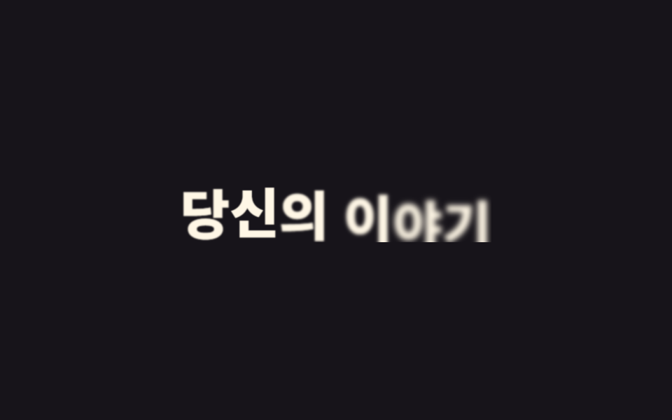
01Lộ chữ từ mặt nạ dưới lên
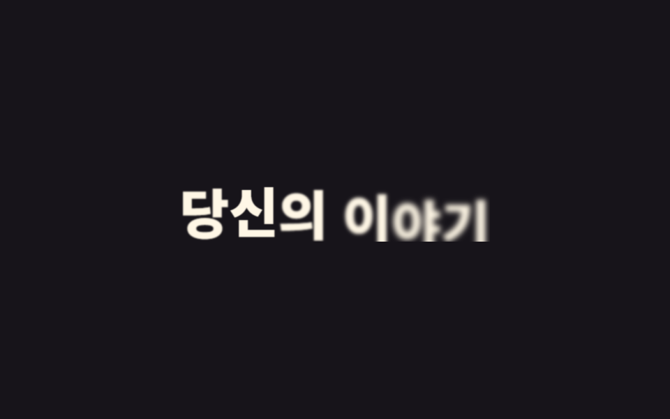
Tiêu đề nằm trong khung overflow:hidden bị cắt gọn, còn chữ bên trong trượt lên bằng translateY từ ngoài mép dưới về đúng vị trí, lộ ra một lượt như kéo một tấm rèm. Khung không hề di chuyển nên bố cục xung quanh đứng yên tuyệt đối trong lúc chữ tự đi lên.
Dùng choLần xuất hiện đầu của headline hero, tiêu đề section khi cuộn vào khung nhìn
overflow:hiddentranslateY 마스크0.5초
<main class="stage">
  <div class="mask">
    <h1 class="mask__text" data-split>Câu chuyện của bạn</h1>
  </div>
</main>
@use "../../../../site/static/demo-tokens" as *;
$duration: $dur-loop; // 마스크가 걷히는 한 주기
$easing: $ease-spring; // 처음 빠르고 끝은 부드럽게
$color: $subject-cream; // 글자 색
@include stage($stage-ink);
.mask {
overflow: hidden; // 상자 밖은 자른다 — 이게 마스크
max-width: min(380px, 90vw);
}
.mask__text {
margin: 0;
font-weight: 800; font-size: clamp(26px, 8vw, 42px); line-height: 1.2; font-family: inherit;
color: $color;
text-align: center;
}
.mask__text .letter {
display: inline-block;
animation: mask-up $duration $easing infinite, letter-blur-in $duration $easing infinite;
animation-delay: calc(var(--i) * 30ms + var(--n) * 70ms); // --i 시차 + --n 노이즈로 기계적 정렬을 깬다
}
@keyframes mask-up {
0%, 4% { transform: translateY(115%); }
30%, 78% { transform: translateY(0); }
96%, 100% { transform: translateY(115%); }
}
@keyframes letter-blur-in {
0%, 4% { filter: blur(10px); }
30%, 78% { filter: blur(0); }
96%, 100% { filter: blur(10px); }
}
@media (prefers-reduced-motion: reduce) {
.mask__text .letter { animation: none; transform: none; filter: none; }
}html, body {
margin: 0;
overflow: hidden;
}
.stage {
box-sizing: border-box;
min-height: 100vh;
display: grid;
place-items: center;
margin: 0;
background: #17141a;
font-family: -apple-system, "Segoe UI", "Noto Sans KR", sans-serif;
padding: clamp(8px, 4vw, 24px);
}
.mask {
overflow: hidden;
max-width: min(380px, 90vw);
}
.mask__text {
margin: 0;
font-weight: 800;
font-size: clamp(26px, 8vw, 42px);
line-height: 1.2;
font-family: inherit;
color: #fff7e6;
text-align: center;
}
.mask__text .letter {
display: inline-block;
animation: mask-up 2s cubic-bezier(0.2, 0.8, 0.2, 1) infinite, letter-blur-in 2s cubic-bezier(0.2, 0.8, 0.2, 1) infinite;
animation-delay: calc(var(--i) * 30ms + var(--n) * 70ms);
}
@keyframes mask-up {
0%, 4% {
transform: translateY(115%);
}
30%, 78% {
transform: translateY(0);
}
96%, 100% {
transform: translateY(115%);
}
}
@keyframes letter-blur-in {
0%, 4% {
filter: blur(10px);
}
30%, 78% {
filter: blur(0);
}
96%, 100% {
filter: blur(10px);
}
}
@media (prefers-reduced-motion: reduce) {
.mask__text .letter {
animation: none;
transform: none;
filter: none;
}
}(function(){
function splitLetters(el){
var text = el.textContent;
el.textContent = "";
Array.from(text).forEach(function(ch, i){
var span = document.createElement("span");
span.className = "letter";
var seed = Math.sin((i + 1) * 12.9898) * 43758.5453;
var noise = seed - Math.floor(seed);
span.style.setProperty("--i", i);
span.style.setProperty("--n", noise.toFixed(3));
span.textContent = ch === " " ? " " : ch;
el.appendChild(span);
});
}
document.querySelectorAll("[data-split]").forEach(splitLetters);
})();import type { CSSProperties } from "react";
import styles from "./MaskRevealUp.module.scss";
type Vars = CSSProperties & { "--i"?: number; "--n"?: number };
function noise(i: number): number {
const s = Math.sin((i + 1) * 12.9898) * 43758.5453;
return Number((s - Math.floor(s)).toFixed(3));
}
export type MaskRevealUpProps = {
text: string;
/** 마스크가 걷히는 한 주기 (기본 2000ms) */
duration?: number;
color?: string;
};
export default function MaskRevealUp({ text, duration = 2000, color = "#fff7e6" }: MaskRevealUpProps) {
const vars = { "--duration": `${duration}ms`, "--color": color } as CSSProperties;
const chars = Array.from(text);
return (
<div className={styles.mask}>
<h1 className={styles.text} style={vars}>
{chars.map((ch, i) => (
<span key={i} className={styles.letter} style={{ "--i": i, "--n": noise(i) } as Vars}>
{ch === " " ? " " : ch}
</span>
))}
</h1>
</div>
);
}01 Lộ chữ từ mặt nạ dưới lên — Diện tích đo được 5.417% · khung hình chuyển động 12/23Nguyên tác GODRICH · SCSS và React nằm trong tệp zip · 9 CSS Text Animation Effects — dán 1 dòng là chạy
Bài viết chứa demo này
 9 CSS Text Animation Effects — dán 1 dòng là chạyCSS text animation effects là các chuyển động chữ dựng thuần bằng CSS, không cần JavaScript, giúp tiêu đề hay câu chữ xu Xem tất cả demo trong bài này