08Dải màu quét qua
Một dải gradient chéo rộng 250% nằm phía sau badge, background-position trượt liên tục từ 150% xuống -150% theo linear infinite và mix-blend-mode: overlay hoà vào nền badge, tạo một vệt sáng quét qua không dừng.
Dùng choBadge khuyến mãi, nhãn mới hoặc giới hạn
대각선 그러데이션background-position2s·linear
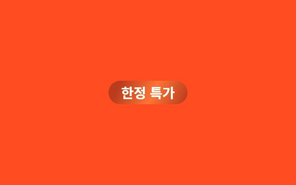
<main class="stage">
  <span class="badge">Ưu đãi có hạn</span>
</main>
@use "../../../../site/static/demo-tokens" as *;
// ── 변수 3개 ─────────────────────────────
$duration: $dur-loop;
$easing: linear; // 이음새 없이 계속 도는 스윕이라 등속이 맞다
$color: $subject-cream; // 빛 줄기 색
// ── 데모 무대 ───────────────────────────────
@include stage($stage-orange);
.badge {
position: relative;
overflow: hidden;
display: inline-block;
padding: $sp-2 $sp-5;
border-radius: $r-pill;
background: color-mix(in srgb, $stage-ink 30%, $stage-orange);
color: $subject-cream;
font-weight: 700;
font-size: clamp(16px, 4.6vw, 22px);
line-height: 1;
font-family: inherit;
// 대각선 그러데이션을 폭 250% 로 깔고 background-position 을 끝없이 옮긴다 (linear·infinite → 이음새 없음)
&::after {
content: "";
position: absolute;
inset: 0;
background: linear-gradient(115deg, transparent 30%, $color 48%, transparent 66%);
background-size: 250% 100%;
mix-blend-mode: overlay;
animation: sweep $duration $easing infinite, sweep-thick $duration $easing infinite;
}
}
@keyframes sweep {
0% { background-position: 150% 0; }
100% { background-position: -150% 0; }
}
// 페인트 물성: 스윕 줄기의 수직 두께가 불규칙 요동 — inset 진동 (transform 아님, 병렬 안전)
@keyframes sweep-thick {
0% { inset: 0 -1px; }
14% { inset: 1px 0; }
28% { inset: -1px 1px; }
42% { inset: 0.5px -0.5px; }
57% { inset: -0.5px 1px; }
71% { inset: 1px 0.5px; }
85% { inset: -1px -0.5px; }
100% { inset: 0 -1px; }
}
@media (prefers-reduced-motion: reduce) {
.badge::after { animation: none; opacity: 0; }
}html, body {
margin: 0;
overflow: hidden;
}
.stage {
box-sizing: border-box;
min-height: 100vh;
display: grid;
place-items: center;
margin: 0;
background: #ff4d1f;
font-family: -apple-system, "Segoe UI", "Noto Sans KR", sans-serif;
padding: clamp(8px, 4vw, 24px);
}
.badge {
position: relative;
overflow: hidden;
display: inline-block;
padding: 8px 20px;
border-radius: 999px;
background: color-mix(in srgb, #17141a 30%, #ff4d1f);
color: #fff7e6;
font-weight: 700;
font-size: clamp(16px, 4.6vw, 22px);
line-height: 1;
font-family: inherit;
}
.badge::after {
content: "";
position: absolute;
inset: 0;
background: linear-gradient(115deg, transparent 30%, #fff7e6 48%, transparent 66%);
background-size: 250% 100%;
mix-blend-mode: overlay;
animation: sweep 2s linear infinite, sweep-thick 2s linear infinite;
}
@keyframes sweep {
0% {
background-position: 150% 0;
}
100% {
background-position: -150% 0;
}
}
@keyframes sweep-thick {
0% {
inset: 0 -1px;
}
14% {
inset: 1px 0;
}
28% {
inset: -1px 1px;
}
42% {
inset: 0.5px -0.5px;
}
57% {
inset: -0.5px 1px;
}
71% {
inset: 1px 0.5px;
}
85% {
inset: -1px -0.5px;
}
100% {
inset: 0 -1px;
}
}
@media (prefers-reduced-motion: reduce) {
.badge::after {
animation: none;
opacity: 0;
}
}import type { CSSProperties, ReactNode } from "react";
import styles from "./ColorSweepBadge.module.scss";
export type ColorSweepBadgeProps = {
children: ReactNode;
/** 빛 한 줄이 한 바퀴 도는 시간 (기본 2000ms) */
duration?: number;
/** 배지 바탕색 */
bg?: string;
/** 빛 줄기 색 */
color?: string;
};
type Vars = CSSProperties & {
"--duration"?: string;
"--bg"?: string;
"--color"?: string;
};
export default function ColorSweepBadge({
children,
duration = 2000,
bg = "#ff4d1f",
color = "#fff7e6",
}: ColorSweepBadgeProps) {
const vars: Vars = {
"--duration": `${duration}ms`,
"--bg": bg,
"--color": color,
};
return (
<span className={styles.badge} style={vars}>
{children}
</span>
);
}08 Dải màu quét qua — Diện tích đo được 3.189% · khung hình chuyển động 18/23Nguyên tác GODRICH · SCSS và React nằm trong tệp zip · 9 CSS Text Highlight Animation: dán 1 dòng là chạy
Bài viết chứa demo này
 9 CSS Text Highlight Animation: dán 1 dòng là chạyCSS text highlight animation là hiệu ứng CSS thuần giúp tô sáng, gạch chân hoặc gạch ngang một từ trong câu ngay khi tra Xem tất cả demo trong bài này