09Đánh số tự động bằng sibling-index()
Mỗi bước đặt counter-set: n calc(sibling-index()) để ::before với content: counter(n) tự đánh số, animation-delay cũng tính từ sibling-index(), bỏ hẳn quy tắc nth-child.
Dùng choChecklist kéo thả đổi thứ tự, danh sách bước thường thêm bớt mục
sibling-index()counter-setcalc()

<main class="stage">
  <ul class="ts09-list is-demo">
    <li class="ts09-step" aria-label="Bước 1: Đăng ký">Đăng ký</li>
    <li class="ts09-step" aria-label="Bước 2: Giao hàng">Giao hàng</li>
    <li class="ts09-step" aria-label="Bước 3: Thanh toán">Thanh toán</li>
    <li class="ts09-step" aria-label="Bước 4: Hoàn tất">Hoàn tất</li>
  </ul>
</main>
@use "../../../../site/static/demo-tokens" as *;
// ── 변수 3개 ──────────────────────────────────────────
$duration: $dur-loop;
$easing: $ease-pop;
$color: $subject-blue;
@include stage($stage-ink);
.ts09-list {
margin: 0;
padding: 0;
list-style: none;
width: min(200px, 76vw);
counter-reset: n 0;
}
.ts09-step {
position: relative;
display: flex;
align-items: center;
gap: $sp-3;
padding: $sp-2 0 $sp-2 $sp-10;
color: $subject-cream;
font: 600 13px/1 -apple-system, "Segoe UI", "Noto Sans KR", sans-serif;
opacity: 0;
transform: scale(.7);
// 기본(폴백): 순서대로 자동 증가하는 CSS 카운터
counter-increment: n;
&::before {
content: counter(n);
position: absolute;
left: 0;
width: 28px;
height: 28px;
border-radius: 50%;
background: $color;
color: $subject-cream;
display: grid;
place-items: center;
font-weight: 700;
font-size: 12px;
line-height: 1;
font-family: inherit;
}
}
// 실제 사용 코드: sibling-index() 를 지원하면 순서가 바뀌어도(드래그 정렬) nth-child 없이 번호가 맞는다
@supports (z-index: calc(sibling-index())) {
.ts09-step {
counter-increment: none;
counter-set: n calc(sibling-index());
animation-delay: calc((sibling-index() - 1) * 120ms);
}
}
.ts09-list.is-demo .ts09-step {
animation: ts09-in $duration $easing infinite;
}
@keyframes ts09-in {
0% { opacity: 0; transform: scale(.7); }
20% { opacity: 1; transform: scale(1.08); }
32% { opacity: 1; transform: scale(1); }
90% { opacity: 1; transform: scale(1); }
100% { opacity: 0; transform: scale(.7); }
}
@media (prefers-reduced-motion: reduce) {
.ts09-step, .ts09-list.is-demo .ts09-step { animation: none !important; opacity: 1 !important; transform: none !important; }
}html, body {
margin: 0;
overflow: hidden;
}
.stage {
box-sizing: border-box;
min-height: 100vh;
display: grid;
place-items: center;
margin: 0;
background: #17141a;
font-family: -apple-system, "Segoe UI", "Noto Sans KR", sans-serif;
padding: clamp(8px, 4vw, 24px);
}
.ts09-list {
margin: 0;
padding: 0;
list-style: none;
width: min(200px, 76vw);
counter-reset: n 0;
}
.ts09-step {
position: relative;
display: flex;
align-items: center;
gap: 12px;
padding: 8px 0 8px 40px;
color: #fff7e6;
font: 600 13px/1 -apple-system, "Segoe UI", "Noto Sans KR", sans-serif;
opacity: 0;
transform: scale(0.7);
counter-increment: n;
}
.ts09-step::before {
content: counter(n);
position: absolute;
left: 0;
width: 28px;
height: 28px;
border-radius: 50%;
background: #2f6df6;
color: #fff7e6;
display: grid;
place-items: center;
font-weight: 700;
font-size: 12px;
line-height: 1;
font-family: inherit;
}
@supports (z-index: calc(sibling-index())) {
.ts09-step {
counter-increment: none;
counter-set: n calc(sibling-index());
animation-delay: calc((sibling-index() - 1) * 120ms);
}
}
.ts09-list.is-demo .ts09-step {
animation: ts09-in 2s cubic-bezier(0.2, 1.4, 0.4, 1) infinite;
}
@keyframes ts09-in {
0% {
opacity: 0;
transform: scale(0.7);
}
20% {
opacity: 1;
transform: scale(1.08);
}
32% {
opacity: 1;
transform: scale(1);
}
90% {
opacity: 1;
transform: scale(1);
}
100% {
opacity: 0;
transform: scale(0.7);
}
}
@media (prefers-reduced-motion: reduce) {
.ts09-step, .ts09-list.is-demo .ts09-step {
animation: none !important;
opacity: 1 !important;
transform: none !important;
}
}import { CSSProperties } from "react";
import styles from "./SiblingIndexNumbering.module.scss";
type Vars = CSSProperties & {
"--duration"?: string;
"--easing"?: string;
"--color"?: string;
};
export interface SiblingIndexNumberingProps {
duration?: string;
easing?: string;
color?: string;
steps?: string[];
}
export default function SiblingIndexNumbering({
duration = "2s",
easing = "cubic-bezier(.2, 1.4, .4, 1)",
color = "#2f6df6",
steps = ["가입", "배송", "결제", "완료"],
}: SiblingIndexNumberingProps) {
const style: Vars = { "--duration": duration, "--easing": easing, "--color": color };
return (
<ul className={styles.list} style={style}>
{steps.map((s, i) => (
<li key={s} className={styles.step} aria-label={`${i + 1}번째 단계: ${s}`}>{s}</li>
))}
</ul>
);
}09 Đánh số tự động bằng sibling-index() — Diện tích đo được 4.478% · khung hình chuyển động 10/23Nguyên tác GODRICH · SCSS và React nằm trong tệp zip · 9 css timeline animation không JS, copy-paste
Bài viết chứa demo này
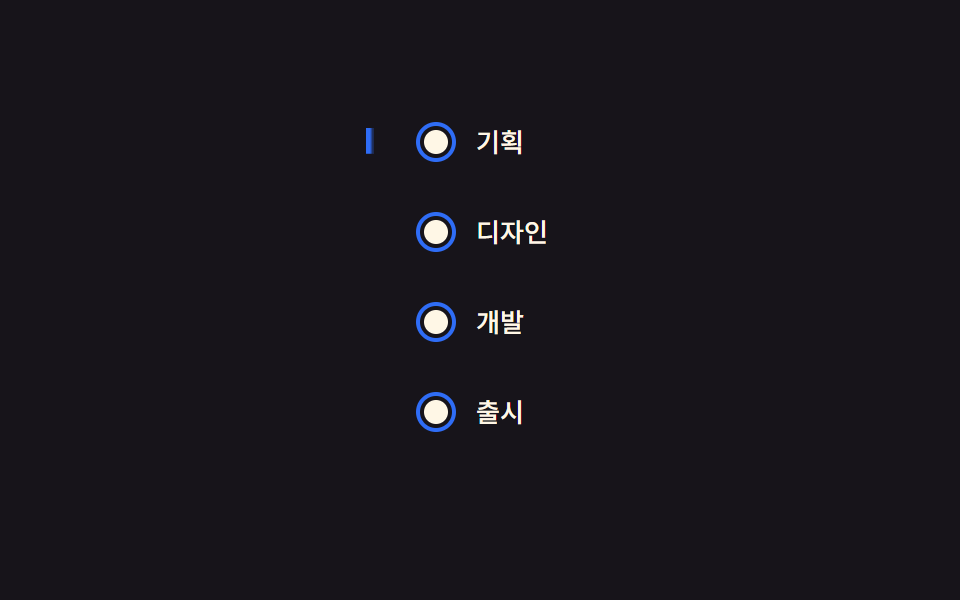 9 css timeline animation không JS, copy-pasteCss timeline animation là cách nối nhiều bước bằng đường kẻ với vòng tròn để bày ra theo thứ tự. Chín mẫu dưới đây không Xem tất cả demo trong bài này