09Kiểu trạng thái disabled
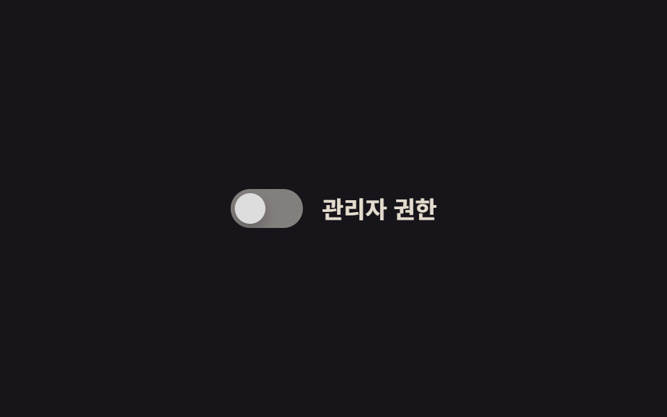
Khi thuộc tính disabled bật lên, track và núm mờ dần qua filter:grayscale và opacity rồi đứng yên tại chỗ, không còn phản hồi.
Dùng choMục cài đặt không có quyền, field form bị vô hiệu hóa có điều kiện
filter:grayscaleopacitycursor:not-allowed
<main class="stage">
  <!-- 이 항목은 실제로 disabled 다. 데모의 흐려짐 루프는 그 상태로 들어가는 전환을 반복 재생해서 보여줄 뿐, 다시 켜지지 않는다. -->
  <label class="switch is-demo">
    <input type="checkbox" class="switch__input" role="switch" aria-checked="false" disabled aria-label="Quyền quản trị">
    <span class="switch__track">
      <span class="switch__bg switch__bg--off"></span>
      <span class="switch__knob"></span>
    </span>
    <span class="switch__label">Quyền quản trị</span>
  </label>
</main>
@use "../../../../site/static/demo-tokens" as *;
// ── 변수 3개 ──────────────────────────────
$duration: $dur-enter;
$easing: $ease-out;
$color: $subject-cream;
// ── 데모 무대 ───────────────────────────────
@include stage($stage-ink);
.switch {
position: relative;
display: inline-flex; align-items: center; gap: clamp(10px, 3vw, 14px);
cursor: not-allowed;
}
.switch__input {
position: absolute; inset: 0; width: 100%; height: 100%;
margin: 0; opacity: 0; cursor: not-allowed;
}
.switch__track {
position: relative; overflow: hidden;
width: clamp(44px, 12vw, 52px); height: clamp(24px, 6.5vw, 28px);
border-radius: $r-pill;
filter: none; opacity: 1;
box-shadow: $shadow-press;
}
.switch__bg { position: absolute; inset: 0; background: $color; opacity: .55; }
.switch__knob {
position: absolute; top: 3px; left: 3px;
width: clamp(18px, 5vw, 22px); height: clamp(18px, 5vw, 22px);
border-radius: 50%;
background: $stage-paper;
box-shadow: $shadow-press;
}
.switch__label { color: $subject-cream; font-weight: 600; font-size: clamp(14px, 4vw, 17px); line-height: 1; font-family: inherit; }
// ── 실제 동작: 진짜 disabled 다. filter·opacity 로만 흐려진다 ──────
.switch__input:disabled ~ .switch__track { filter: grayscale(1); opacity: .45; }
.switch__input:disabled ~ .switch__label { opacity: .55; }
// ── 데모 루프: 흐려지는 전환만 반복 재생한다 (실제로 다시 켜지지 않는다) ──
// 한 겹: 노브 이동은 없다(비활성 데모) — 흐려지는 순간 노브·트랙 그림자가 얕아진다
// (blur·opacity 감소 — "비활성은 바닥에서 뜬다").
.switch.is-demo .switch__track { animation: fade-loop $dur-loop $easing infinite, shadow-fade-loop $dur-loop $easing infinite; }
.switch.is-demo .switch__knob { animation: shadow-fade-loop $dur-loop $easing infinite; }
.switch.is-demo .switch__label { animation: label-fade-loop $dur-loop $easing infinite; }
@keyframes fade-loop {
0%, 20% { filter: grayscale(0); opacity: 1; }
50%, 70% { filter: grayscale(1); opacity: .45; }
100% { filter: grayscale(0); opacity: 1; }
}
@keyframes shadow-fade-loop {
0%, 20% { box-shadow: 0 6px 12px rgba(23, 20, 26, .32); }
50%, 70% { box-shadow: 0 2px 4px rgba(23, 20, 26, .12); }
100% { box-shadow: 0 6px 12px rgba(23, 20, 26, .32); }
}
@keyframes label-fade-loop {
0%, 20% { opacity: 1; }
50%, 70% { opacity: .55; }
100% { opacity: 1; }
}
@media (prefers-reduced-motion: reduce) {
.switch.is-demo .switch__track, .switch.is-demo .switch__knob, .switch.is-demo .switch__label { animation: none !important; }
}html, body {
margin: 0;
overflow: hidden;
}
.stage {
box-sizing: border-box;
min-height: 100vh;
display: grid;
place-items: center;
margin: 0;
background: #17141a;
font-family: -apple-system, "Segoe UI", "Noto Sans KR", sans-serif;
padding: clamp(8px, 4vw, 24px);
}
.switch {
position: relative;
display: inline-flex;
align-items: center;
gap: clamp(10px, 3vw, 14px);
cursor: not-allowed;
}
.switch__input {
position: absolute;
inset: 0;
width: 100%;
height: 100%;
margin: 0;
opacity: 0;
cursor: not-allowed;
}
.switch__track {
position: relative;
overflow: hidden;
width: clamp(44px, 12vw, 52px);
height: clamp(24px, 6.5vw, 28px);
border-radius: 999px;
filter: none;
opacity: 1;
box-shadow: 0 6px 12px rgba(23, 20, 26, 0.32);
}
.switch__bg {
position: absolute;
inset: 0;
background: #fff7e6;
opacity: 0.55;
}
.switch__knob {
position: absolute;
top: 3px;
left: 3px;
width: clamp(18px, 5vw, 22px);
height: clamp(18px, 5vw, 22px);
border-radius: 50%;
background: #ffffff;
box-shadow: 0 6px 12px rgba(23, 20, 26, 0.32);
}
.switch__label {
color: #fff7e6;
font-weight: 600;
font-size: clamp(14px, 4vw, 17px);
line-height: 1;
font-family: inherit;
}
.switch__input:disabled ~ .switch__track {
filter: grayscale(1);
opacity: 0.45;
}
.switch__input:disabled ~ .switch__label {
opacity: 0.55;
}
.switch.is-demo .switch__track {
animation: fade-loop 2s ease-out infinite, shadow-fade-loop 2s ease-out infinite;
}
.switch.is-demo .switch__knob {
animation: shadow-fade-loop 2s ease-out infinite;
}
.switch.is-demo .switch__label {
animation: label-fade-loop 2s ease-out infinite;
}
@keyframes fade-loop {
0%, 20% {
filter: grayscale(0);
opacity: 1;
}
50%, 70% {
filter: grayscale(1);
opacity: 0.45;
}
100% {
filter: grayscale(0);
opacity: 1;
}
}
@keyframes shadow-fade-loop {
0%, 20% {
box-shadow: 0 6px 12px rgba(23, 20, 26, 0.32);
}
50%, 70% {
box-shadow: 0 2px 4px rgba(23, 20, 26, 0.12);
}
100% {
box-shadow: 0 6px 12px rgba(23, 20, 26, 0.32);
}
}
@keyframes label-fade-loop {
0%, 20% {
opacity: 1;
}
50%, 70% {
opacity: 0.55;
}
100% {
opacity: 1;
}
}
@media (prefers-reduced-motion: reduce) {
.switch.is-demo .switch__track, .switch.is-demo .switch__knob, .switch.is-demo .switch__label {
animation: none !important;
}
}import type { CSSProperties } from "react";
import styles from "./DisabledToggle.module.scss";
export type DisabledToggleProps = {
label?: string;
duration?: number;
easing?: string;
color?: string;
};
type Vars = CSSProperties & { "--duration"?: string; "--easing"?: string; "--color"?: string };
/** 항상 disabled. 권한이 없을 때 그대로 두는 용도라 checked/onChange 를 받지 않는다. */
export default function DisabledToggle({
label = "관리자 권한",
duration = 600,
easing = "ease-out",
color = "#fff7e6",
}: DisabledToggleProps) {
const vars: Vars = { "--duration": `${duration}ms`, "--easing": easing, "--color": color };
return (
<label className={styles.switch} style={vars}>
<input type="checkbox" role="switch" aria-label={label} aria-checked={false} className={styles.switch__input} disabled />
<span className={styles.switch__track}>
<span className={styles.switch__bg} />
<span className={styles.switch__knob} />
</span>
<span className={styles.switch__label}>{label}</span>
</label>
);
}09 Kiểu trạng thái disabled — Diện tích đo được 1.517% · khung hình chuyển động 10/23Nguyên tác GODRICH · SCSS và React nằm trong tệp zip · 9 CSS Toggle Switches — dán 1 dòng là chạy
Bài viết chứa demo này
 9 CSS Toggle Switches — dán 1 dòng là chạyCSS toggle switch là control chỉ dùng một input checkbox để bật tắt thật, còn track và núm là lớp vỏ CSS phủ lên trên. C Xem tất cả demo trong bài này