05Crossfade skeleton sang nội dung
Khối skeleton xám và nội dung thật chồng lên nhau, đổi opacity qua lại để báo tải xong không giật hình.
Dùng choDanh sách card đang tải, lần tải đầu của trang hồ sơ
opacity 크로스페이드겹친 레이어0.4초
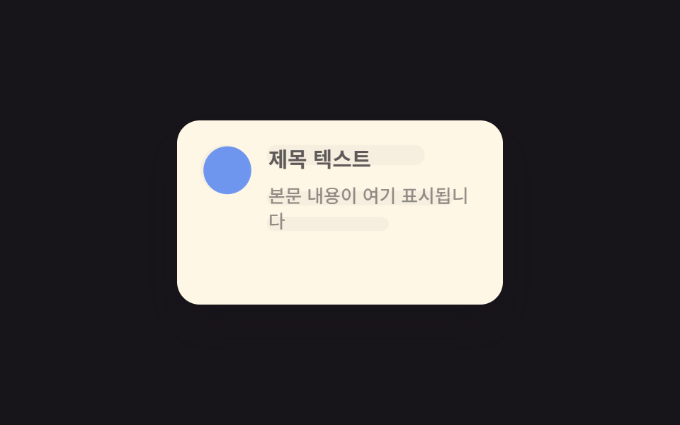
<main class="stage">
  <div class="card is-demo">
    <div class="card__layer card__layer--skeleton" aria-hidden="true">
      <span class="sk sk--avatar"></span>
      <span class="card__col">
        <span class="sk sk--title"></span>
        <span class="sk sk--line"></span>
        <span class="sk sk--line sk--line--short"></span>
      </span>
    </div>
    <div class="card__layer card__layer--content">
      <span class="avatar"></span>
      <span class="card__col">
        <p class="title">Văn bản tiêu đề</p>
        <p class="body">Nội dung sẽ hiển thị ở đây</p>
      </span>
    </div>
  </div>
</main>
@use "../../../../site/static/demo-tokens" as *;
// ── 변수 3개 ──────────────────────────────────────────
$duration: $dur-enter; // 스켈레톤 → 콘텐츠 전환 시간
$easing: $ease-out; // 시작 빠르고 끝은 부드럽게
$color: $subject-blue; // 콘텐츠 아바타 색
// ── 데모 무대 ──────────────────────────────────────────
@include stage($stage-ink);
.card {
position: relative;
width: min(230px, 82vw);
height: clamp(110px, 40vw, 130px);
border-radius: $r-card;
background: $subject-cream;
box-shadow: $shadow-raised;
overflow: hidden;
}
.card__layer {
position: absolute; inset: 0;
box-sizing: border-box;
padding: clamp(14px, 5vw, 18px);
display: flex;
align-items: flex-start;
gap: 12px;
}
.card__col {
display: flex;
flex-direction: column;
min-width: 0;
flex: 1;
}
// ── 스켈레톤 레이어 ──────────────────────────────────
.card__layer--skeleton {
flex-direction: row;
opacity: 1;
transform: scale(1);
transition: opacity $duration $easing, transform $duration $easing;
}
.sk {
display: block;
border-radius: $r-control;
background: rgba($stage-ink, .12);
}
.sk--avatar { width: 34px; height: 34px; border-radius: 50%; flex: none; }
.sk--title { width: 110px; height: 14px; margin-bottom: 10px; }
.sk--line { display: block; width: 130px; height: 10px; margin-top: 8px; }
.sk--line--short { width: 85px; }
// ── 콘텐츠 레이어 ────────────────────────────────────
.card__layer--content {
flex-direction: row;
align-items: flex-start;
opacity: 0;
transform: scale(.98);
transition: opacity $duration $easing, transform $duration $easing;
}
.avatar {
width: 34px; height: 34px; border-radius: 50%; flex: none;
background: $color;
}
.title { margin: 0 0 6px; color: $stage-ink; font-weight: 700; font-size: clamp(13px, 3.8vw, 15px); line-height: 1.3; font-family: inherit; }
.body { margin: 0; color: rgba($stage-ink, .68); font-weight: 500; font-size: clamp(12px, 3.4vw, 13px); line-height: 1.4; font-family: inherit; }
.card.is-demo {
.card__layer--skeleton { animation: sk-fade $dur-loop $easing infinite; }
.card__layer--content { animation: content-fade $dur-loop $easing infinite; }
}
@keyframes sk-fade {
0%, 12% { opacity: 1; transform: scale(1); }
55%, 100% { opacity: 0; transform: scale(1.02); }
}
@keyframes content-fade {
0%, 12% { opacity: 0; transform: scale(.98); }
55%, 100% { opacity: 1; transform: scale(1); }
}
// ── 접근성: 움직임 줄이기 설정이면 콘텐츠 상태로 고정 ────────
@media (prefers-reduced-motion: reduce) {
.card__layer--skeleton, .card__layer--content { transition: none; }
.card.is-demo .card__layer--skeleton,
.card.is-demo .card__layer--content { animation: none !important; }
.card .card__layer--skeleton { opacity: 0; }
.card .card__layer--content { opacity: 1; transform: scale(1); }
}html, body {
margin: 0;
overflow: hidden;
}
.stage {
box-sizing: border-box;
min-height: 100vh;
display: grid;
place-items: center;
margin: 0;
background: #17141a;
font-family: -apple-system, "Segoe UI", "Noto Sans KR", sans-serif;
padding: clamp(8px, 4vw, 24px);
}
.card {
position: relative;
width: min(230px, 82vw);
height: clamp(110px, 40vw, 130px);
border-radius: 16px;
background: #fff7e6;
box-shadow: 0 14px 24px rgba(23, 20, 26, 0.32);
overflow: hidden;
}
.card__layer {
position: absolute;
inset: 0;
box-sizing: border-box;
padding: clamp(14px, 5vw, 18px);
display: flex;
align-items: flex-start;
gap: 12px;
}
.card__col {
display: flex;
flex-direction: column;
min-width: 0;
flex: 1;
}
.card__layer--skeleton {
flex-direction: row;
opacity: 1;
transform: scale(1);
transition: opacity 600ms ease-out, transform 600ms ease-out;
}
.sk {
display: block;
border-radius: 12px;
background: rgba(23, 20, 26, 0.12);
}
.sk--avatar {
width: 34px;
height: 34px;
border-radius: 50%;
flex: none;
}
.sk--title {
width: 110px;
height: 14px;
margin-bottom: 10px;
}
.sk--line {
display: block;
width: 130px;
height: 10px;
margin-top: 8px;
}
.sk--line--short {
width: 85px;
}
.card__layer--content {
flex-direction: row;
align-items: flex-start;
opacity: 0;
transform: scale(0.98);
transition: opacity 600ms ease-out, transform 600ms ease-out;
}
.avatar {
width: 34px;
height: 34px;
border-radius: 50%;
flex: none;
background: #2f6df6;
}
.title {
margin: 0 0 6px;
color: #17141a;
font-weight: 700;
font-size: clamp(13px, 3.8vw, 15px);
line-height: 1.3;
font-family: inherit;
}
.body {
margin: 0;
color: rgba(23, 20, 26, 0.68);
font-weight: 500;
font-size: clamp(12px, 3.4vw, 13px);
line-height: 1.4;
font-family: inherit;
}
.card.is-demo .card__layer--skeleton {
animation: sk-fade 2s ease-out infinite;
}
.card.is-demo .card__layer--content {
animation: content-fade 2s ease-out infinite;
}
@keyframes sk-fade {
0%, 12% {
opacity: 1;
transform: scale(1);
}
55%, 100% {
opacity: 0;
transform: scale(1.02);
}
}
@keyframes content-fade {
0%, 12% {
opacity: 0;
transform: scale(0.98);
}
55%, 100% {
opacity: 1;
transform: scale(1);
}
}
@media (prefers-reduced-motion: reduce) {
.card__layer--skeleton, .card__layer--content {
transition: none;
}
.card.is-demo .card__layer--skeleton,
.card.is-demo .card__layer--content {
animation: none !important;
}
.card .card__layer--skeleton {
opacity: 0;
}
.card .card__layer--content {
opacity: 1;
transform: scale(1);
}
}import type { CSSProperties } from "react";
import styles from "./SkeletonToContentCard.module.scss";
export type SkeletonToContentCardProps = {
loading: boolean;
title: string;
body: string;
/** 전환 시간 (기본 600ms) */
duration?: number;
easing?: string;
color?: string;
};
type Vars = CSSProperties & { "--duration"?: string; "--easing"?: string; "--color"?: string };
export default function SkeletonToContentCard({
loading,
title,
body,
duration = 600,
easing = "ease-out",
color = "#2f6df6",
}: SkeletonToContentCardProps) {
const vars: Vars = { "--duration": `${duration}ms`, "--easing": easing, "--color": color };
return (
<div className={styles.card} style={vars}>
<div className={styles.layer} style={{ opacity: loading ? 1 : 0 }} aria-hidden="true">
<span className={`${styles.sk} ${styles.avatar}`} />
<div>
<span className={`${styles.sk} ${styles.title}`} />
<span className={`${styles.sk} ${styles.line}`} />
<span className={`${styles.sk} ${styles.lineShort}`} />
</div>
</div>
<div className={styles.layer} style={{ opacity: loading ? 0 : 1, transform: loading ? "scale(.98)" : "scale(1)" }}>
<span className={styles.realAvatar} />
<div>
<p className={styles.realTitle}>{title}</p>
<p className={styles.realBody}>{body}</p>
</div>
</div>
</div>
);
}05 Crossfade skeleton sang nội dung — Diện tích đo được 3.401% · khung hình chuyển động 10/23Nguyên tác GODRICH · SCSS và React nằm trong tệp zip · 9 micro interactions css — dán 1 dòng chạy ngay
Bài viết chứa demo này
 9 micro interactions css — dán 1 dòng chạy ngayMicro interactions css là những phản hồi cực nhỏ trên giao diện — nút lún xuống, icon đổi hình, toast xếp chồng — báo ch Xem tất cả demo trong bài này