08Vạch chỉ báo tab trượt
Bấm sang tab khác, vạch gạch chân trượt từ vị trí cũ sang vị trí mới theo cả độ rộng lẫn toạ độ.
Dùng choTab trang cài đặt, tab danh mục trên dashboard
transform 슬라이드width 보간0.25초
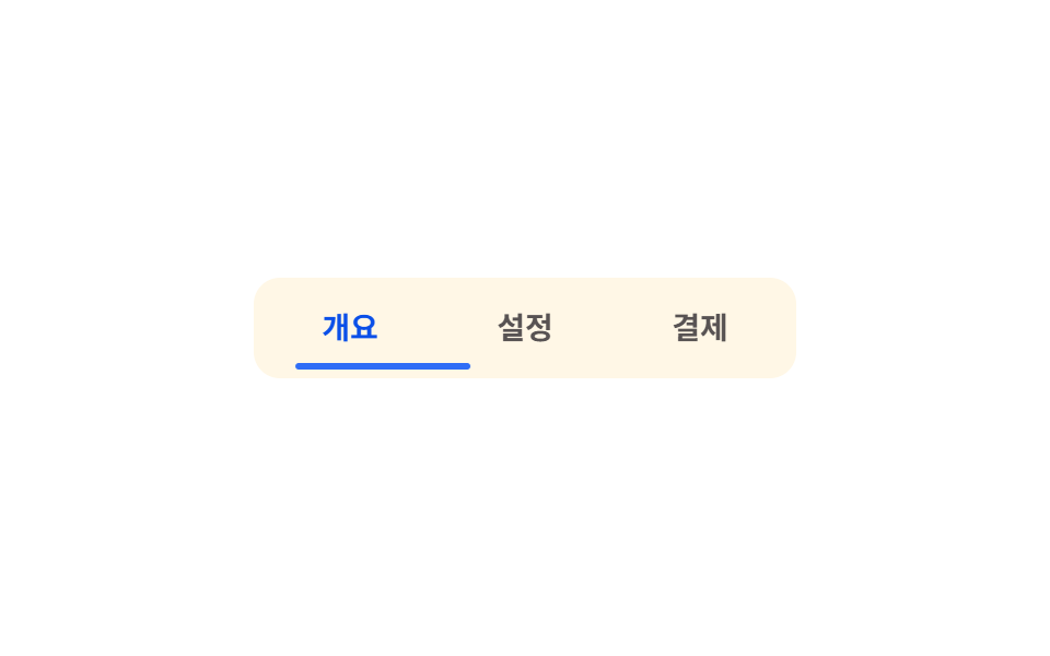
<main class="stage">
  <nav class="tabs is-demo" role="tablist">
    <button class="tabs__item is-active" type="button" role="tab" aria-selected="true">Tổng quan</button>
    <button class="tabs__item" type="button" role="tab" aria-selected="false">Cài đặt</button>
    <button class="tabs__item" type="button" role="tab" aria-selected="false">Thanh toán</button>
    <span class="tabs__indicator" aria-hidden="true"></span>
  </nav>
</main>
@use "../../../../site/static/demo-tokens" as *;
// ── 변수 3개 ──────────────────────────────────────────
$duration: $dur-base; // 인디케이터가 옮겨가는 시간
$easing: $ease-spring; // 이동 곡선
$color: $subject-blue; // 인디케이터·활성 탭 색
// ── 데모 무대 ──────────────────────────────────────────
@include stage($stage-paper);
.tabs {
position: relative;
display: grid;
grid-template-columns: repeat(3, 1fr); // 세 칸을 똑같은 폭으로 — 그래야 translateX 배수만으로 옮겨간다
width: min(240px, 84vw);
background: $subject-cream;
border-radius: $r-control;
padding: 4px;
--i: 0; // 실제 클릭이 여기에 인덱스를 써 넣는다
&__item {
position: relative;
z-index: 1;
border: 0;
background: transparent;
padding: clamp(9px, 3vw, 12px) 4px;
font-weight: 700;
font-size: clamp(12px, 3.4vw, 14px);
line-height: 1;
font-family: inherit;
color: rgba($stage-ink, .72); // 흐린 글자는 알파가 아니라 색으로 — .72 가 크림 면 위 6.9:1
cursor: pointer;
&.is-active { color: $subject-blue-deep; } // 색은 상태값 — 트랜지션 없이 즉시. 크림 면 위 파란 글자는 deep(5.98:1)
}
&__indicator {
position: absolute;
left: 4px; bottom: 4px;
width: calc((100% - 8px) / 3);
height: 3px;
border-radius: $r-pill;
background: $color;
transform: translateX(calc(var(--i, 0) * 100%));
transition: transform $duration $easing;
}
&.is-demo &__indicator { animation: tab-loop $dur-loop $easing infinite; }
}
@keyframes tab-loop {
0%, 20% { transform: translateX(0%); }
33%, 53% { transform: translateX(100%); }
66%, 86% { transform: translateX(200%); }
100% { transform: translateX(0%); }
}
// ── 접근성: 움직임 줄이기 설정이면 즉시 전환, 첫 탭에 고정 ────────
@media (prefers-reduced-motion: reduce) {
.tabs__indicator { transition: none; }
.tabs.is-demo .tabs__indicator { animation: none !important; }
}html, body {
margin: 0;
overflow: hidden;
}
.stage {
box-sizing: border-box;
min-height: 100vh;
display: grid;
place-items: center;
margin: 0;
background: #ffffff;
font-family: -apple-system, "Segoe UI", "Noto Sans KR", sans-serif;
padding: clamp(8px, 4vw, 24px);
}
.tabs {
position: relative;
display: grid;
grid-template-columns: repeat(3, 1fr);
width: min(240px, 84vw);
background: #fff7e6;
border-radius: 12px;
padding: 4px;
--i: 0;
}
.tabs__item {
position: relative;
z-index: 1;
border: 0;
background: transparent;
padding: clamp(9px, 3vw, 12px) 4px;
font-weight: 700;
font-size: clamp(12px, 3.4vw, 14px);
line-height: 1;
font-family: inherit;
color: rgba(23, 20, 26, 0.72);
cursor: pointer;
}
.tabs__item.is-active {
color: #0a4fe8;
}
.tabs__indicator {
position: absolute;
left: 4px;
bottom: 4px;
width: calc((100% - 8px) / 3);
height: 3px;
border-radius: 999px;
background: #2f6df6;
transform: translateX(calc(var(--i, 0) * 100%));
transition: transform 300ms cubic-bezier(0.2, 0.8, 0.2, 1);
}
.tabs.is-demo .tabs__indicator {
animation: tab-loop 2s cubic-bezier(0.2, 0.8, 0.2, 1) infinite;
}
@keyframes tab-loop {
0%, 20% {
transform: translateX(0%);
}
33%, 53% {
transform: translateX(100%);
}
66%, 86% {
transform: translateX(200%);
}
100% {
transform: translateX(0%);
}
}
@media (prefers-reduced-motion: reduce) {
.tabs__indicator {
transition: none;
}
.tabs.is-demo .tabs__indicator {
animation: none !important;
}
}// 실제 클릭: 누른 탭으로 인디케이터가 옮겨간다. 데모(.is-demo) 루프는 클릭하면 멈춘다.
var tabs = document.querySelectorAll('.tabs__item');
var nav = document.querySelector('.tabs');
tabs.forEach(function (t, i) {
t.addEventListener('click', function () {
nav.classList.remove('is-demo');
tabs.forEach(function (x) { x.classList.remove('is-active'); x.setAttribute('aria-selected', 'false'); });
t.classList.add('is-active');
t.setAttribute('aria-selected', 'true');
nav.style.setProperty('--i', i);
});
});import { useState } from "react";
import type { CSSProperties } from "react";
import styles from "./TabIndicatorSlide.module.scss";
export type TabIndicatorSlideProps = {
tabs: string[];
/** 인디케이터가 옮겨가는 시간 (기본 300ms) */
duration?: number;
easing?: string;
color?: string;
};
type Vars = CSSProperties & { "--duration"?: string; "--easing"?: string; "--i"?: number };
export default function TabIndicatorSlide({
tabs,
duration = 300,
easing = "cubic-bezier(.2,.8,.2,1)",
color = "#2f6df6",
}: TabIndicatorSlideProps) {
const [active, setActive] = useState(0);
const vars: Vars = { "--duration": `${duration}ms`, "--easing": easing, "--i": active };
return (
<nav className={styles.tabs} role="tablist" style={{ ...vars, ["--color" as string]: color }}>
{tabs.map((label, i) => (
<button
key={label}
type="button"
role="tab"
aria-selected={i === active}
className={i === active ? `${styles.item} ${styles.active}` : styles.item}
onClick={() => setActive(i)}
>
{label}
</button>
))}
<span className={styles.indicator} style={{ width: `calc((100% - 8px) / ${tabs.length})` }} aria-hidden="true" />
</nav>
);
}08 Vạch chỉ báo tab trượt — Diện tích đo được 0.5% · khung hình chuyển động 11/23Nguyên tác GODRICH · SCSS và React nằm trong tệp zip · 9 micro interactions css — dán 1 dòng chạy ngay
Bài viết chứa demo này
 9 micro interactions css — dán 1 dòng chạy ngayMicro interactions css là những phản hồi cực nhỏ trên giao diện — nút lún xuống, icon đổi hình, toast xếp chồng — báo ch Xem tất cả demo trong bài này