04Liquid fill with a wave line
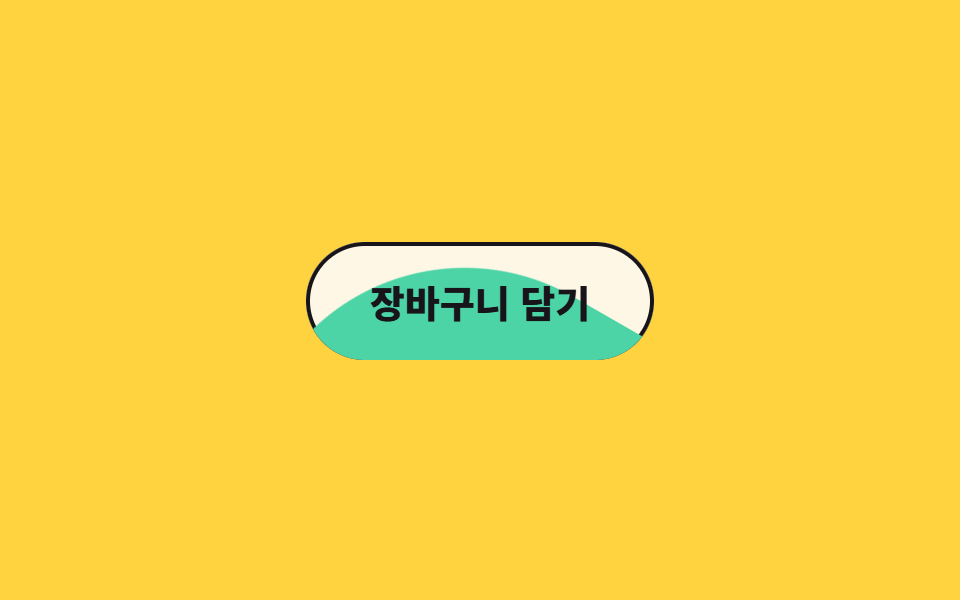
Colour rises from the bottom of the button, but the surface is not flat: it ripples like water. A wave shape turns on its own axis while the whole layer climbs.
Best forOn a commerce button such as add to cart, where colour alone should say that something is being filled
물결 타일translateoverflow
<main class="stage">
  <button class="liq is-demo" type="button">
    <span class="liq__wave" aria-hidden="true"></span>
    <span class="liq__label">Add to cart</span>
  </button>
</main>
@use "../../../../site/static/demo-tokens" as *;
// 변형은 이 세 줄만 바꾼다
$duration: $dur-loop;
$easing: $ease-spring;
$color: $subject-mint;
@include stage($stage-yellow);
.liq {
position: relative;
overflow: hidden;
isolation: isolate;
border: 0;
cursor: pointer;
padding: $sp-4 $sp-8;
border-radius: $r-pill;
background: $subject-cream;
box-shadow: inset 0 0 0 2px $subject-ink;
color: $subject-ink;
font-family: inherit;
font-size: clamp(15px, 4.5vw, 19px);
font-weight: 800;
}
// 수면이 평평하지 않은 이유: 완전한 원이 아니라 네 모서리를 42% 둥글린 정사각형을 통째로 돌린다
.liq__wave {
position: absolute;
left: 50%;
bottom: 0;
width: 260px;
height: 260px;
border-radius: 42%;
background: $color;
transform: translate(-50%, 100%);
}
.liq__label { position: relative; }
.liq.is-demo .liq__wave { animation: liq-rise $duration $easing infinite; }
// rotate 가 0deg 에서 360deg 로 끝나 마지막 프레임과 첫 프레임의 그림이 같다
@keyframes liq-rise {
0% { transform: translate(-50%, 100%) rotate(0deg); }
52% { transform: translate(-50%, 68%) rotate(180deg); }
66% { transform: translate(-50%, 68%) rotate(230deg); }
100% { transform: translate(-50%, 100%) rotate(360deg); }
}
@media (prefers-reduced-motion: reduce) {
.liq.is-demo .liq__wave { animation: none; transform: translate(-50%, 68%); }
}html, body {
margin: 0;
overflow: hidden;
}
.stage {
box-sizing: border-box;
min-height: 100vh;
display: grid;
place-items: center;
margin: 0;
background: #ffd23f;
font-family: -apple-system, "Segoe UI", "Noto Sans KR", sans-serif;
padding: clamp(8px, 4vw, 24px);
}
.liq {
position: relative;
overflow: hidden;
isolation: isolate;
border: 0;
cursor: pointer;
padding: 16px 32px;
border-radius: 999px;
background: #fff7e6;
box-shadow: inset 0 0 0 2px #17141a;
color: #17141a;
font-family: inherit;
font-size: clamp(15px, 4.5vw, 19px);
font-weight: 800;
}
.liq__wave {
position: absolute;
left: 50%;
bottom: 0;
width: 260px;
height: 260px;
border-radius: 42%;
background: #4cd4a6;
transform: translate(-50%, 100%);
}
.liq__label {
position: relative;
}
.liq.is-demo .liq__wave {
animation: liq-rise 2s cubic-bezier(0.2, 0.8, 0.2, 1) infinite;
}
@keyframes liq-rise {
0% {
transform: translate(-50%, 100%) rotate(0deg);
}
52% {
transform: translate(-50%, 68%) rotate(180deg);
}
66% {
transform: translate(-50%, 68%) rotate(230deg);
}
100% {
transform: translate(-50%, 100%) rotate(360deg);
}
}
@media (prefers-reduced-motion: reduce) {
.liq.is-demo .liq__wave {
animation: none;
transform: translate(-50%, 68%);
}
}import type { CSSProperties } from "react";
import styles from "./LiquidFillButton.module.scss";
export type LiquidFillButtonProps = {
label?: string;
duration?: number;
easing?: string;
color?: string;
};
type Vars = CSSProperties & { "--duration"?: string; "--easing"?: string; "--color"?: string };
export default function LiquidFillButton({
label = "Add to cart",
duration = 2000,
easing = "cubic-bezier(.2,.8,.2,1)",
color = "#4cd4a6",
}: LiquidFillButtonProps) {
const vars: Vars = { "--duration": `${duration}ms`, "--easing": easing, "--color": color };
return (
<button type="button" className={styles.liq} style={vars}>
<span className={styles.wave} aria-hidden="true" />
<span className={styles.label}>{label}</span>
</button>
);
}04 Liquid fill with a wave line — Measured area 6.315% · moving frames 13/23Original by GODRICH · SCSS and React ship in the zip · 9 button hover effects css that award sites reuse
The post this demo lives in
 9 button hover effects css that award sites reuseThese button hover effects css techniques are the reactions a button gives when a pointer arrives, sorted by what each s See all demos in this post
If you like this effect - similar demos
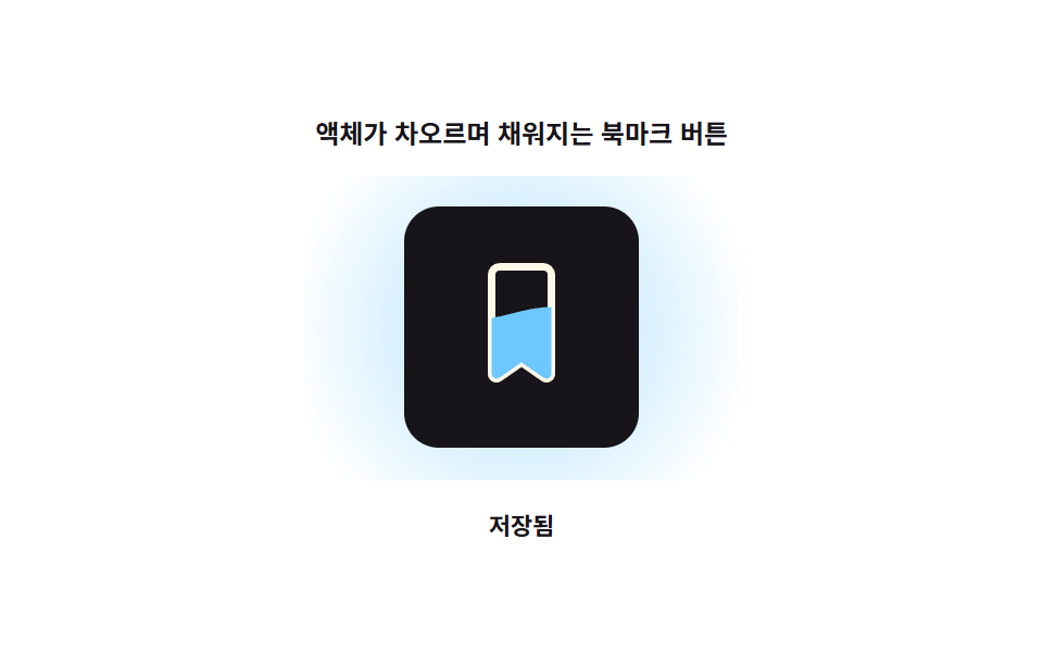 Buttons05 Bookmark Button Filled by a Rising Liquid WaveBookmark Icon Animation: 9 Patterns, One Icon
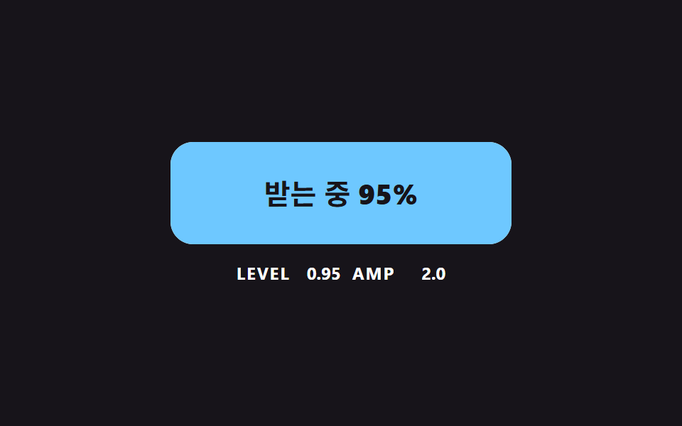 Buttons05 A Liquid Level That Rises With ProgressCSS Download Button: 9 Demos With Springs and Arcs
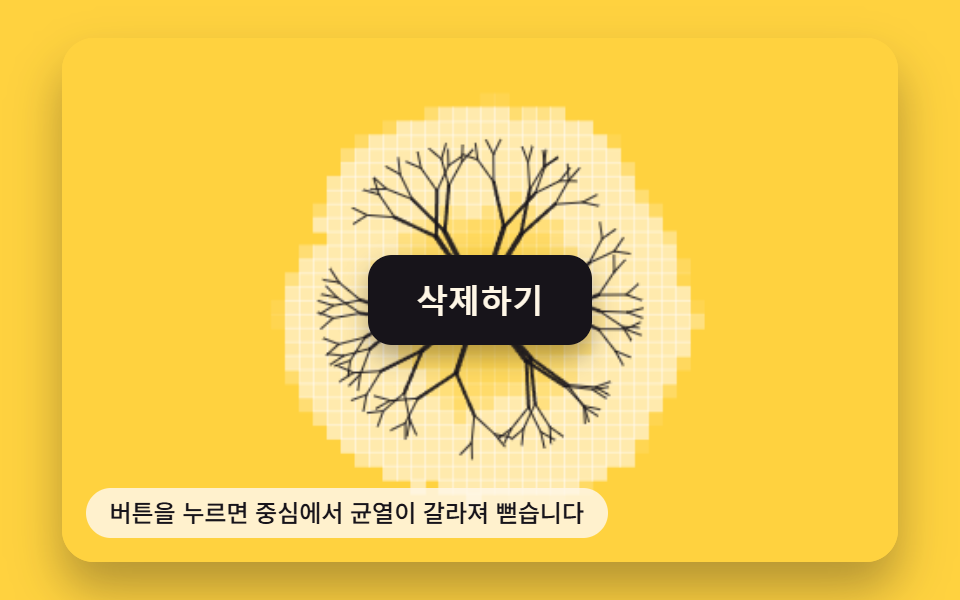 Buttons02 Crack-line Button That Splits With a Press-state ValueButton Click Effect CSS: 9 Canvas Pixel Patterns