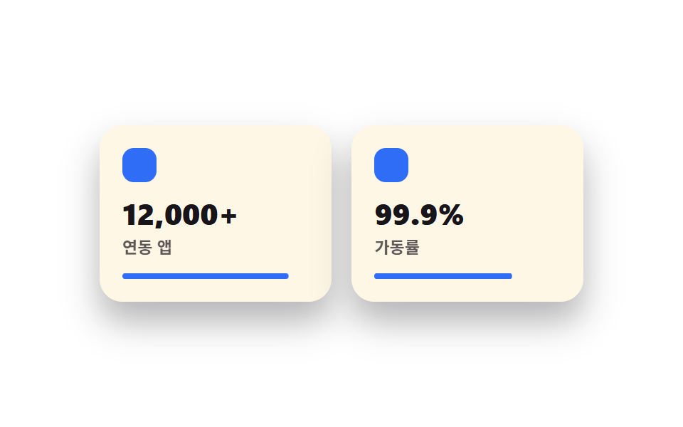
04Icon + number feature cards
Each feature gets one icon and one big highlighted number inside its own card for easy scanning.
Best forFeature summaries above pricing, product overview sections
숫자 강조아이콘 40px호버 살짝 뜸
<main class="stage">
  <section class="feat">
    <div class="feat__card is-demo">
      <span class="feat__icon" aria-hidden="true"></span>
      <p class="feat__num">12,000+</p>
      <p class="feat__label">Connected apps</p>
      <span class="feat__bar" aria-hidden="true"></span>
    </div>
    <div class="feat__card feat__card--b is-demo">
      <span class="feat__icon" aria-hidden="true"></span>
      <p class="feat__num">99.9%</p>
      <p class="feat__label">Uptime</p>
      <span class="feat__bar" aria-hidden="true"></span>
    </div>
  </section>
</main>
@use "../../../../site/static/demo-tokens" as *;
$duration: $dur-loop; // 두 카드가 채워지는 한 주기
$easing: $ease-out; // 채우는 곡선
$color: $subject-blue; // 아이콘·바 색
@include stage($stage-paper);
.feat {
width: clamp(220px, 76vw, 340px);
display: flex;
gap: clamp(10px, 3vw, 16px);
}
.feat__card {
flex: 1;
border-radius: $r-card;
background: $subject-cream;
box-shadow: $shadow-raised;
padding: clamp(12px, 3.4vw, 16px);
display: flex;
flex-direction: column;
gap: 6px;
}
.feat__icon {
width: 24px;
height: 24px;
border-radius: 8px;
background: $color;
margin-bottom: 4px;
}
.feat__num {
margin: 0;
color: $subject-ink;
font-weight: 800; font-size: clamp(17px, 4.6vw, 21px); line-height: 1.1;
}
.feat__label {
margin: 0;
color: $subject-ink;
opacity: .7;
font-weight: 600; font-size: clamp(10px, 2.4vw, 11.5px); line-height: 1.3;
}
.feat__bar {
display: block;
height: 4px;
border-radius: $r-pill;
background: $color;
margin-top: 4px;
transform-origin: left; // 규칙8: 왼쪽부터 차오르는 바
transform: scaleX(0);
animation: barFill $duration $easing infinite;
}
.feat__card--b .feat__bar { animation-delay: -1s; }
// 데모: 바가 왼쪽부터 차오르고, 다 차면 잠깐 머물다 비워진다
@keyframes barFill {
0% { transform: scaleX(0); }
40% { transform: scaleX(1); }
75% { transform: scaleX(1); }
100% { transform: scaleX(0); }
}
@media (prefers-reduced-motion: reduce) {
.feat__bar {
animation: none !important;
transform: scaleX(1);
}
}html, body {
margin: 0;
overflow: hidden;
}
.stage {
box-sizing: border-box;
min-height: 100vh;
display: grid;
place-items: center;
margin: 0;
background: #ffffff;
font-family: -apple-system, "Segoe UI", "Noto Sans KR", sans-serif;
padding: clamp(8px, 4vw, 24px);
}
.feat {
width: clamp(220px, 76vw, 340px);
display: flex;
gap: clamp(10px, 3vw, 16px);
}
.feat__card {
flex: 1;
border-radius: 16px;
background: #fff7e6;
box-shadow: 0 14px 24px rgba(23, 20, 26, 0.32);
padding: clamp(12px, 3.4vw, 16px);
display: flex;
flex-direction: column;
gap: 6px;
}
.feat__icon {
width: 24px;
height: 24px;
border-radius: 8px;
background: #2f6df6;
margin-bottom: 4px;
}
.feat__num {
margin: 0;
color: #17141a;
font-weight: 800;
font-size: clamp(17px, 4.6vw, 21px);
line-height: 1.1;
}
.feat__label {
margin: 0;
color: #17141a;
opacity: 0.7;
font-weight: 600;
font-size: clamp(10px, 2.4vw, 11.5px);
line-height: 1.3;
}
.feat__bar {
display: block;
height: 4px;
border-radius: 999px;
background: #2f6df6;
margin-top: 4px;
transform-origin: left;
transform: scaleX(0);
animation: barFill 2s ease-out infinite;
}
.feat__card--b .feat__bar {
animation-delay: -1s;
}
@keyframes barFill {
0% {
transform: scaleX(0);
}
40% {
transform: scaleX(1);
}
75% {
transform: scaleX(1);
}
100% {
transform: scaleX(0);
}
}
@media (prefers-reduced-motion: reduce) {
.feat__bar {
animation: none !important;
transform: scaleX(1);
}
}import type { CSSProperties } from "react";
import styles from "./BentoFeatures.module.scss";
export type BentoFeaturesProps = {
items?: { num: string; label: string }[];
duration?: number;
easing?: string;
color?: string;
};
type Vars = CSSProperties & { "--duration"?: string; "--easing"?: string; "--color"?: string };
export default function BentoFeatures({
items = [
{ num: "12,000+", label: "Connected apps" },
{ num: "99.9%", label: "Uptime" },
],
duration = 2000,
easing = "ease-out",
color = "#2f6df6",
}: BentoFeaturesProps) {
const vars: Vars = { "--duration": `${duration}ms`, "--easing": easing, "--color": color };
return (
<section className={styles.feat} style={vars}>
{items.map((it, i) => (
<div key={it.label} className={i === 1 ? `${styles.card} ${styles.cardB}` : styles.card}>
<span className={styles.icon} aria-hidden="true" />
<p className={styles.num}>{it.num}</p>
<p className={styles.label}>{it.label}</p>
<span className={styles.bar} aria-hidden="true" />
</div>
))}
</section>
);
}04 Icon + number feature cards — Measured area 0.728% · moving frames 23/23Original by GODRICH · SCSS and React ship in the zip · Bento Grid Design: 9 Ready-to-Copy Sections
The post this demo lives in
 Bento Grid Design: 9 Ready-to-Copy SectionsBento grid design arranges a landing page into tiles of uneven sizes inside one grid, the way a bento box holds differen See all demos in this post