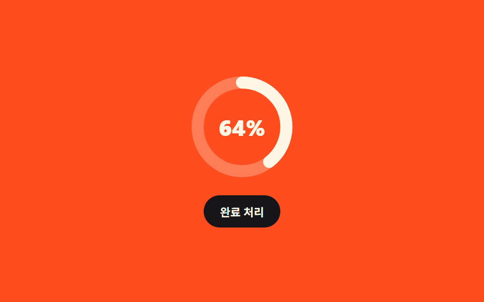
07Ring badge with check morph
Clicking "mark done" winds the ring to full, then the percent fades and a check mark actually draws itself along its stroke.
Best forMoments that deserve a small celebration at 100%, like a finished task or a successful upload
stroke-dashoffsetopacityclick
<main class="stage">
  <div class="bg is-demo">
    <div class="bg__dial">
      <svg class="bg__svg" viewBox="0 0 104 104" width="104" height="104" aria-hidden="true">
        <g class="bg__rings">
          <circle class="bg__track" cx="52" cy="52" r="44"/>
          <circle class="bg__ring" cx="52" cy="52" r="44"/>
        </g>
        <!-- 체크는 아이콘 폰트가 아니라 선 하나짜리 polyline — 그래야 dashoffset 으로 그려진다 -->
        <polyline class="bg__check" pathLength="100" points="36,53 47,64 69,40"/>
      </svg>
      <span class="bg__num" role="status" aria-label="Progress"></span>
    </div>
    <button class="bg__btn" type="button">Mark done</button>
  </div>
</main>
@use "../../../../site/static/demo-tokens" as *;
$duration: $dur-loop;
$easing: $ease-spring;
$color: $subject-cream;
@include stage($stage-orange);
@property --num {
syntax: "<integer>";
inherits: true;
initial-value: 0;
}
.bg {
--num: 64;
box-sizing: border-box;
display: grid;
justify-items: center;
gap: $sp-4;
color: $color;
font-family: -apple-system, "Segoe UI", "Noto Sans KR", sans-serif;
}
.bg__dial { position: relative; display: grid; place-items: center; }
.bg__svg { width: clamp(92px, 28vw, 104px); height: clamp(92px, 28vw, 104px); }
.bg__rings { transform: rotate(-90deg); transform-origin: 52px 52px; } // 규칙8: 링 중심 px 회전
.bg__track { fill: none; stroke: rgba(255, 247, 230, .28); stroke-width: 12; }
.bg__ring {
fill: none;
stroke: $color;
stroke-width: 12;
stroke-linecap: round;
// r=44 → C = 2π × 44 = 276.460
stroke-dasharray: 276.460;
stroke-dashoffset: calc(276.460 * (1 - var(--num) / 100));
transition: stroke-dashoffset $dur-enter $easing;
}
.bg__check {
fill: none;
stroke: $color;
stroke-width: 9;
stroke-linecap: round;
stroke-linejoin: round;
stroke-dasharray: 100;
stroke-dashoffset: 100;
transition: stroke-dashoffset $dur-enter $easing;
}
.bg__num {
position: absolute;
font-size: clamp(19px, 6vw, 22px);
font-weight: 800;
font-variant-numeric: tabular-nums;
transition: opacity $dur-quick $ease-out;
}
.bg__num::after {
counter-reset: n var(--num);
content: counter(n) "%";
}
// 완료 상태: 퍼센트가 빠지고 체크가 그려진다
.bg.is-done .bg__num { opacity: 0; }
.bg.is-done .bg__check { stroke-dashoffset: 0; }
.bg__btn {
border: 0;
border-radius: $r-pill;
background: $stage-ink;
color: $color;
font-family: inherit;
font-size: 11px;
font-weight: 700;
padding: $sp-2 $sp-4;
cursor: pointer;
transition: transform $dur-quick $ease-pop;
}
.bg__btn:hover, .bg__btn:focus-visible { transform: translateY(-2px); }
// ── 자동 루프: 감김 → 체크 그리기 → 체크 지우기 → 풀림. 한 바퀴가 제자리로 돌아온다 ──
.bg.is-demo .bg__ring { animation: bg-wind $duration $easing infinite; }
@keyframes bg-wind {
0% { stroke-dashoffset: 276.460; }
35%, 70% { stroke-dashoffset: 0; }
100% { stroke-dashoffset: 276.460; }
}
.bg.is-demo .bg__check { animation: bg-draw $duration $ease-out infinite; }
@keyframes bg-draw {
0%, 35% { stroke-dashoffset: 100; }
50%, 62% { stroke-dashoffset: 0; }
72%, 100% { stroke-dashoffset: 100; }
}
.bg.is-demo .bg__num { animation: bg-fade $duration $ease-out infinite; }
@keyframes bg-fade {
0%, 33% { opacity: 1; }
42%, 64% { opacity: 0; }
74%, 100% { opacity: 1; }
}
@media (prefers-reduced-motion: reduce) {
.bg.is-demo .bg__ring, .bg.is-demo .bg__check, .bg.is-demo .bg__num { animation: none !important; }
.bg__ring, .bg__check, .bg__num, .bg__btn { transition: none; }
}html, body {
margin: 0;
overflow: hidden;
}
.stage {
box-sizing: border-box;
min-height: 100vh;
display: grid;
place-items: center;
margin: 0;
background: #ff4d1f;
font-family: -apple-system, "Segoe UI", "Noto Sans KR", sans-serif;
padding: clamp(8px, 4vw, 24px);
}
@property --num {
syntax: "<integer>";
inherits: true;
initial-value: 0;
}
.bg {
--num: 64;
box-sizing: border-box;
display: grid;
justify-items: center;
gap: 16px;
color: #fff7e6;
font-family: -apple-system, "Segoe UI", "Noto Sans KR", sans-serif;
}
.bg__dial {
position: relative;
display: grid;
place-items: center;
}
.bg__svg {
width: clamp(92px, 28vw, 104px);
height: clamp(92px, 28vw, 104px);
}
.bg__rings {
transform: rotate(-90deg);
transform-origin: 52px 52px;
}
.bg__track {
fill: none;
stroke: rgba(255, 247, 230, 0.28);
stroke-width: 12;
}
.bg__ring {
fill: none;
stroke: #fff7e6;
stroke-width: 12;
stroke-linecap: round;
stroke-dasharray: 276.46;
stroke-dashoffset: calc(276.46 * (1 - var(--num) / 100));
transition: stroke-dashoffset 600ms cubic-bezier(0.2, 0.8, 0.2, 1);
}
.bg__check {
fill: none;
stroke: #fff7e6;
stroke-width: 9;
stroke-linecap: round;
stroke-linejoin: round;
stroke-dasharray: 100;
stroke-dashoffset: 100;
transition: stroke-dashoffset 600ms cubic-bezier(0.2, 0.8, 0.2, 1);
}
.bg__num {
position: absolute;
font-size: clamp(19px, 6vw, 22px);
font-weight: 800;
font-variant-numeric: tabular-nums;
transition: opacity 220ms ease-out;
}
.bg__num::after {
counter-reset: n var(--num);
content: counter(n) "%";
}
.bg.is-done .bg__num {
opacity: 0;
}
.bg.is-done .bg__check {
stroke-dashoffset: 0;
}
.bg__btn {
border: 0;
border-radius: 999px;
background: #17141a;
color: #fff7e6;
font-family: inherit;
font-size: 11px;
font-weight: 700;
padding: 8px 16px;
cursor: pointer;
transition: transform 220ms cubic-bezier(0.2, 1.4, 0.4, 1);
}
.bg__btn:hover, .bg__btn:focus-visible {
transform: translateY(-2px);
}
.bg.is-demo .bg__ring {
animation: bg-wind 2s cubic-bezier(0.2, 0.8, 0.2, 1) infinite;
}
@keyframes bg-wind {
0% {
stroke-dashoffset: 276.46;
}
35%, 70% {
stroke-dashoffset: 0;
}
100% {
stroke-dashoffset: 276.46;
}
}
.bg.is-demo .bg__check {
animation: bg-draw 2s ease-out infinite;
}
@keyframes bg-draw {
0%, 35% {
stroke-dashoffset: 100;
}
50%, 62% {
stroke-dashoffset: 0;
}
72%, 100% {
stroke-dashoffset: 100;
}
}
.bg.is-demo .bg__num {
animation: bg-fade 2s ease-out infinite;
}
@keyframes bg-fade {
0%, 33% {
opacity: 1;
}
42%, 64% {
opacity: 0;
}
74%, 100% {
opacity: 1;
}
}
@media (prefers-reduced-motion: reduce) {
.bg.is-demo .bg__ring, .bg.is-demo .bg__check, .bg.is-demo .bg__num {
animation: none !important;
}
.bg__ring, .bg__check, .bg__num, .bg__btn {
transition: none;
}
}// 실제 동작: 누르면 is-done 이 붙어 링이 끝까지 감기고 퍼센트가 빠진 자리에 체크가 그려진다. 다시 누르면 되돌아온다.
var bg = document.querySelector('.bg');
bg.querySelector('.bg__btn').addEventListener('click', function () {
bg.classList.remove('is-demo');
var done = bg.classList.toggle('is-done');
bg.style.setProperty('--num', done ? '100' : '64');
});import { useState } from "react";
import type { CSSProperties } from "react";
import styles from "./RingCheckBadge.module.scss";
export type RingCheckBadgeProps = {
duration?: number;
easing?: string;
color?: string;
};
type Vars = CSSProperties & {
"--duration"?: string;
"--easing"?: string;
"--color"?: string;
"--num"?: string;
};
export default function RingCheckBadge({
duration = 600,
easing = "cubic-bezier(.2,.8,.2,1)",
color = "#fff7e6",
}: RingCheckBadgeProps) {
const [done, setDone] = useState(false);
const vars: Vars = {
"--duration": `${duration}ms`,
"--easing": easing,
"--color": color,
"--num": done ? "100" : "64",
};
return (
<div className={`${styles.bg} ${done ? styles.isDone : ""}`} style={vars}>
<div className={styles.dial}>
<svg className={styles.svg} viewBox="0 0 104 104" width="104" height="104" aria-hidden="true">
<g className={styles.rings}>
<circle className={styles.track} cx="52" cy="52" r="44" />
<circle className={styles.ring} cx="52" cy="52" r="44" />
</g>
{/* the check is one polyline, not an icon font — that is what lets dashoffset draw it */}
<polyline className={styles.check} pathLength="100" points="36,53 47,64 69,40" />
</svg>
<span className={styles.num} role="status" aria-label="Progress" />
</div>
<button className={styles.btn} type="button" onClick={() => setDone((d) => !d)}>
Mark done
</button>
</div>
);
}07 Ring badge with check morph — Measured area 3.041% · moving frames 21/23Original by GODRICH · SCSS and React ship in the zip · 9 SVG Progress Ring Widgets, Math Included
The post this demo lives in
 9 SVG Progress Ring Widgets, Math IncludedAn SVG progress ring fills a circle instead of a bar, and one <circle> with two attributes gets you there: stroke-dashar See all demos in this post