03Spin-to-win wheel
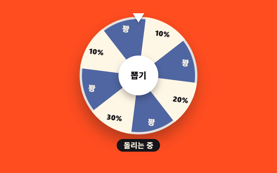
Spin the wheel to win a discount. The eight slices are painted by a single conic-gradient; press draw and a decel easing carries it five full turns until the winning slice settles under the pointer.
Best forSignup welcome popup, first-launch spin wheel
conic-gradientcubic-bezierrotate
<main class="stage">
<div class="wh is-demo" id="wh">
  <div class="wh__rig">
    <div class="wh__pointer" aria-hidden="true"></div>
    <div class="wh__disc" id="disc">
      <div class="wh__ring" aria-hidden="true"></div>
      <span class="wh__lbl" style="--k: 0"><b>10%</b></span>
      <span class="wh__lbl wh__lbl--b" style="--k: 1"><b>Miss</b></span>
      <span class="wh__lbl" style="--k: 2"><b>20%</b></span>
      <span class="wh__lbl wh__lbl--b" style="--k: 3"><b>Miss</b></span>
      <span class="wh__lbl" style="--k: 4"><b>30%</b></span>
      <span class="wh__lbl wh__lbl--b" style="--k: 5"><b>Miss</b></span>
      <span class="wh__lbl" style="--k: 6"><b>10%</b></span>
      <span class="wh__lbl wh__lbl--b" style="--k: 7"><b>Miss</b></span>
    </div>
    <button type="button" class="wh__hub" id="hub">Draw</button>
  </div>
  <p class="wh__result" aria-live="polite"><span class="wh__msg wh__msg--idle">Spin the wheel to win a discount</span><span class="wh__msg wh__msg--spin" aria-hidden="true">Spinning</span><span class="wh__msg wh__msg--win" aria-hidden="true">You won 30% off!</span></p>
</div>
</main>
@use "../../../../site/static/demo-tokens" as *;
// 돌림판 쿠폰 룰렛 — 여덟 칸은 conic-gradient 한 줄로 칠한다.
// 미리보기 루프는 1800deg(정확히 5바퀴)를 돌아 처음과 같은 각으로 돌아온다 — 텔레포트 없음.
// 실제 클릭은 transition 감속 회전(랜덤 당첨칸), 격자 루프와 별개.
$duration: $dur-loop;
$easing: $ease-out;
$color: $subject-cream;
@include stage($stage-orange);
.wh { display: flex; flex-direction: column; align-items: center; gap: $sp-2; width: 100%; }
.wh__rig { position: relative; width: clamp(168px, 48vw, 204px); aspect-ratio: 1; }
.wh__pointer {
position: absolute; top: -6px; left: 50%; transform: translateX(-50%);
width: 0; height: 0; border-left: 10px solid transparent; border-right: 10px solid transparent;
border-top: 16px solid $stage-paper; z-index: 2; filter: drop-shadow(0 2px 2px rgba(23,20,26,.3));
}
.wh__disc {
position: relative; width: 100%; height: 100%; border-radius: 50%;
background:
conic-gradient(
$subject-cream 0deg 45deg,
#5066a2 45deg 90deg,
$subject-cream 90deg 135deg,
#5066a2 135deg 180deg,
$subject-cream 180deg 225deg,
#5066a2 225deg 270deg,
$subject-cream 270deg 315deg,
#5066a2 315deg 360deg
);
box-shadow: $shadow-raised;
transition: transform 1.8s cubic-bezier(.12, .8, .08, 1);
}
// 링은 disc 안쪽에 — 바깥(-6px)에 두면 회전한 경계 상자가 무대를 넘어 BD9 가 깨진다
.wh__ring { position: absolute; inset: 0; border-radius: 50%; border: 4px solid rgba(255,247,230,.85); }
// 라벨은 칸마다 작은 조각으로 — inset:0 짜리 판을 통째로 돌리면 회전한 경계 상자가
// 원판 지름의 √2 배(224 → 310px)로 부풀어 무대를 넘는다(BD9 실측).
.wh__lbl {
position: absolute; left: calc(50% - 22px); top: calc(50% - 10px);
width: 44px; height: 20px; pointer-events: none;
// 칸 하나가 45deg 이므로 라벨은 칸 **중앙**인 k*45+22.5deg 에 놓는다
transform: rotate(calc(var(--k) * 45deg + 22.5deg)) translateY(var(--label-r, -84px));
}
.wh__lbl b {
display: block; text-align: center; line-height: 20px;
font-weight: 800; font-size: clamp(10px, 3vw, 13px); color: $subject-ink;
transform: rotate(calc(var(--k) * -45deg - 22.5deg));
}
.wh__lbl--b b { color: $subject-cream; }
// 허브는 판(.wh__disc) 밖 — 판 안에 두면 회전과 함께 「뽑기」 글자까지 거꾸로 돈다(클릭 실측)
.wh__hub {
position: absolute; left: 50%; top: 50%; transform: translate(-50%, -50%);
width: 34%; aspect-ratio: 1; border: 0; cursor: pointer; border-radius: 50%;
background: $stage-paper; color: $subject-ink; font-family: inherit;
font-weight: 800; font-size: clamp(12px, 3.6vw, 15px); line-height: 1;
box-shadow: $shadow-press; z-index: 1;
transition: transform 140ms cubic-bezier(.2,.8,.2,1);
}
.wh__hub:active { transform: translate(-50%, -50%) scale(.92); }
.wh__hub:focus-visible { outline: 3px solid $stage-yellow; outline-offset: 3px; }
// 주황 무대 위 흰 글자는 3.32:1 로 AA 미달(실측) — 문구는 잉크 알약 위에 올린다
.wh__result { position: relative; margin: 0; min-height: 1.9em; width: min(100%, 300px); text-align: center; }
.wh__msg {
display: inline-block; font-weight: 700; font-size: clamp(11px, 3.2vw, 13px);
color: $subject-cream; background: $subject-ink; border-radius: $r-pill; padding: 0 $sp-3; line-height: 1.7;
}
.wh__msg--spin, .wh__msg--win { position: absolute; left: 50%; top: 0; transform: translateX(-50%); visibility: hidden; }
.wh__msg--win { color: $stage-yellow; }
.wh.is-spinning .wh__msg--idle { visibility: hidden; }
.wh.is-spinning .wh__msg--spin { visibility: visible; }
.wh.is-won .wh__msg--idle { visibility: hidden; }
.wh.is-won .wh__msg--win { visibility: visible; }
// ── 격자 미리보기 루프: 5바퀴 감속 회전 → 82% 에 결과 컷 → 95% 복귀(회전각은 정확히 0으로)
.wh.is-demo .wh__disc { animation: whSpin 2s cubic-bezier(.12, .8, .08, 1) infinite; transition: none; }
@keyframes whSpin {
0% { transform: rotate(0deg); }
82%, 100% { transform: rotate(1800deg); }
}
.wh.is-demo .wh__msg--idle { animation: whCutIdle 2s steps(1, end) infinite; }
@keyframes whCutIdle { 0%, 8% { visibility: visible; } 8.5%, 94% { visibility: hidden; } 94.5%, 100% { visibility: visible; } }
.wh.is-demo .wh__msg--spin { animation: whCutSpin 2s steps(1, end) infinite; }
@keyframes whCutSpin { 0%, 8% { visibility: hidden; } 8.5%, 81% { visibility: visible; } 81.5%, 100% { visibility: hidden; } }
.wh.is-demo .wh__msg--win { animation: whCutWin 2s steps(1, end) infinite; }
@keyframes whCutWin { 0%, 81% { visibility: hidden; } 81.5%, 94% { visibility: visible; } 94.5%, 100% { visibility: hidden; } }
@media (max-width: 340px) {
// 320px 무대의 세로 여유는 174px 뿐 — 판 지름을 먼저 줄인다
.wh__rig { width: 132px; }
.wh { gap: $sp-1; --label-r: -48px; }
.wh__msg { font-size: 10px; padding: 0 $sp-2; }
.wh__lbl b { font-size: 10px; }
}
@media (prefers-reduced-motion: reduce) {
.wh.is-demo .wh__disc,
.wh.is-demo .wh__msg--idle,
.wh.is-demo .wh__msg--spin,
.wh.is-demo .wh__msg--win { animation: none !important; }
.wh__disc, .wh__hub { transition: none !important; }
// 회전 없이 결과만 즉시 보여준다
.wh.is-demo .wh__msg--idle { visibility: hidden; }
.wh.is-demo .wh__msg--win { visibility: visible; }
}html, body {
margin: 0;
overflow: hidden;
}
.stage {
box-sizing: border-box;
min-height: 100vh;
display: grid;
place-items: center;
margin: 0;
background: #ff4d1f;
font-family: -apple-system, "Segoe UI", "Noto Sans KR", sans-serif;
padding: clamp(8px, 4vw, 24px);
}
.wh {
display: flex;
flex-direction: column;
align-items: center;
gap: 8px;
width: 100%;
}
.wh__rig {
position: relative;
width: clamp(168px, 48vw, 204px);
aspect-ratio: 1;
}
.wh__pointer {
position: absolute;
top: -6px;
left: 50%;
transform: translateX(-50%);
width: 0;
height: 0;
border-left: 10px solid transparent;
border-right: 10px solid transparent;
border-top: 16px solid #ffffff;
z-index: 2;
filter: drop-shadow(0 2px 2px rgba(23, 20, 26, 0.3));
}
.wh__disc {
position: relative;
width: 100%;
height: 100%;
border-radius: 50%;
background: conic-gradient(#fff7e6 0deg 45deg, #5066a2 45deg 90deg, #fff7e6 90deg 135deg, #5066a2 135deg 180deg, #fff7e6 180deg 225deg, #5066a2 225deg 270deg, #fff7e6 270deg 315deg, #5066a2 315deg 360deg);
box-shadow: 0 14px 24px rgba(23, 20, 26, 0.32);
transition: transform 1.8s cubic-bezier(0.12, 0.8, 0.08, 1);
}
.wh__ring {
position: absolute;
inset: 0;
border-radius: 50%;
border: 4px solid rgba(255, 247, 230, 0.85);
}
.wh__lbl {
position: absolute;
left: calc(50% - 22px);
top: calc(50% - 10px);
width: 44px;
height: 20px;
pointer-events: none;
transform: rotate(calc(var(--k) * 45deg + 22.5deg)) translateY(var(--label-r, -84px));
}
.wh__lbl b {
display: block;
text-align: center;
line-height: 20px;
font-weight: 800;
font-size: clamp(10px, 3vw, 13px);
color: #17141a;
transform: rotate(calc(var(--k) * -45deg - 22.5deg));
}
.wh__lbl--b b {
color: #fff7e6;
}
.wh__hub {
position: absolute;
left: 50%;
top: 50%;
transform: translate(-50%, -50%);
width: 34%;
aspect-ratio: 1;
border: 0;
cursor: pointer;
border-radius: 50%;
background: #ffffff;
color: #17141a;
font-family: inherit;
font-weight: 800;
font-size: clamp(12px, 3.6vw, 15px);
line-height: 1;
box-shadow: 0 6px 12px rgba(23, 20, 26, 0.32);
z-index: 1;
transition: transform 140ms cubic-bezier(0.2, 0.8, 0.2, 1);
}
.wh__hub:active {
transform: translate(-50%, -50%) scale(0.92);
}
.wh__hub:focus-visible {
outline: 3px solid #ffd23f;
outline-offset: 3px;
}
.wh__result {
position: relative;
margin: 0;
min-height: 1.9em;
width: min(100%, 300px);
text-align: center;
}
.wh__msg {
display: inline-block;
font-weight: 700;
font-size: clamp(11px, 3.2vw, 13px);
color: #fff7e6;
background: #17141a;
border-radius: 999px;
padding: 0 12px;
line-height: 1.7;
}
.wh__msg--spin, .wh__msg--win {
position: absolute;
left: 50%;
top: 0;
transform: translateX(-50%);
visibility: hidden;
}
.wh__msg--win {
color: #ffd23f;
}
.wh.is-spinning .wh__msg--idle {
visibility: hidden;
}
.wh.is-spinning .wh__msg--spin {
visibility: visible;
}
.wh.is-won .wh__msg--idle {
visibility: hidden;
}
.wh.is-won .wh__msg--win {
visibility: visible;
}
.wh.is-demo .wh__disc {
animation: whSpin 2s cubic-bezier(0.12, 0.8, 0.08, 1) infinite;
transition: none;
}
@keyframes whSpin {
0% {
transform: rotate(0deg);
}
82%, 100% {
transform: rotate(1800deg);
}
}
.wh.is-demo .wh__msg--idle {
animation: whCutIdle 2s steps(1, end) infinite;
}
@keyframes whCutIdle {
0%, 8% {
visibility: visible;
}
8.5%, 94% {
visibility: hidden;
}
94.5%, 100% {
visibility: visible;
}
}
.wh.is-demo .wh__msg--spin {
animation: whCutSpin 2s steps(1, end) infinite;
}
@keyframes whCutSpin {
0%, 8% {
visibility: hidden;
}
8.5%, 81% {
visibility: visible;
}
81.5%, 100% {
visibility: hidden;
}
}
.wh.is-demo .wh__msg--win {
animation: whCutWin 2s steps(1, end) infinite;
}
@keyframes whCutWin {
0%, 81% {
visibility: hidden;
}
81.5%, 94% {
visibility: visible;
}
94.5%, 100% {
visibility: hidden;
}
}
@media (max-width: 340px) {
.wh__rig {
width: 132px;
}
.wh {
gap: 4px;
--label-r: -48px;
}
.wh__msg {
font-size: 10px;
padding: 0 8px;
}
.wh__lbl b {
font-size: 10px;
}
}
@media (prefers-reduced-motion: reduce) {
.wh.is-demo .wh__disc,
.wh.is-demo .wh__msg--idle,
.wh.is-demo .wh__msg--spin,
.wh.is-demo .wh__msg--win {
animation: none !important;
}
.wh__disc, .wh__hub {
transition: none !important;
}
.wh.is-demo .wh__msg--idle {
visibility: hidden;
}
.wh.is-demo .wh__msg--win {
visibility: visible;
}
}var wh = document.getElementById('wh');
var disc = document.getElementById('disc');
var hub = document.getElementById('hub');
var spinning = false;
hub.addEventListener('click', function () {
if (spinning) { return; }
wh.classList.remove('is-demo');
spinning = true;
wh.classList.add('is-spinning');
var picks = [0, 2, 4, 6];
var idx = picks[Math.floor(Math.random() * picks.length)];
var perSlice = 45;
var target = 1800 + (360 - (idx * perSlice + perSlice / 2));
disc.style.transform = 'rotate(' + target + 'deg)';
window.setTimeout(function () {
wh.classList.remove('is-spinning');
wh.classList.add('is-won');
spinning = false;
}, 1900);
});// SpinWheelCoupon — vanilla 판(run/283/demo/03-coupon-spin-wheel/index.html) 의 React 포트.
// 여덟 칸은 conic-gradient 한 줄, 라벨은 칸 중앙(k*45+22.5deg)에 놓고 글자만 역회전시킨다.
// 실제 클릭은 transition 감속 회전(랜덤 당첨칸), 격자 미리보기 루프와 별개.
import { useEffect, useRef, useState } from "react";
import type { CSSProperties } from "react";
import styles from "./SpinWheelCoupon.module.scss";
export type SpinWheelCouponProps = {
/** 격자 미리보기용 2초 자동 루프. 사람이 손대면 꺼진다 */
demo?: boolean;
duration?: number;
easing?: string;
color?: string;
};
type Vars = CSSProperties & { "--duration"?: string; "--easing"?: string; "--color"?: string };
type SliceVars = CSSProperties & { "--k"?: number };
type Slice = { k: number; text: string };
/** 여덟 칸 — 짝수 칸이 당첨(크림 바탕), 홀수 칸이 꽝(파란 바탕) */
const SLICES: Slice[] = [
{ k: 0, text: "10%" },
{ k: 1, text: "꽝" },
{ k: 2, text: "20%" },
{ k: 3, text: "꽝" },
{ k: 4, text: "30%" },
{ k: 5, text: "꽝" },
{ k: 6, text: "10%" },
{ k: 7, text: "꽝" },
];
/** 멈출 수 있는 칸(당첨칸만) — vanilla 의 picks 와 같다 */
const PICKS: number[] = [0, 2, 4, 6];
const PER_SLICE = 45;
/** 감속 회전이 끝나는 시각(ms) — vanilla 의 setTimeout 1900 과 같다 */
const SETTLE_MS = 1900;
export default function SpinWheelCoupon({
demo = true,
duration = 2000,
easing = "ease-out",
color = "#fff7e6",
}: SpinWheelCouponProps) {
const [live, setLive] = useState(demo);
const [spinning, setSpinning] = useState(false);
const [won, setWon] = useState(false);
const [angle, setAngle] = useState(0);
const timer = useRef<number>(null);
const vars: Vars = { "--duration": `${duration}ms`, "--easing": easing, "--color": color };
useEffect(function () {
return function () {
if (timer.current !== null) {
window.clearTimeout(timer.current);
}
};
}, []);
// vanilla 의 click 핸들러와 같은 순서·같은 수치
function applySpin() {
if (spinning) {
return;
}
setLive(false);
setWon(false);
setSpinning(true);
const idx = PICKS[Math.floor(Math.random() * PICKS.length)];
const target = 1800 + (360 - (idx * PER_SLICE + PER_SLICE / 2));
setAngle(target);
timer.current = window.setTimeout(function () {
setSpinning(false);
setWon(true);
}, SETTLE_MS);
}
const cls = [
styles.root,
live ? styles.isDemo : "",
spinning ? styles.isSpinning : "",
won ? styles.isWon : "",
].filter(Boolean).join(" ");
const discStyle: CSSProperties = live ? {} : { transform: `rotate(${angle}deg)` };
return (
<main className={styles.stage} style={vars}>
<div className={cls}>
<div className={styles.rig}>
<div className={styles.pointer} aria-hidden="true"></div>
<div className={styles.disc} style={discStyle}>
<div className={styles.ring} aria-hidden="true"></div>
{SLICES.map(function (slice: Slice) {
const sliceVars: SliceVars = { "--k": slice.k };
const lblCls = [styles.lbl, slice.k % 2 === 1 ? styles.lblB : ""].filter(Boolean).join(" ");
return (
<span className={lblCls} style={sliceVars} key={slice.k}><b>{slice.text}</b></span>
);
})}
<button type="button" className={styles.hub} onClick={applySpin}>뽑기</button>
</div>
</div>
<p className={styles.result} aria-live="polite">
<span className={`${styles.msg} ${styles.msgIdle}`}>판을 돌려 할인을 뽑아보세요</span>
<span className={`${styles.msg} ${styles.msgSpin}`} aria-hidden="true">돌리는 중</span>
<span className={`${styles.msg} ${styles.msgWin}`} aria-hidden="true">30% 할인 당첨!</span>
</p>
</div>
</main>
);
}03 Spin-to-win wheel — Measured area 32.835% · moving frames 21/23Original by GODRICH · SCSS and React ship in the zip · Coupon Design: 9 CSS Coupons, Stamp to Spin
The post this demo lives in
 Coupon Design: 9 CSS Coupons, Stamp to SpinCoupon design is what a discount looks like on screen and how it behaves — notch, tear line, stamp slot, countdown. Thes See all demos in this post