05Spinning gradient border
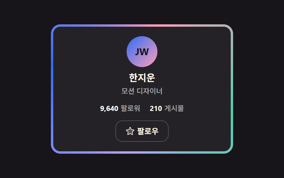
A registered custom property carries the angle so a conic gradient sweeps once around the card, and an inner panel covers it to leave only the rim glowing.
Best forPaid members and verified accounts, where one rim has to say "this person is special"
@propertyconic-gradient--angle
<main class="stage">
  <div class="gr is-demo">
    <div class="gr__rim">
      <article class="gr__face">
        <div class="gr__avatar" aria-hidden="true">JW</div>
        <h2 class="gr__name">Jiun Han</h2>
        <p class="gr__role">Motion designer</p>
        <p class="gr__stats">
          <span class="gr__stat"><strong>9,640</strong>Followers</span>
          <span class="gr__stat"><strong>210</strong>Posts</span>
        </p>
        <button class="gr__follow" type="button" id="gr-follow" aria-pressed="false">
          <svg class="gr__i gr__i--star" viewBox="0 0 256 256" width="16" height="16" aria-hidden="true"><g fill="currentColor"><path d="m229.06 108.79l-48.7 42l14.88 62.79a8.4 8.4 0 0 1-12.52 9.17L128 189.09l-54.72 33.65a8.4 8.4 0 0 1-12.52-9.17l14.88-62.79l-48.7-42A8.46 8.46 0 0 1 31.73 94l63.91-5.2l24.62-59.6a8.36 8.36 0 0 1 15.48 0l24.62 59.6l63.91 5.2a8.46 8.46 0 0 1 4.79 14.79" opacity=".2"/><path d="M239.18 97.26A16.38 16.38 0 0 0 224.92 86l-59-4.76l-22.78-55.09a16.36 16.36 0 0 0-30.27 0L90.11 81.23L31.08 86a16.46 16.46 0 0 0-9.37 28.86l45 38.83L53 211.75a16.38 16.38 0 0 0 24.5 17.82l50.5-31.08l50.53 31.08A16.4 16.4 0 0 0 203 211.75l-13.76-58.07l45-38.83a16.43 16.43 0 0 0 4.94-17.59m-15.34 5.47l-48.7 42a8 8 0 0 0-2.56 7.91l14.88 62.8a.37.37 0 0 1-.17.48c-.18.14-.23.11-.38 0l-54.72-33.65a8 8 0 0 0-8.38 0l-54.72 33.67c-.15.09-.19.12-.38 0a.37.37 0 0 1-.17-.48l14.88-62.8a8 8 0 0 0-2.56-7.91l-48.7-42c-.12-.1-.23-.19-.13-.5s.18-.27.33-.29l63.92-5.16a8 8 0 0 0 6.72-4.94l24.62-59.61c.08-.17.11-.25.35-.25s.27.08.35.25L153 91.86a8 8 0 0 0 6.75 4.92l63.92 5.16c.15 0 .24 0 .33.29s0 .4-.16.5"/></g></svg>
          <svg class="gr__i gr__i--check" viewBox="0 0 256 256" width="16" height="16" aria-hidden="true"><g fill="currentColor"><path d="M232 56v144a16 16 0 0 1-16 16H40a16 16 0 0 1-16-16V56a16 16 0 0 1 16-16h176a16 16 0 0 1 16 16" opacity=".2"/><path d="m205.66 85.66l-96 96a8 8 0 0 1-11.32 0l-40-40a8 8 0 0 1 11.32-11.32L104 164.69l90.34-90.35a8 8 0 0 1 11.32 11.32"/></g></svg>
          <span class="gr__label" id="gr-label">Follow</span>
        </button>
      </article>
    </div>
  </div>
</main>
@use "../../../../site/static/demo-tokens" as *;
// 회전 각도 — @property 로 등록해야 --angle 이 보간된다 (등록 없으면 테두리가 안 돈다)
@property --angle {
syntax: "<angle>";
initial-value: 0deg;
inherits: false;
}
$duration: $dur-enter;
$easing: $ease-spring;
$color: $subject-blue;
@include stage($stage-ink);
.gr {
display: grid;
place-items: center;
user-select: none;
-webkit-user-select: none;
}
// 바깥 상자: conic 그라디언트 테두리가 2초에 한 바퀴 돈다 (360deg 순환 — 텔레포트 없음)
.gr__rim {
width: 300px;
padding: $sp-1;
border-radius: $r-card;
background: conic-gradient(from var(--angle),
$subject-blue, $subject-pink, $subject-mint, $subject-lilac, $subject-blue);
animation-name: gr-spin;
animation-duration: $dur-loop;
animation-timing-function: linear;
animation-iteration-count: infinite;
}
@keyframes gr-spin { to { --angle: 360deg; } }
.gr__face {
display: flex;
flex-direction: column;
align-items: center;
padding: $sp-4;
border-radius: $r-control;
background-color: $stage-ink;
background-image: linear-gradient(rgba(255, 255, 255, .06), rgba(255, 255, 255, .06));
}
.gr__avatar {
display: grid;
place-items: center;
width: 52px;
height: 52px;
border-radius: 50%;
background: linear-gradient(135deg, $subject-blue, $subject-pink);
color: $subject-ink;
font-size: 16px;
line-height: 20px;
font-weight: 700;
}
.gr__name {
margin: $sp-2 0 0;
font-size: 16px;
line-height: 20px;
font-weight: 700;
color: $subject-cream;
}
.gr__role {
margin: $sp-1 0 0;
font-size: 12px;
line-height: 16px;
font-weight: 500;
color: rgba(255, 255, 255, .6);
}
.gr__stats {
display: flex;
gap: $sp-4;
margin: $sp-3 0 0;
font-size: 12px;
line-height: 18px;
font-weight: 500;
color: rgba(255, 255, 255, .6);
}
.gr__stat strong {
margin-right: $sp-1;
font-weight: 700;
color: $subject-cream;
font-variant-numeric: tabular-nums;
}
.gr__follow {
display: inline-flex;
align-items: center;
justify-content: center;
gap: $sp-1;
height: 36px;
margin: $sp-3 0 0;
padding: 0 $sp-4;
background: none;
border: 1px solid rgba(255, 255, 255, .22);
border-radius: $r-control;
color: $subject-cream;
font-family: inherit;
font-size: 13px;
line-height: 16px;
font-weight: 600;
cursor: pointer;
transition: background $dur-quick $easing, border-color $duration $easing;
}
.gr__follow:hover { background: rgba(255, 255, 255, .08); }
.gr__follow:focus-visible { outline: 2px solid $color; outline-offset: 2px; }
.gr__follow[aria-pressed="true"] { border-color: rgba($subject-mint, .65); }
.gr__i { display: inline-flex; }
.gr__i--check { display: none; color: $subject-mint; }
.gr__follow[aria-pressed="true"] .gr__i--star { display: none; }
.gr__follow[aria-pressed="true"] .gr__i--check { display: inline-flex; }
@media (max-width: 340px) {
.gr__rim { width: 272px; }
.gr__face { padding: $sp-3; }
.gr__avatar { width: 44px; height: 44px; font-size: 14px; line-height: 16px; }
.gr__name { margin-top: $sp-1; font-size: 13px; line-height: 16px; }
.gr__role { margin-top: 0; font-size: 11px; line-height: 14px; }
.gr__stats { margin-top: $sp-1; gap: $sp-3; font-size: 11px; line-height: 15px; }
.gr__follow { height: 32px; margin-top: $sp-1; padding: 0 $sp-3; font-size: 12px; line-height: 14px; }
}
@media (prefers-reduced-motion: reduce) {
.gr__rim { animation: none !important; }
.gr__follow { transition: none; }
}@property --angle {
syntax: "<angle>";
initial-value: 0deg;
inherits: false;
}
html, body {
margin: 0;
overflow: hidden;
}
.stage {
box-sizing: border-box;
min-height: 100vh;
display: grid;
place-items: center;
margin: 0;
background: #17141a;
font-family: -apple-system, "Segoe UI", "Noto Sans KR", sans-serif;
padding: clamp(8px, 4vw, 24px);
}
.gr {
display: grid;
place-items: center;
user-select: none;
-webkit-user-select: none;
}
.gr__rim {
width: 300px;
padding: 4px;
border-radius: 16px;
background: conic-gradient(from var(--angle), #2f6df6, #ff9ebb, #4cd4a6, #b9a0ff, #2f6df6);
animation-name: gr-spin;
animation-duration: 2s;
animation-timing-function: linear;
animation-iteration-count: infinite;
}
@keyframes gr-spin {
to {
--angle: 360deg;
}
}
.gr__face {
display: flex;
flex-direction: column;
align-items: center;
padding: 16px;
border-radius: 12px;
background-color: #17141a;
background-image: linear-gradient(rgba(255, 255, 255, 0.06), rgba(255, 255, 255, 0.06));
}
.gr__avatar {
display: grid;
place-items: center;
width: 52px;
height: 52px;
border-radius: 50%;
background: linear-gradient(135deg, #2f6df6, #ff9ebb);
color: #17141a;
font-size: 16px;
line-height: 20px;
font-weight: 700;
}
.gr__name {
margin: 8px 0 0;
font-size: 16px;
line-height: 20px;
font-weight: 700;
color: #fff7e6;
}
.gr__role {
margin: 4px 0 0;
font-size: 12px;
line-height: 16px;
font-weight: 500;
color: rgba(255, 255, 255, 0.6);
}
.gr__stats {
display: flex;
gap: 16px;
margin: 12px 0 0;
font-size: 12px;
line-height: 18px;
font-weight: 500;
color: rgba(255, 255, 255, 0.6);
}
.gr__stat strong {
margin-right: 4px;
font-weight: 700;
color: #fff7e6;
font-variant-numeric: tabular-nums;
}
.gr__follow {
display: inline-flex;
align-items: center;
justify-content: center;
gap: 4px;
height: 36px;
margin: 12px 0 0;
padding: 0 16px;
background: none;
border: 1px solid rgba(255, 255, 255, 0.22);
border-radius: 12px;
color: #fff7e6;
font-family: inherit;
font-size: 13px;
line-height: 16px;
font-weight: 600;
cursor: pointer;
transition: background 220ms cubic-bezier(0.2, 0.8, 0.2, 1), border-color 600ms cubic-bezier(0.2, 0.8, 0.2, 1);
}
.gr__follow:hover {
background: rgba(255, 255, 255, 0.08);
}
.gr__follow:focus-visible {
outline: 2px solid #2f6df6;
outline-offset: 2px;
}
.gr__follow[aria-pressed=true] {
border-color: rgba(76, 212, 166, 0.65);
}
.gr__i {
display: inline-flex;
}
.gr__i--check {
display: none;
color: #4cd4a6;
}
.gr__follow[aria-pressed=true] .gr__i--star {
display: none;
}
.gr__follow[aria-pressed=true] .gr__i--check {
display: inline-flex;
}
@media (max-width: 340px) {
.gr__rim {
width: 272px;
}
.gr__face {
padding: 12px;
}
.gr__avatar {
width: 44px;
height: 44px;
font-size: 14px;
line-height: 16px;
}
.gr__name {
margin-top: 4px;
font-size: 13px;
line-height: 16px;
}
.gr__role {
margin-top: 0;
font-size: 11px;
line-height: 14px;
}
.gr__stats {
margin-top: 4px;
gap: 12px;
font-size: 11px;
line-height: 15px;
}
.gr__follow {
height: 32px;
margin-top: 4px;
padding: 0 12px;
font-size: 12px;
line-height: 14px;
}
}
@media (prefers-reduced-motion: reduce) {
.gr__rim {
animation: none !important;
}
.gr__follow {
transition: none;
}
}// 실제 동작: Follow 토글(aria-pressed) · 첫 조작에 자동 루프 종료 (테두리 회전은 유지)
var root = document.querySelector('.gr');
var btn = document.getElementById('gr-follow');
var label = document.getElementById('gr-label');
function stopDemo() { root.classList.remove('is-demo'); }
root.addEventListener('pointerdown', stopDemo);
root.addEventListener('keydown', stopDemo);
btn.addEventListener('click', function () {
var on = btn.getAttribute('aria-pressed') === 'true';
btn.setAttribute('aria-pressed', on ? 'false' : 'true');
label.textContent = on ? 'Follow' : 'Following';
});import { useState } from "react";
import type { CSSProperties, ReactNode } from "react";
import styles from "./GradientRimCard.module.scss";
export type GradientRimCardProps = {
name?: string;
role?: string;
initials?: string;
followers?: string;
posts?: string;
duration?: number;
easing?: string;
color?: string;
};
type ClickEvt = { currentTarget: { blur(): void } };
type Vars = CSSProperties & { "--duration"?: string; "--easing"?: string; "--color"?: string };
const IconStar = (): ReactNode => (
<svg viewBox="0 0 256 256" width="16" height="16" aria-hidden="true"><g fill="currentColor"><path d="m229.06 108.79l-48.7 42l14.88 62.79a8.4 8.4 0 0 1-12.52 9.17L128 189.09l-54.72 33.65a8.4 8.4 0 0 1-12.52-9.17l14.88-62.79l-48.7-42A8.46 8.46 0 0 1 31.73 94l63.91-5.2l24.62-59.6a8.36 8.36 0 0 1 15.48 0l24.62 59.6l63.91 5.2a8.46 8.46 0 0 1 4.79 14.79" opacity=".2"/><path d="M239.18 97.26A16.38 16.38 0 0 0 224.92 86l-59-4.76l-22.78-55.09a16.36 16.36 0 0 0-30.27 0L90.11 81.23L31.08 86a16.46 16.46 0 0 0-9.37 28.86l45 38.83L53 211.75a16.38 16.38 0 0 0 24.5 17.82l50.5-31.08l50.53 31.08A16.4 16.4 0 0 0 203 211.75l-13.76-58.07l45-38.83a16.43 16.43 0 0 0 4.94-17.59m-15.34 5.47l-48.7 42a8 8 0 0 0-2.56 7.91l14.88 62.8a.37.37 0 0 1-.17.48c-.18.14-.23.11-.38 0l-54.72-33.65a8 8 0 0 0-8.38 0l-54.72 33.67c-.15.09-.19.12-.38 0a.37.37 0 0 1-.17-.48l14.88-62.8a8 8 0 0 0-2.56-7.91l-48.7-42c-.12-.1-.23-.19-.13-.5s.18-.27.33-.29l63.92-5.16a8 8 0 0 0 6.72-4.94l24.62-59.61c.08-.17.11-.25.35-.25s.27.08.35.25L153 91.86a8 8 0 0 0 6.75 4.92l63.92 5.16c.15 0 .24 0 .33.29s0 .4-.16.5"/></g></svg>
);
const IconCheck = (): ReactNode => (
<svg viewBox="0 0 256 256" width="16" height="16" aria-hidden="true"><g fill="currentColor"><path d="M232 56v144a16 16 0 0 1-16 16H40a16 16 0 0 1-16-16V56a16 16 0 0 1 16-16h176a16 16 0 0 1 16 16" opacity=".2"/><path d="m205.66 85.66l-96 96a8 8 0 0 1-11.32 0l-40-40a8 8 0 0 1 11.32-11.32L104 164.69l90.34-90.35a8 8 0 0 1 11.32 11.32"/></g></svg>
);
export default function GradientRimCard({
name = "한지운",
role = "모션 디자이너",
initials = "JW",
followers = "9,640",
posts = "210",
duration = 600,
easing = "cubic-bezier(.2,.8,.2,1)",
color = "#2f6df6",
}: GradientRimCardProps): ReactNode {
const [on, setOn] = useState(false);
const vars: Vars = { "--duration": `${duration}ms`, "--easing": easing, "--color": color };
const toggle = (e: ClickEvt): void => {
setOn((v: boolean): boolean => !v);
e.currentTarget.blur();
};
return (
<div className={styles.gr} style={vars}>
<div className={styles.rim}>
<article className={styles.face}>
<div className={styles.avatar} aria-hidden="true">{initials}</div>
<h2 className={styles.name}>{name}</h2>
<p className={styles.role}>{role}</p>
<p className={styles.stats}>
<span className={styles.stat}><strong>{followers}</strong>팔로워</span>
<span className={styles.stat}><strong>{posts}</strong>게시물</span>
</p>
<button type="button" className={styles.follow} aria-pressed={on} onClick={toggle}>
{on ? <IconCheck /> : <IconStar />}
<span className={styles.label}>{on ? "팔로잉" : "팔로우"}</span>
</button>
</article>
</div>
</div>
);
}05 Spinning gradient border — Measured area 2.851% · moving frames 23/23Original by GODRICH · SCSS and React ship in the zip · 9 Profile Card Design Styles, Copy-Paste Ready
The post this demo lives in
 9 Profile Card Design Styles, Copy-Paste ReadyProfile card design is the job of deciding what material a fixed block of content wears: avatar, name, role, stats, foll See all demos in this post
If you like this effect - similar demos
 Landing sections06 CTA band — a strip whose border-angle value keeps increasing once it enters viewHero Section Design Examples: 9 Patterns
 Landing sections08 Short-post card wallTestimonial Section Design: 9 Social Proof Blocks
 Landing sections03 Spin-to-win wheelCoupon Design: 9 CSS Coupons, Stamp to Spin