08Birthday candle coupon
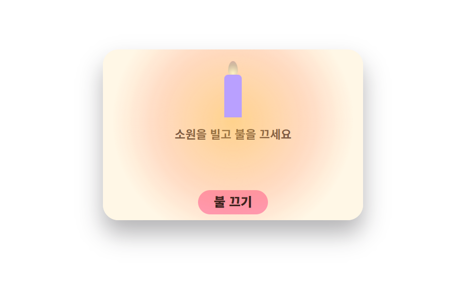
A birthday coupon. The ribbon loop unties to open the card, and the flame sways on a bottom transform-origin. Press blow out and the flame fades away, locking in the discount.
Best forBirthday message card, anniversary coupon
clip-pathtransform-originblur
<main class="stage">
<div class="bd is-demo" id="bd">
  <div class="bd__card" id="card">
    <div class="bd__closed">
      <p class="bd__closedTitle"><svg xmlns="http://www.w3.org/2000/svg" viewBox="0 0 256 256" fill="currentColor" class="bd__ico" aria-hidden="true"><path d="M104,48c0-24,24-40,24-40s24,16,24,40a24,24,0,0,1-48,0ZM208,96H48a16,16,0,0,0-16,16v23.33c0,17.44,13.67,32.18,31.1,32.66A32,32,0,0,0,96,136a32,32,0,0,0,64,0,32,32,0,0,0,32.9,32c17.43-.48,31.1-15.22,31.1-32.66V112A16,16,0,0,0,208,96Z" opacity="0.2"/><path d="M232,112a24,24,0,0,0-24-24H136V79a32.06,32.06,0,0,0,24-31c0-28-26.44-45.91-27.56-46.66a8,8,0,0,0-8.88,0C122.44,2.09,96,20,96,48a32.06,32.06,0,0,0,24,31v9H48a24,24,0,0,0-24,24v23.33a40.84,40.84,0,0,0,8,24.24V200a24,24,0,0,0,24,24H200a24,24,0,0,0,24-24V159.57a40.84,40.84,0,0,0,8-24.24ZM112,48c0-13.57,10-24.46,16-29.79,6,5.33,16,16.22,16,29.79a16,16,0,0,1-32,0ZM40,112a8,8,0,0,1,8-8H208a8,8,0,0,1,8,8v23.33c0,13.25-10.46,24.31-23.32,24.66A24,24,0,0,1,168,136a8,8,0,0,0-16,0,24,24,0,0,1-48,0,8,8,0,0,0-16,0,24,24,0,0,1-24.68,24C50.46,159.64,40,148.58,40,135.33Zm160,96H56a8,8,0,0,1-8-8V172.56A38.77,38.77,0,0,0,62.88,176a39.69,39.69,0,0,0,29-11.31A40.36,40.36,0,0,0,96,160a40,40,0,0,0,64,0,40.36,40.36,0,0,0,4.13,4.67A39.67,39.67,0,0,0,192,176c.38,0,.76,0,1.14,0A38.77,38.77,0,0,0,208,172.56V200A8,8,0,0,1,200,208Z"/></svg><span>Happy birthday!</span></p>
      <button type="button" class="bd__openBtn" id="openBtn">Untie the ribbon</button>
    </div>
    <div class="bd__open" aria-hidden="true">
      <span class="bd__room" aria-hidden="true"></span>
      <div class="bd__candle">
        <span class="bd__flame" aria-hidden="true"></span>
        <span class="bd__glow" aria-hidden="true"></span>
        <span class="bd__wax" aria-hidden="true"></span>
      </div>
      <p class="bd__say">Make a wish and blow out the candle</p>
      <p class="bd__pct">Birthday <b>20%</b></p>
      <button type="button" class="bd__blowBtn" id="blowBtn">Blow out</button>
    </div>
  </div>
  <p class="bd__live" id="live" aria-live="polite"></p>
</div>
</main>
@use "../../../../site/static/demo-tokens" as *;
// 생일 쿠폰 — 리본을 풀면(clip-path 개봉) 촛불이 나타나고, 불꽃은 아래 고정축(transform-origin)으로 흔들린다.
// 불 끄기 → 불꽃이 스르르 줄어들고(역시 아래축) 연기 오르며 할인 확정.
$duration: $dur-enter;
$easing: $ease-spring;
$color: $subject-pink;
@include stage($stage-paper);
.bd { display: flex; flex-direction: column; align-items: center; gap: $sp-2; width: 100%; }
.bd__card {
position: relative; width: min(100%, 268px); aspect-ratio: 268 / 176;
background: $subject-cream; border-radius: $r-card; box-shadow: $shadow-raised; overflow: hidden;
}
.bd__closed, .bd__open { position: absolute; inset: 0; display: flex; flex-direction: column; align-items: center; justify-content: center; gap: $sp-2; }
.bd__closed { background: linear-gradient(160deg, $subject-pink, #ebd6dc); }
.bd__closedTitle { display: flex; align-items: center; gap: $sp-1; margin: 0; font-weight: 800; font-size: clamp(15px, 4.6vw, 20px); color: $subject-ink; }
.bd__ico { width: 22px; height: 22px; color: $subject-ink; }
.bd__openBtn {
border: 0; cursor: pointer; background: $subject-ink; color: $subject-cream;
border-radius: $r-pill; font-family: inherit; font-weight: 800;
font-size: clamp(11px, 3.2vw, 13px); padding: $sp-2 $sp-5; line-height: 1.2;
transition: transform 140ms cubic-bezier(.2,.8,.2,1);
}
.bd__openBtn:active { transform: scale(.94); }
.bd__openBtn:focus-visible { outline: 3px solid $subject-blue; outline-offset: 2px; }
.bd__open { background: $subject-cream; clip-path: inset(0 0 100% 0); }
.bd.is-open .bd__open { clip-path: inset(0 0 0 0); transition: clip-path 600ms $ease-out; }
.bd.is-open .bd__closed { visibility: hidden; }
.bd__candle { position: relative; width: 24px; height: 64px; }
.bd__wax {
position: absolute; left: 50%; bottom: 0; transform: translateX(-50%);
width: 18px; height: 44px; border-radius: $r-xs $r-xs 0 0; background: $subject-lilac;
}
.bd__flame {
position: absolute; left: calc(50% - 5px); bottom: 42px;
width: 10px; height: 16px; border-radius: 50% 50% 50% 50% / 62% 62% 38% 38%;
background: radial-gradient(circle at 50% 78%, #fff3c4, #d1bda1 62%, #d1ada1 100%);
transform-origin: 50% 100%;
}
.bd__glow {
position: absolute; left: calc(50% - 13px); bottom: 32px;
width: 26px; height: 26px; border-radius: 50%;
background: radial-gradient(circle, rgba(255,176,58,.5), transparent 70%);
filter: blur(4px);
}
// 촛불이 방 전체를 물들인다 — 불이 켜진 동안만 카드 바탕이 따뜻해진다
.bd__room {
position: absolute; inset: 0; pointer-events: none; opacity: 0;
background: radial-gradient(circle at 50% 42%, rgba(255,176,58,.55), rgba(255,109,58,.22) 46%, transparent 74%);
}
.bd.is-lit-off .bd__room { opacity: 0 !important; animation: none !important; }
.bd__say { margin: 0; font-weight: 700; font-size: clamp(10px, 3vw, 12px); color: rgba(23,20,26,.78); }
.bd__pct { margin: 0; font-weight: 700; font-size: clamp(13px, 4vw, 16px); color: $subject-ink; }
.bd__pct b { font-weight: 800; font-size: 1.6em; color: $subject-blue; }
.bd__blowBtn {
border: 0; cursor: pointer; background: $subject-pink; color: $subject-ink;
border-radius: $r-pill; font-family: inherit; font-weight: 800;
font-size: clamp(11px, 3.2vw, 13px); padding: $sp-1 $sp-4; line-height: 1.3;
transition: transform 140ms cubic-bezier(.2,.8,.2,1);
}
.bd__blowBtn:active { transform: scale(.94); }
.bd__blowBtn:focus-visible { outline: 3px solid $subject-blue; outline-offset: 2px; }
.bd.is-lit-off .bd__flame { animation: none; transform: scaleY(0); }
.bd.is-lit-off .bd__glow { animation: none; opacity: 0; }
.bd.is-lit-off .bd__say { visibility: hidden; }
.bd__live { margin: 0; min-height: 1.2em; font-weight: 700; font-size: clamp(10px, 2.8vw, 11px); color: rgba(23,20,26,.6); }
// 불꽃 흔들림 — 실사용에서도 계속 산다(장식이 아니라 상태 표시)
.bd__flame { animation: bdFlicker 900ms ease-in-out infinite; }
@keyframes bdFlicker {
0%, 100% { transform: skewX(0deg) scaleY(1) scaleX(1); }
25% { transform: skewX(4deg) scaleY(1.08) scaleX(.94); }
55% { transform: skewX(-3deg) scaleY(.94) scaleX(1.05); }
80% { transform: skewX(2deg) scaleY(1.05) scaleX(.97); }
}
.bd__glow { animation: bdGlow 900ms ease-in-out infinite; }
@keyframes bdGlow { 0%, 100% { transform: scale(1); opacity: .9; } 50% { transform: scale(1.25); opacity: .55; } }
// ── 격자 미리보기 루프: 카드는 **열린 채로** 시작한다. 개봉 wipe 를 루프에 넣으면
// 그 중간 프레임이 언제나 최대 변화라 대표 이미지가 닫힌 분홍 카드가 된다(실측) —
// 주인공인 촛불이 안 보인다. 점화(10%) → 흔들림 → 62% 불 끄기 → 70% 할인 확정 → 94% 복귀
.bd.is-demo .bd__open { clip-path: inset(0 0 0 0); }
.bd.is-demo .bd__closed { visibility: hidden; }
.bd.is-demo .bd__flame { animation: bdFlameLoop 2s ease-in-out infinite; }
@keyframes bdFlameLoop {
0%, 10% { transform: scaleY(0); }
16% { transform: scaleY(1); }
22% { transform: skewX(4deg) scaleY(1.08) scaleX(.94); }
30% { transform: skewX(-3deg) scaleY(.94) scaleX(1.05); }
38% { transform: skewX(2deg) scaleY(1.05) scaleX(.97); }
46% { transform: skewX(-4deg) scaleY(1.1) scaleX(.93); }
54% { transform: skewX(3deg) scaleY(.96) scaleX(1.04); }
62% { transform: skewX(0deg) scaleY(1); }
67%, 92% { transform: scaleY(0); }
92.5%, 100% { transform: scaleY(0); }
}
.bd.is-demo .bd__glow { animation: bdGlowLoop 2s ease-in-out infinite; }
@keyframes bdGlowLoop {
0%, 16% { transform: scale(.6); opacity: 0; }
22% { transform: scale(1); opacity: .9; }
40% { transform: scale(1.2); opacity: .6; }
56% { transform: scale(1.05); opacity: .85; }
62%, 92% { transform: scale(.4); opacity: 0; }
92.5%, 100% { transform: scale(.4); opacity: 0; }
}
// 점화는 한 프레임 컷 — 방이 밝아지는 그 장이 대표 이미지(poster)가 되게 한다.
// 서서히 밝히면 최대 변화 프레임이 「아직 어두운 중간」 이라 촛불빛이 안 찍힌다(실측).
.bd.is-demo .bd__room { animation: bdRoom 2s infinite; }
@keyframes bdRoom {
0%, 13% { opacity: 0; animation-timing-function: steps(1, end); }
14%, 40% { opacity: .95; animation-timing-function: ease-in-out; }
52% { opacity: .7; }
60% { opacity: .95; animation-timing-function: steps(1, end); }
62%, 100% { opacity: 0; }
}
// 불이 켜져 있는 동안은 실사용에서도 방이 밝다
.bd.is-open:not(.is-lit-off) .bd__room { opacity: .85; animation: bdRoomLive 900ms ease-in-out infinite; }
@keyframes bdRoomLive { 0%, 100% { opacity: .85; } 50% { opacity: .62; } }
.bd.is-demo .bd__pct { animation: bdPop 2s ease-out infinite; }
@keyframes bdPop { 0%, 68% { transform: scale(.6); opacity: 0; } 74%, 92% { transform: scale(1); opacity: 1; } 94%, 100% { transform: scale(.6); opacity: 0; } }
.bd.is-demo .bd__say { animation: bdSayCut 2s steps(1, end) infinite; }
@keyframes bdSayCut { 0%, 62% { visibility: visible; } 62.5%, 92% { visibility: hidden; } 92.5%, 100% { visibility: visible; } }
@media (max-width: 340px) {
.bd__candle { height: 44px; width: 20px; }
.bd__wax { height: 28px; width: 14px; }
.bd__flame { bottom: 26px; }
.bd__glow { bottom: 16px; }
.bd__card { width: min(100%, 228px); }
.bd__closed, .bd__open { gap: $sp-1; }
.bd { gap: $sp-1; }
}
@media (prefers-reduced-motion: reduce) {
.bd.is-demo .bd__flame,
.bd.is-demo .bd__glow,
.bd.is-demo .bd__room,
.bd.is-demo .bd__pct,
.bd.is-demo .bd__say,
.bd.is-open:not(.is-lit-off) .bd__room,
.bd__flame,
.bd__glow { animation: none !important; }
.bd.is-demo .bd__room { opacity: .85; }
.bd__openBtn, .bd__blowBtn { transition: none !important; }
.bd.is-demo .bd__flame { transform: scaleY(1); }
.bd.is-demo .bd__glow { transform: scale(1); opacity: .8; }
.bd.is-demo .bd__pct { transform: scale(1); opacity: 1; }
.bd.is-demo .bd__say { visibility: hidden; }
}html, body {
margin: 0;
overflow: hidden;
}
.stage {
box-sizing: border-box;
min-height: 100vh;
display: grid;
place-items: center;
margin: 0;
background: #ffffff;
font-family: -apple-system, "Segoe UI", "Noto Sans KR", sans-serif;
padding: clamp(8px, 4vw, 24px);
}
.bd {
display: flex;
flex-direction: column;
align-items: center;
gap: 8px;
width: 100%;
}
.bd__card {
position: relative;
width: min(100%, 268px);
aspect-ratio: 268/176;
background: #fff7e6;
border-radius: 16px;
box-shadow: 0 14px 24px rgba(23, 20, 26, 0.32);
overflow: hidden;
}
.bd__closed, .bd__open {
position: absolute;
inset: 0;
display: flex;
flex-direction: column;
align-items: center;
justify-content: center;
gap: 8px;
}
.bd__closed {
background: linear-gradient(160deg, #ff9ebb, #ebd6dc);
}
.bd__closedTitle {
display: flex;
align-items: center;
gap: 4px;
margin: 0;
font-weight: 800;
font-size: clamp(15px, 4.6vw, 20px);
color: #17141a;
}
.bd__ico {
width: 22px;
height: 22px;
color: #17141a;
}
.bd__openBtn {
border: 0;
cursor: pointer;
background: #17141a;
color: #fff7e6;
border-radius: 999px;
font-family: inherit;
font-weight: 800;
font-size: clamp(11px, 3.2vw, 13px);
padding: 8px 20px;
line-height: 1.2;
transition: transform 140ms cubic-bezier(0.2, 0.8, 0.2, 1);
}
.bd__openBtn:active {
transform: scale(0.94);
}
.bd__openBtn:focus-visible {
outline: 3px solid #2f6df6;
outline-offset: 2px;
}
.bd__open {
background: #fff7e6;
clip-path: inset(0 0 100% 0);
}
.bd.is-open .bd__open {
clip-path: inset(0 0 0 0);
transition: clip-path 600ms ease-out;
}
.bd.is-open .bd__closed {
visibility: hidden;
}
.bd__candle {
position: relative;
width: 24px;
height: 64px;
}
.bd__wax {
position: absolute;
left: 50%;
bottom: 0;
transform: translateX(-50%);
width: 18px;
height: 44px;
border-radius: 4px 4px 0 0;
background: #b9a0ff;
}
.bd__flame {
position: absolute;
left: calc(50% - 5px);
bottom: 42px;
width: 10px;
height: 16px;
border-radius: 50% 50% 50% 50%/62% 62% 38% 38%;
background: radial-gradient(circle at 50% 78%, #fff3c4, #d1bda1 62%, #d1ada1 100%);
transform-origin: 50% 100%;
}
.bd__glow {
position: absolute;
left: calc(50% - 13px);
bottom: 32px;
width: 26px;
height: 26px;
border-radius: 50%;
background: radial-gradient(circle, rgba(255, 176, 58, 0.5), transparent 70%);
filter: blur(4px);
}
.bd__room {
position: absolute;
inset: 0;
pointer-events: none;
opacity: 0;
background: radial-gradient(circle at 50% 42%, rgba(255, 176, 58, 0.55), rgba(255, 109, 58, 0.22) 46%, transparent 74%);
}
.bd.is-lit-off .bd__room {
opacity: 0 !important;
animation: none !important;
}
.bd__say {
margin: 0;
font-weight: 700;
font-size: clamp(10px, 3vw, 12px);
color: rgba(23, 20, 26, 0.78);
}
.bd__pct {
margin: 0;
font-weight: 700;
font-size: clamp(13px, 4vw, 16px);
color: #17141a;
}
.bd__pct b {
font-weight: 800;
font-size: 1.6em;
color: #2f6df6;
}
.bd__blowBtn {
border: 0;
cursor: pointer;
background: #ff9ebb;
color: #17141a;
border-radius: 999px;
font-family: inherit;
font-weight: 800;
font-size: clamp(11px, 3.2vw, 13px);
padding: 4px 16px;
line-height: 1.3;
transition: transform 140ms cubic-bezier(0.2, 0.8, 0.2, 1);
}
.bd__blowBtn:active {
transform: scale(0.94);
}
.bd__blowBtn:focus-visible {
outline: 3px solid #2f6df6;
outline-offset: 2px;
}
.bd.is-lit-off .bd__flame {
animation: none;
transform: scaleY(0);
}
.bd.is-lit-off .bd__glow {
animation: none;
opacity: 0;
}
.bd.is-lit-off .bd__say {
visibility: hidden;
}
.bd__live {
margin: 0;
min-height: 1.2em;
font-weight: 700;
font-size: clamp(10px, 2.8vw, 11px);
color: rgba(23, 20, 26, 0.6);
}
.bd__flame {
animation: bdFlicker 900ms ease-in-out infinite;
}
@keyframes bdFlicker {
0%, 100% {
transform: skewX(0deg) scaleY(1) scaleX(1);
}
25% {
transform: skewX(4deg) scaleY(1.08) scaleX(0.94);
}
55% {
transform: skewX(-3deg) scaleY(0.94) scaleX(1.05);
}
80% {
transform: skewX(2deg) scaleY(1.05) scaleX(0.97);
}
}
.bd__glow {
animation: bdGlow 900ms ease-in-out infinite;
}
@keyframes bdGlow {
0%, 100% {
transform: scale(1);
opacity: 0.9;
}
50% {
transform: scale(1.25);
opacity: 0.55;
}
}
.bd.is-demo .bd__open {
clip-path: inset(0 0 0 0);
}
.bd.is-demo .bd__closed {
visibility: hidden;
}
.bd.is-demo .bd__flame {
animation: bdFlameLoop 2s ease-in-out infinite;
}
@keyframes bdFlameLoop {
0%, 10% {
transform: scaleY(0);
}
16% {
transform: scaleY(1);
}
22% {
transform: skewX(4deg) scaleY(1.08) scaleX(0.94);
}
30% {
transform: skewX(-3deg) scaleY(0.94) scaleX(1.05);
}
38% {
transform: skewX(2deg) scaleY(1.05) scaleX(0.97);
}
46% {
transform: skewX(-4deg) scaleY(1.1) scaleX(0.93);
}
54% {
transform: skewX(3deg) scaleY(0.96) scaleX(1.04);
}
62% {
transform: skewX(0deg) scaleY(1);
}
67%, 92% {
transform: scaleY(0);
}
92.5%, 100% {
transform: scaleY(0);
}
}
.bd.is-demo .bd__glow {
animation: bdGlowLoop 2s ease-in-out infinite;
}
@keyframes bdGlowLoop {
0%, 16% {
transform: scale(0.6);
opacity: 0;
}
22% {
transform: scale(1);
opacity: 0.9;
}
40% {
transform: scale(1.2);
opacity: 0.6;
}
56% {
transform: scale(1.05);
opacity: 0.85;
}
62%, 92% {
transform: scale(0.4);
opacity: 0;
}
92.5%, 100% {
transform: scale(0.4);
opacity: 0;
}
}
.bd.is-demo .bd__room {
animation: bdRoom 2s infinite;
}
@keyframes bdRoom {
0%, 13% {
opacity: 0;
animation-timing-function: steps(1, end);
}
14%, 40% {
opacity: 0.95;
animation-timing-function: ease-in-out;
}
52% {
opacity: 0.7;
}
60% {
opacity: 0.95;
animation-timing-function: steps(1, end);
}
62%, 100% {
opacity: 0;
}
}
.bd.is-open:not(.is-lit-off) .bd__room {
opacity: 0.85;
animation: bdRoomLive 900ms ease-in-out infinite;
}
@keyframes bdRoomLive {
0%, 100% {
opacity: 0.85;
}
50% {
opacity: 0.62;
}
}
.bd.is-demo .bd__pct {
animation: bdPop 2s ease-out infinite;
}
@keyframes bdPop {
0%, 68% {
transform: scale(0.6);
opacity: 0;
}
74%, 92% {
transform: scale(1);
opacity: 1;
}
94%, 100% {
transform: scale(0.6);
opacity: 0;
}
}
.bd.is-demo .bd__say {
animation: bdSayCut 2s steps(1, end) infinite;
}
@keyframes bdSayCut {
0%, 62% {
visibility: visible;
}
62.5%, 92% {
visibility: hidden;
}
92.5%, 100% {
visibility: visible;
}
}
@media (max-width: 340px) {
.bd__candle {
height: 44px;
width: 20px;
}
.bd__wax {
height: 28px;
width: 14px;
}
.bd__flame {
bottom: 26px;
}
.bd__glow {
bottom: 16px;
}
.bd__card {
width: min(100%, 228px);
}
.bd__closed, .bd__open {
gap: 4px;
}
.bd {
gap: 4px;
}
}
@media (prefers-reduced-motion: reduce) {
.bd.is-demo .bd__flame,
.bd.is-demo .bd__glow,
.bd.is-demo .bd__room,
.bd.is-demo .bd__pct,
.bd.is-demo .bd__say,
.bd.is-open:not(.is-lit-off) .bd__room,
.bd__flame,
.bd__glow {
animation: none !important;
}
.bd.is-demo .bd__room {
opacity: 0.85;
}
.bd__openBtn, .bd__blowBtn {
transition: none !important;
}
.bd.is-demo .bd__flame {
transform: scaleY(1);
}
.bd.is-demo .bd__glow {
transform: scale(1);
opacity: 0.8;
}
.bd.is-demo .bd__pct {
transform: scale(1);
opacity: 1;
}
.bd.is-demo .bd__say {
visibility: hidden;
}
}var bd = document.getElementById('bd');
var openBtn = document.getElementById('openBtn');
var blowBtn = document.getElementById('blowBtn');
var openPane = document.querySelector('.bd__open');
var live = document.getElementById('live');
openBtn.addEventListener('click', function () {
bd.classList.remove('is-demo');
bd.classList.add('is-open');
openPane.setAttribute('aria-hidden', 'false');
live.textContent = 'The birthday coupon is open';
});
blowBtn.addEventListener('click', function () {
bd.classList.remove('is-demo');
bd.classList.add('is-lit-off');
live.textContent = 'Candle out — the 20% discount is locked in';
});// BirthdayCandleCoupon — vanilla 판(run/283/demo/08-coupon-birthday-candle/index.html) 의 React 포트.
// 「리본 풀기」로 카드를 열고(clip-path), 「불 끄기」로 촛불을 꺼서 할인을 확정한다.
import { useState } from "react";
import type { CSSProperties } from "react";
import styles from "./BirthdayCandleCoupon.module.scss";
export type BirthdayCandleCouponProps = {
/** 격자 미리보기 루프 한 바퀴 (vanilla 2s) */
duration?: number;
easing?: string;
color?: string;
};
type Vars = CSSProperties & { "--duration"?: string; "--easing"?: string; "--color"?: string };
export default function BirthdayCandleCoupon({
duration = 2000,
easing = "cubic-bezier(.2, .8, .2, 1)",
color = "#ff9ebb",
}: BirthdayCandleCouponProps) {
const [demo, setDemo] = useState(true);
const [opened, setOpened] = useState(false);
const [litOff, setLitOff] = useState(false);
const [liveText, setLiveText] = useState("");
function applyOpen(): void {
setDemo(false);
setOpened(true);
setLiveText("생일 쿠폰이 열렸어요");
}
function applyBlow(): void {
setDemo(false);
setLitOff(true);
setLiveText("불을 껐어요 — 20% 할인이 확정됐어요");
}
const vars: Vars = { "--duration": `${duration}ms`, "--easing": easing, "--color": color };
const cls: string = [
styles.root,
demo ? styles.isDemo : "",
opened ? styles.isOpen : "",
litOff ? styles.isLitOff : "",
].filter(Boolean).join(" ");
return (
<main className={styles.stage}>
<div className={cls} style={vars}>
<div className={styles.card}>
<div className={styles.closed}>
<p className={styles.closedTitle}>
<svg xmlns="http://www.w3.org/2000/svg" viewBox="0 0 256 256" fill="currentColor" className={styles.ico} aria-hidden="true"><path d="M104,48c0-24,24-40,24-40s24,16,24,40a24,24,0,0,1-48,0ZM208,96H48a16,16,0,0,0-16,16v23.33c0,17.44,13.67,32.18,31.1,32.66A32,32,0,0,0,96,136a32,32,0,0,0,64,0,32,32,0,0,0,32.9,32c17.43-.48,31.1-15.22,31.1-32.66V112A16,16,0,0,0,208,96Z" opacity="0.2" /><path d="M232,112a24,24,0,0,0-24-24H136V79a32.06,32.06,0,0,0,24-31c0-28-26.44-45.91-27.56-46.66a8,8,0,0,0-8.88,0C122.44,2.09,96,20,96,48a32.06,32.06,0,0,0,24,31v9H48a24,24,0,0,0-24,24v23.33a40.84,40.84,0,0,0,8,24.24V200a24,24,0,0,0,24,24H200a24,24,0,0,0,24-24V159.57a40.84,40.84,0,0,0,8-24.24ZM112,48c0-13.57,10-24.46,16-29.79,6,5.33,16,16.22,16,29.79a16,16,0,0,1-32,0ZM40,112a8,8,0,0,1,8-8H208a8,8,0,0,1,8,8v23.33c0,13.25-10.46,24.31-23.32,24.66A24,24,0,0,1,168,136a8,8,0,0,0-16,0,24,24,0,0,1-48,0,8,8,0,0,0-16,0,24,24,0,0,1-24.68,24C50.46,159.64,40,148.58,40,135.33Zm160,96H56a8,8,0,0,1-8-8V172.56A38.77,38.77,0,0,0,62.88,176a39.69,39.69,0,0,0,29-11.31A40.36,40.36,0,0,0,96,160a40,40,0,0,0,64,0,40.36,40.36,0,0,0,4.13,4.67A39.67,39.67,0,0,0,192,176c.38,0,.76,0,1.14,0A38.77,38.77,0,0,0,208,172.56V200A8,8,0,0,1,200,208Z" /></svg>
<span>생일 축하해요!</span>
</p>
<button type="button" className={styles.openBtn} onClick={applyOpen}>리본 풀기</button>
</div>
<div className={styles.open} aria-hidden={opened ? "false" : "true"}>
<span className={styles.room} aria-hidden="true" />
<div className={styles.candle}>
<span className={styles.flame} aria-hidden="true" />
<span className={styles.glow} aria-hidden="true" />
<span className={styles.wax} aria-hidden="true" />
</div>
<p className={styles.say}>소원을 빌고 불을 끄세요</p>
<p className={styles.pct}>생일 <b>20%</b></p>
<button type="button" className={styles.blowBtn} onClick={applyBlow}>불 끄기</button>
</div>
</div>
<p className={styles.live} aria-live="polite">{liveText}</p>
</div>
</main>
);
}08 Birthday candle coupon — Measured area 22.044% · moving frames 17/23Original by GODRICH · SCSS and React ship in the zip · Coupon Design: 9 CSS Coupons, Stamp to Spin
The post this demo lives in
 Coupon Design: 9 CSS Coupons, Stamp to SpinCoupon design is what a discount looks like on screen and how it behaves — notch, tear line, stamp slot, countdown. Thes See all demos in this post