06Loader Whose Rotating Polygon Prism Fills Faces in the Order They Pass
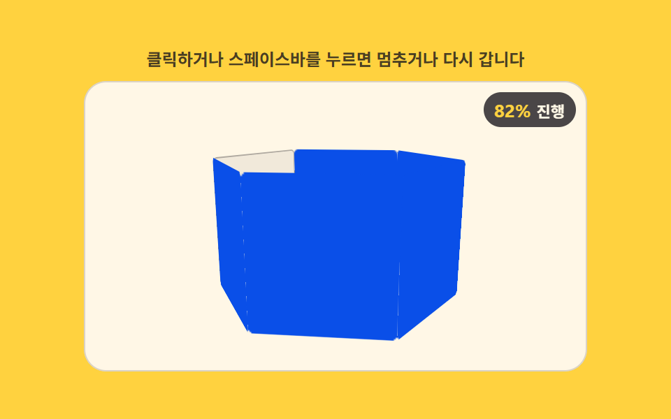
The polygon prism keeps rotating at a fixed rate while each face is filled with color in order up to the index reached by the progress value, leaving unreached faces empty so the fill boundary shows on every turn.
Best forSurvey-progress steps, inventory-fill indicators
PRISM_SIDESFILL_SPANtransform-style
<main class="stage">
<div class="ld" id="ld">
  <p class="ld__hint">Click or press the space bar to pause or restart</p>
  <div class="ld__field" id="field" role="application" aria-label="Rotating prism face-fill test panel" tabindex="0">
    <div class="c3__scene">
      <div class="c3__prism" id="prism"></div>
    </div>
    <b class="ld__badge" aria-hidden="true"><span class="ld__badgeNum" id="pct">0%</span><span class="ld__badgeUnit">Progress</span></b>
  </div>
</div>
</main>
@use "../../../../site/static/demo-tokens" as *;
// 회전 다각기둥 면 채움 로더 — 육각기둥을 일정 속도로 계속 회전시키며, 진행률 값이
// 면마다 정해진 문턱(면 순번 / 전체 면수)을 넘는 순간부터 그 면에 색이 번져 채워진다.
// 채워진 면은 회전이 계속돼도 그대로 유지되어, 한 바퀴 돌 때마다 채워진 경계가 눈에 보인다.
// 01(문턱 하나로 앞면 인덱스를 스왑)·02(정점 좌표 보간)·03(연속 랭크 함수)·04(고리별 개별 기울기 보간)
// ·05(구면 분포 중심 수렴) 과 다른 축 — 면마다 독립된 문턱 램프 함수로 채움 정도를 계산한다.
$duration: $dur-loop;
$easing: linear;
$color: $subject-blue-deep;
@include stage($stage-yellow);
.ld { display: flex; flex-direction: column; gap: $sp-2; width: 100%; max-width: 360px; }
.ld__hint {
margin: 0;
font-weight: 700; font-size: clamp(10px, 2.8vw, 12px); line-height: 1.35;
color: rgba($subject-ink, .78);
text-align: center;
}
.ld__field {
position: relative; height: 208px;
border-radius: $r-card; overflow: hidden;
background: $subject-cream;
box-shadow: inset 0 0 0 1px rgba($subject-ink, .16);
cursor: pointer;
}
.ld__field:focus-visible { outline: 2px solid $subject-blue-light; outline-offset: 2px; }
.c3__scene { position: absolute; inset: 0; perspective: clamp(320px, 70vw, 480px); }
.c3__prism { position: absolute; left: 50%; top: 50%; width: 0; height: 0; transform-style: preserve-3d; }
.c3__face {
position: absolute; left: -44px; top: -48px;
width: 88px; height: 96px;
border-radius: $r-xs;
background: rgba($subject-ink, .06);
box-shadow: inset 0 0 0 1px rgba($subject-ink, .3);
}
.c3__fill {
position: absolute; inset: 0;
border-radius: $r-xs;
background: $color;
opacity: 0;
will-change: opacity;
}
.ld__badge {
position: absolute; right: $sp-2; top: $sp-2;
display: flex; align-items: baseline; gap: $sp-1;
padding: $sp-1 $sp-2; border-radius: $r-pill;
background: rgba($subject-ink, .78);
color: $subject-cream; font-weight: 700; font-size: 11px;
}
.ld__badgeNum { font-size: 13px; color: $stage-yellow; }
.ld__badgeUnit { font-weight: 700; }
@media (max-width: 340px) {
.ld { gap: $sp-1; }
.ld__field { height: 124px; }
.ld__badge { font-size: 10px; padding: 0 $sp-1; }
.ld__badgeNum { font-size: 11px; }
}
@media (prefers-reduced-motion: reduce) {
.ld.is-still .ld__field { cursor: default !important; }
.ld.is-still .ld__badge { opacity: .92 !important; }
}html, body {
margin: 0;
overflow: hidden;
}
.stage {
box-sizing: border-box;
min-height: 100vh;
display: grid;
place-items: center;
margin: 0;
background: #ffd23f;
font-family: -apple-system, "Segoe UI", "Noto Sans KR", sans-serif;
padding: clamp(8px, 4vw, 24px);
}
.ld {
display: flex;
flex-direction: column;
gap: 8px;
width: 100%;
max-width: 360px;
}
.ld__hint {
margin: 0;
font-weight: 700;
font-size: clamp(10px, 2.8vw, 12px);
line-height: 1.35;
color: rgba(23, 20, 26, 0.78);
text-align: center;
}
.ld__field {
position: relative;
height: 208px;
border-radius: 16px;
overflow: hidden;
background: #fff7e6;
box-shadow: inset 0 0 0 1px rgba(23, 20, 26, 0.16);
cursor: pointer;
}
.ld__field:focus-visible {
outline: 2px solid #5b8cf8;
outline-offset: 2px;
}
.c3__scene {
position: absolute;
inset: 0;
perspective: clamp(320px, 70vw, 480px);
}
.c3__prism {
position: absolute;
left: 50%;
top: 50%;
width: 0;
height: 0;
transform-style: preserve-3d;
}
.c3__face {
position: absolute;
left: -44px;
top: -48px;
width: 88px;
height: 96px;
border-radius: 4px;
background: rgba(23, 20, 26, 0.06);
box-shadow: inset 0 0 0 1px rgba(23, 20, 26, 0.3);
}
.c3__fill {
position: absolute;
inset: 0;
border-radius: 4px;
background: #0a4fe8;
opacity: 0;
will-change: opacity;
}
.ld__badge {
position: absolute;
right: 8px;
top: 8px;
display: flex;
align-items: baseline;
gap: 4px;
padding: 4px 8px;
border-radius: 999px;
background: rgba(23, 20, 26, 0.78);
color: #fff7e6;
font-weight: 700;
font-size: 11px;
}
.ld__badgeNum {
font-size: 13px;
color: #ffd23f;
}
.ld__badgeUnit {
font-weight: 700;
}
@media (max-width: 340px) {
.ld {
gap: 4px;
}
.ld__field {
height: 124px;
}
.ld__badge {
font-size: 10px;
padding: 0 4px;
}
.ld__badgeNum {
font-size: 11px;
}
}
@media (prefers-reduced-motion: reduce) {
.ld.is-still .ld__field {
cursor: default !important;
}
.ld.is-still .ld__badge {
opacity: 0.92 !important;
}
}(function () {
'use strict';
var root = document.getElementById('ld');
var field = document.getElementById('field');
var pctEl = document.getElementById('pct');
var prism = document.getElementById('prism');
var PRISM_SIDES = 6;
var RADIUS = 76;
var ROT_TURNS = 1;
var FILL_SPAN = 1 / (PRISM_SIDES * 2); // 문턱을 넘은 뒤 색이 번지는 데 걸리는 진행률 폭
var faces = [];
var fills = [];
for (var i = 0; i < PRISM_SIDES; i++) {
var face = document.createElement('div');
face.className = 'c3__face';
face.style.transform = 'rotateY(' + (i * (360 / PRISM_SIDES)) + 'deg) translateZ(' + RADIUS + 'px)';
var fill = document.createElement('div');
fill.className = 'c3__fill';
face.appendChild(fill);
prism.appendChild(face);
faces.push(face);
fills.push(fill);
}
var reduce = window.matchMedia('(prefers-reduced-motion: reduce)').matches;
var LOOP = 2;
var REDUCE_P = 0.7;
var t0 = 0, raf = 0, paused = false, lastP = 0;
// 면 i 의 문턱은 i / PRISM_SIDES — 진행률이 그 문턱을 넘으면 FILL_SPAN 동안 선형으로 번져 채워지고,
// 그 뒤로는 값이 줄지 않는 한(루프가 돌아 p 가 다시 작아지기 전까지) 채워진 채로 유지된다.
function fillAmount(i, p) {
var threshold = i / PRISM_SIDES;
var raw = (p - threshold) / FILL_SPAN;
if (raw < 0) return 0;
if (raw > 1) return 1;
return raw;
}
function render(p) {
lastP = p;
var rotY = (p * 360 * ROT_TURNS) % 360;
prism.style.transform = 'rotateX(-14deg) rotateY(' + rotY + 'deg)';
for (var i = 0; i < PRISM_SIDES; i++) {
fills[i].style.opacity = String(fillAmount(i, p));
}
pctEl.textContent = Math.round(p * 100) + '%';
}
function frame(now) {
if (!paused) { var t = (now - t0) / 1000; render((t % LOOP) / LOOP); }
raf = requestAnimationFrame(frame);
}
function togglePause() {
paused = !paused;
root.classList.toggle('is-paused', paused);
render(reduce ? REDUCE_P : lastP);
}
function restart() {
t0 = performance.now();
render(reduce ? REDUCE_P : 0);
}
field.addEventListener('click', function () { togglePause(); });
field.addEventListener('keydown', function (e) {
if (e.key === ' ' || e.key === 'Enter') { e.preventDefault(); togglePause(); }
else if (e.key === 'r' || e.key === 'R') { e.preventDefault(); restart(); }
});
window.addEventListener('resize', function () {
if (paused || reduce) render(reduce ? REDUCE_P : lastP);
});
t0 = performance.now();
if (reduce) {
root.classList.add('is-still');
render(REDUCE_P);
} else {
raf = requestAnimationFrame(frame);
}
})();// PrismFaceFillRotate — vanilla 판(run/399/demo/06-loader-3d-prism-face-fill-rotate/index.html) 의 React 포트.
// 면마다 독립된 문턱(면 순번 / 전체 면수)을 넘으면 FILL_SPAN 폭 동안 선형으로 색이 번지는 램프 함수를 쓴다.
// 01·02·03·04·05 와 다른 축 — 면마다 독립된 문턱 램프 함수로 채움 정도를 계산한다.
import { useEffect, useRef } from "react";
import type { CSSProperties } from "react";
import styles from "./PrismFaceFillRotate.module.scss";
export type PrismFaceFillRotateProps = {
duration?: string;
easing?: string;
color?: string;
};
type Vars = CSSProperties & { "--duration"?: string; "--easing"?: string; "--color"?: string };
type Box<T> = { current: T };
type KeyEvt = { key: string; preventDefault(): void };
const PRISM_SIDES = 6;
const RADIUS = 76;
const ROT_TURNS = 1;
const FILL_SPAN = 1 / (PRISM_SIDES * 2);
const LOOP = 2;
const REDUCE_P = 0.7;
const FIELD_LABEL = "회전 다각기둥 면 채움 진행 실험판";
function fillAmount(i: number, p: number): number {
const threshold = i / PRISM_SIDES;
const raw = (p - threshold) / FILL_SPAN;
if (raw < 0) return 0;
if (raw > 1) return 1;
return raw;
}
export default function PrismFaceFillRotate({
duration = "2s",
easing = "linear",
color = "#0a4fe8",
}: PrismFaceFillRotateProps) {
const rootRef = useRef<HTMLDivElement | null>(null);
const fieldRef = useRef<HTMLDivElement | null>(null);
const prismRef = useRef<HTMLDivElement | null>(null);
const pctRef = useRef<HTMLSpanElement | null>(null);
const fillsRef = useRef<(HTMLDivElement | null)[]>(new Array(PRISM_SIDES).fill(null)) as Box<(HTMLDivElement | null)[]>;
const pausedRef = useRef(false) as Box<boolean>;
const lastPRef = useRef(0) as Box<number>;
const t0Ref = useRef(0) as Box<number>;
const rafRef = useRef(0) as Box<number>;
const vars: Vars = { "--duration": duration, "--easing": easing, "--color": color };
function reduced(): boolean {
return window.matchMedia("(prefers-reduced-motion: reduce)").matches;
}
function render(p: number): void {
lastPRef.current = p;
const rotY = (p * 360 * ROT_TURNS) % 360;
const prism = prismRef.current;
if (prism) prism.style.transform = "rotateX(-14deg) rotateY(" + rotY + "deg)";
const fills = fillsRef.current;
for (let i = 0; i < PRISM_SIDES; i++) {
const el = fills[i];
if (!el) continue;
el.style.opacity = String(fillAmount(i, p));
}
if (pctRef.current) pctRef.current.textContent = Math.round(p * 100) + "%";
}
function togglePause(): void {
pausedRef.current = !pausedRef.current;
const root = rootRef.current;
if (root) root.classList.toggle("is-paused", pausedRef.current);
render(reduced() ? REDUCE_P : lastPRef.current);
}
function restart(): void {
t0Ref.current = performance.now();
render(reduced() ? REDUCE_P : 0);
}
function onKey(e: KeyEvt): void {
if (e.key === " " || e.key === "Enter") { e.preventDefault(); togglePause(); }
else if (e.key === "r" || e.key === "R") { e.preventDefault(); restart(); }
}
function onClick(): void {
togglePause();
}
function onResize(): void {
if (pausedRef.current || reduced()) render(reduced() ? REDUCE_P : lastPRef.current);
}
function frame(now: number): void {
if (!pausedRef.current) {
const t = (now - t0Ref.current) / 1000;
render((t % LOOP) / LOOP);
}
rafRef.current = requestAnimationFrame(frame);
}
useEffect(() => {
t0Ref.current = performance.now();
window.addEventListener("resize", onResize);
if (reduced()) {
const root = rootRef.current;
if (root) root.classList.add("is-still");
render(REDUCE_P);
} else {
rafRef.current = requestAnimationFrame(frame);
}
return () => {
window.removeEventListener("resize", onResize);
cancelAnimationFrame(rafRef.current);
};
}, []);
return (
<main className={styles.stage}>
<div className={styles.root} ref={rootRef} style={vars}>
<p className={styles.hint}>클릭하거나 스페이스바를 누르면 멈추거나 다시 갑니다</p>
<div
className={styles.field}
ref={fieldRef}
role="application"
aria-label={FIELD_LABEL}
tabIndex={0}
onClick={onClick}
onKeyDown={onKey}
>
<div className={styles.scene}>
<div className={styles.prism} ref={prismRef}>
{Array.from({ length: PRISM_SIDES }, (_, i) => (
<div
key={i}
className={styles.face}
style={{ transform: "rotateY(" + (i * (360 / PRISM_SIDES)) + "deg) translateZ(" + RADIUS + "px)" }}
>
<div className={styles.fill} ref={(el: HTMLDivElement | null) => { fillsRef.current[i] = el; }} />
</div>
))}
</div>
</div>
<b className={styles.badge} aria-hidden="true"><span className={styles.badgeNum} ref={pctRef}>0%</span><span className={styles.badgeUnit}>진행</span></b>
</div>
</div>
</main>
);
}06 Loader Whose Rotating Polygon Prism Fills Faces in the Order They Pass — Measured area 16.692% · moving frames 23/23Original by GODRICH · SCSS and React ship in the zip · CSS 3D Cube Animation Loaders, 9 Patterns
The post this demo lives in
 CSS 3D Cube Animation Loaders, 9 PatternsA css 3d cube animation isn't a keyframe tween: Frame one shows one flat face. Each threshold swaps a cube face, settles See all demos in this post
If you like this effect - similar demos
 Loaders02 A Loader That Fills the Logo Shape With Water and a Sloshing SurfaceLogo Loading Animation: 9 Progress-Driven Marks
 Loaders05 Icon progress ring — an indicator whose circular progress value fills with the pulled distance and morphs into a checkmark once completePull to Refresh CSS: 9 Loading Patterns
 Loaders01 Loader a Progress Value Fills Like Rising Liquid9 CSS Loading Animation Patterns, Canvas Physics