05Scroll edge fade
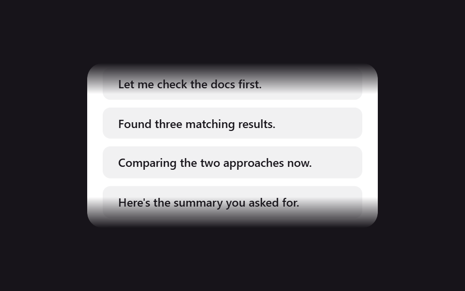
The top and bottom edges of a scrolling chat pane fade out via a mask-image gradient, hinting there's more content without cutting text mid-letter.
Best forLong conversation scroll areas, log or timeline panels
mask-imagetranslateYoverflow: hidden
<main class="stage">
  <div class="sf-viewport">
    <div class="sf-track is-demo">
      <div class="sf-msg">Here's the summary you asked for.</div>
      <div class="sf-msg">Let me check the docs first.</div>
      <div class="sf-msg">Found three matching results.</div>
      <div class="sf-msg">Comparing the two approaches now.</div>
      <div class="sf-msg">Here's the summary you asked for.</div>
      <div class="sf-msg">Let me check the docs first.</div>
      <div class="sf-msg">Found three matching results.</div>
      <div class="sf-msg">Comparing the two approaches now.</div>
    </div>
  </div>
</main>
@use "../../../../site/static/demo-tokens" as *;
// ── 변수 3개 ──────────────────────────────────────────
$duration: 6s;
$easing: linear;
$color: $subject-ink;
@include stage($stage-ink);
.sf-viewport {
width: min(300px, 88vw);
height: 170px;
overflow: hidden;
box-sizing: border-box;
border-radius: $r-card;
background: $stage-paper;
box-shadow: $shadow-raised;
// 가장자리 페이드 — 이 마스크는 고정. 움직이는 건 안의 트랙뿐
-webkit-mask-image: linear-gradient(to bottom, transparent 0, #000 $sp-8, #000 calc(100% - #{$sp-8}), transparent 100%);
mask-image: linear-gradient(to bottom, transparent 0, #000 $sp-8, #000 calc(100% - #{$sp-8}), transparent 100%);
padding: $sp-4 0;
}
.sf-track {
display: flex;
flex-direction: column;
}
.sf-msg {
padding: $sp-2 $sp-4;
margin: 0 $sp-4 $sp-2;
border-radius: $r-sm;
background: rgba(23, 20, 26, .06);
color: $color;
font: 500 12px/1.4 -apple-system, "Segoe UI", sans-serif;
}
// 실사용: 새 메시지가 올 때마다 scrollTop 을 내린다. 데모는 같은 목록 두 벌을 이어 -50% 루프로 흉내낸다
@keyframes sf-scroll {
from { transform: translateY(0); }
to { transform: translateY(-50%); }
}
.sf-track.is-demo {
animation: sf-scroll $duration $easing infinite;
}
@media (prefers-reduced-motion: reduce) {
.sf-track.is-demo {
animation: none !important;
transform: none !important;
}
}html, body {
margin: 0;
overflow: hidden;
}
.stage {
box-sizing: border-box;
min-height: 100vh;
display: grid;
place-items: center;
margin: 0;
background: #17141a;
font-family: -apple-system, "Segoe UI", "Noto Sans KR", sans-serif;
padding: clamp(8px, 4vw, 24px);
}
.sf-viewport {
width: min(300px, 88vw);
height: 170px;
overflow: hidden;
box-sizing: border-box;
border-radius: 16px;
background: #ffffff;
box-shadow: 0 14px 24px rgba(23, 20, 26, 0.32);
-webkit-mask-image: linear-gradient(to bottom, transparent 0, #000 32px, #000 calc(100% - 32px), transparent 100%);
mask-image: linear-gradient(to bottom, transparent 0, #000 32px, #000 calc(100% - 32px), transparent 100%);
padding: 16px 0;
}
.sf-track {
display: flex;
flex-direction: column;
}
.sf-msg {
padding: 8px 16px;
margin: 0 16px 8px;
border-radius: 8px;
background: rgba(23, 20, 26, 0.06);
color: #17141a;
font: 500 12px/1.4 -apple-system, "Segoe UI", sans-serif;
}
@keyframes sf-scroll {
from {
transform: translateY(0);
}
to {
transform: translateY(-50%);
}
}
.sf-track.is-demo {
animation: sf-scroll 6s linear infinite;
}
@media (prefers-reduced-motion: reduce) {
.sf-track.is-demo {
animation: none !important;
transform: none !important;
}
}import { CSSProperties } from "react";
import styles from "./ScrollFadeEdges.module.scss";
type Vars = CSSProperties & {
"--duration"?: string;
"--easing"?: string;
"--color"?: string;
};
export interface ScrollFadeEdgesProps {
duration?: string;
easing?: string;
color?: string;
messages?: string[];
}
const DEFAULT_MESSAGES = [
"Here's the summary you asked for.",
"Let me check the docs first.",
"Found three matching results.",
"Comparing the two approaches now.",
];
export default function ScrollFadeEdges({
duration = "6s",
easing = "linear",
color = "#17141a",
messages = DEFAULT_MESSAGES,
}: ScrollFadeEdgesProps) {
const style: Vars = {
"--duration": duration,
"--easing": easing,
"--color": color,
};
const doubled = [...messages, ...messages];
return (
<div className={styles.viewport} style={style}>
<div className={styles.track}>
{doubled.map((m, i) => (
<div className={styles.msg} key={i}>{m}</div>
))}
</div>
</div>
);
}05 Scroll edge fade — Measured area 27.117% · moving frames 23/23Original by GODRICH · SCSS and React ship in the zip · 9 CSS AI Chat Loading Animations to Copy-Paste
The post this demo lives in
 9 CSS AI Chat Loading Animations to Copy-PasteOpen ChatGPT or Claude and watch dots, a shimmering word, or a blinking line appear before any reply text does. That mov See all demos in this post