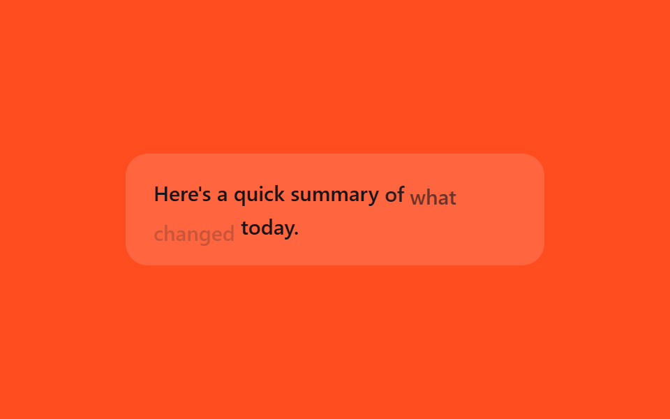
07Word-by-word fade-in
Instead of the finished sentence popping in all at once, each word rises slightly with opacity and translateY in sequence, mimicking tokens landing one after another.
Best forStreamed-answer reveal effect, sequential summary reveal
translateYanimation-delaynth-child
<main class="stage">
  <p class="wf-line is-demo"><span>Here's</span> <span>a</span> <span>quick</span> <span>summary</span> <span>of</span> <span>what</span> <span>changed</span> <span>today.</span></p>
</main>
@use "../../../../site/static/demo-tokens" as *;
// ── 변수 3개 ──────────────────────────────────────────
$duration: 2s;
$easing: $ease-out;
$color: $subject-ink;
@include stage($stage-orange);
.wf-line {
width: min(300px, 88vw);
margin: 0;
padding: $sp-4 $sp-5;
border-radius: $r-card;
box-sizing: border-box;
background: rgba(255, 255, 255, .14);
color: $color;
font: 500 15px/1.6 -apple-system, "Segoe UI", sans-serif;
}
.wf-line span {
display: inline-block;
}
// 실사용: 토큰이 도착할 때마다 새 <span> 을 붙인다. 데모는 같은 문장을 순서대로 반복한다
@keyframes wf-word {
0%, 100% { opacity: 0; transform: translateY(6px); }
15%, 78% { opacity: 1; transform: translateY(0); }
92% { opacity: 0; transform: translateY(6px); }
}
.wf-line.is-demo span {
animation: wf-word $duration $easing infinite;
}
.wf-line.is-demo span:nth-child(1) { animation-delay: 0ms; }
.wf-line.is-demo span:nth-child(2) { animation-delay: 90ms; }
.wf-line.is-demo span:nth-child(3) { animation-delay: 180ms; }
.wf-line.is-demo span:nth-child(4) { animation-delay: 270ms; }
.wf-line.is-demo span:nth-child(5) { animation-delay: 360ms; }
.wf-line.is-demo span:nth-child(6) { animation-delay: 450ms; }
.wf-line.is-demo span:nth-child(7) { animation-delay: 540ms; }
.wf-line.is-demo span:nth-child(8) { animation-delay: 630ms; }
@media (prefers-reduced-motion: reduce) {
.wf-line.is-demo span {
animation: none !important;
opacity: 1 !important;
transform: none !important;
}
}html, body {
margin: 0;
overflow: hidden;
}
.stage {
box-sizing: border-box;
min-height: 100vh;
display: grid;
place-items: center;
margin: 0;
background: #ff4d1f;
font-family: -apple-system, "Segoe UI", "Noto Sans KR", sans-serif;
padding: clamp(8px, 4vw, 24px);
}
.wf-line {
width: min(300px, 88vw);
margin: 0;
padding: 16px 20px;
border-radius: 16px;
box-sizing: border-box;
background: rgba(255, 255, 255, 0.14);
color: #17141a;
font: 500 15px/1.6 -apple-system, "Segoe UI", sans-serif;
}
.wf-line span {
display: inline-block;
}
@keyframes wf-word {
0%, 100% {
opacity: 0;
transform: translateY(6px);
}
15%, 78% {
opacity: 1;
transform: translateY(0);
}
92% {
opacity: 0;
transform: translateY(6px);
}
}
.wf-line.is-demo span {
animation: wf-word 2s ease-out infinite;
}
.wf-line.is-demo span:nth-child(1) {
animation-delay: 0ms;
}
.wf-line.is-demo span:nth-child(2) {
animation-delay: 90ms;
}
.wf-line.is-demo span:nth-child(3) {
animation-delay: 180ms;
}
.wf-line.is-demo span:nth-child(4) {
animation-delay: 270ms;
}
.wf-line.is-demo span:nth-child(5) {
animation-delay: 360ms;
}
.wf-line.is-demo span:nth-child(6) {
animation-delay: 450ms;
}
.wf-line.is-demo span:nth-child(7) {
animation-delay: 540ms;
}
.wf-line.is-demo span:nth-child(8) {
animation-delay: 630ms;
}
@media (prefers-reduced-motion: reduce) {
.wf-line.is-demo span {
animation: none !important;
opacity: 1 !important;
transform: none !important;
}
}import { CSSProperties } from "react";
import styles from "./TokenFadeWords.module.scss";
type Vars = CSSProperties & {
"--duration"?: string;
"--easing"?: string;
"--color"?: string;
};
export interface TokenFadeWordsProps {
duration?: string;
easing?: string;
color?: string;
words?: string[];
}
const DEFAULT_WORDS = ["Here's", "a", "quick", "summary", "of", "what", "changed", "today."];
export default function TokenFadeWords({
duration = "2s",
easing = "ease-out",
color = "#17141a",
words = DEFAULT_WORDS,
}: TokenFadeWordsProps) {
const style: Vars = {
"--duration": duration,
"--easing": easing,
"--color": color,
};
return (
<p className={styles.line} style={style}>
{words.map((w, i) => (
<span key={i} className={styles.word} style={{ animationDelay: `${i * 90}ms` }}>
{w}{" "}
</span>
))}
</p>
);
}07 Word-by-word fade-in — Measured area 2.202% · moving frames 16/23Original by GODRICH · SCSS and React ship in the zip · 9 CSS AI Chat Loading Animations to Copy-Paste
The post this demo lives in
 9 CSS AI Chat Loading Animations to Copy-PasteOpen ChatGPT or Claude and watch dots, a shimmering word, or a blinking line appear before any reply text does. That mov See all demos in this post