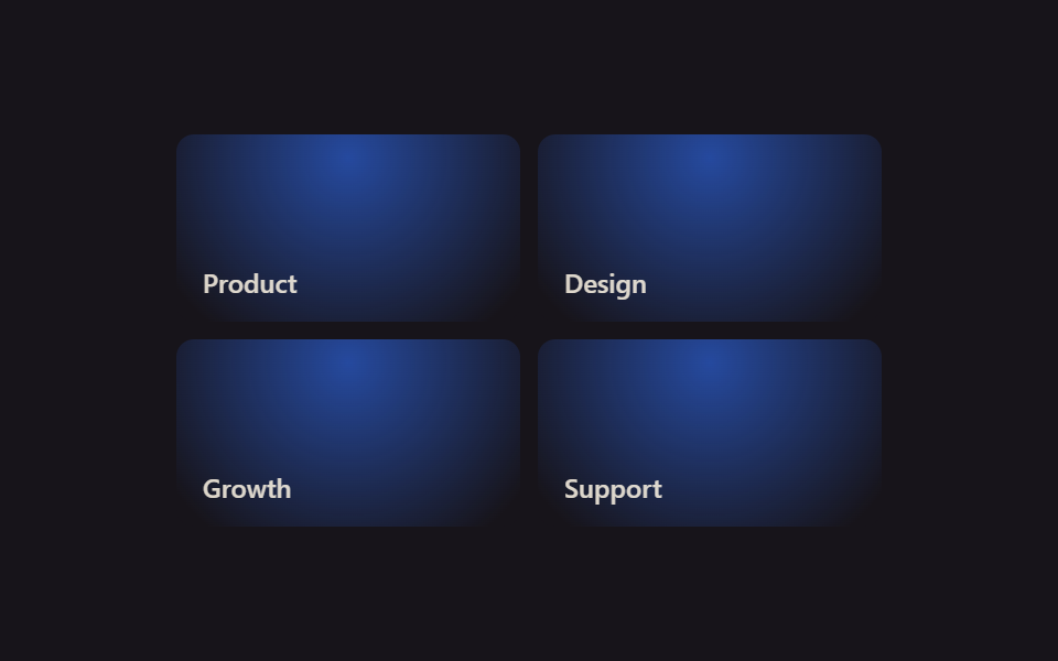
09Neighboring tile glow
Moving the pointer over the grid stores its coordinates in --mx and --my custom properties, so a radial-gradient glow spreads faintly not just on the hovered tile but into neighbors found with :has().
Best forMulti-card feature grids, highlight sections below a hero
:has()radial-gradientJS 8줄
<main class="stage">
  <div class="sl-grid is-demo">
    <div class="sl-tile"><span class="sl-tile__tag">Product</span></div>
    <div class="sl-tile"><span class="sl-tile__tag">Design</span></div>
    <div class="sl-tile"><span class="sl-tile__tag">Growth</span></div>
    <div class="sl-tile"><span class="sl-tile__tag">Support</span></div>
  </div>
</main>
@use "../../../../site/static/demo-tokens" as *;
// ── 변수 3개 ──────────────────────────────────────────
$duration: $dur-loop;
$easing: linear;
$color: $subject-blue;
@include stage($stage-ink);
// 커서 좌표 — 퍼센트 타입으로 등록해야 is-demo 의 키프레임이 값을 보간한다. 그리드 전체에 상속돼 타일마다 같은 지점을 읽는다
@property --mx { syntax: '<percentage>'; inherits: true; initial-value: 50%; }
@property --my { syntax: '<percentage>'; inherits: true; initial-value: 50%; }
.sl-grid {
width: min(320px, 88vw);
aspect-ratio: 340 / 190;
display: grid;
grid-template-columns: repeat(2, 1fr);
grid-template-rows: repeat(2, 1fr);
gap: $sp-2;
--mx: 50%;
--my: 50%;
}
.sl-tile {
border-radius: $r-sm;
padding: $sp-3;
box-sizing: border-box;
color: $subject-cream;
background: $subject-ink;
font: 600 12px/1 -apple-system, "Segoe UI", sans-serif;
position: relative;
overflow: hidden;
display: flex;
align-items: flex-end;
}
.sl-tile__tag { position: relative; z-index: 1; opacity: .85; }
// 글로우 레이어 — 좌표는 공유하지만 opacity 는 :has() 로 "그리드 안 어딘가 호버 중"일 때만 켠다
.sl-tile::before {
content: "";
position: absolute;
inset: 0;
background: radial-gradient(140px circle at var(--mx) var(--my), rgba($color, .6), transparent 70%);
opacity: 0;
transition: opacity 200ms $easing;
pointer-events: none;
}
// 실사용: 진짜 pointermove 가 --mx·--my 를 갱신한다(위 <script>). 호버 중인 타일이 그리드 안에 있으면 전부 켠다
.sl-grid:has(.sl-tile:hover) .sl-tile::before { opacity: 1; }
// 데모 루프: is-demo 는 :has(:hover) 를 못 거니 opacity 를 직접 켜고, --mx·--my 는 keyframes 로 원을 그리며 돈다(캡처용)
@keyframes sl-drift {
0% { --mx: 10%; --my: 15%; }
25% { --mx: 90%; --my: 10%; }
50% { --mx: 85%; --my: 90%; }
75% { --mx: 10%; --my: 85%; }
100% { --mx: 10%; --my: 15%; }
}
.sl-grid.is-demo { animation: sl-drift $duration $easing infinite; }
.sl-grid.is-demo .sl-tile::before { opacity: 1; }
@media (prefers-reduced-motion: reduce) {
.sl-grid.is-demo { animation: none !important; }
.sl-tile::before { transition: none !important; }
}html, body {
margin: 0;
overflow: hidden;
}
.stage {
box-sizing: border-box;
min-height: 100vh;
display: grid;
place-items: center;
margin: 0;
background: #17141a;
font-family: -apple-system, "Segoe UI", "Noto Sans KR", sans-serif;
padding: clamp(8px, 4vw, 24px);
}
@property --mx {
syntax: "<percentage>";
inherits: true;
initial-value: 50%;
}
@property --my {
syntax: "<percentage>";
inherits: true;
initial-value: 50%;
}
.sl-grid {
width: min(320px, 88vw);
aspect-ratio: 340/190;
display: grid;
grid-template-columns: repeat(2, 1fr);
grid-template-rows: repeat(2, 1fr);
gap: 8px;
--mx: 50%;
--my: 50%;
}
.sl-tile {
border-radius: 8px;
padding: 12px;
box-sizing: border-box;
color: #fff7e6;
background: #17141a;
font: 600 12px/1 -apple-system, "Segoe UI", sans-serif;
position: relative;
overflow: hidden;
display: flex;
align-items: flex-end;
}
.sl-tile__tag {
position: relative;
z-index: 1;
opacity: 0.85;
}
.sl-tile::before {
content: "";
position: absolute;
inset: 0;
background: radial-gradient(140px circle at var(--mx) var(--my), rgba(47, 109, 246, 0.6), transparent 70%);
opacity: 0;
transition: opacity 200ms linear;
pointer-events: none;
}
.sl-grid:has(.sl-tile:hover) .sl-tile::before {
opacity: 1;
}
@keyframes sl-drift {
0% {
--mx: 10%;
--my: 15%;
}
25% {
--mx: 90%;
--my: 10%;
}
50% {
--mx: 85%;
--my: 90%;
}
75% {
--mx: 10%;
--my: 85%;
}
100% {
--mx: 10%;
--my: 15%;
}
}
.sl-grid.is-demo {
animation: sl-drift 2s linear infinite;
}
.sl-grid.is-demo .sl-tile::before {
opacity: 1;
}
@media (prefers-reduced-motion: reduce) {
.sl-grid.is-demo {
animation: none !important;
}
.sl-tile::before {
transition: none !important;
}
}var grid = document.querySelector('.sl-grid');
grid.addEventListener('pointermove', function (e) {
var r = grid.getBoundingClientRect();
var x = ((e.clientX - r.left) / r.width * 100).toFixed(1) + '%';
var y = ((e.clientY - r.top) / r.height * 100).toFixed(1) + '%';
grid.style.setProperty('--mx', x);
grid.style.setProperty('--my', y);
});import { CSSProperties, PointerEvent, useCallback, useRef } from "react";
import styles from "./SpotlightNeighbors.module.scss";
type Vars = CSSProperties & { "--color"?: string; "--mx"?: string; "--my"?: string };
export interface SpotlightNeighborsProps {
color?: string;
}
const LABELS = ["Product", "Design", "Growth", "Support"];
// 실사용: 진짜 pointermove 로 --mx·--my 를 갱신한다. 켜고 끄는 건 CSS :has() 가 한다
export default function SpotlightNeighbors({ color = "#2f6df6" }: SpotlightNeighborsProps) {
const gridRef = useRef<HTMLDivElement>(null);
const handleMove = useCallback((e: PointerEvent<HTMLDivElement>) => {
const el = gridRef.current;
if (!el) return;
const r = el.getBoundingClientRect();
const x = (((e.clientX - r.left) / r.width) * 100).toFixed(1) + "%";
const y = (((e.clientY - r.top) / r.height) * 100).toFixed(1) + "%";
el.style.setProperty("--mx", x);
el.style.setProperty("--my", y);
}, []);
const style: Vars = { "--color": color };
return (
<div className={styles.grid} style={style} ref={gridRef} onPointerMove={handleMove}>
{LABELS.map((label) => (
<div key={label} className={styles.tile}>
<span className={styles.tag}>{label}</span>
</div>
))}
</div>
);
}09 Neighboring tile glow — Measured area 36.649% · moving frames 23/23Original by GODRICH · SCSS and React ship in the zip · 9 CSS Bento Grid Hover Animations to Copy-Paste
The post this demo lives in
 9 CSS Bento Grid Hover Animations to Copy-PasteA bento grid is a layout built from big and small boxes fitted together like a photo collage, the shape you see on portf See all demos in this post