06Underline grow
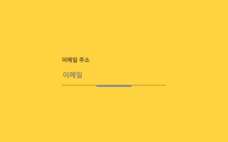
The indicator under an input starts collapsed at the center, and on focus it transitions its left and right values to 0, expanding to both sides until it fills the width.
Best forLogin form input fields, search bar focus indicators
left/right:focus0.22초
<main class="stage">
  <div class="field is-demo">
    <label class="field__label" for="email">Email address</label>
    <input class="field__input" id="email" type="email" placeholder="Email">
    <span class="field__bar" aria-hidden="true"></span>
  </div>
</main>
@use "../../../../site/static/demo-tokens" as *;
$duration: $dur-quick; // 실제 포커스 시 밑줄이 벌어지는 시간
$easing: $ease-out;
$color: $subject-blue; // 밑줄 색
@include stage($stage-yellow);
.stage { padding: clamp(6px, 2.4vw, 16px); }
.field {
position: relative;
width: min(220px, 70vw);
}
.field__label {
display: block;
margin-bottom: 4px;
font-weight: 600; font-size: clamp(11px, 3vw, 12px); line-height: 1.3; font-family: inherit;
color: rgba($stage-ink, .7);
}
.field__input {
box-sizing: border-box;
width: 100%;
border: 0;
border-bottom: 2px solid rgba($stage-ink, .25);
background: transparent;
padding: 10px 2px;
font-weight: 500; font-size: clamp(13px, 3.6vw, 15px); line-height: 1.3; font-family: inherit;
color: $stage-ink;
}
.field__bar {
position: absolute;
left: 50%; right: 50%; bottom: -2px;
height: 2px;
background: $color;
transition: left $duration $easing, right $duration $easing;
}
.field__input:focus + .field__bar { left: 0; right: 0; }
// 데모 루프: 가운데서 시작 → 양쪽으로 채워짐 → 다시 가운데로
.field.is-demo .field__bar { animation: grow $dur-loop $easing infinite; }
@keyframes grow {
0%, 10% { left: 50%; right: 50%; }
40%, 60% { left: 0; right: 0; }
100% { left: 50%; right: 50%; }
}
@media (prefers-reduced-motion: reduce) {
.field__bar { transition: none; }
.field.is-demo .field__bar { animation: none; left: 0; right: 0; }
}html, body {
margin: 0;
overflow: hidden;
}
.stage {
box-sizing: border-box;
min-height: 100vh;
display: grid;
place-items: center;
margin: 0;
background: #ffd23f;
font-family: -apple-system, "Segoe UI", "Noto Sans KR", sans-serif;
padding: clamp(8px, 4vw, 24px);
}
.stage {
padding: clamp(6px, 2.4vw, 16px);
}
.field {
position: relative;
width: min(220px, 70vw);
}
.field__label {
display: block;
margin-bottom: 4px;
font-weight: 600;
font-size: clamp(11px, 3vw, 12px);
line-height: 1.3;
font-family: inherit;
color: rgba(23, 20, 26, 0.7);
}
.field__input {
box-sizing: border-box;
width: 100%;
border: 0;
border-bottom: 2px solid rgba(23, 20, 26, 0.25);
background: transparent;
padding: 10px 2px;
font-weight: 500;
font-size: clamp(13px, 3.6vw, 15px);
line-height: 1.3;
font-family: inherit;
color: #17141a;
}
.field__bar {
position: absolute;
left: 50%;
right: 50%;
bottom: -2px;
height: 2px;
background: #2f6df6;
transition: left 220ms ease-out, right 220ms ease-out;
}
.field__input:focus + .field__bar {
left: 0;
right: 0;
}
.field.is-demo .field__bar {
animation: grow 2s ease-out infinite;
}
@keyframes grow {
0%, 10% {
left: 50%;
right: 50%;
}
40%, 60% {
left: 0;
right: 0;
}
100% {
left: 50%;
right: 50%;
}
}
@media (prefers-reduced-motion: reduce) {
.field__bar {
transition: none;
}
.field.is-demo .field__bar {
animation: none;
left: 0;
right: 0;
}
}import type { CSSProperties } from "react";
import styles from "./UnderlineGrowField.module.scss";
export type UnderlineGrowFieldProps = {
label: string;
placeholder: string;
/** 실제 포커스 시 밑줄이 벌어지는 시간 (기본 220ms) */
duration?: number;
easing?: string;
/** 밑줄 색 */
color?: string;
};
type Vars = CSSProperties & { "--duration"?: string; "--easing"?: string; "--color"?: string };
export default function UnderlineGrowField({
label,
placeholder,
duration = 220,
easing = "ease-out",
color = "#2f6df6",
}: UnderlineGrowFieldProps) {
const vars: Vars = { "--duration": `${duration}ms`, "--easing": easing, "--color": color };
const id = "field-" + label.replace(/\s+/g, "-").toLowerCase();
return (
<div className={styles.field} style={vars}>
<label className={styles.label} htmlFor={id}>{label}</label>
<input className={styles.input} id={id} type="text" placeholder={placeholder} />
<span className={styles.bar} aria-hidden="true" />
</div>
);
}06 Underline grow — Measured area 0.306% · moving frames 17/23Original by GODRICH · SCSS and React ship in the zip · 9 CSS Border Animations — One Line, Copy-Paste
The post this demo lives in
 9 CSS Border Animations — One Line, Copy-PasteA css border animation moves the edge of a card, button, or input instead of its fill, so it can signal loading, focus, See all demos in this post