08Rainbow border
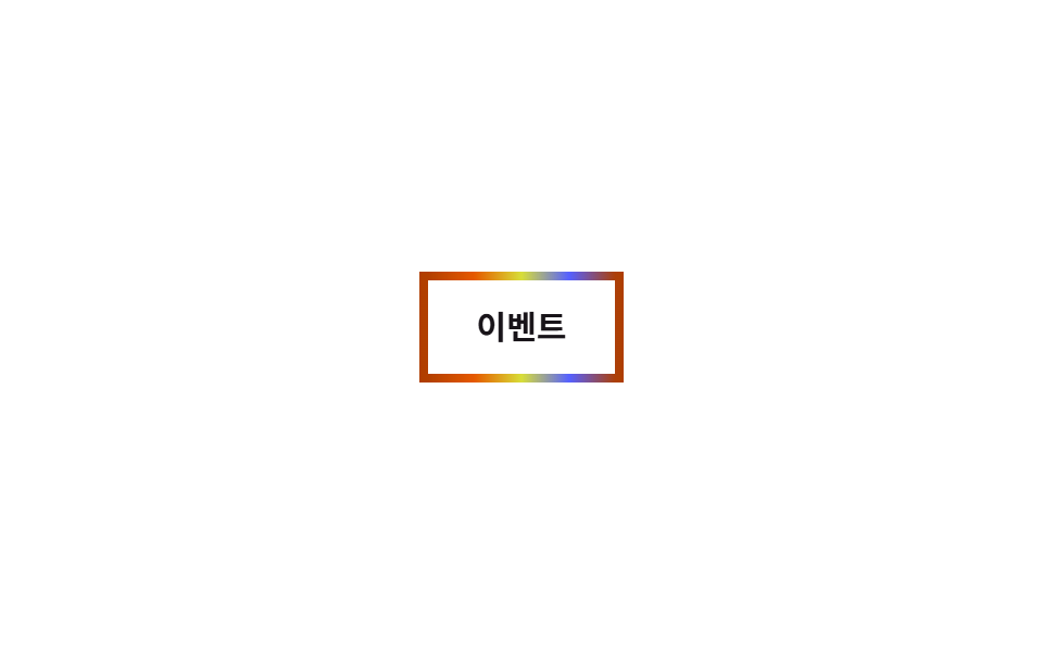
border-image-source carries a fixed rainbow linear-gradient, and only the filter: hue-rotate value turns from 0deg to 360deg, so the border colors cycle in place without the gradient itself moving.
Best forEvent banner borders, celebration cards
border-imagefilter: hue-rotate2초
<main class="stage">
  <span class="badge is-demo">Event</span>
</main>
@use "../../../../site/static/demo-tokens" as *;
$duration: $dur-loop; // 색이 한 바퀴 도는 시간
$easing: linear;
$color: $stage-orange; // (참고용, 실제 색은 아래 무지개 그라데이션)
@include stage($stage-paper);
.stage { padding: clamp(6px, 2.4vw, 16px); }
.badge {
display: inline-block;
border: 4px solid;
border-image-slice: 1;
// 토큰 4색으로 이은 그라데이션 — 팔레트 밖 hex 를 새로 쓰지 않는다 (blog-design)
border-image-source: linear-gradient(90deg, $error, $stage-orange, $stage-yellow, $subject-blue, $error);
border-radius: 4px;
padding: 14px 22px;
font-weight: 700; font-size: clamp(13px, 3.6vw, 15px); line-height: 1; font-family: inherit;
color: $stage-ink;
background: $stage-paper;
}
// 그라데이션 각도는 그대로 두고 filter: hue-rotate 만 돌려 색만 자리에서 순환시킨다
.badge.is-demo { animation: hue $duration $easing infinite; }
@keyframes hue { to { filter: hue-rotate(360deg); } }
@media (prefers-reduced-motion: reduce) {
.badge.is-demo { animation: none; filter: none; }
}html, body {
margin: 0;
overflow: hidden;
}
.stage {
box-sizing: border-box;
min-height: 100vh;
display: grid;
place-items: center;
margin: 0;
background: #ffffff;
font-family: -apple-system, "Segoe UI", "Noto Sans KR", sans-serif;
padding: clamp(8px, 4vw, 24px);
}
.stage {
padding: clamp(6px, 2.4vw, 16px);
}
.badge {
display: inline-block;
border: 4px solid;
border-image-slice: 1;
border-image-source: linear-gradient(90deg, #c2361a, #ff4d1f, #ffd23f, #2f6df6, #c2361a);
border-radius: 4px;
padding: 14px 22px;
font-weight: 700;
font-size: clamp(13px, 3.6vw, 15px);
line-height: 1;
font-family: inherit;
color: #17141a;
background: #ffffff;
}
.badge.is-demo {
animation: hue 2s linear infinite;
}
@keyframes hue {
to {
filter: hue-rotate(360deg);
}
}
@media (prefers-reduced-motion: reduce) {
.badge.is-demo {
animation: none;
filter: none;
}
}import type { CSSProperties } from "react";
import styles from "./RainbowBorderBadge.module.scss";
export type RainbowBorderBadgeProps = {
label: string;
/** 색이 한 바퀴 도는 시간 (기본 2000ms) */
duration?: number;
};
type Vars = CSSProperties & { "--duration"?: string };
export default function RainbowBorderBadge({ label, duration = 2000 }: RainbowBorderBadgeProps) {
const vars: Vars = { "--duration": `${duration}ms` };
return <span className={styles.badge} style={vars}>{label}</span>;
}08 Rainbow border — Measured area 0.761% · moving frames 23/23Original by GODRICH · SCSS and React ship in the zip · 9 CSS Border Animations — One Line, Copy-Paste
The post this demo lives in
 9 CSS Border Animations — One Line, Copy-PasteA css border animation moves the edge of a card, button, or input instead of its fill, so it can signal loading, focus, See all demos in this post