09Animated focus ring
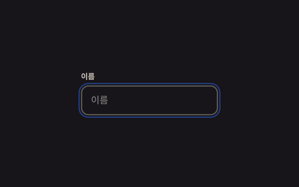
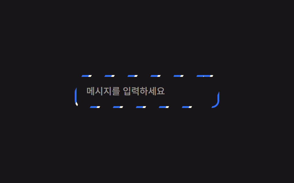
On keyboard focus, outline-offset expands from 0 to 4px while the outline turns from transparent to colored, so the ring appears to pop outward and settle.
Best forKeyboard focus on form fields, buttons that need visible accessibility indicators
outline-offset:focus-visible0.22초
<main class="stage">
  <div class="field">
    <label class="field__label" for="name">Name</label>
    <input class="field__input is-demo" id="name" type="text" placeholder="Name">
  </div>
</main>
@use "../../../../site/static/demo-tokens" as *;
$duration: $dur-quick; // 실제 포커스 시 링이 벌어지는 시간
$easing: $ease-out;
$color: $subject-blue; // 링 색
@include stage($stage-ink);
.stage { padding: clamp(6px, 2.4vw, 16px); }
.field { width: min(220px, 70vw); }
.field__label {
display: block;
margin-bottom: 6px;
font-weight: 600; font-size: clamp(11px, 3vw, 12px); line-height: 1.3; font-family: inherit;
color: rgba($subject-cream, .7);
}
.field__input {
box-sizing: border-box;
width: 100%;
border: 2px solid rgba($subject-cream, .3);
border-radius: $r-control;
padding: 12px 14px;
font-weight: 500; font-size: clamp(13px, 3.6vw, 15px); line-height: 1.3; font-family: inherit;
color: $subject-cream;
background: transparent;
outline: 2px solid transparent;
outline-offset: 0;
transition: outline-color $duration $easing, outline-offset $duration $easing;
}
.field__input:focus-visible { outline-color: $color; outline-offset: 4px; }
// 데모 루프: 링이 붙어 있다가 튀어나오듯 벌어지고 다시 붙는다
.field__input.is-demo { animation: ring $dur-loop $easing infinite; }
@keyframes ring {
0%, 10% { outline-offset: 0; outline-color: rgba($color, .9); }
45%, 65% { outline-offset: 4px; outline-color: rgba($color, .2); }
100% { outline-offset: 0; outline-color: rgba($color, .9); }
}
@media (prefers-reduced-motion: reduce) {
.field__input { transition: none; }
.field__input.is-demo { animation: none; outline-color: rgba($color, .9); }
}html, body {
margin: 0;
overflow: hidden;
}
.stage {
box-sizing: border-box;
min-height: 100vh;
display: grid;
place-items: center;
margin: 0;
background: #17141a;
font-family: -apple-system, "Segoe UI", "Noto Sans KR", sans-serif;
padding: clamp(8px, 4vw, 24px);
}
.stage {
padding: clamp(6px, 2.4vw, 16px);
}
.field {
width: min(220px, 70vw);
}
.field__label {
display: block;
margin-bottom: 6px;
font-weight: 600;
font-size: clamp(11px, 3vw, 12px);
line-height: 1.3;
font-family: inherit;
color: rgba(255, 247, 230, 0.7);
}
.field__input {
box-sizing: border-box;
width: 100%;
border: 2px solid rgba(255, 247, 230, 0.3);
border-radius: 12px;
padding: 12px 14px;
font-weight: 500;
font-size: clamp(13px, 3.6vw, 15px);
line-height: 1.3;
font-family: inherit;
color: #fff7e6;
background: transparent;
outline: 2px solid transparent;
outline-offset: 0;
transition: outline-color 220ms ease-out, outline-offset 220ms ease-out;
}
.field__input:focus-visible {
outline-color: #2f6df6;
outline-offset: 4px;
}
.field__input.is-demo {
animation: ring 2s ease-out infinite;
}
@keyframes ring {
0%, 10% {
outline-offset: 0;
outline-color: rgba(47, 109, 246, 0.9);
}
45%, 65% {
outline-offset: 4px;
outline-color: rgba(47, 109, 246, 0.2);
}
100% {
outline-offset: 0;
outline-color: rgba(47, 109, 246, 0.9);
}
}
@media (prefers-reduced-motion: reduce) {
.field__input {
transition: none;
}
.field__input.is-demo {
animation: none;
outline-color: rgba(47, 109, 246, 0.9);
}
}import type { CSSProperties } from "react";
import styles from "./FocusRingField.module.scss";
export type FocusRingFieldProps = {
label: string;
placeholder: string;
/** 실제 포커스 시 링이 벌어지는 시간 (기본 220ms) */
duration?: number;
easing?: string;
/** 링 색 */
color?: string;
};
type Vars = CSSProperties & { "--duration"?: string; "--easing"?: string; "--color"?: string };
export default function FocusRingField({
label,
placeholder,
duration = 220,
easing = "ease-out",
color = "#2f6df6",
}: FocusRingFieldProps) {
const vars: Vars = { "--duration": `${duration}ms`, "--easing": easing, "--color": color };
const id = "focus-" + label.replace(/\s+/g, "-").toLowerCase();
return (
<div className={styles.field} style={vars}>
<label className={styles.label} htmlFor={id}>{label}</label>
<input className={styles.input} id={id} type="text" placeholder={placeholder} />
</div>
);
}09 Animated focus ring — Measured area 2.264% · moving frames 15/23Original by GODRICH · SCSS and React ship in the zip · 9 CSS Border Animations — One Line, Copy-Paste
The post this demo lives in
 9 CSS Border Animations — One Line, Copy-PasteA css border animation moves the edge of a card, button, or input instead of its fill, so it can signal loading, focus, See all demos in this post