04Sparkle text
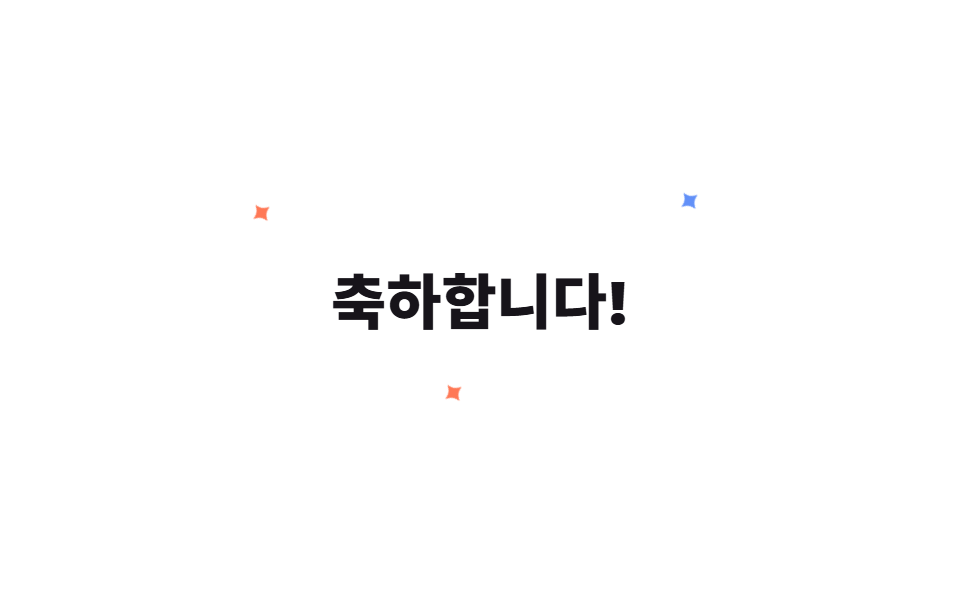
Three small sparkles are placed around a celebration headline and blink on their own timing by animating scale and opacity.
Best forCelebration-message headlines, promo headlines
scaleopacity@keyframes twinkle
<main class="stage">
  <div class="st-wrap is-demo">
    <h2 class="st-title">Congratulations!</h2>
    <span class="st-star st-star--1">✦</span>
    <span class="st-star st-star--2">✦</span>
    <span class="st-star st-star--3">✦</span>
  </div>
</main>
@use "../../../../site/static/demo-tokens" as *;
// ── 변수 3개 ──────────────────────────────────────────
$duration: 1.3s;
$easing: $ease-out;
$color: $subject-blue;
@include stage($stage-paper);
.st-wrap {
position: relative;
display: grid;
place-items: center;
padding: $sp-6;
}
.st-title {
margin: 0;
color: $subject-ink;
font: 800 30px/1 -apple-system, "Segoe UI", "Noto Sans KR", sans-serif;
}
.st-star {
position: absolute;
color: $color;
font-size: 18px;
line-height: 1;
opacity: 0;
transform: scale(.2);
pointer-events: none;
}
.st-star--1 { top: -14px; left: -18px; color: $stage-orange; }
.st-star--2 { top: -20px; right: -14px; }
.st-star--3 { bottom: -16px; left: 40%; color: $stage-orange; }
@keyframes st-twinkle {
0%, 100% { opacity: 0; transform: scale(.2) rotate(0deg); }
50% { opacity: 1; transform: scale(1) rotate(70deg); }
}
.st-wrap.is-demo .st-star { animation: st-twinkle $duration $easing infinite; }
.st-star--2 { animation-delay: 260ms; }
.st-star--3 { animation-delay: 480ms; }
@media (prefers-reduced-motion: reduce) {
.st-wrap.is-demo .st-star { animation: none !important; opacity: 0 !important; }
}html, body {
margin: 0;
overflow: hidden;
}
.stage {
box-sizing: border-box;
min-height: 100vh;
display: grid;
place-items: center;
margin: 0;
background: #ffffff;
font-family: -apple-system, "Segoe UI", "Noto Sans KR", sans-serif;
padding: clamp(8px, 4vw, 24px);
}
.st-wrap {
position: relative;
display: grid;
place-items: center;
padding: 24px;
}
.st-title {
margin: 0;
color: #17141a;
font: 800 30px/1 -apple-system, "Segoe UI", "Noto Sans KR", sans-serif;
}
.st-star {
position: absolute;
color: #2f6df6;
font-size: 18px;
line-height: 1;
opacity: 0;
transform: scale(0.2);
pointer-events: none;
}
.st-star--1 {
top: -14px;
left: -18px;
color: #ff4d1f;
}
.st-star--2 {
top: -20px;
right: -14px;
}
.st-star--3 {
bottom: -16px;
left: 40%;
color: #ff4d1f;
}
@keyframes st-twinkle {
0%, 100% {
opacity: 0;
transform: scale(0.2) rotate(0deg);
}
50% {
opacity: 1;
transform: scale(1) rotate(70deg);
}
}
.st-wrap.is-demo .st-star {
animation: st-twinkle 1.3s ease-out infinite;
}
.st-star--2 {
animation-delay: 260ms;
}
.st-star--3 {
animation-delay: 480ms;
}
@media (prefers-reduced-motion: reduce) {
.st-wrap.is-demo .st-star {
animation: none !important;
opacity: 0 !important;
}
}import { CSSProperties } from "react";
import styles from "./SparkleText.module.scss";
type Vars = CSSProperties & Record<string, string>;
export interface SparkleTextProps {
duration?: string;
easing?: string;
color?: string;
}
export default function SparkleText({
duration = "1.3s",
easing = "ease-out",
color = "#2f6df6",
}: SparkleTextProps) {
const style: Vars = { "--duration": duration, "--easing": easing, "--color": color };
return (
<div className={styles.wrap} style={style}>
<h2 className={styles.title}>축하합니다!</h2>
<span className={`${styles.star} ${styles.star1}`}>✦</span>
<span className={`${styles.star} ${styles.star2}`}>✦</span>
<span className={`${styles.star} ${styles.star3}`}>✦</span>
</div>
);
}04 Sparkle text — Measured area 0.193% · moving frames 21/23Original by GODRICH · SCSS and React ship in the zip · 9 CSS Confetti Animation & Sparkle Effects
The post this demo lives in
 9 CSS Confetti Animation & Sparkle EffectsA confetti animation is the small colored burst a screen fires when something succeeds — a finished signup, a completed See all demos in this post