03Scale from corner origin
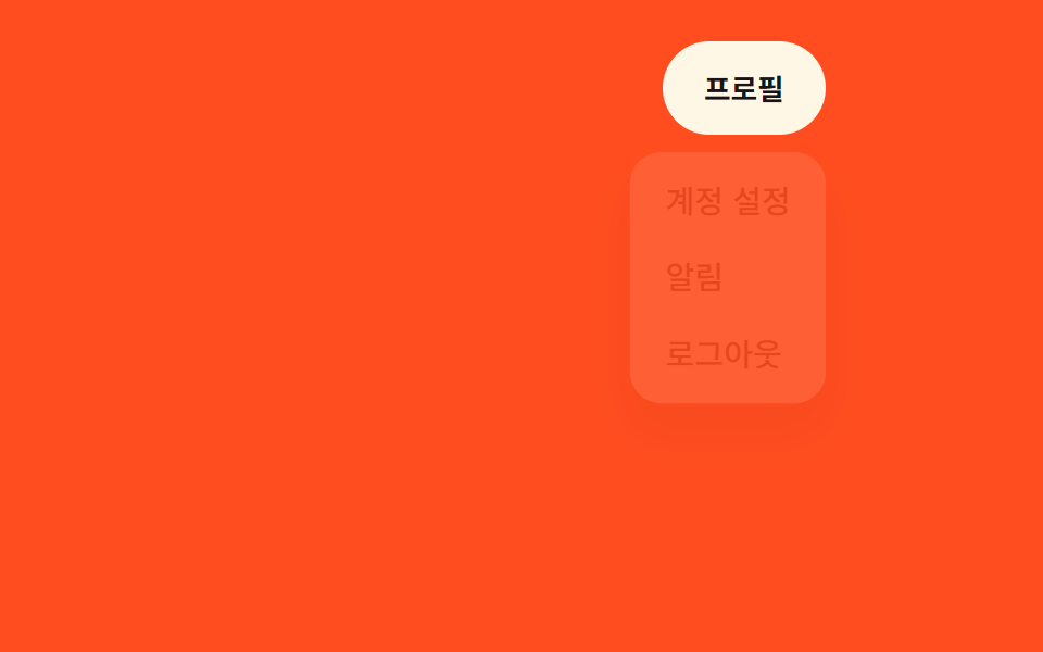
The menu scales open from the corner nearest its trigger button, set as the transform-origin.
Best forTop-right profile menus, toolbar option menus
transform-originscale(0.95→1)0.15초
<main class="stage">
  <div class="toolbar">
    <nav class="menu is-demo">
      <button class="menu__trigger" type="button" aria-expanded="false">Profile</button>
      <ul class="menu__panel">
        <li><a href="#">Account settings</a></li>
        <li><a href="#">Notifications</a></li>
        <li><a href="#">Log out</a></li>
      </ul>
    </nav>
  </div>
</main>
@use "../../../../site/static/demo-tokens" as *;
$duration: $dur-quick; // 확대되는 시간
$easing: $ease-pop; // 살짝 튀는 이징
$color: $subject-cream; // 트리거 버튼 색 (주황 무대와 대비)
@include stage($stage-orange);
.toolbar {
width: min(280px, 92vw);
display: flex;
justify-content: flex-end;
align-self: flex-start; // 패널이 트리거 아래로 열려 무대 중앙에 두면 320px 에서 아래로 넘친다 — 위로 붙여 여유를 둔다 (실측 320px 재검증 2026-09-10)
}
.menu {
position: relative;
font-weight: 500;
font-size: clamp(13px, 3.6vw, 16px);
line-height: 1.4;
font-family: inherit;
&__trigger {
border: 0;
border-radius: $r-pill;
padding: clamp(9px, 3vw, 12px) clamp(16px, 4vw, 20px);
font-weight: 700;
font-family: inherit;
color: $stage-ink;
background: $color;
cursor: pointer;
}
&__panel {
position: absolute;
top: calc(100% + 8px);
right: 0; // 트리거가 붙은 모서리
width: max-content;
max-width: min(170px, 76vw);
margin: 0;
padding: 6px;
list-style: none;
background: $subject-cream;
border-radius: $r-card;
box-shadow: $shadow-raised;
transform-origin: top right; // 트리거 모서리를 기준으로 확대
transform: scale(.9);
opacity: 0;
pointer-events: none;
}
&__panel li a {
display: block;
padding: 8px 12px;
border-radius: $r-control - 4px;
color: $stage-ink;
text-decoration: none;
}
&__panel li a:hover { background: rgba($stage-ink, .06); }
&.is-open &__panel { opacity: 1; transform: scale(1); pointer-events: auto; transition: opacity $duration $easing, transform $duration $easing; }
&.is-demo &__panel { animation: reveal-loop $dur-loop $easing infinite; }
}
@keyframes reveal-loop {
0%, 30% { opacity: 0; transform: scale(.9); }
45%, 80% { opacity: 1; transform: scale(1); }
95%, 100% { opacity: 0; transform: scale(.9); }
}
@media (prefers-reduced-motion: reduce) {
.menu__panel { transition: none !important; }
.menu.is-demo .menu__panel { animation: none; opacity: 0; transform: scale(.9); }
}html, body {
margin: 0;
overflow: hidden;
}
.stage {
box-sizing: border-box;
min-height: 100vh;
display: grid;
place-items: center;
margin: 0;
background: #ff4d1f;
font-family: -apple-system, "Segoe UI", "Noto Sans KR", sans-serif;
padding: clamp(8px, 4vw, 24px);
}
.toolbar {
width: min(280px, 92vw);
display: flex;
justify-content: flex-end;
align-self: flex-start;
}
.menu {
position: relative;
font-weight: 500;
font-size: clamp(13px, 3.6vw, 16px);
line-height: 1.4;
font-family: inherit;
}
.menu__trigger {
border: 0;
border-radius: 999px;
padding: clamp(9px, 3vw, 12px) clamp(16px, 4vw, 20px);
font-weight: 700;
font-family: inherit;
color: #17141a;
background: #fff7e6;
cursor: pointer;
}
.menu__panel {
position: absolute;
top: calc(100% + 8px);
right: 0;
width: max-content;
max-width: min(170px, 76vw);
margin: 0;
padding: 6px;
list-style: none;
background: #fff7e6;
border-radius: 16px;
box-shadow: 0 14px 24px rgba(23, 20, 26, 0.32);
transform-origin: top right;
transform: scale(0.9);
opacity: 0;
pointer-events: none;
}
.menu__panel li a {
display: block;
padding: 8px 12px;
border-radius: 8px;
color: #17141a;
text-decoration: none;
}
.menu__panel li a:hover {
background: rgba(23, 20, 26, 0.06);
}
.menu.is-open .menu__panel {
opacity: 1;
transform: scale(1);
pointer-events: auto;
transition: opacity 220ms cubic-bezier(0.2, 1.4, 0.4, 1), transform 220ms cubic-bezier(0.2, 1.4, 0.4, 1);
}
.menu.is-demo .menu__panel {
animation: reveal-loop 2s cubic-bezier(0.2, 1.4, 0.4, 1) infinite;
}
@keyframes reveal-loop {
0%, 30% {
opacity: 0;
transform: scale(0.9);
}
45%, 80% {
opacity: 1;
transform: scale(1);
}
95%, 100% {
opacity: 0;
transform: scale(0.9);
}
}
@media (prefers-reduced-motion: reduce) {
.menu__panel {
transition: none !important;
}
.menu.is-demo .menu__panel {
animation: none;
opacity: 0;
transform: scale(0.9);
}
}// 트리거를 클릭하면 열리고 닫힌다. 데모(.is-demo)는 스스로 반복한다.
var m = document.querySelector('.menu'), t = m.querySelector('.menu__trigger');
t.addEventListener('click', function () {
m.classList.remove('is-demo');
t.setAttribute('aria-expanded', m.classList.toggle('is-open'));
});import { useState } from "react";
import type { CSSProperties } from "react";
import styles from "./ScaleOriginDropdown.module.scss";
export type ScaleOriginDropdownProps = {
triggerLabel: string;
items: string[];
/** 확대되는 시간 (기본 220ms) */
duration?: number;
easing?: string;
color?: string;
};
type Vars = CSSProperties & { "--duration"?: string; "--easing"?: string; "--color"?: string };
export default function ScaleOriginDropdown({
triggerLabel,
items,
duration = 220,
easing = "cubic-bezier(.2,1.4,.4,1)",
color = "#fff7e6",
}: ScaleOriginDropdownProps) {
const [open, setOpen] = useState(false);
const vars: Vars = { "--duration": `${duration}ms`, "--easing": easing, "--color": color };
return (
<nav className={styles.menu} style={vars}>
<button type="button" className={styles.trigger} aria-expanded={open} onClick={() => setOpen((v) => !v)}>
{triggerLabel}
</button>
<ul className={open ? `${styles.panel} ${styles.panelOpen}` : styles.panel}>
{items.map((label) => (
<li key={label}><a href="#">{label}</a></li>
))}
</ul>
</nav>
);
}03 Scale from corner origin — Measured area 12.244% · moving frames 6/23Original by GODRICH · SCSS and React ship in the zip · 9 CSS Dropdown Menu Animation—No Library, Pure CSS
The post this demo lives in
 9 CSS Dropdown Menu Animation—No Library, Pure CSSA css dropdown menu animation is the motion a panel plays between hidden and open — height, opacity, transform, or clip- See all demos in this post
If you like this effect - similar demos
 Transitions03 Scale fade-in — size and opacity values grow together from a smaller starting valueContext Menu UI: 9 Right-Click Menu Patterns
 Transitions01 Lightbox That Expands From the Thumbnail's SpotCSS Lightbox Gallery Animation — 9 Transitions
 Transitions03 Shared element hero morph9 CSS Page Transitions — No Library, Pure CSS