06Snappy spring
Lowering the damping ratio to .35 and raising the angular frequency to 9.0 makes the curve overshoot the target by more than 30% and oscillate a few more times — visibly springy.
Best forLike-button presses, cards that spring back after a drag release
linear()감쇠 스프링오버슈트
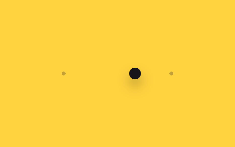
<main class="stage is-demo">
  <div class="track">
    <span class="dot dot--start"></span>
    <span class="dot dot--end"></span>
    <div class="puck"></div>
  </div>
</main>
@use "../../../../site/static/demo-tokens" as *;
// ── 변수 3개 ──────────────────────────────────────────
$duration: $dur-loop; // 2s
// linear() — 감쇠비(zeta) .35 · 각진동수(w) 9.0 인 스프링 방정식을 27개 점으로 표본화했다.
// 감쇠비를 낮추고 각진동수를 올리면 목표를 30% 넘게 지나쳤다가 몇 번을 더 오간다 — 탄력이 셀수록 오버슈트가 크다
$easing: linear(0, .055, .197, .394, .612, .824, 1.009, 1.153, 1.25, 1.3, 1.307, 1.281, 1.231, 1.167, 1.099, 1.035, .982, .942, .916, .905, .907, .917, .935, .955, .976, .995, 1);
$color: $subject-ink;
@include stage($stage-yellow);
$track-w: 220px;
$puck-w: $sp-6;
$travel: $track-w - $puck-w;
.track {
position: relative;
width: $track-w;
height: $sp-2;
}
.dot {
position: absolute;
top: 50%;
width: $sp-2;
height: $sp-2;
border-radius: $r-pill;
background: rgba(23, 20, 26, .25);
transform: translate(-50%, -50%);
}
.dot--start { left: 0; }
.dot--end { left: $track-w; }
.puck {
position: absolute;
top: 50%;
left: 0;
width: $puck-w;
height: $puck-w;
border-radius: $r-pill;
background: $color;
box-shadow: $shadow-raised;
transform: translate(0, -50%);
}
.stage.is-demo .puck {
animation: move $duration $easing infinite alternate;
}
@keyframes move {
from { transform: translate(0, -50%); }
to { transform: translate($travel, -50%); }
}
@media (prefers-reduced-motion: reduce) {
.stage.is-demo .puck { animation: none; transform: translate($travel, -50%); }
}html, body {
margin: 0;
overflow: hidden;
}
.stage {
box-sizing: border-box;
min-height: 100vh;
display: grid;
place-items: center;
margin: 0;
background: #ffd23f;
font-family: -apple-system, "Segoe UI", "Noto Sans KR", sans-serif;
padding: clamp(8px, 4vw, 24px);
}
.track {
position: relative;
width: 220px;
height: 8px;
}
.dot {
position: absolute;
top: 50%;
width: 8px;
height: 8px;
border-radius: 999px;
background: rgba(23, 20, 26, 0.25);
transform: translate(-50%, -50%);
}
.dot--start {
left: 0;
}
.dot--end {
left: 220px;
}
.puck {
position: absolute;
top: 50%;
left: 0;
width: 24px;
height: 24px;
border-radius: 999px;
background: #17141a;
box-shadow: 0 14px 24px rgba(23, 20, 26, 0.32);
transform: translate(0, -50%);
}
.stage.is-demo .puck {
animation: move 2s linear(0, 0.055, 0.197, 0.394, 0.612, 0.824, 1.009, 1.153, 1.25, 1.3, 1.307, 1.281, 1.231, 1.167, 1.099, 1.035, 0.982, 0.942, 0.916, 0.905, 0.907, 0.917, 0.935, 0.955, 0.976, 0.995, 1) infinite alternate;
}
@keyframes move {
from {
transform: translate(0, -50%);
}
to {
transform: translate(196px, -50%);
}
}
@media (prefers-reduced-motion: reduce) {
.stage.is-demo .puck {
animation: none;
transform: translate(196px, -50%);
}
}import type { CSSProperties } from "react";
import styles from "./SpringSnappy.module.scss";
export type SpringSnappyProps = {
duration?: number;
color?: string;
};
export default function SpringSnappy({ duration = 2000, color = "#17141a" }: SpringSnappyProps) {
const vars: CSSProperties = { "--duration": `${duration}ms`, "--color": color } as CSSProperties;
return (
<div className={styles.stage} style={vars}>
<div className={styles.track}>
<span className={`${styles.dot} ${styles.dotStart}`} />
<span className={`${styles.dot} ${styles.dotEnd}`} />
<div className={styles.puck} />
</div>
</div>
);
}06 Snappy spring — Measured area 6.622% · moving frames 23/23Original by GODRICH · SCSS and React ship in the zip · 9 CSS Easing Curves You Can Copy-Paste
The post this demo lives in
 9 CSS Easing Curves You Can Copy-PasteA CSS animation moving at one constant speed looks robotic; ease it down at the end, or spring past the target and settl See all demos in this post