07SCSS easing map mixin
A single $easings Sass map holds every curve from this post by name, and @mixin ease($name) pulls the right one via map.get() so no post ever has to copy-paste a raw curve value again.
Best forDesign systems where many components need to share the same brand easing
Sass map@mixinmap.get
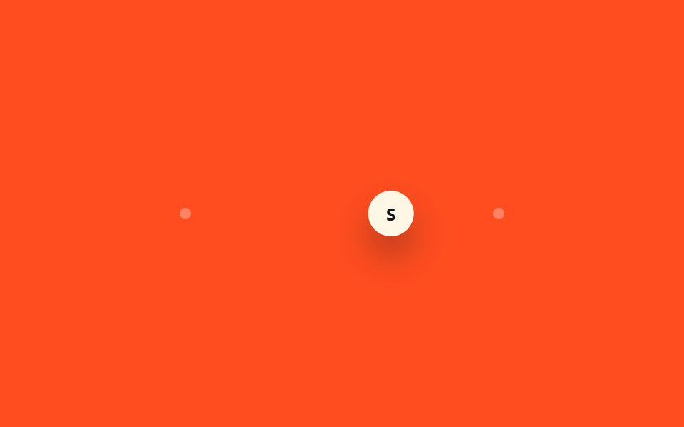
<main class="stage is-demo">
  <div class="track">
    <span class="dot dot--start"></span>
    <span class="dot dot--end"></span>
    <div class="puck">S</div>
  </div>
</main>
@use "sass:map";
@use "../../../../site/static/demo-tokens" as *;
// ── 변수 3개 ──────────────────────────────────────────
$duration: $dur-loop; // 2s
$easing: spring-snappy; // 아래 $easings 맵의 키 — 값 자체가 아니라 "이름"을 변수로 넘긴다
$color: $subject-cream;
// 이 편 9종에 쓴 곡선을 이름으로 묶어두면, 편마다 값을 복붙하지 않고 이름만 불러 쓴다
$easings: (
"ease-out-quart": cubic-bezier(.25, 1, .5, 1),
"ease-in-out-back": cubic-bezier(.68, -.6, .32, 1.6),
"spring-gentle": linear(0, .044, .153, .297, .452, .602, .736, .849, .937, 1.002, 1.045, 1.071, 1.082, 1.083, 1.077, 1.066, 1.053, 1.04, 1.028, 1.018, 1.009, 1.003, 1),
"spring-snappy": linear(0, .055, .197, .394, .612, .824, 1.009, 1.153, 1.25, 1.3, 1.307, 1.281, 1.231, 1.167, 1.099, 1.035, .982, .942, .916, .905, .907, .917, .935, .955, .976, .995, 1),
);
@mixin ease($name, $prop: animation-timing-function) {
#{$prop}: map.get($easings, $name);
}
@include stage($stage-orange);
$track-w: 220px;
$puck-w: $sp-8;
$travel: $track-w - $puck-w;
.track {
position: relative;
width: $track-w;
height: $sp-2;
}
.dot {
position: absolute;
top: 50%;
width: $sp-2;
height: $sp-2;
border-radius: $r-pill;
background: rgba(255, 255, 255, .3);
transform: translate(-50%, -50%);
}
.dot--start { left: 0; }
.dot--end { left: $track-w; }
.puck {
position: absolute;
top: 50%;
left: 0;
width: $puck-w;
height: $puck-w;
border-radius: $r-pill;
background: $color;
color: $stage-ink;
font: 700 12px/1 -apple-system, "Segoe UI", "Noto Sans KR", sans-serif;
display: grid;
place-items: center;
box-shadow: $shadow-raised;
transform: translate(0, -50%);
}
.stage.is-demo .puck {
animation-name: move;
animation-duration: $duration;
animation-iteration-count: infinite;
animation-direction: alternate;
@include ease($easing); // ← 맵에서 spring-snappy 값을 꺼내 animation-timing-function 에 꽂는다
}
@keyframes move {
from { transform: translate(0, -50%); }
to { transform: translate($travel, -50%); }
}
@media (prefers-reduced-motion: reduce) {
.stage.is-demo .puck { animation: none; transform: translate($travel, -50%); }
}html, body {
margin: 0;
overflow: hidden;
}
.stage {
box-sizing: border-box;
min-height: 100vh;
display: grid;
place-items: center;
margin: 0;
background: #ff4d1f;
font-family: -apple-system, "Segoe UI", "Noto Sans KR", sans-serif;
padding: clamp(8px, 4vw, 24px);
}
.track {
position: relative;
width: 220px;
height: 8px;
}
.dot {
position: absolute;
top: 50%;
width: 8px;
height: 8px;
border-radius: 999px;
background: rgba(255, 255, 255, 0.3);
transform: translate(-50%, -50%);
}
.dot--start {
left: 0;
}
.dot--end {
left: 220px;
}
.puck {
position: absolute;
top: 50%;
left: 0;
width: 32px;
height: 32px;
border-radius: 999px;
background: #fff7e6;
color: #17141a;
font: 700 12px/1 -apple-system, "Segoe UI", "Noto Sans KR", sans-serif;
display: grid;
place-items: center;
box-shadow: 0 14px 24px rgba(23, 20, 26, 0.32);
transform: translate(0, -50%);
}
.stage.is-demo .puck {
animation-name: move;
animation-duration: 2s;
animation-iteration-count: infinite;
animation-direction: alternate;
animation-timing-function: linear(0, 0.055, 0.197, 0.394, 0.612, 0.824, 1.009, 1.153, 1.25, 1.3, 1.307, 1.281, 1.231, 1.167, 1.099, 1.035, 0.982, 0.942, 0.916, 0.905, 0.907, 0.917, 0.935, 0.955, 0.976, 0.995, 1);
}
@keyframes move {
from {
transform: translate(0, -50%);
}
to {
transform: translate(188px, -50%);
}
}
@media (prefers-reduced-motion: reduce) {
.stage.is-demo .puck {
animation: none;
transform: translate(188px, -50%);
}
}import type { CSSProperties } from "react";
import styles from "./EasingMap.module.scss";
// SCSS $easings 맵과 같은 값을 JS 객체로 옮겼다 — 이름으로 곡선을 찾는 패턴은 언어가 달라도 같다
const EASINGS = {
"ease-out-quart": "cubic-bezier(.25, 1, .5, 1)",
"ease-in-out-back": "cubic-bezier(.68, -.6, .32, 1.6)",
"spring-gentle": "linear(0, .044, .153, .297, .452, .602, .736, .849, .937, 1.002, 1.045, 1.071, 1.082, 1.083, 1.077, 1.066, 1.053, 1.04, 1.028, 1.018, 1.009, 1.003, 1)",
"spring-snappy": "linear(0, .055, .197, .394, .612, .824, 1.009, 1.153, 1.25, 1.3, 1.307, 1.281, 1.231, 1.167, 1.099, 1.035, .982, .942, .916, .905, .907, .917, .935, .955, .976, .995, 1)",
} as const;
export type EasingMapProps = {
duration?: number;
color?: string;
/** 위 EASINGS 의 키. 기본은 SCSS 판과 같은 spring-snappy */
easing?: keyof typeof EASINGS;
};
export default function EasingMap({ duration = 2000, color = "#fff7e6", easing = "spring-snappy" }: EasingMapProps) {
const vars: CSSProperties = {
"--duration": `${duration}ms`,
"--color": color,
"--ease": EASINGS[easing],
} as CSSProperties;
return (
<div className={styles.stage} style={vars}>
<div className={styles.track}>
<span className={`${styles.dot} ${styles.dotStart}`} />
<span className={`${styles.dot} ${styles.dotEnd}`} />
<div className={styles.puck}>S</div>
</div>
</div>
);
}07 SCSS easing map mixin — Measured area 9.358% · moving frames 23/23Original by GODRICH · SCSS and React ship in the zip · 9 CSS Easing Curves You Can Copy-Paste
The post this demo lives in
 9 CSS Easing Curves You Can Copy-PasteA CSS animation moving at one constant speed looks robotic; ease it down at the end, or spring past the target and settl See all demos in this post