08Glitch boot
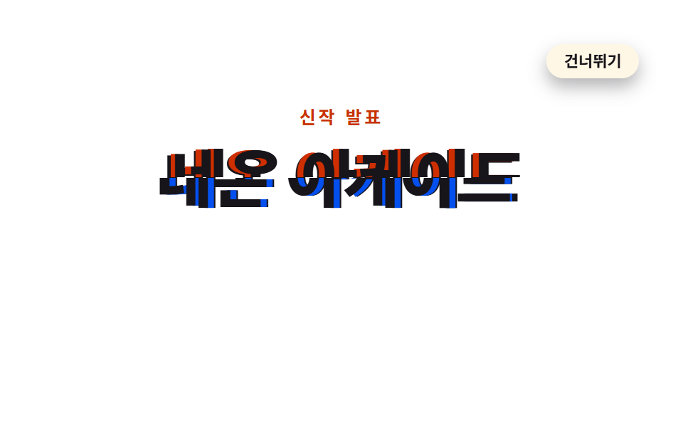
The headline tears into two clip-path slices whose text-shadow colors jump sideways, then the offset converges to zero and it snaps into one line.
Best forEntry screen for a game or tech brand
text-shadowclip-pathanimation-iteration-count
<main class="stage">
  <section class="gl is-demo" id="gl" aria-label="Site first screen">
    <div class="gl__head">
      <p class="gl__kicker">New release</p>
      <div class="gl__titlewrap">
        <h1 class="gl__title">Neon Arcade</h1>
        <span class="gl__slice gl__slice--a" aria-hidden="true">Neon Arcade</span>
        <span class="gl__slice gl__slice--b" aria-hidden="true">Neon Arcade</span>
      </div>
    </div>
    <div class="gl__aside" id="content">
      <p class="gl__sub">Tonight at 8, the new title drops</p>
      <button class="gl__cta" type="button">Notify me</button>
    </div>
    <button class="gl__skip" id="skip" type="button">Skip</button>
    <p class="gl__sr" id="status" aria-live="polite">Playing intro</p>
  </section>
</main>
@use "../../../../site/static/demo-tokens" as *;
// 글리치 부팅 — 제목이 clip-path 로 잘린 두 겹으로 어긋난 채 등장해 text-shadow 잔상 색을 좌우로
// 튀다가 어긋남이 0 으로 수렴하며 한 줄로 붙고, 그 뒤에 부제와 버튼이 따라 오른다.
// 글자를 해독하거나 타이핑하지 않는다 — 이미 완성된 제목이 '붙는' 진입 연출이다.
// 기본(작성) 상태 = 완료 상태(두 겹 정렬, 잔상 없음). 건너뛰기와 reduced-motion 은
// animation-name: none 만으로 완료 상태가 된다.
$duration: $dur-enter; // 실제 인트로 한 번의 길이
$easing: $ease-pop; // 제목이 자리를 잡을 때 한 번 더 튄다
$color: $subject-blue-deep; // 글리치 잔상 A — 페이퍼 위 6.37:1 (run/016/_probe/a3_대비.py)
@include stage($stage-paper);
.gl {
position: relative; width: 100%; height: 100%; overflow: hidden;
display: grid; place-content: center; justify-items: center; gap: $sp-3;
text-align: center;
}
// ── 머리 — 키커와 제목. 첫 프레임부터 보인다(어긋난 채)
.gl__head { display: grid; justify-items: center; gap: $sp-2; }
.gl__kicker {
margin: 0; color: $subject-orange-deep; // 페이퍼 위 5.38:1
font-weight: 700; font-size: clamp(11px, 2.6vw, 13px); line-height: 1.4; letter-spacing: .16em;
}
.gl__titlewrap { position: relative; margin: 0; }
.gl__title {
margin: 0; color: $subject-ink; // 페이퍼 위 18.24:1
font-weight: 800; font-size: clamp(30px, 9vw, 48px); line-height: 1.15; white-space: nowrap;
}
// 제목을 위·아래로 자른 두 겹. 본문 h1 위에 포개어 놓고 제각기 어긋난다
.gl__slice {
position: absolute; inset: 0; display: grid; place-items: center; pointer-events: none;
color: $subject-ink;
font-weight: 800; font-size: clamp(30px, 9vw, 48px); line-height: 1.15; white-space: nowrap;
}
.gl__slice--a {
clip-path: inset(0 0 50% 0); // 칩: clip-path — 위 반쪽
animation-name: glSliceAOnce; animation-duration: $duration;
animation-timing-function: $easing; animation-iteration-count: 1; animation-fill-mode: backwards;
}
.gl__slice--b {
clip-path: inset(50% 0 0 0); // 아래 반쪽
animation-name: glSliceBOnce; animation-duration: $duration;
animation-timing-function: $easing; animation-iteration-count: 1; animation-fill-mode: backwards;
}
// ── 제목이 붙은 뒤 따라 오르는 부제·버튼. 기본 상태 = 다 올라온(완료) 상태
.gl__aside {
display: grid; justify-items: center; gap: $sp-2;
animation-name: glAsideOnce; animation-duration: $duration;
animation-timing-function: $easing; animation-iteration-count: 1; animation-fill-mode: backwards;
}
.gl__sub {
margin: 0; color: rgba($subject-ink, .78); // 페이퍼 위 9.04:1
font-weight: 500; font-size: clamp(12px, 3vw, 14px); line-height: 1.5;
}
.gl__cta {
margin: 0; border: 0; border-radius: $r-pill; padding: $sp-2 $sp-4;
background: $subject-ink; color: $subject-cream; // 17.11:1
font-family: inherit; font-weight: 700; font-size: clamp(12px, 3vw, 14px); line-height: 1.4;
cursor: pointer;
}
.gl__cta:focus-visible { outline: 2px solid $subject-orange-deep; outline-offset: 2px; }
.gl__skip {
position: absolute; top: $sp-3; right: $sp-3; z-index: 4; margin: 0;
border: 0; border-radius: $r-pill; padding: $sp-1 $sp-3;
background: $subject-cream; color: $subject-ink; // 17.11:1 — 흰 무대 위 그대로 통과
font-family: inherit; font-weight: 700; font-size: 11px; line-height: 1.4;
cursor: pointer; box-shadow: $shadow-press;
}
.gl__skip:focus-visible { outline: 2px solid $subject-ink; outline-offset: 2px; }
.gl__sr {
position: absolute; width: 1px; height: 1px; margin: 0; overflow: hidden;
clip-path: inset(50%); white-space: nowrap;
}
// ── 실제 인트로(한 번 재생). 어긋남이 줄다 34% 에 0 이 되고 잔상도 0 0 으로 수렴한다
@keyframes glSliceAOnce {
0% { transform: translate(-9px, 0); text-shadow: 5px 0 $color; clip-path: inset(0 0 52% 0); }
7% { transform: translate(5px, -1px); text-shadow: -4px 0 $subject-orange-deep; clip-path: inset(0 0 48% 0); }
14% { transform: translate(-6px, 1px); text-shadow: 4px 0 $color; clip-path: inset(0 0 55% 0); }
21% { transform: translate(3px, 0); text-shadow: -3px 0 $subject-orange-deep; clip-path: inset(0 0 47% 0); }
28% { transform: translate(-2px, 0); text-shadow: 2px 0 $color; clip-path: inset(0 0 50% 0); }
34%, 100% { transform: translate(0, 0); text-shadow: 0 0 transparent; clip-path: inset(0 0 50% 0); }
}
@keyframes glSliceBOnce {
0% { transform: translate(9px, 1px); text-shadow: -5px 0 $subject-orange-deep; clip-path: inset(48% 0 0 0); }
7% { transform: translate(-5px, 0); text-shadow: 4px 0 $color; clip-path: inset(52% 0 0 0); }
14% { transform: translate(6px, -1px); text-shadow: -4px 0 $subject-orange-deep; clip-path: inset(45% 0 0 0); }
21% { transform: translate(-3px, 1px); text-shadow: 3px 0 $color; clip-path: inset(53% 0 0 0); }
28% { transform: translate(2px, 0); text-shadow: -2px 0 $subject-orange-deep; clip-path: inset(50% 0 0 0); }
34%, 100% { transform: translate(0, 0); text-shadow: 0 0 transparent; clip-path: inset(50% 0 0 0); }
}
@keyframes glAsideOnce {
0%, 36% { opacity: 0; transform: translateY(14px); }
100% { opacity: 1; transform: translateY(0); }
}
// ── 격자 미리보기 루프(2초). 붙은 상태를 보여 준 뒤 76% 부터 다시 어긋나 88% 안에 처음으로 복귀
.gl.is-demo .gl__slice--a {
animation-name: glSliceALoop; animation-duration: $dur-loop;
animation-timing-function: $easing; animation-iteration-count: infinite; animation-fill-mode: backwards;
}
.gl.is-demo .gl__slice--b {
animation-name: glSliceBLoop; animation-duration: $dur-loop;
animation-timing-function: $easing; animation-iteration-count: infinite; animation-fill-mode: backwards;
}
.gl.is-demo .gl__aside {
animation-name: glAsideLoop; animation-duration: $dur-loop;
animation-timing-function: $easing; animation-iteration-count: infinite; animation-fill-mode: backwards;
}
@keyframes glSliceALoop {
0% { transform: translate(-9px, 0); text-shadow: 5px 0 $color; clip-path: inset(0 0 52% 0); }
6% { transform: translate(5px, -1px); text-shadow: -4px 0 $subject-orange-deep; clip-path: inset(0 0 48% 0); }
13% { transform: translate(-6px, 1px); text-shadow: 4px 0 $color; clip-path: inset(0 0 55% 0); }
20% { transform: translate(3px, 0); text-shadow: -3px 0 $subject-orange-deep; clip-path: inset(0 0 47% 0); }
27% { transform: translate(-2px, 0); text-shadow: 2px 0 $color; clip-path: inset(0 0 50% 0); }
33%, 76% { transform: translate(0, 0); text-shadow: 0 0 transparent; clip-path: inset(0 0 50% 0); }
80% { transform: translate(-3px, 0); text-shadow: 2px 0 $color; clip-path: inset(0 0 51% 0); }
84% { transform: translate(4px, -1px); text-shadow: -3px 0 $subject-orange-deep; clip-path: inset(0 0 48% 0); }
88%, 100% { transform: translate(-9px, 0); text-shadow: 5px 0 $color; clip-path: inset(0 0 52% 0); }
}
@keyframes glSliceBLoop {
0% { transform: translate(9px, 1px); text-shadow: -5px 0 $subject-orange-deep; clip-path: inset(48% 0 0 0); }
6% { transform: translate(-5px, 0); text-shadow: 4px 0 $color; clip-path: inset(52% 0 0 0); }
13% { transform: translate(6px, -1px); text-shadow: -4px 0 $subject-orange-deep; clip-path: inset(45% 0 0 0); }
20% { transform: translate(-3px, 1px); text-shadow: 3px 0 $color; clip-path: inset(53% 0 0 0); }
27% { transform: translate(2px, 0); text-shadow: -2px 0 $subject-orange-deep; clip-path: inset(50% 0 0 0); }
33%, 76% { transform: translate(0, 0); text-shadow: 0 0 transparent; clip-path: inset(50% 0 0 0); }
80% { transform: translate(3px, 1px); text-shadow: -2px 0 $subject-orange-deep; clip-path: inset(49% 0 0 0); }
84% { transform: translate(-4px, 0); text-shadow: 3px 0 $color; clip-path: inset(52% 0 0 0); }
88%, 100% { transform: translate(9px, 1px); text-shadow: -5px 0 $subject-orange-deep; clip-path: inset(48% 0 0 0); }
}
// 복귀: 제목이 다시 어긋나기 직전 두 프레임에 걸쳐 내려가며 빠진다 — 겹쳐 보일 대상이 없는 이탈이라 유령이 생기지 않는다
@keyframes glAsideLoop {
0%, 34% { opacity: 0; transform: translateY(14px); }
52%, 74% { opacity: 1; transform: translateY(0); }
78%, 100% { opacity: 0; transform: translateY(14px); }
}
// 건너뛰기·Esc·재방문 — 애니메이션을 꺼 기본 상태(완료)로 돌린다 (is-demo 규칙 뒤에 둔다)
.gl.is-done .gl__slice--a, .gl.is-done .gl__slice--b, .gl.is-done .gl__aside { animation-name: none; }
@media (max-width: 340px) {
.gl { gap: $sp-2; }
.gl__head { gap: $sp-1; }
.gl__skip { top: $sp-2; right: $sp-2; }
}
@media (prefers-reduced-motion: reduce) {
.gl__slice--a, .gl__slice--b, .gl__aside { animation-name: none !important; }
}html, body {
margin: 0;
overflow: hidden;
}
.stage {
box-sizing: border-box;
min-height: 100vh;
display: grid;
place-items: center;
margin: 0;
background: #ffffff;
font-family: -apple-system, "Segoe UI", "Noto Sans KR", sans-serif;
padding: clamp(8px, 4vw, 24px);
}
.gl {
position: relative;
width: 100%;
height: 100%;
overflow: hidden;
display: grid;
place-content: center;
justify-items: center;
gap: 12px;
text-align: center;
}
.gl__head {
display: grid;
justify-items: center;
gap: 8px;
}
.gl__kicker {
margin: 0;
color: #c93000;
font-weight: 700;
font-size: clamp(11px, 2.6vw, 13px);
line-height: 1.4;
letter-spacing: 0.16em;
}
.gl__titlewrap {
position: relative;
margin: 0;
}
.gl__title {
margin: 0;
color: #17141a;
font-weight: 800;
font-size: clamp(30px, 9vw, 48px);
line-height: 1.15;
white-space: nowrap;
}
.gl__slice {
position: absolute;
inset: 0;
display: grid;
place-items: center;
pointer-events: none;
color: #17141a;
font-weight: 800;
font-size: clamp(30px, 9vw, 48px);
line-height: 1.15;
white-space: nowrap;
}
.gl__slice--a {
clip-path: inset(0 0 50% 0);
animation-name: glSliceAOnce;
animation-duration: 600ms;
animation-timing-function: cubic-bezier(0.2, 1.4, 0.4, 1);
animation-iteration-count: 1;
animation-fill-mode: backwards;
}
.gl__slice--b {
clip-path: inset(50% 0 0 0);
animation-name: glSliceBOnce;
animation-duration: 600ms;
animation-timing-function: cubic-bezier(0.2, 1.4, 0.4, 1);
animation-iteration-count: 1;
animation-fill-mode: backwards;
}
.gl__aside {
display: grid;
justify-items: center;
gap: 8px;
animation-name: glAsideOnce;
animation-duration: 600ms;
animation-timing-function: cubic-bezier(0.2, 1.4, 0.4, 1);
animation-iteration-count: 1;
animation-fill-mode: backwards;
}
.gl__sub {
margin: 0;
color: rgba(23, 20, 26, 0.78);
font-weight: 500;
font-size: clamp(12px, 3vw, 14px);
line-height: 1.5;
}
.gl__cta {
margin: 0;
border: 0;
border-radius: 999px;
padding: 8px 16px;
background: #17141a;
color: #fff7e6;
font-family: inherit;
font-weight: 700;
font-size: clamp(12px, 3vw, 14px);
line-height: 1.4;
cursor: pointer;
}
.gl__cta:focus-visible {
outline: 2px solid #c93000;
outline-offset: 2px;
}
.gl__skip {
position: absolute;
top: 12px;
right: 12px;
z-index: 4;
margin: 0;
border: 0;
border-radius: 999px;
padding: 4px 12px;
background: #fff7e6;
color: #17141a;
font-family: inherit;
font-weight: 700;
font-size: 11px;
line-height: 1.4;
cursor: pointer;
box-shadow: 0 6px 12px rgba(23, 20, 26, 0.32);
}
.gl__skip:focus-visible {
outline: 2px solid #17141a;
outline-offset: 2px;
}
.gl__sr {
position: absolute;
width: 1px;
height: 1px;
margin: 0;
overflow: hidden;
clip-path: inset(50%);
white-space: nowrap;
}
@keyframes glSliceAOnce {
0% {
transform: translate(-9px, 0);
text-shadow: 5px 0 #0a4fe8;
clip-path: inset(0 0 52% 0);
}
7% {
transform: translate(5px, -1px);
text-shadow: -4px 0 #c93000;
clip-path: inset(0 0 48% 0);
}
14% {
transform: translate(-6px, 1px);
text-shadow: 4px 0 #0a4fe8;
clip-path: inset(0 0 55% 0);
}
21% {
transform: translate(3px, 0);
text-shadow: -3px 0 #c93000;
clip-path: inset(0 0 47% 0);
}
28% {
transform: translate(-2px, 0);
text-shadow: 2px 0 #0a4fe8;
clip-path: inset(0 0 50% 0);
}
34%, 100% {
transform: translate(0, 0);
text-shadow: 0 0 transparent;
clip-path: inset(0 0 50% 0);
}
}
@keyframes glSliceBOnce {
0% {
transform: translate(9px, 1px);
text-shadow: -5px 0 #c93000;
clip-path: inset(48% 0 0 0);
}
7% {
transform: translate(-5px, 0);
text-shadow: 4px 0 #0a4fe8;
clip-path: inset(52% 0 0 0);
}
14% {
transform: translate(6px, -1px);
text-shadow: -4px 0 #c93000;
clip-path: inset(45% 0 0 0);
}
21% {
transform: translate(-3px, 1px);
text-shadow: 3px 0 #0a4fe8;
clip-path: inset(53% 0 0 0);
}
28% {
transform: translate(2px, 0);
text-shadow: -2px 0 #c93000;
clip-path: inset(50% 0 0 0);
}
34%, 100% {
transform: translate(0, 0);
text-shadow: 0 0 transparent;
clip-path: inset(50% 0 0 0);
}
}
@keyframes glAsideOnce {
0%, 36% {
opacity: 0;
transform: translateY(14px);
}
100% {
opacity: 1;
transform: translateY(0);
}
}
.gl.is-demo .gl__slice--a {
animation-name: glSliceALoop;
animation-duration: 2s;
animation-timing-function: cubic-bezier(0.2, 1.4, 0.4, 1);
animation-iteration-count: infinite;
animation-fill-mode: backwards;
}
.gl.is-demo .gl__slice--b {
animation-name: glSliceBLoop;
animation-duration: 2s;
animation-timing-function: cubic-bezier(0.2, 1.4, 0.4, 1);
animation-iteration-count: infinite;
animation-fill-mode: backwards;
}
.gl.is-demo .gl__aside {
animation-name: glAsideLoop;
animation-duration: 2s;
animation-timing-function: cubic-bezier(0.2, 1.4, 0.4, 1);
animation-iteration-count: infinite;
animation-fill-mode: backwards;
}
@keyframes glSliceALoop {
0% {
transform: translate(-9px, 0);
text-shadow: 5px 0 #0a4fe8;
clip-path: inset(0 0 52% 0);
}
6% {
transform: translate(5px, -1px);
text-shadow: -4px 0 #c93000;
clip-path: inset(0 0 48% 0);
}
13% {
transform: translate(-6px, 1px);
text-shadow: 4px 0 #0a4fe8;
clip-path: inset(0 0 55% 0);
}
20% {
transform: translate(3px, 0);
text-shadow: -3px 0 #c93000;
clip-path: inset(0 0 47% 0);
}
27% {
transform: translate(-2px, 0);
text-shadow: 2px 0 #0a4fe8;
clip-path: inset(0 0 50% 0);
}
33%, 76% {
transform: translate(0, 0);
text-shadow: 0 0 transparent;
clip-path: inset(0 0 50% 0);
}
80% {
transform: translate(-3px, 0);
text-shadow: 2px 0 #0a4fe8;
clip-path: inset(0 0 51% 0);
}
84% {
transform: translate(4px, -1px);
text-shadow: -3px 0 #c93000;
clip-path: inset(0 0 48% 0);
}
88%, 100% {
transform: translate(-9px, 0);
text-shadow: 5px 0 #0a4fe8;
clip-path: inset(0 0 52% 0);
}
}
@keyframes glSliceBLoop {
0% {
transform: translate(9px, 1px);
text-shadow: -5px 0 #c93000;
clip-path: inset(48% 0 0 0);
}
6% {
transform: translate(-5px, 0);
text-shadow: 4px 0 #0a4fe8;
clip-path: inset(52% 0 0 0);
}
13% {
transform: translate(6px, -1px);
text-shadow: -4px 0 #c93000;
clip-path: inset(45% 0 0 0);
}
20% {
transform: translate(-3px, 1px);
text-shadow: 3px 0 #0a4fe8;
clip-path: inset(53% 0 0 0);
}
27% {
transform: translate(2px, 0);
text-shadow: -2px 0 #c93000;
clip-path: inset(50% 0 0 0);
}
33%, 76% {
transform: translate(0, 0);
text-shadow: 0 0 transparent;
clip-path: inset(50% 0 0 0);
}
80% {
transform: translate(3px, 1px);
text-shadow: -2px 0 #c93000;
clip-path: inset(49% 0 0 0);
}
84% {
transform: translate(-4px, 0);
text-shadow: 3px 0 #0a4fe8;
clip-path: inset(52% 0 0 0);
}
88%, 100% {
transform: translate(9px, 1px);
text-shadow: -5px 0 #c93000;
clip-path: inset(48% 0 0 0);
}
}
@keyframes glAsideLoop {
0%, 34% {
opacity: 0;
transform: translateY(14px);
}
52%, 74% {
opacity: 1;
transform: translateY(0);
}
78%, 100% {
opacity: 0;
transform: translateY(14px);
}
}
.gl.is-done .gl__slice--a, .gl.is-done .gl__slice--b, .gl.is-done .gl__aside {
animation-name: none;
}
@media (max-width: 340px) {
.gl {
gap: 8px;
}
.gl__head {
gap: 4px;
}
.gl__skip {
top: 8px;
right: 8px;
}
}
@media (prefers-reduced-motion: reduce) {
.gl__slice--a, .gl__slice--b, .gl__aside {
animation-name: none !important;
}
}(function () {
var root = document.getElementById('gl');
var aside = document.getElementById('content');
var status = document.getElementById('status');
var KEY = 'godrich-intro08-seen';
var MSG_DONE = 'Intro finished';
function finish() {
if (root.classList.contains('is-done')) { return; }
root.classList.add('is-done');
status.textContent = MSG_DONE;
try { sessionStorage.setItem(KEY, '1'); } catch (e) {}
}
// 한 번 본 브라우저에서는 처음부터 완료 상태
try { if (sessionStorage.getItem(KEY)) { finish(); } } catch (e) {}
document.getElementById('skip').addEventListener('click', finish);
document.addEventListener('keydown', function (e) {
if (e.key === 'Escape') { finish(); }
});
// 격자 미리보기 루프(.is-demo)는 손이 닿으면 실제 인트로(한 번 재생)로 넘어간다
root.addEventListener('pointerdown', function () { root.classList.remove('is-demo'); }, { once: true });
// 실제 인트로의 마지막 애니메이션(부제·버튼 안착)이 끝나면 완료로 기록한다
aside.addEventListener('animationend', function (e) {
if (e.target === aside) { finish(); }
});
})();// GlitchBoot — vanilla 판(run/016/demo/08-intro-glitch-boot/index.html) 의 React 포트.
// 제목이 clip-path 로 잘린 두 겹으로 어긋났다가 잔상이 수렴하며 한 줄로 붙는다. 해독·타이핑 아님.
// @keyframes 본문은 vanilla 와 같은 글자다 (값을 다시 타이핑하지 않는다).
import { useEffect, useState } from "react";
import type { CSSProperties } from "react";
import styles from "./GlitchBoot.module.scss";
export type GlitchBootProps = {
duration?: number; // ms — 실제 인트로(한 번 재생) 길이
easing?: string;
color?: string; // 글리치 잔상 A 색
};
type Vars = CSSProperties & { "--duration"?: string; "--easing"?: string; "--color"?: string };
type KeyEvt = { key: string };
type AnimEvt = { target: unknown; currentTarget: unknown };
const KEY = "godrich-intro08-seen";
const LABEL = "사이트 첫 화면";
const KICKER = "신작 발표";
const TITLE = "네온 아케이드";
const SUB = "오늘 밤 8시, 신작 공개";
const CTA = "알림 받기";
const SKIP = "건너뛰기";
const STATUS_PLAY = "인트로 재생 중";
const STATUS_DONE = "인트로가 끝났습니다";
export default function GlitchBoot(props: GlitchBootProps) {
const duration = props.duration ?? 600;
const easing = props.easing ?? "cubic-bezier(.2, 1.4, .4, 1)";
const color = props.color ?? "#0a4fe8";
// 한 번 본 브라우저에서는 처음부터 완료 상태
const [done, setDone] = useState<boolean>(() => {
try { return sessionStorage.getItem(KEY) === "1"; } catch { return false; }
});
const [preview, setPreview] = useState<boolean>(true);
useEffect(() => {
if (!done) return;
try { sessionStorage.setItem(KEY, "1"); } catch { /* 저장 불가 환경 무시 */ }
}, [done]);
useEffect(() => {
const onKey = (e: KeyEvt) => { if (e.key === "Escape") setDone(true); };
window.addEventListener("keydown", onKey);
return () => window.removeEventListener("keydown", onKey);
}, []);
const vars: Vars = { "--duration": duration + "ms", "--easing": easing, "--color": color };
return (
<main className={styles.stage}>
<section
className={styles.gl + (preview ? " " + styles.isDemo : "") + (done ? " " + styles.isDone : "")}
style={vars}
aria-label={LABEL}
onPointerDown={() => setPreview(false)}
>
<div className={styles.head}>
<p className={styles.kicker}>{KICKER}</p>
<div className={styles.titlewrap}>
<h1 className={styles.title}>{TITLE}</h1>
<span className={styles.slice + " " + styles.sliceA} aria-hidden="true">{TITLE}</span>
<span className={styles.slice + " " + styles.sliceB} aria-hidden="true">{TITLE}</span>
</div>
</div>
<div
className={styles.aside}
onAnimationEnd={(e: AnimEvt) => { if (e.target === e.currentTarget) setDone(true); }}
>
<p className={styles.sub}>{SUB}</p>
<button className={styles.cta} type="button">{CTA}</button>
</div>
<button className={styles.skip} type="button" onClick={() => setDone(true)}>{SKIP}</button>
<p className={styles.sr} aria-live="polite">{done ? STATUS_DONE : STATUS_PLAY}</p>
</section>
</main>
);
}08 Glitch boot — Measured area 9.744% · moving frames 17/23Original by GODRICH · SCSS and React ship in the zip · Intro Animation CSS: 9 Website Intro Animations
The post this demo lives in
 Intro Animation CSS: 9 Website Intro AnimationsIntro animation css is the short opening a page plays over its first screen, and all nine here end the same way: an intr See all demos in this post