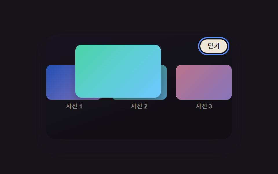
03Lightbox Whose Caption Slides Up From Below
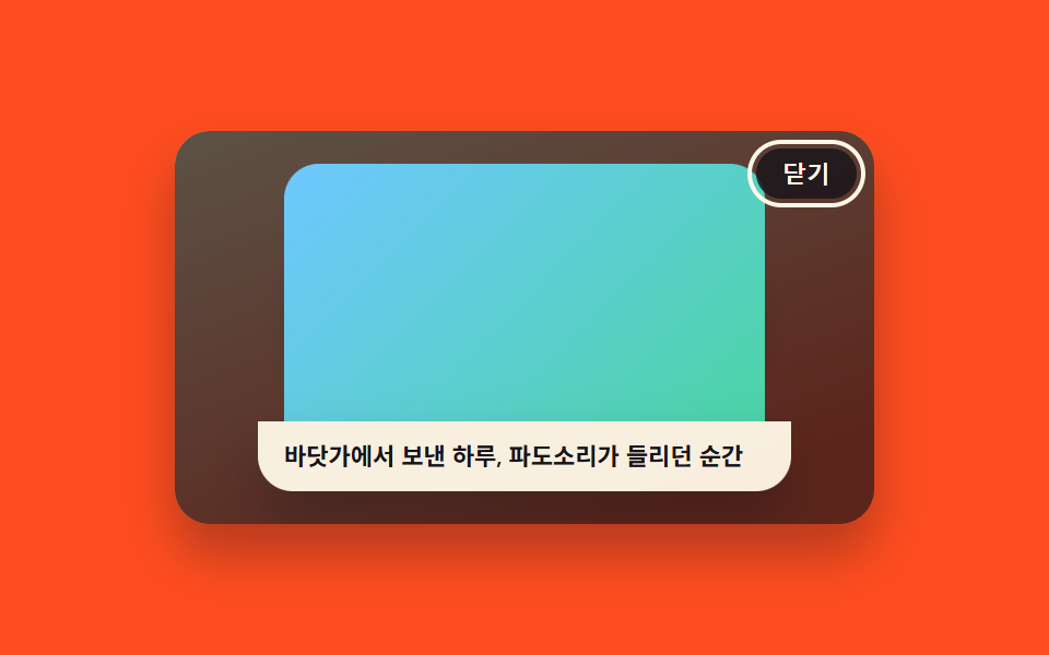
A beat after the image finishes expanding, the caption strip slides up from the bottom edge into place, so the image and its caption arrive in two distinct steps rather than together.
Best forCaptioned photo galleries, artwork detail views
transform: translateYrequestAnimationFramestaggered timing
<main class="stage">
<div class="scene is-demo" id="scene">
  <ul class="grid" id="grid">
    <li><button class="thumb" id="thumb0" type="button" aria-haspopup="dialog"><span class="thumbImg thumbImg--a"></span><span class="thumbLabel">Photo 1</span></button></li>
    <li><button class="thumb" id="thumb1" type="button" aria-haspopup="dialog"><span class="thumbImg thumbImg--b"></span><span class="thumbLabel">Photo 2</span></button></li>
    <li><button class="thumb" id="thumb2" type="button" aria-haspopup="dialog"><span class="thumbImg thumbImg--c"></span><span class="thumbLabel">Photo 3</span></button></li>
  </ul>
  <div class="backdrop" id="backdrop"></div>
  <div class="lightbox" id="lightbox" role="dialog" aria-modal="true" aria-hidden="true" aria-label="View photo with caption">
    <span class="fullImg" id="fullImg"></span>
    <p class="caption" id="caption"></p>
    <button class="closeBtn" id="closeBtn" type="button">Close</button>
  </div>
</div>
</main>
@use "../../../../site/static/demo-tokens" as *;
// 변수 3개
$duration: $dur-enter;
$easing: $ease-out;
$color: $subject-ink;
// 계산 겹: index.html 이 캡션 요소를 먼저 visibility:hidden 으로 렌더해 실제 높이(getBoundingClientRect)를
// 잰 뒤 그 값만큼 translateY 로 내렸다가 0 으로 올린다 — 텍스트 길이(로케일)마다 시작 위치가 다르다.
@include stage($stage-orange);
.scene {
position: relative;
width: 320px;
height: 180px;
border-radius: $r-card;
overflow: hidden;
box-shadow: $shadow-raised;
background: linear-gradient(160deg, #ffe3b0, $stage-orange 85%);
}
.grid {
position: absolute;
inset: 0;
margin: 0;
padding: 0;
list-style: none;
display: flex;
align-items: center;
justify-content: center;
gap: $sp-4;
}
.thumb {
appearance: none;
border: none;
background: none;
padding: 0;
display: flex;
flex-direction: column;
align-items: center;
gap: $sp-1;
cursor: pointer;
&:focus-visible .thumbImg { outline: 2px solid $subject-ink; outline-offset: 2px; }
}
.thumbImg {
display: block;
width: 60px;
height: 44px;
border-radius: $r-sm;
box-shadow: $shadow-press;
&--a { background: linear-gradient(135deg, $subject-mint, $subject-sky); }
&--b { background: linear-gradient(135deg, $subject-lilac, $subject-blue); }
&--c { background: linear-gradient(135deg, $subject-sky, $subject-mint); }
}
.thumbLabel {
font-size: 10px;
font-weight: 700;
color: $subject-ink;
}
.backdrop {
position: absolute;
inset: 0;
background: $subject-ink;
opacity: 0;
visibility: hidden;
pointer-events: none;
}
.lightbox {
position: absolute;
inset: 0;
display: flex;
flex-direction: column;
align-items: center;
justify-content: center;
gap: 0;
visibility: hidden;
overflow: hidden;
}
.fullImg {
display: block;
width: 220px;
height: 118px;
border-radius: $r-card $r-card 0 0;
opacity: 0;
&--a { background: linear-gradient(135deg, $subject-mint, $subject-sky); }
&--b { background: linear-gradient(135deg, $subject-lilac, $subject-blue); }
&--c { background: linear-gradient(135deg, $subject-sky, $subject-mint); }
}
.caption {
width: 220px;
margin: 0;
padding: $sp-2 $sp-3;
border-radius: 0 0 $r-card $r-card;
background: rgba($subject-cream, .96);
color: $subject-ink;
font-size: 11px;
font-weight: 600;
line-height: 1.4;
box-shadow: $shadow-raised;
}
.closeBtn {
position: absolute;
top: $sp-2;
right: $sp-2;
appearance: none;
border: none;
border-radius: $r-pill;
padding: $sp-1 $sp-3;
font-size: 11px;
font-weight: 600;
color: $subject-cream;
background: rgba($subject-ink, .82);
cursor: pointer;
&:focus-visible { outline: 2px solid $subject-cream; outline-offset: 2px; }
}
@media (max-width: 340px) {
.scene { width: 220px; height: 124px; }
.fullImg { width: 160px; height: 82px; }
.caption { width: 160px; font-size: 10px; }
}
@media (prefers-reduced-motion: reduce) {
// 실사용 경로 적용 — 이미지 등장·캡션 슬라이드는 index.html 의 animate() 가 reduce 시 즉시 최종 상태로 처리한다.
.closeBtn, .thumb { transition: none; }
}html, body {
margin: 0;
overflow: hidden;
}
.stage {
box-sizing: border-box;
min-height: 100vh;
display: grid;
place-items: center;
margin: 0;
background: #ff4d1f;
font-family: -apple-system, "Segoe UI", "Noto Sans KR", sans-serif;
padding: clamp(8px, 4vw, 24px);
}
.scene {
position: relative;
width: 320px;
height: 180px;
border-radius: 16px;
overflow: hidden;
box-shadow: 0 14px 24px rgba(23, 20, 26, 0.32);
background: linear-gradient(160deg, #ffe3b0, #ff4d1f 85%);
}
.grid {
position: absolute;
inset: 0;
margin: 0;
padding: 0;
list-style: none;
display: flex;
align-items: center;
justify-content: center;
gap: 16px;
}
.thumb {
appearance: none;
border: none;
background: none;
padding: 0;
display: flex;
flex-direction: column;
align-items: center;
gap: 4px;
cursor: pointer;
}
.thumb:focus-visible .thumbImg {
outline: 2px solid #17141a;
outline-offset: 2px;
}
.thumbImg {
display: block;
width: 60px;
height: 44px;
border-radius: 8px;
box-shadow: 0 6px 12px rgba(23, 20, 26, 0.32);
}
.thumbImg--a {
background: linear-gradient(135deg, #4cd4a6, #6ec8ff);
}
.thumbImg--b {
background: linear-gradient(135deg, #b9a0ff, #2f6df6);
}
.thumbImg--c {
background: linear-gradient(135deg, #6ec8ff, #4cd4a6);
}
.thumbLabel {
font-size: 10px;
font-weight: 700;
color: #17141a;
}
.backdrop {
position: absolute;
inset: 0;
background: #17141a;
opacity: 0;
visibility: hidden;
pointer-events: none;
}
.lightbox {
position: absolute;
inset: 0;
display: flex;
flex-direction: column;
align-items: center;
justify-content: center;
gap: 0;
visibility: hidden;
overflow: hidden;
}
.fullImg {
display: block;
width: 220px;
height: 118px;
border-radius: 16px 16px 0 0;
opacity: 0;
}
.fullImg--a {
background: linear-gradient(135deg, #4cd4a6, #6ec8ff);
}
.fullImg--b {
background: linear-gradient(135deg, #b9a0ff, #2f6df6);
}
.fullImg--c {
background: linear-gradient(135deg, #6ec8ff, #4cd4a6);
}
.caption {
width: 220px;
margin: 0;
padding: 8px 12px;
border-radius: 0 0 16px 16px;
background: rgba(255, 247, 230, 0.96);
color: #17141a;
font-size: 11px;
font-weight: 600;
line-height: 1.4;
box-shadow: 0 14px 24px rgba(23, 20, 26, 0.32);
}
.closeBtn {
position: absolute;
top: 8px;
right: 8px;
appearance: none;
border: none;
border-radius: 999px;
padding: 4px 12px;
font-size: 11px;
font-weight: 600;
color: #fff7e6;
background: rgba(23, 20, 26, 0.82);
cursor: pointer;
}
.closeBtn:focus-visible {
outline: 2px solid #fff7e6;
outline-offset: 2px;
}
@media (max-width: 340px) {
.scene {
width: 220px;
height: 124px;
}
.fullImg {
width: 160px;
height: 82px;
}
.caption {
width: 160px;
font-size: 10px;
}
}
@media (prefers-reduced-motion: reduce) {
.closeBtn, .thumb {
transition: none;
}
}(function () {
var IMAGE_MS = 550;
var CAPTION_GAP_MS = 120;
var CAPTION_MS = 420;
var HOLD_MS = 480;
var CLOSE_MS = 380;
var LOOP_MS = 2000;
var scene = document.getElementById('scene');
var backdrop = document.getElementById('backdrop');
var lightbox = document.getElementById('lightbox');
var fullImg = document.getElementById('fullImg');
var caption = document.getElementById('caption');
var closeBtn = document.getElementById('closeBtn');
var thumbs = [].slice.call(document.querySelectorAll('.thumb'));
var reduce = window.matchMedia('(prefers-reduced-motion: reduce)').matches;
var imgClassByIdx = ['fullImg--a', 'fullImg--b', 'fullImg--c'];
// 문구.json 에서 en·ja 로 함께 옮겨지도록 문자열 리터럴로 둔다(html data-* 속성은 문구치환 대상 밖)
var captionByIdx = ['A shot taken on an autumn walk', 'City night view', 'A day at the beach, the moment the waves could be heard'];
function clamp(v, lo, hi) { return Math.min(hi, Math.max(lo, v)); }
function easeOutCubic(t) { return 1 - Math.pow(1 - t, 3); }
// reduce: 실사용 경로 적용 — 트윈 없이 최종 상태로 즉시 전환한다
function animate(duration, onFrame, onDone) {
if (reduce) { onFrame(1); if (onDone) onDone(); return; }
var start = performance.now();
function frame(now) {
var p = clamp((now - start) / duration, 0, 1);
onFrame(easeOutCubic(p));
if (p < 1) requestAnimationFrame(frame);
else if (onDone) onDone();
}
requestAnimationFrame(frame);
}
var open = false;
var activeIdx = 1;
var timers = [];
function openFrom(idx) {
if (open) return;
open = true;
caption.textContent = captionByIdx[idx];
caption.style.transform = 'translateY(0px)';
caption.style.opacity = '0';
fullImg.className = 'fullImg ' + imgClassByIdx[idx];
fullImg.style.transform = 'scale(.86)';
fullImg.style.opacity = '0';
lightbox.style.visibility = 'visible';
lightbox.setAttribute('aria-hidden', 'false');
backdrop.style.visibility = 'visible';
animate(IMAGE_MS, function (e) {
fullImg.style.transform = 'scale(' + (0.86 + 0.14 * e).toFixed(4) + ')';
fullImg.style.opacity = e.toFixed(3);
backdrop.style.opacity = (0.7 * e).toFixed(3);
}, function () {
// 캡션 자신의 실제 렌더 높이를 측정해 그 높이만큼 아래서 밀어 올린다 — 텍스트 길이마다 시작 위치가 다르다
caption.style.visibility = 'hidden';
caption.style.opacity = '1';
var capH = caption.getBoundingClientRect().height;
caption.style.transform = 'translateY(' + capH.toFixed(1) + 'px)';
caption.style.visibility = 'visible';
timers.push(setTimeout(function () {
animate(CAPTION_MS, function (e2) {
caption.style.transform = 'translateY(' + (capH * (1 - e2)).toFixed(1) + 'px)';
}, function () {
closeBtn.focus({ preventScroll: true });
});
}, CAPTION_GAP_MS));
});
}
function closeLightbox() {
if (!open) return;
animate(CLOSE_MS, function (e) {
fullImg.style.opacity = (1 - e).toFixed(3);
caption.style.opacity = (1 - e).toFixed(3);
backdrop.style.opacity = (0.7 * (1 - e)).toFixed(3);
}, function () {
lightbox.style.visibility = 'hidden';
lightbox.setAttribute('aria-hidden', 'true');
backdrop.style.visibility = 'hidden';
open = false;
thumbs[activeIdx].focus({ preventScroll: true });
});
}
function human() {
if (scene.classList.contains('is-demo')) {
scene.classList.remove('is-demo');
timers.forEach(function (id) { clearTimeout(id); clearInterval(id); });
timers = [];
}
}
thumbs.forEach(function (t, i) {
t.addEventListener('click', function () {
human();
activeIdx = i;
openFrom(i);
});
});
closeBtn.addEventListener('click', function () { human(); closeLightbox(); });
backdrop.addEventListener('click', function () { human(); closeLightbox(); });
document.addEventListener('keydown', function (e) {
if (e.key === 'Escape' && open) { human(); closeLightbox(); }
});
function cycle() {
activeIdx = 2;
openFrom(2);
timers.push(setTimeout(closeLightbox, IMAGE_MS + CAPTION_GAP_MS + CAPTION_MS + HOLD_MS));
}
if (!reduce) {
cycle();
timers.push(setInterval(function () {
if (scene.classList.contains('is-demo')) cycle();
}, LOOP_MS));
}
})();import { useEffect, useRef } from 'react';
import styles from './CaptionSlideUp.module.scss';
const IMAGE_MS = 550;
const CAPTION_GAP_MS = 120;
const CAPTION_MS = 420;
const HOLD_MS = 480;
const CLOSE_MS = 380;
const LOOP_MS = 2000;
// 문구.json 에서 en·ja 로 함께 옮겨지도록 문자열 리터럴로 둔다(html data-* 속성은 문구치환 대상 밖)
const captionByIdx = ['가을 산책길에서 담은 한 장', '도시의 야경', '바닷가에서 보낸 하루, 파도소리가 들리던 순간'];
export default function CaptionSlideUp() {
const sceneRef = useRef<HTMLDivElement>(null);
useEffect(() => {
const scene0 = sceneRef.current;
if (!scene0) return undefined;
const backdrop0 = scene0.querySelector<HTMLDivElement>('.' + styles.backdrop);
const lightbox0 = scene0.querySelector<HTMLDivElement>('.' + styles.lightbox);
const fullImg0 = scene0.querySelector<HTMLSpanElement>('.' + styles.fullImg);
const caption0 = scene0.querySelector<HTMLParagraphElement>('.' + styles.caption);
const closeBtn0 = scene0.querySelector<HTMLButtonElement>('.' + styles.closeBtn);
const thumbs = Array.from(scene0.querySelectorAll<HTMLButtonElement>('.' + styles.thumb));
if (!backdrop0 || !lightbox0 || !fullImg0 || !caption0 || !closeBtn0 || thumbs.length === 0) return undefined;
const scene = scene0;
const backdrop = backdrop0;
const lightbox = lightbox0;
const fullImg = fullImg0;
const caption = caption0;
const closeBtn = closeBtn0;
const reduce = window.matchMedia('(prefers-reduced-motion: reduce)').matches;
const imgClassByIdx = [styles['fullImg--a'], styles['fullImg--b'], styles['fullImg--c']];
function clamp(v: number, lo: number, hi: number) { return Math.min(hi, Math.max(lo, v)); }
function easeOutCubic(t: number) { return 1 - Math.pow(1 - t, 3); }
// reduce: 실사용 경로 적용 — 트윈 없이 최종 상태로 즉시 전환한다
function animate(duration: number, onFrame: (e: number) => void, onDone?: () => void) {
if (reduce) { onFrame(1); if (onDone) onDone(); return; }
const start = performance.now();
function frame(now: number) {
const p = clamp((now - start) / duration, 0, 1);
onFrame(easeOutCubic(p));
if (p < 1) requestAnimationFrame(frame);
else if (onDone) onDone();
}
requestAnimationFrame(frame);
}
let open = false;
let activeIdx = 1;
let timers: number[] = [];
function openFrom(idx: number) {
if (open) return;
open = true;
caption.textContent = captionByIdx[idx];
caption.style.transform = 'translateY(0px)';
caption.style.opacity = '0';
fullImg.className = styles.fullImg + ' ' + imgClassByIdx[idx];
fullImg.style.transform = 'scale(.86)';
fullImg.style.opacity = '0';
lightbox.style.visibility = 'visible';
lightbox.setAttribute('aria-hidden', 'false');
backdrop.style.visibility = 'visible';
animate(IMAGE_MS, (e) => {
fullImg.style.transform = 'scale(' + (0.86 + 0.14 * e).toFixed(4) + ')';
fullImg.style.opacity = e.toFixed(3);
backdrop.style.opacity = (0.7 * e).toFixed(3);
}, () => {
// 캡션 자신의 실제 렌더 높이를 측정해 그 높이만큼 아래서 밀어 올린다 — 텍스트 길이마다 시작 위치가 다르다
caption.style.visibility = 'hidden';
caption.style.opacity = '1';
const capH = caption.getBoundingClientRect().height;
caption.style.transform = 'translateY(' + capH.toFixed(1) + 'px)';
caption.style.visibility = 'visible';
timers.push(window.setTimeout(() => {
animate(CAPTION_MS, (e2) => {
caption.style.transform = 'translateY(' + (capH * (1 - e2)).toFixed(1) + 'px)';
}, () => {
closeBtn.focus({ preventScroll: true });
});
}, CAPTION_GAP_MS));
});
}
function closeLightbox() {
if (!open) return;
animate(CLOSE_MS, (e) => {
fullImg.style.opacity = (1 - e).toFixed(3);
caption.style.opacity = (1 - e).toFixed(3);
backdrop.style.opacity = (0.7 * (1 - e)).toFixed(3);
}, () => {
lightbox.style.visibility = 'hidden';
lightbox.setAttribute('aria-hidden', 'true');
backdrop.style.visibility = 'hidden';
open = false;
thumbs[activeIdx].focus({ preventScroll: true });
});
}
function human() {
if (scene.classList.contains(styles['is-demo'])) {
scene.classList.remove(styles['is-demo']);
timers.forEach((id) => { window.clearTimeout(id); window.clearInterval(id); });
timers = [];
}
}
const thumbHandlers = thumbs.map((_, i) => () => { human(); activeIdx = i; openFrom(i); });
thumbs.forEach((t, i) => t.addEventListener('click', thumbHandlers[i]));
function onCloseClick() { human(); closeLightbox(); }
function onBackdropClick() { human(); closeLightbox(); }
function onKeydown(e: KeyboardEvent) {
if (e.key === 'Escape' && open) { human(); closeLightbox(); }
}
closeBtn.addEventListener('click', onCloseClick);
backdrop.addEventListener('click', onBackdropClick);
document.addEventListener('keydown', onKeydown);
function cycle() {
activeIdx = 2;
openFrom(2);
timers.push(window.setTimeout(closeLightbox, IMAGE_MS + CAPTION_GAP_MS + CAPTION_MS + HOLD_MS));
}
if (!reduce) {
cycle();
timers.push(window.setInterval(() => {
if (scene.classList.contains(styles['is-demo'])) cycle();
}, LOOP_MS));
}
return () => {
timers.forEach((id) => { window.clearTimeout(id); window.clearInterval(id); });
thumbs.forEach((t, i) => t.removeEventListener('click', thumbHandlers[i]));
closeBtn.removeEventListener('click', onCloseClick);
backdrop.removeEventListener('click', onBackdropClick);
document.removeEventListener('keydown', onKeydown);
};
}, []);
return (
<div className={`${styles.scene} ${styles['is-demo']}`} ref={sceneRef}>
<ul className={styles.grid}>
<li><button className={styles.thumb} type="button" aria-haspopup="dialog"><span className={`${styles.thumbImg} ${styles['thumbImg--a']}`} /><span className={styles.thumbLabel}>사진 1</span></button></li>
<li><button className={styles.thumb} type="button" aria-haspopup="dialog"><span className={`${styles.thumbImg} ${styles['thumbImg--b']}`} /><span className={styles.thumbLabel}>사진 2</span></button></li>
<li><button className={styles.thumb} type="button" aria-haspopup="dialog"><span className={`${styles.thumbImg} ${styles['thumbImg--c']}`} /><span className={styles.thumbLabel}>사진 3</span></button></li>
</ul>
<div className={styles.backdrop} />
<div className={styles.lightbox} role="dialog" aria-modal="true" aria-hidden="true" aria-label="사진과 설명 보기">
<span className={styles.fullImg} />
<p className={styles.caption} />
<button className={styles.closeBtn} type="button">닫기</button>
</div>
</div>
);
}03 Lightbox Whose Caption Slides Up From Below — Measured area 39.872% · moving frames 21/23Original by GODRICH · SCSS and React ship in the zip · CSS Lightbox Gallery Animation — 9 Transitions
The post this demo lives in
 CSS Lightbox Gallery Animation — 9 TransitionsAmong nine css lightbox gallery ideas, one grows from the clicked thumbnail's spot, one times a downward flick to decide See all demos in this post