05Orbit dots
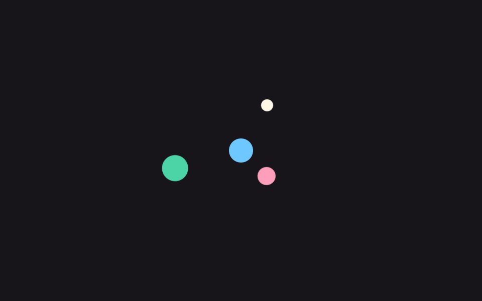
Three differently sized dots share one center but orbit on different radii and speeds; the bigger the dot, the slower it travels, giving a planetary sense of depth.
Best forData-sync indicator, analytics tool preparation screen
rotatetransform-origin$duration
<main class="stage">
  <div class="ob-system is-demo" aria-hidden="true">
    <span class="ob-core"></span>
    <span class="ob-dot od-s"></span>
    <span class="ob-dot od-m"></span>
    <span class="ob-dot od-l"></span>
  </div>
</main>
@use "../../../../site/static/demo-tokens" as *;
// ── 변수 3개 ──────────────────────────────────────────
$duration: 2s; // 바깥 두 점의 한 바퀴 (안쪽 작은 점은 절반)
$easing: linear;
$color: $subject-cream;
@include stage($stage-ink);
// 실사용: 로딩 중에만 .is-loading
// 각 점은 자기 transform-origin 을 계통 중심에 두고 제자리에서 공전한다.
// 회전하는 컨다란 팔 박스를 쓰면 정사각형이 45도에 경계 상자가 루트2배로
// 커져 320px 폰 화면에서 세로 넘침을 일으킨다 (219 실측).
.ob-system {
position: relative;
width: 168px;
height: 168px;
}
.ob-core {
position: absolute;
left: 50%;
top: 50%;
width: 24px;
height: 24px;
margin: -12px 0 0 -12px;
border-radius: 50%;
background: $subject-sky;
}
.ob-dot {
position: absolute;
border-radius: 50%;
}
// 작은 점: 안쪽 궤도(반지름 52), 빠르게
.od-s {
top: 26px; // 84 - 52 - 6
left: calc(50% - 6px);
width: 12px;
height: 12px;
background: $color;
transform-origin: 50% 58px; // 점 중심에서 계통 중심까지 52 + 자기 반지름 6
}
// 중간 점: 가장 안쪽 궤도(반지름 36)
.od-m {
top: 39px; // 84 - 36 - 9
left: calc(50% - 9px);
width: 18px;
height: 18px;
background: $subject-pink;
transform-origin: 50% 45px; // 규칙8: 계통 중심 공전 축
}
// 큰 점: 바깥 궤도(반지름 68), 느리게
.od-l {
top: 3px; // 84 - 68 - 13
left: calc(50% - 13px);
width: 26px;
height: 26px;
background: $subject-mint;
transform-origin: 50% 81px; // 규칙8: 계통 중심 공전 축
}
// 세 점은 같은 방향, 서로 120도씩 어긋난 위상에서 출발한다
.ob-system.is-loading .od-s,
.ob-system.is-demo .od-s { animation: ob-spin-a ($duration / 2) $easing infinite; }
.ob-system.is-loading .od-m,
.ob-system.is-demo .od-m { animation: ob-spin-b $duration $easing infinite; }
.ob-system.is-loading .od-l,
.ob-system.is-demo .od-l { animation: ob-spin-c $duration $easing infinite; }
@keyframes ob-spin-a {
from { transform: rotate(0deg); }
to { transform: rotate(360deg); }
}
@keyframes ob-spin-b {
from { transform: rotate(120deg); }
to { transform: rotate(480deg); }
}
@keyframes ob-spin-c {
from { transform: rotate(240deg); }
to { transform: rotate(600deg); }
}
@media (prefers-reduced-motion: reduce) {
.ob-system.is-loading .od-s,
.ob-system.is-loading .od-m,
.ob-system.is-loading .od-l,
.ob-system.is-demo .od-s,
.ob-system.is-demo .od-m,
.ob-system.is-demo .od-l {
animation: none !important;
transform: none !important;
}
}html, body {
margin: 0;
overflow: hidden;
}
.stage {
box-sizing: border-box;
min-height: 100vh;
display: grid;
place-items: center;
margin: 0;
background: #17141a;
font-family: -apple-system, "Segoe UI", "Noto Sans KR", sans-serif;
padding: clamp(8px, 4vw, 24px);
}
.ob-system {
position: relative;
width: 168px;
height: 168px;
}
.ob-core {
position: absolute;
left: 50%;
top: 50%;
width: 24px;
height: 24px;
margin: -12px 0 0 -12px;
border-radius: 50%;
background: #6ec8ff;
}
.ob-dot {
position: absolute;
border-radius: 50%;
}
.od-s {
top: 26px;
left: calc(50% - 6px);
width: 12px;
height: 12px;
background: #fff7e6;
transform-origin: 50% 58px;
}
.od-m {
top: 39px;
left: calc(50% - 9px);
width: 18px;
height: 18px;
background: #ff9ebb;
transform-origin: 50% 45px;
}
.od-l {
top: 3px;
left: calc(50% - 13px);
width: 26px;
height: 26px;
background: #4cd4a6;
transform-origin: 50% 81px;
}
.ob-system.is-loading .od-s,
.ob-system.is-demo .od-s {
animation: ob-spin-a 1s linear infinite;
}
.ob-system.is-loading .od-m,
.ob-system.is-demo .od-m {
animation: ob-spin-b 2s linear infinite;
}
.ob-system.is-loading .od-l,
.ob-system.is-demo .od-l {
animation: ob-spin-c 2s linear infinite;
}
@keyframes ob-spin-a {
from {
transform: rotate(0deg);
}
to {
transform: rotate(360deg);
}
}
@keyframes ob-spin-b {
from {
transform: rotate(120deg);
}
to {
transform: rotate(480deg);
}
}
@keyframes ob-spin-c {
from {
transform: rotate(240deg);
}
to {
transform: rotate(600deg);
}
}
@media (prefers-reduced-motion: reduce) {
.ob-system.is-loading .od-s,
.ob-system.is-loading .od-m,
.ob-system.is-loading .od-l,
.ob-system.is-demo .od-s,
.ob-system.is-demo .od-m,
.ob-system.is-demo .od-l {
animation: none !important;
transform: none !important;
}
}import { CSSProperties } from "react";
import styles from "./OrbitDots.module.scss";
type Vars = CSSProperties & {
"--duration"?: string;
"--easing"?: string;
"--color"?: string;
};
export interface OrbitDotsProps {
duration?: string;
easing?: string;
color?: string;
}
export default function OrbitDots({
duration = "2s",
easing = "linear",
color = "#fff7e6",
}: OrbitDotsProps) {
const style: Vars = {
"--duration": duration,
"--easing": easing,
"--color": color,
};
return (
<div className={styles.system} style={style} aria-hidden="true">
<span className={styles.core} />
<span className={`${styles.dot} ${styles.dotS}`} />
<span className={`${styles.dot} ${styles.dotM}`} />
<span className={`${styles.dot} ${styles.dotL}`} />
</div>
);
}05 Orbit dots — Measured area 11.261% · moving frames 23/23Original by GODRICH · SCSS and React ship in the zip · 9 Loading Screen Designs — Pretty CSS Loaders
The post this demo lives in
 9 Loading Screen Designs — Pretty CSS LoadersA loading screen design is the first thing your site says while the user waits. A pastel ring or a circle filling with w See all demos in this post