02House with window glow
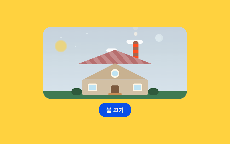
A striped-roof house — flip the switch and the sky dims to dusk, every window lights up warm, and chimney smoke puffs rise in staggered delay.
Best forReal-estate and home-service onboarding heroes
repeating-linear-gradientanimation-delaytransition
<main class="stage">
<div class="hs is-demo" id="hsRoot">
  <div class="hs__scene">
    <span class="hs__skyday"></span>
    <div class="hs__skynight">
      <span class="hs__star hs__star--a"></span>
      <span class="hs__star hs__star--b"></span>
      <span class="hs__star hs__star--c"></span>
      <span class="hs__moon"></span>
    </div>
    <span class="hs__sun"></span>
    <span class="hs__cloud hs__cloud--a"></span>
    <span class="hs__cloud hs__cloud--b"></span>
    <span class="hs__ground"></span>
    <div class="hs__house">
      <span class="hs__smoke hs__smoke--1"></span>
      <span class="hs__smoke hs__smoke--2"></span>
      <span class="hs__smoke hs__smoke--3"></span>
      <span class="hs__chimney"></span>
      <span class="hs__roof"></span>
      <span class="hs__gable"></span>
      <span class="hs__win hs__win--round"></span>
      <span class="hs__wall"></span>
      <span class="hs__win hs__win--l"></span>
      <span class="hs__win hs__win--r"></span>
      <span class="hs__door"></span>
      <span class="hs__step"></span>
      <span class="hs__bush hs__bush--l"></span>
      <span class="hs__bush hs__bush--r"></span>
    </div>
  </div>
  <button class="hs__btn" id="hsBtn" type="button" aria-pressed="false">Lights off</button>
</div>
</main>@use "../../../../site/static/demo-tokens" as *;
// 집 — 창문 불빛과 굴뚝 연기. 지붕 줄무늬는 repeating-linear-gradient,
// 연기 세 점은 animation-delay 로 시차를 두고, 낮/밤 전환은
// 밤 하늘 겹침막의 opacity transition 하나로 한다(하늘·창문·해·달이 같이 움직인다).
$duration: $dur-enter;
$easing: $ease-out;
$color: $stage-orange;
$roof: #c68c8c;
$roof-fold: #b76e6e;
$wall: #c8b190;
$wall-side: #d2c0a5;
$wood: #7c5a3e;
$leaf: #2f5a3c;
$leaf-light: #3f7a52;
$glass: #bfe3f2;
$sky-top: #d6e4eb;
$sky-bottom: #e8f6fb;
$night-top: #1d2340;
$night-bottom: #3a2f55;
@include stage($stage-yellow);
.hs {
display: flex; flex-direction: column; align-items: center; gap: $sp-2;
width: min(100%, 300px);
}
.hs__scene {
position: relative; box-sizing: border-box;
width: 100%; height: 150px;
border-radius: $r-card; overflow: hidden;
background: linear-gradient(180deg, $sky-top 0%, $sky-bottom 100%);
}
// 밤 하늘 겹침막 — 낮 위에 opacity 로 올라온다
.hs__skynight {
position: absolute; inset: 0; opacity: 0;
background: linear-gradient(180deg, $night-top 0%, $night-bottom 100%);
animation-name: hsCycle; animation-duration: $dur-loop;
animation-timing-function: ease-in-out; animation-iteration-count: infinite;
}
.hs__star {
position: absolute; width: 3px; height: 3px; border-radius: 50%;
background: $subject-cream;
}
.hs__star--a { left: 12%; top: 14%; }
.hs__star--b { left: 30%; top: 8%; }
.hs__star--c { left: 22%; top: 26%; }
.hs__moon {
position: absolute; left: 78%; top: 10%; width: 16px; height: 16px;
border-radius: 50%; background: $subject-cream;
box-shadow: inset -4px 0 0 rgba(23, 20, 26, .18);
}
.hs__sun {
position: absolute; left: 8%; top: 12%; width: 26px; height: 26px;
border-radius: 50%;
background: radial-gradient(circle, $stage-yellow 0 55%, rgba(255, 210, 63, 0) 78%);
animation-name: hsSun; animation-duration: $dur-loop;
animation-timing-function: ease-in-out; animation-iteration-count: infinite;
}
.hs__cloud {
position: absolute; height: 8px; border-radius: $r-pill;
background: rgba(255, 255, 255, .9);
}
.hs__cloud--a { left: 58%; top: 18%; width: 34px; }
.hs__cloud--b { left: 44%; top: 30%; width: 22px; }
.hs__ground {
position: absolute; left: 0; right: 0; bottom: 0; height: 16px;
background: $leaf-light;
}
// ── 집
.hs__house {
position: absolute; left: 50%; bottom: 8px; width: 150px; height: 112px;
margin-left: -75px;
}
.hs__roof {
position: absolute; left: -4px; right: -4px; top: 18px; height: 30px;
clip-path: polygon(50% 0, 100% 100%, 0 100%);
background: repeating-linear-gradient(48deg, $roof 0 8px, $roof-fold 8px 16px);
}
.hs__gable {
position: absolute; left: 8px; right: 8px; top: 46px; height: 34px;
clip-path: polygon(50% 0, 100% 100%, 0 100%);
background: $wall;
}
.hs__chimney {
position: absolute; right: 26px; top: 0; width: 12px; height: 36px;
border-radius: $r-xs $r-xs 0 0;
background: repeating-linear-gradient(0deg, $color 0 6px, #a46651 6px 12px);
}
.hs__smoke {
position: absolute; right: 28px; top: -8px; width: 8px; height: 8px;
border-radius: 50%; background: rgba(255, 247, 230, .8);
animation-name: hsSmoke; animation-duration: $dur-loop;
animation-timing-function: ease-out; animation-iteration-count: infinite;
animation-fill-mode: both;
}
.hs__smoke--2 { animation-delay: 660ms; }
.hs__smoke--3 { animation-delay: 1320ms; }
.hs__wall {
position: absolute; left: 6px; right: 6px; top: 80px; bottom: 0;
border-radius: 0 0 $r-xs $r-xs;
background: $wall-side;
}
// 창: 유리색이 밤에 노란 불빛으로 바뀐다(같은 transition)
.hs__win {
position: absolute; border: 3px solid $subject-cream; box-sizing: border-box;
border-radius: $r-xs; background: $glass;
transition: background $duration $easing, box-shadow $duration $easing;
}
.hs__win--round {
left: 50%; top: 58px; width: 18px; height: 18px; margin-left: -9px;
border-radius: 50%;
}
.hs__win--l { left: 18px; top: 88px; width: 20px; height: 16px; }
.hs__win--r { right: 18px; top: 88px; width: 20px; height: 16px; }
.hs.is-night .hs__win {
background: $stage-yellow;
box-shadow: 0 0 12px rgba(255, 210, 63, .8);
}
.hs__door {
position: absolute; left: 50%; top: 92px; width: 18px; height: 20px;
margin-left: -9px; border-radius: $r-xs $r-xs 0 0;
background: $wood;
}
.hs__step {
position: absolute; left: 50%; bottom: 0; width: 28px; height: 4px;
margin-left: -14px; border-radius: $r-xs; background: #c98d54;
}
.hs__bush {
position: absolute; bottom: 0; width: 22px; height: 14px;
border-radius: $r-pill; background: $leaf;
}
.hs__bush--l { left: -16px; }
.hs__bush--r { right: -16px; }
// 미리보기 루프: 밤 겹침막이 52~78% 구간에만 올라왔다가 90% 안에 물러난다
.hs__btn {
box-sizing: border-box; padding: $sp-2 $sp-4; border: 0;
border-radius: $r-pill; background: $subject-blue-deep; color: $subject-cream;
font-family: inherit; font-weight: 700; font-size: 12px; line-height: 1.2;
cursor: pointer;
}
@keyframes hsCycle {
0%, 30% { opacity: 0; }
52%, 78% { opacity: 1; }
90%, 100% { opacity: 0; }
}
@keyframes hsSun {
0%, 26% { transform: translateY(0); opacity: 1; }
40%, 82% { transform: translateY(22px); opacity: 0; }
92%, 100% { transform: translateY(0); opacity: 1; }
}
@keyframes hsSmoke {
0% { transform: translateY(0) scale(.6); opacity: 0; }
22% { opacity: .85; }
86%, 100% { transform: translateY(-30px) scale(1.5); opacity: 0; }
}
// 사람이 고른 상태: 루프를 끄고 transition 으로만 바뀐다(연기는 계속 상승)
.hs:not(.is-demo) .hs__skynight,
.hs:not(.is-demo) .hs__sun {
animation-name: none;
}
.hs:not(.is-demo) .hs__skynight { transition: opacity $duration $easing; }
.hs:not(.is-demo) .hs__sun { transition: transform $duration $easing, opacity $duration $easing; }
.hs.is-night .hs__skynight { opacity: 1; }
.hs:not(.is-demo).is-night .hs__sun { transform: translateY(22px); opacity: 0; }
@media (max-width: 340px) {
.hs__scene { height: 118px; }
.hs__house { transform-origin: bottom center; transform: scale(.82); }
.hs__btn { padding: $sp-1 $sp-3; font-size: 11px; }
}
@media (prefers-reduced-motion: reduce) {
.hs__skynight, .hs__sun, .hs__smoke { animation-name: none !important; }
.hs:not(.is-demo) .hs__skynight,
.hs:not(.is-demo) .hs__sun,
.hs__win { transition: none !important; }
}html, body {
margin: 0;
overflow: hidden;
}
.stage {
box-sizing: border-box;
min-height: 100vh;
display: grid;
place-items: center;
margin: 0;
background: #ffd23f;
font-family: -apple-system, "Segoe UI", "Noto Sans KR", sans-serif;
padding: clamp(8px, 4vw, 24px);
}
.hs {
display: flex;
flex-direction: column;
align-items: center;
gap: 8px;
width: min(100%, 300px);
}
.hs__scene {
position: relative;
box-sizing: border-box;
width: 100%;
height: 150px;
border-radius: 16px;
overflow: hidden;
background: linear-gradient(180deg, #d6e4eb 0%, #e8f6fb 100%);
}
.hs__skynight {
position: absolute;
inset: 0;
opacity: 0;
background: linear-gradient(180deg, #1d2340 0%, #3a2f55 100%);
animation-name: hsCycle;
animation-duration: 2s;
animation-timing-function: ease-in-out;
animation-iteration-count: infinite;
}
.hs__star {
position: absolute;
width: 3px;
height: 3px;
border-radius: 50%;
background: #fff7e6;
}
.hs__star--a {
left: 12%;
top: 14%;
}
.hs__star--b {
left: 30%;
top: 8%;
}
.hs__star--c {
left: 22%;
top: 26%;
}
.hs__moon {
position: absolute;
left: 78%;
top: 10%;
width: 16px;
height: 16px;
border-radius: 50%;
background: #fff7e6;
box-shadow: inset -4px 0 0 rgba(23, 20, 26, 0.18);
}
.hs__sun {
position: absolute;
left: 8%;
top: 12%;
width: 26px;
height: 26px;
border-radius: 50%;
background: radial-gradient(circle, #ffd23f 0 55%, rgba(255, 210, 63, 0) 78%);
animation-name: hsSun;
animation-duration: 2s;
animation-timing-function: ease-in-out;
animation-iteration-count: infinite;
}
.hs__cloud {
position: absolute;
height: 8px;
border-radius: 999px;
background: rgba(255, 255, 255, 0.9);
}
.hs__cloud--a {
left: 58%;
top: 18%;
width: 34px;
}
.hs__cloud--b {
left: 44%;
top: 30%;
width: 22px;
}
.hs__ground {
position: absolute;
left: 0;
right: 0;
bottom: 0;
height: 16px;
background: #3f7a52;
}
.hs__house {
position: absolute;
left: 50%;
bottom: 8px;
width: 150px;
height: 112px;
margin-left: -75px;
}
.hs__roof {
position: absolute;
left: -4px;
right: -4px;
top: 18px;
height: 30px;
clip-path: polygon(50% 0, 100% 100%, 0 100%);
background: repeating-linear-gradient(48deg, #c68c8c 0 8px, #b76e6e 8px 16px);
}
.hs__gable {
position: absolute;
left: 8px;
right: 8px;
top: 46px;
height: 34px;
clip-path: polygon(50% 0, 100% 100%, 0 100%);
background: #c8b190;
}
.hs__chimney {
position: absolute;
right: 26px;
top: 0;
width: 12px;
height: 36px;
border-radius: 4px 4px 0 0;
background: repeating-linear-gradient(0deg, #ff4d1f 0 6px, #a46651 6px 12px);
}
.hs__smoke {
position: absolute;
right: 28px;
top: -8px;
width: 8px;
height: 8px;
border-radius: 50%;
background: rgba(255, 247, 230, 0.8);
animation-name: hsSmoke;
animation-duration: 2s;
animation-timing-function: ease-out;
animation-iteration-count: infinite;
animation-fill-mode: both;
}
.hs__smoke--2 {
animation-delay: 660ms;
}
.hs__smoke--3 {
animation-delay: 1320ms;
}
.hs__wall {
position: absolute;
left: 6px;
right: 6px;
top: 80px;
bottom: 0;
border-radius: 0 0 4px 4px;
background: #d2c0a5;
}
.hs__win {
position: absolute;
border: 3px solid #fff7e6;
box-sizing: border-box;
border-radius: 4px;
background: #bfe3f2;
transition: background 600ms ease-out, box-shadow 600ms ease-out;
}
.hs__win--round {
left: 50%;
top: 58px;
width: 18px;
height: 18px;
margin-left: -9px;
border-radius: 50%;
}
.hs__win--l {
left: 18px;
top: 88px;
width: 20px;
height: 16px;
}
.hs__win--r {
right: 18px;
top: 88px;
width: 20px;
height: 16px;
}
.hs.is-night .hs__win {
background: #ffd23f;
box-shadow: 0 0 12px rgba(255, 210, 63, 0.8);
}
.hs__door {
position: absolute;
left: 50%;
top: 92px;
width: 18px;
height: 20px;
margin-left: -9px;
border-radius: 4px 4px 0 0;
background: #7c5a3e;
}
.hs__step {
position: absolute;
left: 50%;
bottom: 0;
width: 28px;
height: 4px;
margin-left: -14px;
border-radius: 4px;
background: #c98d54;
}
.hs__bush {
position: absolute;
bottom: 0;
width: 22px;
height: 14px;
border-radius: 999px;
background: #2f5a3c;
}
.hs__bush--l {
left: -16px;
}
.hs__bush--r {
right: -16px;
}
.hs__btn {
box-sizing: border-box;
padding: 8px 16px;
border: 0;
border-radius: 999px;
background: #0a4fe8;
color: #fff7e6;
font-family: inherit;
font-weight: 700;
font-size: 12px;
line-height: 1.2;
cursor: pointer;
}
@keyframes hsCycle {
0%, 30% {
opacity: 0;
}
52%, 78% {
opacity: 1;
}
90%, 100% {
opacity: 0;
}
}
@keyframes hsSun {
0%, 26% {
transform: translateY(0);
opacity: 1;
}
40%, 82% {
transform: translateY(22px);
opacity: 0;
}
92%, 100% {
transform: translateY(0);
opacity: 1;
}
}
@keyframes hsSmoke {
0% {
transform: translateY(0) scale(0.6);
opacity: 0;
}
22% {
opacity: 0.85;
}
86%, 100% {
transform: translateY(-30px) scale(1.5);
opacity: 0;
}
}
.hs:not(.is-demo) .hs__skynight,
.hs:not(.is-demo) .hs__sun {
animation-name: none;
}
.hs:not(.is-demo) .hs__skynight {
transition: opacity 600ms ease-out;
}
.hs:not(.is-demo) .hs__sun {
transition: transform 600ms ease-out, opacity 600ms ease-out;
}
.hs.is-night .hs__skynight {
opacity: 1;
}
.hs:not(.is-demo).is-night .hs__sun {
transform: translateY(22px);
opacity: 0;
}
@media (max-width: 340px) {
.hs__scene {
height: 118px;
}
.hs__house {
transform-origin: bottom center;
transform: scale(0.82);
}
.hs__btn {
padding: 4px 12px;
font-size: 11px;
}
}
@media (prefers-reduced-motion: reduce) {
.hs__skynight, .hs__sun, .hs__smoke {
animation-name: none !important;
}
.hs:not(.is-demo) .hs__skynight,
.hs:not(.is-demo) .hs__sun,
.hs__win {
transition: none !important;
}
}// Lights off/켜기는 .is-night 하나. 낮 하늘과 창문 불빛이 같이 바뀐다.
// 손이 닿는 순간 미리보기 루프(.is-demo)를 떼고 사람이 고른 상태를 유지한다.
(function () {
var root = document.getElementById('hsRoot');
var btn = document.getElementById('hsBtn');
var offLabel = 'Lights off';
var onLabel = 'Lights on';
btn.addEventListener('click', function () {
root.classList.remove('is-demo');
var night = root.classList.toggle('is-night');
btn.textContent = night ? onLabel : offLabel;
btn.setAttribute('aria-pressed', night ? 'true' : 'false');
});
})();// HouseGlow — vanilla 판(run/078/demo/02-object-house-glow/index.html) 의 React 포트.
// 불 끄기/켜기는 night 하나로 갈리고, 첫 클릭에 미리보기 루프(is-demo)를 뗀다.
import { useState } from "react";
import type { CSSProperties } from "react";
import styles from "./HouseGlow.module.scss";
export type HouseGlowProps = {
duration?: number;
easing?: string;
color?: string;
initialNight?: boolean;
};
type Vars = CSSProperties & { "--duration"?: string; "--easing"?: string; "--color"?: string };
export default function HouseGlow(props: HouseGlowProps) {
const duration = props.duration ?? 600;
const easing = props.easing ?? "ease-out";
const color = props.color ?? "#ff4d1f";
const [night, setNight] = useState<boolean>(props.initialNight ?? false);
const [preview, setPreview] = useState<boolean>(true);
const vars: Vars = { "--duration": duration + "ms", "--easing": easing, "--color": color };
const rootClass = ["hs", preview ? "is-demo" : "", night ? "is-night" : ""]
.filter(Boolean).map((c) => (styles as { [k: string]: string })[c]).join(" ");
return (
<main className={styles.stage}>
<div className={rootClass} style={vars}>
<div className={styles["hs__scene"]}>
<span className={styles["hs__skyday"]}></span>
<div className={styles["hs__skynight"]}>
<span className={styles["hs__star"] + " " + styles["hs__star--a"]}></span>
<span className={styles["hs__star"] + " " + styles["hs__star--b"]}></span>
<span className={styles["hs__star"] + " " + styles["hs__star--c"]}></span>
<span className={styles["hs__moon"]}></span>
</div>
<span className={styles["hs__sun"]}></span>
<span className={styles["hs__cloud"] + " " + styles["hs__cloud--a"]}></span>
<span className={styles["hs__cloud"] + " " + styles["hs__cloud--b"]}></span>
<span className={styles["hs__ground"]}></span>
<div className={styles["hs__house"]}>
<span className={styles["hs__smoke"] + " " + styles["hs__smoke--1"]}></span>
<span className={styles["hs__smoke"] + " " + styles["hs__smoke--2"]}></span>
<span className={styles["hs__smoke"] + " " + styles["hs__smoke--3"]}></span>
<span className={styles["hs__chimney"]}></span>
<span className={styles["hs__roof"]}></span>
<span className={styles["hs__gable"]}></span>
<span className={styles["hs__win"] + " " + styles["hs__win--round"]}></span>
<span className={styles["hs__wall"]}></span>
<span className={styles["hs__win"] + " " + styles["hs__win--l"]}></span>
<span className={styles["hs__win"] + " " + styles["hs__win--r"]}></span>
<span className={styles["hs__door"]}></span>
<span className={styles["hs__step"]}></span>
<span className={styles["hs__bush"] + " " + styles["hs__bush--l"]}></span>
<span className={styles["hs__bush"] + " " + styles["hs__bush--r"]}></span>
</div>
</div>
<button
className={styles["hs__btn"]}
type="button"
aria-pressed={night ? "true" : "false"}
onClick={() => { setPreview(false); setNight((n) => !n); }}
>
{night ? "불 켜기" : "불 끄기"}
</button>
</div>
</main>
);
}02 House with window glow — Measured area 22.172% · moving frames 22/23Original by GODRICH · SCSS and React ship in the zip · CSS Art Animation — 9 Objects From Pure Shapes
The post this demo lives in
 CSS Art Animation — 9 Objects From Pure ShapesCSS art animation draws everyday objects — a washer, a house, a car — with a few colored boxes and makes them move, not See all demos in this post