08Game-studio hero backdrop
A dark game-studio hero — violet light blooms, a swirl band rotates slowly, and specks float up. Click and the swirl reverses direction.
Best forGame studio about-page heroes
repeating-conic-gradientanimation-directionfilter: blur
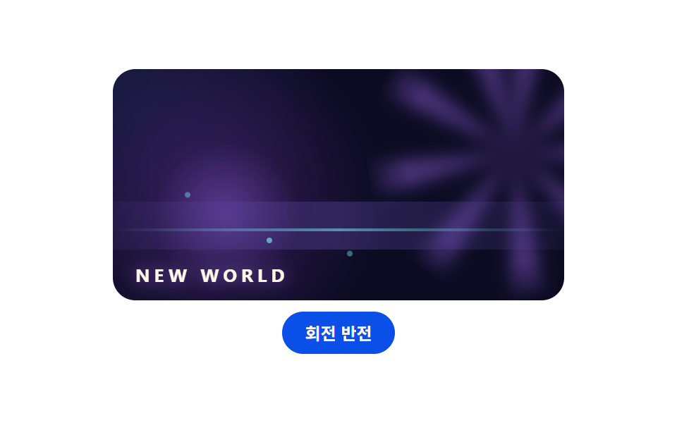
<main class="stage">
<div class="gh is-demo" id="ghRoot">
  <div class="gh__hero">
    <span class="gh__bloom"></span>
    <span class="gh__swirl"></span>
    <span class="gh__haze"></span>
    <span class="gh__horizon"></span>
    <span class="gh__dot gh__dot--a"></span>
    <span class="gh__dot gh__dot--b"></span>
    <span class="gh__dot gh__dot--c"></span>
    <span class="gh__dot gh__dot--d"></span>
    <span class="gh__dot gh__dot--e"></span>
    <p class="gh__tag">NEW WORLD</p>
  </div>
  <button class="gh__btn" id="ghBtn" type="button" aria-pressed="false">Reverse spin</button>
</div>
</main>
@use "../../../../site/static/demo-tokens" as *;
// 게임 회사풍 히어로 배경 — 어두운 판 위에 보라 빛 블룸(radial-gradient),
// repeating-conic-gradient 소용돌이 띠(filter: blur 로 녹인다), 떠오르는 입자.
// 소용돌이는 2초 왕복 회전 — 버튼 하나로 animation-direction 을 뒤집는다.
$duration: $dur-loop;
$easing: ease-in-out;
$color: #af9cce;
$deep: #0b0b21;
$deep-2: #1a1035;
$violet: #af9cce;
$violet-soft: rgba(88, 44, 136, .55);
@include stage($stage-paper);
.gh {
display: flex; flex-direction: column; align-items: center; gap: $sp-2;
width: min(100%, 320px);
}
.gh__hero {
position: relative; box-sizing: border-box;
width: 100%; height: 164px;
border-radius: $r-card; overflow: hidden;
background:
radial-gradient(circle at 22% 55%, $violet-soft 0%, rgba(88, 44, 136, 0) 46%),
radial-gradient(circle at 0% 0%, rgba(30, 40, 90, .5) 0%, rgba(30, 40, 90, 0) 42%),
$deep;
}
// 좌측 보라 빛 블룸: 느리게 숨쉰다
.gh__bloom {
position: absolute; left: 8%; top: 30%; width: 110px; height: 110px;
border-radius: 50%;
background: radial-gradient(circle, rgba(138, 92, 214, .5) 0%, rgba(138, 92, 214, 0) 66%);
animation-name: ghBreathe; animation-duration: $duration;
animation-timing-function: $easing; animation-iteration-count: infinite;
animation-direction: alternate;
}
// 소용돌이 띠: 방사형 줄무늬를 blur 로 흐린 뒤 가장자리를 지운다
.gh__swirl {
position: absolute; right: -70px; top: -46px; width: 210px; height: 210px;
border-radius: 50%;
background: repeating-conic-gradient(rgba(138, 92, 214, .5) 0 14deg, rgba(138, 92, 214, 0) 14deg 42deg);
-webkit-mask-image: radial-gradient(circle, rgba(0, 0, 0, 1) 0 52%, rgba(0, 0, 0, 0) 74%);
mask-image: radial-gradient(circle, rgba(0, 0, 0, 1) 0 52%, rgba(0, 0, 0, 0) 74%);
filter: blur(6px);
animation-name: ghSwirl; animation-duration: $duration;
animation-timing-function: $easing; animation-iteration-count: infinite;
animation-direction: alternate;
}
.gh.is-rev .gh__swirl { animation-direction: alternate-reverse; }
// 옅은 안개 띠
.gh__haze {
position: absolute; left: -20%; right: -20%; bottom: 22%; height: 34px;
border-radius: $r-pill;
background: linear-gradient(90deg, rgba(30, 40, 90, 0), rgba(90, 70, 160, .4), rgba(30, 40, 90, 0));
animation-name: ghDrift; animation-duration: $duration;
animation-timing-function: $easing; animation-iteration-count: infinite;
animation-direction: alternate;
}
.gh__horizon {
position: absolute; left: 0; right: 0; bottom: 30%; height: 2px;
background: linear-gradient(90deg, rgba(126, 249, 255, 0), rgba(126, 249, 255, .5), rgba(126, 249, 255, 0));
}
// 떠오르는 입자
.gh__dot {
position: absolute; width: 4px; height: 4px; border-radius: 50%;
background: rgba(126, 249, 255, .8);
animation-name: ghRise; animation-duration: $duration;
animation-timing-function: linear; animation-iteration-count: infinite;
animation-fill-mode: both;
}
.gh__dot--a { left: 16%; bottom: 10%; }
.gh__dot--b { left: 34%; bottom: 4%; animation-delay: 400ms; }
.gh__dot--c { left: 52%; bottom: 12%; animation-delay: 800ms; }
.gh__dot--d { left: 68%; bottom: 6%; animation-delay: 1200ms; background: rgba(255, 210, 63, .8); }
.gh__dot--e { left: 84%; bottom: 16%; animation-delay: 1600ms; }
.gh__tag {
position: absolute; left: $sp-4; bottom: $sp-3; margin: 0;
font-weight: 700; font-size: 13px; line-height: 1; letter-spacing: 3px;
color: $subject-cream;
text-shadow: 0 0 12px rgba(138, 92, 214, .9);
}
.gh__btn {
box-sizing: border-box; padding: $sp-2 $sp-4; border: 0;
border-radius: $r-pill; background: $subject-blue-deep; color: $subject-cream;
font-family: inherit; font-weight: 700; font-size: 12px; line-height: 1.2;
cursor: pointer;
}
@keyframes ghBreathe {
from { transform: scale(.92); opacity: .7; }
to { transform: scale(1.08); opacity: 1; }
}
@keyframes ghSwirl {
from { rotate: -14deg; }
to { rotate: 14deg; }
}
@keyframes ghDrift {
from { transform: translateX(-14px); }
to { transform: translateX(14px); }
}
@keyframes ghRise {
0% { transform: translateY(0); opacity: 0; }
18% { opacity: .9; }
86%, 100% { transform: translateY(-96px); opacity: 0; }
}
// 사람이 고른 상태: 루프 애니메이션은 그대로 두고 direction 만 갈아 탄다(정지 사진이 아니게)
@media (max-width: 340px) {
.gh__hero { height: 128px; }
.gh__swirl { width: 170px; height: 170px; right: -56px; top: -38px; }
.gh__btn { padding: $sp-1 $sp-3; font-size: 11px; }
}
@media (prefers-reduced-motion: reduce) {
.gh__bloom, .gh__swirl, .gh__haze, .gh__dot { animation-name: none !important; }
}html, body {
margin: 0;
overflow: hidden;
}
.stage {
box-sizing: border-box;
min-height: 100vh;
display: grid;
place-items: center;
margin: 0;
background: #ffffff;
font-family: -apple-system, "Segoe UI", "Noto Sans KR", sans-serif;
padding: clamp(8px, 4vw, 24px);
}
.gh {
display: flex;
flex-direction: column;
align-items: center;
gap: 8px;
width: min(100%, 320px);
}
.gh__hero {
position: relative;
box-sizing: border-box;
width: 100%;
height: 164px;
border-radius: 16px;
overflow: hidden;
background: radial-gradient(circle at 22% 55%, rgba(88, 44, 136, 0.55) 0%, rgba(88, 44, 136, 0) 46%), radial-gradient(circle at 0% 0%, rgba(30, 40, 90, 0.5) 0%, rgba(30, 40, 90, 0) 42%), #0b0b21;
}
.gh__bloom {
position: absolute;
left: 8%;
top: 30%;
width: 110px;
height: 110px;
border-radius: 50%;
background: radial-gradient(circle, rgba(138, 92, 214, 0.5) 0%, rgba(138, 92, 214, 0) 66%);
animation-name: ghBreathe;
animation-duration: 2s;
animation-timing-function: ease-in-out;
animation-iteration-count: infinite;
animation-direction: alternate;
}
.gh__swirl {
position: absolute;
right: -70px;
top: -46px;
width: 210px;
height: 210px;
border-radius: 50%;
background: repeating-conic-gradient(rgba(138, 92, 214, 0.5) 0 14deg, rgba(138, 92, 214, 0) 14deg 42deg);
-webkit-mask-image: radial-gradient(circle, rgb(0, 0, 0) 0 52%, rgba(0, 0, 0, 0) 74%);
mask-image: radial-gradient(circle, rgb(0, 0, 0) 0 52%, rgba(0, 0, 0, 0) 74%);
filter: blur(6px);
animation-name: ghSwirl;
animation-duration: 2s;
animation-timing-function: ease-in-out;
animation-iteration-count: infinite;
animation-direction: alternate;
}
.gh.is-rev .gh__swirl {
animation-direction: alternate-reverse;
}
.gh__haze {
position: absolute;
left: -20%;
right: -20%;
bottom: 22%;
height: 34px;
border-radius: 999px;
background: linear-gradient(90deg, rgba(30, 40, 90, 0), rgba(90, 70, 160, 0.4), rgba(30, 40, 90, 0));
animation-name: ghDrift;
animation-duration: 2s;
animation-timing-function: ease-in-out;
animation-iteration-count: infinite;
animation-direction: alternate;
}
.gh__horizon {
position: absolute;
left: 0;
right: 0;
bottom: 30%;
height: 2px;
background: linear-gradient(90deg, rgba(126, 249, 255, 0), rgba(126, 249, 255, 0.5), rgba(126, 249, 255, 0));
}
.gh__dot {
position: absolute;
width: 4px;
height: 4px;
border-radius: 50%;
background: rgba(126, 249, 255, 0.8);
animation-name: ghRise;
animation-duration: 2s;
animation-timing-function: linear;
animation-iteration-count: infinite;
animation-fill-mode: both;
}
.gh__dot--a {
left: 16%;
bottom: 10%;
}
.gh__dot--b {
left: 34%;
bottom: 4%;
animation-delay: 400ms;
}
.gh__dot--c {
left: 52%;
bottom: 12%;
animation-delay: 800ms;
}
.gh__dot--d {
left: 68%;
bottom: 6%;
animation-delay: 1200ms;
background: rgba(255, 210, 63, 0.8);
}
.gh__dot--e {
left: 84%;
bottom: 16%;
animation-delay: 1600ms;
}
.gh__tag {
position: absolute;
left: 16px;
bottom: 12px;
margin: 0;
font-weight: 700;
font-size: 13px;
line-height: 1;
letter-spacing: 3px;
color: #fff7e6;
text-shadow: 0 0 12px rgba(138, 92, 214, 0.9);
}
.gh__btn {
box-sizing: border-box;
padding: 8px 16px;
border: 0;
border-radius: 999px;
background: #0a4fe8;
color: #fff7e6;
font-family: inherit;
font-weight: 700;
font-size: 12px;
line-height: 1.2;
cursor: pointer;
}
@keyframes ghBreathe {
from {
transform: scale(0.92);
opacity: 0.7;
}
to {
transform: scale(1.08);
opacity: 1;
}
}
@keyframes ghSwirl {
from {
rotate: -14deg;
}
to {
rotate: 14deg;
}
}
@keyframes ghDrift {
from {
transform: translateX(-14px);
}
to {
transform: translateX(14px);
}
}
@keyframes ghRise {
0% {
transform: translateY(0);
opacity: 0;
}
18% {
opacity: 0.9;
}
86%, 100% {
transform: translateY(-96px);
opacity: 0;
}
}
@media (max-width: 340px) {
.gh__hero {
height: 128px;
}
.gh__swirl {
width: 170px;
height: 170px;
right: -56px;
top: -38px;
}
.gh__btn {
padding: 4px 12px;
font-size: 11px;
}
}
@media (prefers-reduced-motion: reduce) {
.gh__bloom, .gh__swirl, .gh__haze, .gh__dot {
animation-name: none !important;
}
}// Reverse spin: .is-rev 하나로 소용돌이 띠의 animation-direction 을 뒤집는다.
// 손이 닿는 순간 미리보기 루프(.is-demo)를 떼고 고른 방향을 유지한다.
(function () {
var root = document.getElementById('ghRoot');
var btn = document.getElementById('ghBtn');
btn.addEventListener('click', function () {
root.classList.remove('is-demo');
var rev = root.classList.toggle('is-rev');
btn.setAttribute('aria-pressed', rev ? 'true' : 'false');
});
})();// GameHero — vanilla 판(run/078/demo/08-object-game-hero/index.html) 의 React 포트.
// 회전 반전은 rev 하나로 animation-direction 을 뒤집는다. 첫 클릭에 미리보기 루프를 뗀다.
import { useState } from "react";
import type { CSSProperties } from "react";
import styles from "./GameHero.module.scss";
export type GameHeroProps = {
duration?: number;
easing?: string;
color?: string;
tag?: string;
};
type Vars = CSSProperties & { "--duration"?: string; "--easing"?: string; "--color"?: string };
export default function GameHero(props: GameHeroProps) {
const duration = props.duration ?? 2000;
const easing = props.easing ?? "ease-in-out";
const color = props.color ?? "#8a5cd6";
const tag = props.tag ?? "NEW WORLD";
const [rev, setRev] = useState<boolean>(false);
const [preview, setPreview] = useState<boolean>(true);
const vars: Vars = { "--duration": duration + "ms", "--easing": easing, "--color": color };
const rootClass = ["gh", preview ? "is-demo" : "", rev ? "is-rev" : ""]
.filter(Boolean).map((c) => (styles as { [k: string]: string })[c]).join(" ");
return (
<main className={styles.stage}>
<div className={rootClass} style={vars}>
<div className={styles["gh__hero"]}>
<span className={styles["gh__bloom"]}></span>
<span className={styles["gh__swirl"]}></span>
<span className={styles["gh__haze"]}></span>
<span className={styles["gh__horizon"]}></span>
<span className={styles["gh__dot"] + " " + styles["gh__dot--a"]}></span>
<span className={styles["gh__dot"] + " " + styles["gh__dot--b"]}></span>
<span className={styles["gh__dot"] + " " + styles["gh__dot--c"]}></span>
<span className={styles["gh__dot"] + " " + styles["gh__dot--d"]}></span>
<span className={styles["gh__dot"] + " " + styles["gh__dot--e"]}></span>
<p className={styles["gh__tag"]}>{tag}</p>
</div>
<button
className={styles["gh__btn"]}
type="button"
aria-pressed={rev ? "true" : "false"}
onClick={() => { setPreview(false); setRev((r) => !r); }}
>
회전 반전
</button>
</div>
</main>
);
}08 Game-studio hero backdrop — Measured area 13.677% · moving frames 23/23Original by GODRICH · SCSS and React ship in the zip · CSS Art Animation — 9 Objects From Pure Shapes
The post this demo lives in
 CSS Art Animation — 9 Objects From Pure ShapesCSS art animation draws everyday objects — a washer, a house, a car — with a few colored boxes and makes them move, not See all demos in this post
If you like this effect - similar demos
 Creative UI09 Player Hero Scene Where a Blurred Backdrop and Ring InterlockCustom Audio Player CSS — 9 Computed UI Patterns
 Creative UI09 Mesh Hero Backdrop Behind a HeadlineMesh Gradient Background: 9 Canvas Animations
 Creative UI09 A Hero Backdrop Where Three Layers Grow From One SeedGenerative Art JavaScript: 9 Patterns That Grow