023-layer depth parallax
Back, mid, and front layers each move at their own speed to build real perspective on the stage.
Best forGame showcase pages, brand-story sections
0.2·0.5·0.8배세 겹translateY

<main class="stage is-demo">
  <div class="layer3">
    <div class="layer3__back" aria-hidden="true"></div>
    <div class="layer3__mid" aria-hidden="true"></div>
    <div class="layer3__front" aria-hidden="true"></div>
    <h2 class="layer3__title">3-layer perspective</h2>
  </div>
</main>
@use "../../../../site/static/demo-tokens" as *;
// ── 변수 3개. 변형은 이것만 바꾼다 ──────────────────────────
$back-shift: 10px; // 뒤 레이어 이동량 (가장 적게)
$mid-shift: 26px; // 중간 레이어 이동량
$front-shift: 46px; // 앞 레이어 이동량 (가장 많이)
@include stage($stage-yellow);
.layer3 {
position: relative;
width: 100%;
height: 100%;
overflow: hidden;
&__back, &__mid, &__front {
position: absolute;
border-radius: 50%;
background: $subject-ink;
}
&__back {
width: 70px; height: 70px; left: 14%; top: 20%; opacity: .18;
@supports (animation-timeline: scroll()) { animation: drift-back linear both; animation-timeline: scroll(root); }
}
&__mid {
width: 56px; height: 56px; left: 58%; top: 46%; opacity: .38;
@supports (animation-timeline: scroll()) { animation: drift-mid linear both; animation-timeline: scroll(root); }
}
&__front {
width: 40px; height: 40px; left: 30%; top: 66%; opacity: .82;
@supports (animation-timeline: scroll()) { animation: drift-front linear both; animation-timeline: scroll(root); }
}
&__title {
position: absolute;
z-index: 1;
top: 50%;
left: 50%;
transform: translate(-50%, -50%);
margin: 0;
padding: 14px 22px;
border-radius: $r-pill;
background: $stage-ink;
color: #fff;
font: 700 clamp(14px, 4.6vw, 18px)/1 -apple-system, "Segoe UI", "Noto Sans KR", sans-serif;
white-space: nowrap;
}
}
// ── 실제 사용 코드: 세 레이어가 각각 다른 속도로 스크롤과 함께 이동한다 ──
@keyframes drift-back { from { transform: translateY(0); } to { transform: translateY(-#{$back-shift}); } }
@keyframes drift-mid { from { transform: translateY(0); } to { transform: translateY(-#{$mid-shift}); } }
@keyframes drift-front { from { transform: translateY(0); } to { transform: translateY(-#{$front-shift}); } }
// ── 데모(.is-demo): 왕복 루프로 흉내 ────────
.stage.is-demo .layer3__back { animation: loop-back $dur-loop ease-in-out infinite; }
.stage.is-demo .layer3__mid { animation: loop-mid $dur-loop ease-in-out infinite; }
.stage.is-demo .layer3__front { animation: loop-front $dur-loop ease-in-out infinite; }
@keyframes loop-back { 0%, 100% { transform: translateY($back-shift); } 50% { transform: translateY(-$back-shift); } }
@keyframes loop-mid { 0%, 100% { transform: translateY($mid-shift); } 50% { transform: translateY(-$mid-shift); } }
@keyframes loop-front { 0%, 100% { transform: translateY($front-shift); } 50% { transform: translateY(-$front-shift); } }
@media (prefers-reduced-motion: reduce) {
.layer3__back, .layer3__mid, .layer3__front,
.stage.is-demo .layer3__back, .stage.is-demo .layer3__mid, .stage.is-demo .layer3__front {
animation: none !important;
transform: none;
}
}html, body {
margin: 0;
overflow: hidden;
}
.stage {
box-sizing: border-box;
min-height: 100vh;
display: grid;
place-items: center;
margin: 0;
background: #ffd23f;
font-family: -apple-system, "Segoe UI", "Noto Sans KR", sans-serif;
padding: clamp(8px, 4vw, 24px);
}
.layer3 {
position: relative;
width: 100%;
height: 100%;
overflow: hidden;
}
.layer3__back, .layer3__mid, .layer3__front {
position: absolute;
border-radius: 50%;
background: #17141a;
}
.layer3__back {
width: 70px;
height: 70px;
left: 14%;
top: 20%;
opacity: 0.18;
}
@supports (animation-timeline: scroll()) {
.layer3__back {
animation: drift-back linear both;
animation-timeline: scroll(root);
}
}
.layer3__mid {
width: 56px;
height: 56px;
left: 58%;
top: 46%;
opacity: 0.38;
}
@supports (animation-timeline: scroll()) {
.layer3__mid {
animation: drift-mid linear both;
animation-timeline: scroll(root);
}
}
.layer3__front {
width: 40px;
height: 40px;
left: 30%;
top: 66%;
opacity: 0.82;
}
@supports (animation-timeline: scroll()) {
.layer3__front {
animation: drift-front linear both;
animation-timeline: scroll(root);
}
}
.layer3__title {
position: absolute;
z-index: 1;
top: 50%;
left: 50%;
transform: translate(-50%, -50%);
margin: 0;
padding: 14px 22px;
border-radius: 999px;
background: #17141a;
color: #fff;
font: 700 clamp(14px, 4.6vw, 18px)/1 -apple-system, "Segoe UI", "Noto Sans KR", sans-serif;
white-space: nowrap;
}
@keyframes drift-back {
from {
transform: translateY(0);
}
to {
transform: translateY(-10px);
}
}
@keyframes drift-mid {
from {
transform: translateY(0);
}
to {
transform: translateY(-26px);
}
}
@keyframes drift-front {
from {
transform: translateY(0);
}
to {
transform: translateY(-46px);
}
}
.stage.is-demo .layer3__back {
animation: loop-back 2s ease-in-out infinite;
}
.stage.is-demo .layer3__mid {
animation: loop-mid 2s ease-in-out infinite;
}
.stage.is-demo .layer3__front {
animation: loop-front 2s ease-in-out infinite;
}
@keyframes loop-back {
0%, 100% {
transform: translateY(10px);
}
50% {
transform: translateY(-10px);
}
}
@keyframes loop-mid {
0%, 100% {
transform: translateY(26px);
}
50% {
transform: translateY(-26px);
}
}
@keyframes loop-front {
0%, 100% {
transform: translateY(46px);
}
50% {
transform: translateY(-46px);
}
}
@media (prefers-reduced-motion: reduce) {
.layer3__back, .layer3__mid, .layer3__front,
.stage.is-demo .layer3__back, .stage.is-demo .layer3__mid, .stage.is-demo .layer3__front {
animation: none !important;
transform: none;
}
}import type { CSSProperties, ReactNode } from "react";
import styles from "./ThreeLayerDepth.module.scss";
export type ThreeLayerDepthProps = {
children: ReactNode;
/** 뒤 레이어 이동량 (기본 10px) */
backShift?: number;
/** 중간 레이어 이동량 (기본 26px) */
midShift?: number;
/** 앞 레이어 이동량 (기본 46px) */
frontShift?: number;
className?: string;
};
type Vars = CSSProperties & {
"--back-shift"?: string;
"--mid-shift"?: string;
"--front-shift"?: string;
};
export default function ThreeLayerDepth({
children,
backShift = 10,
midShift = 26,
frontShift = 46,
className = "",
}: ThreeLayerDepthProps) {
const vars: Vars = {
"--back-shift": `${backShift}px`,
"--mid-shift": `${midShift}px`,
"--front-shift": `${frontShift}px`,
};
return (
<div className={`${styles.layer3} ${className}`} style={vars}>
<div className={styles.back} aria-hidden="true" />
<div className={styles.mid} aria-hidden="true" />
<div className={styles.front} aria-hidden="true" />
<div className={styles.title}>{children}</div>
</div>
);
}02 3-layer depth parallax — Measured area 7.535% · moving frames 23/23Original by GODRICH · SCSS and React ship in the zip · 9 CSS Parallax Scrolling — No JS, Scroll-Driven
The post this demo lives in
 9 CSS Parallax Scrolling — No JS, Scroll-DrivenCSS parallax scrolling is scroll-linked motion — a background, a layer, a whole hero — driven entirely by animation-time See all demos in this post
If you like this effect - similar demos
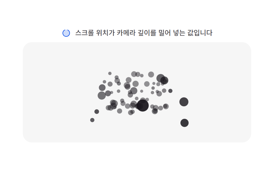 Scroll04 Depth parallax layer — each particle carries its own depth value, so the same scroll distance applies at a different distance per depth valueMoving Particles Background CSS: 9 Scroll Scenes
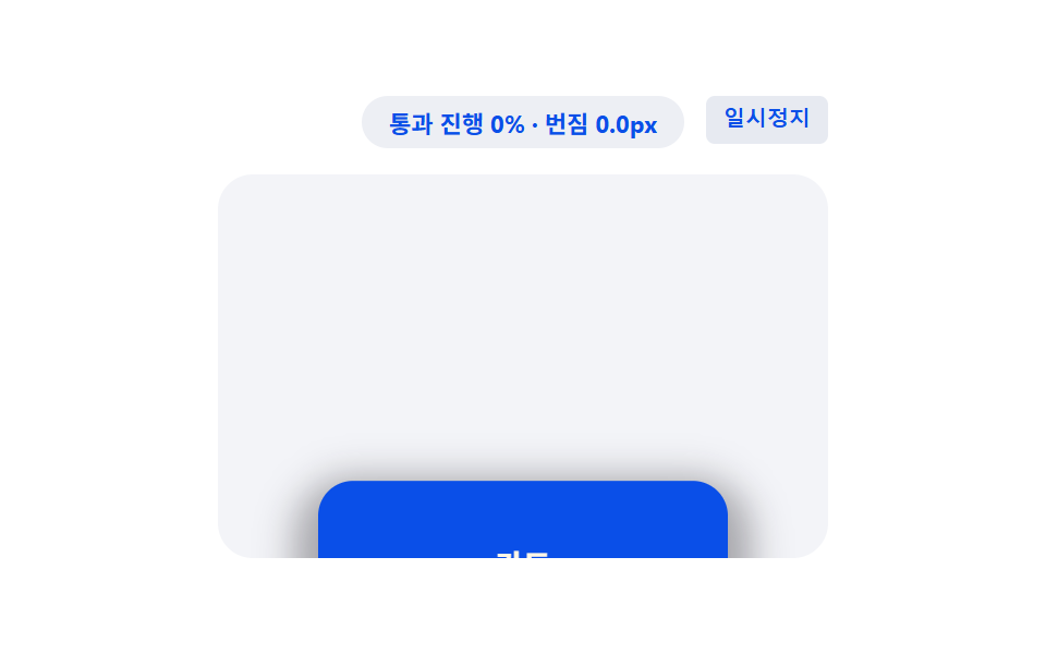 Scroll08 Card That Lifts by the Range Value's ShadowCSS Scroll Animation: 9 View-Timeline Examples
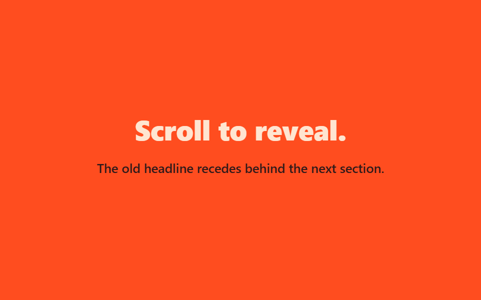 Scroll07 Text fades behind on scroll9 CSS Hero Section Animations You Can Copy-Paste