08Card That Lifts by the Range Value's Shadow
As the range value grows, the shadow's spread-distance value and blur value both increase together, making the card look as if it is lifting off the screen.
Best forCard list depth shadow
box-shadowtranslateY--shadow-spread
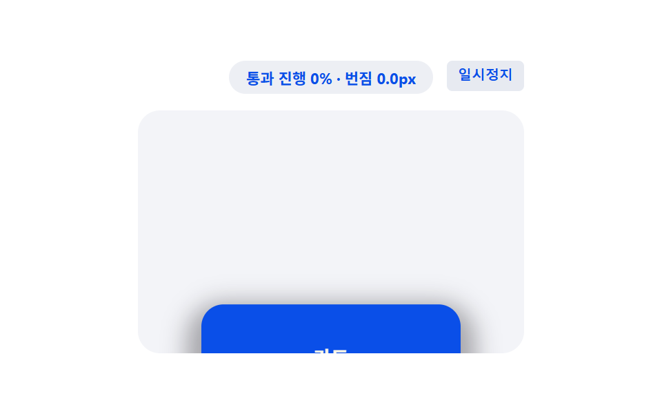
<main class="stage">
<div class="sld is-demo" id="sldRoot">
  <div class="sld__badge" id="sldBadge">cover range 0%~100%</div>
  <button class="sld__ctrl" id="sldCtrl" type="button">Pause</button>
  <div class="sld__view" id="sldView">
    <div class="sld__track" id="sldTrack">
      <div class="sld__spacer sld__spacer--top"></div>
      <div class="sld__card" id="sldCard">
        <span class="sld__label">Card</span>
      </div>
      <div class="sld__spacer sld__spacer--bottom"></div>
    </div>
  </div>
</div>
</main>
@use "../../../../site/static/demo-tokens" as *;
// 핵심: animation-timeline: view() + animation-range: cover 로 요소가 뷰포트를
// 통과하는 전체 구간 값(0~1)에 그림자 번짐 거리·흐림 값과 들어올림 정도를 함께
// 묶는다. 미지원 환경은 스크롤 위치로 같은 통과 진행 값을 계산해 같은 그림자를 그린다.
$duration: $dur-loop;
$easing: linear;
$color: $subject-blue-deep;
@include stage($stage-paper);
.sld {
position: relative;
width: min(100%, 280px);
display: flex;
flex-direction: column;
align-items: center;
gap: $sp-3;
}
.sld__badge {
padding: $sp-1 $sp-3;
border-radius: $r-pill;
background: rgba(20, 45, 120, .08);
color: $subject-blue-deep;
font-weight: 700;
font-size: 11px;
font-variant-numeric: tabular-nums;
}
.sld__ctrl {
position: absolute;
top: 0;
right: 0;
border: 0;
border-radius: $r-xs;
padding: $sp-1 $sp-2;
background: rgba(20, 45, 120, .10);
color: $subject-blue-deep;
font-weight: 600;
font-size: 10px;
line-height: 1.4;
cursor: pointer;
}
.sld__ctrl:focus-visible { outline: 2px solid $subject-blue-deep; outline-offset: 2px; }
.sld__view {
box-sizing: border-box;
width: 100%;
height: 176px;
overflow-y: auto;
overflow-x: hidden;
border-radius: $r-card;
background: rgba(20, 45, 120, .05);
scrollbar-width: thin;
}
.sld__track {
display: flex;
flex-direction: column;
align-items: center;
}
.sld__spacer--top { height: 200px; flex: 0 0 auto; }
.sld__spacer--bottom { height: 200px; flex: 0 0 auto; }
.sld__card {
flex: 0 0 auto;
box-sizing: border-box;
width: 188px;
height: 76px;
display: grid;
place-items: center;
border-radius: $r-card;
background: $color;
box-shadow: 0 6px 10px 0px rgba(23, 20, 26, .35);
transform: translateY(0px);
}
.sld__label {
color: $subject-cream;
font-weight: 700;
font-size: 14px;
}
.supports-vt .sld__card {
animation-name: sldLift;
animation-duration: 1s;
animation-timing-function: linear;
animation-fill-mode: both;
animation-timeline: view();
animation-range: cover;
}
@keyframes sldLift {
0% { box-shadow: 0 6px 10px 0px rgba(23, 20, 26, .35); transform: translateY(0px); }
100% {
box-shadow: 0 calc(6px + var(--shadow-spread, 24px) * .3) calc(10px + var(--shadow-spread, 24px) * .6) var(--shadow-spread, 24px) rgba(23, 20, 26, .35);
transform: translateY(-14px);
}
}
@media (max-width: 340px) {
.sld { gap: $sp-2; }
.sld__view { height: 130px; }
.sld__spacer--top { height: 150px; }
.sld__spacer--bottom { height: 150px; }
.sld__card { width: 160px; height: 64px; }
}
@media (prefers-reduced-motion: reduce) {
.sld__card {
animation: none !important;
box-shadow: 0 calc(6px + var(--shadow-spread, 24px) * .3) calc(10px + var(--shadow-spread, 24px) * .6) var(--shadow-spread, 24px) rgba(23, 20, 26, .35) !important;
transform: translateY(-14px) !important;
}
}html, body {
margin: 0;
overflow: hidden;
}
.stage {
box-sizing: border-box;
min-height: 100vh;
display: grid;
place-items: center;
margin: 0;
background: #ffffff;
font-family: -apple-system, "Segoe UI", "Noto Sans KR", sans-serif;
padding: clamp(8px, 4vw, 24px);
}
.sld {
position: relative;
width: min(100%, 280px);
display: flex;
flex-direction: column;
align-items: center;
gap: 12px;
}
.sld__badge {
padding: 4px 12px;
border-radius: 999px;
background: rgba(20, 45, 120, 0.08);
color: #0a4fe8;
font-weight: 700;
font-size: 11px;
font-variant-numeric: tabular-nums;
}
.sld__ctrl {
position: absolute;
top: 0;
right: 0;
border: 0;
border-radius: 4px;
padding: 4px 8px;
background: rgba(20, 45, 120, 0.1);
color: #0a4fe8;
font-weight: 600;
font-size: 10px;
line-height: 1.4;
cursor: pointer;
}
.sld__ctrl:focus-visible {
outline: 2px solid #0a4fe8;
outline-offset: 2px;
}
.sld__view {
box-sizing: border-box;
width: 100%;
height: 176px;
overflow-y: auto;
overflow-x: hidden;
border-radius: 16px;
background: rgba(20, 45, 120, 0.05);
scrollbar-width: thin;
}
.sld__track {
display: flex;
flex-direction: column;
align-items: center;
}
.sld__spacer--top {
height: 200px;
flex: 0 0 auto;
}
.sld__spacer--bottom {
height: 200px;
flex: 0 0 auto;
}
.sld__card {
flex: 0 0 auto;
box-sizing: border-box;
width: 188px;
height: 76px;
display: grid;
place-items: center;
border-radius: 16px;
background: #0a4fe8;
box-shadow: 0 6px 10px 0px rgba(23, 20, 26, 0.35);
transform: translateY(0px);
}
.sld__label {
color: #fff7e6;
font-weight: 700;
font-size: 14px;
}
.supports-vt .sld__card {
animation-name: sldLift;
animation-duration: 1s;
animation-timing-function: linear;
animation-fill-mode: both;
animation-timeline: view();
animation-range: cover;
}
@keyframes sldLift {
0% {
box-shadow: 0 6px 10px 0px rgba(23, 20, 26, 0.35);
transform: translateY(0px);
}
100% {
box-shadow: 0 calc(6px + var(--shadow-spread, 24px) * 0.3) calc(10px + var(--shadow-spread, 24px) * 0.6) var(--shadow-spread, 24px) rgba(23, 20, 26, 0.35);
transform: translateY(-14px);
}
}
@media (max-width: 340px) {
.sld {
gap: 8px;
}
.sld__view {
height: 130px;
}
.sld__spacer--top {
height: 150px;
}
.sld__spacer--bottom {
height: 150px;
}
.sld__card {
width: 160px;
height: 64px;
}
}
@media (prefers-reduced-motion: reduce) {
.sld__card {
animation: none !important;
box-shadow: 0 calc(6px + var(--shadow-spread, 24px) * 0.3) calc(10px + var(--shadow-spread, 24px) * 0.6) var(--shadow-spread, 24px) rgba(23, 20, 26, 0.35) !important;
transform: translateY(-14px) !important;
}
}(function () {
// VIEWTL_SHADOW_SPREAD_PX — 변형 3: 24 → 48 로 늘리면 그림자가 멀리 번져 카드가 훨씬 높이 떠 보인다.
var VIEWTL_SHADOW_SPREAD_PX = 24;
document.documentElement.style.setProperty('--shadow-spread', VIEWTL_SHADOW_SPREAD_PX + 'px');
var supportsVt = CSS.supports('animation-timeline: view()');
var root = document.getElementById('sldRoot');
var view = document.getElementById('sldView');
var card = document.getElementById('sldCard');
var badge = document.getElementById('sldBadge');
var ctrl = document.getElementById('sldCtrl');
root.classList.add(supportsVt ? 'supports-vt' : 'no-vt');
// 계산 한 겹: 요소가 뷰포트를 통과하는 구간(cover) 진행 값을 요소 높이·뷰포트
// 높이·스크롤 위치로 직접 계산한다.
function coverProgress() {
var elTop = card.offsetTop;
var elH = card.offsetHeight;
var viewH = view.clientHeight;
var raw = (view.scrollTop - elTop + viewH) / (elH + viewH);
return Math.min(1, Math.max(0, raw));
}
function render(cov) {
var spread = VIEWTL_SHADOW_SPREAD_PX * cov;
if (!supportsVt) {
var y = (6 + spread * 0.3).toFixed(1);
var blur = (10 + spread * 0.6).toFixed(1);
card.style.boxShadow = '0 ' + y + 'px ' + blur + 'px ' + spread.toFixed(1) + 'px rgba(23, 20, 26, .35)';
card.style.transform = 'translateY(' + (-14 * cov).toFixed(1) + 'px)';
}
badge.textContent = 'cover progress ' + Math.round(cov * 100) + '% · spread ' + spread.toFixed(1) + 'px';
}
view.addEventListener('scroll', function () {
render(coverProgress());
}, { passive: true });
render(coverProgress());
var playing = true;
var frame = 0;
var PERIOD = 80;
function tick() {
if (playing) {
frame += 1;
var max = view.scrollHeight - view.clientHeight;
var t = frame % (PERIOD * 2);
var f = t < PERIOD ? (t / PERIOD) : ((PERIOD * 2 - t) / PERIOD);
view.scrollTop = f * max;
render(coverProgress());
}
requestAnimationFrame(tick);
}
requestAnimationFrame(tick);
function stopAuto() {
if (root.classList.contains('is-demo')) { root.classList.remove('is-demo'); }
playing = false;
ctrl.textContent = 'Play';
}
view.addEventListener('wheel', stopAuto, { passive: true });
view.addEventListener('touchstart', stopAuto, { passive: true });
ctrl.addEventListener('click', function () {
playing = !playing;
ctrl.textContent = playing ? 'Pause' : 'Play';
if (playing) { root.classList.add('is-demo'); }
render(coverProgress());
});
ctrl.addEventListener('keydown', function (e) {
if (e.key === 'r' || e.key === 'R') {
frame = 0;
view.scrollTop = 0;
playing = true;
root.classList.add('is-demo');
ctrl.textContent = 'Pause';
render(coverProgress());
}
});
window.addEventListener('resize', function () {
render(coverProgress());
});
var reduce = window.matchMedia('(prefers-reduced-motion: reduce)').matches;
if (reduce) {
playing = false;
root.classList.remove('is-demo');
render(1);
badge.textContent = 'cover progress 100% · spread ' + VIEWTL_SHADOW_SPREAD_PX.toFixed(1) + 'px';
}
})();import { useEffect, useRef, useState } from "react";
import styles from "./ShadowLiftDepth.module.scss";
// 핵심: animation-timeline: view() + animation-range: cover 로 요소가 뷰포트를
// 통과하는 전체 구간 값(0~1)에 그림자 번짐 거리·흐림 값과 들어올림 정도를 함께
// 묶는다. 미지원 환경은 스크롤 위치로 같은 통과 진행 값을 계산해 같은 그림자를 그린다.
// VIEWTL_SHADOW_SPREAD_PX — 변형 3: 24 → 48 로 늘리면 그림자가 더 멀리 번져 보인다.
const VIEWTL_SHADOW_SPREAD_PX = 24;
export default function ShadowLiftDepth() {
const rootRef = useRef<HTMLDivElement>(null);
const viewRef = useRef<HTMLDivElement>(null);
const cardRef = useRef<HTMLDivElement>(null);
const [badge, setBadge] = useState("통과 구간 0%~100%");
const [demo, setDemo] = useState(true);
const [supportsVt, setSupportsVt] = useState(false);
useEffect(() => {
const view = viewRef.current;
const card = cardRef.current;
const root = rootRef.current;
if (!view || !card || !root) { return; }
card.style.setProperty("--shadow-spread", VIEWTL_SHADOW_SPREAD_PX + "px");
const vt = CSS.supports("animation-timeline: view()");
setSupportsVt(vt);
function coverProgress() {
const elTop = card!.offsetTop;
const elH = card!.offsetHeight;
const viewH = view!.clientHeight;
const raw = (view!.scrollTop - elTop + viewH) / (elH + viewH);
return Math.min(1, Math.max(0, raw));
}
function render(cov: number) {
const spread = VIEWTL_SHADOW_SPREAD_PX * cov;
if (!vt) {
const y = (6 + spread * 0.3).toFixed(1);
const blur = (10 + spread * 0.6).toFixed(1);
card!.style.boxShadow = "0 " + y + "px " + blur + "px " + spread.toFixed(1) + "px rgba(23, 20, 26, .35)";
card!.style.transform = "translateY(" + (-14 * cov).toFixed(1) + "px)";
}
setBadge("통과 진행 " + Math.round(cov * 100) + "% · 번짐 " + spread.toFixed(1) + "px");
}
function onScroll() { render(coverProgress()); }
view.addEventListener("scroll", onScroll, { passive: true });
render(coverProgress());
let playing = true;
let frame = 0;
const PERIOD = 80;
let rafId = 0;
function tick() {
if (playing) {
frame += 1;
const max = view!.scrollHeight - view!.clientHeight;
const t = frame % (PERIOD * 2);
const f = t < PERIOD ? (t / PERIOD) : ((PERIOD * 2 - t) / PERIOD);
view!.scrollTop = f * max;
render(coverProgress());
}
rafId = requestAnimationFrame(tick);
}
rafId = requestAnimationFrame(tick);
function stopAuto() {
setDemo(false);
playing = false;
}
view.addEventListener("wheel", stopAuto, { passive: true });
view.addEventListener("touchstart", stopAuto, { passive: true });
function onClick() {
playing = !playing;
setDemo(playing);
render(coverProgress());
}
function onKeyDown(e: KeyboardEvent) {
if (e.key === "r" || e.key === "R") {
frame = 0;
view!.scrollTop = 0;
playing = true;
setDemo(true);
render(coverProgress());
}
}
root.addEventListener("keydown", onKeyDown);
function onResize() { render(coverProgress()); }
window.addEventListener("resize", onResize);
const reduce = window.matchMedia("(prefers-reduced-motion: reduce)").matches;
if (reduce) {
playing = false;
setDemo(false);
render(1);
setBadge("통과 진행 100% · 번짐 " + VIEWTL_SHADOW_SPREAD_PX.toFixed(1) + "px");
}
const ctrl = root.querySelector("button");
ctrl?.addEventListener("click", onClick);
return () => {
cancelAnimationFrame(rafId);
view.removeEventListener("scroll", onScroll);
view.removeEventListener("wheel", stopAuto);
view.removeEventListener("touchstart", stopAuto);
root.removeEventListener("keydown", onKeyDown);
window.removeEventListener("resize", onResize);
ctrl?.removeEventListener("click", onClick);
};
// eslint-disable-next-line react-hooks/exhaustive-deps
}, []);
return (
<main className={styles.stage}>
<div ref={rootRef} className={`${styles.sld} ${demo ? styles["is-demo"] : ""} ${supportsVt ? styles["supports-vt"] : styles["no-vt"]}`}>
<div className={styles["sld__badge"]}>{badge}</div>
<button className={styles["sld__ctrl"]} type="button">{demo ? "일시정지" : "재생"}</button>
<div ref={viewRef} className={styles["sld__view"]}>
<div className={styles["sld__track"]}>
<div className={`${styles["sld__spacer"]} ${styles["sld__spacer--top"]}`} />
<div ref={cardRef} className={styles["sld__card"]}>
<span className={styles["sld__label"]}>카드</span>
</div>
<div className={`${styles["sld__spacer"]} ${styles["sld__spacer--bottom"]}`} />
</div>
</div>
</div>
</main>
);
}08 Card That Lifts by the Range Value's Shadow — Measured area 28.618% · moving frames 23/23Original by GODRICH · SCSS and React ship in the zip · CSS Scroll Animation: 9 View-Timeline Examples
The post this demo lives in
 CSS Scroll Animation: 9 View-Timeline ExamplesNine css scroll animation demos, one idea: A card sits blurred, then sharpens as you scroll past it — one range value dr See all demos in this post